

Mary Solaas
-
Posts
1,389 -
Joined
-
Last visited
-
Days Won
68
Content Type
Profiles
Gallery
Forums
Posts posted by Mary Solaas
-
-
never mind - I found it.
-
 1
1
-
-
I need to get to the YouTube where how to produce this effect is shown in Photoshop. Help.

-
18 minutes ago, Donna Sillia said:
Gorgeous, Mary. Is there anyway that you can post the steps?
I'll go back and look at the steps I took in several different pspimages. However, there has got to be a way of doing it without all the playing around I did. What finally helped was having your image up alongside the one I was working on. But, now I have to get dressed and get real and get ready for the 3pm service at Resurrection Church.
-
 2
2
-
1
-
-
I've been playing with that reflection effect. I'll post the dark blue sample that was posted by Donna and for the comparison the one Ive been playing with. Many different layers but really using a glitter by Cassel and using different blend modes (mostly soft light) and then playing with effects>texture effects>mosaic glass several times, and then sharpness several times, this is what I came up with. Oh, yeah, also effects>distortion effects> fine weave also. While I was playing, I had Donna's image up for comparison with what I was doing.

-
10
-
-
3 hours ago, Susan Ewart said:
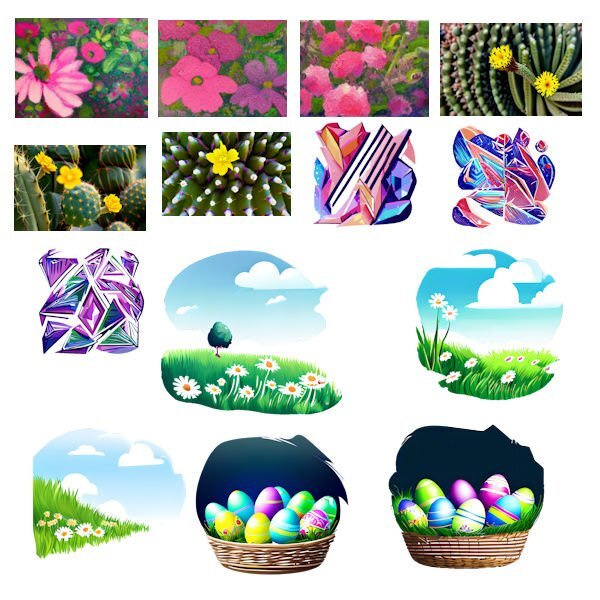
Those are very neat. I tried it but didnt get good results and it kept saying I was in line and it took more than 5 minutes. I am not that patient, the results were not great. For me I find it a dilemma. If i think it but dont have the skills to execute it, and I have someone/something else design it, who is the artist? I do understand it is a tool in our toolbox and we should use all the tools at our disposal. I will come around as it has very pleasing results for you. I think I'm not creative enough or perhaps descriptive enough to get those needed results. That 3rd from the left top row flower grouping is really pretty and would make a great paper. Maybe I should re-think my logic.
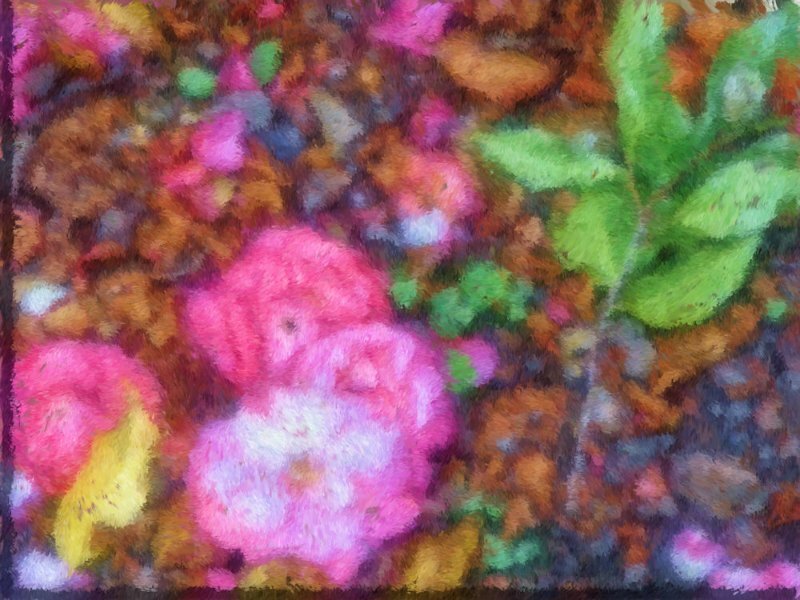
That was my favorite too. The picture I started with was one I took in Louisiana some years ago of some camillia flowers that had fallen on the ground. There was some green leaves in the picture too and I had taken it and put it through pic to painting before I put it through CF Spark. The last 5 I was just playing around with thoughts and spelled them out and they were the results. The abstract pics were the result of taking a presented pic of a bouquet that I asked for enameled lines. Just fun and I'll see what I do with it all later.
-
1
-
-
I've just discovered what CF Spark can do. So I will show what I have been playing with today. The last 5 are something I just asked it to create with a description. The others are from a beginning picture.
-
2
-
5
-
-
I took a picture i took of Camillias on the ground in LA several years ago and brought it into Painter and this is what I came up with.
-
I'm done in. Workshop 7. Changed many times, but this is what I finally came up with. I'll post it and then I have to restart my computer as I overloaded it working on this. The font is Dragon Kids from Creative Fabrica. The lower cluster is from PS - Jessica Dunn.
-
9
-
6
-
-
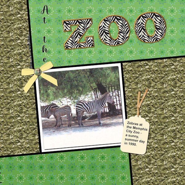
Well, I did complete workshop 6 and will go on to 7 today also. Not too happy with my last couple of layouts - however, the different ways to use text have been interesting. With this one I used a pattern in the letters instead of a color - it was interesting resizing the layout - the zebra pattern didn't want to resize; so I had to close the jpg and then call it forward again - and this time the zebra pattern also resized. The ribbon on the tag is from PS - Gina Jones; the rest of the elements are my own. I think the font I used for the Zoo was something Big Chunk.
-
2
-
15
-
-
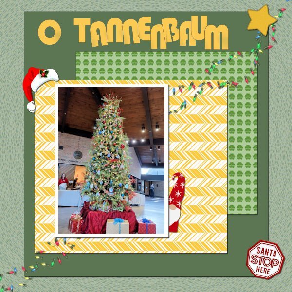
Still working on it. This is workshop 5. The text is Bauhaus 93; the Christmas hat and the star are from Cassel; I'm not sure, but I think the gnome is from Creative Fabrica. I extracted the "Santa Stop Here" sign from another picture of the tree. The scene is from the Germantown (TN) Civic Center Christmas Santa Party for the kids. Yes, Santa was there and I even have a picture of me with Santa!
-
7
-
6
-
-
Well, I'm only finishing workshop 4 and will have to quit now. The title font is AR CHRISTY and the journaling is Arial Bold. As you can see, I do love putting text on a path. Do love the pen tool now, but really will have to explore more with it.
-
6
-
6
-
-
8 hours ago, Susan Ewart said:
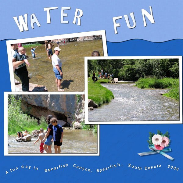
Day 4. Text on a Path. I like being reminded how to do text on a path. At first I thought my Text too was out-to-lunch because I couldnt highlight the text. Are you ready for a laugh...well, I had not put the paper in place of the grey holder spot so I couldnt see the text being highlighted because it was the same color. I put a temp paper in and there my text was, all highlighted and happy. The temporary paper (yellow) I kept and added a texture effect. The brown paper is from APJess-Furry cuddles (Digital Scrapbook) that I also added the Blinds texture. The buttons are from Digital Scrapbook - I forget who. Font is Stay Latte for the bottom and Mustard Med for the top, I cut it out of the top paper, using the magic wand to select the letters and then hitting delete on the paper layer...and initially forgot to hide the grey layer, another Duh moment.
Absolutely love this, Susan. The winding road pictures are my absolute favorite - it's exciting thinking about what's around the bend in the road.
-
2
-
 1
1
-
1
-
-
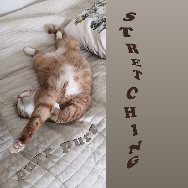
1 hour ago, Pirkko Seppälä said:
here is my work for Day 4 Sulo warms the sleeping place for his mistress ?
What if I wanted to write in the path from top to bottom?
Oh, Pirkko - I really loved this - and your word is really s t r e t c h i n g!!!
-
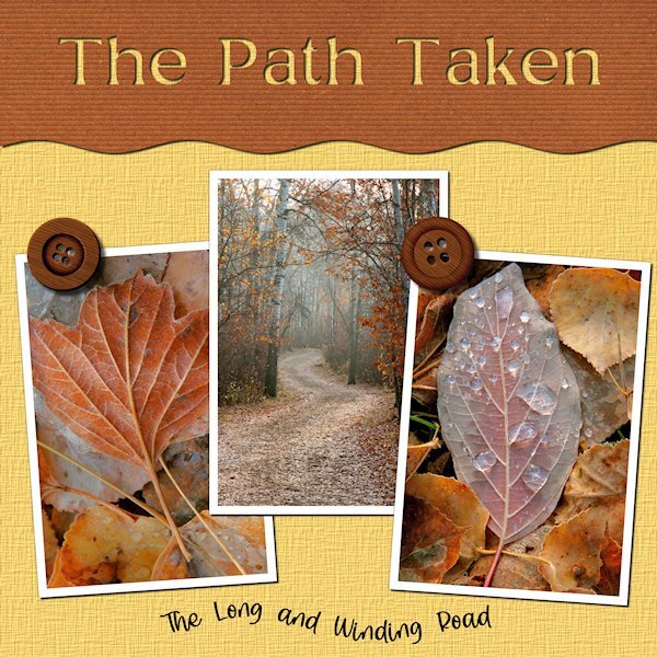
Using my desert pics and the build a kit workshop elements and papers - this is my day 3 text workshop. Interesting how to use the magic wand to make the area for the journaling.
-
3
-
13
-
-
23 minutes ago, Cassel said:
@Anja Pelzer Nice soft colors in that title. They match the page very well.
@Sue Thomas Thanks for pointing out that they were pine cones in the fill. The resizing of the image made it harder to identify what they were. That Red squirrel is adorable!
@Lesley Maple I'll have to find a way to get that effect in PSP!! Did you add shadows on the papers under the photo? I think it would add more definition, especially on a busy background.
@MoniqueN. Have you considered trying to add some shadows on the little elements inside the "Baby" title? I wonder if it would add some volume? Not a big shadow but just a little.
@Michele It is fun to see the fill on the top part of the text. A little unexpected but definitely in line with the theme!
@Susan Ewart I am curious to know what you put in the title. Are those confetti?
@Linda J Walker Glad to see that you are sharing the title on its own, even if the page is not ready.
@Julie Magerka The owl photo really makes me smile! For the title, since you have a patterned background, have you considered adding a little shadow on the letters as if they were cut out of papers?
@Linda Hitt Great way to customize a template. It is always a starting point, but the destination is often different!
@Hank Sobah I love how you layered that single fish on top of the title. It really gives it some depth too. Colorful concert page!
@nadine Nice idea to have the clouds on top of the fill! Templates are meant to be changed!!! ?
@Ann Seeber You might want to tweak the placement of the text as the overlapping with the decorative element is inconsistent. Maybe move the text a little downward or resize the decorative element a little to shift upward? That change in size for the title really gives that impression of jumping!!
@Cristina Due to the resizing, I am not sure so what did you use to fill the title? Are those confetti?
@Donna Sillia You filled the title with tiny Easter eggs, right?
@Louyse Toupin Did you place the scattered confetti and rotated a duplicate by any chance? It looks like there are two different types of shadows on them.
@Bonnie Ballentine What kind of pattern were you looking for?
@Corrie Kinkel Changing colors word by word is definitely another way to use this technique.
@Mary Solaas That yellow is really standing out! You might want to add (or add more) shadows on your papers to give them thickness.
@Pirkko Seppälä Awe... sweet photo!!! The whole family!
@Gerry Landreth Sand in the hair! that is no fun! But the picture is worth it!!!
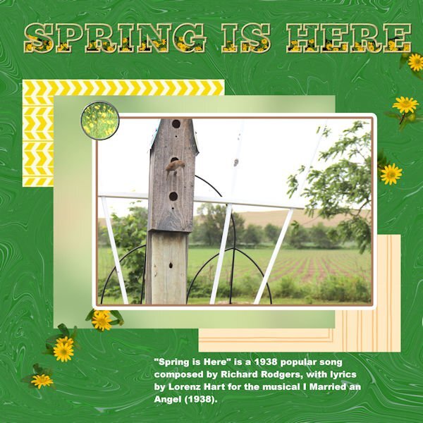
No shadows on "Spring Is Here" as I just wanted to get the thing saved. My problem with PSP Ultimate 2022 was definitely with that layout. Could it possibly be with the many undos and redos? And, if so, can I remove the history from the layout pspimate?????
-
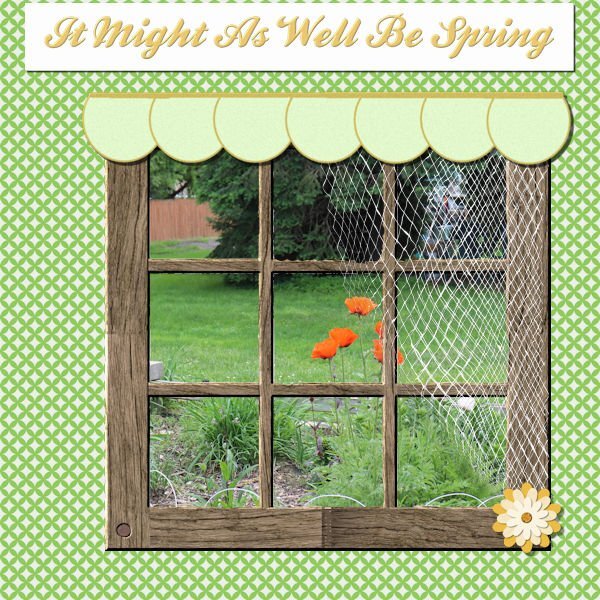
Well - seems it was just the previous layout because now PSP Ultimate 2022 is acting like it's supposed to. this is my layout 2.
-
7
-
13
-
-
Today it's just PSP Ultimate 2022. Couldn't get it to do File> - anything. But finally got it saved. Then SLOWWWWLY SaveAs a jpg. Close it out. Then reopen the jpg and reduce it in size (no problem there) and then saved at 600. Could it possibly be the size of the layout due to undo and redo's? I haven't had that problem before. Anyway - here is #2.
There is a really good rendition of this song on YouTube by Ella Fitzgerald.
-
3
-
-
Having problems with PSP Ultimate 2022 - today! But I finally got it to work and finish day 1. I am going to post it in the song challenge too.
-
9
-
9
-
-
Thanks for helping. And yes, it was the Create As choice was the problem. I wonder what would happen if it had "floating" as the choice?
-
3 minutes ago, Cassel said:
Oh, is it possible that the Create as... has been changed to Selection instead of Vector?
I just opened a new layout and played with the pen tool since it uses a vector layer and that works fine, I can duplicate it and it doesn't disappear - But then if I choose the Text tool the same thing happens.
3 minutes ago, Cassel said:Oh, is it possible that the Create as... has been changed to Selection instead of Vector?
-
30 minutes ago, Cassel said:
Are you using 2023? There is a "bug" that happens if the file is saved with the bottom layer active. Somehow, it messes PSP and then it is really hard to select layers correctly. For that, you would need to activate another layer first, save the file, close it and reopen it.
I'll look at saving not with the bottom layer active. I'm using 2022 Ultimate. It's not with the saving. It has to do with selecting a font and creating a title, and then clicking on it to duplicate it - as soon as you do that, the layer disappears and the title disappears except that it is outlined with "marching ants". The layer also disappears if you decide to move the title and choose the pick tool. This is just crazy and has only happened today. When I did the layout for the Build-A-Kit workshop, it didn't happen and that was yesterday, I believe.
The last update to Windows 10 64bit was on 3/15/2023.
I just checked - I posted that layout on the workshop yesterday, but there was no font used. So - I haven't tried to use the font tool for some time.
WOOOW. I just discovered what was the matter - it pays to look at all the areas of your tool -- for some strange reason it had changed to "create as" - selection! In trying to do it again, I discovered this. When I changed it to "create as" vector, it worked just as it was supposed to. I can't believe I could be so dumb! Thanks for looking at my problem.
-
13 minutes ago, Mary Solaas said:
I'm game. The first song that popped into my head was from State Fair (a musical by Rogers and Hammerstein). I thought I was kind of copying a layout I had done before and just change the title. However, I have worked on this almost the whole day - the problem was the font! Every time I wanted to duplicate the title so that I could innerbevel it, the layer disappeared and left me with the title as "selected". I finally just flood filled the selection on a raster layer and went from there. I even tried closing out and restarting the computer, but that didn't work. I don't know if there was just so much in the file because I had worked hard on the netting and it couldn't handle the font. Well, anyway, here it is.
It is still happening. I went back and opened a new layout, put in a paper, then placed a title. As soon as I clicked on it to duplicate it, the layer disappeared and the title was just a selection. Did something happen to Windows 10 in an update that could have done this??? Anyone have any ideas???
-
I'm game. The first song that popped into my head was from State Fair (a musical by Rogers and Hammerstein). I thought I was kind of copying a layout I had done before and just change the title. However, I have worked on this almost the whole day - the problem was the font! Every time I wanted to duplicate the title so that I could innerbevel it, the layer disappeared and left me with the title as "selected". I finally just flood filled the selection on a raster layer and went from there. I even tried closing out and restarting the computer, but that didn't work. I don't know if there was just so much in the file because I had worked hard on the netting and it couldn't handle the font. Well, anyway, here it is.
-
5
-
-
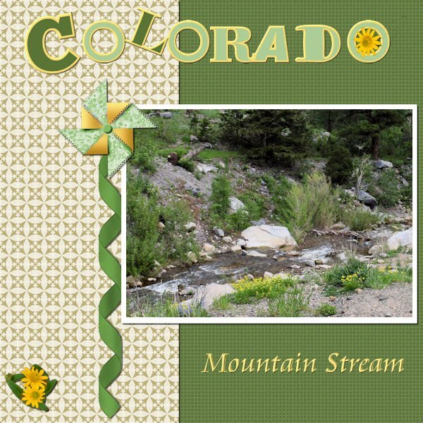
I have been working in the Build-a-kit workshop. I had a theme of desert because Joe and Laurie have been working their way west and have stopped in several states that have deserts. So, I have made use of the kit with a few of the pictures. All of the elements and papers were developed in the kit, including the alpha.
-
2
-
5
-


What are you working on (in April 2023)?
in Showroom
Posted
I have played with this for the past several days as I have had time. I am very OCD. I cannot, for the life of me, recreate what I did to get this result. I cannot figure out which pspimage I used to get this result (as I had made several). So, what you see is what you get and I have to leave it at that.