

Mary Solaas
-
Posts
1,389 -
Joined
-
Last visited
-
Days Won
68
Content Type
Profiles
Gallery
Forums
Posts posted by Mary Solaas
-
-
20 hours ago, Rene Marker said:
I spent the day yesterday actually scrapping. I was catching up on the backlog of photos for my cousin's family from April 2022. I decided to think outside the box on one of the layouts. I don't use frames very often and the kit I was using had a lot of frames. The template I used was very basic since it was more to do a magazine type layout so had no clusters on it. So I kept the photo spot and one paper strip then did what I wanted. Starting with using a frame as a basis for a cluster - some items behind it, others on top of it.
The template is Scrapping With Liz Zine Double (set 2) available at The Lily Pad. The kit used is "Center Stage" by Kristin Cronin-Barrow available at Sweet Shoppe Designs.

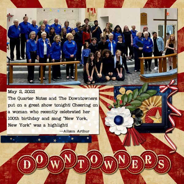
Rene - really well done - like what you did to create the cluster - interesting idea to use the frame as the base - and the alpha is great = a great idea for the new project in the build a kit workshop. My step-mother had been a singer in a group called the Sweet Adelines here in Memphis. We always enjoyed their show.
-
 1
1
-
 1
1
-
-
On 3/3/2023 at 3:06 PM, cindy harris said:
Hi my Daughter took me there its about hour 40 mins from me. Did You go in the hot springs pools, I never noticed healing properties either but ppl come from all over the world to come there. Theres so many sites and things to do there, now days they have gambling and horse races is BIG. loved your post Art pages.
Hi Cindy, my daughter, daughter-in-law, and 3 grandchildren (all girls) went there quite some years ago - we did a Ya-Ya-Sister weekend. We did do the baths - the water feels good. I also went there with a friend of mine and we did not go in the pools that time, but we did do "crystal mining" and then went to the diamond mine to poke around in the offall from the mine. Diamonds have actually been found in the slag.
-
3
-
2
-
-
43 minutes ago, kasany said:
I coudn't active participe in MaskWorkshop'23 in different cases /home problems, router-problems-no net for a week, covid-19 as an end/. I hope all's fine now:))))
So I can play PSP right now and be happy with you:))))))))))
Excuse me Carole, my absence during lessons, I'm sorry...
Kasany - Sorry about your problems - glad they have abated and you are on the mend. God is good and He does bring us through those times when the world throws us a few loops. I always enjoy your layouts and so I'm glad they will be forthcoming again.
-
1
-
-
2 hours ago, Marie-Claire said:
@Mary Solaas thanks again Mary for your comment in the Mask Workshop about my dog and layouts.
I think I read somewhere that you now also have a wacom tablet and pen? Do you now only work with the pen for everything? also outside PSP ? Or do you also use the mouse.
I still find it difficult outside of PSP, especially scrolling is easier with the mouse I find.
In PSP I have to be careful because I easily move toolbars without wanting to.
Are you used to it already?I do use a tablet but it is not a wacom. I bought a cheaper type called XP. I have only used it with PSP. And not on the laptop. It is connected to my desktop which is mostly where I work. I have to remind myself, though to use it. Mostly it is when I invoke the pen tool. I'm beginning to be more comfortable with it and with the pen tool. I really hated the pen tool until I started using the tablet.
-
2
-
-
1 hour ago, Marie-Claire said:
Day 7
the small photos are made with a Free script from Cassel in the store : cass-polaroid
Sticker: Master class Title Work 3.I enjoyed participating in this Workshop for the third time, and to see the various beautiful pages you have made.
Thank you Carole for reviewing our work.
Marie - I sure enjoy your pictures of your dog - Poncho - isn't that his name? I also enjoy your layouts.
-
1
-
 1
1
-
-
7 hours ago, Ann Seeber said:
Here is a seamless tile I made for my Snowdrops layout (posted in What are you doing...? ) I took a piece of the blue vase behind the flowers in the photo and used it to fill the background.
Ann - love your idea for a tile. Makes for an interesting background.
-
1
-
1
-
-
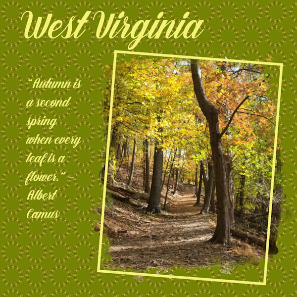
I'll post a few of the many patterns I made during the mask workshop. Most were made either with the West Virginia layout, the ocean layout.
Julia - love your perspective stripes - some of them remind me of a pinstripe suit material.

-
8
-
2
-
-
This is my project 7. finally finished the workshop. whew!!!
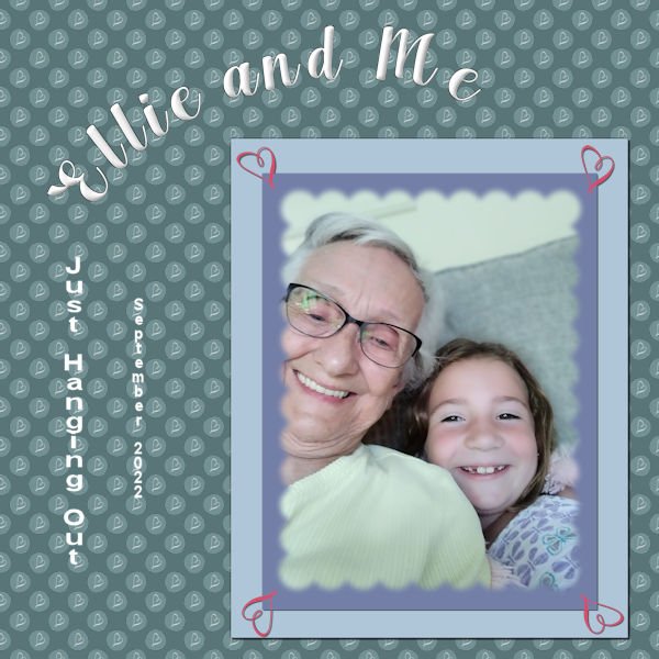
Had fun playing. The background is the combo polka dot - learned that in one of the previous labs I was doing. I put a "squiggle" from one of the fonts that I imported as a brush. (What fun!) And I used that squiggle brush in the four corners of the papers behind the mask. Ellie is the great granddaughter of my cousin that I visit every year in Illinois. She is a barrel of fun. The font is Arlington Script (the only font factory I go to is Creative Fabrica). I chiseled and inner bevelled the title. The journaling is in Arial (2 different sizes). The original polka dot was a deep pink with a white heart squiggle, so the polka dot part of the paper is in the luminance blend mode as the background paper is a deep blue green. Fun, fun, fun!
-
2
-
8
-
-
Harmony - you're doing great. Grandchildren are so much fun.
-
1
-
1
-
-
And this is the Extra 6. And I've got to go to bed. Good Night!
-
6
-
2
-
-
And now Project 6. My linoleum started out green, but I used Hue Saturation Lightness and changed the color. Title font is Aryaduta (CF). I extracted the chess pieces (only the white ones - I used Brightness and Contrast for the black pieces (duplicate copies of the white ones). Fun with the curled ribbon made with a script from Cassel. This mask is the one I talked about in the previous post - I made it with the watercolor brushes and some interesting twiggy brushes around the edges. I inner bevelled and drop shadowed the title. The white swirlly things on the paper in back of the masked picture were made with a brush I had made earlier playing around with the fancy squiggles and things that come with some of the fonts. I had forgotten how you made linoleum. I think I will play around with that again when I finally finish this workshop. One more project to go.
-
3
-
6
-
-
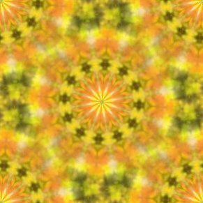
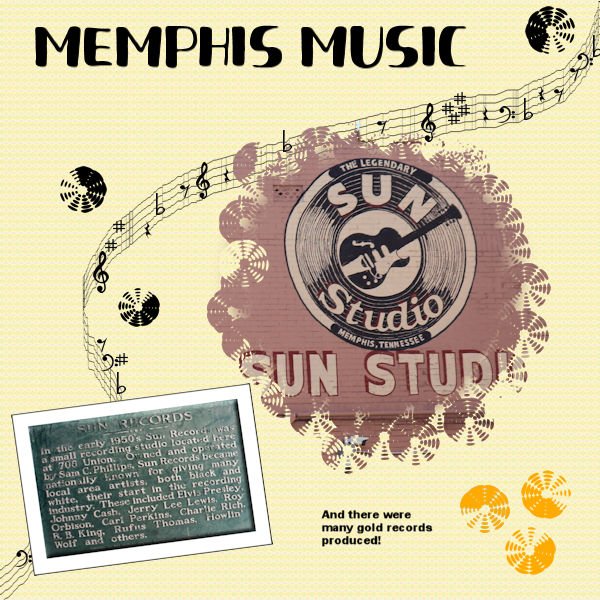
Project 5. Still behind. Using several layers for the background and the top layer was a pattern from a previous project and the blend mode. There is a brush that looks like a record (kind of) so I used that for around the original circle mask. I also used it for the records as elements. The font was Fresh Hansler Duo (CF) for the title. I used some different settings than I usually use for the Sun Records placque - inner bevel, and I used chisel on the paper behind it. This has been a challenging workshop and I do intend to finish it. I played around with creating a mask from those watercolor brushes from an earlier project and I'm also going to post a layout using the one I developed that uses some odd but interesting brushes around the edges. I think I learned more about blend modes this time as well as refreshing my understanding of how to make a mask. Anyway, it has been most interesting.
-
8
-
-
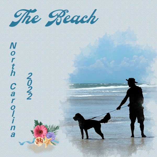
I'm working on catching up. I did do Project 4. Making the mask was interesting. Working on the picture you choose was great. I do like the McBad brushes if you use the F11 Brush Variance. However, I still do not understand it, but Carole shows us what settings to use. The picture is of Joe and Lucy on the NC beach last spring. I had fun making a silhouette of them. I did a kaleidascope (I can't spell) from the picture with a darken blend mode and then put a layer on top of white canvas which I texturized and used an Overlay bend mode and opacity of 83. Think it turned out pretty good. You can just barely see the kaleidascope pattern and so it doesn't distract from the picture. The title font is Cattleya (CF) and the state and date is Free Universal. The cluster at the bottom is mine.
-
1
-
6
-
-
I've done this workshop several times. Why is it so hard this time? This is the Extra for Project 3. The frame with the hearts had me going for hours trying to get it pink and not covering the picture. I saw where Ann Seeber said "I put an extra mat behind the mask group in order to color the framing and hearts." and so I did. Thank you, Ann. Then I spent several hours trying to get a background. I ended up with 3 layers: the perspective lines, a kaleidescope from a part of the picture, and a patterned layer of Canvas - all with different blend modes. The font is Feeling Blessed from CF.
-
1
-
6
-
-
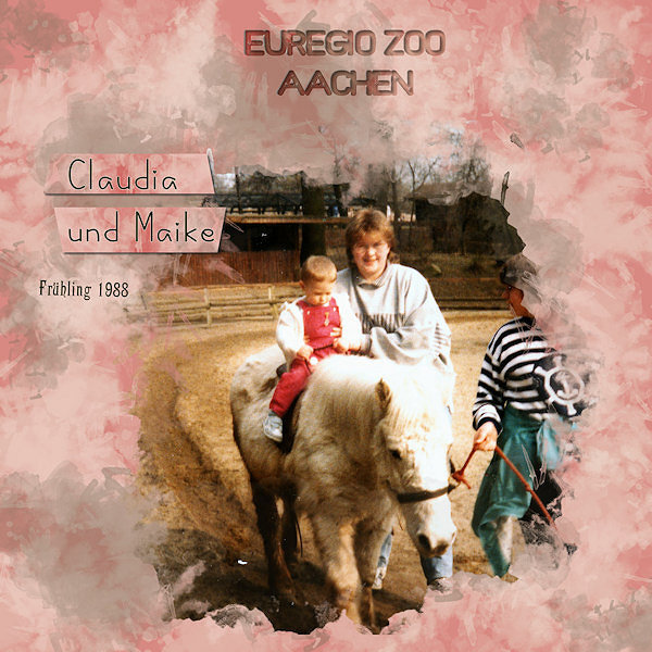
6 hours ago, Anja Pelzer said:
here is now day 4
with my Sister and my Daughter in 1988 visiting our zoo in Aachen
paper made with the same brushes I used for the mask
strips made from the paper
I love what you do with the brushes. I'm going to have to work on that. You do beautiful work.
-
1
-
1
-
-
17 minutes ago, Susan Ewart said:
I know, right...about the frame. For so long I wanted to know how people did that. It wasnt until I did the Greeting Card workshop that I learned how. Now to figure out how Sue does the intertwined frames! Your background is really nice with that photo, which is beautiful by the way. I would love to walk there.
Me too. My granddaughter took that picture and she does like to hike. I really like what you did with the picture of that poor squirrel. Yes, it is interesting on how to change a patterned paper with using a different color layer in back of it and then lowering the opacity of the patterned paper. Isn't this fun!!!
-
1
-
-
This is certainly a busy workshop. So good!!!!
I'm finally finished with Project 3 (yes, I know I'm slow). I played and played and played with the Reflection effects for this one. I do like Kalaidescope and this time I made several patterns and chose this one for my background. I also played with the reflective pattern. The frame I made (I can't believe it is so simple to make a frame)! Oh, the font is Barna from CF.
-
3
-
7
-
-
Sharon Thompson: love your library photo and layout. You know when I read Beauty and the Beast as a youngster, the part that fascinated me was when the beast gives her access to the library - what a treat that would be!!!!!
-
1
-
-
Wow, Anne - love the picture = but really like that background - how many layers cause it looks like you have an overlay over the kaleidiscope
-
1
-
-
And this is the 2nd extra for Day 2.
Carole, I did try using the other patterns at a lower scale, but they lost their beauty and just didn't work as well as the plaid. Yes, I need to check out those other tutorials on the plaids - I remember that we did some different ones in the labs.
-
8
-
3
-
-
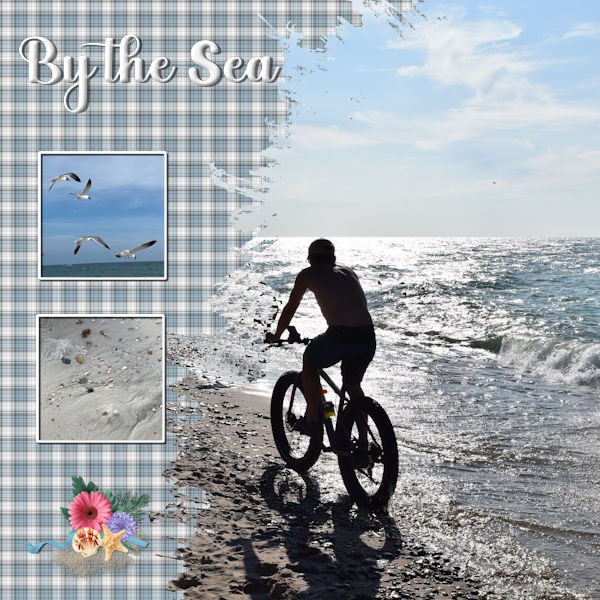
I know this is the 3rd day of the Mask workshop, but I'm behind. This is the extra for Day 2. The large photo is by Laurie Solaas, the 2 small photos are by Chris Solaas. The paper and elements are mine. the font is Aryaduta and inner bevelled and shadowed. I chose plaid again for the background. Used the colors from the ocean in the big pic. Using that same rectangle, I did a kaleidiscope pattern and a reflected pattern which I liked, but they were too powerful for the layout. I'll show those also.
-
2
-
7
-
-
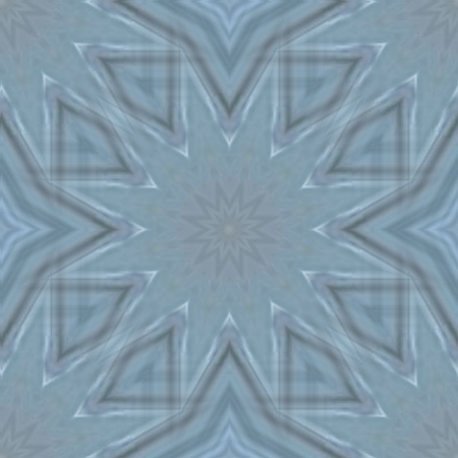
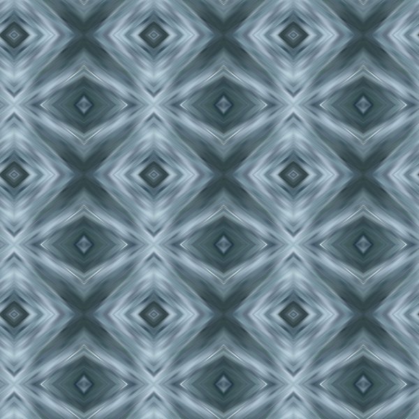
I had forgotten how we had made that plaid for this mask. I kept trying to remember how we had done it with the rotating mirror. So, duh, I listened to the tutorial. Oh, Yeah!!!! So now I will try to remember how to make this plaid. Again I chose Memphis for the theme. The main pic is one I took from a painting on the wall of one of my favorite fast food places here. The other pics: the Big M bridge lit up was taken by my daughter, Anna. I took the St. Jude pic. The brad I used is one I developed to represent the pyramid in Memphis. The font used is Ambrogio.
-
6
-
3
-
-
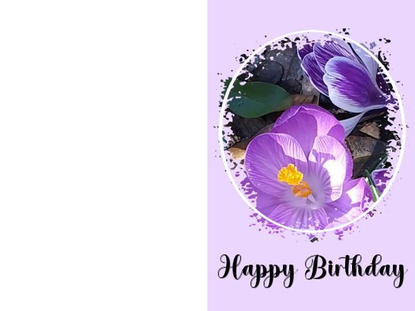
And this is the 2nd extra. Think I'll save this in my cards folder. This is a picture of the crocuses in our garden last year. They haven't appeared yet this year.
-
2
-
11
-
-
This is the 1st extra for Project 1 - my daughter's and my favorite park near our home. Title font is Bollywod from CF. Date font is arial.
-
5
-
9
-


What are you working on (in March 2023)?
in Showroom
Posted
Thanks for the freebie site, Michelle.