
Resized.jpg.46eaf2dbce9171c9f3a489ed9ad45018.jpg)
Bonnie Ballentine
-
Posts
2,928 -
Joined
-
Last visited
-
Days Won
56
Content Type
Profiles
Gallery
Forums
Posts posted by Bonnie Ballentine
-
-
Thank you, Carole. Tons of fun! Happy Easter!
-
 3
3
-
-
Individual vertical daffs by Elif Sahin, flowers 34-08 at Digital Scrapbooking.

-
 4
4
-
-
Y = yearly
-
V = victory over death
-
T = tomb
-
R = Resurrection
-
Here in Virginia we say, "If you don't like the weather, wait a minute. It will change."
You can't fool with Mother Nature. She doesn't like it.
-
 3
3
-
-
P = Palm Sunday
-
1
-
-
J = joy
-
1
-
-
F = faith
-
1
-
-
I'm in.
-
1
-
-
B = bunny
-
1
-
-
8 hours ago, Cassel said:
@Gerry Landreth Yes, picture tubes do have some settings that can be changed to get different effects. Isn't is fun to accidentally find something new?
@Carolyn Rye Glad you are enjoying yourself. I think you rotated the text a little more than the 5 degrees that was suggested. When you get more comfortable, you will be able to add shadows on the various papers and elements.
@Corrie Kinkel Perfect choice of color for the rope around the text. I was actually hesitant to offer the Build-A-Kit workshop at the same time as another one, but I figured that since it was not as intense, participants can pick and choose what to work on.
@MoniqueN.As others have mentioned, add the shadow and see the difference for yourself. Although it might not look like much when you add it, it shows clearly when you don't have it. The technique on day 7 is not something that is typical, but if you ever have a nice landscape image, it might be perfect for that technique.
@Louyse Toupin Glad that you managed to use the text on the path. May I suggest that you move the text a little to the left so it does not overlap the photo?
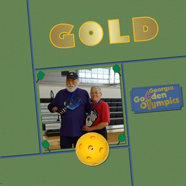
@Bonnie Ballentine I see you also used multiple fonts in the title for the Sandy layout. Did you forget the shadows on the cat photos? Never a dull moment looking at your projects either! ? On the title, I see that the pickleballs are "uneven". Is that intended? If so, no problem. If no, you might need to change the setting for Placement mode from Random to Continuous. That is a setting that is often overlooked.
@Anne Lamp Glad to see at least some of your projects. If you finish them later, the thread will still be open for you to post.
@Susan Ewart You won't be without work for very long. Hint, hint. Another workshop will come in April and something else for Easter. All those techniques will probably show up in upcoming projects?
@Rene Marker That is a good font for that project and shows enough of the image.
@Hank Sobah Spring will come... eventually!
@Ann Seeber What a great story and you showcased it well too.
@Marie-Claire Happy birthday Poncho!
@Linda Hitt You did great by using the technique on individual letters. It is more work, but the result is worth it!
@Donna Sillia That is a great idea to put the letters vertically to showcase that photo!
@Alice Daniel Glad to see you post projects. Keep them coming. Practice will help.
Although today is officially the last day of the workshop, you still have 7 more days to access the tutorials and continue posting your projects in the thread. DIAMOND members don't need to rush as you have permanent access to the tutorials.
Keep it up!
Carole, yes, it looks like I forgot the shadows on Penny's layout. Off to fix it. Thanks for the catch. I worked forever with the pickleball outline. That was as close as I could get it. I did have it set to continuous. I changed the size of the balls and the step multiple times searching for a solution.
-
1
-
-
Day 6 Outline with Tubes
The pickleballs are so small. Here is just the title...resized to 600.
-
8
-
 1
1
-
6
-
-
Day 5, Overlapping Text.
This a layout completed some time ago...I am so far behind and even though there is no pressure or time line...I am dedicated to completeing this workshop.

-
8
-
5
-
-
Day 4 Text On A Path...easiest time I have had doing text on a path. It usually takes several tries. This layout was completed fairly quickly. Not sure I should have used a path on top and bottom...it did give me more practice.
-
7
-
1
-
7
-
-
2 hours ago, MoniqueN. said:
Bonnie, your text at the bottom is far to the left, did you do that on purpose?
I love the way you did the text at the top, it suits the ladies well!?
Fixed it. Thanks for the catch!
-
3
-
1
-
-
2 hours ago, MoniqueN. said:
Bonnie, your text at the bottom is far to the left, did you do that on purpose?
I love the way you did the text at the top, it suits the ladies well!?
No, Monique...it should not be far left. I'll fix it. Thanks for catching that!
-
1
-
-
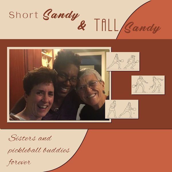
Day 3 Text Wrapping
Short Sandy on the left; Tall Sandy in the center; Bonnie on the right. There was no way I know to get me out of the picture. Tall Sandy is tall...about 6 feet. Short Sandy is short...about 5'4 or less. Once we had 3 Sandys in our pickleball group. When Sandy 3 arrived the immediate question was, "What will we call her?" She told us to call her Fat Sandy. No way! We ended up calling her Sandy D. Even though Tall Sandy has moved away, she and her "Sister", Short Sandy stay in touch. Tall Sandy stays in touch with several of her Virginia Pickleball Friends. That's one of the things I love about pickleball...lasting friendships!
-
1
-
12
-
-
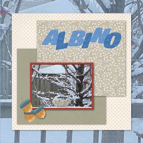
10 minutes ago, Julie Magerka said:
Day 5 is done. Those are acorns in case they are not very clear in the reduced size. Never use them to feed critters, but used 'em here! Photo taken not that long ago. Crazy weather lately.
We had 2 albino squirrels long ago. Sadly, they didn't survive long. I did enjoy watching them they were here.
-
1
-
1
-
1
-
-
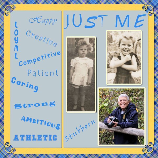
I used this in the Random Challenge also. The papers are from my Build A Kit workshop. I also used for the first time Carole's corner punches. This was Corner Punches B, I think. This is the Day 2 lesson. I am way behind!
-
3
-
12
-
-
My brush work is actually corner punches by Carole. I hope that counts. Fun challenge once I got started on it. Thank you, Carole! Yes, I could be difficult as a child...still can be in the right situation.
-
5
-
-
14 minutes ago, Cassel said:
@Anja Pelzer Nice soft colors in that title. They match the page very well.
@Sue Thomas Thanks for pointing out that they were pine cones in the fill. The resizing of the image made it harder to identify what they were. That Red squirrel is adorable!
@Lesley Maple I'll have to find a way to get that effect in PSP!! Did you add shadows on the papers under the photo? I think it would add more definition, especially on a busy background.
@MoniqueN. Have you considered trying to add some shadows on the little elements inside the "Baby" title? I wonder if it would add some volume? Not a big shadow but just a little.
@Michele It is fun to see the fill on the top part of the text. A little unexpected but definitely in line with the theme!
@Susan Ewart I am curious to know what you put in the title. Are those confetti?
@Linda J Walker Glad to see that you are sharing the title on its own, even if the page is not ready.
@Julie Magerka The owl photo really makes me smile! For the title, since you have a patterned background, have you considered adding a little shadow on the letters as if they were cut out of papers?
@Linda Hitt Great way to customize a template. It is always a starting point, but the destination is often different!
@Hank Sobah I love how you layered that single fish on top of the title. It really gives it some depth too. Colorful concert page!
@nadine Nice idea to have the clouds on top of the fill! Templates are meant to be changed!!! ?
@Ann Seeber You might want to tweak the placement of the text as the overlapping with the decorative element is inconsistent. Maybe move the text a little downward or resize the decorative element a little to shift upward? That change in size for the title really gives that impression of jumping!!
@Cristina Due to the resizing, I am not sure so what did you use to fill the title? Are those confetti?
@Donna Sillia You filled the title with tiny Easter eggs, right?
@Louyse Toupin Did you place the scattered confetti and rotated a duplicate by any chance? It looks like there are two different types of shadows on them.
@Bonnie Ballentine What kind of pattern were you looking for?
@Corrie Kinkel Changing colors word by word is definitely another way to use this technique.
@Mary Solaas That yellow is really standing out! You might want to add (or add more) shadows on your papers to give them thickness.
@Pirkko Seppälä Awe... sweet photo!!! The whole family!
@Gerry Landreth Sand in the hair! that is no fun! But the picture is worth it!!!
Carol, I wanted my outline (foreground) to be medium green. I came close.
-
1
-
-
I had a hard time with this one. I didn't have a pattern that would create what I wanted. This is close...no page...just the title.
-
11
-
3
-


Happy birthday, Corrie!
in Chit Chat
Posted
Happy birthday, Corrie! Wishing you a day filled with all you hold dear.