Leaderboard


Popular Content
Showing content with the highest reputation on 01/24/2024 in all areas
-
Lesson 7 done! Cassel, that you for offering us this free workshop. It has been a thoroughly enjoyable course to take and your explanations are clear and to the point.
 9 points
 -
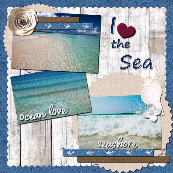
Day 7 I changed the template completely (started with the Diamond Day 7 template). the little tag is where the journal spot was and the title is in the same spot as the template. I did add shadows but they arent going to be visible, except on the screwhead. I originally wanted to use a label to cover up the alligator clip but thought it would look more "specimen-y" with it. the title and the outer frame have an inner bevel. Filled with a gradient (all the frames) and a pattern called Black Gold for the fill in the title. Fonts used: Herkings (Creative Fabrica), and Arial (Windows) Tag: my tag from the Vector Workshop (highly recommend this workshop!) Thank you Carole for another wonderful workshop. I'm always so delighted to re-remember the things I forgot from the last time through. I saw so many beautiful and inspiring layouts and often thought; "that's awesome, why didn't I think of that"?
9 points
-
Well here goes with my number 7 It is rather busy but I like it anyway.
9 points
-
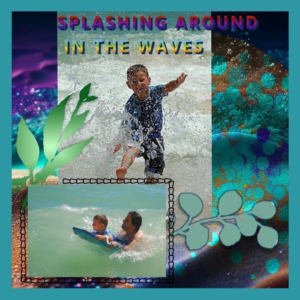
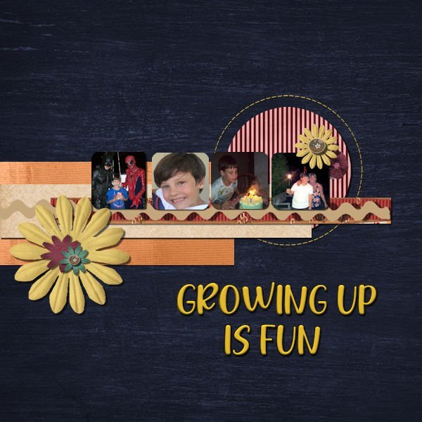
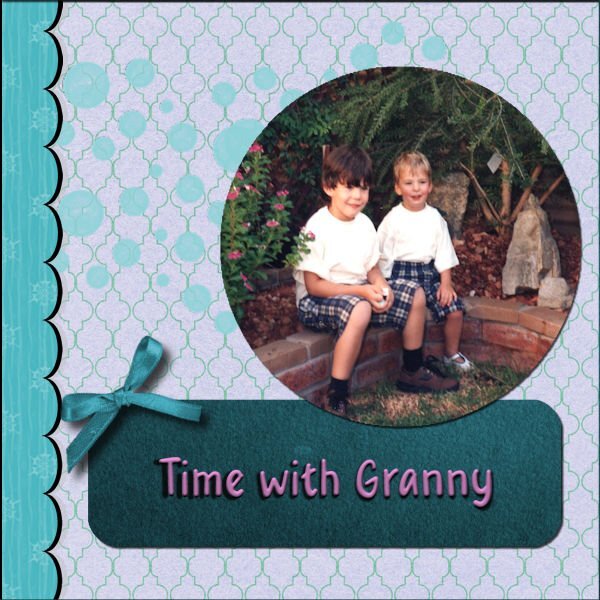
My son and grandson having fun on vacation in Mexico Summer of 2006
7 points
-
Good morning, here I'll show you my further progress in my PSP training in the new German forum. Unfortunately, I'm not allowed to publish my own training tasks elsewhere (at the moment sign tags) despite many credits on the picture (the artists who gave permission to the forum can only be shown edited in the forum), but my own frames around my own photos, which can I show where I want. With frames you can easily get into a routine with PSP. Unfortunately there is no filter. With filters I always have to save in .psd and then insert the filters into PI. I can't even insert the "Filter unlimited" into PSP because many filters are integrated.
6 points
-
SUBSET. You know, JK likes mountains. I use pics he sends to me, I use right now a mask 'Send Me an Angel' created by me in PSP.
5 points
-
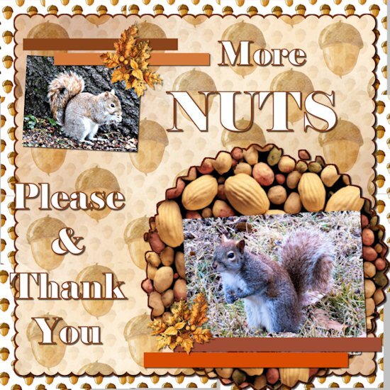
Here is my take on day 7. I kept hem hawing about what to do for this one. I got lucky and got the picks in my yard this morning. The squirrels were really active today. Yesterday we had freezing rain from about 3AM to noon. I did not go anywhere.
5 points
-
Template 6. Changed the layout by moving the title to the bottom, moving the pictures up, adding a journal sheet, and removing some of the elements replacing them with my own elements. I had fun – and learned something new – to put a paper on top of the textured layer and working with the blend mode and the opacity of the paper layer. Great stuff!! The title is Annie Tobin’s font (she was such a wonderful lady) which I glittered and innerbevelled. The heart in the top left corner is from CF and I innerbevelled it. The bow I made with Cassel’s Bow 2 script. The Santa sign is from my stash as is the poinsettia cluster in the bottom left corner. The star tube is from Cassel. The pictures are from scanning 1991 35m prints. They were in bad shape and I used every trick that PSP has (well almost). I had forgotten about fade correction, but Cassel reminded us of that tool and I used it and de-noised it to the max and sharpening it to the max. The difference is amazing. That trip was special and finding it was such a gift. You can't imagine - as we went down the road into the town, it was dark - everything was closed up tight - no lights - off to the left at a distance was an oil drum that seemed to have a fire in it - something that the people on the road in the depression might have used to keep warm or cook food - the scene was really eerie. Dolores really wanted to turn back, but I just felt we had to go further. And then, when we turned that corner it was like Judy Garland opening the door into Oz - from blah to radiant color. I will never forget it.
5 points
-
Wow, wow and another wow!😍4 points
-
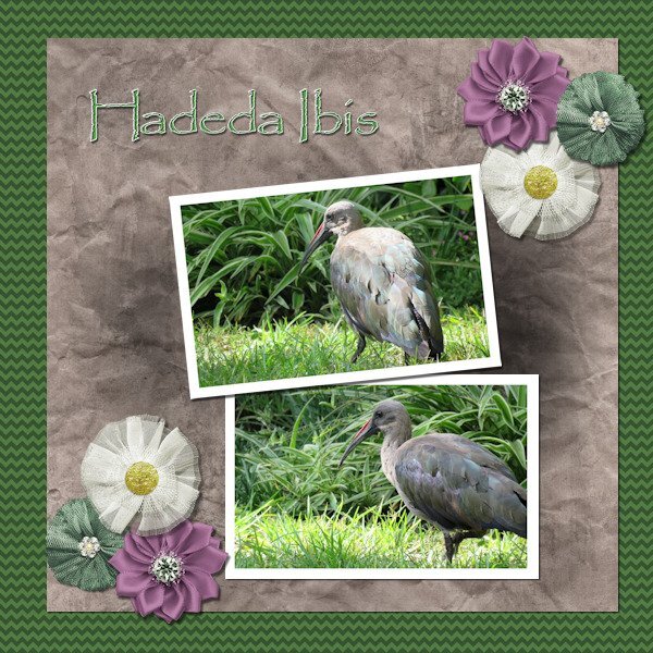
Lesson 6 done! We have a flock of about 10 Hadedas that visit us every day and most times spend the day in our garden. They are large birds (about 76 cm (30 in) long) and very noisy. Their call sounds like their name HA - DE - DA. When they make a noise, don't even try talking because someone standing in front of you won't even be able to hear you. I love these birds.
4 points
-
You are so lucky. I would love this! I had a Merlin in my yard on Sunday. I was most excited. He/She came, sat, pooped, and left. But we watched for about 15 minutes. I can never get enough of birds. Your layout is beautiful.3 points
-
I have had a lot of fun with this Workshop and learned so much. Unfortunately, for the next week, I will be without a Windows computer. I will miss working in PaintShop very much, but my daughter has a full schedule of things to do in Fredericksburg. I am hoping to get some great pictures! I made a quick roadtrip template. Thanks to our vector workshop, I was able to make a little car that sort of looks like our Toyota. The map is from Google. See you in a week.😪
3 points
-
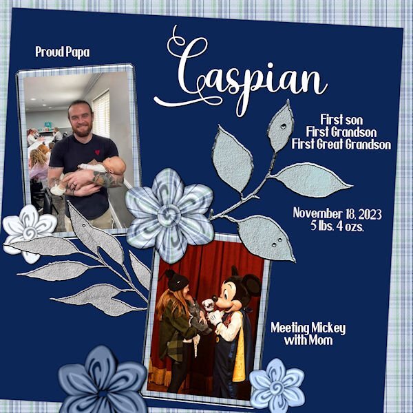
Lesson 3- Bit behind but it's what I can do right now. Font is Villanesia and Yoshieka. Flowers are made with cass-folded flower1 script. Caspian is the first child from my second daughter's son and wife, Connor and Whitney.
3 points
-
To quote the captain in "Galaxy Quest" - "Never give up! Never surrender!" Galaxy Quest is one of my favorite movies!2 points
-
So far so good. I am dedicating Wednesday mornings to work on this book. Depending on how late I sleep in, or what else might be on my schedule, I still manage to get a few hours each week. My process is to go through all the content that is gathered from various blog posts, tutorials, and classes, and make them all in the same style. Blog posts and classes have different formats (with intro, links, etc.) so I am making those a bit more streamlined, removing some extras, shortening sentences, etc. Today, I was working on chapter 5, which had a lot of screenshots for tools and dialog windows for various PSP versions. I plan to limit the screenshots to 2023 (or whatever will be the current version when it is published if there are significant changes). I reason that although there are some differences, if someone uses PSPX8, and the screenshot is from PSP2023, it should still be easy enough to follow. I can therefore remove a lot of "unnecessary" screenshots to save space! For those who have purchased the Tips and Tricks book, that was in a 6x9 format. I feel that would be a bit small for a scrapbooking book that would include lots of images so I plan on a full-size 8.5x11 format. I don't know if it is new (on Amazon) or if I had not noticed it before, but I think it would give a better result for the reader. And I will be able to have it IN COLORS! (that was not available at a reasonable price when the Tips and Tricks book was published).2 points
-
I did not purchase it either, mostly because I don't think I would use it much except for in these challenges, so I am glad Cassel reminded us how to do it the long way.2 points
-
I just wanted to say Thanks to Cassel for this great workshop. I have learned so much. I never ceases to amaze me seeing all the wonderfully creative and different takes everyone has posted from the same few templates. Well done everyone. I will be sure to keep checking in for a few days too.2 points
-
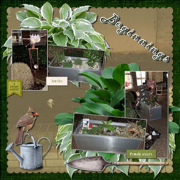
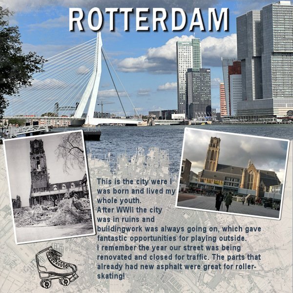
As this challenge will generate a new prompt every month or so and we had the Template Workshop to do, I only now had the time to make something for this new challenge. I liked what Bonnie did and made a page for the city where I was born and lived my whole youth. A little detail that is not mentioned in the layout is the black and white photo which is taken by my dad some time after the bombing of the city center of Rotterdam in WWII. The photo to the right is of the same church and I took that one on more or less the same spot a couple of year ago. My dad passed the love for photography on to me!
2 points
-
It's been a while since I had time to create a new one. (They've been repeating themes from 2017 so I've been repeating my layouts with a few adjustments.) The background paper is a chevron from PS/DS by Sheila Reid to which I added a Gaussian blur. I used the Andrea Bilarosa font I got in a free font bundle from CF and the flourish is from my collection of scrapbooking "stuff." 🙂 As you probably already guessed, the illustration is by Hayden Williams. The best part, and the reason I wanted to share this, is Cassel's gimp trims picture tube. I used one to frame the illustration and the layout.2 points
-
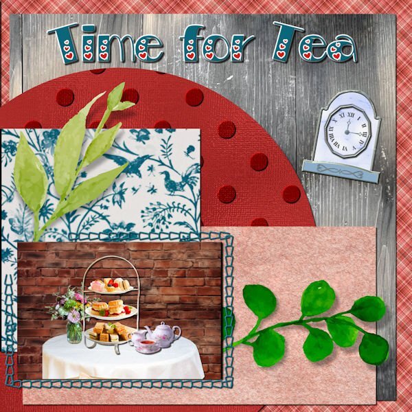
My daughter found an afternoon tea event in Fredericksburg that we will be attending. Since I don't have any good teahouse photos, I created one using Canva for the table, tea tray and tea set. The brick background is from deeezy.com. The bird paper is also from Canva; the polka dot paper is my own, the parchment is from FF, the wood from one of my daughter's photos, the plaid is one of my own and the clock is from my build a kit. The font is Bravo from Creative Fabrica.
2 points
-
Interestingly, just this weekend, we tried a new recipe for chicken breasts. It was soooooo easy (5 minutes prep). It is to cook those breasts in the slow cooker. NO LIQUID added, yet, it generated almost a cup of its own juice and the meat was so tender.1 point
-
N = No pain, no gain...did we have this one. If ever there was a silly quote this is it. If there is pain, that's not good. Sore muscles are one thing, pain is quite another, listen to your body.1 point
-
Day 7. This for a bit of a test for me, but I certainly did learn a lot.
1 point
-
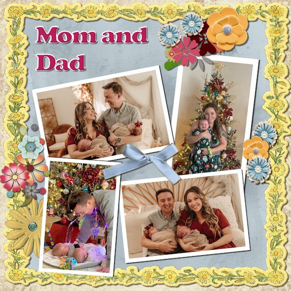
Time to pay tribute to the parents!
1 point
-
Michele, I have always admired your choice of illustrations; this layout is lovely. Gimmp Trims 1 - Gimp Trim 2 Picture Tubes really adds a touch of elegance to the page.1 point
-
Day 6 What a great video using the blend modes with the textured paper. I used the paper (blue) from the kit as I new I wanted blue anyway. Blend mode used was Multiply. the layer above I had a metal element (was a brass metal clock outer ring element) that I resized to the the blue paper fully then used the blend mode Dodge to make it look like it was part of the paper design (opacity of clock lowered to 38). Ditto for the faint clock hands at 9 and 12, using a blend mode of Softlight and reduce opacity to 57. Title has an inner bevel. Paper doily I used HSL to make it a light ivory instead of stark white. Tiny white clock I added an inner bevel as well. I had a weird message about not being able to save. I'm not super happy with the title fill but was having such issues saving that I just went with it in case catastrophe struck. The deets: Background paper: Riley B Graphics (Creative Fabrica) Blue Paper and white clock face: Janet Scott - elegant autumn mini kit (Digital Scrapbook) Bottom flowers/clock ring/clock hands/wings: (on blue paper): Kerry Dempsy -KMRD Steampunk Elements (Digital Scrapbook) Bee Wax Seal: Billie Irene Steampunk something or other kit (Digital Scrapbook) Font: Samantha Upright (Creative Fabrica) - used glyphs on "S" "t" and "s"
1 point
-
Day 6.
1 point
-
Here is my Number 7 and last Template result. I have loved every moment of these workshplessons despite being very wobbly at times.This has been a good distraction for me.Thanks to Carole for putting them up for us and thanks to all who participated, some fabulous results.
1 point
-
Here is my day 6.
1 point
-
Here is my number 6 Template result.
1 point
-
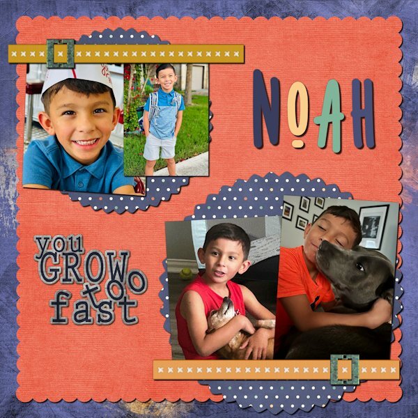
Day 7. Noah has been doing modeling and commercials. In one, he had to portray a child who was happily playing and suddenly dramatically sick. While the director praised his talent, his mother realized she saw the same behavior when she yelled, "Time to go to school!" Is it talent or practice? The kit is a collaboration called Boy of Mine from Go Digital Scrapbooking. The font is Nonplussed from Creative Market.
1 point
-
Day 4 I used stock photos from Pixabay. Font is Magnolia Script. I made the paper. And I added an inner bevel to the title.
1 point
-
I managed to do template 2 and although I have Caroles scripts, I wanted to do this template as instructed and after a few attempts I managed to do it. I learn by getting it wrong first time rather than right and hopefully with good notes I remember how to do it. Anyway,here is my result for template day 2.
1 point
-
Day 3 I used my kits. Font is Forte.
1 point
-
And here is my Lesson 2, though not totally happy with the curvy text but practice makes perfect! My photo...
1 point
-
Thank you again. All 3 worked. If only I had asked on Monday !1 point
-
graphics myself, you can dl the winter themed mini here1 point
-
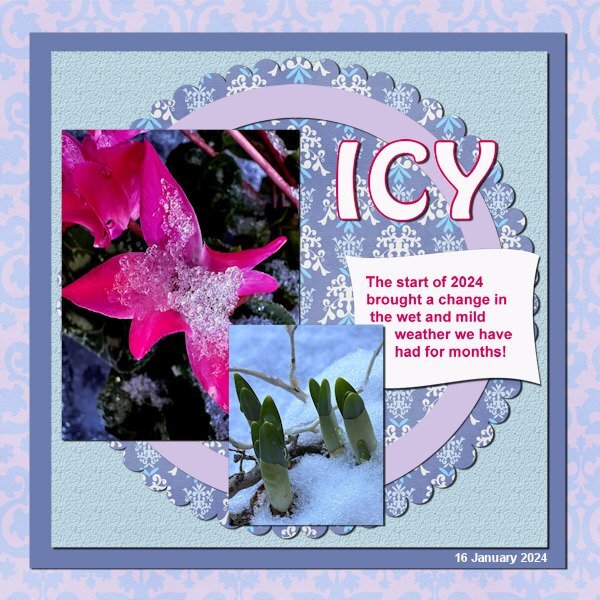
Day 4. The picture is from Pixabay. A pond in our neighborhood is a favorite rest stop on the migratory route. A neighbor posted a picture of some late-season travelers waddling around on the ice that has formed during this brutal cold snap.
1 point
-
graphics myself, you can dl them here1 point
-
The extra from day 2. I treated it as a poster. The 2 pics are watercolors from Creative Fabrica.
1 point
-
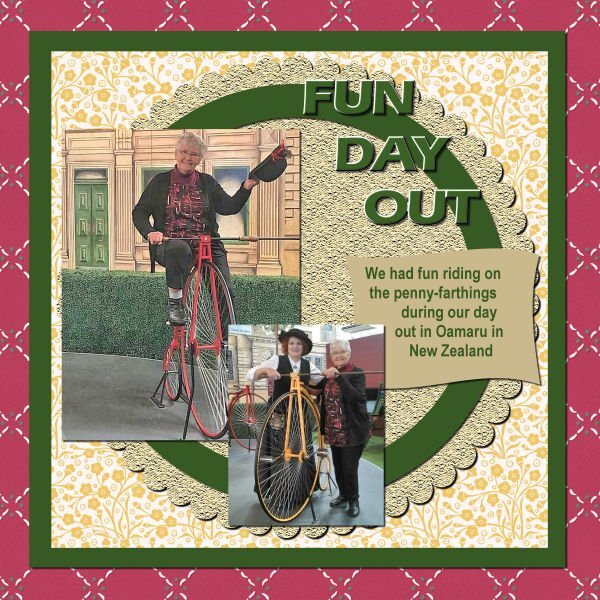
Hi, here is my Day 2. This is me visiting a friend of the family who works at one of our Historic towns, and they are known for the penny-farthing tricycle. It was such a fun day.
1 point
-
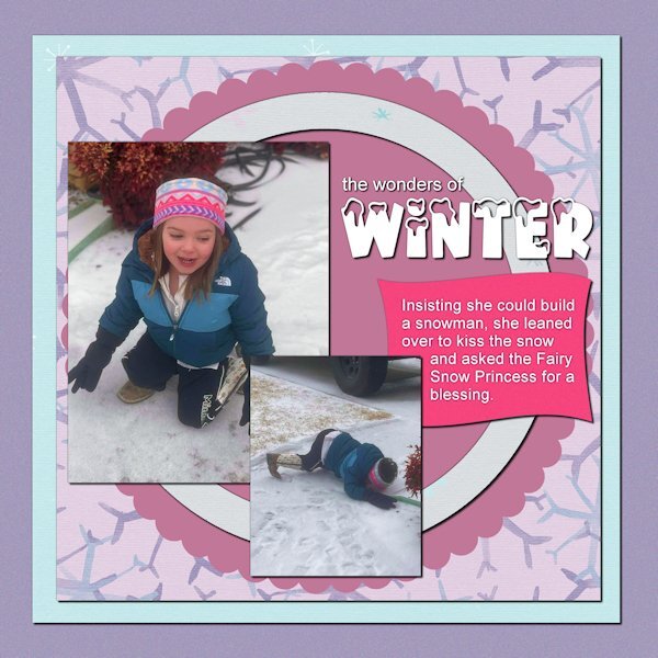
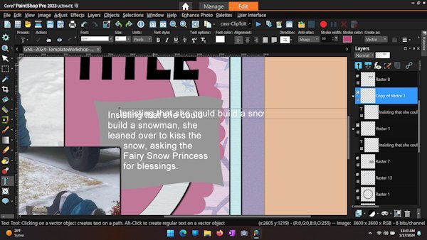
Day 2 - This is my 3-year-old great-niece Amelia. It looks like she borrowed gloves from her dad. The papers are from a collection by Marisa Lerin called Winter Arabesque. The snow-capped font is Winter Vibes from Creative Fabrica. I've also attached screenshot of a recent problem with wrapping text. Even after clicking the checkmark for ACCEPT, any change, e.g., moving, changing size, or duplicating the layer, removes the constraint of the selection. This is a recent phenomenon. My PSP 2023 version is 25.2.0.58 x64.
1 point
-
1 point
-
1 point
-
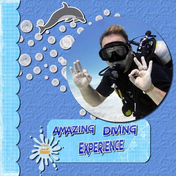
What a nightmare !! My laptop keyboard has decided it will not delete in PSP 23 therefore I could not use the template. There is no other way I could find to delete except to delete the whole layer. I put another keyboard in ..no luck . I used another computer no luck. It would delete in any program but PSP23.So looks like a reinstall. I tried in PSPx8 and hey ho all working again on the same laptop! So I have managed to put something together for day 1.Probably a lot of mistakes but at least I didn't loose the will to live !! It is a shot of my son on one of his diving jaunts .The background was just using a blue from the photo and adding a texture. .The other papers and graphics were from a kit called Dancing with whales.
1 point
-
Day 3
1 point
-
Extra template 1: Kit used: DSAFeb14-MarisaLerin, changed the color of the paper 087 to blue with Hue Saturation Lightness; removed the arrow head element and replaced it with an arrow from the preset shapes; removed the dot element and replaced it with paint brush snowflakes that I created in one of the labs; changed the background paper from the kit with hue saturation lightness also; and the scalloped paper layer in the template I colorized to blend in with the picture; the font is Bambe from CF. The picture was taken outside my window (hence the screen) on Tuesday afternoon. Our snowfall was about 4”. This morning we have 4 degree weather, but it’s nice and cozy inside. We’ve been asked to conserve energy so no lights unnecessarily and we hand wash dishes (shades of my childhood). It was fun watching that squirrel. He would hop on the statue to eat the acorn and then hop down and grab another one from the leaves on the ground near the statue and then hop up on the statue again to eat it. He stayed long enough for me to grab one of the great grands I live with to show them.
1 point
-
Day 2 Here I used a kit called Kiss from Marisa Lerin, which I had in my supplies for a while. It is all blue and because there is pink in my photo I changed some of the blues a bit for coherence. The circle and the dark blue paper are just colored with a color from the other papers The title font is Hobo and the journaling is Arial. The photos are taken today in my courtyard. I'm happy to be doing some simple scrapping after all the months of doing the scripting course, which was time consuming and intens but very rewarding and I loved it.
1 point
-
1 point
-
My project for day 1
1 point