Leaderboard


Popular Content
Showing content with the highest reputation since 04/02/2025 in all areas
-
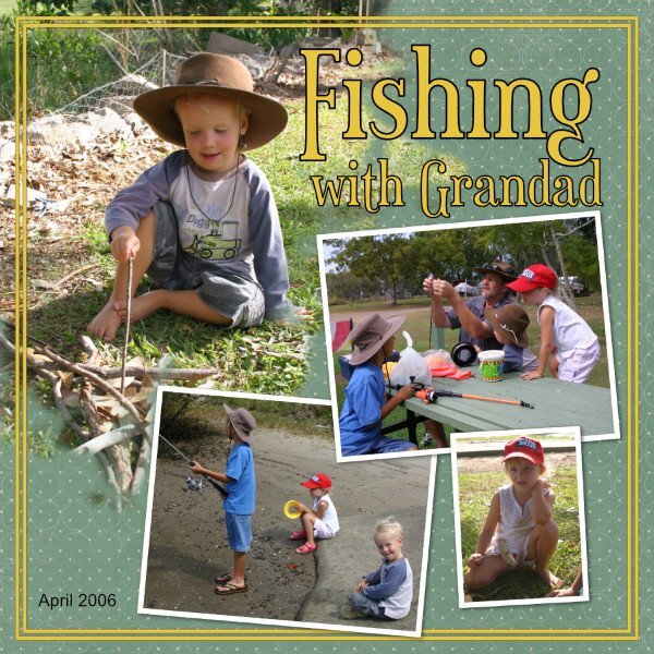
Day 6: Japanese theme continues with images by Hiroshige downloaded from Wikipedia. The papers are from Janet Scott’s Fresh kit.
 19 points
 -
I've just had a play with Template 5 and made the 4 photos into portrait. I am having fun with this workshop.
19 points
-
And here is Day 6. The blend mode I used for the pink paper was Passthrough. I rather like it. It's so good to learn these things that I would never have stumbled across on my own. And it's fabulous to learn about the reverse shadow. I used that a lot with PSP and now it's great to be able to do it in Affinity. As always, we learn so much with Carole's workshops.
19 points
-
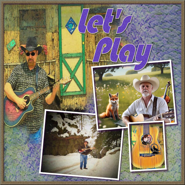
Template 6 diamond Affinity 2.6 This photograph was taken one evening in the hills overlooking my area. I have used Janet Kemp's Elegant Autumn kit and the fonts used are Mocha Cherry and Mocha Cherry Inline.
18 points
-
And here is my number 6, at the ripe age of 64 and disabled I qualified as a Yoga Teacher something I am very proud of. The yoga pose skeletons I wanted to look like someone had added ink stamps over the page which is why they go over the photo's. The yoga skeletons are from rachelM-yoga-skeletons from digitalscrapbook.com
18 points
-
And I'm caught up now, here is Template 5. I think I'll redo this one, I like to have more space taken up with photos so I'll probably have a play with it, but it's always good to follow along with the lesson.
18 points
-
Here is Day 4. I'm enjoying learning new things in Affinity.
18 points
-
I used Carole's template and papers. Changed the colors with Adjust/Hue and saturation. The book pngs came from Freepik https://www.freepik.com/free-photos-vectors/book-png This is a very old high school still, in service. The Jimmy Hendrix quote is on a rock by the school
17 points
-
Day 7 Of course, a girl has got to eat.17 points
-
Day 517 points
-
So Here is my day 4. I am findingworking with affinity really speeds things up.
17 points
-
Day two I have used affinity 2.6 for this template it is my first time of using it.All the papers used are from Chantalia designs the photos are my own which were taken last year at a pretty village in Cumbria U.K. called Grasmere. William Wordsworth is buried there in the grounds of St Oswalds Church and they made this lovely garden as a tribute to him which looks amazing when all the daffodils are out.
17 points
-
For this page, I used paper and elements from Lynn Grieveson's kit “Whale of a Time.” Cassel’s DateStamp#8 script was also included. Font: Canastra This is the paper I used, but I changed the Blend Mode to Difference.
17 points
-
I just had another go at Template 4. I found these old photos from when we visited Australia Zoo just before Christmas 2003. We were very lucky to see Steve there that day. Sadly we'll never get to see him again.
17 points
-
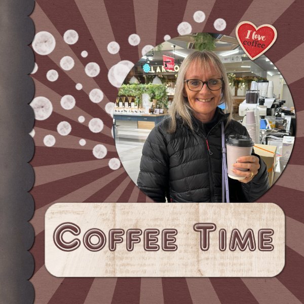
Here is my Day 1 . I used the Coffee Break kit from Sweet Shoppe Designs and the font is AR Delaney
17 points
-
Lesson 1 Template1b- PSP papers from Creative Fabrica and Digital Scrapbook. Font is Keshiki (CF). The dots have a very low opacity. The rectangle is a blend of a paper and a fill color. the photo is mine and a re-hash from the Magazine workshop (I'm almost done!). No time for new photos right now 😢.
17 points
-
Here is the new Opera & Ballet Theatre of Kosovo featured on My Modern Met. The designer is BIG - Bjarke Ingels Group. No papers used, just colors and textures. The font is Eras. There are several spectacular photos featured so I will continue with this theme.
17 points
-
17 points
-
Here is my day one.
17 points
-
Everyone's photographs are so wonderful. My pages so far:
16 points
-
Template Workshop Background and frame by Marisa of Creative Fabrica, template cass template from the Workshop Photos are mine and I really don't know what kind of flowers. If anyone knows what they are, let me know.
16 points
-
Day 7 - In anticipation, I decided to use some of my garden flowers from last May. The large background and the flower backgrounds are from Adobe Elements which was use to extract the Iris flowers. The large photo is of one of my clematis growing on the vines in my flower garden. The scalloped background is my own from the papers workshop and recolored for the circles. The font is called "Bureno Regular" from CF.
16 points
-
Hi! I am working in Affinity now. Have started the lessons over. papers: cpjess-dandelionwishespaper, THD-WeddingBouque(Feb25DESBT) recolored background paper and text letters to match blue in jacket I felt like Affinity was working better for me.
16 points
-
Day 4 font : MisterEart BT Paper : Digitalscrapbook Blogtrain october 2021 - DigiBrandi Designs16 points
-
Day 6, Diamond template. Ann and Maryann came to the beach with friends where they spent the entire weekend being royalty. During our weekend, they were pickleball queens.16 points
-
Day 616 points
-
Day 4 We were at the beach 3 days + 2 travel days. I did the entire workshop from those photos + the sketch challenge.16 points
-
Hi everyone. started a bit late and since the affinity bootcamp I haven't made anything in Affinity, that's why I made these lessons in Affinity. Day 1 font : Rage Italic, Franklin Gothic Demi Cond Papers : PSBT-Mar21-Spring-DBMagnolia16 points
-
here is my day 5 using the Diamond template and a kit by Fayette Designs - Optimistic pictures AI by Bing and day 6 using a kit by AWhimsicalAdventure - Ostara . I find in Affinity the GlyphsBrowser and used it to change the title with the glyphs. Font Anticed16 points
-
Lesson 6 A day behind and still have the last day template to look forward to. My wave design background paper is from Marisa Lerin 'the captain paper'. The shells are from Digital Scrapbooking too. My photo groups when merging down did not show the Merge Group as an option but it worked in Merge Down to include the white border mat.
16 points
-
Day 3 is of sweetpeas I grew a few years back. I LOVE the beautiful colors and smell of sweetpeas.
16 points
-
still using Affinity 2.6.2 and finding it a joy to use. This is lesson 2, i am a bit behind though due to some more life issues but i will get to finish. The photos are from pixabay and created a colour swatch from it in affinity photo and used those colours on my project. Beige coloured paper created from a pattern, teal blue paper free from Chantahlia Design, foliage design is an abr brush imported into affinity. again i give thanks to Carole for the templates and the video as they are well explained. i have been looking at everyone's projects for this workshop and you all have created lovely work. best wishes to everyone, Dawn
16 points
-
16 points
-
I am way behind you all I've just signed up for the challenge. Papers used are the same as Carole but I used the colour changer tool to try and match colours in the photo of a bumble bee on a blackcurrant bush that my son sent me today. Font used is Mocha Cherry.
16 points
-
I finally finished Day 3's template. More Kosovo Opera House - exteriors close-up. I duplicated the photo area as I have a lot more to show you. Elephant font, no papers, just patterns and textures.
16 points
-
Day 2 - Affinity Again, I used papers and elements from the kit "Tastes Like Summer" by Lynn Grieveson. I added a date stamp that was created in PSP using Cassel's DateStamp#8 script. Fonts. Caneletter Script and Canastra.
16 points
-
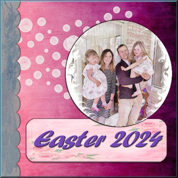
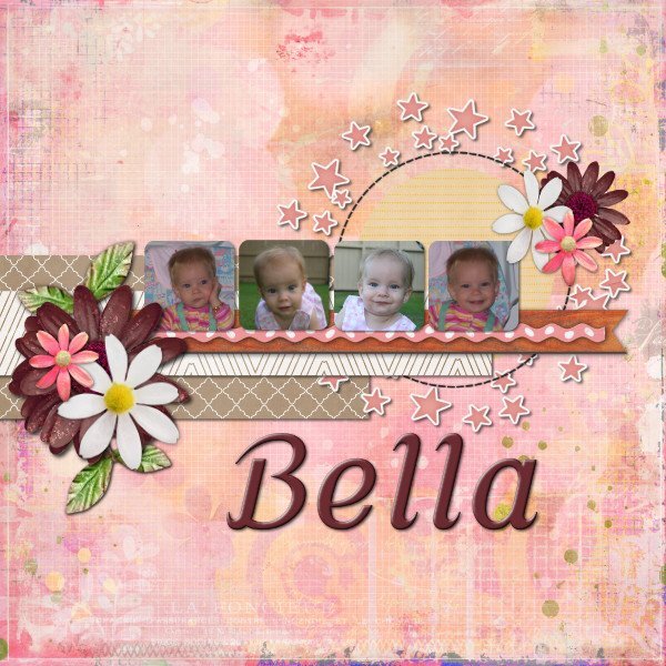
and Day 2 - I struggled with this one trying to find suitable papers. That is always my problem, I waste far too much time trying to find the right ones. This is my granddaughter Bella, she loves posing for photos.
16 points
-
The title font on this one was Wet Paint.
16 points
-
using photos from my girlfriend Melanie, the kit is Meow Party by CaroleWDesigns16 points
-
Here's my version of Lesson 2 - trying to showcase the Kosovo Opera House. I dumped a few of the photo blocks and just used the circles. My text font is Elephant, journaling is Copperplate. Papers are from a jess-countryside mini.
16 points
-
Here my go at the 2nd template16 points
-
Using Affinity Photo 2.2 - the photo is mine and the papers from a Gemini kit called Out of the Blue - the font is Mistic.
16 points
-
I'm using Affinity for these tutorials. The papers are all from Creative Fabrica and the font is Comic Sans (seems appropriate for kittens). This pic was from 2009 and Camo was the best momma cat!!
16 points
-
my template filled with Affinity , Kit Ilonka Designs - it had to be you - my Mom16 points
-
Last weekend 8 of us went to the beach (brrr) for a ladies weekend. While there we competed in a pickleball tournament.16 points
-
day 615 points
-
And now for day 3
15 points
-
I've been scrolling around looking for my Day 4 and it seems I forgot to post it! I may have overdone the silver but what the hey!
15 points
-
15 points
-
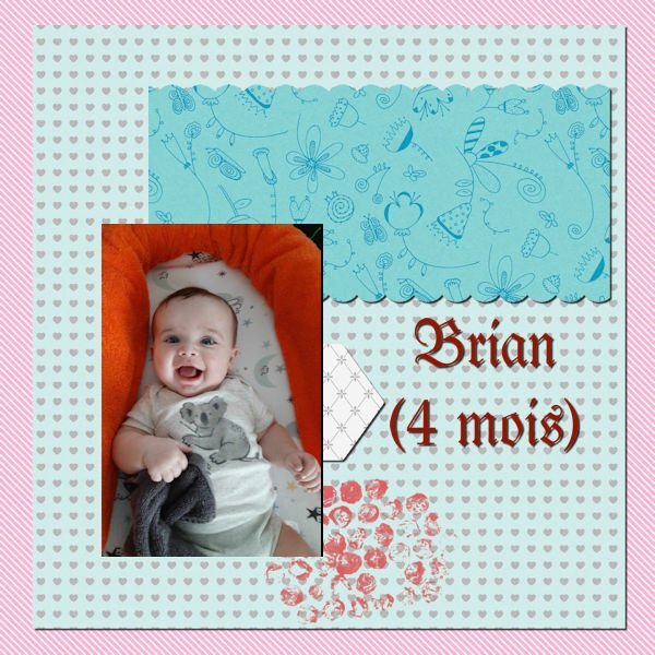
Time flies: My third grandson is already 4 months old.
15 points


Resized.thumb.jpg.d25811db03a63358cedab1e79f527635.jpg)