Leaderboard


Popular Content
Showing content with the highest reputation on 03/31/2023 in all areas
-
after a long week of work I finished now the layouts for day 6 and 76 points
-
Day #5 Working on this one I realized that I really need to add more textures to my supply in PSP, and practice the technique, but It was fun doing the overlap method!
 6 points
 -
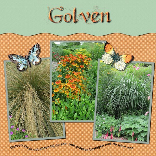
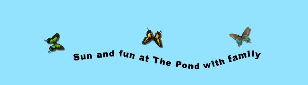
Day #4 A simple path which can be used on future scrapbook pages, I have lots of pics from family vacations spent at The nearby pond! I dropped in a few butterflies so it wasn't so plain.....
6 points
-
Day #2 Managed to have some time to work on a few of the titles from the text workshop.
6 points
-
I saw now that I forget to post my day 55 points
-
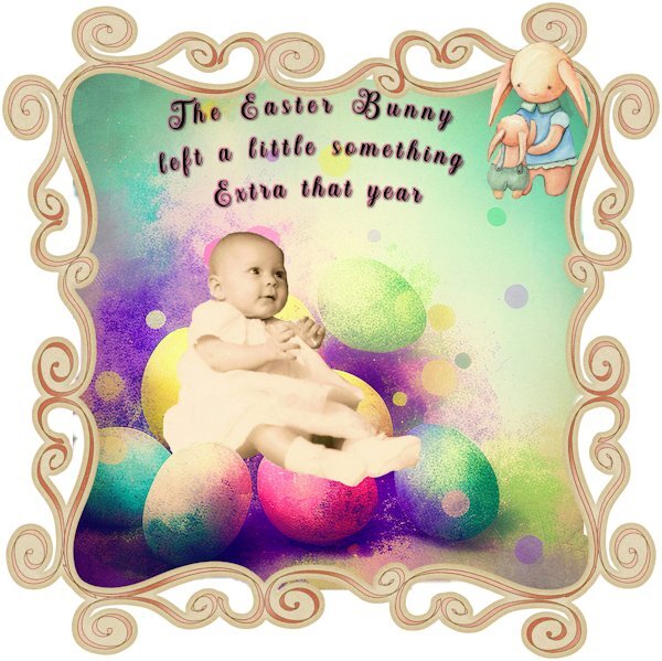
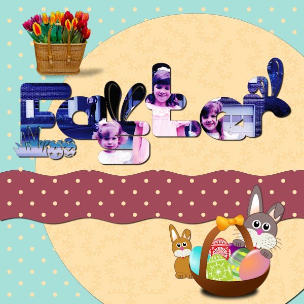
The baby is me. Background paper from "Easter-Vintage-Watercolor-Easter-Background-59971939" Frame "SheilaReid_SV_whimsicalborder" Bunny in R upper corner. "Easter-watercolor-clipart-Bunny-26872833"
3 points
-
I looked over some tutorials inside the Diamond section, "Meli-Melo Paper" caught my attention and after the video I wanted to try it. It's really easy. I played a lot with the blend mode and opacity, results so cool!! I just used one picture to do my selections. Here the link for those who would be interested: https://scrapbookcampus.com/element-creation-index/meli-melo-paper/
3 points
-
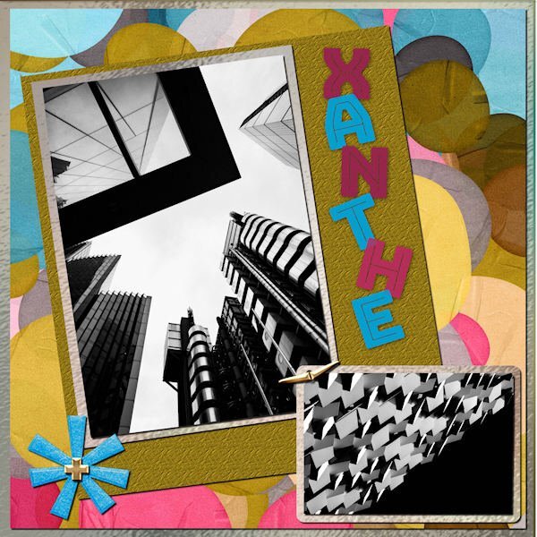
I did the March Sketch Challenge. I used a kit called ps-rachel-martin_xanthe for any papers and elements. The photos are random from Mike Hindle on Unsplash. The font is Bungee Inline and I used the technique taught by Carole in the Text Workshop-Lesson 5 but this time I used a "fatter" font and added texture. I took the title from the name of the kit.
2 points
-
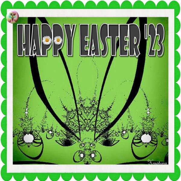
Happy Easter Friends:) I used here my fractal found in the past so I use it nowadays. Have fine holydays
2 points
-
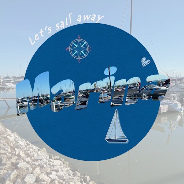
Day 7. Done. The text says "marina" in case it's not easily readable. I find it's often a bit challenging to read the letters when they are cut out as pictures. The photo is mine of the lovely marina we have in our small town on Lake St. Clair (not a Great Lake officially, but part of the system). I really enjoyed this series of lessons and prompts. I used techniques I wasn't familiar with and got a bit improved in some of those. Thanks Carole. Having your templates was a great help as well. I don't do scrapbooking, but I do enjoy just creating layouts for birthdays or other things. Mainly, PSP helps me work with old photos to make them better quality for my history and genealogy projects.
2 points
-
Day 7. Template : Cassel Bug : A Bugs World-DBMagnolia (digitalscrapbook)2 points
-
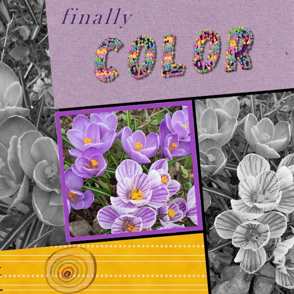
Trying to get caught up. Here is Day 6. There are many things that didn't work out well, but sometimes that has to be good enough. Photo is from my garden a few years ago. The cheerful and welcome little crocus. The title is done with a small colored ball and the vector tube script. It filled each letter entirely....oh well. I wanted colour, and I got colour! (I used American spelling on the layout.)
2 points
-
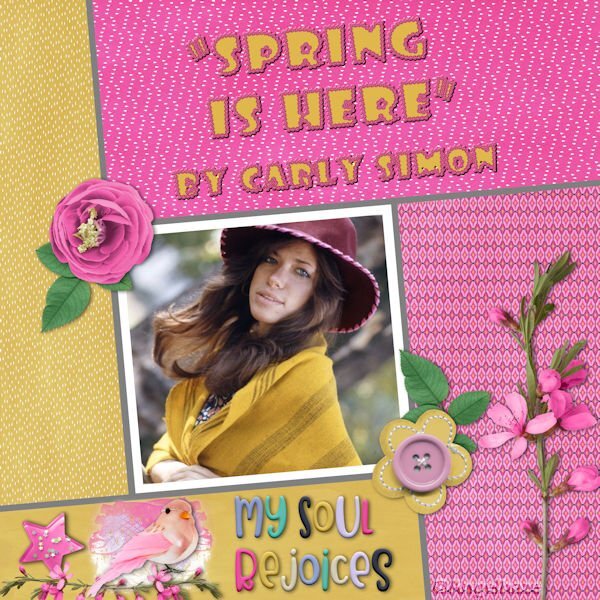
Here is my Workshop #6: Spring is here, this is the name of the song from Carly Simons, the scrap kit is Extraordinary Bundled Collection by Artgal Style and he title is made with the font: Showcard Gothic with a rose rope vector script.
2 points
-
Day 6. Template : Cassel Papers : Marisa Lerin (digitalscrapbook) Font : Simplefire (= monoline font)2 points
-
I'm done in. Workshop 7. Changed many times, but this is what I finally came up with. I'll post it and then I have to restart my computer as I overloaded it working on this. The font is Dragon Kids from Creative Fabrica. The lower cluster is from PS - Jessica Dunn.
2 points
-
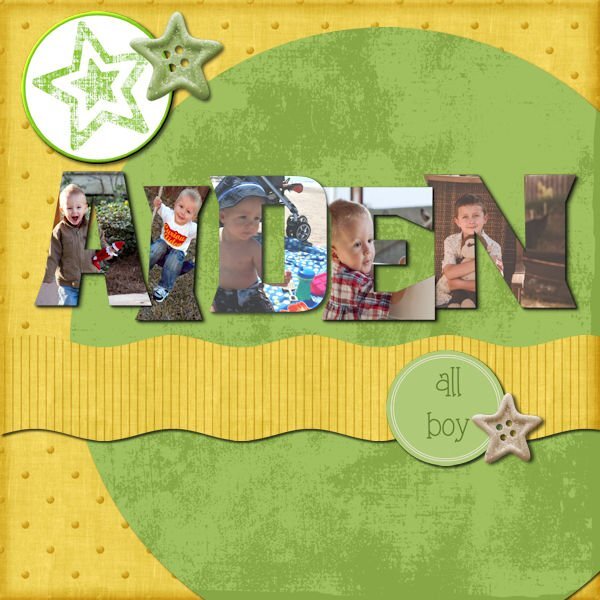
Finally completed Day 7. The photos are of my youngest grandson, who by the way, is now a teenager. Found this one, for some reason, hard. It is still not my best attempt but after two attempts, have given it a go. I am definitely not good at scrapbooking. Needless to say, I have learned a lot thanks to Carole. I have absolutely enjoyed all 7 Days.
2 points
-
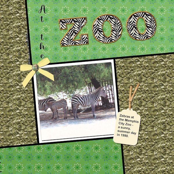
Well, I did complete workshop 6 and will go on to 7 today also. Not too happy with my last couple of layouts - however, the different ways to use text have been interesting. With this one I used a pattern in the letters instead of a color - it was interesting resizing the layout - the zebra pattern didn't want to resize; so I had to close the jpg and then call it forward again - and this time the zebra pattern also resized. The ribbon on the tag is from PS - Gina Jones; the rest of the elements are my own. I think the font I used for the Zoo was something Big Chunk.
2 points
-
Day 7. I found several fun graphics on Pixabay but kept running into shadow problems. I couldn't use the eggs because the shadow angle was wrong for the layout. The font is Thanks Bunny. It has lots of fun glyphs.
2 points
-
Day 5 : it's not really a scrapbook page, but I didn't like everything I tried, so I tried something else ? Template : Carole Cassel Instead of papers, I used on the bottom layer the effects - texture effects - soft plastic on the second a blend mode The font is Poplar Std2 points
-
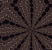
a semless overlay I made for one of my mini )) i use 2 different hearts shapes and image kaleidoscope you can use it if you want, but only on PU (thanks )1 point
-
It is very simple: cut strips of paper the height of the book cut little squares pile them up as thick as needed and glue one side (which will be the spine of the book) print and cut the covers on photo paper glue the papers inside the book trim the excess paper If I do more miniature projects, I might do more books. They are easy to make. You can use plain cardstock for the covers, or use printouts of actual books if you can find the images. Using PSP, it is very easy to do and resize to scale (that is 1:12 scale by the way).1 point
-
I think if you put a border around the letters, they would be more legible. There are several methods you can use, but one of the easier ones is to use the magic wand with contiguous unchecked, invert selection, then select selection borders.1 point
-
Day 7 Titles Class - didn't follow the script exactly, but used the techniques to design a flyer for a summer show...
1 point
-
Nice colors, Julie! ?1 point
-
Many years ago I was on ArtGal Style's creative team so I have a lot of her kits. Although she retired all of them when PlainDigital Wrapper closed down and only moved her newer kits to her new shop at GoDigitalScrapbooking. She is a sweet person and still creates really nice kits! Nice layout.1 point
-
WOW! It's a triple play! You covered one text workshop, the song of the month and the freebie, all in one! Nice - congrats!1 point
-
I'm not too happy with the rendering of my letters on this last day .... I think that the photo chosen is not ideal, with the dark on the J of JEU (game). Or maybe the chosen font??? mystery ... but I did several tests and I admit that, oops, I believe that I do not like this effect at all, sorry. All the other technical proposals, I really loved, but there ... I can't seem to like the rendering. It's just a matter of taste LOL. But the technique is not to be ousted. I will definitely do more tests. Maybe I'll find another way to use it. all credits on my gallery1 point
-
I have been fooling around with the various techniques and am quite excited to use them in future. Thanks. Below is one of my pages.
1 point
-
For the day 7 workshop, I used a picture of my grandson, David, playing rugby in Las Vegas. He is the one running over the guy on the ground. He is currently coaching the women's Las Vegas rugby team that has made a splash by winning all of their games so far. I deviated from using my kit except for the star. Rugby does not really fit the art deco style so I used a sports kit that included rugby from Marisa Lerin. I colored her background paper, originally black, to green. The colors in her kit for rugby coincides with David's Las Vegas team colors. The background for the wavy section is a RB 80's gradient with the opacity lowered. The text is GuinnessExtra Stout in honor of the boys always drinking stout. All the other graphics are from the kit, including the WordArt which I modified, but the words are hers. They are perfect, but I never would have thought of them myself. *I had to edit the first one because I forgot the shadows. Psp was working very slow until I shut it down and ran Norton Utilites to clean out the junk files.
1 point
-
Here is my Workshop 5 made with the kit: Mimosa story by Malo Scrap by Malo Scrap I made my big possible!
1 point
-
Finally finished my day 7 project. I started over on it several times! I decided rather than one picture to do individual letters with separate pictures. This is my grandson when he was small. Not sure where any of the papers are from. I got the elements from Pixel Scrappers and the round star at the top was made from a paper by Marisa Laren. This has been a fun week!
1 point
-
Day 4 I used Cassel's template. Papers : digitalscrapbook , commons_sharon-grant Font : Goudy Old Style Title Font : Hobo Std1 point
-
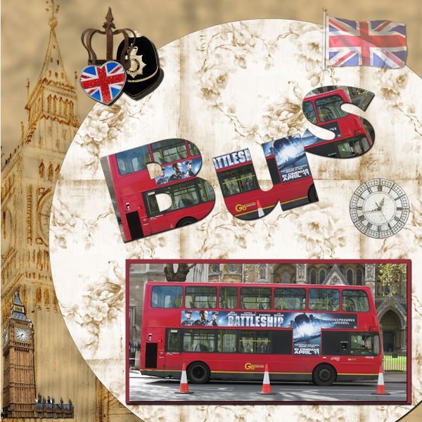
Day 7 I don't think I will use this feature much, or only with specific photo's. ? Gill sans ultra bold is the font I used ? The kit was miz-London town Odd that with resizing the shadow on the red mat looks very black but with the original size it looked ok, well I think it was ok?
1 point
-
Day 4 Text On A Path...easiest time I have had doing text on a path. It usually takes several tries. This layout was completed fairly quickly. Not sure I should have used a path on top and bottom...it did give me more practice.
1 point
-
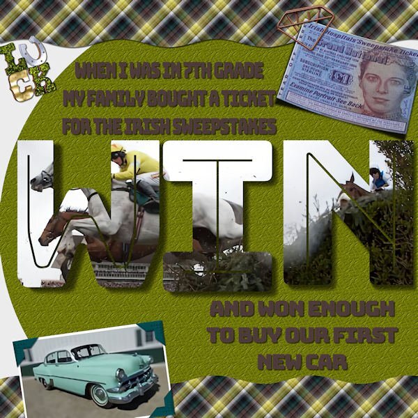
Here's my final project for the Text Workshop. A bit of a story. When I was in 7th grade my parents had bought their annual Irish Sweepstakes ticket and, for once, they won! The way it worked, thousands of people bought tickets and the hospital (charity behind the game) committee in Ireland drew a ticket for each horse in the Grand National race. If you we assigned a horse you automatically won money, and of course, if your horse won, you got more. So, our ticket was assigned but did not win the race. I think my folks got about $1000 which, in 1954, was enough for a new car! (First new car they ever had.) It was a fun time! My font is Bungee Inline. The photo corners are from my own kit. I made the plaid from the horse photo colors. Cassel's curved photo script on the ticket. Interesting techniques using vector texts as shapes.
1 point
-
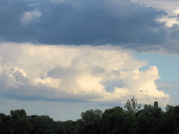
Day 6 of Titles Class. Almost time to get to the water again
1 point
-
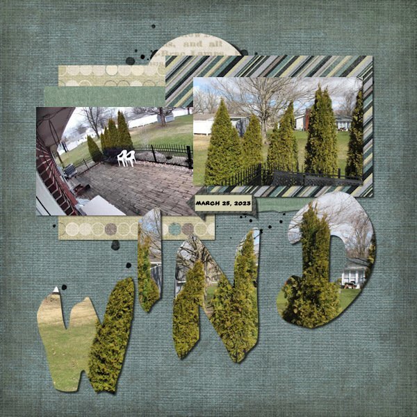
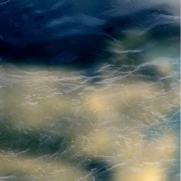
Day 7. I used photos I took yesterday out a window during the high winds. I didn't take the time to get all the settings needed to actually show the motion of the shrubs but figured these might be good photos to play with for this challenge. I used an old kit by a retired designer from 2012 and a template from Scrapping With Liz. I deleted all elements from the template and just used papers and an arrow from the kit. Font is Yard Sale.
1 point
-
I have not done a page for all of the days, but have at least practiced each technique show. Thanks Cassel. Here is the page I did for day 7.
1 point
-
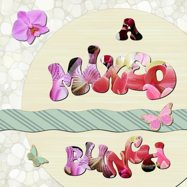
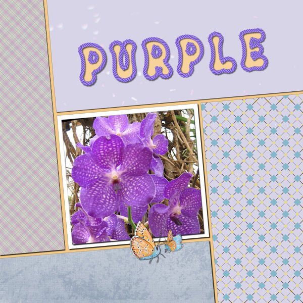
Day 7 and I'm a bit sad that the workshop is finished, but now I can go ahead with the Build a Kit. I have to admit it is a bit busy with 2 workshops at the same time and yes I now I don't have to finish either of them in a specific time but it's addictive! Maybe I should plan a detox period! I have loved seeing all the different layouts, mostly done with the same templates and techniques, so inspiring! For this last one I used a photo, taken in a gardencenter of a bunch of mixed orchids standing on a table and I used it for all the words. The strip on the template is a bit smaller otherwise it was to prominent and I wanted to use that striped paper for contrast to the lighter colors. Again some butterflies and an extracted orchid flower. The font is Bumble. I have done this workshop as the Wise Words Challenge as it was called 2 years ago. It was my first challenge after the basic Scrap Course and I have to say I have learned a lot since that day from the masterclasses, challenges, tutorials from Carole and by looking what all the other members are showing.
1 point
-
Day 4 part 2? Text is better now in a wave, all the characters you can read instead of pressed into each other?
1 point
-
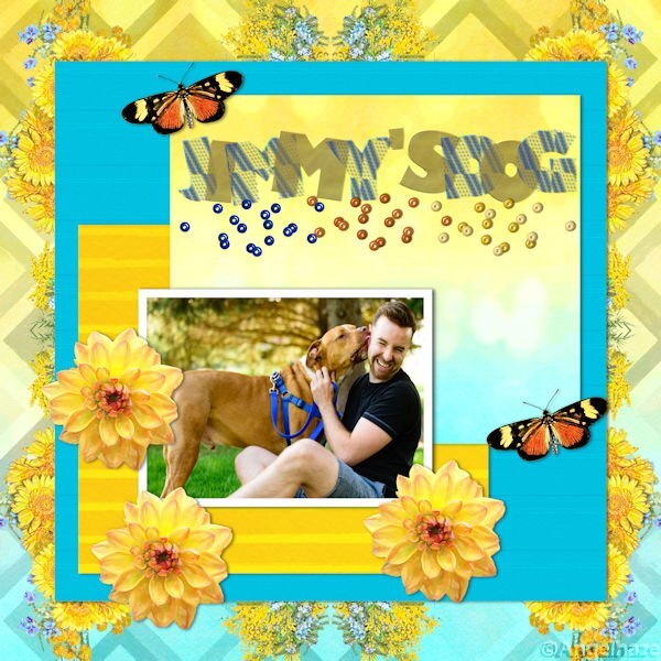
I wanted to post my project for day 6 and saw Corrie mentioning she forgot to add a shadow to the rope , I haven't done that either, but do you think it needs a shadow in my project? I did a shadow on the paper behind my dog, that's all.?
1 point
-
1 point
-
Day 4 project. I used Carole's layout with a few minor changes. Wings are from Marisa Lerin's Birdhouse In My Soul Kit. The background is from Marisa's Garden Party Paper Kit. The photos are compliments of my oldest daughter who is learning photography.
1 point
-
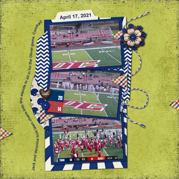
Day 4. I'm glad I finally figured out how to do this. I played with the different vector ways to do it to make sure I got it down. However, when using one of the preset filled-in arrow shapes the text wanted to go on the inside (black of the arrow) not around the outside. Curious if that is how it is supposed to be because it didn't look nice at all. I'm not sure I'll use this much but at least I know how to use it. Another one of my Trine football layouts. Again used the Sporty Football kit from Kristin Aagard and a template from Scrapping With Liz in the Recyclables 75 kit. Both available at The Lily Pad.
1 point
-
Ann, Thanks for pointing out the freebie. Lately I was looking for something like that, with circles for pix. Yours is lovely.1 point
-
This is very pretty!1 point
-
Ann - love your idea for a tile. Makes for an interesting background.1 point
-
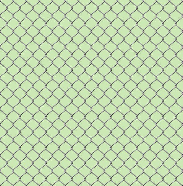
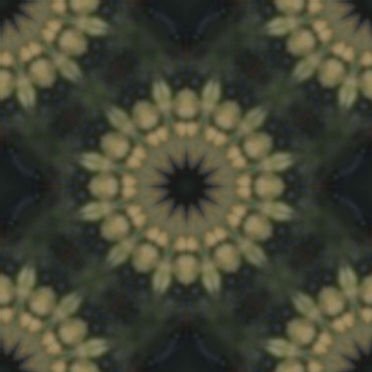
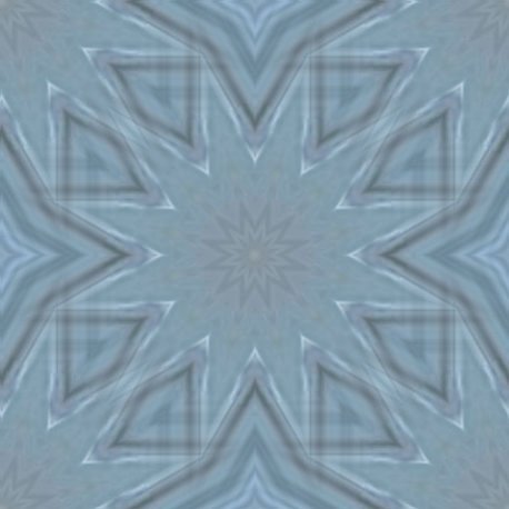
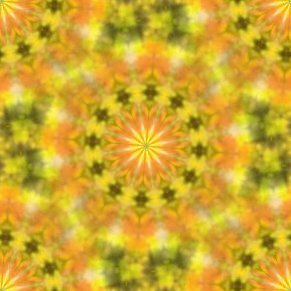
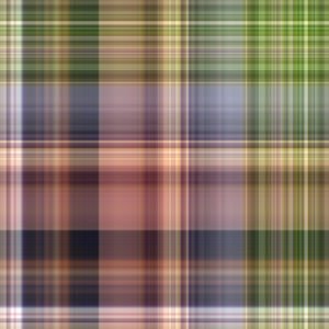
An example of a seamless tile I did some time ago for a layout. Instead of that page I show the tile and a page filled with it. I have made a lot of hem with the kaleidoskop, or of plaids but as they are intended for a particular layout I stopped saving those and simply make new ones that suits the new project. I found that I never reuse those, so I save only the more generic ones.
1 point
-
I'll post a few of the many patterns I made during the mask workshop. Most were made either with the West Virginia layout, the ocean layout. Julia - love your perspective stripes - some of them remind me of a pinstripe suit material.
1 point


Resized.thumb.jpg.d25811db03a63358cedab1e79f527635.jpg)