Leaderboard
Popular Content
Showing content with the highest reputation on 03/23/2023 in all areas
-
14 points
-
Day 3. It's always a treat when any four legged animal comes to visit. Carole used the word adorable to describe my Red squirrel, so I decided to use it in this page. As I do adore these majestic animals. The Antelope are frequent visitors. Males and females are segregated. Here we have some adult males with yearling males, not to far away were the pregnant females and yearling females. I don't use the selection tool to wrap text. It's ideal for quickly typing journaling, but it has far to many limitations for my liking, and for the word art/text that I like to create. Again, I didn't use any outside recourses.14 points
-
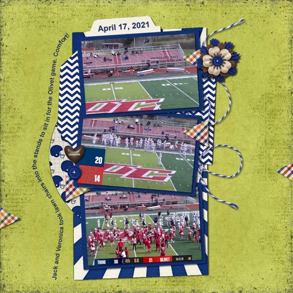
Day 2. I used Carol's template (highly modified) and Kristin Aagard's Sporty Football (available at The Lily Pad). This is the next game in the project on Trine Football 2021 through 2023. My cousin's son had a touchdown in the game so TOUCHDOWN was the perfect title. Fonts used were: Cooper Black, Arial, Century Schoolbook, Cosmic, and Comic Sans. I also flipped the fill and stroke on the O H W letters.14 points
-
14 points
-
13 points
-
13 points
-
I didn't make any plaids for my kit, so I created one in my color pallette. Fortunately, the restaurant matches. The pictures are mine. The fonts that I used are FlamingoShadow, Arial, and Gumondo, I think. The center paper is a texture in PSP that was yellow but colorized to the coral color with a little tweaking with Flaming Pear, Kyoto color. The left side is from the plaid with a gaussian blur applied.13 points
-
I'm calling this Day 2 & 3--I used my title for Day 2, on my Day 3 page. I'm not sure if that makes me efficient or a slacker ? I don't know why, but my text became a 'floating selection'. It took me a bit of time to figure out what to change, so it was a frustrating evening! I imagine there is some reason you would want text to be a 'floating selection', but I don't know why.12 points
-
11 points
-
11 points
-
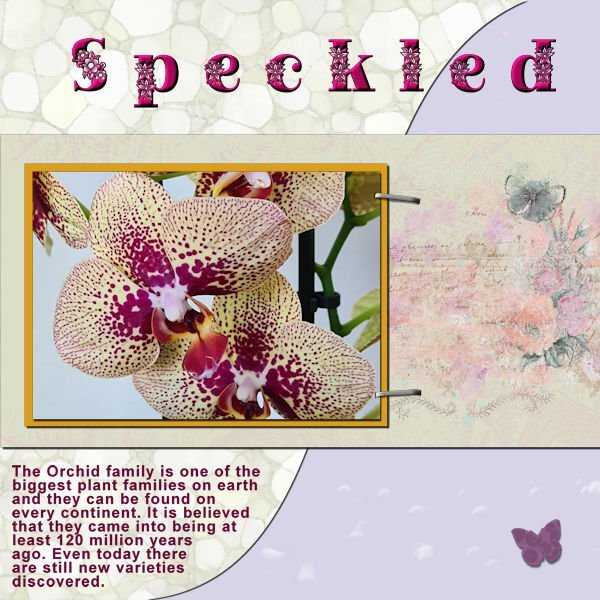
I stayed with my orchids an my papers! But I didn't want much embellishments for this. The font is Peaceful Nature. When I wanted to resize nothing happened; I had my wrapped text as a raster layer, but by close inspection I noticed I had lost one of the staples. It took me some time before I realized that when resizing the resize all layers box wasn't checked!11 points
-
11 points
-
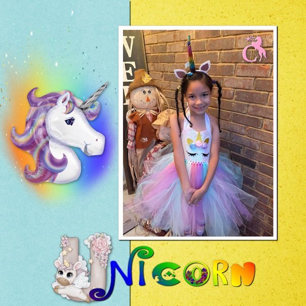
Day 2 - All of the fonts are unicorn related: Cute Alphabet Unicorn, Unicorn Express, Star Unicorn, Magical Unicorn, and Groovy Unicorn. The monogram at the top corner of the picture is Star Unicorn Monogram. My niece loves unicorns, just like her Uncle. Although, unlike her uncle, I think she is starting to outgrow them. Such is life in "Honah Lee" ...11 points
-
Day 3. This was taken a few years ago. She was mad because she still had to use the car seat. Once they got on the road, her mother informed her that she was going to the pediatrician. From that moment on, she became as incorrigible as she could.10 points
-
9 points
-
9 points
-
9 points
-
My Day 4 with my granddaughter who is learning to dance the twist by videoconference. Her dance teacher making videos for classes during covid in 2020, so that his students learn while having fun. She loved that. ? text: "Videoconference Dance Classes, due to Covid" All Credits on my gallery8 points
-
8 points
-
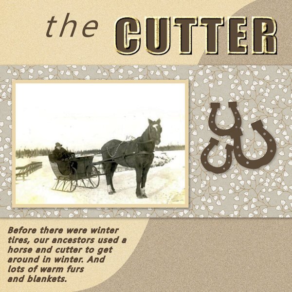
I was so ready for Day 3. And Carole gave us a template to work with! So, how hard was it going to be? Well, let me say...I spent way too much *@^$# time on this project! The text tool has a mind of its own (which is what I thought before I started this series). When I clicked on the Text Tool and tried to change the size, the colours would change. So, then I'd click on the Materials Palette boxes to change the colour, and the text size would revert. Or I'd click on the Font colour button on the text toolbar, and nothing would happen. And this went on and on until I was ready to do damage to the laptop! Sigh. So here is my Day 3 with wrapped text. I'm so over it. (I used an old photo b/c I happened to have it for some work I was doing on a history article.) And then, I wanted to go back to change a couple of things, and I saved the .pspimage merged. Not my day. EDIT: I just couldn't walk away from the project. I had to try again. I started with the template and same image, and worked it through. I still had a few glitches with the text tool, but not nearly as many as the first attempt. Now, I AM DONE with this!7 points
-
Day 4. I'm glad I finally figured out how to do this. I played with the different vector ways to do it to make sure I got it down. However, when using one of the preset filled-in arrow shapes the text wanted to go on the inside (black of the arrow) not around the outside. Curious if that is how it is supposed to be because it didn't look nice at all. I'm not sure I'll use this much but at least I know how to use it. Another one of my Trine football layouts. Again used the Sporty Football kit from Kristin Aagard and a template from Scrapping With Liz in the Recyclables 75 kit. Both available at The Lily Pad.6 points
-
Day 3. plaid and bow: curiopantry.com, the other papers I made myself. The beads are made with cass-beadsMaker3 script.5 points
-
5 points
-
Not my best work, it's too busy and too much focused (hahaha pun intended) on the right side. I used stuff from my kit and learning I need way more stuff and that "stuff" needs to be in different orientations. The photo was a test for me getting ready to photograph my camera collection. The Pentax K1000 was the first SLR camera I ever used, it has a soft spot in my heart. And of course this isnt the actual camera I used, cause then I would have stolen it from my high school...and I'm a good girl and don't do that sort of thing?. Anyway, my brother, who at the time was a commerical diver living in Borneo, came home to visit the family and came to the open house at my high school. He was blown away by the schools dark room and my interest in photography, so much so, that he bought me my first camera, a Ricoh KR10, which I sold and now wish I still had. I know. BEST. BROTHER. EVER! Looking forward to Lesson 3, it looks wonderful.5 points
-
5 points
-
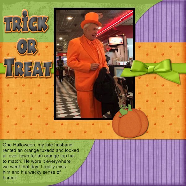
Here is my day 3 project. The pumpkin element is from Pixel Scrappers and the bow and ribbon are from Cassel's blog. All the papers and the title are from my stash and not really sure where they came from. I did switch the order of the two bottom papers so that the shadow would show some separation. I didn't pay enough attention to the last minute of the video and lost my story on the first try....good thing I saved my PSP file.5 points
-
I am still using my kit papers and some of the elements that I made. The pictures are my own--one taken in the desert in Nevada and the other taken in Hilton Head. The crazy flower was made using the hue up and down brush which peaked my curiosity. It sort of fits my Art Deco theme. I should have made a list of all the fonts that I used, but I just sort of scrolled through my fonts until I found one that suited me. The orange font is Mesquite and the arrows are a preset shape. I used a Layer Style bevel on the title.5 points
-
5 points
-
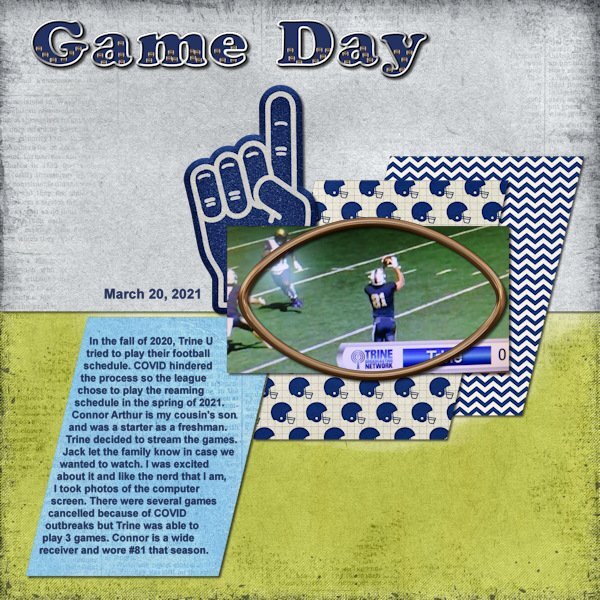
I did a layout for the project that I am using for this workshop. So this layout actually combines Day 1 title and Day 3 text wrapping. I used a template by Scrapping With Liz (October Mood Board) and the kit is by Kristin Aagard called Sporty Football, both available at The Lily Pad. For the title I wanted a fill that pertained to football. There was a football element in the kit so I made it smaller and made a tube out of it to fill the title. I also didn't make the fill translucent as I wanted to keep the dark blue color that is the school's color. I went with a silvery outline of the title. Font is Cooper Black. For the text wrapping I used the remove selection to take out the corner area where the photo covers the paper. I tried the paper over the photo but it didn't look right with the football shaped frame there as well. Font is Arial. This is a very simple layout and not my normal style since I usually have at least 1 cluster on them. But I wanted this layout to be about the story and the photo. I will do a second layout with more photos of this game then move on to the next game which is where my Day 2 title is being used.5 points
-
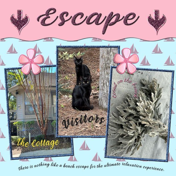
I finally finished No. 4 after many issues with the move and pick tools. I am still using my kit items and finding out that either don't like some or the colors don't work. For the background, used an embossed background but the bevel I had loaded had a light pink color. I decided to use it since that is one of my colors. The font used is Veni; the pictures are my own from Hilton Head.The jeweled flowers are part of my kit. The arrows were made today from presets, and I will add them to my kit. I've used the title before so I must be longing to return to the ocean. I am sort of getting the hang of curved text and started using it in my card making projects. I also should add that I am trying to be more aware of the use of shadows. I am saving them on their own layer so that they can be adjusted.4 points
-
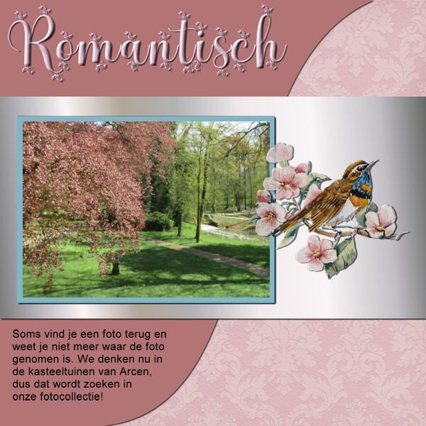
Still with my papers and orchid photos. I just made a simple curve with the text. The font is Salmon Queen script with an inner bevel. On all the layouts I have some sort of butterfly as an embellishment. Here in The Nederlands we have a world famous Spring bulbs show called "De Keukenhof" and on the grounds are glasshouses too and in one of those there is an orchid show with fantastic plants and the colors of the flowers go from subtle to vibrant. We have been there a couple of times in the past and each year the displays are different inside and outside.4 points
-
I am a little behind on posting. I have been trying to work with each days workshop but have been having some issues with my PSP21, or more probably with my PC. I finally got one project day 3 finished. Oh well maybe it will go better now, I cleaned a bunch of stuff off my P C and will try again. The text on the top is Jokeman.4 points
-
I have 24 drop shadow presets that I use. But even with the presets I will tweak them before applying them. Pretty much they are a starting point in my process. Some are my go to shadows to use all the time. Others get me close to the settings I might want. For example one of them were settings that Carole has recommended for strings. I made the preset then use it on a string but quite often might make slight adjustments for what I'm working on. The thing is that I don't have to remember the settings for all the various things. The preset can get me close to what I need.4 points
-
4 points
-
For this 3rd day, I used Carole's template (thanks @Cassel for this template) and I tried to remember the live for the snow on my title (hope it's not too bad LOL). The credits are in my gallery by clicking on the image ? Translated text: "SNOW - January 2021 This year is the first time that the snow hasn't melted since Moïra was born. With a piece of cardboard covered with a garbage bag, she improvises a sledge and slides down the slope. And with his father and his sister, prepares a battle of snowballs."4 points
-
4 points
-
BEAUTIFUL images! Your daughter is a natural. You will have loads of images to come I hope.3 points
-
I have the same problem. Yesterday I put a piece of paper on my windowsill and looked how the sahdow was and later on with thicker paper. If you see it "real" it looks like you understand the shadows better. I even saved some shadows from workshops as a preset but with some projects it's still not looks ok, too much, too little, to dark etc ?3 points
-
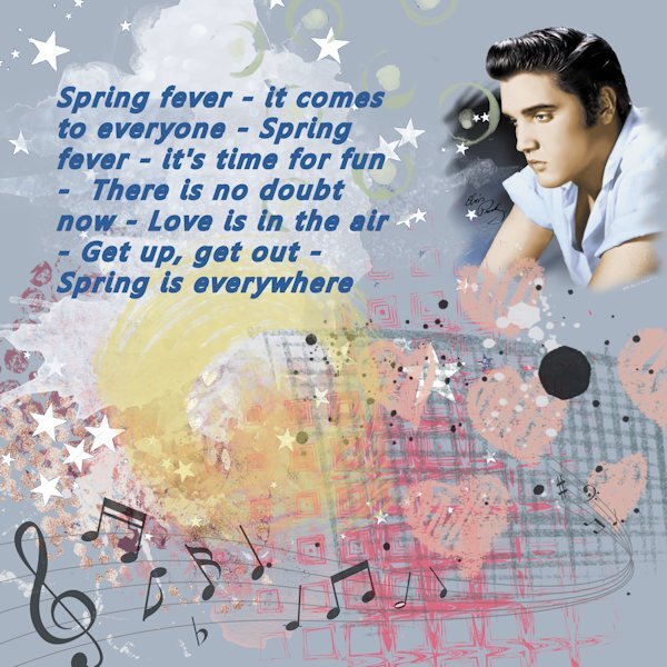
I wanted to make something for this challenge. But I couldn't think of ONE song with Spring in the title, so of course I googled for one. I chose this one by the King of whom I was not particularly a fan back then, but really love his voice now. I just wanted to "mess around" with it, and that's what turned out.3 points
-
3 points
-
My brain can't handle that just yet!!! How to use paths has always eluded me. LOL2 points
-
This is a trip to memory lane; a long time ago I had that camera too! Look at all those extra lenses etc.2 points
-
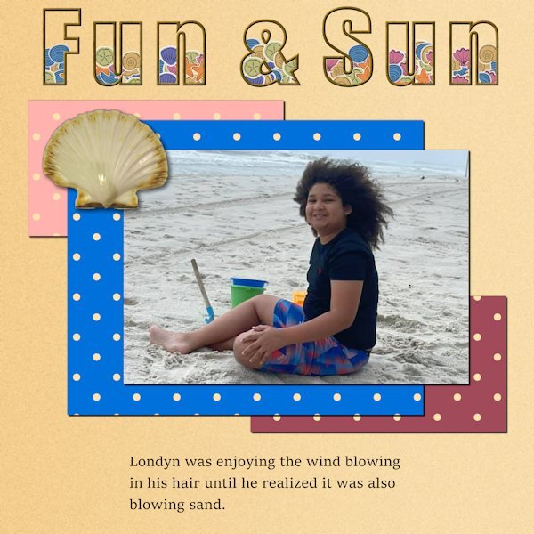
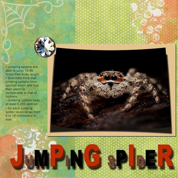
@Anja Pelzer Nice soft colors in that title. They match the page very well. @Sue Thomas Thanks for pointing out that they were pine cones in the fill. The resizing of the image made it harder to identify what they were. That Red squirrel is adorable! @Lesley Maple I'll have to find a way to get that effect in PSP!! Did you add shadows on the papers under the photo? I think it would add more definition, especially on a busy background. @MoniqueN. Have you considered trying to add some shadows on the little elements inside the "Baby" title? I wonder if it would add some volume? Not a big shadow but just a little. @Michele It is fun to see the fill on the top part of the text. A little unexpected but definitely in line with the theme! @Susan Ewart I am curious to know what you put in the title. Are those confetti? @Linda J Walker Glad to see that you are sharing the title on its own, even if the page is not ready. @Julie Magerka The owl photo really makes me smile! For the title, since you have a patterned background, have you considered adding a little shadow on the letters as if they were cut out of papers? @Linda Hitt Great way to customize a template. It is always a starting point, but the destination is often different! @Hank Sobah I love how you layered that single fish on top of the title. It really gives it some depth too. Colorful concert page! @nadine Nice idea to have the clouds on top of the fill! Templates are meant to be changed!!! ? @Ann Seeber You might want to tweak the placement of the text as the overlapping with the decorative element is inconsistent. Maybe move the text a little downward or resize the decorative element a little to shift upward? That change in size for the title really gives that impression of jumping!! @Cristina Due to the resizing, I am not sure so what did you use to fill the title? Are those confetti? @Donna Sillia You filled the title with tiny Easter eggs, right? @Louyse Toupin Did you place the scattered confetti and rotated a duplicate by any chance? It looks like there are two different types of shadows on them. @Bonnie Ballentine What kind of pattern were you looking for? @Corrie Kinkel Changing colors word by word is definitely another way to use this technique. @Mary Solaas That yellow is really standing out! You might want to add (or add more) shadows on your papers to give them thickness. @Pirkko Seppälä Awe... sweet photo!!! The whole family! @Gerry Landreth Sand in the hair! that is no fun! But the picture is worth it!!!2 points
-
I was looking for some inspiration for day 3 of the Text workshop. I have all the projects for all the workshops I participated in, in one folder. What fun it was too see how many workshops I attended and what I've learned over the years ( a lot!), but it was also a trip down memory lane with all those nice projects! ????2 points
-
I'd say that makes you efficient. I admire any one who can grow anything. I manage okay to grow Parsley, Thyme and Rosemary, but nothing else I grow survives. My husband says it's because I forget to water them..hahaha. It's true. I start out all gung ho, then I just neglect plants. Going on that, I would have made a bad mother.1 point
-
1 point
-
1 point
-
1 point
-
1 point
-
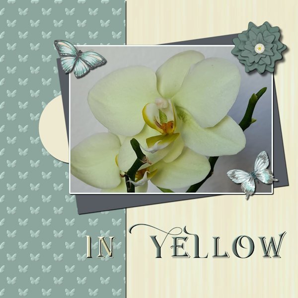
I have chosen my orchid photos for this workshop. I haven't that much new photos at the moment as I was the last 5 months not very mobile and now I can go walking again the weather isn't very good, for taking photos, much rain and dark clouds. I used my Build a Kit supplies again with the exception of the butterflies which come from a set of watercolors by Creative Fabrica. For the title I chose 2 fonts in the end, because I tried all different ones but found it not to my liking. Instead I gave the words a different color to stand out better against the papers. The fonts I used are: Arienne and Agreloy.1 point


.jpg.27a42ede37cc47376d062a4cb09c0cff.jpg)



.jpg.ba0df8074d38aac75336fb1f2ace1cf2.jpg)















Resized.thumb.jpg.d25811db03a63358cedab1e79f527635.jpg)
