Leaderboard
Popular Content
Showing content with the highest reputation on 08/21/2024 in all areas
-
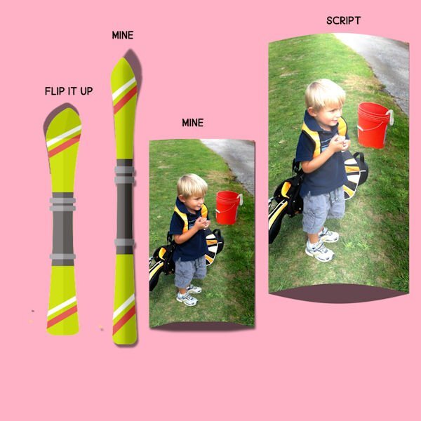
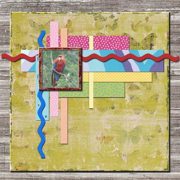
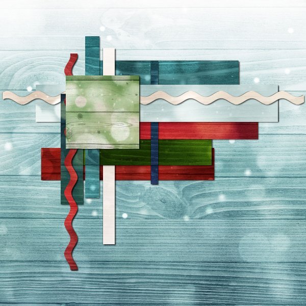
Here is my lesson 2. Shadow setting 8 8 60 8. Reverse shadow 0 0 35 8. Perhaps it's personal choice, but I don't like to make my shadows to heavy and to dark, especailly on papers. As there is next to nothing in thickness in plain paper. On card stock and elements that is a different thing all together. My preference is to lower the depth and darkness. The colours of the papers also determine the settings I use. Is my thinking right or wrong? I almost always use the reverse shadow, to define papers.11 points
-
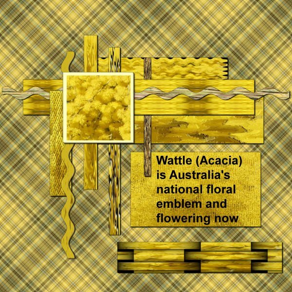
Driving home today through the bush with all the wattle out reminded me of some 'tiles' I had experimented with many years ago (2006). Using a wattle photo I had taken I played around with different effects making small tiles (300x300px) - plaid, antique, enamel, fur, illumination, brush strokes, tiles, soft plastic straw, weave, wave, polished stone etc. These tiles are what I have used here. The shadow settings are those suggested in the tutorial. I have these all saved as presets from the Basic Scrap course and are pretty much my go to shadow settings.11 points
-
11 points
-
10 points
-
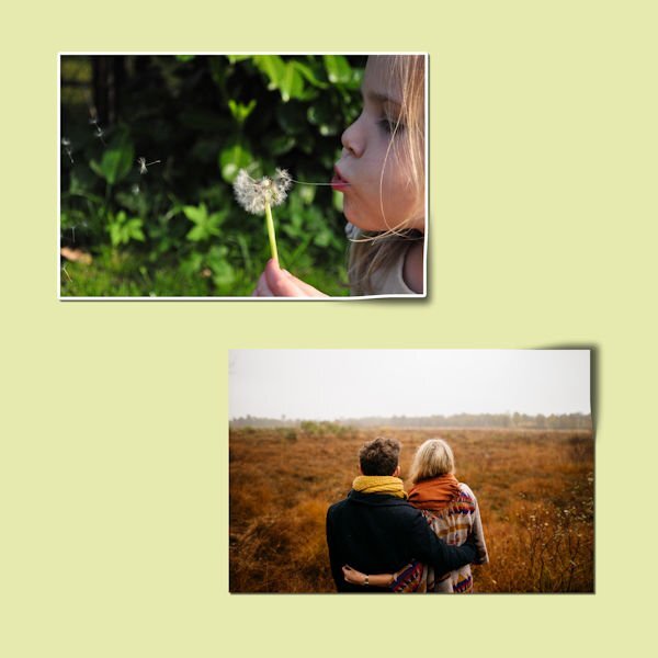
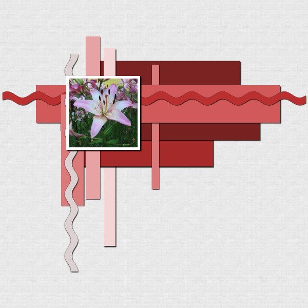
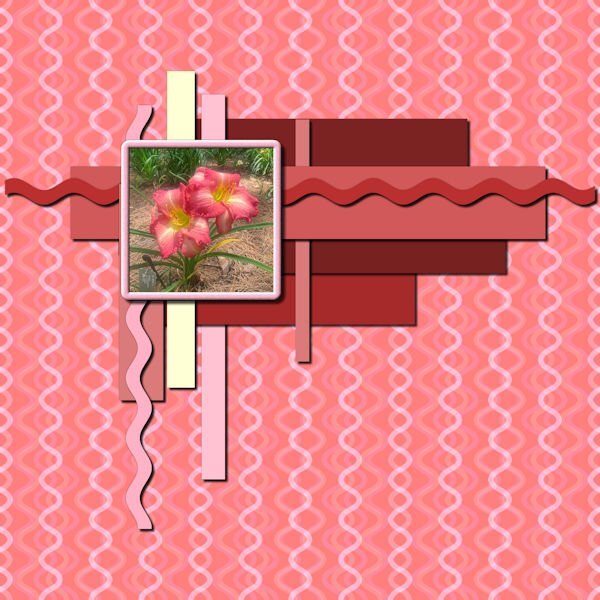
Got a late start today. A week ago I had surgery, so today was the post-op appointment. I don't think I have used a reverse shadow before. Photo is mine that I took at a local garden. I had an extra layer in the file? You can see bit of the edge to the left of my photo, in the corner of the 2 papers. I should have nudged the layer so you couldn't see it, but I forgot about it.10 points
-
10 points
-
9 points
-
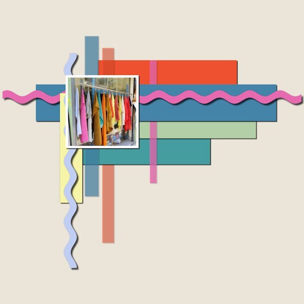
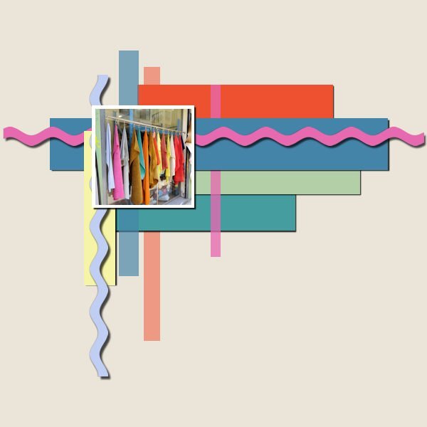
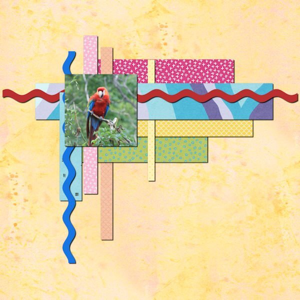
Lesson2: Colour palette from the colours in the photo. Rikrak drop shadow as card stock 20;20;70 20 and a reverse shadow 0:0:30:10. The yellow strip reverse shadow 0:0:50:10. The pale vertical strips are reduced opacity, like a transparent tape, so wasn't sure how to make a shadow for them. Putting a shadow on only shows through the strip, making it darker so I left off completely.9 points
-
8 points
-
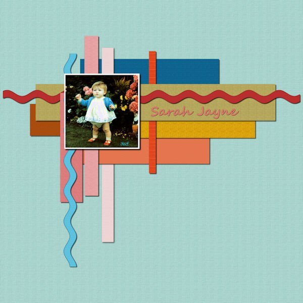
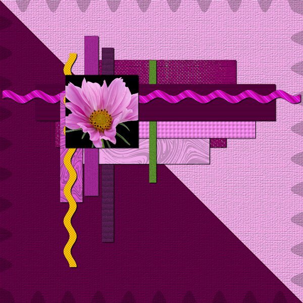
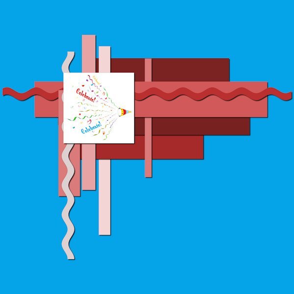
Lesson 2 All papers: 10 10 75 10 reverse Shadow 0 0 80 0 I had wanted to have some light papers on both the darker and lighter background to see the difference the reverse shadow makes. I see the dark background is good with the 80 opacity at 100%, but the yellow ribbon it was really noticeable so i reduced the opacity and turned it on and off to just have enough to see the difference. but now the ribbon on the darker background could actually benefit from a the whole 80%. Do we get picky enough about reverse shadows to select what's on the darker background and bring the opacity back to full? sorry if I have any bad grammar, I should be in my car driving to work right now. but hey, I needed to get this done...a girl has to have priorities, right? totally wild color (put your sunglasses on. I used PSP different textures and two marble overlays from Elif Sahin at Digital scrapbook.com.8 points
-
8 points
-
I really do think that over thinking creates more problems, especially when it comes to shadows. If it looks right and real go with it. Spend some time outside observing shadows. The eye will educate the brain. In turn when creating shadows on a layout the brain will be able to tell if it looks natural or not. Of course it is Carole who educates us in what tools and settings to use and how to correctly apply them to a paper or element. Keen observation helps whether you are applying shadows, creating a colour palette or anything else to achieve a pleasing result.7 points
-
Glad to see even more participants today! What a collection of assignments! @Carolyn RyeYes, chalk should not have shadows as it has no thickness. Also, check the shadows for the sequins. It MIGHT be due to the resizing, but it looks like they are wider than they should. Those additional elements on the second assignment look like they do have appropriate shadows. @Susan EwartYou are correct: a large offset will "separate" from a thin element so it would look like it is floating. That is a good observation and it is important because even with the "correct" settings, some elements will need you to tweak them in some situations. @Anja PelzerThe shadow was very small for the sequins so it was likely lost in the resizing. On the second project, are the shadows larger or is it just the fact that you resized to 700 instead of 600 that gives that impression? @Michele Yes, I also noticed that the shadows are different on both photos, and it is the same for several other participants. The first time I saw it, I thought someone added a shadow twice, accidentally, but now, everyone has the same "mistake" so it is definitely due to the resizing. @Euka It is ok to follow the tutorial to the letter. The important part is for you to understand why I use the settings I used so that next time, you can apply something similar. @Chris Schults Shadows used in the Drop Shadow should always be black. The only time you will need to find the color from an element to add it as a Drop Shadow is if the light goes through colored glass. A blue button does not have a blue shadow (unless it is made of translucent glass). Look at the shadow from your hand onto a piece of paper. Is the shadow the same color as your skin? The appearance of a colored shadow is the combination of the black shadow at a lower opacity, showing the background color through. By the way, 296kb is larger than the 0.290MB. Very little, but it is still larger. @Daniel HessI also think that as faint as a reverse shadow can be, it still makes a difference. Most people don't even notice it! @Cristinathat reverse shadow turns a "flat" element into a real 3D one! @Rene MarkerThat makes for a very colorful assignment. Did you use reverse shadows before? @Jnet AllardYour shadows look good, although I suspect the "larger" shadow on the orange paper is only due to the resizing, right? @Bonnie BallentineYou are correct: a few points more or less would not make a significant difference so it is ok if one changes them a little for their project. The idea is mostly to be "logical" in our tweaks. @Ann SeeberThat is a fun collage. @Marie-ClaireIt is ok to follow the exact same settings. Do they make sense to you? @Mary SolaasHow do you feel about all those shadow settings? @Julie MagerkaYou are correct. The doodles didn't need a shadow. Isn't that logical? @Corrie Kinkel Those wavy lines COULD be replaced by actual ricrac ribbons. But you can replace any shape by any element. The important part is to understand how they need shadowing, and especially the paper elements when it comes to the reverse shadows. @Donna SilliaThat is a lot of good practice for you. @Susan EwartWe don't have to be this picky, in general. Right now, we are so focused on those shadows that we probably "see" them more than normally in an overall project. @Gerry LandrethI suspect that during this workshop, we will often "overthink". Over time, shadows should become automatic. In the end, there is simple logic behind the settings. That is all that counts. @fiona cookTranslucent elements are challenging to shadow. Here is a little trick: you can use similar settings, but divide the Opacity by about half. Translucent elements are only partially opaque AND light shines through it, which makes the shadow more faint. @Sheila HoggAdding textures makes your assignment more interesting. Good work. @Jeni SimpsonGood work. Do those shadows make sense so far? @Linda J WalkerI don't see that extra layer on your image. What do you think of the reverse shadow? @Sue ThomasYou are correct in your approach. The settings I give are only starting points, and assume a certain thickness of paper (scrapbook paper is usually thicker than writing paper) and if you adjust the settings based on the colors, it is the perfect tweak. Keep it up. Keep it up. Tomorrow, we will play with shadows and distort them. Get ready!7 points
-
7 points
-
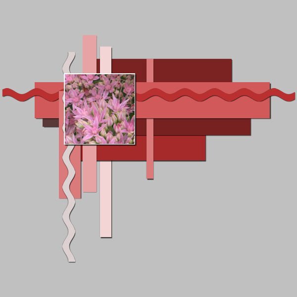
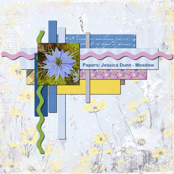
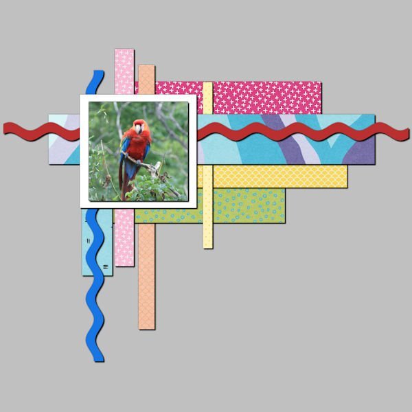
Lesson 2 For all the papers and photo I used the same shadows as in the first lesson. I assumed that the green and pink are thin ribbons so they got a shadow with an offset of 15, opacity 66 and blur 15. Like Rene I noticed that one layer was hidden and I moved it a bit (the plaid one). For my own pleasure I replaced all the papers with different ones from a kit I have and the photo of the Nigella is by me.7 points
-
7 points
-
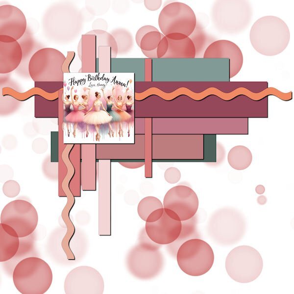
My granddaughter in San Jose, CA, had a birthday early in August and I played with one of the AI programs that was offered for free to create a birthday card for her. She is a fan of the ballet so that was the theme I went with. Now I used the card as part of the Lesson 2 layout for shadows. I filled the background with red and added a white layer above that and used my eraser with the bokeh bubbles brush set to 3000. I just pulled this back and changed the colors of the exercise to match the ballerina's tutus. I also found the "hidden layer."7 points
-
7 points
-
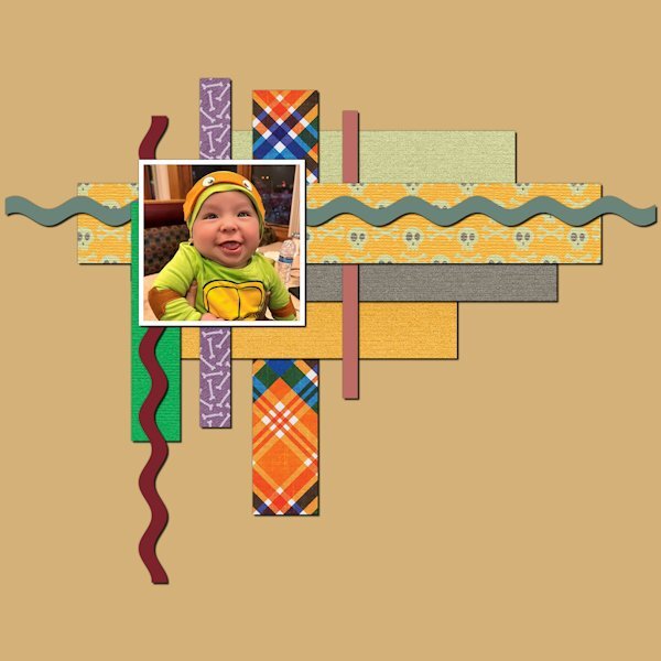
One layer was completely hidden under the other rectangle shapes so I moved it lower on the canvas so it could be seen. I also replaced all layers with layers from a kit I have. I used 10-10-70-20 on all elements. The reverse shadow was 0-0-80-10 on all but 2 layers. Those layers had the top edge hidden.7 points
-
6 points
-
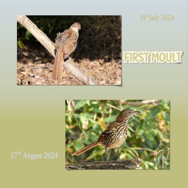
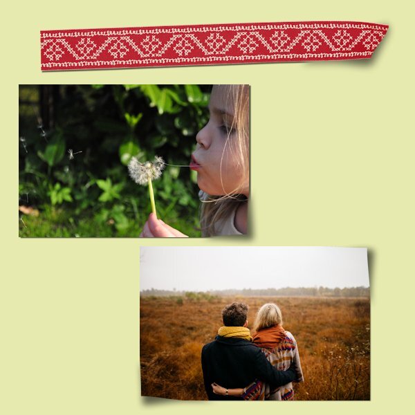
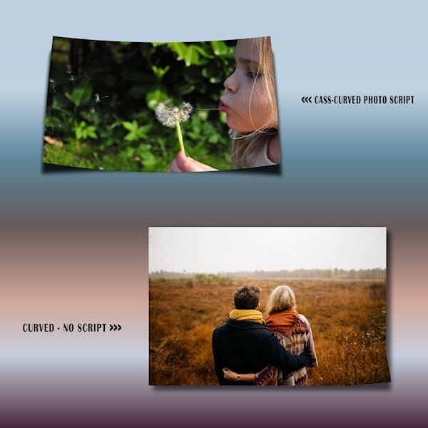
Another scorching hot day here. I decided to crack on and do day 3. To my mind, I don't think that there is anyone that can do a lifted corner which on a parr with the the lifted photo script. Although, I must say everyone is doing superbly in this shadows workshop. I decided to showcase The Brown Thrashers going through a moult. I first noticed it on the 18th July. Every day I would go and photograph them, if they were about. I had them come to the call, like the Robins, their reward was a treat in the form of either nuts or blueberries. I now have a sequence of pics of the transition from juveniles to immature. Even their eyes are an earthy pale blue when young, and gradually during the moult changes to a yellow, eventually their eyes will be bright yellow. Here I used the first photo, and the last photo taken. I haven't seen them since, I suspect they have finally left the nursery. I did all three corners, and the sticker. I also used the fading background gradient for the background paper. Using the buish and yellowie colours from their eyes.6 points
-
6 points
-
OK, Day 3 done. This is one area that I struggle with... the lifting of the photo or element or whatever. I've seen some great photo lifts on layouts in galleries but I just have never been able to do it. Practice makes perfect and I guess I just don't practice much. Admittedly, my style of layouts would look weird with lifted photos. I used a basic shadow of 10-10-60-10 for the shadows. For the warp brush I used a push size of 800. For the feathering I used 90. The Gaussian Blur was set at 30. This is for both of the photos. I then added a ribbon from a kit to try the lifting of the end. The drop shadow is 10-10-60-10. I lowered the push size to 600. I again used 90 for the feathering. Gaussian Blue was set at 40. With the 2nd photo and the ribbon, I did have to move the shadow like Carole showed on the top edge. I did it but there is lots of room for improvement!!!6 points
-
6 points
-
6 points
-
6 points
-
6 points
-
Very interesting. I read the everyone's replies and played with the various settings. A few points either way really doesn't make much, if any difference. I do enjoy the reverse shadow. I have been using an opacity of 10...30 is much better.6 points
-
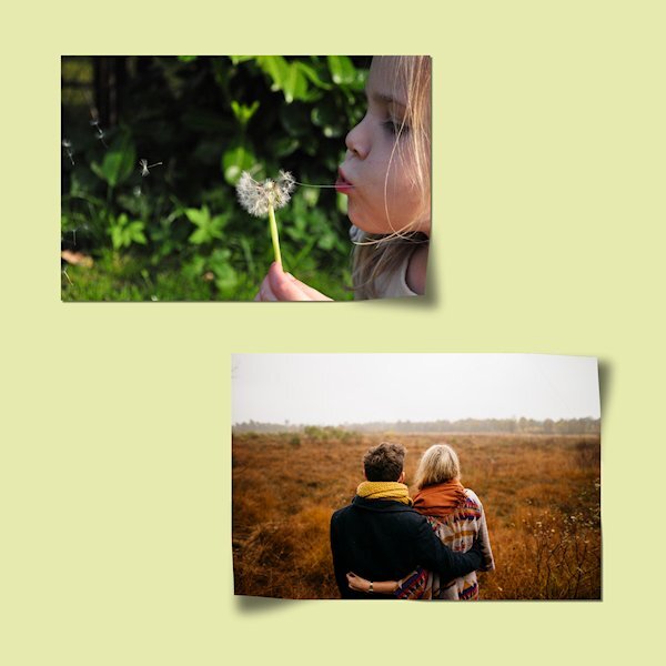
I had a busy day so I used the practice paper. Maybe I haven't paid close attention to the making of a lifted corner in the past, but the use of feathering was completely new to me and it is giving a better result. I need a lot more practice when attempting this technique by hand instead of using the scripts. Finally having my new glasses since last week let me see it so much better now. I stayed for the weekend with my son and daughter in law and I was constantly saying "oh WOW" I can see this or read that, for me a little miracle after 8 or so months of misery. Although seeing it better doesn't make my hands less shaky (I'm using a mouse) and it will take more time to get this technique easier. I'll stick to the scripts for now.5 points
-
It does matter a lot which place on the world you are. On the equator in the tropics shadows can be very small. When the sun is right above you there is a iny tiny bit shadow.5 points
-
Our group does enjoy Jenga. The tower often reaches 30-35 layers...or the upper twenties, lower thirties.5 points
-
5 points
-
I managed to finish Lesson 3 before traveling. I also have Carole's Curved Photo & Lifted Photo scripts. They are great. I should use this technique more often to get a better feel for how far or low to push the shadow or the photo, for example. I added a border to the photos to see the results better. I am enjoying this workshop very much.4 points
-
4 points
-
4 points
-
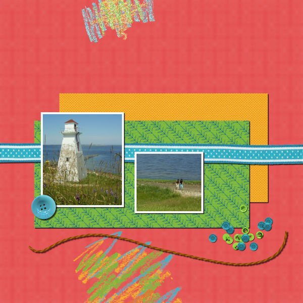
Papers and Photos: 10/10/80/10 The shadows don't look identical when sized down to 600. Isn't it weird how that works? Ribbon: 15/15/70/15 Button: 15/15/60/15 Since the button was on top of the paper and not hanging over the background, I felt it needed a smaller shadow with less blur. Scatter: 5/5/60/10 String: 20/20/70/20 The string seemed thicker than the ribbon, so I gave it a larger shadow and blur.4 points
-
3 points
-
3 points
-
Thanks for the tip Carole for shadows for translucent layers. I later tried it for Lesson2. Having set the shadow opacity to 40%, it made the coloured layer too dark but I double clicked on the shadow layer to get the layer properties where the opacity value appeared here at 100 so this I reset to 40 and it then seemed to work.3 points
-
I agree! Admittedley the closer to the equator you get the less length of shadow you get, but there is still a shadow, no matter how minimal it is. I do believe that for a few days of the year there aren't any shadows what so ever at the equator.3 points
-
It doesn't matter where you are in the world, shadows are created the same by the sun. There are seasonal variations. In the northern hemisphere they move from west to east and point north at mid day. In the southern hemisphere the shadow will point south. Time of day can vary a shadow greatly. From sunrise to sunset. At mid day, there will be a shadow but it will be minimal, unlike at sunrise and set. As the sun moves, so does the shadows. Shadows are constantly moving and changing thoughout the day.3 points
-
Shadows I always thought were difficult (and still do to be honest, but when I hesitated so much I put a paper on a window sill and looked how the shadow was and later on thicker things like a button and see what the shadow did. That way it made more sense, but sometimes I keep hesitating. So this workshop wil give me more confidence I hope. What a great idea to show us what the shadows do on the blue spots in lesson one! Why did I never think of that!3 points
-
Hi all, I combined lesson 1 and 2 in one project. 🙂 Oops! I forgot to add a shadow to the string, but since I only saved it as png and jpg I can't change it, and do not want to it all over again. For the top scrabble I used a setting as it was a washi tape, the bottom one was chalk, so I didn't add a shadow there.3 points
-
I don't think PSP should support AI, other than something basic. Even then it slows the program down. I for one don't use AI. I don't have any inclination to use it either. Depending on the AI the program it creates using key words. Making the image not your own, unreal and in many cases far to futuristically unnatural. I will continue to create as natural as possible. By observing the wonders of mother nature.3 points
-
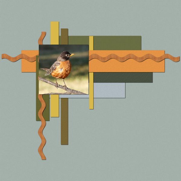
I have being using lower than normal settings lately too. Seems like soon as it's a JPG it's way darker than I want. I start with 0-0-80-10 on a reverse shadow but usually lower the opacity a lot, especially if it's on a light paper. Your color palette is spot on (I know, you used the photo and that's why it's so cohesive, you are a master at that). Robins always make me smile. I am seeing some other points of view on shadowing and learning some good stuff...and we hardly even started yet.3 points
-
3 points
-
Yeah, I also love that tool. Just select the object that needs a color change. Open target shaped tool and use it as a brush to apply a different color. I don't even always select if the object is isolated. Play with it as it reacts to the original color in odd ways, sometimes.3 points
-
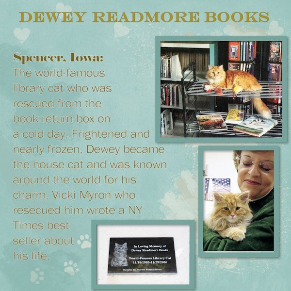
At someone's house yesterday, I noticed a cute cat on a postcard stuck to the fridge. His name is 'Dewey Readmore Books', and then the story of his life came out. It's a wonderful, heartwarming story of a rescue kitten in a small town in Iowa who gained far-flung fame. I looked him up to get some pix. Dewey is gone now 😢 but the librarian who saved him has another she calls Page. The background is mine with brushwork. The rest of it is straightforward with photos from online.3 points
-
Probably not going to have a PSP 2024. IMO, they need to fix the problems in PSP 2023 first.3 points
-
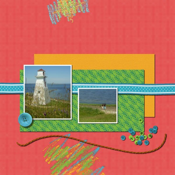
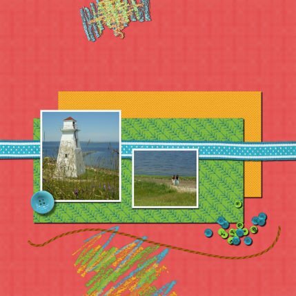
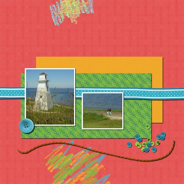
Lesson 1 Shadow settings: Paper: 10 - 10 - 80 - 10 Ribbon: 15 - 15 - 75 -15 Button: 20 - 20 - 70 - 20 Sequins: 7 - 7 - 80 - 7 Rope: 15 - 15 - 75 - 15 Crayon I did not shadow, thought it had no thickness I love that little math equation for getting a starting point (start at 90 subtract Offset amount to get the blur amount). I played around with the settings, especially the rope and the sequins. I found if I went larger on the rope (even though it's likely thicker than paper) the shadow separated from the rope and it looked like it was floating. The sequins were just a guess, I tried lots of settings on that one. the circles at the beginning of the video was neat to see the differences. Now I'll go see if I'm in the same ball park as everyone else.3 points















Resized.thumb.jpg.d25811db03a63358cedab1e79f527635.jpg)

