Leaderboard
Popular Content
Showing content with the highest reputation on 05/25/2024 in all areas
-
12 points
-
10 points
-
10 points
-
10 points
-
Hello, I just got to card #2 today. It was a difficult birth. In the future I will always have to work with the card/templates in PSP in forum size. The program kept freezing on me. That's why I made them almost exactly as specified. In my opinion it is well suited for a young birthday child. The star overlay is from DS MarisaL "scifi paper 07-template", the fonts are Sweet Dream and Elegance.9 points
-
9 points
-
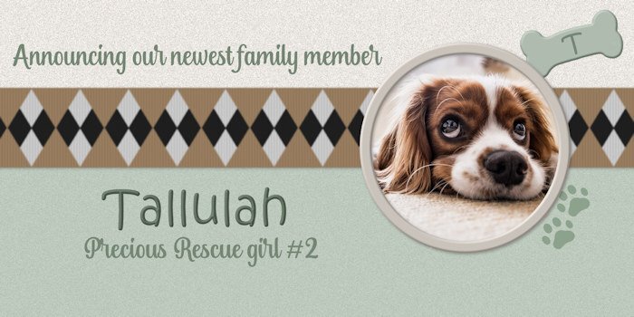
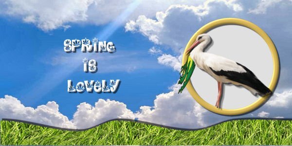
Lesson 5 - I kept it simple and took a pass on the the stork and its layers and shadows. I have done a couple of baby announcement layouts in the last couple of months. It's a fictional announcement but the type I and my friends might make about saving rescue dogs. I have three of them already, which keeps me busy (and broke 😛). Cute dog from Pixabay. Ribbon from M. Lerin at DS. Pawprints from a brush.9 points
-
8 points
-
I decided to follow the video closely; I need to refresh my techniques. I love how it came out. The balloons are from my stash. The main font is Amsterdam from CF and the font is Billy Signature from FDR (Free Design Resources).8 points
-
8 points
-
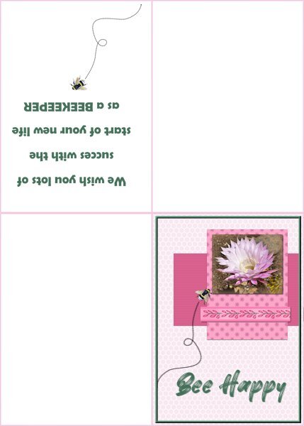
Card6-Extra For this card I followed the tutorial to make a folded card with a text printed inside. Although the card isn't square for me that isn't a problem because my printer and so do I, use European A-4 paper which is better suited for rectangle layouts. I used a photo of an Echinopsis flower and the ribbon is from Chanthalia Desig. The backgroundpaper has an overlay of a honeycomb that I made some time ago. The other papers are colored and one has a little flower again from CD as a pattern, the other a blinds texture. The font is Better Brush and on the inside Berlin sans. The flying bee comes from my stash,7 points
-
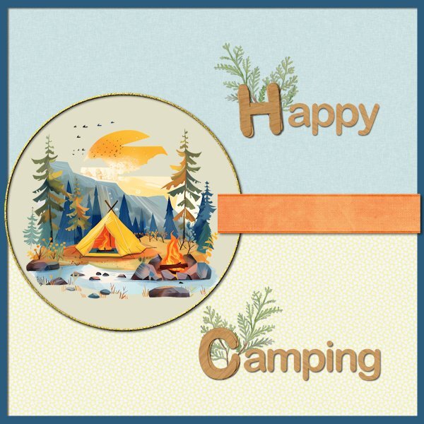
Card5-Extra This time I wanted to create a card for my family because they told me they would go camping this summer. I have no camping related photos but I found this clipart on clean png. Papers and ribbon are from Marisal-sweet moments; the papers have a slight texture but that is almost invisible in this reduced version. The letters H and C are made with cass-Stacked Alpha script and use Arial just as the rest of the text. The greenery is from my stash and all the colors are chosen from the clipart. I'm going to email this card therefore it isn't a problem that is a square card, for printing I wouldn't use it because that doesn't go well with my printer and A-4 paper.7 points
-
6 points
-
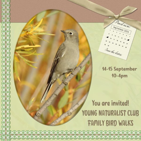
I had to rotate the whole layout, in order to accommodate the photo that I wanted to use. Used cass custom calendar, which I edited to suit my needs. Used the hue map, which I use a lot anyway, to change the colours on the ribbon. Taking a colour from the photo I then used that colour in the bow 3 script. For the background paper I used the photo as an overlay. Townsend's Solitaire. Birds migrating for warmer climes, as winter sets in here. (Autumn)6 points
-
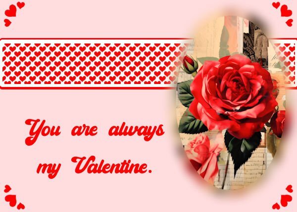
Day 4 The Rose is from Creative Fabrica, Paris Valentine Collage Art Tumbler Wrap Graphic by CraftArt · Creative Fabrica. This was free today (May 25, 2024). The font used is Cheers. It may be this link ... I am unsure where I got it from, but I found this link today Cheers Font - Dafont Free. I did do a selection around the Ellipse from the template to do a cutout of the rose. It had blank space at top and bottom, so I took a small part and stretched it, at top and bottom. Then I decreased the selection by a percentage, inverted the selection and used Gaussian blur on just the outside of the rose part.6 points
-
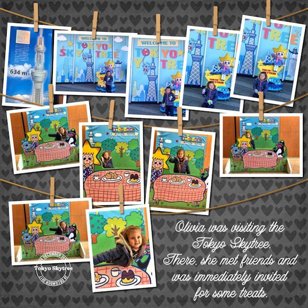
Here is another layout that I finally finished last week. I don't remember what I had in mind for the page when I started, but it was probably different from what it is now. Credits: Background paper - Playtime Princess_D4ED_hearts paper 8, an old freebie by Pauline Thompson / Dream4Ever. Cassel: DateStamp#8 -- Hanging Photos Script Font: Lazy Ride Script6 points
-
6 points
-
6 points
-
5 points
-
5 points
-
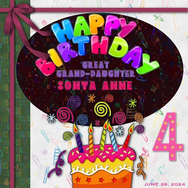
LESSON SIX - A birthday card for my step-great grand Sonya Ann, for June 26. She and Magic are both 4 in June. Her grandmother is my step-daughter, Beth, and her mother is my step- granddaughter, Alycia. I've been playing with this all day and now forget all the steps I took. Chalk it up to my senior moment! 😜 The font for the names is Dingo Nursery. I had fun with all the colors! The Happy Birthday is clipart as is the cake and numeral 4. I used a cass-floppy bow and applied the blinds texture effect to the ribbons.5 points
-
5 points
-
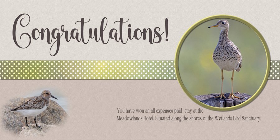
Wonderful, congrats! You won't be disappointed, don't forget to take your wellies and camera!5 points
-
5 points
-
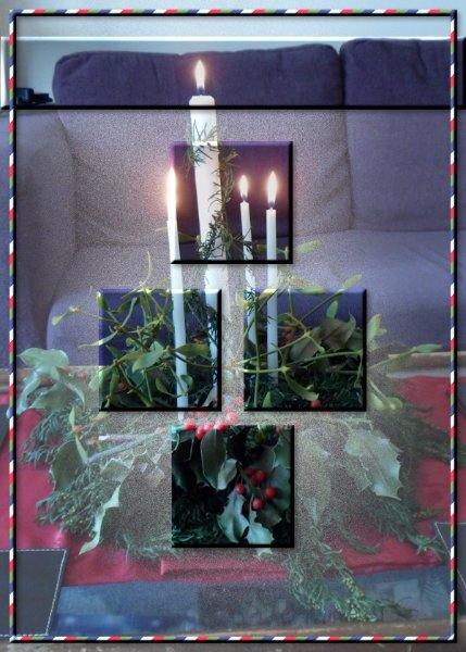
So here goes with my number 2 I did something different, filling the areas on the template with promoted selections from the card, which I used inner belvel and drop shadow on. I then put a show all mask over the main layer and with the airbrish and one of the watercolour brushes I have sprayed some black in areas under the elements which reduced the visibility of the main picture making the promoted elements stand out more. I didn't feel like it needed any words5 points
-
5 points
-
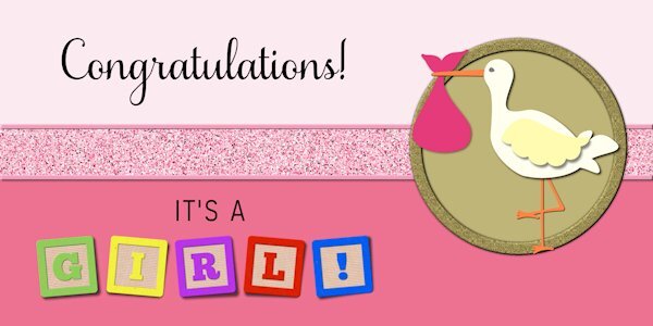
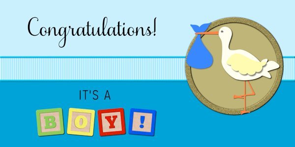
The script is Samantha Upright. The blocks were created using the Baby Alpha Block script by Cassel. The ribbon was also created with a script by Cassel, Glitters-C. I've added one for a boy. That way, I'm covered. With two great-nieces and one great-nephew added to the brood, I can't leave anyone out.5 points
-
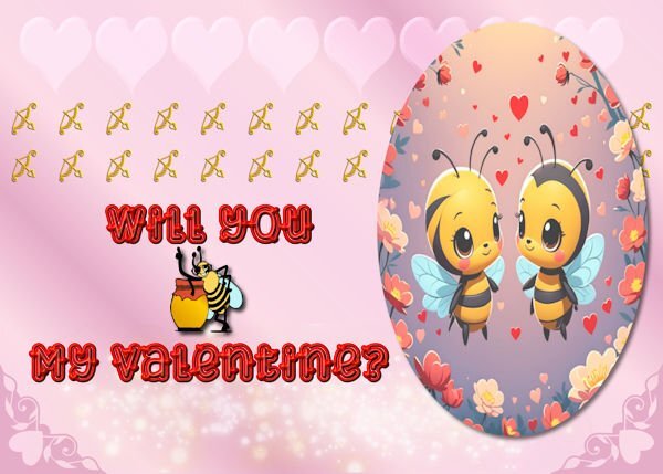
Day 4 The image is an AI image from a paid Cyperlink program call "My Edit." I made a vector oval and cut the image to fit the oval. I made the background with preset hearts and cass sparkle script and a lot of blending. The font is Love Heart from CF. The bee is a dingbat font call Bee Cute, and the bow and arrows are from a Valentine dingbat font also from CF.5 points
-
I am days behind but enjoyed putting this together. I see today it's not 'unique', but good to know I'm not so far out there with the idea :-0 I can't wait to get some time to go through all the posts and see what everyone has come up with. I've seen a lot of inspiring ideas in the short time I've had to check them out.5 points
-
4 points
-
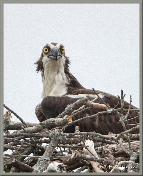
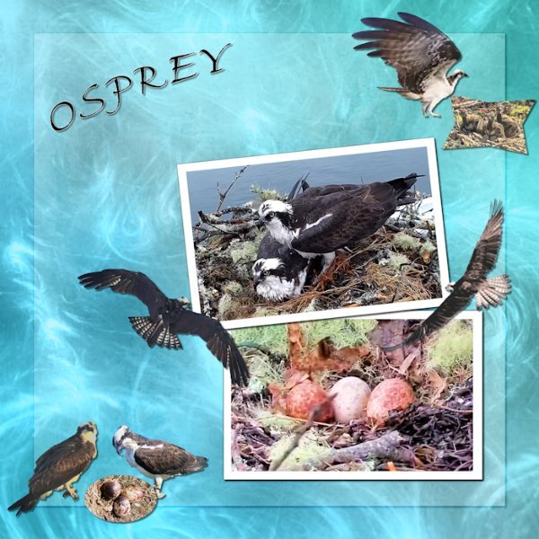
Mt day 6 card. The background is a paper from (Beautiful-Intense-Iridescent-Gradients-18728752) the font is Fine Hand. All the elements are ones I have created over the years from screenshot from an Osprey nest I have been watching for a long time. I went with this background because I thought it looked a little like water and Osprey eat only fish for the most part.4 points
-
I love the dots on the background papers. I thought you had created what looks like embosed dots. Great efffect however your created them.4 points
-
Cool! Even your text on a path has movement; like that of flapping wings (up, down, up down)4 points
-
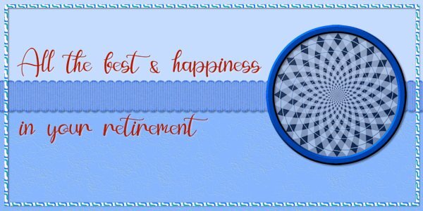
Card 5. My male friend is retiring so my card isn't too 'pretty, pretty'. The photo is one I took in an Illusions Museum of a kaleidoscope pattern. The border is a wave pattern fill. Effect on the paper is Fine Leather. Font: Evelyne. I've used a shadow on the text in white instead of black just to lift it from the background but I am taking a gamble with the effect.4 points
-
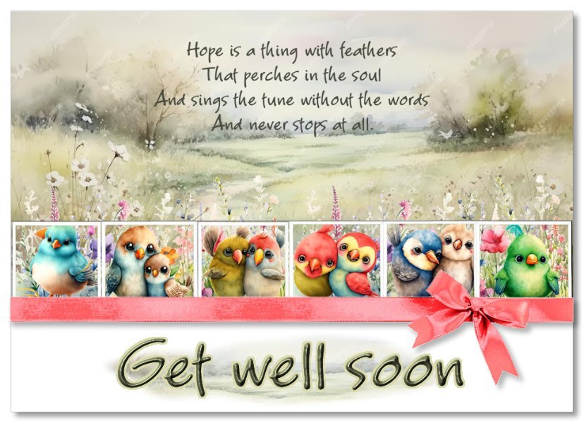
Oh no!!! Don't do that!!! Come, and I will be your birding guide, taking you to places that not even the locals have been too, even a day on the water in a kayak, and in the saddle Thinking about you, hope you make a speedy recovery. Sending cwtches! ( cuddles, hugs, embrace, it also have another meaning, cubbyhole, cupboard.4 points
-
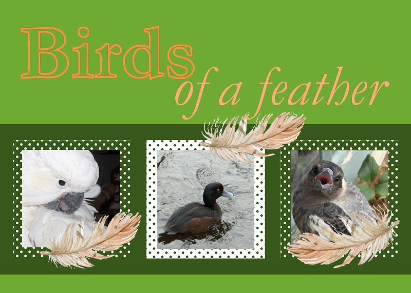
I enjoy capturing birds, especially when I get them up close. Maggie, the magpie, on the right was busy singing Happy Birthday when I sneaked up and took this pic. The middle bird is a pāpango, or Scaup, a diving duck, and is native to New Zealand. Billy, on the left, is an Australian, a Cockatoo, he loves roaming free, and befriending people. I chose to colour the font, Garamond, in shades of orange, the opposite colour on the colour wheel from green. I made the polka dot papers and the feathers came from an exchange in my one of my graphics groups. Jeni4 points
-
Hi all together , I am very late with my cards, but now I have Card 1 and 2 ready card 1 - My mom 2009 taking pictures of all kinds of flowers and greeneries during a Mothers Day walk card 2 flowers from Creative Fabrica and font is Helena Script, I made no shadows, the frame and squares have a tiny innerbevel3 points
-
All bird photos taken face on, as you put it look goofy. I tend not to use face on shots, as many look very angry, which doesn't do them any justice.3 points
-
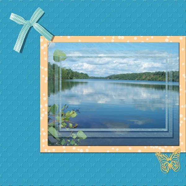
Lab 12 Mod 5; requirements: 1. create a paper with random dots - the frame paper around the picture (I created several and chose this one to display); 2. create a pattern of triangles facing in opposite directions (#7) - I used the pattern for a paper, and a ribbon and used Cassel's script for Bow 12; 3. embossed paper - I had quite a time creating the butterfly pattern for the embossing to display it the way I like - but it gave me an idea of how to create patterns for embossing that are not round. I placed the picture in a mask I created when I was fooling around with various transparencies of frames; and I used that sparkled butterfly that I used in the last module.3 points
-
Nice card Michele and I like that font too and I have it as well. No surprise there as I live in the Netherlands and Amsterdam is the capital!3 points
-
@Wendy Sanders You are doing it right. Only if you want to quote someone, you can highlight the phrase or paragraph to quote. Otherwise, you can just post at the bottom of the page. @kasany That is a cute font. When you use a decorated font, especially with bevels, go easy on the shadows so it does not detract for the details. @Michele That is a really cute font! @Jeni SimpsonThat is a great way to showcase those birds. @Peggy Dyar It is interesting to see the frame halfway over/under elements. @fiona cook Did you try both the black and white shadows or just opt for white from the start? @Donna Sillia How did you get the 3D effect on the text for the valentine card? @Gerry Landreth That is a smart thing to do: be prepared for both options! @carol Woudema Did you size your project to less than 600 pixels and then size it up? It is strange how it is pixelated. @Harmony Birch It is never too early to prepare for holiday cards! @Sue Thomas With all those invitations, we will have a party at your place! @Anne Lamp I think you might want to fix a typo on "May YOUR future be bright" before sending it out! @Corrie Kinkel That is a great way to use the stacked wooden alpha. @Julie Magerka You are totally free to change the theme for any of the cards! @Randy It is fun to see those abstract designs find a way to embellish a regular card. @Sheila Hogg It is fun to see the use of extra glyphs! @Louyse Toupin Be careful resizing images. The flowers are obviously stretched. It is ok to keep them proportional, even if they don't span the whole width. Still two days to go. This thread is a fantastic source of ideas!3 points
-
Susan, thank you so much. Years ago, when living in Australia, I saw a tree in the distance. It looked like a white magnolia, and the closer I got, the flowers seemed to be less. The tree was full of cockatoos, and they were flying away from that tree! That was the first time I saw cockatoos in the wild. Billy isn't allowed outside and, instead, he flies around the house. Jeni3 points
-
That is one way to do it. Which looks lovely. May I suggest a quicker easier way for you to try? Place a white, or colour of your choosing (lightish) below the main the photo, and lower the opacity of the main photo. You could even add a very small blur to the main photo.3 points
-
3 points
-
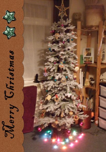
Playing catchup, here's my number 1, I did several different versions of this for all the sizes of card blanks I have. This is the one I decided to share. I am making christmas cards for next year featuring my own christmas photos, hopefully it will stir family members memories as it stirs mine. This one I am showing I took the ribbon out and replaced it with the text3 points
-
3 points
-
3 points
-
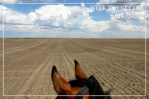
Thank you Carole, birding outings are usually organized in and around the cities, using local parks. Regina is a 3hr drive, Moose Jaw 2 1/2hr and Saskatoon is a 2hr drive. When I trail ride, I like to have as many hours in the saddle as it does to get to the venue and back, to make it worth while. I have been on a couple, these days I don't do well around crowds of people. I enjoy my own company, along with seeing and hearing a lot more when I'm on my own with the camera. Chaplin conservation centre is the closest, at an hour and half away. I should have mentioned that I used a bird (dingbat font) silhouette for the flock, by waving the layer, it almost replicates how the Pelicans are flying in the photo.3 points
-
This came in handy today for my dear friend Lorraine's birthday! I forgot to mention that the font is Zooky Squash which I got from FontBundles years ago during one of their $1 sales. It came with seven versions including alternates, swashes, and ornaments. I think I got my money's worth. 😄3 points
-
3 points


