Leaderboard


Popular Content
Showing content with the highest reputation on 01/21/2024 in all areas
-
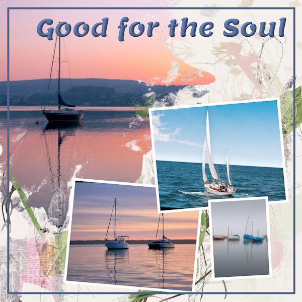
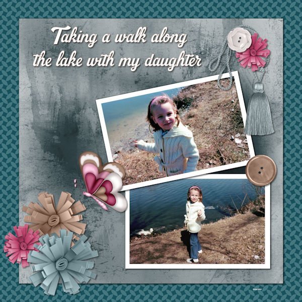
Day 6 assignment done. Kept to the template this time. I am learning so many new tricks like that "reversed shadow". The papers are from Freepik. Font is Polar Vortex (free from Dafont). The intricate snowflakes are part of a larger set that are available for purchase from Jane Creative over at Creative Fabrica. I tried adjusting the settings on the photos to get the two red jackets to match a bit better but gave up after several attempts and instead ended up with an underlying red paper that was halfway between the two colors in the jackets.
 13 points
 -
This is regular Template #4. I'm just keeping the templates as they are, not rearranging or changing much. It takes me longer to find an idea for the layout than to actually do it! The font is Lemon with some embossing added. The background paper has paintbrush work by ET Designs, and the images come from Unsplash, bless their hearts since I don't take many photos. Just realized I forgot shadows, regular or reverse! My bad.
11 points
-
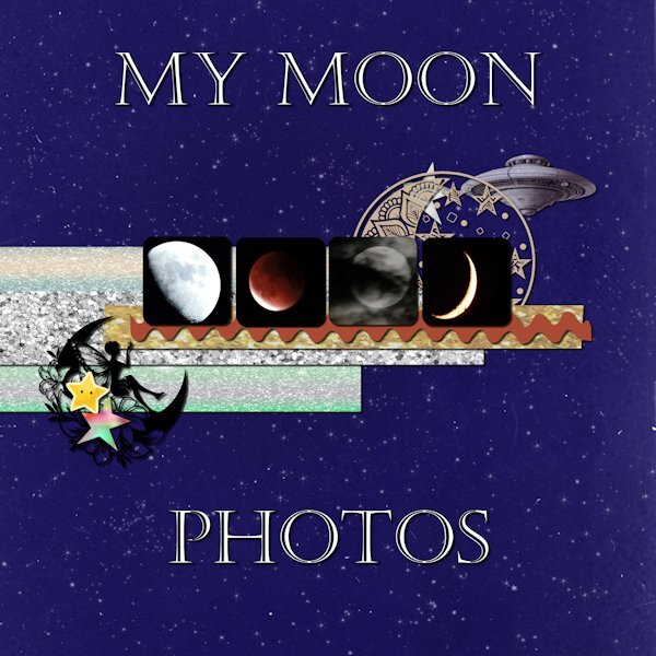
Day 5 Moon photos are mine. Font is Castellar. I have lost track of where the background and other stuff are from. I didn't make notes while working on it.
11 points
-
Regular Template #5. Took a few liberties with this one and changed some elements. All pix from Unsplash, as usual. I'm having a hard time trying to keep up with all the layouts in this workshop. So many and so much variety and creativity. Carole must be up all night looking at them and commenting. Applause to y'all!
10 points
-
Day 6. Most graphics for the Greek challenge at DS. Zebra paper by Marisa Lerin. Font is Lust.8 points
-
Lesson 7 Winter vibes is the font , All the other items are from my stash or Creative fabrica. The filling of the doily's is a pattern. For the first time I got a subscription for CF 🙂
8 points
-
Day 6 I used kits that I made and the font is World Series.
8 points
-
Lesson 2 done. The photos used on this page were obtained from royalty free websites, sorry, I can't remember the names of the websites. Thank you for the lesson @Cassel. Everything is so clearly explained. I took many courses during the '90 learning how to use Paintshop Pro's many features and your lessons are helping me to refresh my memory.
8 points
-
day 3 I made again my own papers with Quicktile scripts and I made the border around the photo with Stiches by Cassel day 4 here I made the paper with a color from the photo and added a wooden texture day 5 I used the Kit Introspective by Jen Yurko, the little tag is filled by me with the pentablet, I clipped a paper from the kit to the ricrac.8 points
-
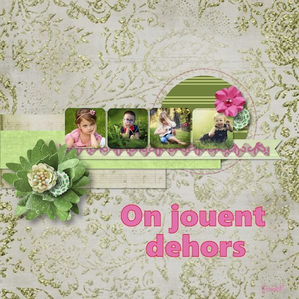
Day 6 Today I'm sticking with my flowers but this photo is from last spring and I choose it because I'm fed up with the cold and the remnants of the snow that makes the footpaths slippery! The timing of this workshop is great as we, my hubby and I are getting a little bit afraid of taking a fall on those slippery paths/roads and that is maybe a sensible thing regarding our ages. Why don't I like being sensible.............. I wanted to use this photo and therefore I used the extra diamond template because I could combine the mask layers in one layer (something we learned in the Magazine Workshop). The papers come from a kit called Denim and I got the dark background by using 2 papers and a blendmode. I really like using the blendmodes and in PSP 2023 that has become so easy. Instead of using the flowers that are in the kit I have chosen I bouquet from my stash. The font is Prida01 and that one has nice glyphs and I gave the text a bevel.
8 points
-
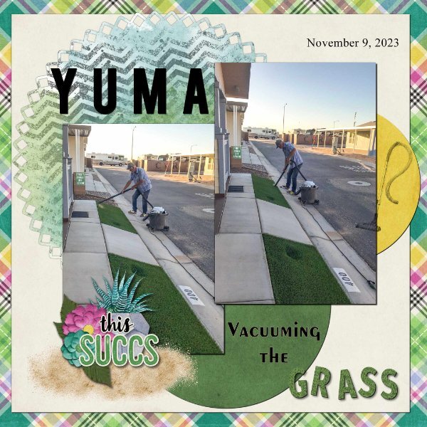
Day 7. Thank you Carole for the templates. I used the diamond membership template. I used a kit from Connie Prince Prickly. Font Fira Sans ExtraBold, Exotc350 Bd BT and Times New Roman. I used Cass GrassTexture script on the word "grass". Speaking of the clip to it script, it is one of my most favourite scrips, I use it all the time when working with templates. I really enjoy seeing all of the great layouts.
7 points
-
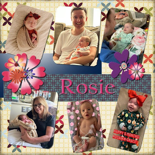
I greatly altered the template and made it into something else entirely. I wanted to really show off our lovely Rosie = AKA Rosalyn Grace. Also her dad hadn't made it into my projects yet, or her grandmom - Carole (my sister).
7 points
-
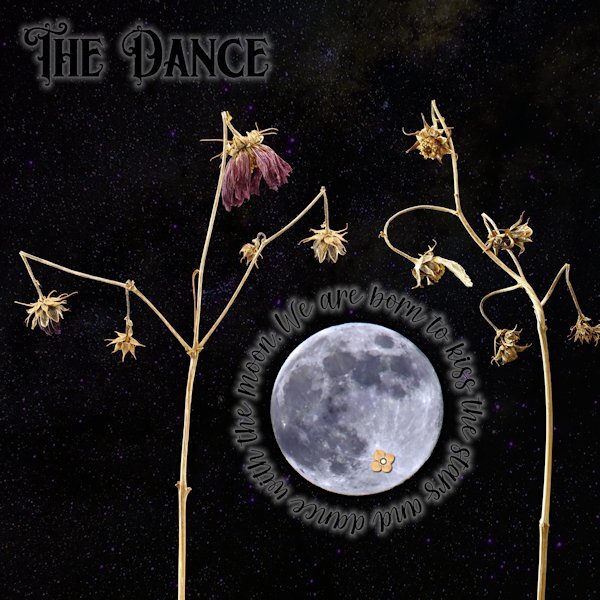
Day 5 First, apologies for really messing with the template. I did keep the round circle that the stitching was around and turned it into a mask and fit the moon (yup, I did some unspeakable things to the moon to make it not as real). Also, the little flower on the (*Ahem*) private "underparts" of the moon (you know, it looks like a cat walking away from you with it's tail up). They are right in the spots they started at too. I couldn't seem to make the template work with the small pictures like I have in the past so I had to improvise. I used "text on a path" for the quote around the moon, and wanted to add the author but it would have looked weird with a big gap of small lettering. For both the title and the quote I used a layer style of outer glow. That is an odd thing. I had it at the lowest possible setting and 50% opacity and it's really still too big. I did have to lower the opacity of the layer as well so it wasn't too overwhelming. I wonder if there is a better way, and not have to use the layer style as there is not much fine control with it. Once I had that I turned the font color black. The stars was a starry background paper I got somewhere, that I put above the photo layers and used "screen" blend mode. I thought these subjects looked like they were dancing when I shot them, they are the Forgotten Moonflower Fairy Queens. Font: Title is Morgan Tattoo and the quote font is Morning both by Creative Fabrica Quote: by Avijeet Das Little Flower: Digi-Dewi -Relax, flower-brown (Digital Scrapbook.com)
7 points
-
Day 7
6 points
-
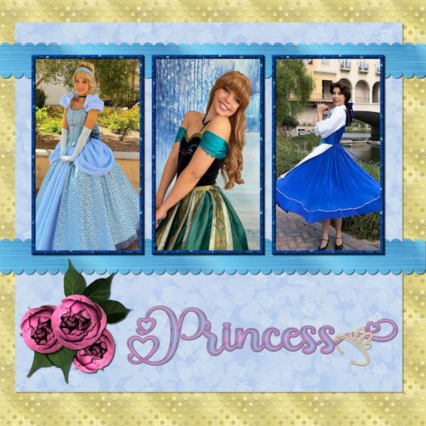
Day 6 - The photos are compliments of my future daughter in law, Lane. She works for a company that does Disney parties for children. The gold dot background is one of my own as is the blue overlay with a lowered opacity. The scalloped ribbons are my own texture, scalloped using cass quick scallop script(what a time saver!). The roses and leaves are from a package that I purchased from deeezy.com. The font is Hilender Rhapsody from Creative Fabrica. I used layer styles for the font, but wanted it to "pop" more and applied Hue and Saturation. The crown is a preset shape that was created from a font. I used VectorTube to apply the diamonds, a directional tube that I made using cassdirectiontube script.
6 points
-
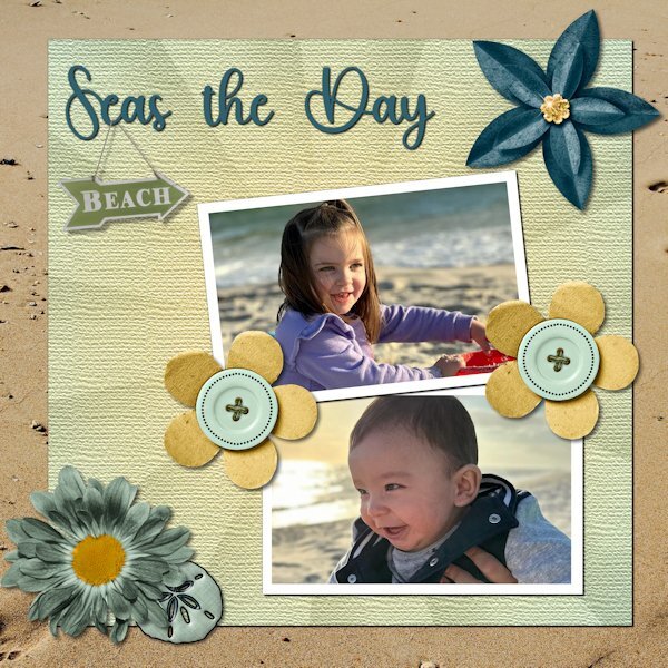
Day 6. Technically, the pictures were taken at Gulf Shores. As a veteran Miamian, I understand the difference between a gulf and the ocean. However, Felix, who is six months old, and Amelia, who is three, are not interested in nuance. Besides, nuanced accuracy would have gotten in the way of the fun title I found. The kit is from Throwing Some Scrap Around by Jodi Watson, which I found on Go Digital Scrapbooking. Unfortunately, the website does not seem to be operational. The font is Hey Beach from Creative Fabrica.
6 points
-
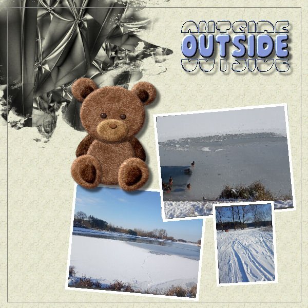
Day4. Outsige is fine but better inside. Not only Teddy Bear thinks so; ) Done without scripts but probably it would be easier with them;)
6 points
-
Good question. The Clip to it script was created to simulate the "clipping mask" in Photoshop, and it will use the paper/photo you place on top of the shape. The Raster-to-mask will do the same thing as the Clip to it EXCEPT that it will stop at the mask creation while the Clip to it will ALSO grab the layer above (paper or photo) and move it inside the mask group. So the Clip to it might be more convenient when you want to use a specific image/paper, while the Raster to mask will stop after the mask group creation when you might not yet have decided on the paper/photo.5 points
-
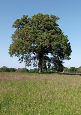
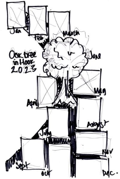
I have not followed what's going on for a few weeks so a bit late into the challenge, sorry but it is the perfect subject for a personal project I started last year that I have not finished the final layout for. I dutifully walked to the same oak tree on the outskirts of our village, once a month for all of 2023, getting the exercise and always having in my mind the creative challenge of how to present the collection of photos at the end. So my project is not quite p52 but very similar. I am still cogitating how to display all twelve of the photos into one photo montage and have made a layout to start with. The scripts that some of you are using on your designs are giving me ideas but here is where I am at so far...
4 points
-
Corrie, I am almost "really old"...79. Age is just a number to me. Some say your age is the number of years the world has been enjoying you. I did realize yesterday that others see me as really old. Two neighbor children came over to shovel my sidewalk and a neighbor who owns a tractor came to plow my driveway. While I can still do those things, it was a real blessing to have the help this time. I am really enjoying this workshop. I have day 6 almost complete but all of you will have to wait until I return. I leave tomorrow for sunny, warm (hopefully) Florida for a pickleball clinic. It will be a nice change from our frigid and snow covered ground. I am flying this time so I will not take a computer. I'll have my tablet so I hope to be able to check in but will have no new layouts until I return on Thursday PM. Judy is so confused by this trip, she has been no help and at times a real hinderance. Any change to the "normal" routine throws her for a loop. We will not be taking any other trips for a long time. This trip was planned months ago and I did not realize how quickly Judy would decline. Thankfully, we are traveling with friends who really love Judy and will help where they can. Of course, they should not give up any of the activities they paid for. I am sure it will be a delightful time...and we plan lots of board games too! Everyone stay warm, keep creativing and I'll see you when I get back.4 points
-
I agree with Susan. You are such a devoted friend. Having people like you in one's life is a real blessing. Good luck on the trip.3 points
-
Darning! OMG. Haven't seen a darning tool (usually for socks in my experience) for ages. This is lovely.3 points
-
...and who doesn't want more horsey. They are the best!3 points
-
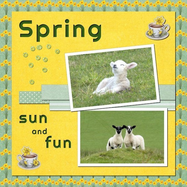
I love that little lamb in the top picture. This is what happiness looks like!3 points
-
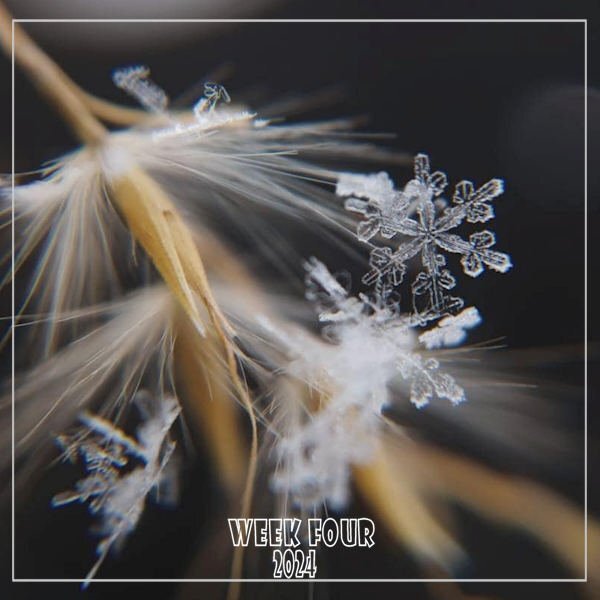
WEEK FOUR - Celebrating our frigid, snowy weather; a nice closeup from the Hudson Valley in Pictures gallery by Cindy Plumb Bishop on 01-20-24. I changed my font from Wide Latin to Showcard Gothic.
2 points
-
@Cassel - Is there some reason why you are only using "clip-to-it" and not "raster-to-mask" scripts? I have usually used the clip/to script for papers and accessories, and the raster/mask for photos in the past.2 points
-
It's been a while since I had time to create a new one. (They've been repeating themes from 2017 so I've been repeating my layouts with a few adjustments.) The background paper is a chevron from PS/DS by Sheila Reid to which I added a Gaussian blur. I used the Andrea Bilarosa font I got in a free font bundle from CF and the flourish is from my collection of scrapbooking "stuff." 🙂 As you probably already guessed, the illustration is by Hayden Williams. The best part, and the reason I wanted to share this, is Cassel's gimp trims picture tube. I used one to frame the illustration and the layout.2 points
-
Love this. The spaceship is a great touch.2 points
-
I've said it before. You are an amazing friend to Judy(and to all your friends, I am sure) and a real powerhouse, so inspiring to me.2 points
-
I agree but the problem is that people older than me are really old (between 80 and 90! ) so that means I'm getting old!😢 However as long I can learn a new skill like script my brain does what it is suppoost to do! Which is a reassuring thought and yah "always look at the bright side of life" according to Monty Python2 points
-
Day 6
2 points
-
Day six: The photos are mine, taken a couple of years ago. The papers and teacup are from the Afternoon Daffodil kit by Jessica Dunn - I changed the background paper by adding a pattern of daffodils to it from a png graphic from Freepik. The glitter bits are from somewhere else – I can’t remember where. The font is Righteous.
2 points
-
Template Lesson 5 result. Took longer to get elements together than anything else. Loved using the scripts.
2 points
-
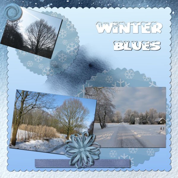
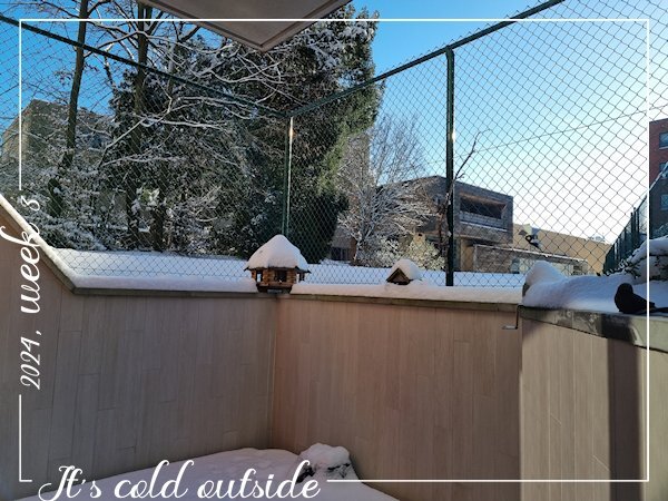
Here also a layer of snow and below zero, from tomorrow the temperature will be above zero again. A photo taken from our small terrace.
2 points
-
Thank you for this explanation. I've been using the long way so I don't forget how, but the scripts are great if I have a ton of masks to do.1 point
-
@fiona cook That would be a great idea for a double page! Make it somewhat like a timeline and it would be great to see it through the seasons.1 point
-
1 point
-
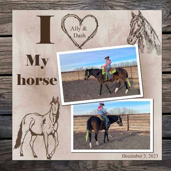
Day 6. I am on time ...... Another great handout. I really like the reverse shadow, I have saved the PDF for future reference. I did not use the flowers as I wanted it more horsey!!!!
1 point
-
Lesson 6 Font is Wintervibes (thanks to who mentioned it earlier) Photo's are my own and all the elements are from a very old kit I had 🙂
1 point
-
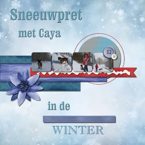
Lesson 5 Our last boxer, she loved the enormous amount of snow we had that year. 🙂 Caya died very young, just 5,3 years. I just realised it's already 10 years ago she died............. Background comes from Craetive fabrica, also the ricrac and ribbons en buttons 🙂
1 point
-
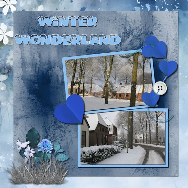
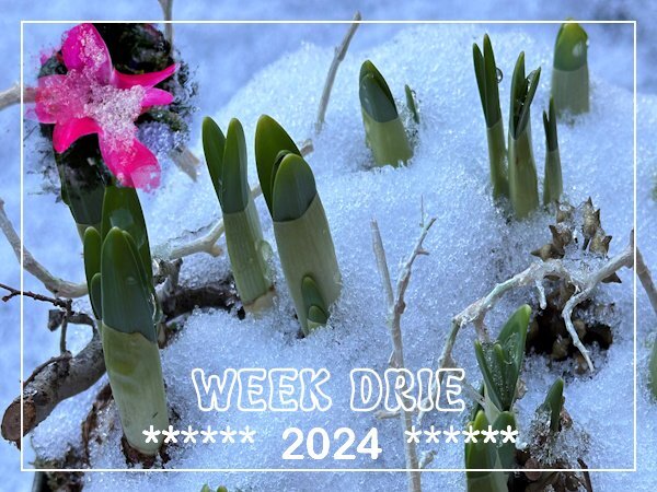
Week 3 and here the week is also dominated by some snow and temperatures below zero and I use the same photos from the Template Workshop. I couldn't choose between 2 photos and decided to use them both although one is very small with a mask otherwise it overpowered the bigger photo.
1 point
-
Day 5 result. I had promised another new dragon themed tag for a guy who has a "Dungeons & Dragons" group (he has a truck, I don't, but I need one to haul soil etc for my garden so I make tags for his group emails all year). I did try and work with the template but, after inserting all those menacing dragon eyes into the photo slots, I quickly abandoned that idea and deleted them. There was a circle and some rectangles left and, in the spirit of moving placeholders and using the pick tool for scaling, I went completely off script. The paper was a rescaled and recolored wallpaper, the dragons & flames were already in my stash but, because I usually work in tagger scale, I was constantly rescaling things. The pale dragon at top right was a jpeg so I had to tube it (I hate tubing) and there was no clear color definition. After adding it to the paper, I realized that I should have misted it as blurring the edges didn't work well. It was going to be blended into the background so it doesn't look too bad unless you zoom in on some of the edges. It took several attempts with drop shadows to make the flames leap out a bit. Font is Brush Script Std.
1 point
-
Day 5 Again a layout with purplish colors, I hope that is not becoming a new trend, but the color seems to suit the layout and photos. Although I love seeing colorful layouts, the ones I make are usually more subdued. The papers are by cpjes in the 2022 augustus blogtrain; the doily is by Sheila Reid. The ribbons and flowers are by Marissa Lerin and recolored. The brads come from my stash and the font is Bremlin
1 point
-
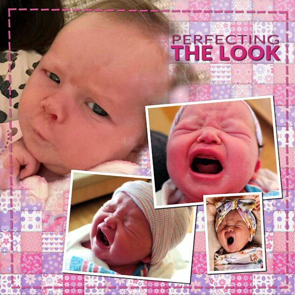
Day 5. Felix was born this past summer. The pictures are some of "The Firsts" of his first year - winter (in Illinois), Halloween, and Christmas. The papers are from Annie Digital. The fonts are Lato Light and Belgium.
1 point
-
Day 5
1 point
-
Day 4. Ansley, born in September, is the newest addition to my sister's roster of grandkids. We have one more coming in April and added another one by a recent marriage. The background is from Chantahlia Designs.
1 point
-
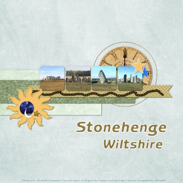
This layout could serve a double purpose...workshop and All About Me. I used a purchased kit...Travelogue by Connie Prince. I also rotated the two larger photos. The masked photo is of the State House. The historical markers tell of the burning of Columbia. During the Civil War Columbia was attacked and burned by General Sherman. The bronze stars mark 6 places where artillery hit the State House on February 19, 1865. My high school was about 3 blocks behind the state house. I love my home state!1 point
-
Some of the text blurred in the reduced size, but is clear at full scale. They are adorable!
1 point
-
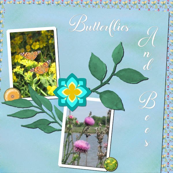
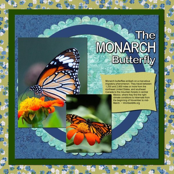
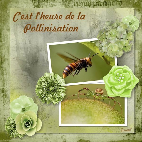
Day 3 - Diamond template. All the papers and elements were created from scratch – the flair buttons from tutorials by Cassel as well as the stylized flower in the center. The font is Butterfly Wish – most of my fonts are from Creative Fabrica. The butterfly picture was taken in Blue Earth, MN, and the bee picture was taken at an RV park in St. Peter, MO.
1 point
-
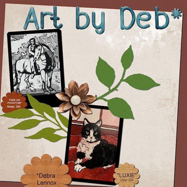
Finished Lesson 3 - I'm getting there! Used the Diamond template this time, featuring some new art from daughter, Deb.
1 point
.jpg.e868a0d9153568bc3a815544e9b65692.jpg)


Resized.thumb.jpg.d25811db03a63358cedab1e79f527635.jpg)


.jpg.ea0de3bb5afd63d9d8be16f6b989c0f3.jpg)