Leaderboard


Popular Content
Showing content with the highest reputation on 08/26/2024 in all areas
-
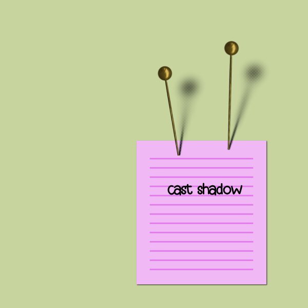
Lesson 7 - Cast shadow When I use the eraser, I seem to get a pattern. I'm not sure if it will be noticable when I post it.
 7 points
 -
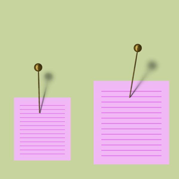
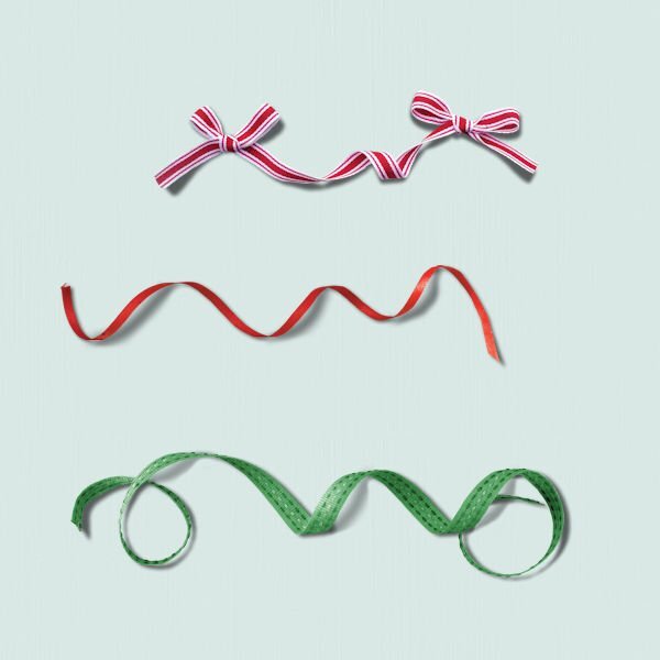
@Jeni Simpson You did very well with those curly ribbons! @Carolyn RyeGreat work. Hopefully, next time you try it (if you do), it will take you less time. @Anja PelzerThe cast shadows are good for both pins. @EukaAlthough you might not use clusters often, remember that occasionally, you could simply have two elements overlapping each other and it will make you think of this shadow trick. @Michele You know, having an easier time drawing downward makes sense. In caligraphy, it is always downward. When you draw with a pencil, it is also easier downward mainly based on the angle of the pencil. There is actually science behind that! @Ann SeeberI think the shadows for your pins need to have a "less blurred" section close to the contact point. @Daniel Hess Your cast shadows look good. On the blue thumbtack, it seems like the light is a little lower on the left side. If you want to determine the light source, draw an imaginary line from the tip of the shadow to the matching tip on the element. That should give you the position of the light source. @Rene MarkerVarious elements COULD be sticking out, whether they are pins, maybe little wooden signs, thumbtacks, and in some situations, maybe a twig could be very lifted from the page. It is not that common, but when you encounter one, you will know how the shadow will be different that the "flat" shadow. @Susan Ewart It is fun to see you practice with 3 different sizes. In fact, the smaller one COULD be meant to be leaning toward us (away from the paper) and if so, the shadow could have been angled toward the bottom. In that case, only the shadow would tell us that the pin is angled. @Donna SilliaYou managed those shadow quite well. You should be proud! @Corrie KinkelThat is a great observation. I guess I included the "wrong" pins in the practice file because in the video, it was in the correct direction. And yes, finding out how the element is lit can make the whole shadowing more consistent. I think that the balloon you used has a perfect shadow, and it could look good on a birthday card! @Linda J WalkerIf you see a pattern in the Eraser, check if there is a texture in the background swatch. That is a well hidden "feature". Remember that all those tricks and techniques are meant to inform you and let you observe and analyze shadows (and elements to shadow) in a critical way. It might mean that you will rotate an element that has a shading that does not match the other elements. It might mean that you will take the opportunity to warp shadows to give more dynamism or use multiple shadows if it overlaps more than one element (especially thicker ones). Don't worry, I won't be "correcting" every single shadow you will apply in your projects and I will probably take shortcuts myself too! Keep it up. I will give feedback tomorrow too, to those who will post their projects during the day.6 points
-
Shadows seem to be my nemesis. However, I finally did complete the last two lessons. I have downloaded some clusters and ribbons for practice.
5 points
-
Lesson 7. This one was almost as hard as the last one. Have be able to lean a lot. Now all I have to do is remember it all.
4 points
-
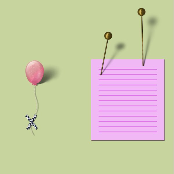
Lesson 7 In the first place I flipped both of the pins because I want my shadow coming from the top left and the pins haven't. For the right pin I went with all the settings as in the lesson. I made the second pin somewhat shorter and at a different angle, Therefore the shadow could be a tiny bit darker because it was nearer to the background. I was wondering what else I could use to make a different cast shadow. I have other pins but they are only different in color or what is on top. When I was browsing through my stash I found balloons and was wondering if I could make it work this way too. The size of the balloon and the washitape on the string is not in proportion to the other elements on this background, but for this trial I don't mind.
4 points
-
Thanks @Michele and @Corrie Kinkel for mentioning going top to bottom for drawing the ribbon shadows. I tried it this afternoon and it went a lot better than going bottom to top. And, that was with a mouse. Now I at least I can do it if needed but I'll probably still hide curly ribbons inside a cluster.4 points
-
Lesson 7 I liked this lesson and even remembered the steps along the way (cause they were short). I finally understand how to use the feathering. Thank you! I never would have thought how this is done. It's pretty simple and fast as well. I tried different settings. I would have liked to try more pins but I'm getting a new hard drive and the data needs to be transferred over so I'll be down for a while. Thank you Carole, for a another informative workshop. I'm sure beyond a basic shadow I would not have come up with these techniques on my own. I'm glad to know them and have access to the videos as well.
4 points
-
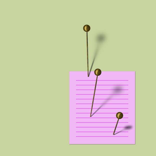
I strongly suspect that I missed completely with the blue pin but I think I did alright with the other three.
4 points
-
Day 6 Just like Corrie, I found this to be logical. It's easier for me when it's logic over creativity. I'll try to do another cluster tomorrow, but for today my eyes have had it.4 points
-
LESSON 7 - SHADOWS - Assuming the light source is the top right according to the highlight on the top of the pins. Here's my attempt...
4 points
-
Day 5 Well, I won't say it was torture, but it wasn't easy. I have to work on the points at which the top of the drawn shadows meet the bottom of the original shadows. I couldn't seem to get them to blend well. It's tough working with a mouse, but I'm getting better at it for this type of technique. Oddly enough I found it easier to draw from the top to the bottom. I don't know why.4 points
-
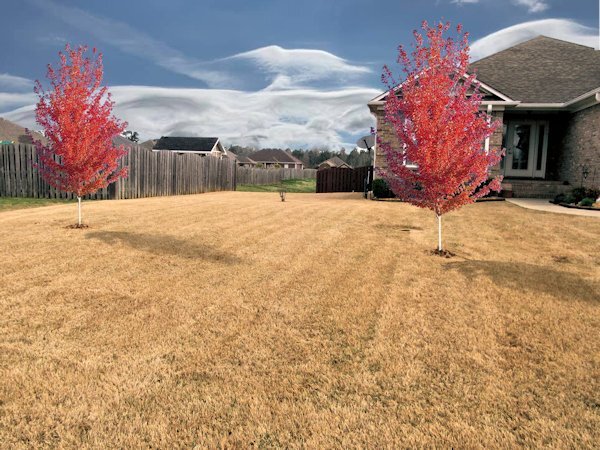
Day 7. Shadowing the pin was quite a challenge. When I got to the second project, I better understood the process. The second picture is our front yard. I was trying to visualize planting a couple of trees. The trees are lifted from a website. The picture was taken on a dreary day, so I replaced the sky to make it more believable.
3 points
-
here is mine3 points
-
Had a heck of a time at first. For some unknown reason, the Gaussian Blur was showing on the settings preview and the Overview Pane but not on the actual canvas. Kept undoing and starting over and it never changed. Finally closed the canvas (which actually closed the program), then restarted PSP and pulled the canvas onto the workspace. Then it worked. I did do the 2nd pin and did the shadow to the left for practice. Since it is practice, I didn't consider light source. I wanted to get to know the steps. Now off to think of other items this would be used for...
3 points
-
Michele I agree and I also draw from top to bottom, maybe it has something to do with working with a mouse and/or being righthanded. It goes more fluently that way.3 points
-
Jeni these lessons let you look critically to your own work (or that of others) as well and help you understanding better!3 points
-
Day 5 is a miss for me - I have tried but my mouse refused to co operate - fortunately, I rarely use ribbons and at least I have good notes now on what to do should I need to shadow them. Day 6 was easier and it is logical but oh boy, I needed to concentrate without interruptions. I don't generally use clusters but it is nice to learn how best to shadow and showcase them.
3 points
-
Yes it did, I'm good with logic!3 points
-
THNX I saved this. Works great.2 points
-
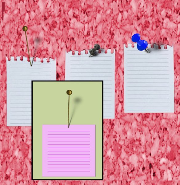
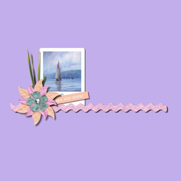
My Number 7. Used a cork texture for the background and some text, 2Peas Champagne on the paper.
2 points
-
Day 7 Thank goodness for an easier lesson than the last two. 😄 I didn't realize the highlight on the head of the pin was backward until I was done. Instead of starting over, I selected and promoted just the head of the pin and then flipped the image on the promoted layer. Thanks for a wonderful workshop, Carole. I'll be going through it again in the future so the techniques stick.2 points
-
Thanks for a very interesting workshop Carole - a lot more practice is required to master some of these shadows but hopefully in time and maybe with a new mouse I will get there.
2 points
-
You can use psd files in Paintshop Pro. I get PSD templates rather than single layers as in jpgs and TIFFs. That way they are already in layers and makes for easier moving of elements, if required.2 points
-
I open PSD in PSP and save as a .pspimage to preserve the individual layer format.2 points
-
The PSD file is the one you want as it will have the elements on different layers.2 points
-
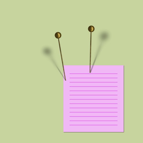
my day 7 I hope this is okay, I tryed with both pins2 points
-
Lesson 6 Extra Wowzers people, this is some kind of hard stuff! I got pretty mixed up and I made a cluster (I wont be quitting my day job anytime soon) that some of the shadows wouldn't show up because of the angle. oops. I finally had to name them with the names in the video (tag, ribbon, frame, background) because I was getting so mixed up with where I was at. I had a leaf, a tag, a plant sprig and a background. I did the shadows even though you couldn't see them (because of the angle). I like knowing how to do this technique, and I know I need to get a lot more practice. It probably wont show up, but I do see the difference on sprig as one shadow on the sprig is darker than the shadow (from the flower) on the background.
2 points
-
I think I got all the steps here, don't think I missed any. I would not be able to do it again without the video. And personally, I feel 'tricky and tedious' may be an understatement.
2 points
-
You found layered clusters, very nice I'll have a look there because I have a couple of clusters that are in a kit but they aren't layered so I only can shadow on the outside.2 points
-
Mary have a nice trip with your daughter and maybe there will be photos of it in some project to come as well. See you when you are back!1 point
-
I think you did a nice job shadowing the pin!1 point
-
I've been behind in this workshop - WAY BEHIND! I've been getting myself, the car, etc. ready for the trip I will be taking with my daughter next week. I've kept all the stuff for this workshop in a folder that I'll be taking on the trip, but probably won't post anything until I get back in September. This workshop will take going over many times, I think. I've even thought of using a lamp to check out how the real shadows show on a flat surface. Well, might post results in September. Thank you, Carole. Really have enjoyed looking at the videos and everyone's take on the projects. All of you have given each of us much to think about. Love you all!1 point
-
I'm top to bottom too, using a mouse, a craft knife and and glass cutter. I'm a lefty and have more control coming toward myself.1 point
-
Thanks Jeni, I love fonts too and learning more about them is interesting. I only happened to read this book when my friends were moving and thought I might like it. I didn't know that about Serif fonts, that's neat to know. I've learned about X-height, baseline, wasteline, ascenders, descenders, majuscule and miniscule etc, from doing Calligraphy years ago but know very little about fonts, typefaces and rest of the lingo that goes along with them.1 point
-
Lesson 6. I have really found this hard. This has taken me quite a few hours to get to this. I have really learnt a lot.
1 point
-
Lesson 5 Curly Ribbons Oh dear, I'm not sure my hand was steady enough for these. And, I did give them a go, although I'm having trouble with lesson 6, not my best one, I am sure. Funnily enough, when I uploaded my lesson here, I noticed mistakes and had to correct those. Easily enough with the warp brush and the eraser.
1 point
-
Thanks for the reminder for hiding the shadows. I only did it the once. I had to laugh, this concept and it's steps are logical and easy for you and I struggled to keep it all straight in my head. Doesn't this remind you of how we each were with Scripting (you got it, I didnt). 😅1 point
-
Often, the harder (or pickier) tutorials turn out to be some of the most important ones I've needed to learn. I think this one is an important concept to understand. I can see there is a pattern to the steps that I need to get straight in my head. That will come with more practice I hope. Or...is this the "Shadow" version of scripting for me. hahaha1 point
-
The font is Neug Asia, probably from CF and most definitely more readable the bigger it is. I just learned that. I'm reading a book called Just My Type, about fonts and a bit a history, politics and some humor about fonts and how they all started. One of the things when Type designers were designing was how readable the font(typeface?) is when it's small. Some fonts are great small and are great fonts, but only when they are big. I noticed if this got too small it would make your eyes go wonky.1 point
-
For me this is logical and therefore not very complicated. No problems with unsteady hands here! I only had to keep my focus on the layers and found the trick in the video to hide the shadowed layers temporarily useful. I have no layered clusters in my stash so I made one just a simple one from elements I have. I find it easier to make a cluster when I'm working on a project and I'll will pay more attention to the shadowing on them if needed.
1 point
-
Rene I like your cluster but I hope you don't mind me saying so, but to my eye some of the shadows you used are not coherent with the light coming from the top left. For instance the big red bauble has a shadow on its left side where the light is coming from as well as some parts of the white ribbon and the greenery.1 point
-
I just wanted to say this has been very informative. I have watched each days vid and played around some. I don't do a lot of clusters, ribbons etc. but if I do, I have all the links saved including the link to this page. I have read a lot of Cassel's comments to each member and some of the comments by other members. There is a lot of useful info in them that I may use at some time. Thanks Cassel and everyone that posted there projects and or commented on others.1 point
-
and now the with 2 other ribbons1 point
-
Let's give it a try. Make sure to compress the image enough. Even 500KB can add up when we have dozens of participants and several lessons each 🙂1 point
-
That's exactly right. I'll be doing the Labs at some point, but I only have the time for the tutorials right now.1 point
-
Yes, all the tutorials in The Lab SHOULD be listed also in the Creative Scrap. Otherwise, there would be no way to know where to look when you want to create a particular element/effect.1 point
-
It's like a kid in a candy store! I look through the previews when I'm looking for something specific because we don't always call things the same. When I'm simply teaching myself, I go through it alphabetically which I'm doing right now. I'm skipping the ones from the Labs because I want to do those in full.1 point
-
This came out great, Michele. Isn't it amazing what we can create with Carole's tutorials? I remember looking for the first time at the Creative Scrap Tutorial Preview Photos, and it was like Christmas for me. The Tutorial Preview with the photo is still my go-to when I want to create something more than the Tutorial Alphabetical, which can be very useful sometimes.1 point
-
This was a challenge with 2 faces for me. The easy part was the streamer which I already had done some time ago and the metallic words for which I used a gold metal that I had in my patterns from other projects. Those ..... knots gave me a lot of trouble!!! The drawing of the path with the pentool went ok now I knew that the tracking had to be much higher! But cutting the path and making the different parts of that path on their own layers didn't went so well. Sometimes I was deleting on the wrong layer and had to do it again. I started 3 times anew and was almost ready to cheat with a rope with knots that I had in my stash! On my photo I used a mask that came from a template by Lady22 and the bouquet from my stash went in between the streamer. I see now that I probably should have attached my rope with a pin or a staple, but for now I assume I glued it on the wooden background!🙃 Carole I have a question on how to shadow that ..... knotted rope and I'll put it in the Q&A for Sunday if there is time enough that is.
1 point
-
My hand is getting to shakey to do a decent job drawing with the pen tool using a mouse these days. Athough I used a cass rope, It looks more like string, and hides the shakiness. I went with a goldy metalic title. Created the curly streamer, placing it under the flowers. I will remove the flowers, streamer and knots to make room for some info at a later date. I have only ever photographed 2 birds with their uropygial gland exposed. Also known as the preen gland. It secretes an oily fluid which the bird uses in preening its feathers.
1 point