Leaderboard


Popular Content
Showing content with the highest reputation on 01/26/2024 in all areas
-
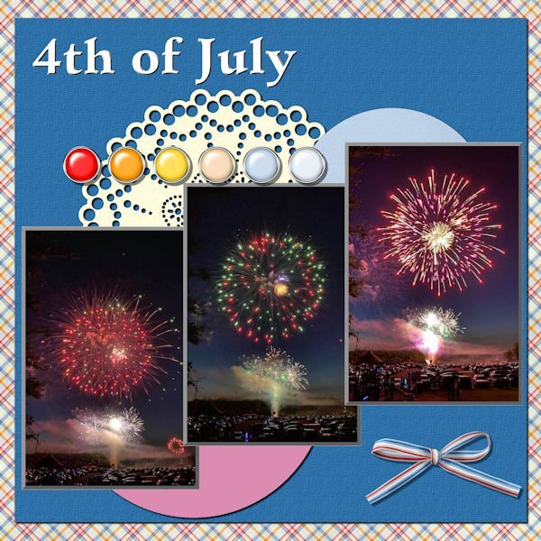
Last - Template 7 Diamond. All the papers and the brad group are from Cassel's Fire and Ice kit. The bow at the bottom is also from Cassel. The font is Violenty Script.
 7 points
 -
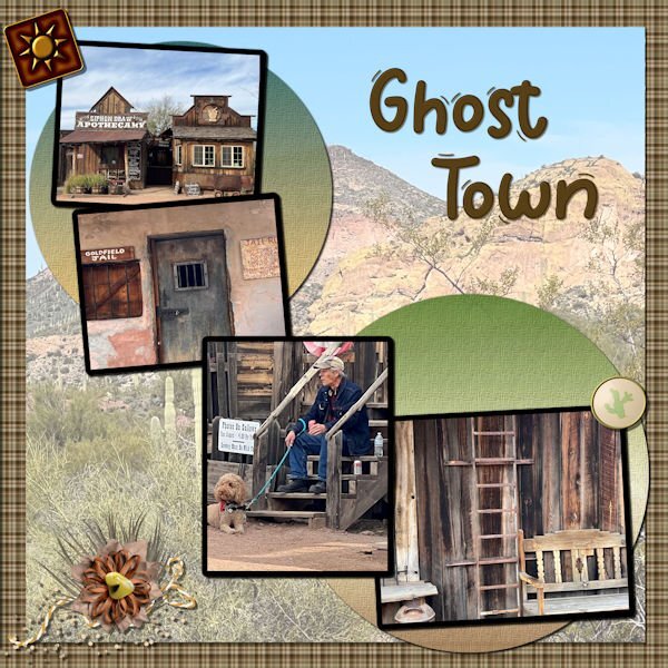
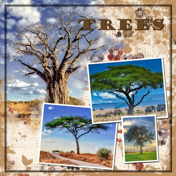
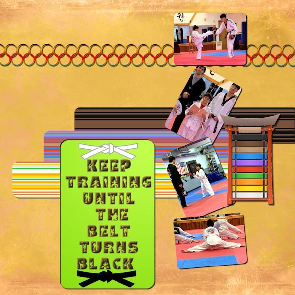
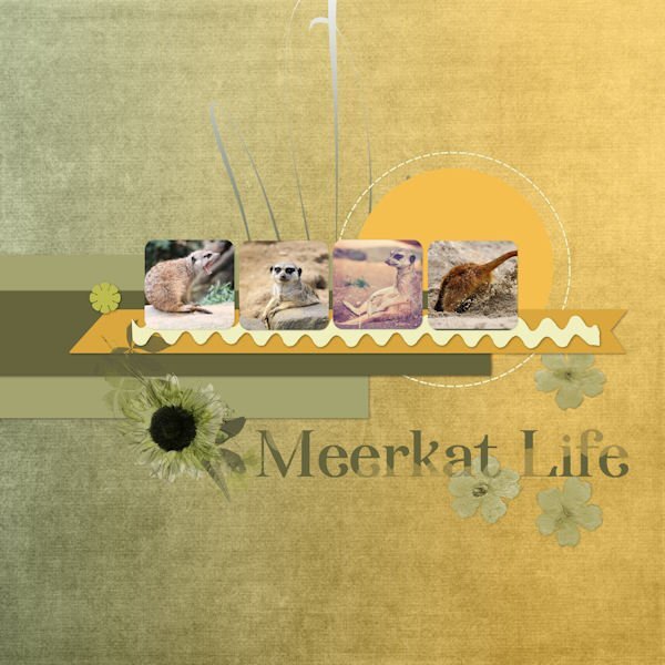
Template 7. The background paper, the 2 round papers, and the elements are all from my desert kit we did last year. The font is Wigglye from CF. The paper on top of the background paper is a picture from the same group as the 4 pictures that are dominant; however the opacity has been reduced, the underlying paper is white, and the blend mode is Multiply. The font was innerbevelled and shadowed.
6 points
-
I created this one for the challenge --- https://scrapbookcampus.com/invision/forums/topic/1634-january-string-of-words-challenge-2024/?vgo_ee=WImv8ZbX0V2OVMo7jXIFuXLkR8paCHociubarwrrq%2F1IzIbO6E4y%3Akyh5hX%2Fm7YnWp%2FA5862zDrk%2BGomvFGG%2F
6 points
-
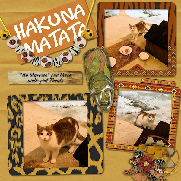
I take it: pets. 😺 Here are my Ferals with better photos. I call the young male Thunderbolt and the adult is Mommy. I used a new kit from Gingerscraps called The Circle of Life based on The Lion King. The new word is: Valentine.
5 points
-
@Cassel I just want to say "Thank you!" for the 2024 Template Workshop. It proved to be a wonderful refresher course since I took the 2022 Challenge. I did learn some new things, used kits from other designers where I have been prone to use my own things lately (which isn't so bad I guess); that neat tool of using blend modes and opacity to produce new takes for backgrounds; also learned new things to think about from the other participants in this workshop. Thanks again.4 points
-
"I take it" Children. NEW WORD -- Pets. (dogs, cats, fish, mice -------)
4 points
-
The mitts strung at the bottom really add a special touch.3 points
-
Wasn't aware of that script. I like the effect. And the colours and the way you've used them are really great.3 points
-
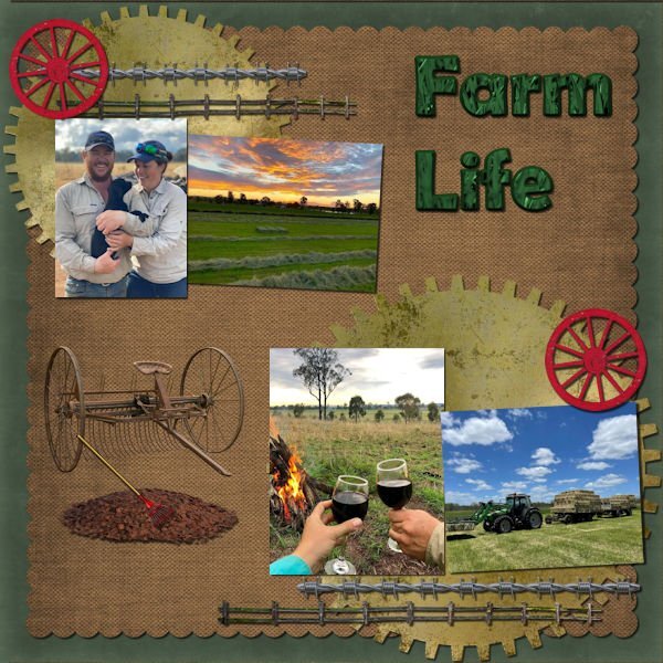
Template 6 Diamond. Because one of the pictures was horizontal, I had to change the layout somewhat. I colored and textured the 3 ribbons; that Winter Vibes font that was talked about and several of us downloaded it, the sticker and the mitten banner are mine as is the background paper. The Hot Chocolate card in the center is from Pixel Scrapper – Jessica Dunn (one of my favorite developers). The 2 hot chocolate buttons holding the mitten banner are from Pixel Scrapper – Brooke Gazarek. The 3 generations are from different families of mine.
3 points
-
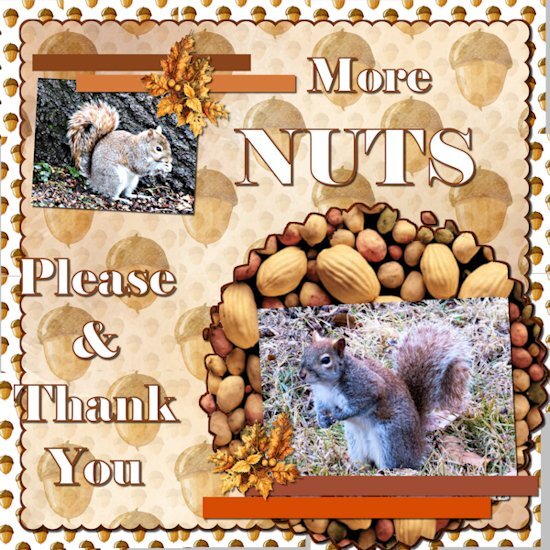
Here is my take on day 7. I kept hem hawing about what to do for this one. I got lucky and got the picks in my yard this morning. The squirrels were really active today. Yesterday we had freezing rain from about 3AM to noon. I did not go anywhere.
3 points
-
I am glad to see those workshops being enjoyed by the participants, even though they are repeated. I guess the next workshop will be an easy one for you!2 points
-
I just check it out and it's a cool script. I'd also add to watch the video, it's very good. Michele, does all those brushes shown in the video come with that script? that alone is worth the price!2 points
-
These are perfect fireworks! They look like flowers with a stem.2 points
-
Thank you. Check out the script in the store and you'll see the flexibility it offers. https://creationcassel.com/store/index.php?main_page=product_info&cPath=7_9&products_id=4762 points
-
Lesson 7 done! Cassel, that you for offering us this free workshop. It has been a thoroughly enjoyable course to take and your explanations are clear and to the point.
2 points
-
Day 7 I changed the template completely (started with the Diamond Day 7 template). the little tag is where the journal spot was and the title is in the same spot as the template. I did add shadows but they arent going to be visible, except on the screwhead. I originally wanted to use a label to cover up the alligator clip but thought it would look more "specimen-y" with it. the title and the outer frame have an inner bevel. Filled with a gradient (all the frames) and a pattern called Black Gold for the fill in the title. Fonts used: Herkings (Creative Fabrica), and Arial (Windows) Tag: my tag from the Vector Workshop (highly recommend this workshop!) Thank you Carole for another wonderful workshop. I'm always so delighted to re-remember the things I forgot from the last time through. I saw so many beautiful and inspiring layouts and often thought; "that's awesome, why didn't I think of that"?
2 points
-
Well here goes with my number 7 It is rather busy but I like it anyway.
2 points
-
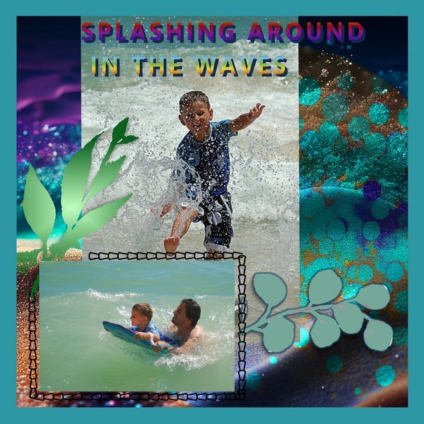
My son and grandson having fun on vacation in Mexico Summer of 2006
2 points
-
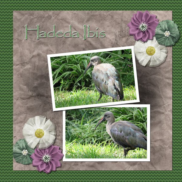
Lesson 6 done! We have a flock of about 10 Hadedas that visit us every day and most times spend the day in our garden. They are large birds (about 76 cm (30 in) long) and very noisy. Their call sounds like their name HA - DE - DA. When they make a noise, don't even try talking because someone standing in front of you won't even be able to hear you. I love these birds.
2 points
-
Template 6. Changed the layout by moving the title to the bottom, moving the pictures up, adding a journal sheet, and removing some of the elements replacing them with my own elements. I had fun – and learned something new – to put a paper on top of the textured layer and working with the blend mode and the opacity of the paper layer. Great stuff!! The title is Annie Tobin’s font (she was such a wonderful lady) which I glittered and innerbevelled. The heart in the top left corner is from CF and I innerbevelled it. The bow I made with Cassel’s Bow 2 script. The Santa sign is from my stash as is the poinsettia cluster in the bottom left corner. The star tube is from Cassel. The pictures are from scanning 1991 35m prints. They were in bad shape and I used every trick that PSP has (well almost). I had forgotten about fade correction, but Cassel reminded us of that tool and I used it and de-noised it to the max and sharpening it to the max. The difference is amazing. That trip was special and finding it was such a gift. You can't imagine - as we went down the road into the town, it was dark - everything was closed up tight - no lights - off to the left at a distance was an oil drum that seemed to have a fire in it - something that the people on the road in the depression might have used to keep warm or cook food - the scene was really eerie. Dolores really wanted to turn back, but I just felt we had to go further. And then, when we turned that corner it was like Judy Garland opening the door into Oz - from blah to radiant color. I will never forget it.
2 points
-
I have had a lot of fun with this Workshop and learned so much. Unfortunately, for the next week, I will be without a Windows computer. I will miss working in PaintShop very much, but my daughter has a full schedule of things to do in Fredericksburg. I am hoping to get some great pictures! I made a quick roadtrip template. Thanks to our vector workshop, I was able to make a little car that sort of looks like our Toyota. The map is from Google. See you in a week.😪
2 points
-
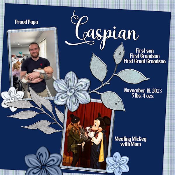
Lesson 3- Bit behind but it's what I can do right now. Font is Villanesia and Yoshieka. Flowers are made with cass-folded flower1 script. Caspian is the first child from my second daughter's son and wife, Connor and Whitney.
2 points
-
I cannot agree more. Very nice layout, Mary, and a great story to remember.1 point
-
Hi Susan and all , I would like to say Thank you very much for the many hearts and likes among my few graphic works. I appreciate them and I'm really happy about them. @Susan Ewart yes, that was the wedding of one of our godchildren >10 years ago. I had a large, extensive photo book made for her and for us using my framed and scraped photos. I love to "weave" embellis (often a lot of erasing work, but it doesn't take much effort for me if the result is consistent)
1 point
-
To quote the captain in "Galaxy Quest" - "Never give up! Never surrender!" Galaxy Quest is one of my favorite movies!1 point
-
SUBSET. You know, JK likes mountains. I use pics he sends to me, I use right now a mask 'Send Me an Angel' created by me in PSP.
1 point
-
I just wanted to say Thanks to Cassel for this great workshop. I have learned so much. I never ceases to amaze me seeing all the wonderfully creative and different takes everyone has posted from the same few templates. Well done everyone. I will be sure to keep checking in for a few days too.1 point
-
Have a fabulous trip Donna. I'm looking forward to seeing the photos of your adventures.1 point
-
Cristina thank you and over here in the night from last Sunday on Monday all the snow (we had less then you got) melted away and the temperatures are now + 12C, but with a stormy wind and some showers. I was happy to go for a walk today as I always do on Tuesdays with a friend; we are doing that for almost 20 years now!1 point
-
L4corrected. btw, Carole, thank you very much for nowaday activity:)))))
1 point
-
Day 7. This for a bit of a test for me, but I certainly did learn a lot.
1 point
-
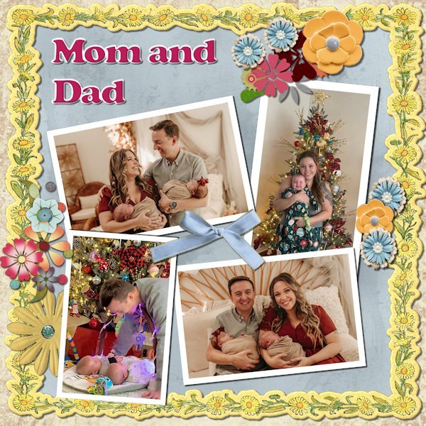
Time to pay tribute to the parents!
1 point
-
Day 6. I think this is my favourite so far, I added a little extra to the texture layer once I had merged it by adding another raster layer on top, Using a picture tube to add 2 spiders then using the luminance blend mode.
1 point
-
Workshop Template 5 Diamond. I think I am tired out and there is still 2 more project day templates to go. Thinking about the theme (pictures, etc.) is now the hardest part. I texturized and colored the 3 small papers (that was fun) - I used "tiling" under effects>texture effects for the first time and I like it - gives me some ideas for making ribbons. I played with the Change to Target tool on the flower element in the lower right corner. Interesting that this time there was no TITLE layer. I guess the journaling tells all.
1 point
-
Lesson 6, cass-Template6.jpg with the kits; The Master Of Time Sampler by Malo Scrap & Christmas dream by Malo Scrap
1 point
-
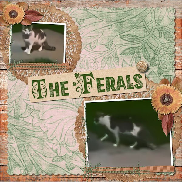
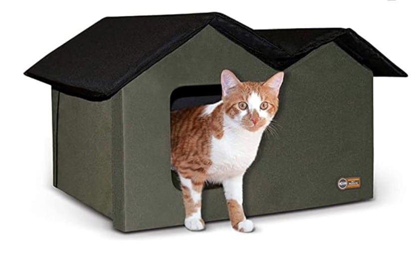
LESSON 7 - A classic scrapbook page, hoping to overcome some really lame photos clipped from a video. A little more involved than I usually do but I think it looks nice. All the elements and papers came from a kit called True Heart Digitals and the fonts are am-index and flora garden. The top cat is a mature female (I think) and the lower one is probably her nearly grown (possibly male) kitten. They seem to act as a bonded pair. She hides under a neighbor's car when I come out on the porch whereas he is bolder and comes running, meowing at me for food. I now have a Cat Cabin on the porch with straw for bedding. I've included a promo photo of it here.
1 point
-
I'm not happy (again) with this layout, but it is what it is! I haven't kept all the different techniques I used on each of the elements, pictures, font, papers; but, I did use different blend modes, and I began to take off when I changed the hue>saturation>lightness on the background paper (which was from a marisa lerin kit) and then played with the blend modes and opacity - which worked with what I was trying to do. I played and played and played around with trying to figure out what to do with the elements in the lower left corner and ended up with a doily since it is round to balance the round paper in the top right corner. Of course, you can see that I also played with the placement of the picture layers and placed the title at the top.
1 point
-
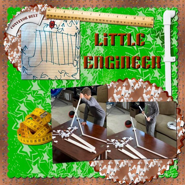
Day 7 Photos of my youngest grandson are from my daughter in law. Thomas loves to build things. The background was created using cass seamless background script with tools from Marisa Lerin. The pvc pipes, ruler and measuring tape were all from in Canva. The pvc patterns were created using cass scatter script and then cass seamless background. The green background paper was actually created by Thomas in Procreate. The font is Super Blash from Creative Fabrica.
1 point
-
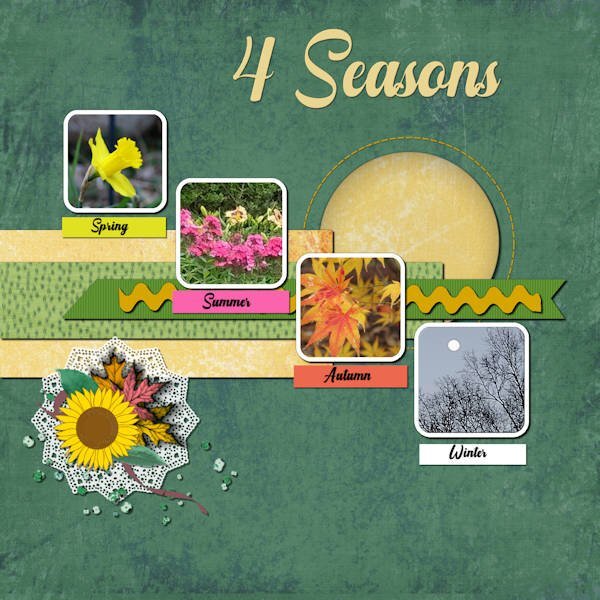
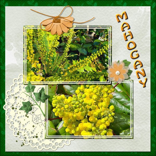
Day 7 Before we got the cold and snow I noticed that the mahogany bushes in my neighborhood already had big fat buds and I have a couple of photos from another year where they are in flower. They mostly flower somewhere in January/February at least where I live. I wanted to use those photos for day 7 and used the diamond template but I rotated t because my photos are landscape format. When I work on something else I often start with a template and rotate it to give me what I want. The colors were a bit of a challenge because the colors of the photos are vibrant and I didn't want to overpower those with vibrant colors of the papers. I couldn't find a kit to my liking so I used what I have is my stash where I store all kinds of things that I find somewhere, mostly for situations like this. So most of it I can't attribute to someone. Besides that I changed some of the colors as well. The doilie is from Marissa Lerin in the kit Fire and Ice and the font is Hobo.
1 point
-
Lesson 3 done!
1 point
-
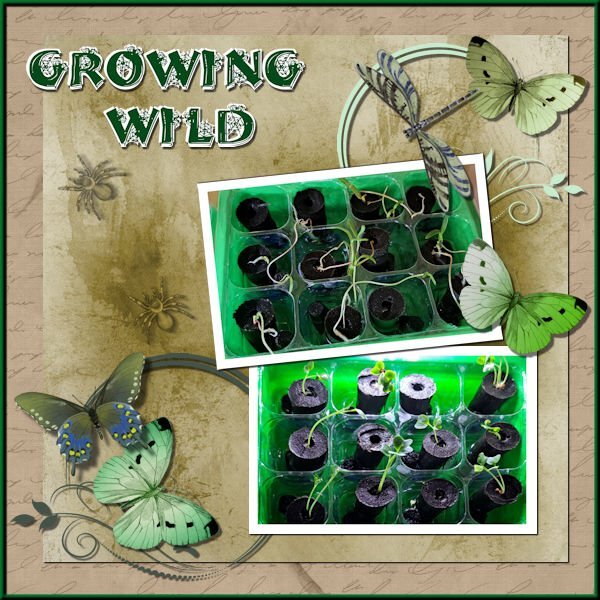
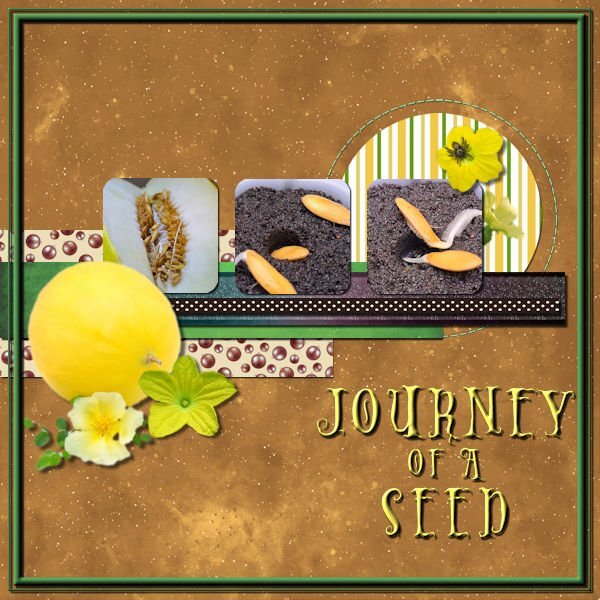
Day 5 done, I decided for this one just to focus on one seed, the Melon that I threw in just for fun and didn't expect to sprout. For just a few days it's doing really well. The font is Holiween one that I really like, all the elements are melon flowers hopefully I will get to see some one day and I added a tiny spider, just because. I used techniques from one of the earlier lessons to add a frame. I didn't like the ricrac so added a second ribbon instead.
1 point
-
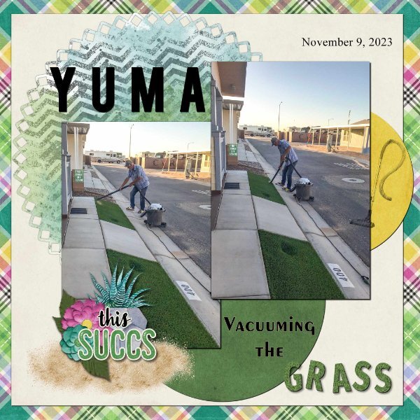
Day 7. Thank you Carole for the templates. I used the diamond membership template. I used a kit from Connie Prince Prickly. Font Fira Sans ExtraBold, Exotc350 Bd BT and Times New Roman. I used Cass GrassTexture script on the word "grass". Speaking of the clip to it script, it is one of my most favourite scrips, I use it all the time when working with templates. I really enjoy seeing all of the great layouts.
1 point
-
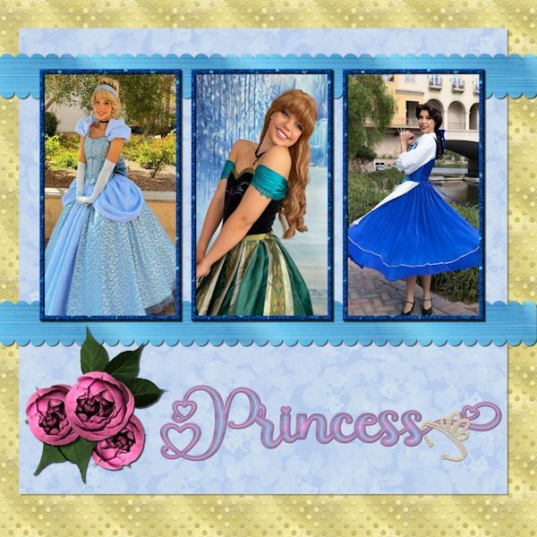
Day 6 - The photos are compliments of my future daughter in law, Lane. She works for a company that does Disney parties for children. The gold dot background is one of my own as is the blue overlay with a lowered opacity. The scalloped ribbons are my own texture, scalloped using cass quick scallop script(what a time saver!). The roses and leaves are from a package that I purchased from deeezy.com. The font is Hilender Rhapsody from Creative Fabrica. I used layer styles for the font, but wanted it to "pop" more and applied Hue and Saturation. The crown is a preset shape that was created from a font. I used VectorTube to apply the diamonds, a directional tube that I made using cassdirectiontube script.
1 point
-
Carole, thank you so much for the Fade Correction reminder. I remember learning this technique and completely forgot it. I will definitely remember it for future uses. Here is the template with the pictures corrected.
1 point
-
Day 6. Most graphics for the Greek challenge at DS. Zebra paper by Marisa Lerin. Font is Lust.1 point
-
Day 6 I used kits that I made and the font is World Series.
1 point
-
Lesson 2 done. The photos used on this page were obtained from royalty free websites, sorry, I can't remember the names of the websites. Thank you for the lesson @Cassel. Everything is so clearly explained. I took many courses during the '90 learning how to use Paintshop Pro's many features and your lessons are helping me to refresh my memory.
1 point
-
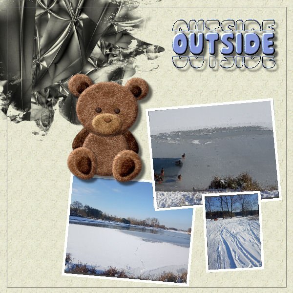
Day4. Outsige is fine but better inside. Not only Teddy Bear thinks so; ) Done without scripts but probably it would be easier with them;)
1 point
-
Regular Template #5. Took a few liberties with this one and changed some elements. All pix from Unsplash, as usual. I'm having a hard time trying to keep up with all the layouts in this workshop. So many and so much variety and creativity. Carole must be up all night looking at them and commenting. Applause to y'all!
1 point
-
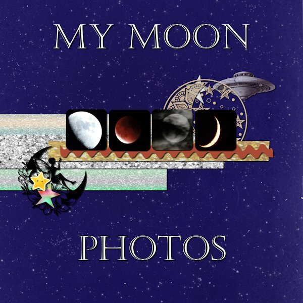
Day 5 Moon photos are mine. Font is Castellar. I have lost track of where the background and other stuff are from. I didn't make notes while working on it.
1 point