Leaderboard
Popular Content
Showing content with the highest reputation on 01/17/2024 in all areas
-
12 points
-
11 points
-
11 points
-
here is day 2 I used again the QuickTile scripts to make patterns for the papers, fonts are Campanile and Fette Steinschrift, the Lego Blocks are a picturetube by Cassel I made the masks so -- I turned the grey and black photospots to white and used the new masklayer in black, so no need to invert the image.11 points
-
11 points
-
I have had a go at this first one but is taking me longer than it should as I am suffering with an inner ear condition making me a bit/very wobbly headed. Anyway, I will be going at a snails pace and dependant on weather me head feels it is screwed on alright shallbe posting my efforts. Hope everyone is doing ok.11 points
-
10 points
-
10 points
-
9 points
-
9 points
-
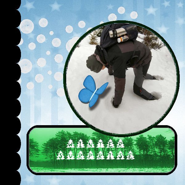
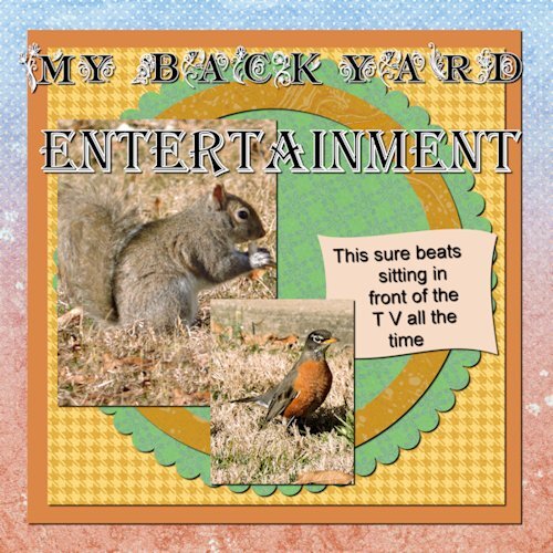
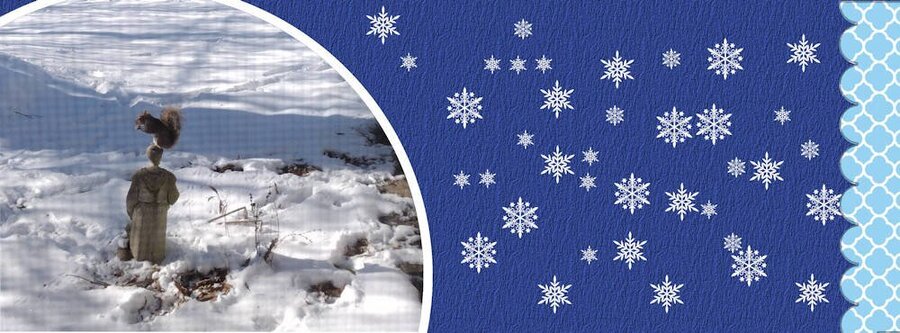
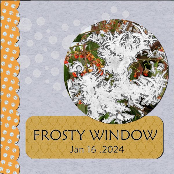
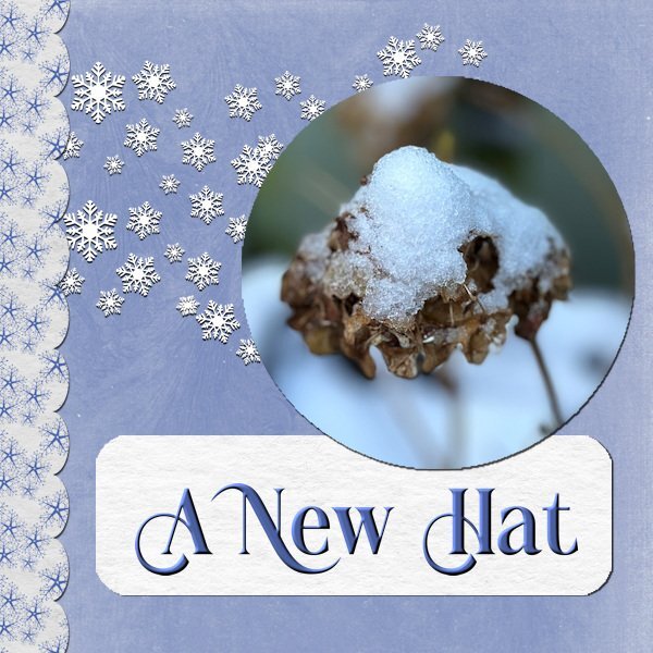
Extra template 1: Kit used: DSAFeb14-MarisaLerin, changed the color of the paper 087 to blue with Hue Saturation Lightness; removed the arrow head element and replaced it with an arrow from the preset shapes; removed the dot element and replaced it with paint brush snowflakes that I created in one of the labs; changed the background paper from the kit with hue saturation lightness also; and the scalloped paper layer in the template I colorized to blend in with the picture; the font is Bambe from CF. The picture was taken outside my window (hence the screen) on Tuesday afternoon. Our snowfall was about 4”. This morning we have 4 degree weather, but it’s nice and cozy inside. We’ve been asked to conserve energy so no lights unnecessarily and we hand wash dishes (shades of my childhood). It was fun watching that squirrel. He would hop on the statue to eat the acorn and then hop down and grab another one from the leaves on the ground near the statue and then hop up on the statue again to eat it. He stayed long enough for me to grab one of the great grands I live with to show them.9 points
-
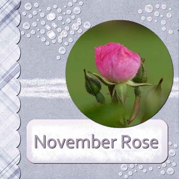
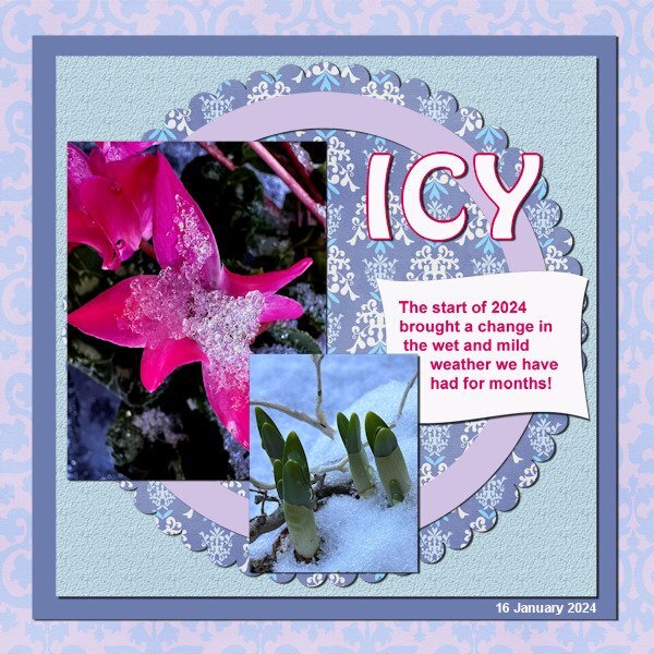
Day 2 Here I used a kit called Kiss from Marisa Lerin, which I had in my supplies for a while. It is all blue and because there is pink in my photo I changed some of the blues a bit for coherence. The circle and the dark blue paper are just colored with a color from the other papers The title font is Hobo and the journaling is Arial. The photos are taken today in my courtyard. I'm happy to be doing some simple scrapping after all the months of doing the scripting course, which was time consuming and intens but very rewarding and I loved it.9 points
-
9 points
-
I am waiting on eye surgery so small fonts frustrate me at the moment and zooming in and out is so tedious. So, it is large fonts for now. I will have to try wrapping around the text later so I moved the text box to get everything in. Had some issues getting the inner paper to match the colors of the dress but, surprisingly, adding a bevel worked as altering the bevel settings can alter color depth. I was confused about the "layer...new mask layer" instructions & image in the video as I do not have that setting but I found it in the submenu for "new layer" in PSPX8. Can't get used to using those "Cntrl+C" etc commands. I find it easier to use my mouse and the dropdown commands at the top. Just a personal preference. It's a good thing that PSP has so many redundancies. Font is Comic Sans MS and the papers are from kits by CathyK and Brown Owl. I snagged the photos from the internet as no one wants to see a photo of my messy sewing room and I sure don't want to clean it up just for this lesson. However, the larger photo does mimic the inspiration board that I do make up with swatches, trim & ribbon scraps, buttons & thread that I select before starting on a garment. Sharon9 points
-
8 points
-
8 points
-
Template Workshop #2 At first I thought this is a lot of work to achieve the same thing that I could a different way. But the more I worked with it and thought about it, I do see where using masks like this can have it's benefits. I do have a template that I started setting up with masks to save as a psp image to use later. Thank you for the lesson. 🙂 Oh, I used papers from my own kits.8 points
-
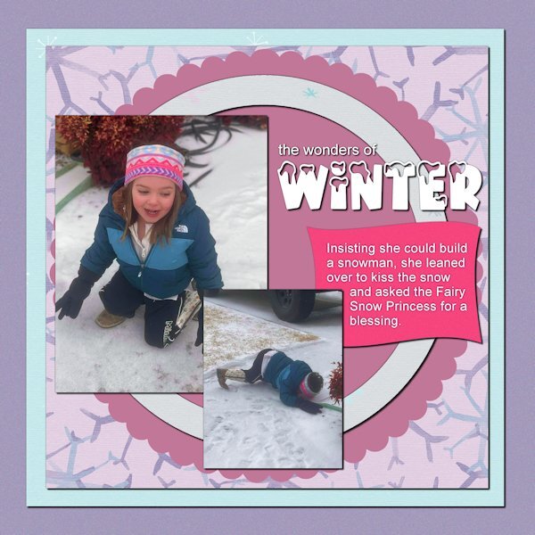
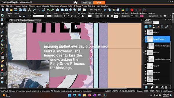
Day 2 - This is my 3-year-old great-niece Amelia. It looks like she borrowed gloves from her dad. The papers are from a collection by Marisa Lerin called Winter Arabesque. The snow-capped font is Winter Vibes from Creative Fabrica. I've also attached screenshot of a recent problem with wrapping text. Even after clicking the checkmark for ACCEPT, any change, e.g., moving, changing size, or duplicating the layer, removes the constraint of the selection. This is a recent phenomenon. My PSP 2023 version is 25.2.0.58 x64.7 points
-
7 points
-
What a nightmare !! My laptop keyboard has decided it will not delete in PSP 23 therefore I could not use the template. There is no other way I could find to delete except to delete the whole layer. I put another keyboard in ..no luck . I used another computer no luck. It would delete in any program but PSP23.So looks like a reinstall. I tried in PSPx8 and hey ho all working again on the same laptop! So I have managed to put something together for day 1.Probably a lot of mistakes but at least I didn't loose the will to live !! It is a shot of my son on one of his diving jaunts .The background was just using a blue from the photo and adding a texture. .The other papers and graphics were from a kit called Dancing with whales.7 points
-
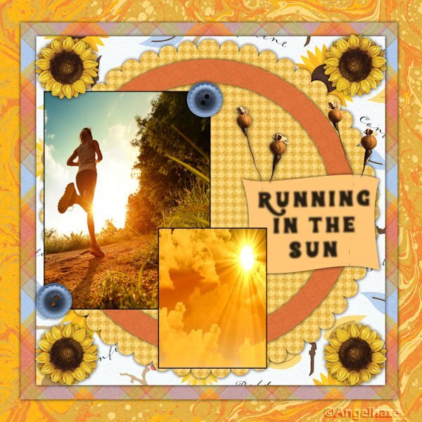
Day 2: I tried to stick to the template but I couldn’t get it to work for me without some changes. I suspect I could keep on changing my mind about the theme and layout for many days so time to stop and move on… The photos are copyright free from Freepik. The Papers are from a kit called Reach for the Sun by Jessica Dunn. The font is Santa.7 points
-
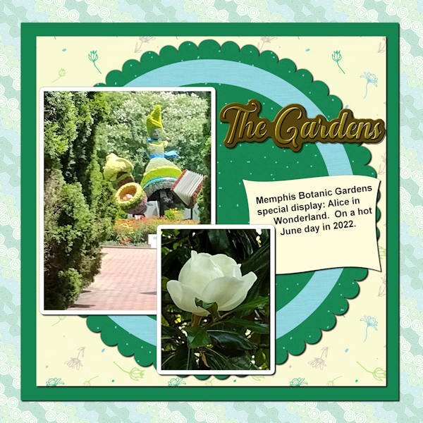
On to template 2. Kit used is PS_Jessica-D-wintertropics-mini – the Background paper (reduced opacity), the scalloped paper and the paper in back of the scalloped paper; the title is a metallic title I made in a lab; the paper above the background was simply colorized as was the circle element which was texturized. I’ve used these pictures before except for the magnolia blossom – it was on a tree in the gardens and was just beautiful – perfectly formed and I’ve been dying to use it. The font is Arial for the journaling.6 points
-
5 points
-
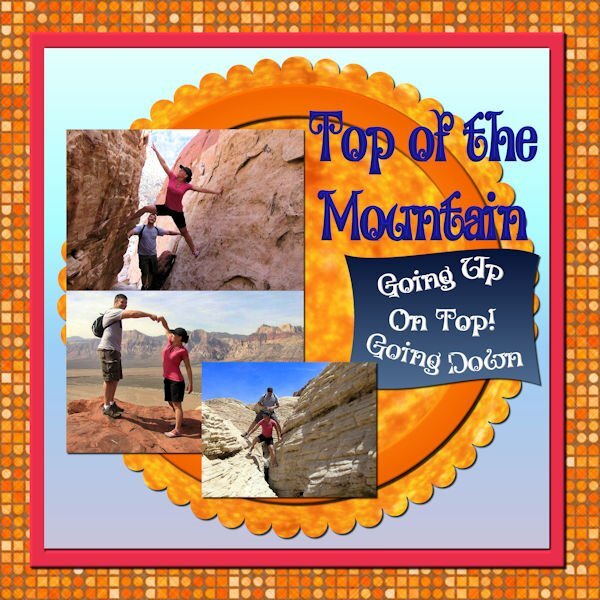
My daughter and son in law loved to hike in the desert around Las Vegas when they lived there. The background is from FF as is the pattern in the scalloped layer. Pictures are from my daughter. The font is Alister Oblique, but I don't know where I got it. The pink square is the color of my daughter's shirt. The other backgrounds are gradients. Beth now is in Fredericksburg, VA, although the Las Vegas house is going to be their retirement home. I will be computerless from Jan 24th to Jan 31st as I will be visiting her in Fredericksburg. Old Town is charming and there is lots to see surrounding Fredericksburg. Needless to say, I will be taking lots of pictures.5 points
-
5 points
-
Day 3. Panicked a bit when I saw a different template in some of the members comments until I saw a reference to "diamond" so I guess that group is getting different templates, I hope, as I just did my day 3 using this one. Now that I have the use of papers and selections & deletes in the right way, I hoped to get to that wrap text that I missed in the previous lesson. PSPX8 is supposed to have a wrap text feature but I sure can't find it. I got into the Corel site and found it being demonstrated and I did what their video said but to no avail. PLUS, when I try and type in that selection area, the text defaults to a huge spacing between lines. I played around with the "leading" settings but still got huge spaces between lines. So, back to separate lines of text on separate layers and moving them around manually. At least I know how to do that..... tedious but less frustrating. The subject for the picture is shasta daisies, one of my garden favorites. I cut them to the ground in October and they were up and blooming again in early December (it helped that we had no snow yet).4 points
-
Day 3 After the snow photos of day 1 and 2 I used 2 photos of the same Hortensia that was in my day 1, but here in full bloom. I used the extra template for this one and colored the leaves with the technique of the lesson. The papers are my one creation and I had them in my stash. The flower elements are by cpjess-old fashioned summer. The button is one I use often and recolor as needed. The butterfly I forgot where I have that one from. I have accumulated a whole bunch of butterflies. Last the front is Bastro.4 points
-
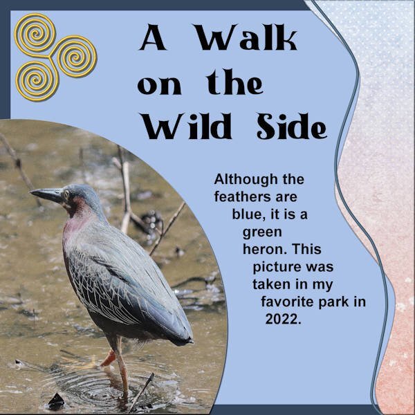
Trying to catch up. Day 2 Diamond template. The paper on the right side was taken from a kit: cpjess-reach for the sun; the background paper was colored with a color of the bird as was the journal paper; the triple spiral element I made in a recent lab; the title font is Black Castle (Creative Fabrica font); the journaling is arial. Again the text tool to determine the size of the text was wonky – don’t know why this happens as it doesn’t happen except once in a while. My daughter and I went to our favorite park in Memphis (not far from home) where there is a lake. The lake has “Canadian” geese that live there year round and ducks, but occasionally a heron stops by – usually a great blue heron, but sometimes we have other herons that appear – I have a picture of a LITTLE blue colored heron as well as this one of the green heron.4 points
-
4 points
-
4 points
-
4 points
-
Day one Yesterday we had a tiny, tiny bit of snow with temperatures between -2 C at night and +2 C in the daytime. Here in the Netherlands we don't get snow every year and today was sunny; so I took some photos and used one of those for this day 1 layout. The kit I used is a favorite of mine and is called Winter Morning by DBMagnolia for the Blogtrain January 2022. I didn't use the layer with the circles, hided it and added a new raster layer with snowflakes made with a brush. The font is Fantasy Magist a freebie by Creative Fabrica (one of their everyday freebies)4 points
-
3 points
-
I hope your ear problems get better soon. I really like the way you made the dots colorful.3 points
-
3 points
-
Not sure I like this...but here it is. Wordart by Robin Sampson, Greatest Gifts kit, Digital Scrapbooking. Papers by Saskia Veldhoen, Classy Christmas Kit, Digital Scrapbooking. Green papers are simply a color with texture.3 points
-
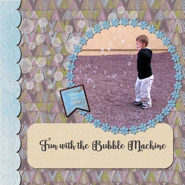
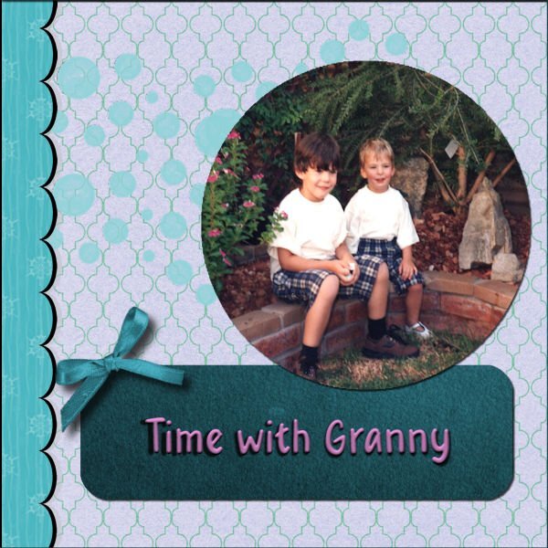
I used the papers from a kit from Pixel Scrapper: Marisal-gl22-jan-mini. Used a full one for the scalloped paper on the left side and as patterns for the background and the label since they would have overpowered the picture otherwise. The element was from that kit. The flower frame was one of my creations which I inner bevelled. The font is Baghira (I’m pretty sure it is from Creative Fabrica since most of my interesting fonts are from there). I duplicated the font and then converted it to a raster layer and inner bevelled it. The scalloped paper I textured with a bark texture which I had created and I also inner bevelled it. I played with adjusting the brightness and contrast on the bubbles as well as inner bevelling them in order to make them more like the bubbles in the bubble machine and also reduced the opacity. I placed a texture on the background paper also. I think that about sums up working with the template. I had forgotten that technique of opening the paper (or photo), copying it and pasting it above the layer you want to size it to, and then matching it to the template layer by using the magic wand on the outside of the template layer (so that it is inverted – or is it “outverted”?) and then clicking on the layer with the photo or paper and deleting. I did do that with the photo and the scalloped paper on the left side. That sums up the layout. The photo was taken in the summer of 2008 of my great grandson in California. His grandparents had bought him a bubble machine that was hand held by my son as he played with his grandson. It produces a “ton” of bubbles!3 points
-
3 points
-
Sheila, all the best for a speedy recovery and we should say: "Thinking of you"2 points
-
Ohhhh, I could not see it before. I know I clicked on that big main image before when I was looking for it, but you have to click right in the middle of that image. I have it now. Thank you! My eyesight is not the best anymore.2 points
-
2 points
-
2 points
-
Hello and thank you @Cassel and to everyone. I'm a wee bit late to the party.... and I hope I can catch up. Wonderful pages here already. 💓Oh and I brought a lil gift for everyone, too. You can dl my winter themed mini here.1 point
-
1 point
-
Yes there is, I wondered the same thing until I looked a little closer. The vid is at the top. At first it looks like just a picture of her first project, but the little play arrow is hard to see because it is sort of hiding in the "P" at the end of the last word, but it is the vid for day two.1 point
-
Bonnie, my daughter has quite an itinerary planned including going to see Jersey Boys on my 81st birthday on the 26th. She and her husband are foodies so we will be trying out some of her favorite places to eat--Afgan, Indian, Mexican and French to name a few.1 point
-
1 point
-
For Cassel re query about the dog in my layout. No, the dog is not mine. My mother lived with me for the last 20 years of her life and she was extremely afraid of dogs since she was badly mauled by one when she was young. After she died, I thought about getting a dog but arthritis was causing increasing mobility problems and I believe that if you cannot care for a dog properly, including walking it a couple of times a day, you should not own one. So, I am "grandma" to all my friends' and neighbors' dogs. I give great cuddles and have an inexhaustible supply of bacon flavored doggie snacks. Sharon1 point
-
1 point



.jpg.208cd26df487ecaab0db48990a4de93c.jpg)



.jpg.997fdcc81ae7a0dc4cd95750ebd45d6e.jpg)




.jpg.8e51df6b817b521b542679bbaae3bcfb.jpg)


Resized.thumb.jpg.d25811db03a63358cedab1e79f527635.jpg)
