Leaderboard
Resized.thumb.jpg.d25811db03a63358cedab1e79f527635.jpg)


Popular Content
Showing content with the highest reputation on 03/26/2023 in all areas
-
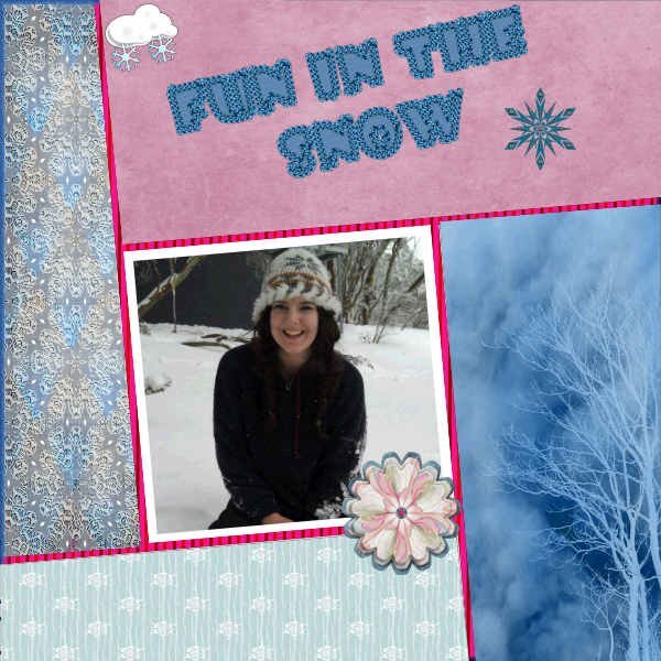
Day 6. I have learned a lot but I know I still have a lot to go. Thank you so much Carole. This is a photo of my granddaughter when she was lucky enough to see and play in the snow. It is not something that we see too often here in Australia. I did have some trouble using the template, but I am sure it would have been something I was doing wrong. Still trying to learn all kinds of PSP things.
 14 points
 -
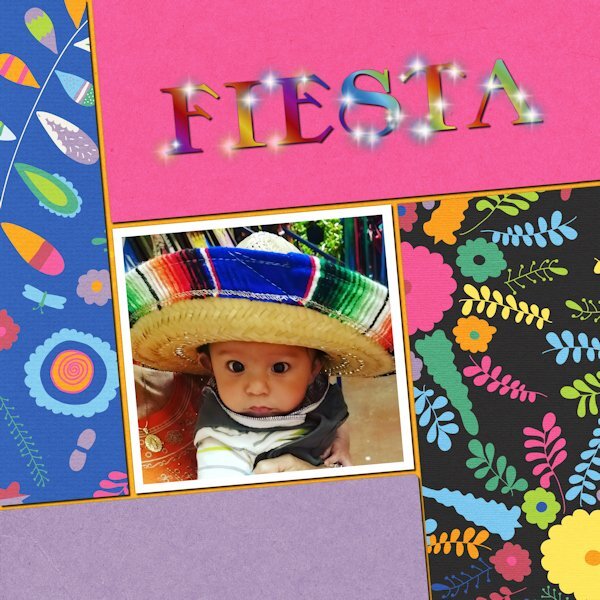
Day 6. I accidentally found that adjusting the settings could give some cool variations. The tube is "flare." The picture is my youngest great-nephew, four years ago. He lives in Texas, and this was his first trip to Mexico with his abuela.
11 points
-
Day 6. As you can see I didn't use the template. I used a photo from last year, as I'm yet to get a shot of one this year. I thought I saw one on Wednesday, and then this morning I saw one at the top of our drive. It's a bit early for them yet. Slats script. Text on a path using my own vector arrows. Cassel's bead tube around the word Squirrel, and the dingbat corner elements. The label is mine, the gold element is also a font.
11 points
-
I used this in the Random Challenge also. The papers are from my Build A Kit workshop. I also used for the first time Carole's corner punches. This was Corner Punches B, I think. This is the Day 2 lesson. I am way behind!
11 points
-
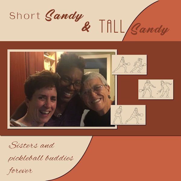
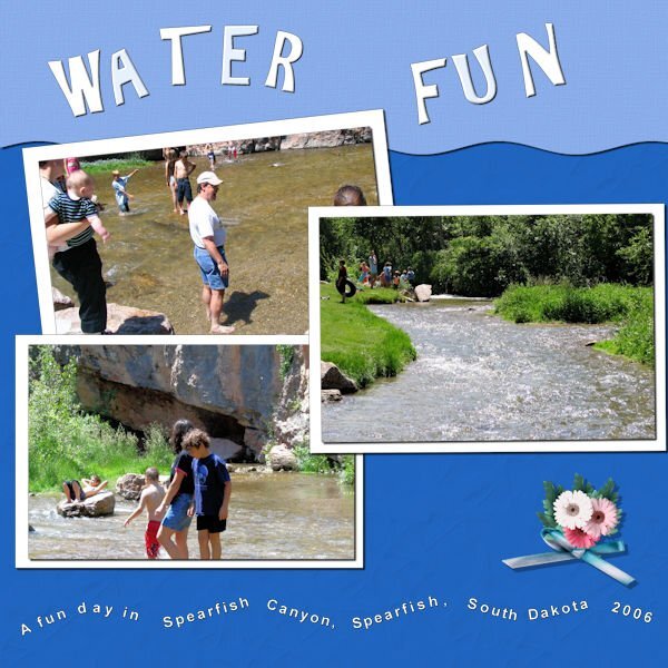
Day 3 Text Wrapping Short Sandy on the left; Tall Sandy in the center; Bonnie on the right. There was no way I know to get me out of the picture. Tall Sandy is tall...about 6 feet. Short Sandy is short...about 5'4 or less. Once we had 3 Sandys in our pickleball group. When Sandy 3 arrived the immediate question was, "What will we call her?" She told us to call her Fat Sandy. No way! We ended up calling her Sandy D. Even though Tall Sandy has moved away, she and her "Sister", Short Sandy stay in touch. Tall Sandy stays in touch with several of her Virginia Pickleball Friends. That's one of the things I love about pickleball...lasting friendships!
10 points
-
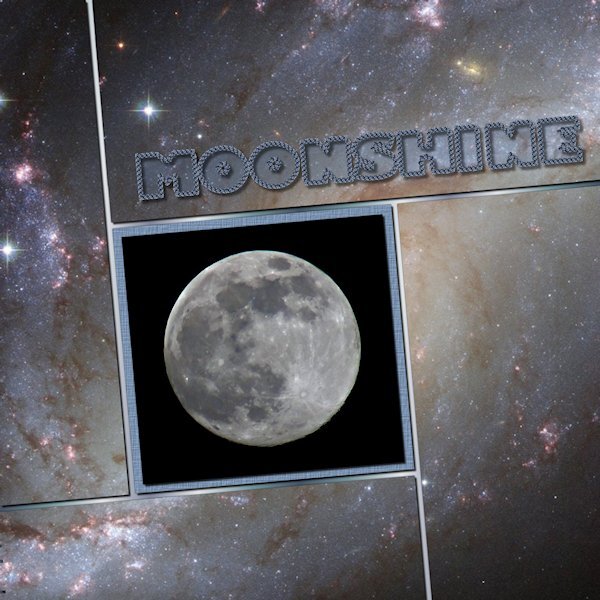
Day 6 and I'm caught up. Now to catch up in the Build A Kit workshop. I really like all the templates we've gotten and this one I especially like. I love that free Vector Tube script. I got it a long time ago but had no idea how to use it until today. What a great tool to have in the virtual toolbox. I used the who photo (creative fabrica I think) as the back ground. Putting a duplicate above each layer and used the magic wand and deleting, as we learned from the start. The moon photo is mine and the font is windows Gill Sans Ultr Bold, one of my favorites of the "fat" fonts. That still makes me laugh to see that..."fat" fonts. I used a gradient for the base paper.
10 points
-
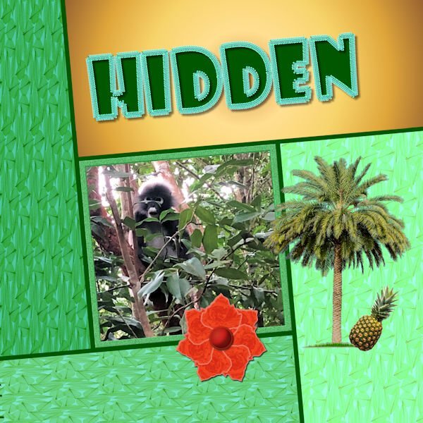
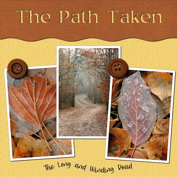
For No 6, I used a photo that was sent to me by my grandson who spent 3 months in Southeast Asia, sightseeing and playing Rugby. I made a background of leaves using one of my kit papers, changing the brightness and contrast to each section. The orange flower was made when I was going through my flower making obsession. The tree is a tube, and the pineapple was created using Microsoft AI. I included the pineapple because David informed me that Thailand has huge pineapple farms. The font is Showcase Gothic outlined with Cass gimp tube with which I fell in love when browsing the store. The gold layer is a RB 80s gradient.
10 points
-
For Day 5, I used the template of the day, but with an Artsy style background, in line with the style of the title. @Cassel Thank you for the template)) All credits on my gallery.10 points
-
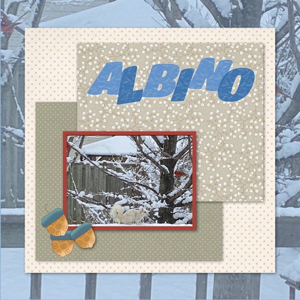
Day 5 is done. Those are acorns in case they are not very clear in the reduced size. Never use them to feed critters, but used 'em here! Photo taken not that long ago. Crazy weather lately.
10 points
-
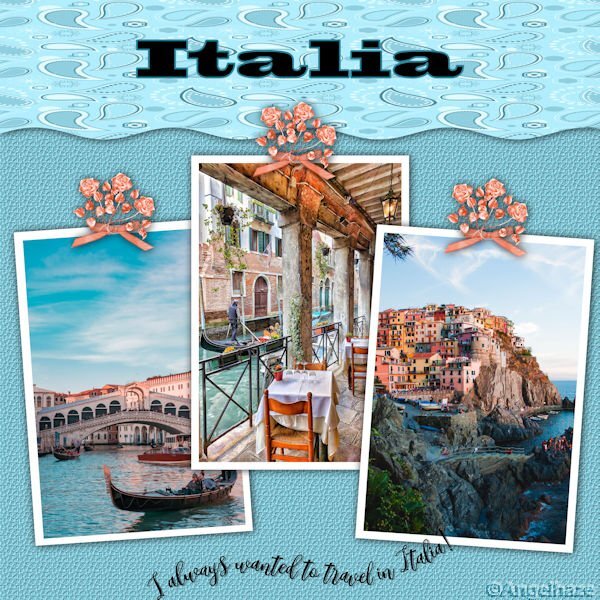
Here is my Workshop 4, I had a lot of trouble doing the curved text but finally I got there. I took papers and elements from my mini kit Summer Sizzle in BNB blog train: My blog:Digiscrap Angelhaze
9 points
-
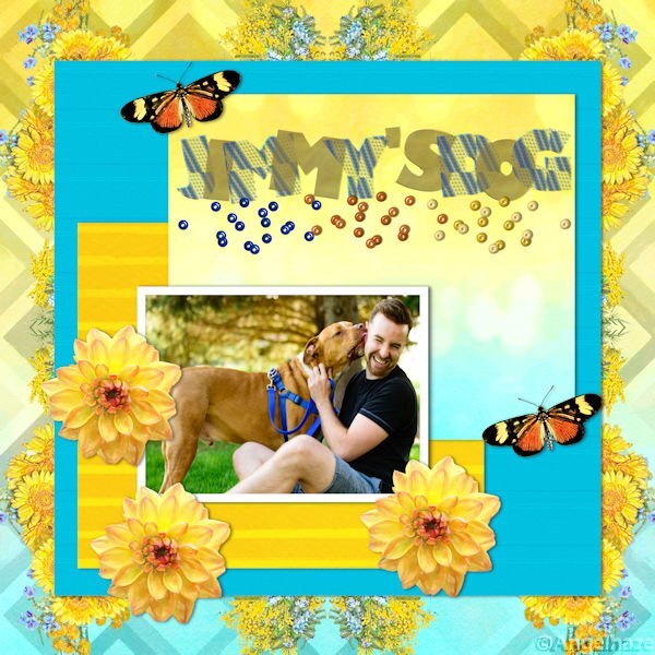
I wanted to post my project for day 6 and saw Corrie mentioning she forgot to add a shadow to the rope , I haven't done that either, but do you think it needs a shadow in my project? I did a shadow on the paper behind my dog, that's all.?
9 points
-
9 points
-
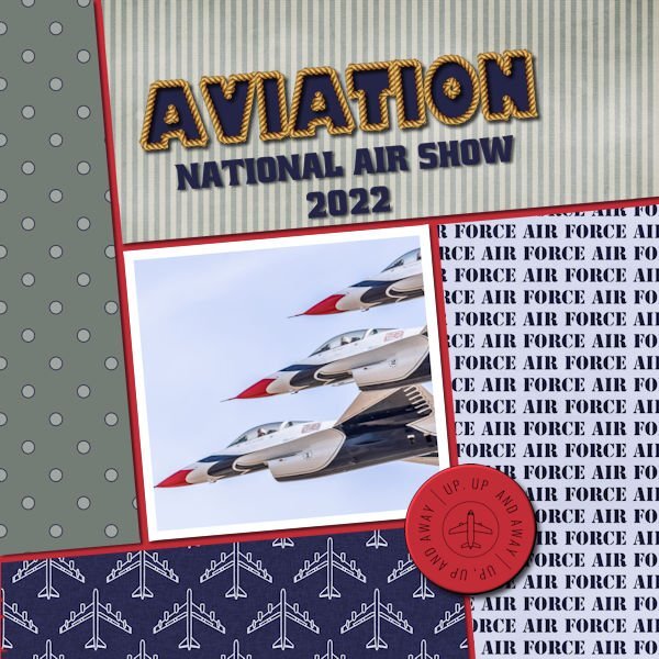
Finally finished Day 6 project. Used another picture taken by my daugther this time at the Air Force Air Show in Nevada last year (she had so many good ones it was hard to choose just one). 3 of the papers are from Marisa Lerin's Air Force Papers Kit and the other one I made. The button was made from a stamp also from Marisa Lerin.
9 points
-
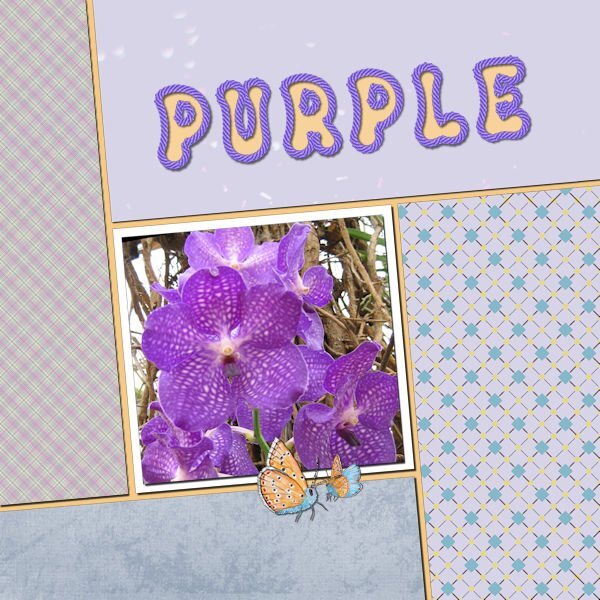
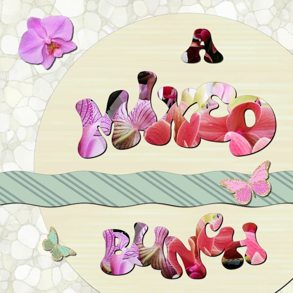
Day 7 and I'm a bit sad that the workshop is finished, but now I can go ahead with the Build a Kit. I have to admit it is a bit busy with 2 workshops at the same time and yes I now I don't have to finish either of them in a specific time but it's addictive! Maybe I should plan a detox period! I have loved seeing all the different layouts, mostly done with the same templates and techniques, so inspiring! For this last one I used a photo, taken in a gardencenter of a bunch of mixed orchids standing on a table and I used it for all the words. The strip on the template is a bit smaller otherwise it was to prominent and I wanted to use that striped paper for contrast to the lighter colors. Again some butterflies and an extracted orchid flower. The font is Bumble. I have done this workshop as the Wise Words Challenge as it was called 2 years ago. It was my first challenge after the basic Scrap Course and I have to say I have learned a lot since that day from the masterclasses, challenges, tutorials from Carole and by looking what all the other members are showing.
8 points
-
Day 4 part 2? Text is better now in a wave, all the characters you can read instead of pressed into each other?
8 points
-
Day 7 I don't think I will use this feature much, or only with specific photo's. ? Gill sans ultra bold is the font I used ? The kit was miz-London town Odd that with resizing the shadow on the red mat looks very black but with the original size it looked ok, well I think it was ok?
7 points
-
Day 4 Text On A Path...easiest time I have had doing text on a path. It usually takes several tries. This layout was completed fairly quickly. Not sure I should have used a path on top and bottom...it did give me more practice.
7 points
-
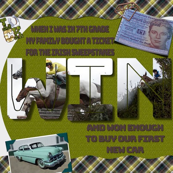
Here's my final project for the Text Workshop. A bit of a story. When I was in 7th grade my parents had bought their annual Irish Sweepstakes ticket and, for once, they won! The way it worked, thousands of people bought tickets and the hospital (charity behind the game) committee in Ireland drew a ticket for each horse in the Grand National race. If you we assigned a horse you automatically won money, and of course, if your horse won, you got more. So, our ticket was assigned but did not win the race. I think my folks got about $1000 which, in 1954, was enough for a new car! (First new car they ever had.) It was a fun time! My font is Bungee Inline. The photo corners are from my own kit. I made the plaid from the horse photo colors. Cassel's curved photo script on the ticket. Interesting techniques using vector texts as shapes.
7 points
-
I am ready now with Day 47 points
-
Day 4 I used Cassel's template. Papers : digitalscrapbook , commons_sharon-grant Font : Goudy Old Style Title Font : Hobo Std6 points
-
Day 5, Overlapping Text. This a layout completed some time ago...I am so far behind and even though there is no pressure or time line...I am dedicated to completeing this workshop.
6 points
-
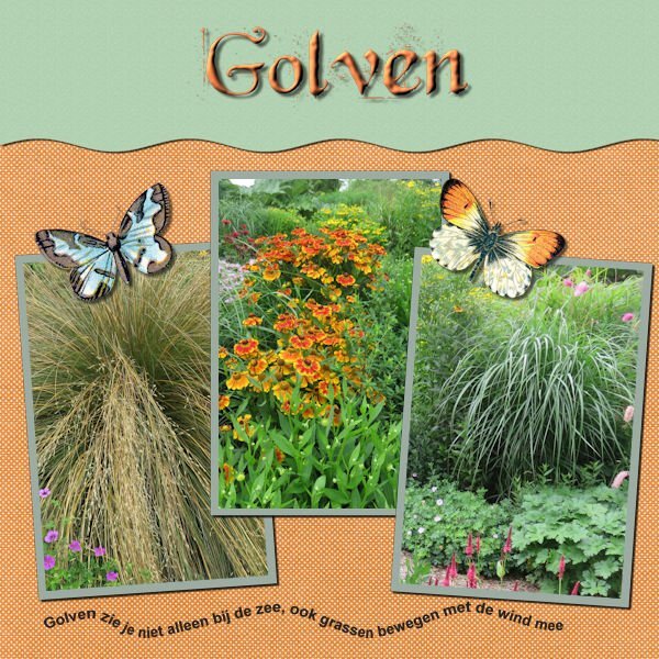
Day 6 of Titles Class. Almost time to get to the water again
6 points
-
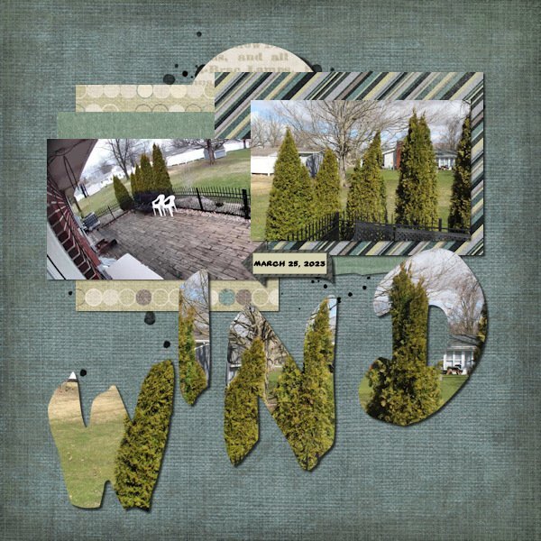
Day 7. I used photos I took yesterday out a window during the high winds. I didn't take the time to get all the settings needed to actually show the motion of the shrubs but figured these might be good photos to play with for this challenge. I used an old kit by a retired designer from 2012 and a template from Scrapping With Liz. I deleted all elements from the template and just used papers and an arrow from the kit. Font is Yard Sale.
6 points
-
As I said before, I did not do a page for each day, but here are the Titles I created to practice each technique. If I finish any more pages I might still post some if I am happy with them.
6 points
-
I have not done a page for all of the days, but have at least practiced each technique show. Thanks Cassel. Here is the page I did for day 7.
6 points
-
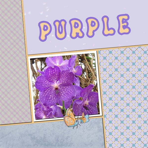
Day 6. Below the left and the bottom paper I placed a second paper and used the blendmode to saturation (left) and darken (bottom) with an opacity to 90 - 95%. I like how I can get a different look with the same papers and it still has nice matching colors with everything in my kit. The font is Groovy Yellow and I have a rope tube in a set by Carole that perfectly matches the orchid.
6 points
-
ok, you got me laughing at #4 - more like Text on a Peak! LOL5 points
-
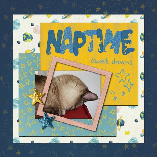
Day 5. Rudy, my Siamese mix, who is blind in one eye. He has odd sleeping habits. The font is The Cat. The kit, Sweet Dreams by Melo Vrijhof, is from Digital Scrapbook
5 points
-
Well, I'm only finishing workshop 4 and will have to quit now. The title font is AR CHRISTY and the journaling is Arial Bold. As you can see, I do love putting text on a path. Do love the pen tool now, but really will have to explore more with it.
4 points
-
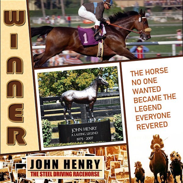
Here's my Day 6 - I filled all sections with images and/or text. We saw this horse in person at the Meadowlands Racetrack in NJ. Everyone was so excited to see The Legend. I discovered they made a 90 minute documentary about him and the DVD is available for ONLY $100!! ? The sad part is that he was incorrigible as a young horse, so he was gelded and, as a result, was unable to pass on his talents to any progeny. The font I used for the title is Bauhaus 93. The vector tube script was perfect!
4 points
-
oops not very inspired by day 5 ;( but I'll get back to it soon....here's my day 6 with a mini kit by me. All credits on my gallery )) Thank you very much for the template ))) love it !!! @Cassel4 points
-
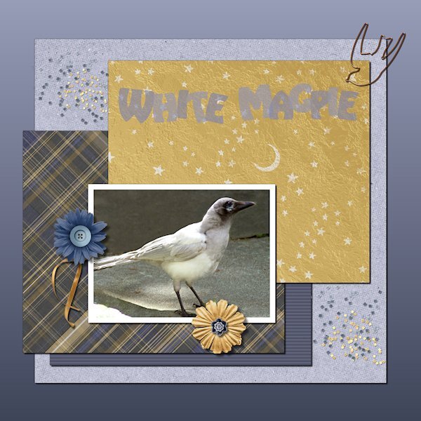
yay, Lesson 5 done and I'm catching up. This white magpie I think is the progeny of the famous St. Albert White Magpie. It lives in an area a bit aways from me. Last this guy showed up for two days. I think it's a baby as it looks like there is still a little bit of pink around the corners of it's beek (mouth?) and the eye looks slightly blue. Of course my camera was set to studion work and i had to shoot through really dirty windows with the sun haze coming in. the before of the this picture is quite bad, I'm surprised I could get this much out of it. This bird looks kinda of ugly up close and rather like a raptor (dinosaur), but when it flew up to the fence and I saw it's wing and tail spread from the back it was like a white Angel. I was just about to delete any photo's I got as I thought they wouldnt be useable, so I tried and this is okay. At least I have a record of this guy/gal. Fonts is Harlequin Extra Bold. Background is graident base originally from the around the eye of the bird and I chose the lighter color and then Foreground/background graident (is that what it's called, I can only see part of the first word in the gradient materials list). the rest of the supplies from Digital scrapbook, the following designers: MarisaL, cpjess, apjess (is this the same person as cpjess), Billie Irene, Elif Sahin and Gina Jones.
4 points
-
Day 5, a little bit of a tangent again but it's all fun and makes me look back on other lessons.
4 points
-
Day 6. Template is a really old one that is retired by Scrapping With Liz. The kit is Fired Up by Kristin Aagard available at The Lily Pad. I hid the journaling on the layout since it had personal information in it but the whole right side that is empty is filled with journaling. I used Showcard Gothic font for the title and the Rope tube.
4 points
-
Here is my Workshop 5 made with the kit: Mimosa story by Malo Scrap by Malo Scrap I made my big possible!
3 points
-
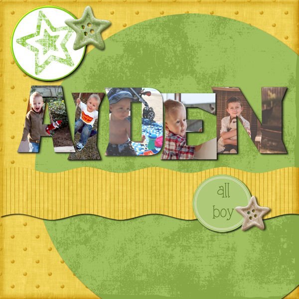
Finally finished my day 7 project. I started over on it several times! I decided rather than one picture to do individual letters with separate pictures. This is my grandson when he was small. Not sure where any of the papers are from. I got the elements from Pixel Scrappers and the round star at the top was made from a paper by Marisa Laren. This has been a fun week!
3 points
-
I need to get back to working on a project I'm helping my cousin with for the church. I've put it off for 10 days and that bag full of folders isn't going anywhere. Oh and the laundry I need to do! LOL3 points
-
Your words are so spot on. I will take a detox time too and turn my attention to my new camera. It was busy this past week with two workshops running at the same time. Once it's done we'll be craving more...after all, it's an addiction. But what a great addiction it is.3 points
-
My brush work is actually corner punches by Carole. I hope that counts. Fun challenge once I got started on it. Thank you, Carole! Yes, I could be difficult as a child...still can be in the right situation.
3 points
-
I use the straighten tool to find out the angle of anything, the angle used will be in the tool bar.3 points
-
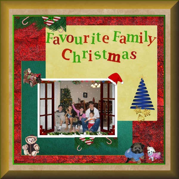
Have just finished Day 5. I think I am actually starting to understand a "little" of this. Will this is my attempt at doing a special Christmas Day with my Grandchildren. The two dogs at the bottom right are photos of my fur babies.
3 points
-
Lesson 7 Spring is in the air, except for the snowfall yesterday and today. The font is: Wish Apic (Creative Fabrica) I used flower picture tubes Photo's and papers, elements I made. Thank you for another wonderful course. I learned something new in every lesson. I really like that transluscent look in the titles we did that on. And being able to separate the letters and work on them on their own is the favorite technique I learned.
2 points
-
For the day 7 workshop, I used a picture of my grandson, David, playing rugby in Las Vegas. He is the one running over the guy on the ground. He is currently coaching the women's Las Vegas rugby team that has made a splash by winning all of their games so far. I deviated from using my kit except for the star. Rugby does not really fit the art deco style so I used a sports kit that included rugby from Marisa Lerin. I colored her background paper, originally black, to green. The colors in her kit for rugby coincides with David's Las Vegas team colors. The background for the wavy section is a RB 80's gradient with the opacity lowered. The text is GuinnessExtra Stout in honor of the boys always drinking stout. All the other graphics are from the kit, including the WordArt which I modified, but the words are hers. They are perfect, but I never would have thought of them myself. *I had to edit the first one because I forgot the shadows. Psp was working very slow until I shut it down and ran Norton Utilites to clean out the junk files.
2 points
-
Great idea!?2 points
-
Monique I always add the shadows on a separate layer, for the reasons you said and for editing them if I see that they aren't looking good! I once had to start almost all over with a layout by not doing this! ?2 points
-
I add the shadows (on a separate layer) and then I turn the shadow layer on and off and see the difference. It always surprises me that the shadow does make a difference in most situations. At least when they are on the separate layer you can choose to keep them on or turn them off.2 points
-
"does this FAT font make me look fat?" hahahaha. Fat fonts is a funny term, but I find I dont have enough of them either.2 points
-
Just exploring and learning about tools so no templates or designs. First workshop I've properly participated in, and I'm enjoying it. Did I see somewhere you can download the text as I won't remember it all later.
2 points
-
Day 4. Text on a Path. I like being reminded how to do text on a path. At first I thought my Text too was out-to-lunch because I couldnt highlight the text. Are you ready for a laugh...well, I had not put the paper in place of the grey holder spot so I couldnt see the text being highlighted because it was the same color. I put a temp paper in and there my text was, all highlighted and happy. The temporary paper (yellow) I kept and added a texture effect. The brown paper is from APJess-Furry cuddles (Digital Scrapbook) that I also added the Blinds texture. The buttons are from Digital Scrapbook - I forget who. Font is Stay Latte for the bottom and Mustard Med for the top, I cut it out of the top paper, using the magic wand to select the letters and then hitting delete on the paper layer...and initially forgot to hide the grey layer, another Duh moment.
2 points
-
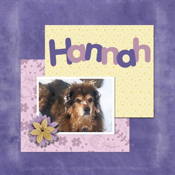
This is my attempt at Lesson 5. I totally forgot to do the texture in the text but I still like the effect. Hannah loved the snow!
2 points