Leaderboard
Popular Content
Showing content with the highest reputation on 03/24/2023 in all areas
-
This is the first time I have taken part in this kind of forum and I have totally enjoyed it. I have now completed day 4 and I am looking forward to the next 3 days. I am very new to this and realize just how much I do not know. I had trouble with adding photos on the template so had to change the way they should have been done so that I could complete the project. I will have to learn how to add photos the right way. I have attached a copy of the 4th day's project just to show that I am trying.11 points
-
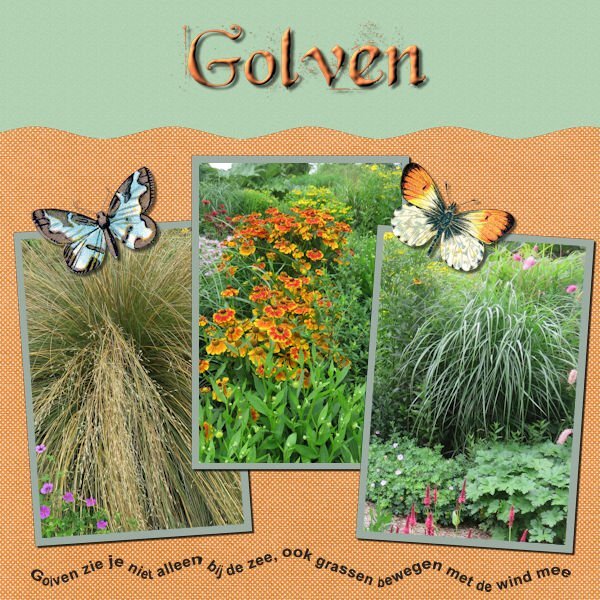
Still with my papers and orchid photos. I just made a simple curve with the text. The font is Salmon Queen script with an inner bevel. On all the layouts I have some sort of butterfly as an embellishment. Here in The Nederlands we have a world famous Spring bulbs show called "De Keukenhof" and on the grounds are glasshouses too and in one of those there is an orchid show with fantastic plants and the colors of the flowers go from subtle to vibrant. We have been there a couple of times in the past and each year the displays are different inside and outside.11 points
-
I am a little behind on posting. I have been trying to work with each days workshop but have been having some issues with my PSP21, or more probably with my PC. I finally got one project day 3 finished. Oh well maybe it will go better now, I cleaned a bunch of stuff off my P C and will try again. The text on the top is Jokeman.11 points
-
Day 3. plaid and bow: curiopantry.com, the other papers I made myself. The beads are made with cass-beadsMaker3 script.11 points
-
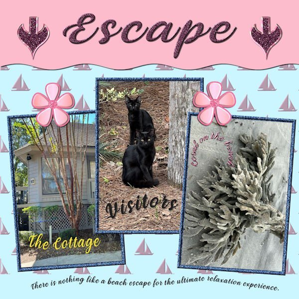
I finally finished No. 4 after many issues with the move and pick tools. I am still using my kit items and finding out that either don't like some or the colors don't work. For the background, used an embossed background but the bevel I had loaded had a light pink color. I decided to use it since that is one of my colors. The font used is Veni; the pictures are my own from Hilton Head.The jeweled flowers are part of my kit. The arrows were made today from presets, and I will add them to my kit. I've used the title before so I must be longing to return to the ocean. I am sort of getting the hang of curved text and started using it in my card making projects. I also should add that I am trying to be more aware of the use of shadows. I am saving them on their own layer so that they can be adjusted.10 points
-
9 points
-
My Day 4 with my granddaughter who is learning to dance the twist by videoconference. Her dance teacher making videos for classes during covid in 2020, so that his students learn while having fun. She loved that. ? text: "Videoconference Dance Classes, due to Covid" All Credits on my gallery9 points
-
8 points
-
8 points
-
7 points
-
7 points
-
7 points
-
7 points
-
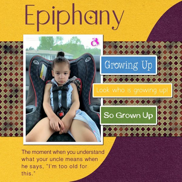
Day 3. This was taken a few years ago. She was mad because she still had to use the car seat. Once they got on the road, her mother informed her that she was going to the pediatrician. From that moment on, she became as incorrigible as she could.7 points
-
you have all done beautiful work, I am a little behind because the late shift, must work from 1pm to 9;30 pm and I am very tired after work so here is day 35 points
-
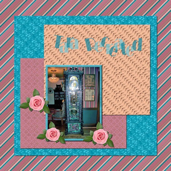
There is a replica Tara in Sharon, PA which we visited several years ago and stayed in the Rhett Butler bedroom. My photo is of a clock on the main floor and seems to be very art deco. I did use papers from my kit but made a small selection of the wallpaper for the striped background. It fits into my kit perfectly. The font is Broadway. Yesterday I received an email from Microsoft inviting me to try their new AI site, Microsoft Designer, which is where I made the roses which are also perfect for my kit. The blue paper has a PSP texture while the pink background has one of my pattern papers. I saved all of my papers not only as jpegs but also as psp images which makes it easy to change colors. I am very happy with the result except for the Title. I experimented with it, but it does seem to stand out the way that I would like it to.5 points
-
5 points
-
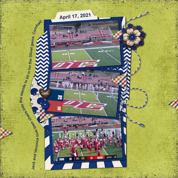
Day 4. I'm glad I finally figured out how to do this. I played with the different vector ways to do it to make sure I got it down. However, when using one of the preset filled-in arrow shapes the text wanted to go on the inside (black of the arrow) not around the outside. Curious if that is how it is supposed to be because it didn't look nice at all. I'm not sure I'll use this much but at least I know how to use it. Another one of my Trine football layouts. Again used the Sporty Football kit from Kristin Aagard and a template from Scrapping With Liz in the Recyclables 75 kit. Both available at The Lily Pad.5 points
-
I have fallen a bit behind, so here is Day 4. I am SO grateful to have the templates provided to save some time. Thank you Carole. The photos are all from UnSplash, and the rest is likely all from Digital Scrapbooking. Not very spring-like here yet, so I think the poor robins must be hungry and chilly, and they've been around for a while now.4 points
-
4 points
-
4 points
-
Look who's becoming a "Word Art" pro. Beautiful layout, the colors work really well together.3 points
-
@kasany Your filled-in text is well done. Your outline is really shiny!! @Linda I'll try to troubleshoot through emails in order to not flood this thread with back-and-forth exchanges, ok? @Ann Seeber Those translucent stars are lovely. @Hank Sobah As long as you are practicing the technique to use it whenever you need it, that is all this workshop is for ? @Linda Hitt Those are beautiful photos!!! nicely showcased! @Rene Marker With a little practice, that text on path will become easy, I promise! @Mary Solaas That Wrapped Text was such a great addition to PSP and it is so versatile! @Gerry Landreth Have you shown her that page showcasing her photo? What does she think of it now? @Pirkko Seppälä What would you want to write from bottom to top? Would you want it like we would read it "sideway"? You can either reverse the path, or draw it from the bottom to the top in the first place. Is that what you mean? @MoniqueN. You are right: the nodes were a little too tight, but since it is a path, you can always tweak that and the path will follow! @nadine That is such a great layout with so much energy!! You should share with her teacher! @Marie-Claire That picture really made me chuckle!!! @Anne Lamp You are catching up nicely! keep it up. Don't worry, the tutorials will still be available to you. @Corrie Kinkel Those photos are so colorful!!!! @Donna Sillia Shadows can be challenging but with practice, you will develop an eye for it. Keep it up!3 points
-
3 points
-
Thank you Carole, It happens that Poncho comes along, but usually I go alone, because he is a bit jealous . If I go alone, I can give the cat more attention.2 points
-
I have the same problem. Yesterday I put a piece of paper on my windowsill and looked how the sahdow was and later on with thicker paper. If you see it "real" it looks like you understand the shadows better. I even saved some shadows from workshops as a preset but with some projects it's still not looks ok, too much, too little, to dark etc ?2 points
-
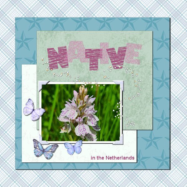
This time a photo of a native orchid in The Netherlands seen on a walk last summer. The background is of a plaid paper but with a solid paper below and the blend mode set to luminance, which gives a different effect. All papers come from my kit. Again I used some butterflies and a confetti tube by Carole. I don't have many bold fonts so I went with Gill Sans Ultra Bold and gave it a heavy texture, otherwise it wasn't very visible.1 point
-
It will get easier with help from here and all the tutorials and labs. It's a massive program to master! I wanted to give up many times, but it's worth sticking around. :-)) And, for the first attempt, you've done such a great job! More than I could do when I got started.1 point
-
I didn't use a shadow but I did put a 2 pixel black stroke around my letters. It doesn't show much on the small version but looks good on the large version.1 point
-
Text on path in PaintShop Pro | Scrapbook Campus Maybe this will help. Blog post from July 18, 20161 point
-
This is a beautiful layout. The colors go very well together. I found I need to make changes to mine too. Two colors I knew I didnt get right from the start, but I went with them. And the dark colors dont seem to be dark enough, as well as I should have had more colors in my pallet.. I absolutely love your arrows and your awesome cottage visitors. I used to live very near the ocean and worked a few blocks from the ocean where I could stand on the beach and see America (Blaine, WA). Now I'm living in a prairie province. I miss the ociean and the mountains. Side note: have you ever watched the Hercule Poirot shows (I think filmed in the 80's-90's? The show is set in the 30's and so much Art Deco pieces in it. We've been watching them on U-tube(we cancelled Netflix, who knew U-tube had all kinds of movies for free).1 point
-
1 point
-
My brain can't handle that just yet!!! How to use paths has always eluded me. LOL1 point
-
I was trying to click on the outside of the shape but couldn't get the [T] cursor. I was using 2023 which is still giving me problems at times. Just tried it again and it took 4 tries before I got it where it needed to be.1 point
-
1 point
-
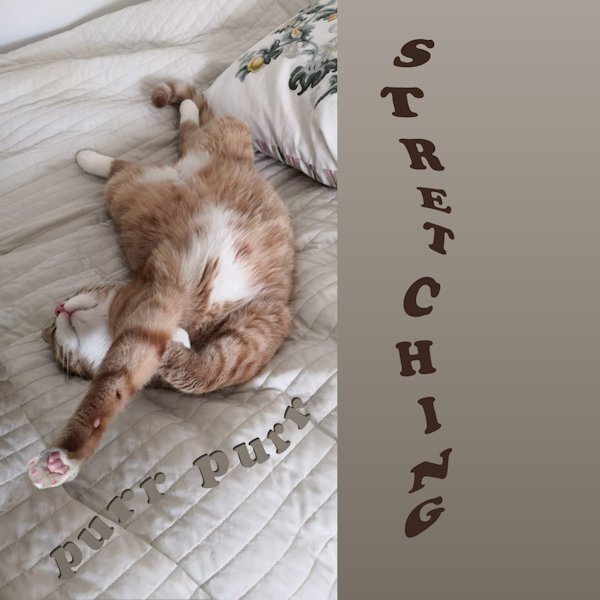
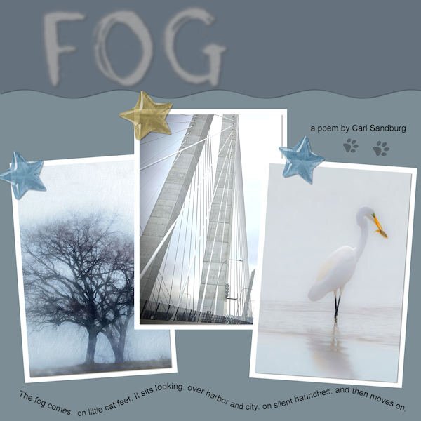
Wow Ann! This is fabulous. The quote is purr-fect! Those photo's are really give the layout a great atmosphere.1 point
-
You have to make sure that the text is highlighted to make the changes, otherwise, PSP might not know it is to apply on the current text, and think it is for the next one. Did you try that?1 point
-
Thanks, Carol. I used a picture tube for the flowers, but I'm sure you already knew that. ❤️1 point
-
Carole, they are not confetti; they are seed-bead tubes I created for the Buil-A-Kit workshop. I will increase the size as they are tiny, even in full size.1 point
-
1 point
-
Today it's just PSP Ultimate 2022. Couldn't get it to do File> - anything. But finally got it saved. Then SLOWWWWLY SaveAs a jpg. Close it out. Then reopen the jpg and reduce it in size (no problem there) and then saved at 600. Could it possibly be the size of the layout due to undo and redo's? I haven't had that problem before. Anyway - here is #2. There is a really good rendition of this song on YouTube by Ella Fitzgerald.1 point
-
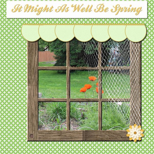
I'm game. The first song that popped into my head was from State Fair (a musical by Rogers and Hammerstein). I thought I was kind of copying a layout I had done before and just change the title. However, I have worked on this almost the whole day - the problem was the font! Every time I wanted to duplicate the title so that I could innerbevel it, the layer disappeared and left me with the title as "selected". I finally just flood filled the selection on a raster layer and went from there. I even tried closing out and restarting the computer, but that didn't work. I don't know if there was just so much in the file because I had worked hard on the netting and it couldn't handle the font. Well, anyway, here it is.1 point
-
good Job Ive started 10 times hrs and still have not got there, here like you yet ?0 points


