Leaderboard


Popular Content
Showing content with the highest reputation on 02/20/2023 in all areas
-
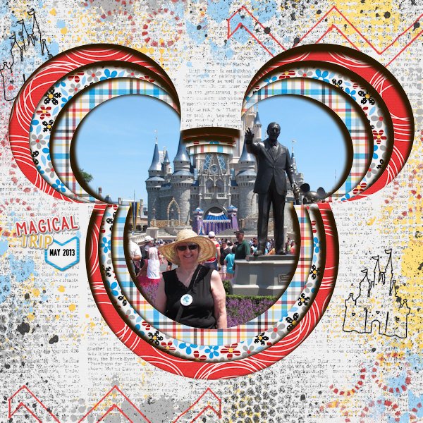
Days 6 and 7. Friday and Saturday proved to be productive full hiking days. Corner punches used on both pages, lino paper, and instead of using polka dots, I used 2 different snowflakes, with different sizes. I used 2 overlays on the 18th Feb page. Brushes to create the masks. Pages sized down to 5x7 photo paper. I haven't exactly conformed with what Carole demonstrated. I sort of went off on a whim.
 9 points
 -
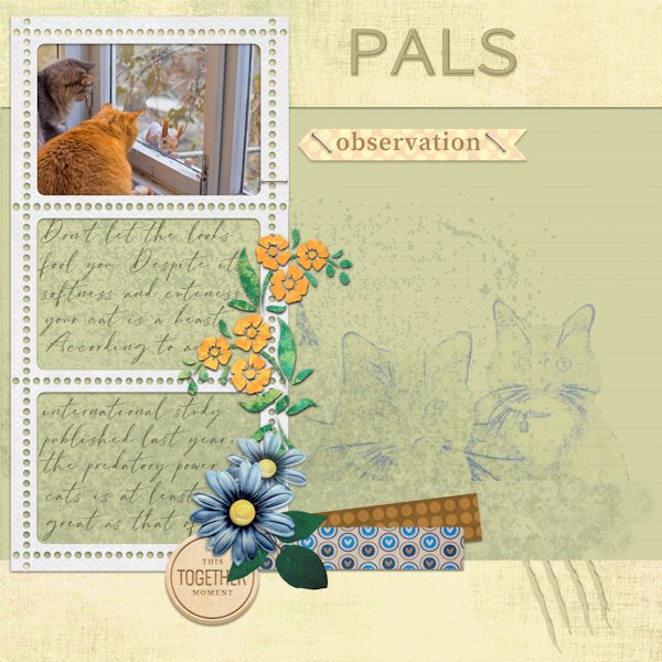
And the final project is one of my cat clients for those of you so inclined. The elements are from Gina Jones' Everyday is Caturday kit. The font is Allura (from Google fonts) Thanks so much for this workshop, Carole.
8 points
-
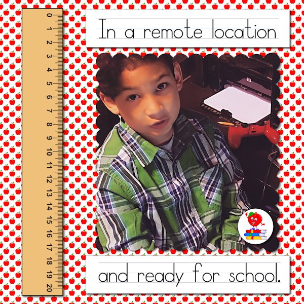
Londyn always made sure he looked his best in case the teacher in case he had to be on camera. This is 5 years ago. All of the elements, including the apple I used for the paper, came from Creative Fabrica. The font is School Rules, also from Creative Fabrica. It is a set of three fonts, one with letters and lines, one with only lines, and the other with only letters. Because I couldn't figure around the blank space using the combination letters and lines, I did them separately on layers and aligned them manually.
8 points
-
Here's my layout for Day 2....it's not as easy as it looks! LOL Hangin' In--- but way behind?♀️!
8 points
-
Today I learned how to move a mask and how to make polka dots. I also learned that text on top of polka dots is not necessarily a good thing. I played with both the size & blending of the dots as well as the type and size of text and ended up frustrated. I added a border to finish it off. I think that I will make a batch of polka dot washi tape instead and stick to textured or plaid paper in the future. The font is Script MT Bold.
8 points
-
I had so much fun doing this one. The dancers are from CF's Dance-Marathon-Watercolor-Animals-Set. I'm really getting my money's worth from my subscription lately! The font is Party Dance which, I think, was in my system fonts. I tried to add a texture to the background layer to match what was on the paint splotches.7 points
-
Day 7 Fonts used : Kelly Ann Gothic----Adobe Fangsong Background created with the polkadot------3 different size layers Elements are from PNGTree Picture taken by me ...the Snake was on the rocks surrounding my flowerbeds ,luckily it stuck around long enough for me to take some pictures
7 points
-
The font is Femme, free from DaFont; I thought it had a nice relaxing feel. The background is mine, but I need some help. I wanted to add a little interest to the background to blend into the watercolor clip art I got from CF. I didn't like the results from any of the watercolor brushes I have. I ended up adding a texture which, unfortunately, changed the color. So I promoted the "spots" from the texture, then flood filled them to adjust the color. There has to be an easier way to do this as it took me forever to get this result. One of these days I have to master the brush variance as that would probably have solved my problem. Any suggestions?6 points
-
Day 7. This is a fun way to make a mask. I quite enjoyed it. I also went and sought out the "burnt edges" tutorial in the campus. I think it would also look better if I added a curl to one of the corners...I'll need to head back to the campus for that one. I also did a version without burnt corners. Here's the deets: Font: Beast Bird Screw Heads: a freebie picture tube from Carole (cass-screwheads) All the elements (except the screws) are from Digital Scrapbook (KMRD, Gina Jones, Elif Sahin, CPJess, Jessica D - are the last two the same person?) I used light beam (or something or other) I found going through the effects drop down to make a bright spot on "sun". So many beautiful layouts came in today while I was working on mine; they are fabulous! What a great workshop this is.
6 points
-
Lesson 3 Centaur and (I think) Celtic garamond are the fonts I used. The kaleidoscope effect is fun to work with, but as the picture in my project is a bit "busy" it was better to make it very small and use it as a background paper with a plain mat.
5 points
-
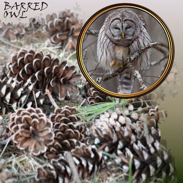
DAY 7 - BARRED OWL + WINTER TEXTURE - Extra template. Font: Viner Hand. Background gradient: Bog. Owl photo: Ed Frampton. Cones: Chuck Calio. I tripled up the circular frame with separate colors for each, treated them to an inner bevel and shadows.
5 points
-
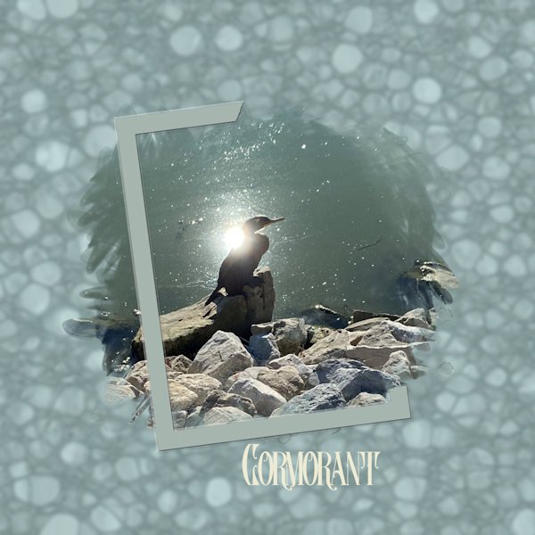
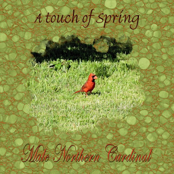
Day 6 project. Both fonts are Bradley Hand ITC . The photo is mine. on the background I followed the instructions using monochrome and then selected the dark "strings" with the magic wand set to brightness with a low tolerance, and flood filled that whit the red from the bird.
5 points
-
this was a fun and interesting workshop, I learned a lot, here is my day 7 , one with blur on the mask and one without the blur I used the dandelion to make the paper and reduced the opacity4 points
-
Day 7 Masks Workshop, chose to use the twins, unfortunately I don't have a lot of pictures of only them ? As you can see, I took the Polka Dot idea and did something a little different with artistic lines, fills, and overlay and some Text lessons from previous workshops.
4 points
-
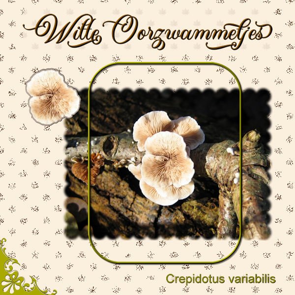
Day 7 and here is the last for my series of fungi. The pattern for the background is made with a leaf brush and the blendmode dissolve. I almost never use that blend mode but here it is fitting to make the leaves looking brittle. This font is Almond Script and I needed some thing to fill the left corner, so I used a corner brush from Carole. Made a sticker out of the fungus in the photo and instead of a white border, gave it a greyish one otherwise it wouldn't stand out on the background. Stickers don't always have a white border.
4 points
-
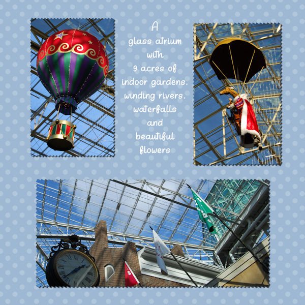
Day 7 The glass atrium at Opryland Hotel. I'm glad we went when we did. Today, you need a ticket, an appointment time and pay to park. I notice some of you are posting more than one photo in the same post. How do you do that. I am not seeing that option. What am I missing?
4 points
-
I worked with the Kit of Cintia Dhariana in Feb 2023 Blogtrain #14 digitalscrapbook.com the cats belong to my friend
4 points
-
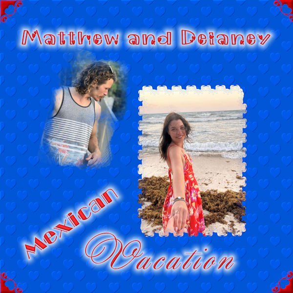
I finally completed Mask 7. I had a lot of problems with Chrome yesterday. The pictures are from my grandson who recently visited Mexico with his girlfriend. I used a flower brush for mask 1 and a watercolor brush for mask 2. For the background, I followed the embossed pattern in the tutorials. The fonts are morning love, broadway engraved and annabel.
3 points
-
Here is my day 5 project. The top font is Bigtime.
3 points
-
Not too difficult, but not everything has to be. I started with a black png file that I recolored it with red, black, and light grey. Polka dots on the background to make it interesting. I wanted a display font that wasn't fancy so I used Nesdate October Ten, free from DaFont. I added a black rectangular selection behind it as the dots were too distracting.3 points
-
For the Valentine's Day theme, I used AnnieCDigitals Valentine template. The background is a paper from a valentine mini kit by MarisaL of Pixel Scrapper. I used the RemingtonWeather font to try and stay consistent with the wonderful word art Marisa made. And I topped it off one of Carole's lovely bows. (The couple are characters from the game.)3 points
-
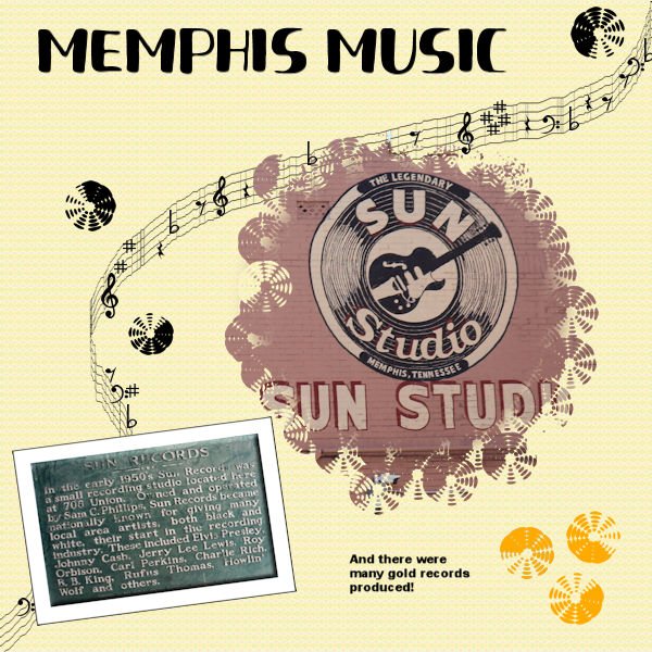
Project 5. Still behind. Using several layers for the background and the top layer was a pattern from a previous project and the blend mode. There is a brush that looks like a record (kind of) so I used that for around the original circle mask. I also used it for the records as elements. The font was Fresh Hansler Duo (CF) for the title. I used some different settings than I usually use for the Sun Records placque - inner bevel, and I used chisel on the paper behind it. This has been a challenging workshop and I do intend to finish it. I played around with creating a mask from those watercolor brushes from an earlier project and I'm also going to post a layout using the one I developed that uses some odd but interesting brushes around the edges. I think I learned more about blend modes this time as well as refreshing my understanding of how to make a mask. Anyway, it has been most interesting.
2 points
-
I leaned a lot (like how not to assume that you have finished watching all of the video when you are interrupted by a power outage). The pick tool is one that I never used before and it is fast becoming one of my favorites. The text on a path links from Cassel were especially appreciated but my head still aches over brush variances. I loved the chance to practice masks and get individual as well as group feedback. Plus I have a list of things to try that other students used in their assignments. It was a delightful way to spend time during a cold and wet and gloomy week. Many thanks to Cassel and all the participants.
2 points
-
I just did the quiz. I am hanging my head in shame. I have cats, I love cats, and the only one I got wrong was the name of the cat! My own cats are disgusted at me right now.?2 points
-
@Mary SolaasThat kaleidoscope pattern is really toned down and it creates a great effect instead of being overpowering. Making a silhouette is a great way to handle bad colors and such too (not that yours had that issue). @Donna SilliaUsing masks is also a way to "extract" elements. In fact, it would be a similar technique that is explained in this blog post. @GabrielaGreat colorful layout with those butterflies. The superposition of three different sizes of polkadot gives a really interesting effect! @Julie MagerkaThose "incomplete frames" are popular and so easy to make. @Hank SobahYou can always answer the question the way you did. Or you can highlight the question, and you will have the option to "quote", which would create a post with my question and you can answer to it. You are having fun with AI effects? You created that lino pattern with non-monochrome settings. That looks really nice. @TonimarieBeautiful mask. I am glad you are getting the hang of it. @Susan EwartThe choice of a gradient is a great decision. Sometimes, we have to go to plan B when we start a project. And for the Pick tool, it is a known "bug". Typically, it happens if you used a keyboard shortcut before, like Ctrl-C, or Ctrl-D. But other times, it seems random. That burnt edge is a really nice addition and you did it quite well too. @Karen BorgmannGreat start. Better late than never! @Marie-ClaireTo create the interlacing frames along with the shadows, the trick is to add the shadows on the same layer as the individual frames. That way, the shadows would follow. If you have the shadows on separate layers, it is still workable, but you just have to repeat the same steps (with the same selection) to the shadow layers. @MoniqueN.As mentioned by Corrie, it is possible that the Pick tool changed mode. It is an annoying behavior! @Rene MarkerThat is quite an interesting font! Thanks for sharing the name. @Anne LampWas that text on a path or individual words you just rotated? I am glad to see that you are starting with the lino pattern and working with it to create something different. It is not always easy to "plan" the end result of that technique. @Bonnie BallentineWhen you post an image, don't you still have the same options on the bottom right of the field to add another image? @sharon thompson You will see that if you change details like the scale of a polkadot, it might give a very different result. And changes in colors, blend modes, etc. can also make the pattern less powerful. And yes, all the comments, from me and other participants is a big part of these workshops. Isn't this a great community? @Corrie KinkelThe Disolve blend mode is quite different from the others as it is based on the Opacity level. I guess it is different from how we expect colors to be adjusted by blend modes, but you found a grea way to use it. @Ann SeeberThat triple frame is such a delicate additional detail. Great effect. @Gerry LandrethIs that a multi-layered font? @cindy harris Is it possible you clicked on the wrong blue button? Those pages are often made to be confusing. @Sue ThomasYou surely know how the tutorials are meant to be integrated and customized! As users get comfortable with the techniques, that is when we see the most variations. @Lesley MapleDid you happen to use a solid color overlay? It looks like it and it seems like it has been accidentally shifted down (see a little gap on the top). That happens to me often when I want to move one element and a different layer is activated. Although this is officially the last day of the workshop, the tutorials will stay available for another week for anyone who needs to catch up. Of course, DIAMOND members do have a permanent access. If you want to join as a DIAMOND member, head over to this page. All the tutorials for the different background papers are part of the membership and we have dozens of other patterns tutorials. And remember to fill out the survey!2 points
-
Here is another one that I just did from a freebie template by Fiddle-Dee-Dee. Kit used is from Bella Gypsy "Here's To The Ears" for sale at The Lily Pad. Cheryl (Fiddle-Dee-Dee) had the shadows already on this template as separate layers. So no shadows had to be added to the 3-D shape.
2 points
-
Beautiful cat! Great layout!1 point
-
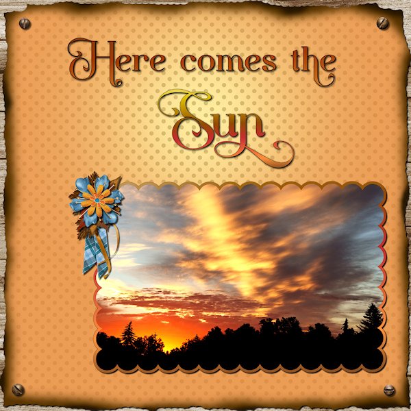
Good thinking to create the brunt edges on the paper. I love it. As the sky is certainly on fire. Like you we also have incredibly stunning sunrises and sunsets. Which I'm addicted to photographing.1 point
-
Thank you very much Susan. It's easy to distinguish males from females. These two are mature females, younger females aren't as heavily barred.1 point
-
I can't believe that I missed that in the tutorial along with how to make that plaid paper!!!!! I remember being interrupted by a power interruption and I guess I thought that i was finished it. Now I have to go back and rewatch them all and see what else I missed. My little grey cells aren't as alert as they once were.1 point
-
That's me when I can't have ice cream!1 point
-
To Hank S. This darling photo reminds me of what my Dad used to say when one of the kids looked like that. He would say if you stick that lip out any further we can play checkers on it. (Thanks for a long buried memory)1 point
-
Day 6 Masks Workshop
1 point
-
And, Day 7: The polka dots were blended with a flood fill of 113-196-206 (Multiply 100). Fonts: Only By Request and The Vintage Typewriter.1 point
-
After a busy 2 days (lunch with out of town family, then funeral visitation on Friday and the funeral on Saturday with a wedding last evening), I have finally had time to do the last 3 days. Day 5: I used a snowflake brush for the mask then made the snowflakes following the Snowflake (2) tutorial in Lab 9, Module 12. I used a flood fill for the background, blending it with ps_elif-sahin_196132_gold-textures-texture-08-template_pu (Darken 100). Igloo Caps is the font. Day 6: I made a bunch of linoleum papers and chose 2 that I felt worked the best. The yellowish one was then used as a frame and has an inner bevel. The background is blended with an RGB of 77-119-60 (Multiply 100) for the background. Font is Only By Request.1 point
-
Lesson 2 I don't know what I did with the edges around the photo's at the bottom, but they are not the same width.? Fonts: Celtic md and centaur
1 point
-
Better Late then Never.....this was a struggle for me....but I finally worked it out (kinda') Anyway, here's my entry for Day 1.....CorvetteKaren
1 point
-
Day 6 finally done. Used my own photo taken at the marina/park near where I live on a crisp autumn day. I spent way too much time on the lino effect and then playing with the frame. I wanted to try dynamic frame style but it really didn't work for me, so I opted to cut off a bit at the bottom right. Then,, when I thought I had something, I realized I'd forgotten the mask! I know what I want in my head, but it usually comes out differently in the layout.
1 point
-
My grandson is in Mexico and sent me this picture saying that it would be perfect if his dog was in it. I selected the dog from another photo and instead of extracting it, I used a rectangular mask and used black to eliminate the mask around Chooch. It was so much easier than extracting! The only thing I worry about is the proportion of the dog and asked Matt to let me know if it is too small. If so, I will use a larger picture of Chooch.
1 point
-
There are so many posts for the masking workshop, I just can't keep up with them all! But I'm delighted to see so many creative layouts and projects. So many talented folks in this group who are willing to share. I just love it! I still need to work on Day 6, but no time today.1 point
-
Day 3. I call this "Most Muscular". As this wee babe looks like he's doing the "most muscular" pose at a bodybuilding contest. Or could it be that he's just showing the Magpies and Blue Jay he's not afraid of them. I had to go outside several times in the day as the larger birds were picking on this fearless baby. He scampered around the ground and all over the lawn furniture and since he couldnt get into the bird baths (it was hot) he lapped up the water off the pavement. I think I played around for almost an hour with kaleidoscope random pattern. This one is at size 25 or 30. I tried a number of sizes and it looks like it's at a 45 degree angle but it's at zero. Again I put a black layer under the background layer and lowered the opacity to get a darker result. I find I can control density better than using Brightness/contrast and I can go back and change it later if I want to. The frames were added on separate layers with an inner bevel.
1 point
-
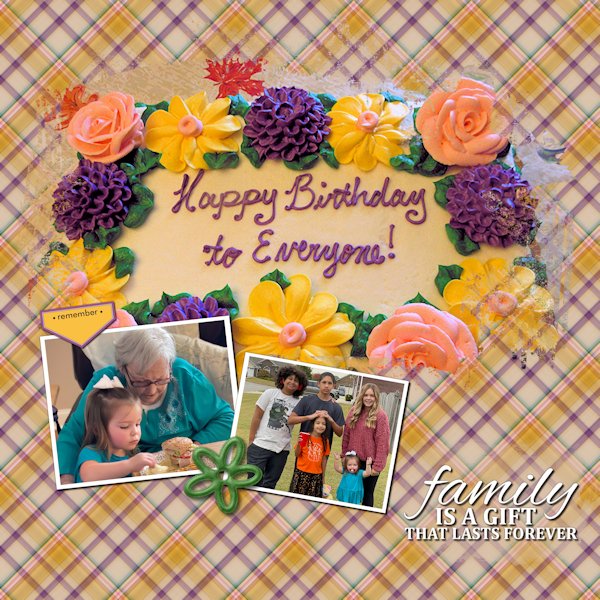
The birthday party was universal for the entire family. We used to get together for each of the kids' birthday, but they got older and would rather go out with friends.
1 point
-
Maybe I'll change my plans and do a Shadow box tutorial for the March lab module. Or maybe a Master class instead? Hum...1 point
-
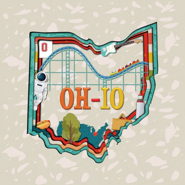
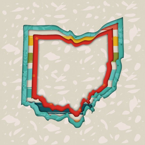
Based on the question about 3D extreme shadows for the Q&A, I have played with doing this. I saw it done at The Lily Pad in 2021. They included basic instructions for PS and PSE on how to do this but since the way PSP does shadows is different, I struggled with the shadow portion of it. Last night I played around and found a method that worked and looked a lot like the examples they had. Carole showed a different way of doing it in the Q&A. I had done an actual layout earlier today using my method. After the Q&A, I recreated the basic layout using Carole's method. The main difference is that I used a cut out file for my shape instead of a vector object. I used papers and elements from a kit called "50 States Ohio" sold at Sweet Shoppe Designs. The cut out shape of Ohio came from Scrapping With Liz's Ohio Cutouts sold at The Lily Pad.
1 point
-
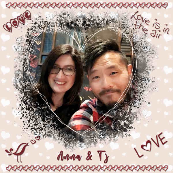
My granddaughter, Anna, and her husband, Tj. He's a software engineer and she's a speech pathologist. They live in California so I don't see them much. I used some decor from 3 Valentine's kits I had on hand that seemed to be mostly in French. The heart mask was from Carole this season.
1 point
-
I found a wonderful fantasy picture for today's theme; I always try to find the original artist, but sometimes I just can't. Anyway, I used cass-Slat Heart-Template and adjusted it as needed. The background is the original pic with gaussian blur and a lower opacity over a white layer. I gave the original black outline of the heart an overlay blend mode. Then I added some selections I flood-filled with black for the stripes and changed the blend mode to soft light. The font is Adine Kirnberg, free from 1001 Fonts.1 point
-
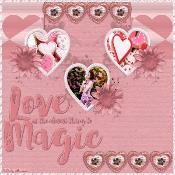
Here is another layout made with 3 hearts design by myself and the kit: Love Bundle Designed By Marisa Lerin And some cookies photos and a woman took on the web.
1 point
-
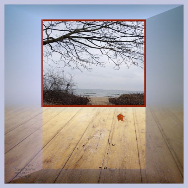
We'll swim tomorrow up ... You know this photo taken by JK at the seaside.
1 point
-
A bit early for Mardi Gras, but I use the theme that the game gives me every day. lol The mask clip art is from CF. I recreated (used as inspiration?) the word art, also from CF. The fonts I used are Cooper MdBT and BetterValentina. And, of course, the woman is a character from the game.1 point
-
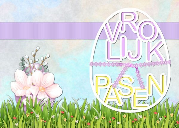
Nothing fancy this time, I just finished making an Eastercard with a stencil. I recently bought PSP2023 and it took a while before everything was installed and customized to my liking. Then I decided to do a "spring clean" of all my files and supplies, because it had become messy in places. Now I finished cleaning (not my hobby btw) and I'm ready to go for the next Workshops. I was already working on the stencil and put it on a card from the Card Workshop, the backgrund is made of 2 papers with the blendmode set to overlay. The grass is from my stash just as the egg, and the lace wrap was a freebie by Carole.
1 point


Resized.thumb.jpg.d25811db03a63358cedab1e79f527635.jpg)