Leaderboard
Popular Content
Showing content with the highest reputation on 02/13/2023 in all areas
-
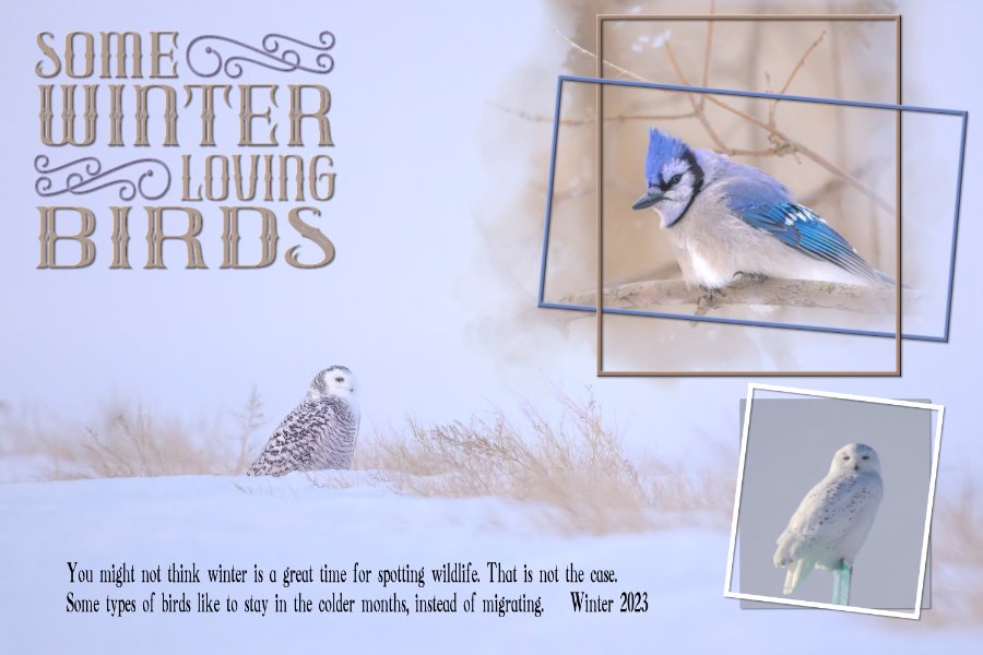
I found my unfinished Day 1 from last year's mask workshop so finished it and did another one (I had computer problems and couldn't complete the workshop at that time). The Blue Jay is from 2022, the birds is current. Photos of the birds are from last week. They like to hang out in my one tree. One day I had close to 30 of them.4 points
-
It doesn't matter how many times I do the steps for converting to a mask, I still manage to mix it up and have to re-do and re-do! This one was fairly straightforward to do, but I had so many interruptions while I was trying to do it! But, done for Day 1. (It was, however, easier than the first time I did this workshop.)4 points
-
I'll be here. I really need practice with "homemade" masks. I'm too dependent on Cassel's script: Raster-to-Mask which limits me to whatever shape the raster is and doesn't have those nice fading brush strokes on the edges.4 points
-
3 points
-
normally when using templates I am mostly open my old CS2 because of the clipping mask feature. So now I learned it for PSP , thank you Carole for this workshop, here is my 5 year youmger Sister, she died suddenly in October 20223 points
-
I had already put my mind to using the background photo as the main photo for day 1 of the Mask challenge. We can have clear blue skies, but when the wind blows with such force, visibility is greatly diminished by blowing snow. I used the mask which came with Day 1 of the Love story challenge (Masks) back in 2017. I did have to edit it to accommodate the Blue Jay. The mask suited the layout I had in mind. I placed the blue frame, over and under the brown one. The page itself came together quickly, the word art took a little longer. I didn't use a 12x12 scrap page, I used the size of the photo.3 points
-
3 points
-
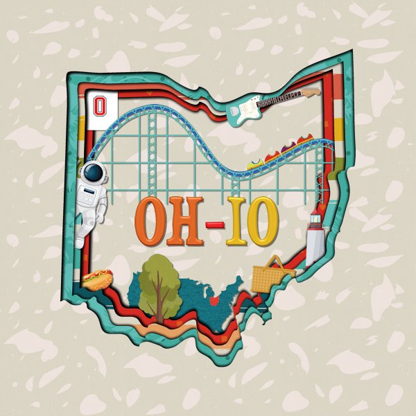
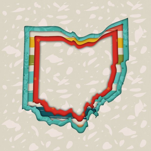
Based on the question about 3D extreme shadows for the Q&A, I have played with doing this. I saw it done at The Lily Pad in 2021. They included basic instructions for PS and PSE on how to do this but since the way PSP does shadows is different, I struggled with the shadow portion of it. Last night I played around and found a method that worked and looked a lot like the examples they had. Carole showed a different way of doing it in the Q&A. I had done an actual layout earlier today using my method. After the Q&A, I recreated the basic layout using Carole's method. The main difference is that I used a cut out file for my shape instead of a vector object. I used papers and elements from a kit called "50 States Ohio" sold at Sweet Shoppe Designs. The cut out shape of Ohio came from Scrapping With Liz's Ohio Cutouts sold at The Lily Pad.3 points
-
3 points
-
3 points
-
2 points
-
2 points
-
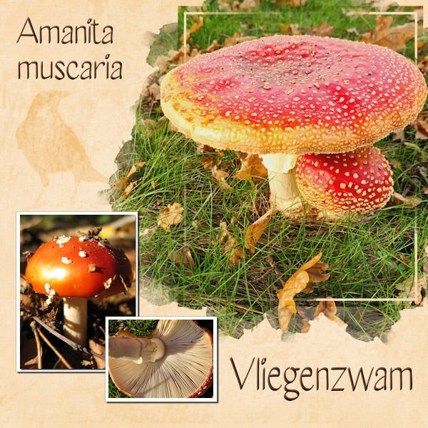
My theme for this Workshop will be mushrooms, I have so many photos of them and often choose flowers instead. I'll add the names in Dutch and and in Latin because I don't know all the names in English and Google nor the dictionary is that helpful for this subject. I didn't have much time today so it is a simple layout and a good rehearsel of the masking technique because most of the time I use Carole's Raster to Mask script.2 points
-
2 points
-
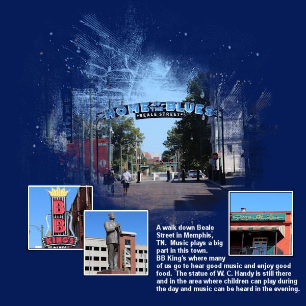
Memphis, TN is my theme. Fun relearning how to make a shape into a mask. I've been using the ClipToIt script so much of this year and last year (it's so easy and does all the work for you) but it is important to know what the steps are so that is how I shall continue. The journaling font is Arial. The pictures are mine.2 points
-
I would love that. And everyone can watch the master class which will reach a wider audience for this technique. Your samples were outstanding. I wouldnt have gotten there on my own, especially the shadow part.2 points
-
Maybe I'll change my plans and do a Shadow box tutorial for the March lab module. Or maybe a Master class instead? Hum...2 points
-
I will be there will bells on...and nothing else.? Good thing we arent doing this in person, eh?. I havent picked any photo's yet so I will wing it and choose randomly.2 points
-
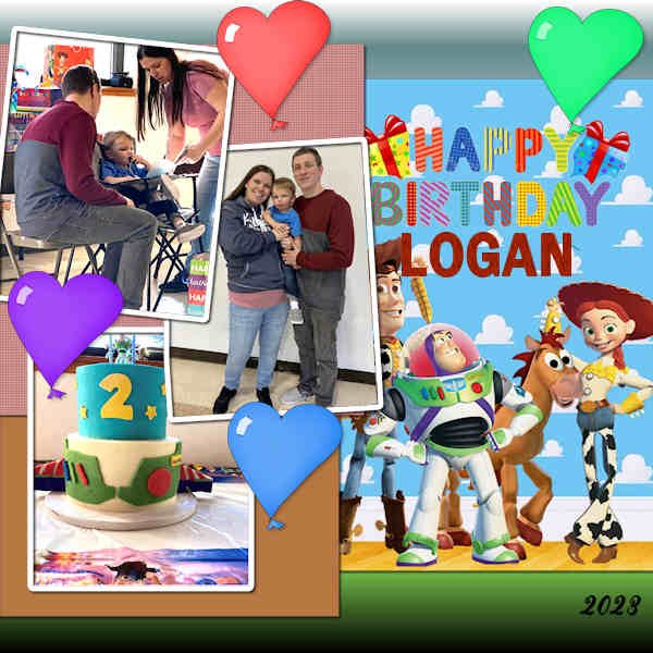
Great-grand Logan Robert turned 2 on Feb 6 and there was a Toy Story themed party yesterday (Sat Feb 11). I used a template from Marisa Lerin. I found the Toy Story art online and the balloons were from a baby kit, which I duplicated and colorized. Logan's brother is due this June. He is slate to be Jonah James.2 points
-
2 points
-
Hi I love all of you guys work, your all so good. i am doing this i think again but didnt get it last time, but still trying, been trying to do labs they are to hard for me so doing on breakdown at a time still trying. ty2 points
-
Hi! I am totally clueless about masks. Why would I want to use one? How do you do it? I'm looking forward to getting my questions answered!2 points
-
I just read that the Diamond members are getting new masks, so I'm pretty exicted!!!! Carole thank you so much for making the Workshop attractive for all of us!2 points
-
It would depend on the format they come in. I have a a couple of tutorials on using masks: How to use masks? Using transparent masks But we will go in further details during the Workshop.2 points
-
Carole: Is there any way we can get some instruction on using pre-made masks? I have several but don't know how to use them. Thanks!2 points
-
I will participate too, I liked the previous classes about masks, so here I am again ?2 points
-
2 points
-
2 points
-
2 points
-
I just signed up for this too. Maybe I will actually remember how to do some of the things Cassel teaches us this time.2 points
-
2 points
-
I'll be here too, this workshop is one of my favorites! It will be great to rehearse what I have learned before and be more creative with those masks.2 points
-
Another workshop will soon start. Are you in? It will start on February 13th. This workshop is FREE for everyone, so spread the word. This workshop is meant to be for those with some experience with PaintShop Pro. If you are brand new to using the program, it will be a little more challenging, although we are here to help you if you still want to participate. Did you find this thread before the registration page? Here it is. (and yes, it is the same series of tutorials, but I'll try to find more supplies for the DIAMOND members)1 point
-
Julie, once it clicks, there will be no going back, it will become second nature to you. I will suggest to you though, that you create a mask at every opportunity. Instead of say, using the selection tool to add a photo, until you have mastered the technique. Lovely layout. I love the lifted corners technique and effect it has on a layout. That script saves a lot of time.1 point
-
1 point
-
Hi, good thing I'm here, I seem to have forgotten everything I ever knew about masks.1 point
-
I am also in. Like all the other workshops, it is fun and instructive. I also haven't picked any photos yet, and hopefully, I will have time to post one or two layouts... I am very slow! ?1 point
-
1 point
-
I agree about tablets or phones but that seems to be where the best diary apps are. I do think One Note would work for what you want. You could set it up your way.1 point
-
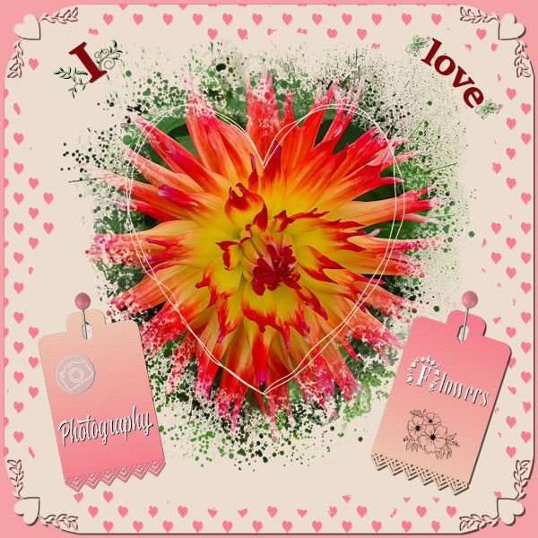
I didn't want to make a Valentine page but the colors lend themselves to a love theme so much! Valentine was and still is not a big thing overhere; it mostly, at least with the elderly people, is looked at as very commercial. Just before Valentiine the flowers are much more expensive and they go down in price after that! It is getting bigger this days with cards and offers of chocolate etc. So I decided to make something with the things I love: flowers and photograpgy which must come as no surprise as you know me by now. I used the Heart Mask that came with this theme and 2 papers from Escale Amoureuze and recolored them to go with the palette. The photo of the Dahlia had much of the colors of the palette in it. Heartpunches from from Caole and the freebie tag from this week; I used the black one and colored it with a gradient made with the palette colors.1 point
-
1 point
-
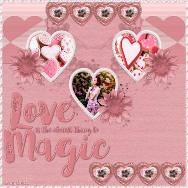
I found a wonderful fantasy picture for today's theme; I always try to find the original artist, but sometimes I just can't. Anyway, I used cass-Slat Heart-Template and adjusted it as needed. The background is the original pic with gaussian blur and a lower opacity over a white layer. I gave the original black outline of the heart an overlay blend mode. Then I added some selections I flood-filled with black for the stripes and changed the blend mode to soft light. The font is Adine Kirnberg, free from 1001 Fonts.1 point
-
1 point
-
1 point
-
I love the red lips and the tiny splashes of red! It just makes a lot of difference.1 point
-
Fashion Illustration is by Megan Hess. I used a combination of fonts: Veria Monogram and Bodoni MT. I like the monogram, but not the actual letter in it so I converted it to raster and erased the letter. Then I used Bodoni. The lace was a png that I've had for a long time so I don't know where it came from.1 point
-
1 point
-
I'm hoping to get some practice with working with jpg masks. I had to try several times before I could use Carole's valentine mask.1 point
-
I made my own clothes for my 2 children when they babies and toddlers. Of course back in those days boys and girls were dressed the same when babies. I used to make Viyella nighties and vests for them. Also I knitted all their matinee jackets, using the Blackberry stitch, as it is my favourite stitch. I ordered a hand made personized rag doll for the youngest granddaughter for Xmas. I'm in the process of crocheting a hat and matching scarf and mittens for her. As an Easter gift. I suspect the cost of the postage to Wales will be far in excess of the wool. But Hey, you can't put a price on making something yourself.1 point
-
1 point







.jpg.3d6c1cf284cc83eb9ce266defa0bff6e.jpg)
.jpg.d9307117da302e9db39e3f8365d30c38.jpg)
Resized.thumb.jpg.d25811db03a63358cedab1e79f527635.jpg)