Leaderboard


Popular Content
Showing content with the highest reputation on 06/20/2025 in all areas
-
Day 4. I had previously added watercolours, which I have used here. I did find it a bit of a challenge, as I couldn't rotate, although I did change the settings to random. I felt that I have more control when it comes to editing masks in PSP, perhaps it is because I am so familiar with them. I need to play with Affinity more, as there are settings I need to locate. For me Winter is the best time to really get to grips with this programme.
 14 points
 -
Day 4: Created in Affinity. I enjoyed making the mask. I added a layer with a grey colour from the photo and added some noise.
14 points
-
Day 4 with Affinity. This was fun to do and so easy! I used one of the brushes from Carole's link. The back ground is a texture layer with a colored pixel layer over it. Then I used a blending mode to get the look and color I wanted.
14 points
-
Lesson 3 Diamond Template. Font is Single Fighter (CF). I made lots of tiles using the Kaleidoscope, some seamless and some not seamless that looked cool as a smaller size. the background is subtle(and might not show up) and is made from two not so seamless tiles in a small size and at 45 degrees and a blend mode of lighten. Then i added a texture of bricks to simulate a graffiti wall over the mask group(rasterized) and the text group (rasterized). Such a fun effect. Everyone has been making such cool plaids and backgrounds, super inspiring. Photo is mine.
13 points
-
Lesson 2. This was a great lesson. I have worked with this technique some years ago in a different software, so it was great to revisit it again.
13 points
-
Grandpa Great was a very hard worker. He often put in long work days as a Field Supervisor at Green Giant. On his rare free days, he enjoyed fishing at his cabin, playing golf and restoring antique engines. He loved playing cards with his wife and the card club gang. And of course most of all, he enjoyed the company of his 4 kids and their spouses, 6 grandkids and 7 great grands.
13 points
-
Lesson - Affinity When starting with Affinity I imported all the abr.brushes which I originally had downloaded for PSP; I always keep the zipfile! I just chose one of my collection watercolor brushes to use on the photo. It is nice that Affinity has sort of similar settings for the brushes as F11 in PSP, so it is simple to understand what they are. Because the orientation of the tree in the photo I placed it on the left side and used a rather small brush along the right side where the branches are. The background consists of 2 colored layers with a blendmode and a canvas pattern overlay that I made in the Paper Workshop also with a blendmode. I hope it is visible in this reduced version.
13 points
-
Here's my Lesson 4 - Daughter Deb took the photo for this one at The Met (The Metropolitan Museum of Art) in NYC. I played with the brushes a bit, used a solid brush to clear up the center of the painting and a really small watercolor to finish the edges. Then I applied a drop shadow to the whole group. The fonts are Niagara Solid and Copperplate Gothic Bold. The text at the bottom reads: The Metropolitan Museum of Art proudly presents Iba N’Diaye: Between Latitude and Longitude, a landmark exhibition celebrating the legacy of Iba N’Diaye, a pivotal figure in African Modernist painting. Tabaski III celebrates the Muslim ritual of sacrifice. Oil on plywood painted in 1970, it is an imposing size, measuring about 5 feet in height by more than 8 feet in width. EDIT: I'll also post the original photo so you can see my transition.
13 points
-
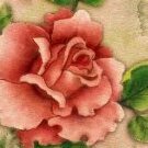
Lesson 5. My photo of the 'Peace' rose doesn't have much of a background area as I took a close up so I created a full background using a mask from Lesson 2. Then I applied the circular selection mask to make the designs around the outside and added a pink background under the mask layer.
12 points
-
Here is Day 5. I practiced the kaleidoscope technique again. I liked these Sprays and Spatters brushes very much.
12 points
-
Here is my Lesson 3 and Lesson 4. Both photos were taken by my cousin about 20years ago when she did a group trip. the png masks used on both are from an old software i had called Craft Artist. the brushes used on softening edges are free ones downloaded from an Affinity Forum i found when searching for brushes called TB Dots 01 pack 11.
12 points
-
I'm a bit late getting to do this workshop, here's my first lesson.
12 points
-
Day 4 using Affinity I used a photo of hubby relaxing on the grass under a tree with the hills behind him it was a lovely summers day, I changed the photo into a pencil Drawing and made a mask to soften the image by using a photo of the hills which I took from a slighty different angle. I then used a stipple brush over the top to add to it, finished off with Baby Garland Font for the text on a path. Added a second one using the brush set from the link Carole provided added a gradient for the background paper .
12 points
-
Day 4 - Today's layout revisits one from 2021 of my niece, Corinne. Both are posted. I found free snowflake, frost, and glowing circle Photoshop brushes at DeviantArt. On another topic, Affinity has been closing down without warning. It started in the last couple of days. Has anyone else experienced this issue and been able to identify the cause?
12 points
-
Here is Day 4. After Carole’s comment about the importance of having a 1-pixel selection to create the plaid pattern, I decided to redo it. I used the Move Tool to position the selection exactly where I wanted it and also used the Transform Tool to adjust the selection's size. Instead of using the Watercolor Brush, I chose the Acrylic Brush, as the former was taking too long to achieve the expected result within the limited time I had to work with it.
11 points
-
Day 3
11 points
-
Day 4
10 points
-
Our cat works in modeling, from time to time;) L4. JK has been there today.
10 points
-
Eindelijk nummer dag 2 Mijn dochter Wendy en haar dochter Nike op het strand.gemaakt in psp 2023. Ik was even vergeten dat deze in 3600x3600 germaakt is daarom is het ruitmotief wat klein uitgevallen. Maar mistaat niet. Ik heb het gehele template/masker een kwart slag gedraaid omdat ik de mooie japon van mijn dochter goed in beeld wilde krijgen. Ik weet niet hoe het komt maar het gehele masker is wat doorschijnend geworden. Terwijl die orginele er toch onder zat.
9 points
-
Lesson 3: I'm behind, but plugging away at it. Did this one rather fast. Used PSP (2022) since the kaleidoscope effect is much easier than in PSE. Not an effect I would use very much, but nice to be reminded how to do it. Kept it all simple. A friend's dog when he was a pup. He's a big boy now. Elements from my stash. Font Bodoni. I can't keep up with the layouts being produced and displayed! So many great ones, such fun to see. The newcomers are doing a great job with masks. Much better than I did at the start. We're all keeping Carole busy!!!!
9 points
-
Day 5 - This is a very unhappy Felix, my youngest nephew. The layout was created using Affinity Photo. The spectres are brushes I found on DeviantArt, on a separate layer set at 40% opacity with blend mode set to 'contrast negate'.
8 points
-
Here is my Lesson 5 using PSP. Meet Thurston. Thurston was a stray Himalia that showed up on our door step many years ago.
8 points
-
Lesson 3 Background Here's what the layers looked like and the blended result.
8 points
-
Lesson 4, continuing with images from my sketchbook ..
8 points
-
Here's my layout for Mask Lesson 4. Enjoyed this one...even uploaded the free brushes all by myself; didn't even require a "Help" note to Carole! Making progress and feeling so good about myself!!! Whoop-Whoop!😉
8 points
-
Day 3 PSP - My pansy photo. The CF layered front is called FROS. I could have played with the kaleidoscope effect all day. I did use a blend mode to adjust the color of the kaeidoscope. The frames are from the cass script Nested Frames.
8 points
-
@Connie CollierSimple is beautiful, and it helps showcase your photos and your skill. @Jeni SimpsonBeautiful layouts. Yourfirst kaleidoscope pattern, I had to look at it twice to realize it was done with that technique. It looks so delicate! @kasanyDoes the rose have a black background or is that the shape of the mask? If it is the actual background, I think it would work better if the paper is also dark, otherwise, the contrast does not give a smooth transition. Your latest project is stunning with the black background! @Sharla I think that this pattern looks good. Right now, you are "very close" to your design so it might become "boring" to you, but for us, viewing it in a project, we just see the overall effect and it looks great. @fiona cookThat is a great end result. And you are totally allowed to play with all those effects. That is how you can discover something new or something you didn't think you would like. @CristinaUsing the pattern only on the edges is a great way to use it without overpowering. And with that light-colored photo, it was a smart choice. @Jen Brown Great to see you! Your first layout is wonderful. Looking forward to your other projects. @Robert GarrettThe effect is much more striking with the resized mask/photo. @Donna SilliaYour use of the nested frames in your PSP project is puzzling me. It looks like some sections have a bevel but not all. It LOOKS like what is overlapping the mask has no bevel but the rest does. I think you COULD consider erasing some parts that overlap the mask and it would even show off your photo more. @Karen BorgmannThose Those boards are great! Did you make them from scratch or were they part of a kit? @Corrie KinkelYes, some things are harder or just not possible in Affinity. You will see that on Saturday!!! 😞 @Julie MagerkaYou might not think much of those kaleidoscope patterns, but I definitely think that they have great potential. Once you don't have them right "in your face", you might appreciate them more. @Gerry LandrethYour pages are wonderful. I think that Affinity is just like PSP: it can get finicky with closing and it is inconsistent. It is annoying, and usually, there is no specific solution unless it can be reproducible on demand. @gwen jewittthe bird layout made me smile! That is a great way to combine different layers in a single "story". @Hank SobahAre we invited to those festivals? They look great. @Ann SeeberIt is interesting how that shadow was essential for the text, and it looks good, making the text legible. @Clarineare you planning on printing an album about your grandfather? With all those layouts (and more that you can add), it would be great!7 points
-
Day 3 - Affinity I copied the frames from PSP as pngs in order to add them to Affinity and changed the font to Brandish from CF. I also played with the styles settings.
7 points
-
Here is Lesson 4. This time I used PSP 2023 Ultimate. I used the Effect Browser - Photo Effects - Retro Lab to get the effect on the background.
7 points
-
Lesson 1 - Masks Workshop using Affinity Photo
7 points
-
This abstract turned into some kind of cervid in my mind, so I made a deer-shaped brush to go with it for the exercise in Lesson 5. While I did use a mask to cover some of the main image, I didn't feather its edges because I wanted to maintain the strong, side-to-side movement of my "herd." Then I finished it with a layer of animals using the brush with a solid colour.
6 points
-
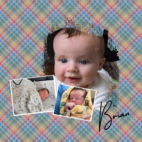
Day 4 - Photos are from my grandson. I downloaded the watercolor brushes from Creative Fabrica. The fonts are Jibril and melaine BT. The background is from Photoshop Elements stock. It is easier to make the masks in Affinity. I find myself having to manipulate both photos and masks in PSP.
6 points
-
Day 5. It is rare for me to say that I am not overly happy with the result. I realize that I am after all a newbie to Affinity, and in time I will get the hang of this programme. Practise is what I need, but I am afraid not during the summer months.
6 points
-
Yeah, Susan, life in the wild can be harsh. While they enjoy freedom, it's a constant struggle for survival. Still, it's better than keeping them in confinement.6 points
-
Feels good, doesn't it, to nail done those techniques! Good for you. Love the colours in this.6 points
-
Cassell, thanks for the input. Here is a remake of Lesson 3. I had played with the opacity for all the layers and that is most likely what messed it up. I also believe in the original posting the background is to dark.
6 points
-
Lesson 4. Being a bit abstract in the combination of photos as got carried away again and like Carole says, the effects can be addictive. I've used the overlay blend mode for my background image with a filled layer of a colour taken from the main 'bee' photo. The background image itself applied Effects/Texture Effects, Texture-Plant Leaves.
6 points
-
Lesson 5 I too liked the brush used by Carole, but I added a faint butterfly brush on the outside. Being busy with brushes I used a corner brush as well. I couldn't find a way to get the brush rotate by 90 degrees, I think there must be a way to do that. Of course I have duplicated the brush layer and rotated it by 90 degrees to get what I wanted. Because my flower is round I put the text in a circle and I have to admit I had to check the vector workshop on how to do it. It need more practice to remember all this new things, on the positive side at least I know were to find it.
5 points
-
Little nap of the grandsons, My day 2 (PSP)
5 points
-
Day 5 using Affinity I used the same brush as Carole as I liked the affect it gave, the font I used is back to Vintage. The photo is of two juvenilles with the red patches on the top of the head and that's mum at the feeder, my son took the photo just the other day, he has had woodpeckers visiting that same tree for the past 11 years. When he sent me the photo he wrote Mrs Woodpecker sighed wearily as she pecked up her order at the McPeanuts Fly-Thru, that second egg had definitely been a mistake... I read Caroles comments and I have redone it I am happier with the result, I also changed the Font to Before the Rainbow as I wasn't happy with the first one Back to Vintage ,thank you Carole ,all comments you make are positive ones
5 points
-
Your Himalayan cat is beautiful! 😻5 points
-
Love the layout, Ann.5 points
-
Beautiful layout, Susan.5 points
-
Hank, is this a country music festival, or a county music festival? You may need to tweek it if it is supposed to be country.5 points
-
Susan, that kaleidoscope is beautiful, so soft, yet I can see it, hiding behind that brick wall.5 points
-
I love what you did with the font on the surfboard!5 points
-
Day 3: Created in Affinity. It’s not the type of pattern I’d ordinarily use but it was fun learning how to create it.
5 points
-
L3, my rose done with Incendia.
5 points
-
Day 3 PSP Using a photograph I took from a garden tour at Wedderburn in the Manioto, in Otago, I used a small square from the statue for the kaleidoscope pattern. The hearts I created to it the hearts in the mask. Affinity This photo was also taken in the Maniototo; it shows a backpacker's hostel close to the rail trail in Central Otago. It was taken on a late afternoon walk back from a long walk, and the light was so different that I couldn't resist. The rail trail is a bicycle trail that runs across Central Otago. I used another Melo mask, this one is called mixed-media-3-spill-frames-mask-01-circle, the fonts are Umbrella and Arial. I nearly placed that text inside the mask, and changed my mind at the last minute.
5 points
-
I'm in the mood for simple pages, but somehow I end up fiddling endlessly anyway! I like making the kaleidoscopes.
5 points