Leaderboard
Popular Content
Showing content with the highest reputation on 09/27/2024 in all areas
-
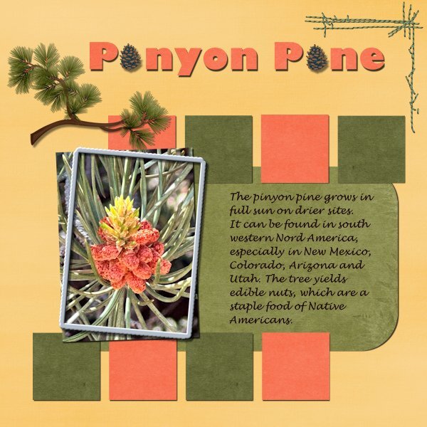
Project #5 For today I choose I photo of a pinyon pine tree that I saw on a hill side on one of the road trips I took with my family. Because of the hill I was able to look into the tree on more or less eye level and noticed this "flower" that grows into the pine cone. These trees doesn't grow in Europe, of course we have conifers too, just different ones. The colors of my layout are all taken from the photo and I used a kit by DBMagnolia in the blogtrain from juli 2021. The stitching came from the blogtrain october 2022. The fonts are Lucinda Handwriting and Gill Sans Ultra Bold. I have really enjoyed doing this Bootcamp again and have loved to see all the different layouts that were posted.8 points
-
Day 11. Bundy and his Champas have now passed but we constantly think of them. They were a very big part of our lives. Millie our now 8-year-old little girl, was lucky enough to spend a few years with Bundy. Thank you Cassle, for all your advice, because I have learnt so much from all your tips and tricks and pointers. This is how I have got to this point. I still have a lot to learn but I am getting there.7 points
-
Day 11 - Project 5 I'm not very good with flowers so I hope I identified it properly. If not, please correct me. The photo is mine. I used various papers and elements from Mizteeques, AnnieC, Melisa Lerin, Janet Kemp, and the little flower under the text from Freepik. Whew. I made the little boxes by filling in selections with triadic colors and adding some texture. I can see now that I probably should have varied the textures. The clip and flower were two separate elements so I tried adjusting the drop shadows as we learned in the Shadows Workshop. I think I did it right. The title font is Acmatic Personal and the text font is Aguafina Script.6 points
-
I got this far and then couldn't find a frame saved in any folders and after trying to find and save and use a brand new frames (and still no luck finding them in a folder) I gave up. Not only did I not conquer finding/using a new frame, I lost all the layers I had up to this point so I couldn't do the shadows. I know it's time to give up when my bums gets sore and my legs start to fall asleep. I have enjoyed getting reacquainted with the program and relearning how to use layers. I don't do scrapbook pages, but I do do a lot of editing the many photos I take. It was really nice to see many of the familiar and beautiful faces that grace the pages of the forum. That just feels good!!! Thank you Carole for doing such a marvelous job teaching us how to use PSP. You are a delight to have for a teacher. 🙂6 points
-
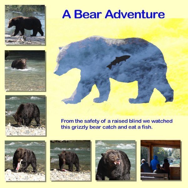
Here is an image that sort of meets the two picture criteria, as the upper left image is the photo that served as the start of the silhouette. Several months ago Carole did a tutorial on creating a silhouette with another picture inside it. I was intrigued and used it to create this image that tells the story of this adventure in an interesting way. The bear adventure was at a river in Klahoose First Nations territory and the image of the salmon jumping was taken in a river close to where I live in British Columbia. Thank Nikon for long lens cameras.5 points
-
5 points
-
5 points
-
Day 11 Project 5. Papers are combination from PSBT-Songbird, Jessica Dunn, and tutorial practice projects with some blending involved. Frames and flowers and other elements from internet. Fonts are Gill Sans Ultra Bold Condensed @350 px and a script font.5 points
-
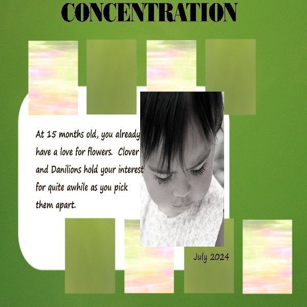
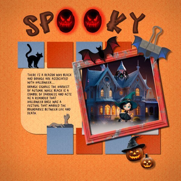
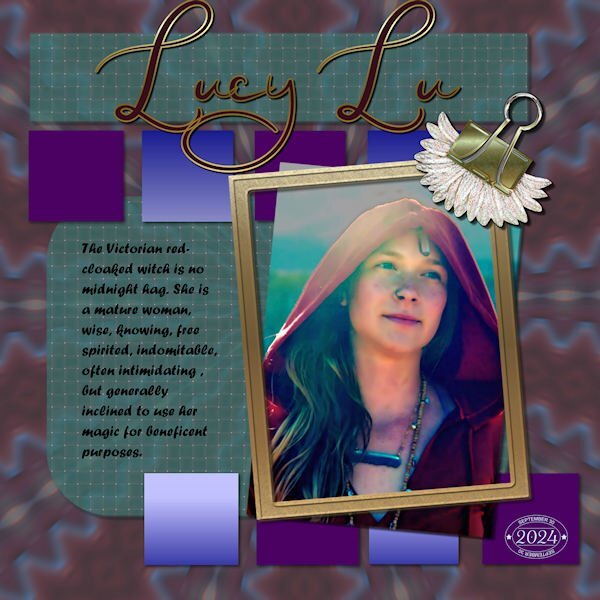
I just couldn't find a photo that I liked for "Concentration," so I decided use some of my Halloween (not my favorite holiday) stuff. I made all the backgrounds using FF and changing them to different colors. The title font is called "Hello Jack" from CF. I experimented with a layer style bevel in orange and was pleasantly surprised that made the letters smokey inside. The journal font is "Halloween" from CF. I used AI quite a bit. I am not sure where I got the house, but it was treated in My Edit, an AI product from Cyberlink. The witch and jack o lanterns are also from AI in My Edit. The bat and frame are from Canva. The clip is my own with bat wings added. The cat and the hands, I think, are from font extras from CF. I have been adding Carole's shadows to my presets after I label them to indicate their use. For example, "cassdropshadow for frame." Since I am shadow deficient, this labeling really helps me when I am making something without having to scroll through a video to help me.4 points
-
@Michele Yes, a common occurrence for me when working inside a bounding box. It may have something to do with conversions of PS files to PSPIMAGE. I find if I duplicate and rasterize the text it behaves better. @Cassel I fixed the shadowing on the squares and replaced the font on the journaling with Forte which seems more readable than Curlz.3 points
-
I already sent him a copy of the layout in the messages on his 501 North Photography FB page. I hope he likes it.3 points
-
Well this has taken me all day ....and still not how I wanted it ... I was playing with the background trying to get something I liked and ended up using the wrong squares - not sure why I didn't see it when I was working on sorting them out!! The difference is the colour of the font to make it show up better and the dark brown made slightly lighter. I still have the others so "one of these days" I will switch them out. My shadows were on a separate layer and looked good until I resized to 600 and lost half of them ... so I redid them on the same layer and think they are ok now.3 points
-
3 points
-
Day 9 - Project 4 I absolutely adore this photographer's work. If you're on Facebook, you should check out his page. He goes under 501 North Photography and has some amazing pictures of the Aurora Borealis. I decided to share some of his barn shots. I created an uncharacteristically (for me) muted layout so the pics could be the real stars. I used a bunch of supplies from the ALFLT Blog Train Jan 2021. The title font is Xpressive and the text font is Sugarstyle Millenial.3 points
-
3 points
-
2 points
-
I've found that I need to Merge All (Flatten) before I resize mine. Otherwise weird things can happen. I've had my text disappear.2 points
-
It could be my bad memory, but I think this is the first of your pics that doesn't have wildlife in it.2 points
-
I open any new frames in my PSP workspace and then import them to PSP frames. It's a choice under the Files menu. The program knows where to put them.2 points
-
2 points
-
2 points
-
2 points
-
2 points
-
Day 7 - Project 3 The papers and flower are from a mini kit by Marjan De With that I obtained in the Nov 2018 Blog Train. I made the scatter using Cassel's Punch Confetti script. For the glitter, I took a maroon glitter paper from Marisa Lerin, added a layer on top with the foreground/background gradient using the maroon and green from the papers, and changed the blend mode to Hue. The title font is Romantic Crafty and the text font is Segoe Print.2 points
-
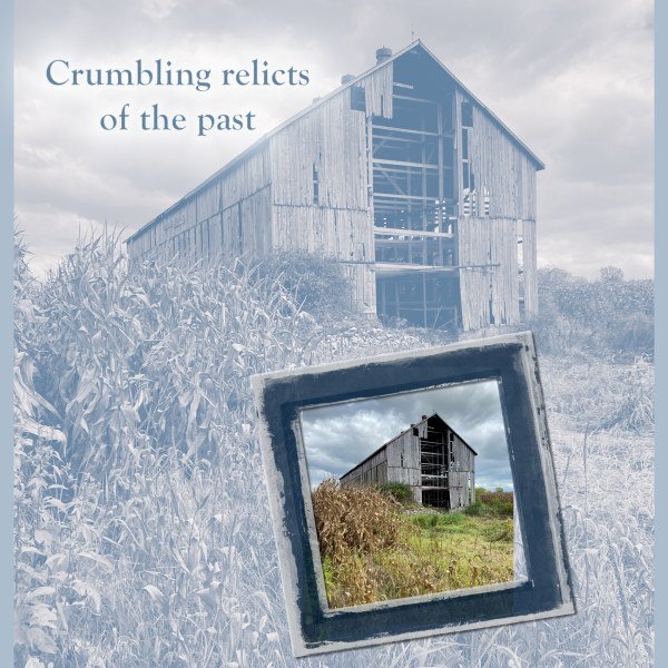
I made a "road trip" this week (unexpectedly) and ended up in a county (Ontario) to the east which is predominantly agricultural. I passed an old barn which was set in the middle of corn fields with only a rutted track to get to it. On the way back, I had to stop and try the track (which was, fortunately, dry) and get some pix. I have always loved old barns. They are a throwback to an earlier age of settlement (here in Canada) that speaks to the richness of community despite the distances. Men and women gathered to help new neighbours in a "barn raiser" that took not much more than one day of labour by everyone involved. Most of them are now gone, but occasionally a real remnant can be found. The background image is treated as Sepia Effect with an Overlay blend against the blue background. The frame on the colour image is from ET Designs.2 points
-
2 points
-
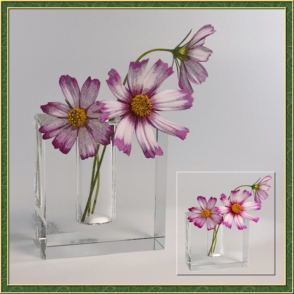
I've been busy lately with another project so this is a sparse layout from me. I needed a little PSP time so my brain could reset for the other project that I'm running into more challenges than expected. the little photo is framed with a cutout. I actually extracted the flowers and vase then made the selection around them and added the cutout. the good part was I didnt need to be perfect with the extraction as it blended in with the background. I got lucky on that. I also used the pencil sketch 2 script. I played with the opacity of the layers and used a mask to make the centre yellow part show through a little more. I turned on the photo layer that the sketch leaves intact to allow the the color to come through. maybe a little too much though.2 points
-
Frame is from Cassel, the reading dragon came off the internet. Rest was just "Moi". Font was Fraktur BT at 550 Pixels.2 points
-
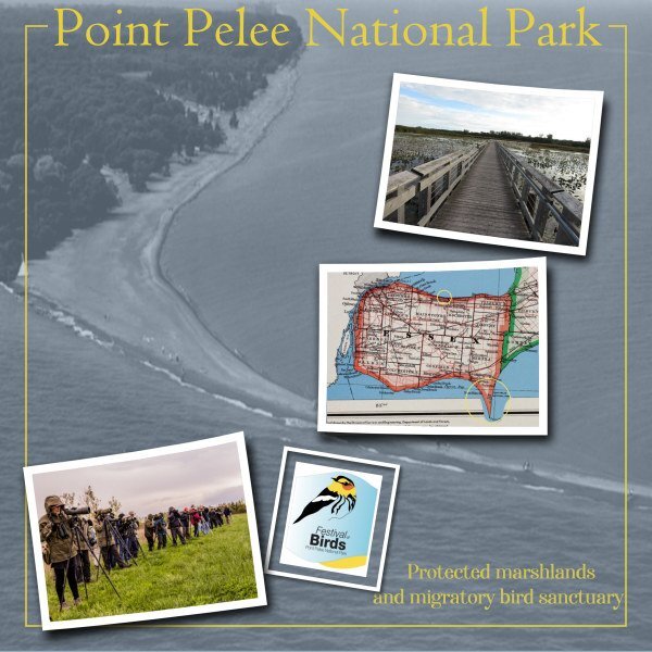
I think it is a truth universally accepted (to use a phrase from Jane Austen) that we tend not to notice the special places around us. I lived in Toronto for many years and, after visiting all the "hot spots" and special places, I didn't really pay much more attention to them unless I took visiting friends around. The same where I've been living for the last 12 years (southwestern Ontario). Because I grew up down here, I often disregard that we have have nifty places to explore and visit. One example is Point Pelee National Park, the most southerly and ecologically diverse park in Canada, jutting into Lake Erie. It is well-known, especially by birders who travel to it from places far away each May for the Festival of Birds. Over those weeks, more than 100 species of birds stop there on their northern migrations. I've been a couple of times, and it is quite the adventure. On the map, Pelee is the long tapering point down at the bottom of Essex County. It's a skinny peninsula that just fades away in sand. If you take a ferry (from Leamington) for about 90 minutes,you can visit Pelee Island which is quite outstanding as well. These are the most southern parts of Canada and have different climatic conditions than elsewhere which allows for many different species to flourish. (On the map, my town - Belle River - is on the other lake to the north (Lake St. Clair). About a 40 minute drive to the park for me. Photos from online in frames from my stash; Cass-Word Frame; fonts....?1 point
-
1 point
-
1 point
-
I believe, I have posted 12 non wildlife pages in this challenge alone. Only the other week, week 35 was a photo of an old local red barn. I had to check myslef, as I created the pages, and yet doubted my memory of what I had and hadn't posted. Lol !!!1 point
-
It can work but it always depends on the element. In the other comment I made, it was a very thick rope and it was under "flat ribbons". That is the part that does not work. In your cluster, the rope is much thinner, and the elements on top of it are logical to see in that order. Does that make sense?1 point
-
1 point
-
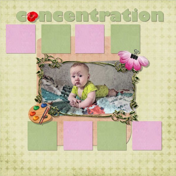
@Cassel This is my grandson (Ludovyk), the younger brother (Noah) who appears in the photos of my other projects. This is one of the photos I converted into a painting using the "Corel Painter" software in the "Van Gogh" style (nearly a week of work)1 point
-
1 point
-
Clarine, go to the top toolbar, click Image, choose Picture Frame. There's an entire, free PSP library for your use.1 point
-
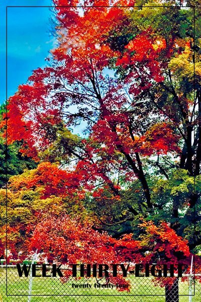
Unfortunately, the pattern this year is for the leaves to turn brown and fall off the trees without the usual color display.1 point
-
Corel's cards are excellant IMHO but I would wait a moment for a real fall;)1 point
-
1 point
-
@Cassel Yes, I did add the extra shadow around the circle because it did not appear to stand out enough with the small shadow.1 point
-
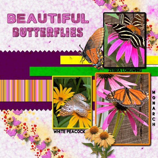
Thank you for your comments, Carole. I was very unhappy with the scatter and font colors on the original. I created a new scatter using VectorPaint and VectorTube. The used shadows on each layer of the scatter before merging since I didn't like how they looked on the merged file. I created a coneflower tube from a coneflower downloaded from Canva. I also tried to fix how the pictures looked. All shadows have been saved on their own layer for future adjustment. The Butterflies font is from CF. The glitter in the scatter is from a brush downloaded from Deviant Art.1 point
-
Although I have been using PaintShop pro since 2007 (PainshopProp Photo 11), this is the first time I use it to make "Scrapbooks". I have rather used Corel Painter to transform my photos into "paintings". I have learned many things that I will reuse.1 point
-
the next lab 13 module calls for learning to do fringe papers. Not sure what I will do with it, but I thought that Olaf (from Frozen) wanted to experience summer. My daughter got me a little stuffed Olaf with a hula skirt (since he wanted to experience summer). I thought that maybe I could use the tut for fringe to make a hula skirt for him. So I made an Olaf. This is my Olaf waiting for his hula skirt. I made the eyes in a previous lab. the toothy grin is mine as are the square buttons. the arms and carrot nose are from Pixel Scrapper - Jessica Dunn.1 point
-
Hello everyone,🖐️ now the hot, humid summer is over in Germany and I can sit back at the PC and relax. It was really a stressful time for us health-wise. But now things should get going again. I'm currently working on two private birthday cards and am practicing an online AI generator. Here is my latest scrap of it. I'm slowly running out of private photos that I can show publicly. @ Carol I'm really unhappy with the PSP 2023, would it be possible to exchange the program for an earlier version at Corel? I really want to be able to use the filters I've collected. Or is Corel planning to do an update? You're connected to the company and maybe you know more about it?1 point
-
1 point
-
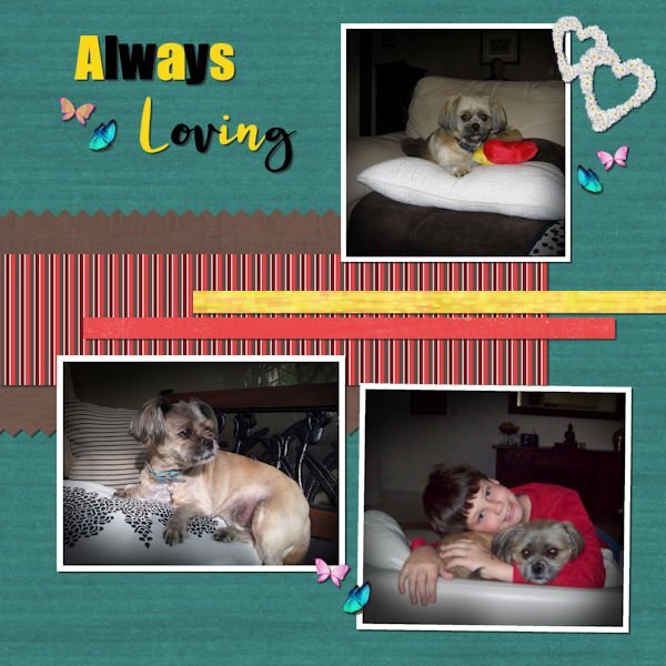
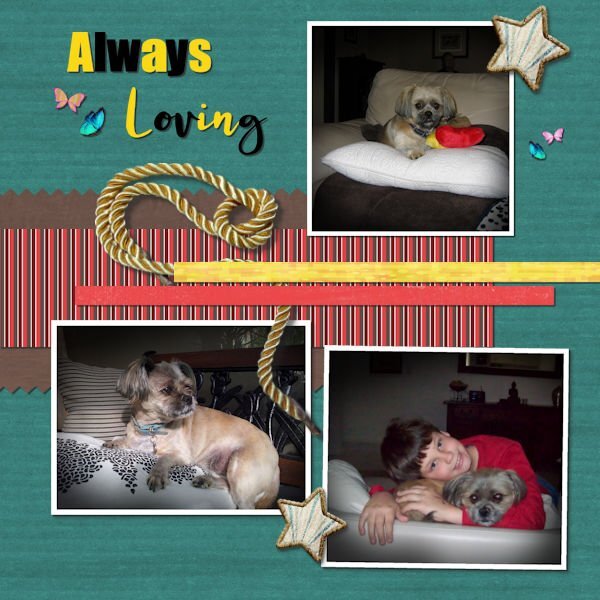
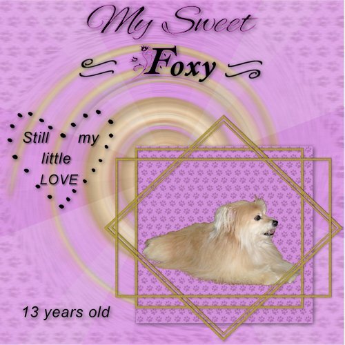
I have been wanting to use this photo I took of my Foxy and thought this was a good place to play with it. She is a rescue and they said she was a Yorkie-Pom mix. I call her the harry beast most of the time because she has the Pomeranian undercoat and sheds all the time. I am just glad she isn't the size of a Great Dane. Oh well, I still love her to death.1 point
-
I didn't read the directions carefully but here is my take of the challenge. Jerry and I play with each other once a year or once every 2 years. (He lives in Georgia; I live in VA.) We have learned to play together and do pretty well. This photo is from last week at the Georgia Golden Olympics. We competed against 70-75 year olds and were undefeated. We won the gold medal for the age group 80-85. This was our first 80+ tournament. We hope to competed in Des Moines, Iowa next year in the National Senior Games.1 point
-
1 point
-
1 point















Resized.thumb.jpg.d25811db03a63358cedab1e79f527635.jpg)
