Leaderboard
Popular Content
Showing content with the highest reputation on 09/26/2024 in all areas
-
Day 9 - Project 4 I absolutely adore this photographer's work. If you're on Facebook, you should check out his page. He goes under 501 North Photography and has some amazing pictures of the Aurora Borealis. I decided to share some of his barn shots. I created an uncharacteristically (for me) muted layout so the pics could be the real stars. I used a bunch of supplies from the ALFLT Blog Train Jan 2021. The title font is Xpressive and the text font is Sugarstyle Millenial.7 points
-
7 points
-
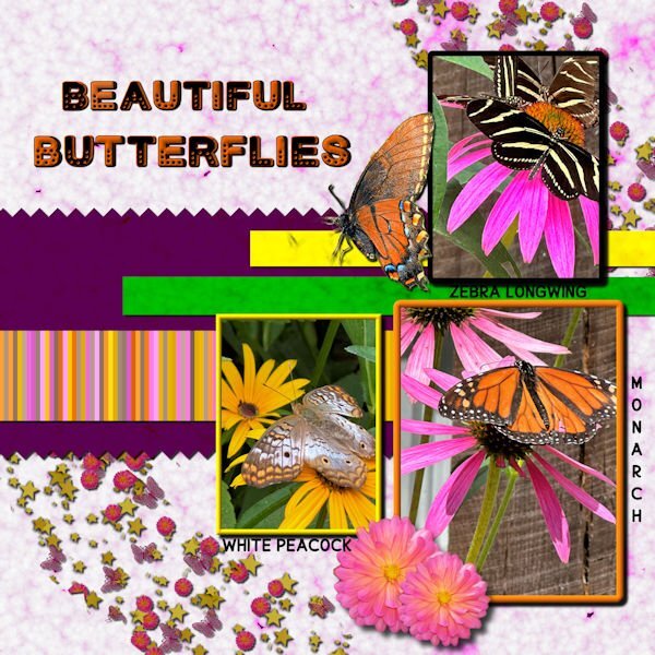
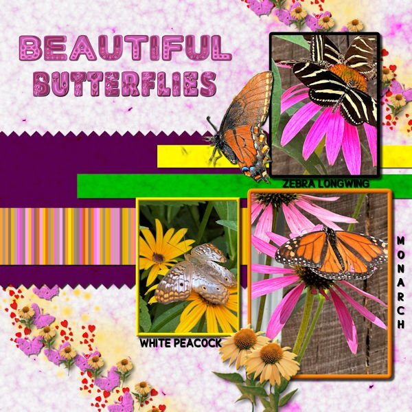
Thank you for your comments, Carole. I was very unhappy with the scatter and font colors on the original. I created a new scatter using VectorPaint and VectorTube. The used shadows on each layer of the scatter before merging since I didn't like how they looked on the merged file. I created a coneflower tube from a coneflower downloaded from Canva. I also tried to fix how the pictures looked. All shadows have been saved on their own layer for future adjustment. The Butterflies font is from CF. The glitter in the scatter is from a brush downloaded from Deviant Art.6 points
-
Day 11 Project 5. Papers are combination from PSBT-Songbird, Jessica Dunn, and tutorial practice projects with some blending involved. Frames and flowers and other elements from internet. Fonts are Gill Sans Ultra Bold Condensed @350 px and a script font.5 points
-
5 points
-
5 points
-
the next lab 13 module calls for learning to do fringe papers. Not sure what I will do with it, but I thought that Olaf (from Frozen) wanted to experience summer. My daughter got me a little stuffed Olaf with a hula skirt (since he wanted to experience summer). I thought that maybe I could use the tut for fringe to make a hula skirt for him. So I made an Olaf. This is my Olaf waiting for his hula skirt. I made the eyes in a previous lab. the toothy grin is mine as are the square buttons. the arms and carrot nose are from Pixel Scrapper - Jessica Dunn.5 points
-
Hi Bonnie, Belated best wishes for your special birthday, dear Bonnie.🤗🌻 The format is made for mobile phones. ur special birthday, dear Bonnie.🤗🌻5 points
-
4 points
-
4 points
-
Hello everyone,🖐️ now the hot, humid summer is over in Germany and I can sit back at the PC and relax. It was really a stressful time for us health-wise. But now things should get going again. I'm currently working on two private birthday cards and am practicing an online AI generator. Here is my latest scrap of it. I'm slowly running out of private photos that I can show publicly. @ Carol I'm really unhappy with the PSP 2023, would it be possible to exchange the program for an earlier version at Corel? I really want to be able to use the filters I've collected. Or is Corel planning to do an update? You're connected to the company and maybe you know more about it?4 points
-
Day 7 - Project 3 The papers and flower are from a mini kit by Marjan De With that I obtained in the Nov 2018 Blog Train. I made the scatter using Cassel's Punch Confetti script. For the glitter, I took a maroon glitter paper from Marisa Lerin, added a layer on top with the foreground/background gradient using the maroon and green from the papers, and changed the blend mode to Hue. The title font is Romantic Crafty and the text font is Segoe Print.4 points
-
3 points
-
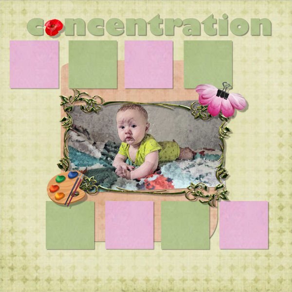
Although I have been using PaintShop pro since 2007 (PainshopProp Photo 11), this is the first time I use it to make "Scrapbooks". I have rather used Corel Painter to transform my photos into "paintings". I have learned many things that I will reuse.3 points
-
Very lovely and good you took the time to explore! I sadly live in a small and very regulated and country where you can't see such great barn structures. The most we might have are old sheds on a yard and they are not very pittoresk and the farmer won't be happy if you took a photo of it either.3 points
-
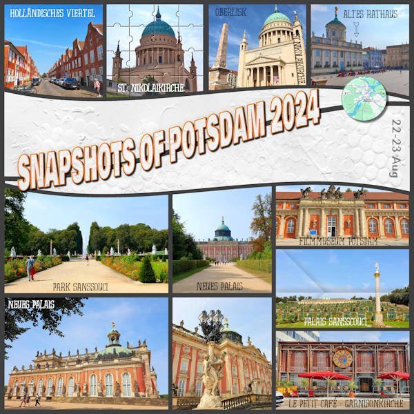
This layout is from the trip we did in August, the first stop. This city has many places to visit, but we only stayed there for two nights, so there are plenty of things to see if we ever go back. Credits: Template by Scrapping with Liz SwL_SimplePhotosandWavesTemplate1 Paper – Lilypad – Mommyish - JustJaimee-jj-CU-GessoTextures-1 Cassel’s Tutorials: Folded Photo Puzzle Flair Button Fonts: Evertone one / Bowlby One SC / Dessert Menu Sans3 points
-
3 points
-
Happy Birthday month to you, @Bonnie Ballentine. You have wonderful friends who celebrate you. What more can you ask for?3 points
-
3 points
-
This was my fourth attempt to finish this assignment. When I went to the file folder to find and add the next element, it would shut the program down. After the 3rd time, I ended up restarting the computer. Finally, it went pretty quickly/smoothly and I finished. If you can check out the frames on each of the photos, you can see that it is not a solid frame. Using the flood tool, I had to click each spot to get the white to attach, and as you can see, the white still did not fill in on all the spots. Not sure why this happened, but it was consistent thru all 3 prior attempts as well. But in the end, I liked the camo effect so didn't mind that it didn't work as it should have. My grandson will love that I did this assignment for him.3 points
-
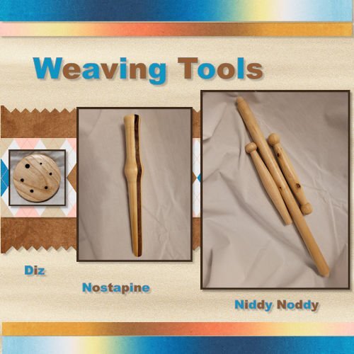
Here is my Project 4. I used some pictures of Weaving tools that I turned this summer. I am not a weaver, but I belong to an organization that has Woodturners, Weavers/Spinners and Gourd Artists so we cross paths quite a bit. Most of the papers I used came from DigitalScrapbook.com (formerly Pixel Scrapper).3 points
-
3 points
-
Project 4. Background started out as an internet image for Flamingo Wallpaper you can purchase for your home (in what room would you put that LOL???) which I completely transformed to make a pattern for my paper. Butterflies were from ps_elif-sahin, watermelon heart from Janet Kemp, Barcode from Marisa Larin, the striped ribbon was modified from one got from Flolinette-PBS, the other I can't remember but it was modified and originally from digitalscrapbook.com. The dragonfly, I found on the internet.3 points
-
2 points
-
I have been working (slowly) through the Basic Scrap Course and posting in the gallery and in the Basic Scrap Course thread. If anybody has critiques or suggestions, I welcome the inputs.2 points
-
2 points
-
Mother Nature hasn't gotten the memo where I live also, down in the most southern part of California, along the Salton Sea. Our daytime temperatures are still around 117° but our nighttime temps are getting down to the mid 80's. We've been in the hundreds since April. I live in the very low desert at 238 feet below sea level so we expect hot temps but it would be really nice if it would start cooling down soon. I'm so looking forward to being able to finally opening my doors and windows to air out my house.2 points
-
@ Carole, I had a look at that shadow and luckily I have it on a separate layer, force of habit. The shadow really is there and not under a paper. In the layers palette it is right under the photo layer. No idea what happened, maybe it has something to do with my PSP acting strangely and suddenly shutting down. I didn't had that specific problem for some time now, hopefully it was a hiccup and not something structural again. I removed the shadow and did it again and now it is there, strange!2 points
-
It was another hot and humid weekend here. The AC went out, making it a bit more uncomfortable than usual. Having lived through long hurricane-related power outages in Miami, I learned to cope. The upside is that I had power and lots of fans. Fortunately, it was a faulty capacitor that was under warranty. When the repair guy explained what a capacitor does, I resisted telling him I knew what it did. After all, I've seen Back to the Future 1, 2, AND 3!2 points
-
I'm pretty sure I saw some of their stuff on youtube...2 points
-
2 points
-
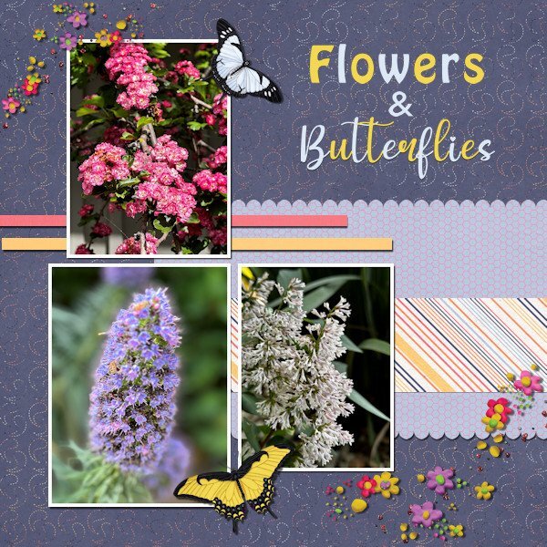
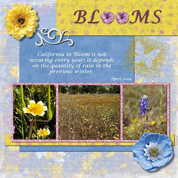
Project #4 I continue to use my photos from California and to me it is amazing to see the wide variety of flowers there when I take a stroll through the neighborhood where my family lives. All the papers are from Rachel M Hailey; the butterflies are from the Meadow bundle by Jessica Dunn and the scatters from Marissa Lerin. The fonts are Impact and My Butterfly. No pinky shears for me, I like scallops more. I mirrored the layout from the lesson because my photos are more tilted to the right and this way is more pleasing to the eye, at least to mine. As always the most time goes to selecting the photos which is a pleasure!2 points
-
Day 6 I've used bees in the past, so this time I switched to butterflies. All of the butterfly photos were taken by me at a beautiful butterfly house. The single monarch is an extraction from a photo sent to me by my grandson. I made the background papers using FF and changing the colors for the papers. The stripes were made with cass stripe 2. I made the scatters using cass script scattered elements. The stars, flowers and butterflies were from my kits. The font is Cute Dots from CF.2 points
-
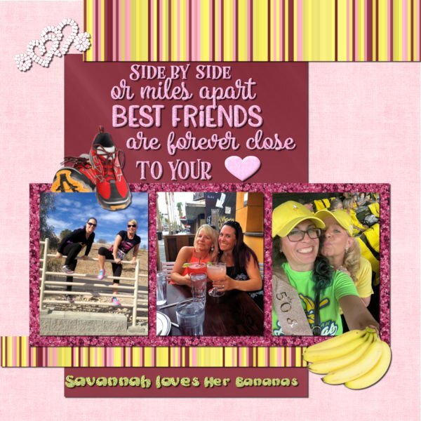
My daughter and Heidi have been BFF for over 30 years. They celebrated their 50th birthdays in Savannah, GA where Beth lived at the time. If you haven't heard of the Savannah Bananas baseball team, you should check out their hilarious videos on YouTube. They are so popular that you have to enter a raffle to get their tickets even if they are playing in Cleveland. I made the background using FF. The glitters are from ones that I made in the past using the cass glitter script. The stripes were made with cass stripes 2 script. The bananas and running shoes are from Canva. The saying is from Creative Fabrica. I converted the hearts to a vector using selection to path script and then my diamond tubes using VectorTube. The saying was selected and filled with my pink glitter pattern. The heart was a vector shape converted to a raster and filled with the pink glitter. I chose the colors based on Heidi's love of pink and of glitter (my kind of girl!). The photos are from Beth (I didn't get a good one of them wearing their banana costumes).2 points
-
2 points
-
2 points
-
2 points
-
2 points
-
2 points
-
2 points
-
Fine idea. One pic, two different way created:)))1 point
-
This makes me curious about the place. Off to Prof Google.....1 point
-
That would be right up my alley, Bonnie. But I don't have cable (only antenna) so probably won't be able to see it. Maybe they have some stuff on YouTube.1 point
-
Where I am is finally back to seasonal temperatures for the month of September. In the first 21 days of the month, 19 of them set new temp records. We had quite a few days in the high 80's and low 90's. That is August temps, not September. We've also had very little rain and went into drought declarations. My grass is brown but the weeds are as green as can be. The last time my neighbor mowed was my lawn was August 23rd. We did have about an inch of rain Monday night locally but some of the drought areas of Ohio didn't even get that. However, due to the tropical storm that is predicted to become a hurricane overnight we could have rain all weekend. As for the foliage, there have been trees in town that were turning in late August. My neighbor's tree that I love to watch in the fall is already changing colors. Extremely early! Even the leaf pickup in my neighborhood is going to start in mid-October due to leaves possibly falling early. I started doing an October daily album of fall colors in Ohio several years ago. I took photos of the leaves changing throughout the month. My neighbor's tree was still green at the beginning of the month and had changed and was losing the leaves at the end of the month. Last year it was already half changed by the 1st. That could possibly happen again this year and it might not have any leaves by the end of the month. So much for documenting the changes throughout the month... However, I will be out of state for a week and could see fall foliage on my trip.1 point
-
Wow! Thank you, Michele! Yes, I am blessed with wonderful friendships!1 point
-
@Jacques Lacerte I have heard from the designer and she gave me a different link so if you try again, it should be fixed.1 point
-
1 point
-
Project #3 This time I kept pretty much to the layout in the lesson, just because I like the outlook of that page. Everything except the swirl, the glitters and the glitterbutterfly comes from cpjess-MeadowBundle. I thought that was appropriate because my photos are from a meadow. The swirl is recolored and from the Fire and Ice kit (by Marissa Lerin if I'm correct). The glitterbutterfly was done by me sometime ago because I just liked to make one and that comes in handy now. The glitters around the photos are called ChineseOriental and I don't remember where I got them. The font is Lucida calligraphy.1 point
-
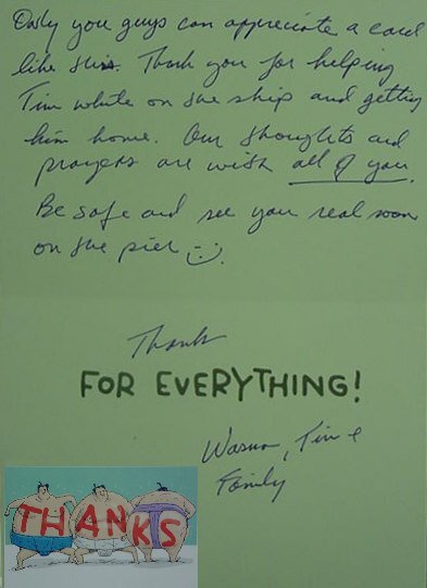
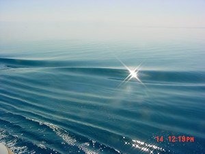
Project 3. I know it is difficult to read the postcard at 600 dpi so I'm throwing in a small size copy of that element. The angel(s) came from Janet Kemp, The background was from a Tutorial Project, the striped paper was a modification of a Flolinette-PBS paper, the font was Blackletter 686 BT. The background for the bigger text is an original photo taken while we were steaming FAST through the Red Sea to get on station for the start of the Desert Storm campaign which I heavily modified, by changing hues, and mirroring a selection (small copy attached of original).1 point
-
1 point





Resized.thumb.jpg.d25811db03a63358cedab1e79f527635.jpg)

