Leaderboard
Popular Content
Showing content with the highest reputation on 08/22/2024 in all areas
-
Day Two As usual, I'm a little behind. I had a birthday card to make yesterday.9 points
-
9 points
-
9 points
-
8 points
-
7 points
-
7 points
-
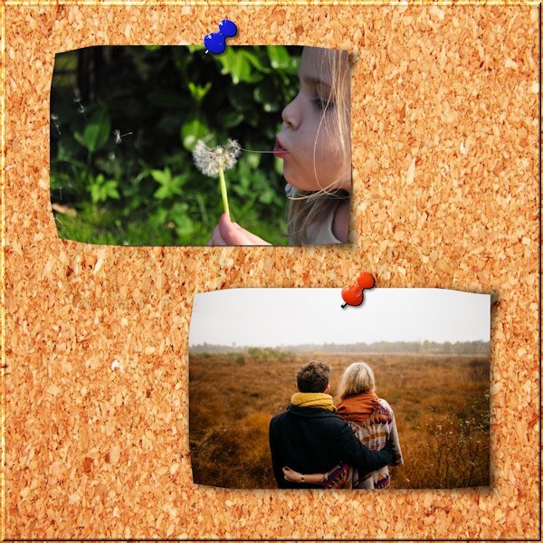
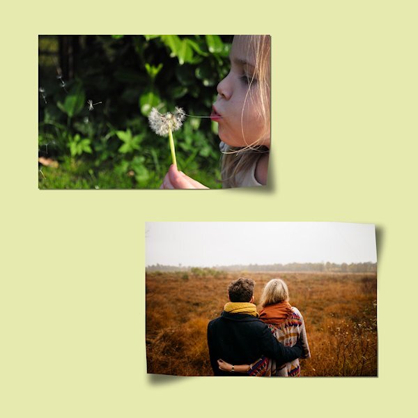
I await with anxiety on this one LOL. I'm not nearly as good with finesse like most of you Diamond members. At any rate, here is my attempt at this concept. I'm hoping I got the "other" corners that weren't in the "assignment" correct at least in how they would present. PS, someone who would thumbtack important pictures to a corkboard and let them curl should probably be prosecuted LOL. I suspect the offsets for my thumbtack shadows could have been higher numbers.7 points
-
I really struggled with this one, mainly because my warp brush was a bit wayward and making balloons with the shadows so, gave up with that tool and used the pick tool instead which gave me more control and no bad behaving!! I put a texture on the background. I find shadows can be a bit of a challenge and can vary from time to time dependant on luck rather than judgement to make them look plausible. Could do better with more practice...6 points
-
I always have a tough time making cards for men. This year I took my inspiration from my friend Dan's profile pic. I thought he was looking rather dapper. The vintage gentleman was shared in one of my PSP groups on FB. The hexagons and brad are by melo-vrijhof from Pixel Scrapper/Digital Scrapbook. The text is Dogma and I applied cass's Dimension script to it. I also used that script for the frame around Dan.6 points
-
Lab 13 Mod 4: flower vines (pink one behind the 3 photos, purple one and yellow one behind the Easter eggs); Easter eggs (3 in the picture of the 6 I made); Easter chick. The font is LaBambaLET; the background picture behind the 3 photos is an AI I created with CF's Spark some time ago. The 2 background papers are mine created from labs. The title is inner beveled and shadowed. Shadows are the ones I have been using which I put in presets - learned mostly from Cassel.6 points
-
5 points
-
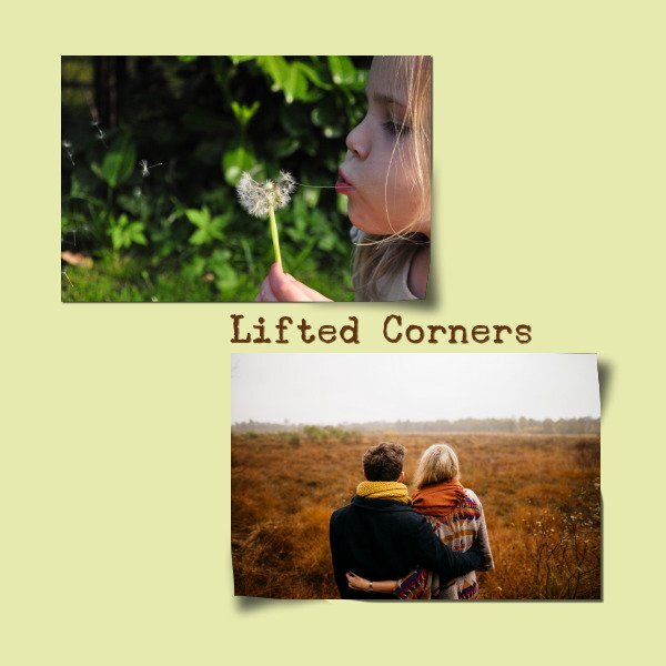
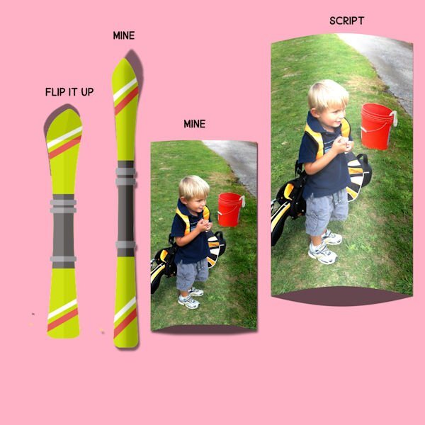
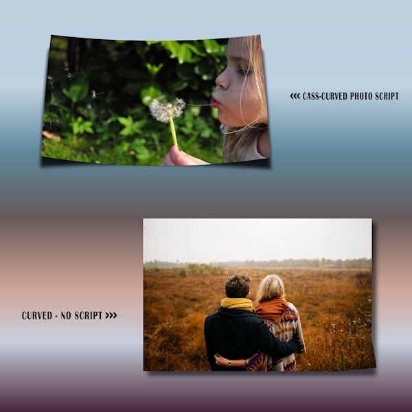
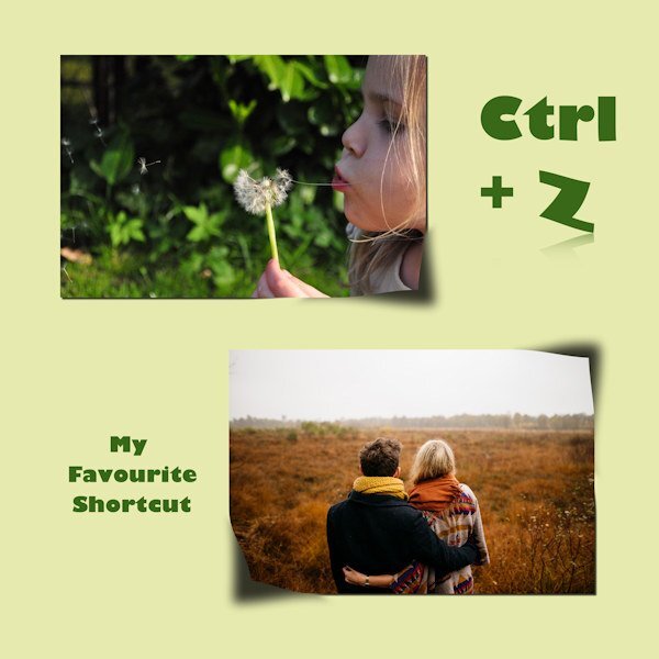
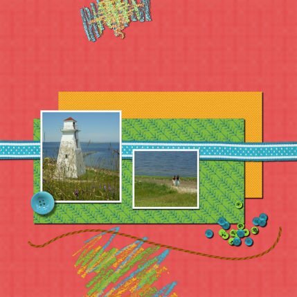
It is great to see everyone working so hard on today's technique. @Sue Thomas You are right: one great way to learn about shadows is to look at them and analyze what they are. Observation is key in replicating any effect. I love how you added the lifted effect on the "sticker". That is another element that can easily be "lifted" on scrap pages. You are also correct about the idea to lighten the lifted corner a little (although it would not apply to all four corners). Unfortunately, that is not a detail that will be addressed. Maybe it will come in a second workshop on shadows! 🙂 @MoniqueN. The scribbles are both chalk, so it would not need a shadow. You see how it looks really natural on the bottom one, while the top one is unrealistic. Your question about the size of the shadow base on the geographical location is an interesting one. We know that the shadows are directly dependent on the light source so if the sun is low on the horizon, the shadows will be much longer. If the sun is high in the sky, it will be much shorter. If you live close to the Equator, the sun will be very high at noon, while it will be much lower if you are on the north pole. However, that only applies to shadows created by the sun. If you are indoors it won't make any difference. And if you are talking about shadows on a project, that won't have any visible effect. But here is a little technical article where an old experiment that shows some difference. @Rene MarkerYou are correct in using the reverse shadow only in some instances. I think that they are not essential every time, especially if the papers already have textures and obvious differences with the surrounding papers. The lifted shadows on the bottom photo look the most realistic. The top photo MIGHT have used more feathering before the blur. I think the same thing applies to the ribbon. It is a good idea to try on a ribbon as that is an element that can easily be "lifted" in a project. @Ann SeeberI think that for your lifted shadow, you started with too much of an offset. Then, I think you pushed the photo corner toward the top right instead of the top left (inward). Is that possible? @fiona cookThose shadows look good. I think the only issue is with the Warp brush. One trick you can try is to avoid putting the very center of the brush right on the tip of the corner. Try to keep that center away from the corner. I think it will push the corner a bit better (maybe there should be lessons about the Warp Brush in the future too!). Your shadows on the translucent ribbons are great. @Corrie Kinkel You are correct: once you have a starting point for the shadow, it is up to you to adjust it based on various conditions. And with practice, you might start to have your own prefered settings (and presets). Yes, the feathering is one way to go from the "regular" shadow on the flat section to the "lifted" shadow on the lifted section. @Cristina Great work on those lifted corners. I think the only slight issue is the corner of the photo. It looks like they are not "smoothly" curled up. I think that is just a Warp Brush issue, and that might need some additional lessons. @Donna SilliaThe shadow on the top photo is quite good, but if you look at the one on the bottom photo, your shadow was stretched in the wrong direction: it should have gone toward the bottom and you sent it to the top. If you want to try it again, you might see the obvious difference. I am surprised that the Flip it up script would send the shadow toward the top left??? @Susan EwartI think you did pretty well with those lifted shadows. Keep practicing so they become more "automatic". @Daniel HessThe shadows for the thumbtacks will be addressed in Lesson 7 so I won't comment on them. For the photo on the top, It looks like it is missing the shadow for the bottom left corner. For the other corners (and the other photo), they look quite good. @Anja Pelzer Your shadows look good, however, the one on the bottom left of the bottom photo seems to be misaligned. If you draw a line between the corner of the photo and the corner of the shadow, it would indicate a light source on the top, slightly to the right even. Do you see that? @Carolyn RyeYou did very well for those being your first tries! I think I would have pushed the top shadow from the bottom photo a little more toward the bottom. It MIGHT have been in the correct direction, but the blur just made it less clear. @Gerry LandrethThose are pretty good. I wonder if you feathered before adding the blur (maybe you did the same mistake I made!). @Linda J WalkerThe shadow on the top photo seems perfect. On the bottom one, I think you just pushed the shadows inward a tiny bit too much to fix the edges, but otherwise, they would have looked like the one on the top photo. For information about saving presets, you can read this article. Tomorrow, we will look at shadowing flowers. You will be able to use a few techniques learned until now!5 points
-
5 points
-
5 points
-
5 points
-
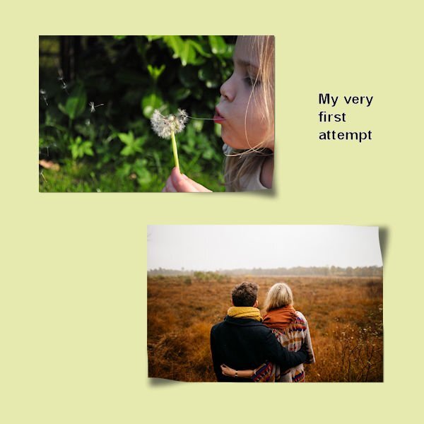
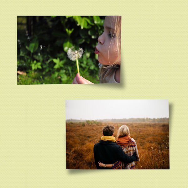
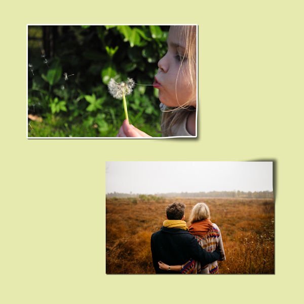
Day 3. I, too, need practice. I did as instructed for the 2 photos, but added on the top photo an adjustment of brightness because as the corner is lifted, the light is shining and brightening that corner - just a little bit. On the bottom photo, I adjusted the brightness downward as the only corner that will reflect some of the light as it is lifted is the bottom right.4 points
-
4 points
-
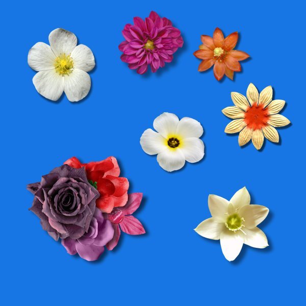
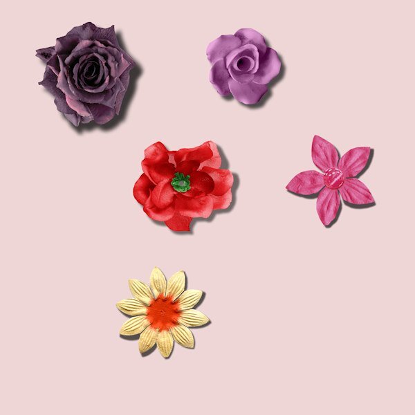
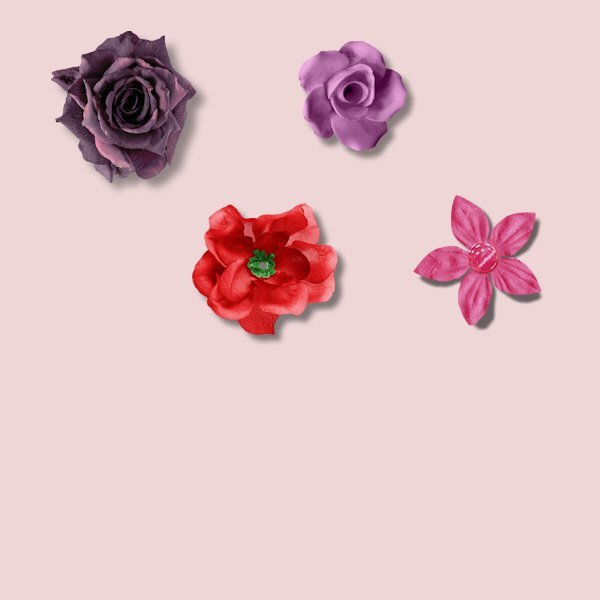
I used settings very close to the video for the 6 flowers in the tutorial. For the extra 4 flowers, I used the settings shared with me by a creative team member of a popular store that uses PSP. She does a lot of flower/foliage clusters and I asked her how she shadowed them. She also does not use any warp on the shadows but you wouldn't know it because of her settings. She has a basic setting that she tweaks as she scraps each element. Her cluster (flower/foliage/etc) is 25-42-61-66. I started with this setting then tweaked if needed. I then positioned the 4 flowers into a cluster and used the warp brush on each of them. I used to use settings much like Carole's but was never satisfied with my clusters (and I like to cluster although not as elaborate as many creative team scrappers). Once I started using Jill's settings, I loved how my clusters looked. Clustering is not for everyone though. I'm just sharing what works for me and the way I scrap.4 points
-
I think the selection area of the top photo is the issue because I used the exact same setting for both photos. I'm still confused about how you decide where to make the selection like how close to where you want the lift to be. I did play with it some more last night and the results were a little better. I even played with the brightness on the photo and that really did help on the top photo. I also played with doing a lifted shadow on a butterfly. I avoid using them but with a lifted shadow, I would use them more. Still need more practice! As for the reverse shadow, I tend to use papers that are very similar in color so they end up looking flat. The reverse shadow gives just enough depth and helps to show the subtle texture. I always use very subtle texture papers as well.4 points
-
In the tropics when the sun is right above you is difficult to make some shadow. Spread your arms and you see shadow right under the arms. So,it is not the day but the time and place you are. But still you see a minimal shadow from things at a distance from you. When they are not right under the sun.4 points
-
@Daniel Hess Guilty... still have bulletin boards with photos thumbtacked on them with turned up corners. One photo is from 1971!4 points
-
I'm glad to hear you have a new clear look at the world now. How frustrating that must've been. I still have my nagging floater, almost a year now. Getting older isn't fun. Your corners are nice. I pushed a bit to hard here and there but it's the first time I was able to not squish the shadow to nothingness with the warp brush. I watched carefully, just where the arrow and brush tip need to be and with a much better, larger mouse pad, the mouse slides so much better and not in jerky movements.4 points
-
4 points
-
3 points
-
3 points
-
The good thing about doing this with everybody is to have also your feedback, Carole. Plus, learning from each other. 🙂3 points
-
@Cassel-- Mary SolaasHow do you feel about all those shadow settings? It was very interesting how you demonstrated it on the blue circles. Most of these settings I have put as presets in the shadow tool.3 points
-
Thank you. I'll go out to check the the wind direction, if it's blowing west, I'll shout for you, to see if you come running for treats! lol3 points
-
If I'm ever in the vicinity I will also come running for nuts and blueberries! I think you are on par with the Script, which I have and use. It's awesome!3 points
-
I am so happy that you can see better. I feel a deep sympathy for anyone who has vision problems.3 points
-
To me, you did a grand job! You do surprise me about not knowing about the feathering, then blur. I also make a selection and feather, to brighten the lifted corners a touch on the photos, using brightness and contrast tool. It doesn't always show up well, it depends on the photo. I didn't use that technique on these photos. As Carole may demonstrate it later on this week. OOOps! Perhaps I shouldn't have said anything.3 points
-
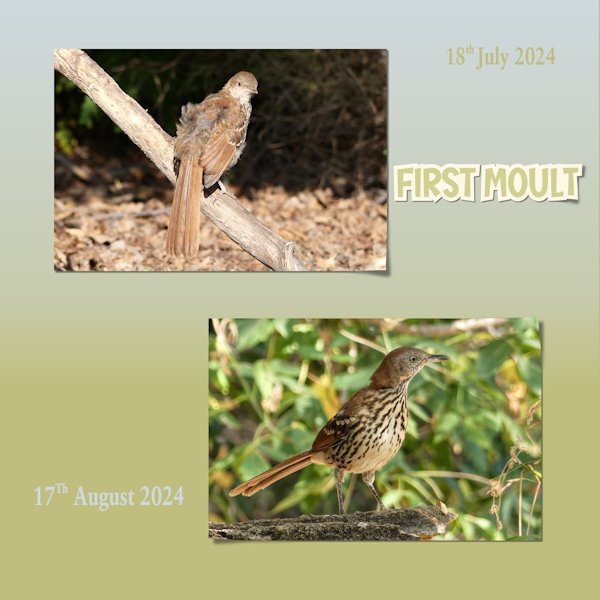
Another scorching hot day here. I decided to crack on and do day 3. To my mind, I don't think that there is anyone that can do a lifted corner which on a parr with the the lifted photo script. Although, I must say everyone is doing superbly in this shadows workshop. I decided to showcase The Brown Thrashers going through a moult. I first noticed it on the 18th July. Every day I would go and photograph them, if they were about. I had them come to the call, like the Robins, their reward was a treat in the form of either nuts or blueberries. I now have a sequence of pics of the transition from juveniles to immature. Even their eyes are an earthy pale blue when young, and gradually during the moult changes to a yellow, eventually their eyes will be bright yellow. Here I used the first photo, and the last photo taken. I haven't seen them since, I suspect they have finally left the nursery. I did all three corners, and the sticker. I also used the fading background gradient for the background paper. Using the buish and yellowie colours from their eyes.3 points
-
2 points
-
2 points
-
I'll post it on faace book, as posting on here really doesn't do the page justice, due to such compression.2 points
-
I had a busy day so I used the practice paper. Maybe I haven't paid close attention to the making of a lifted corner in the past, but the use of feathering was completely new to me and it is giving a better result. I need a lot more practice when attempting this technique by hand instead of using the scripts. Finally having my new glasses since last week let me see it so much better now. I stayed for the weekend with my son and daughter in law and I was constantly saying "oh WOW" I can see this or read that, for me a little miracle after 8 or so months of misery. Although seeing it better doesn't make my hands less shaky (I'm using a mouse) and it will take more time to get this technique easier. I'll stick to the scripts for now.2 points
-
2 points
-
2 points
-
Here's an article in the Campus explaining how to use the Change to Target brush. It comes in very handy when trying to match elements/papers to a desired color scheme. https://scrapbookcampus.com/2020/09/changing-colors-in-paintshop-pro/2 points
-
Julie, I love the cat's name! Your lovely layout faithfully tells this touching story.2 points
-
Lessons 3 & 4 The Warp Brush is not my favourite tool for this effect (lifted), but I just kept undoing and redoing. Thank goodness for a Script and the other method using the Perspective Tool. Since I won't be entering any contests for Best Use of Shadows on a Layout, I will have to accept my limitations. (See photo 2)1 point
-
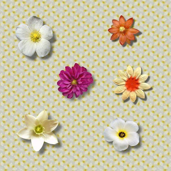
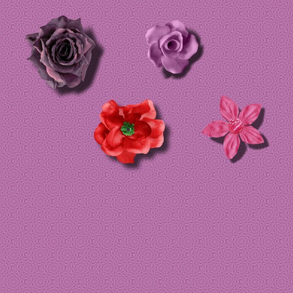
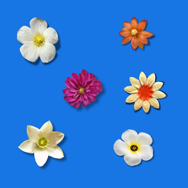
Day 4 and it is very interesting to see the different flowers with their also different shadows; it lets me think a bit more about the shadows that I always tend to use. For the tutorial page I used the shadows with the settings from the tut and the warpbrush for 3 of the flowers. No warpbrush on the dahlia as mentioned in the tut. No warpbrush on the bottom right flower because it looks to me that the petals are curled a bit inwards (I don't know a better way to describe it), so they do not need to have their shadows altered. The flower on the bottom left is already looking lifted and when I tried to alter the shadow with the warpbrush it didn't looked better or right, so no warpbrush in the end. For lack of time I used the practice flowers as they are with different shadows and as you can hopefully see only one has its petals lifted with the warpbrush because I think that it only works for those flowers that have defined petals that can be lifted individually. The pink flower (bottom right): 20/20 - 54 - 24 (blur) with the warpbrush on some of the petals. The lilac flower: 40/40 - 42 - 50 no warpbrush The purple flower: 50/50 - 38 - 75 no warpbrush and the red flower: 40/40 - 46 - 50 also no warpbrush1 point
-
1 point
-
And the time of day, and the time of the year, shadows are different in these circumstances.1 point
-
Shadows I always thought were difficult (and still do to be honest, but when I hesitated so much I put a paper on a window sill and looked how the shadow was and later on thicker things like a button and see what the shadow did. That way it made more sense, but sometimes I keep hesitating. So this workshop wil give me more confidence I hope. What a great idea to show us what the shadows do on the blue spots in lesson one! Why did I never think of that!1 point
-
Hi all, I combined lesson 1 and 2 in one project. 🙂 Oops! I forgot to add a shadow to the string, but since I only saved it as png and jpg I can't change it, and do not want to it all over again. For the top scrabble I used a setting as it was a washi tape, the bottom one was chalk, so I didn't add a shadow there.1 point
-
1 point
-
1 point
-
1 point
-
Me either. Soon as I started seeing Bonnie's posts on Pickleball all of a sudden it was everywhere. It's like when you buy a new car and it seems like you see the make/model you bought everywhere, where as before you never noticed them.1 point


