Leaderboard
Popular Content
Showing content with the highest reputation on 03/01/2024 in all areas
-
5 points
-
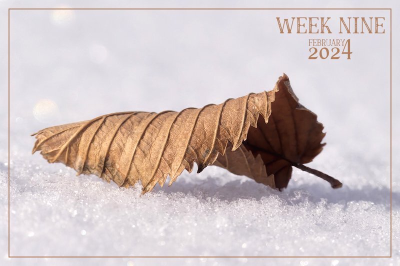
Spring is a long, long way off here. I'm pleased that the cold resonated through the photo, as it was bitterly cold, -29c, calm, with a clear blue sky. I can only expose fingers for a vey short time, batteries drain quickly. It's great taking photos at ground level, during the winter months, as the snow moulds to my shape, making being sprawled on the ground comfortable. The snow is ever so dry, that I don't get wet, I brush it off like you would icing sugar.4 points
-
4 points
-
3 points
-
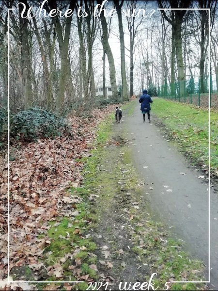
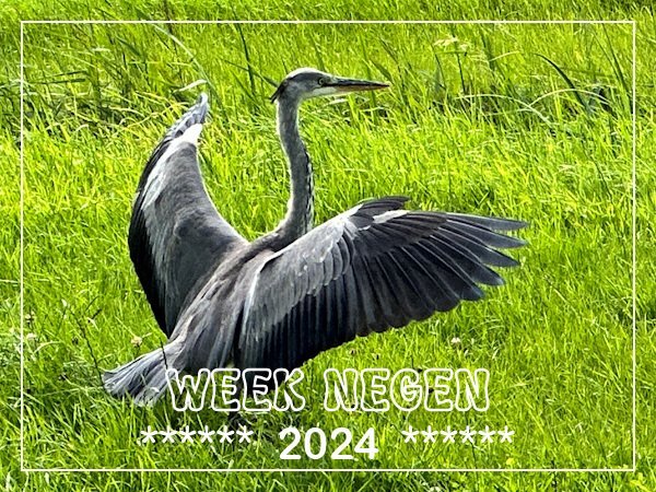
Hurrah, this week on Tuesday we had sunshine! On Tuesdays I go for a walk with a friend and we do so for at least 20 years now. In those days we had a group of about 8 to 10 and over the years the others quitted one by one. The corona years did the rest and now we are just the 2 of us. This week we were on a path we often use and a blue heron decided to land on some grassland next to us. He/she was turned away from us and there was a ditch full of water between the grass and our path, so I couldn't go nearer. Slowly I reached for my phone and was able to take a couple of shots before the heron walked away.3 points
-
3 points
-
3 points
-
3 points
-
That's the secret Corrie, getting the right photo and editing for the script. Not editing to make the photo beautiful as the photo it is, but know when to get the dark areas lighter and the lighter areas darker, especially as you pointed out, too light around the edges then it just disappears. I never thought of making cards for men, your card is perfect for that. I did find I had to lighten the darks, somewhere to slightly darker than a mid-value and to darken the areas that are too light. And a properly edited or even the edit that was for the script under it and lowering the opacity. or even putting the orig.photo on the layer above and trying the blend modes and using the the opacity with that. Also using masks to have just one bit of color showing through. So many possibilities.3 points
-
3 points
-
I have done the bootcamp before and was wanting to do it again and every time there was something preventing me from doing so. I'm not doing the Build A Kit workshop because I haven't time enough. In April I'm going to California for a visit to my daughter and the grandkids and that takes a lot of time in preparations, but the bootcamp will fit in. It isn't that time consuming and I like to have a smaller project besides all the prep stuff.1 point
-
I LOVE bootcamp! I have been attending for 3 years and it is offered several times a year. The layouts demonstrated are classic with a clean look which is just what I like. Some of my best scrapbook pages have been done in bootcamp and I look forward to more. One of the best parts is meeting new people and hopefully, being a little helpful if they need it. I find I learn things better when explaining them to others.1 point
-
I guess the prevailing sport would be ice sculptures rather than snowmen. ⛄That kind of snow doesn't pack satisfactorily for snowballs, either! 😉1 point
-
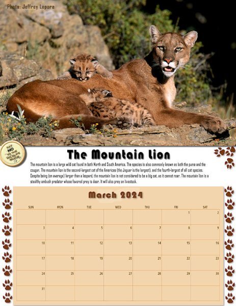
Happy March! I feel we're now one step closer to Spring! 🌷 Here is my Wild Cat Calendar for March featuring The Mountain Lion, aka Cougar or Puma. I got the animal details from activecat.com. I will put a full-sized version on Facebook for printing as an 8.5"x11" decoration for our refrigerator doors. 😉1 point
-
Wow, that is a beautiful photo, Sue. That snow is so clear I can feel the cold from it! 😉 Funny, I'm preparing my own Week Nine and it also features fallen leaves but with a little taste of Spring.1 point
-
1 point
-
Susan I know! I find the script works its magic on so many different items as long as they have enough dark colors in them, or if you can change the colors to darker ones and maybe black and white too. That's something I have to try with another photo.1 point
-
Looking at the original book released by JASC (many years ago) called Scrapbooking the digital way, they have a variety of techniques but they come with a simple layout tutorial (like torn edges, cutting photos, etc.) So that might be what could a second book be, so the first one would be for the basics like layers, how to start a page (quick-pages, templates, scraplifting), the components of a page, basic photo fixes and some "scrap with me" projects. Then, a second book could be about more scrapbook projects integrating various techniques. Well, I am still brainstorming as I work on things. I also have a document where I move things around!1 point
-
I love that as a problem simply because it means you have enough material for lots of books! See it is a large jigsaw - take all the segments and then keep on moving them round until the fit logically together and then divide it all into chunks (chapters and sections). I use pieces of papers and write out the headings and then just keep moving them about until I have them in a sequence that makes sense. Don't be frightened of changing your mind - just keep moving the pieces until it fits okay for you. When I think back to my first introduction to scrapbooking and PSP I really needed things to be quite simple and in small bites - the Bootcamp was perfect - so my view is that first book should be quite basic. Mention of things like how to create masks or even clusters would have lost me completely. You can include loads more in follow ups and even have an experts guide for those who have been doing it for a long time. By the way I think you mentioned that Tips and Tricks is 6x9 inches - my copy is the next size up. Amazon show the size as 17.78 x 1.14 x 25.4 cm or 7 x 0.45 x 10 inches depending on what site you're using. I suspect that size is probably large enough for this book, 6x9 would have been okay for Tips and Tricks.1 point
-
Corrie, that windmill is perfect. This script is quite addicting. I cant wait to do some more photography specifically for this script.1 point
-
1 point
-
1 point
-
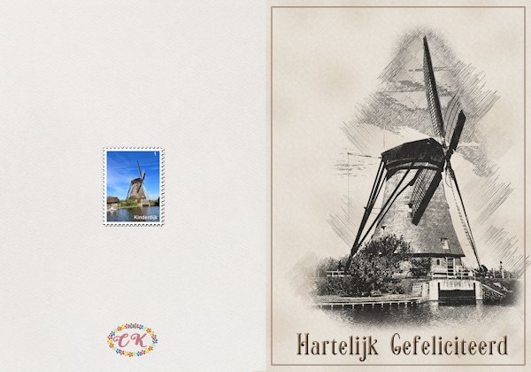
I wasn't finished playing with that Pencilscript (Susan I like it as much as you do!) and this time I wanted to see what the script would make of a photo of a mill. The mill was mostly a dark color and I like the result of the script very much. It very much looks like an old drawing and I need birthday cards for (older) men. I had used this photo for my postage stamps and put that stamp on the back of the card together with my logo. This card has happy birthday in Dutch and I did a German one too; there are a couple of guys I have in mind for this card in 2024! The font is Sonia btw.1 point
-
Very nice and this script definitively will go on my ever growing wishlist!1 point
-
1 point
-
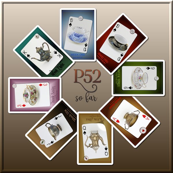
I want to join the Photo Circle Template script action too. Here is a 8 week P52 challenge recap. took a few times through the script to get the right size for the P52 size ( i chose the custom shape choice as I wanted a rectangle. then I added a frame around each one adding a shadow and reverse shadow as well. I did have to erase a little bit of the spill over shadow on the last one and I managed to remember how to do that. The fonts I used are Linna and Lophinky (i might have spelled that wrong - both from Creative Fabrica).1 point
-
Ah, I used the new template, also. Here is grandson, Tyler-John (28), just back from his first Caribbean vacation in Costa Rica all by himself! (He says he hasn't had time to develop any romantic relationships yet. 😉) I used the cass-datestamp9. The toucan bird is from a kit "Froot Loops." (Does he qualify for the Rainbow Challenge?) The background photo is from Alamy_MHKT6M.1 point
-
Lab 13 - 03 I used the template : link in the notebook. Made the Wooden token and Decorated metal charm tutorial. The digit beads were made with the cass-Alpha-beads script. The other elements come from pixel-scrapper-blog-trains/feb-2017-blog-train-final-list: themagnoliapatch.blogspot.com WinterFun-addon. Own photos, January 2009, Belgium, Waterloo. A walk with my first Scottish Collie Enzo. I'm not entirely happy with the metal charms I made, I think it doesn't look that metallic.1 point
-
1 point
-
I couldn't wait to try Carole's photo circle template! I even made the plaid...turned down the opacity.1 point
-
Template by: The Cherry on Top, Newletter Hop, 2024. Elements from Creative Fabrica.1 point
-
Truth or Dare...she held that big smile for the entire 2 minutes. The next day her cheeks were sore. Template 194 by Lady 22.1 point
-
Template 309 from Chantahlia Design. Game pieces from Digital Scrapbooking, Family Game Night, Game Pieces by Marisa Lerin. Pickleball paddle from Creative Fabrica.1 point
-
Another layout from our pickleball clinic trip. I created the background paper during the mask workshop. Wordart from Creative Fabrica (paid).1 point
-
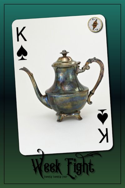
Week 8 I should be doing my Solid papers but for some reason our email program just stopped working so hubby has been trying to get it up and running. So I'm doing a little bit in between his "fixing" time. Good thing for my old laptop with a nice working email. I used King Edward font (from CF). I wanted a shadow so it would show on the card. I sure flip-flopped on what settings to use where it would show up but not look weird because I find shadows can make black text look blurry or like accidental double text. I didn't shadow the 2024 as I knew it would look weird, but I wanted a black text and a darker layout as well. Gradient is from PSP that I've used before, it's a favorite of mine. I'm trying to get rid of most of the t-cups and will be the same for the t-pots and here I was in the thrift store yesterday with yet another t-cup and t-pot in my hands! I just noticed this layout looks better if you click on and see it with the black around it.1 point
-
You may love the rain on my photo but I'm fed up with all the bad weather we are having this last couple of month. One day some sunshine and the rest of the week rain alternated with showers!1 point
-
AnnieC, one of my favorite designers, had some freebies on her page which were perfect for this theme. The couple is from VectorStock and I changed the colors. The font is Parallove.1 point
-
This is a beautiful illustration by Maja Lindberg that I found years ago. I used Suz Shook's script, ss-BrushstrokesFrame2 script (the Creation Cassel store has several of her scripts for free). The font is Bradley Gratis.1 point
-
I had no idea what to do with this. While playing around with borders and shadows, I ended up making "stickers". At least I hope that's what they look like. I added the same texture to everything and added a drop shadow around the bottom layers only. The font for the text is Priscilla Script (from Deal Jumbo) and the font for the hearts is Beauty And Love (from Creative Fabrica).1 point
-
A small project I've been working on to populate my new 32" monitor. I'm using the cass-painted-frames and I've made one for Cable or Streaming TV shows and a separate one for Streaming Movies. For the Movie one I went and found a film strip and duplicated it all over the place on top of the color painted frame strips. Here is one I did for my Friday Blue Bloods TV show and another for the film, Suncoast, which I will watch tonight on Hulu.1 point
-
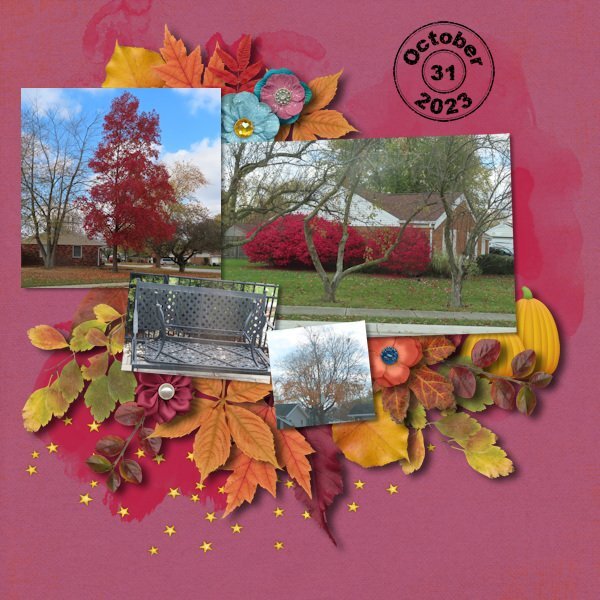
For the last 2 years (2022 and 2023), I have done a project in October of taking photos of the fall foliage every day of the month. In 2022, I was able to scrap the layout within a day or two. But with surgery the beginning of the month in 2023 and then getting the flu at the end of the month, I only got a couple of pages done. Then with another surgery the week before Christmas and a 3rd surgery Jan 18th, I never got the project finished. I made it a goal to get it done by the end of February. I'm happy to say that I got it done today! I used templates from Fiddle-Dee-Dee at The Lily Pad. She has 3 sets that are autumn themed so I selected from them according to the number of photos I had for the day. I also have a lot of kits of the autumn theme (I love the colors) so tried to use the ones I had never used. And, Days 1 and 2 were made using the kit I made from the 2023 Build-A-Kit workshop along with the title page. I used the same kit for the 2 pages that will be next to each other in my album (for example, days 1/2, days 5/6 etc). Day 31 was on its own. I also used Cassel's Date Stamp on every page to show the date. Here is the Day 31 layout: Kit is Evening Autumn by Kristin Aagard with some additional foliage from her CU Fall Foliage kits #2, #4 and #5. All available at The Lily Pad.1 point
-
Hi, I've been working on the Masterclass video cutout today because I love cutout design so much. I'm still having a bit of a problem with the buttons. And I actually got the beginning right first time. So that it doesn't look so boring, I framed it a bit.1 point
-
1 point





Resized.thumb.jpg.d25811db03a63358cedab1e79f527635.jpg)
