Leaderboard


Popular Content
Showing content with the highest reputation on 02/14/2024 in all areas
-
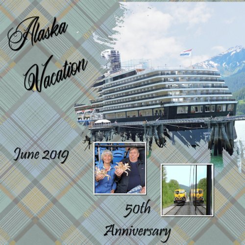
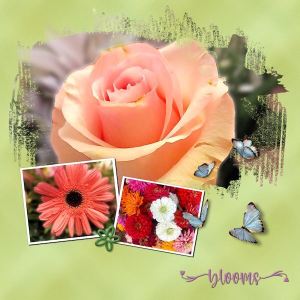
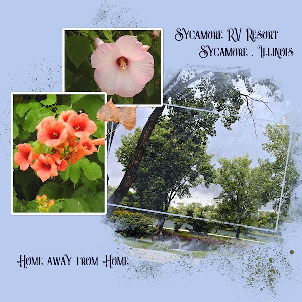
This white crane was at our pickleball clinic. The yellow plaid and the green/pink plaid were created from that photo. The blue plaid was from Day 1 layout. Neither the yellow or green/pink plaid looked good with my layout. Shadows added.13 points
-
Here is my day 2. I addded blend mode of dissolve for the plaid because I thought the texture looked good for these photos. I also used a darker colour to make the text stand out as I was using white. I kept the paint spatters from the template and turned them red, just for fun. The fonts are Jokerman and Poemione. I seem to be building up a collection of what I consider are playful fonts.
 12 points
 -
Hi all , I`m in too I will go with photos from our Tierpark --Zoo here in Aachen I made over the years here is Day 1 and Day 2 the fonts are Ariston and Handwritten12 points
-
Day 2 I gave up trying to make the plaid paper and adapted one I already had. I was looking for the "custom selection" command in the wrong place. GRRR! I will try again to make the plaid for something else.
12 points
-
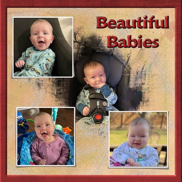
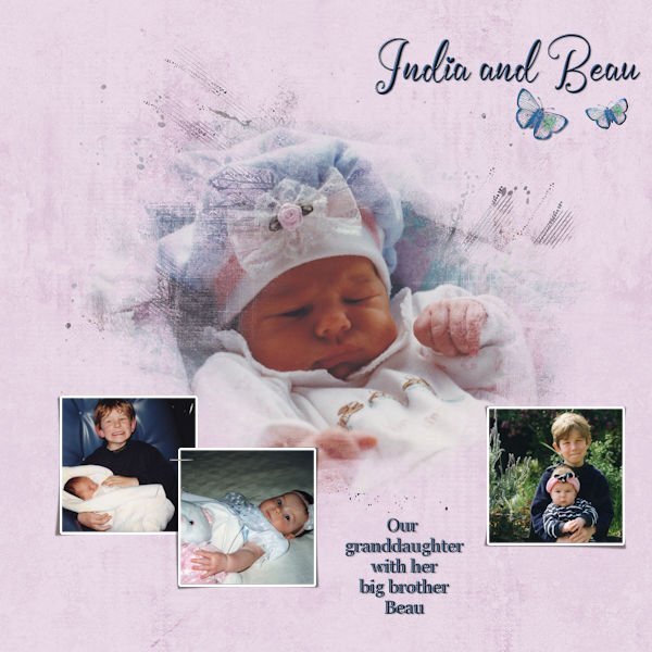
Day 2 of the Mask Workshop. It am finding it easier each time I attempt doing this. Thank you Cassel for your comments regarding my beautiful grandchildren. These photos were taken many years ago, and as adults they are still beautiful. I really like the way you did the background on this workshop.
11 points
-
Lesson 3 I made the kaleidoscope pattern from a selection using the main photo (mine from my window) so that the colours matched a bit. I used another Melo Vrijhof Mask from Digital Scrapbook.com as it fitted the format of the photo better. For the 'Mama' text I used 'Selection from Vector Object' and placed the text selection over the main image and Promoted the Selection as a new layer which I slightly offset on top of the original white text.
10 points
-
Thanks for lesson two and the template update @Cassel and especially for the plaid trick! It works really well. But in this case (I played around with a plaid but then decided against it) I left the plaid at home 😉 . Lady22 (Bourico at digitalscrapbook dot com) has been sharing such lovely templates! I really do like these simple, photo centered templates without much frou-frou... My take for day 2. Haiku and most supplies myself. Mask Lady22. Fonts is Poppins on haiku and Omnium on title.10 points
-
All of my layouts for this workshop are being done for a book I'm doing for my cousin's family. So because of that I am using kits that I have in my stash so the book will look cohesive when done. I had the template from last year's workshop so didn't even try to download it. Layout #1 for Day 2, kit is a retired kit from Bella Gypsy (Christmas Cheer). Template from 2023 workshop. Layout #2 for Day 2, I used 2 kits, both retired from Bella Gypsy (Soul Sisters, Woof). Template is from 2023 workshop, extra for diamond members. Font is Discover Beauty for both layouts.
10 points
-
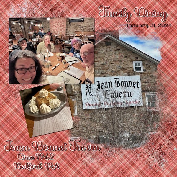
Day 2 - Continuing with my birthday trip theme, my daughter took some selfies at one of our favorites stops on the way home from Virginia. Jean Bonnet Tavern is filled with ambience and a lot of wonderful food. The font is called "Valentine" from Creative Fabrica, and the plaid background is from one of my Build a Kit plaids. I thought it matched the old quilt hanging on the wall. The dessert is Oatmeal Pie. My husband begged our wonderful server for the extra whipped cream.
10 points
-
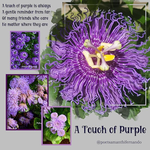
Mask Workshop Day 1 Getting off to a slow start. Still moving in and figuring out what furniture we want to put into this place. Time is always short. The poem is an excerpt from a poet, Samantha Fernando. Her credit is included on the bottom of the page. If you would like to see the entire poem you can find it at https://starsafire.starrayz.com/wordpress/2014/07/a-touch-of-purple/ All the photos are mine.
9 points
-
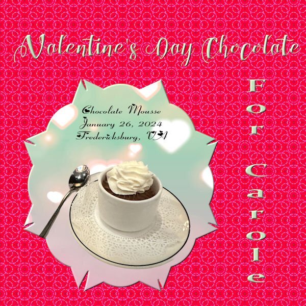
Day 3- More chocolate for Carole. The mask was made from a preset shape converted to a raster with raster to mask script applied. The picture is of a chocolate mousse cup from a French restaurant in Fredericksburg, VA. (and I wonder why my sugar is so high) The font for the title is Chocolateheartfree. The side font is Constancia from Creative Fabrice, and the journal font is Fiolex Girls(not sure where I got that). The background is from the background of the mask, but I changed the color to a more red for Valentines Day. It is actually two layers of the same pattern with different colors and a blend mode of burn for the top layer. BTW, the mousse was outstanding. I think there may be more to see of this restaurant.
8 points
-
8 points
-
DAY 1 I made the background myself, a neutral color, with monochrome noise above it. With the brush tool I placed two stains. Edges : overlay by Marisa Lerin on Digitalscrapbook. I made the beads with the script cass-Alpha Beads, with AR Destine font The written font is Sun Island Regular8 points
-
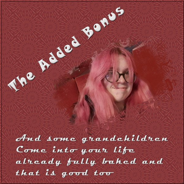
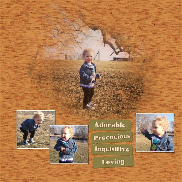
Continuing with the theme of grandchildren, not all grandchildren are directly descended from your own flesh and blood that doesn't make them any the less important. The title font is Snap ITC, and the journalling font is Magneto. I used a free mask from Jessica Dunn's nesting mask kit. https://www.digitalscrapbook.com/jessica-dunn/kits/nesting-masks-kit-baby-birds-precious-love-black
7 points
-
Font is Omnia, graphics Marisa Lerin, Jessica Dunn and myself. Haiku myself. The kaleidoscope pattern is Greek enough alright. Day 03 :7 points
-
I spent lots of time experimenting with the plaid, including tinkering with the settings for seamless tiling. Since the photos are "busy," I wanted a pattern that wouldn't compete. The green "plaid" looks closer to a grunge effect. The photos are mine. Although I'm not a good photographer, I keep finding little bits of a picture that look nice enough to showcase. The font is Welcome Spring from Creative Fabrica. The butterflies came from Pixabay. They already had shadows but in the wrong direction. Flipping them solved the problem.
7 points
-
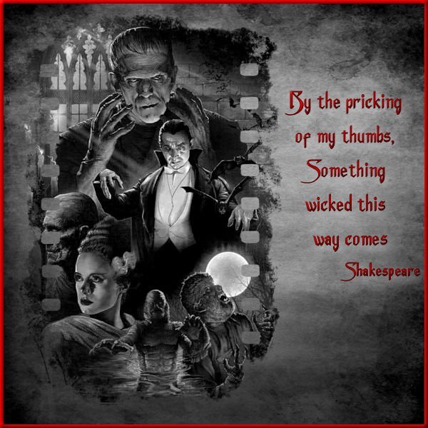
Day 3 - Still can't figure out how I locked that color palette for my project but decided to work around it. If anyone can help sort that for me, I will redo the project but with a colored background paper as originally planned. I flattened the image & exported to a jpg and then reopened it, treating it like any other jpeg & then finished the lettering & border. That restricted my background to b&w instead of the red bloody splattered grunge paper that I wanted but, it seems to work. I did have to change the quote though as my original choice went better with the bloody paper. The film style mask is a snag from Pinterest, the monster collage is from a horror movie archive, the paper texture is from Freepick, and the font is Anger Styles from Dafont. I am not a fan of the kaleidoscope effect but that is just a personal preference. I am too busy making more plaid patterns from yesterday's lesson.
6 points
-
DAY 2 Flair button is from Jessica Dunn on Digitalscrapbook For the two small photos I applied the cass-PencilSketch2 script, but stopped halfway through the script to get a different effect. (not good visible here) The border above the plaid is a font from the Creation Cassel Store: cass-Edge2 Text font: Dialova6 points
-
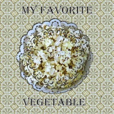
Project 3 Hey corn is a vegetable.
6 points
-
Day 3 and I was looking for a mask in my stash and this one was a Diamond of last year. Just a title - font Bavire - and a string of brads that I recolored. After some trying with the kaleidoskop I'm going for this one, which is a very subtle pattern otherwise I didn't like it.
6 points
-
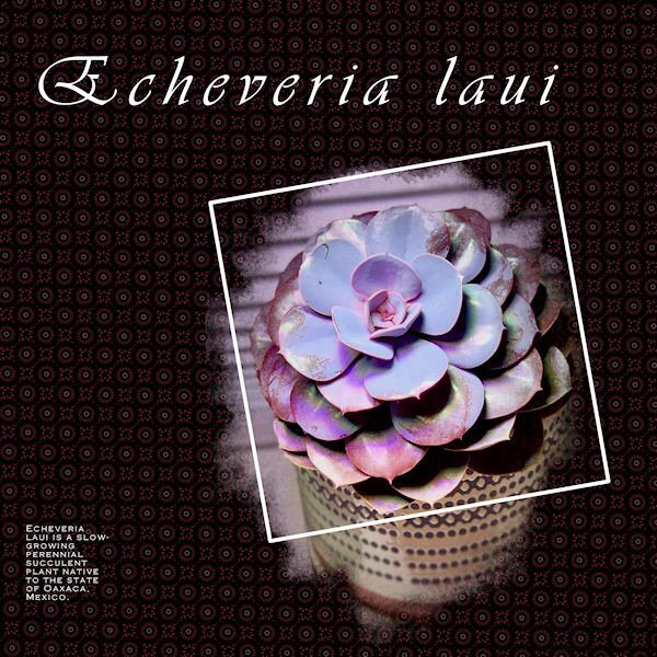
I forgot how interesting the kaleidoscope effect is! This was a little plant given to us when we attended grandchild Jackie's wedding. Her hubby is a horticulture enthusiast and he had put out baby succulents for us to take home that day. Originally it was 1/4 the size of this. One of my few successes with a houseplant. It did stay outdoors all summer. The title font is Vivaldi, the journaling font is Copperplate Gothic, the mask is cass-SimpleArtsy-Template01.
5 points
-
I started a bit later today and noticed a new link for a template which I used, although I have the old one and the Diamond one too. I have both used, but a new template is always welcome! For this template I could use a couple of photos that are narrow and long without having much resizing. I made different plaids until I had one that I liked and that went well with the colors of the photos but I reduced the opacity otherwise it would overpower the photos. Fonts are Perfectly Vintages and Arial rounded. The smaller photos had no borders or a mat underneath, so I made very thin borders to make them stand out a bit more.
5 points
-
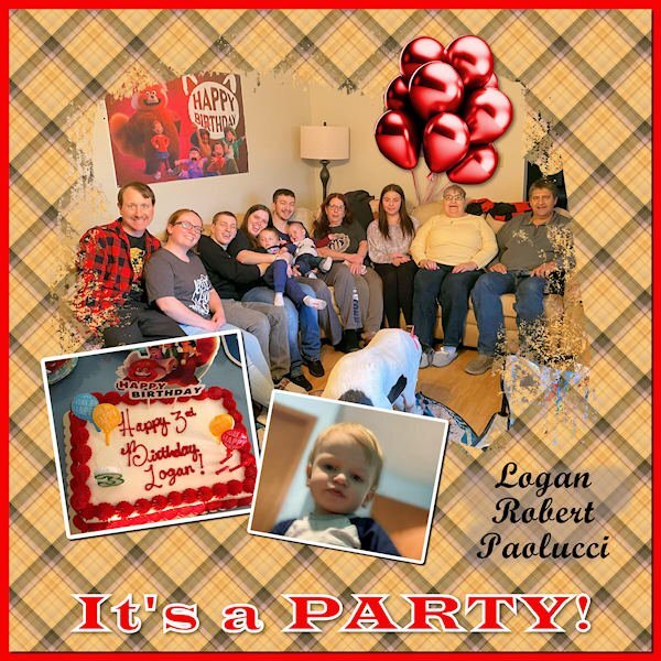
My Lesson Two - It's a Party! This occurred Saturday, Feb. 10, though his birthday was on the 6th. I used the same old template as last time. Discovered some strange layers. 😁 It happens when I'm struggling with masks, especially if they're in French! 😆 I created the plaid, and the balloons are a template from Marisa Lerin. I do struggle to align photos in a mask that is on an angle. I tried the Free Rotate tool but didn't see much change with it. Is there a trick to it?
5 points
-
Font is Omnia, graphics Marisa Lerin, Jessica Dunn and myself. Haiku myself. This somehow sits better with me.4 points
-
Workshop Day 2 This is the place we stayed at for 7 months while waiting for our home to be built.
4 points
-
Never used a Mask before and no idea what I m doing ! but I have managed to put something together no doubt with many mistakes !The video was excellent, it was my brain and my version of psp letting me down! My idea was to showcase the first 7 weeks in a puppys life one week a day. After taking two days to do day one I am not sure how that will turn out! Never mind life is a learning curve ..Just realised I have not put a date they were born on . opps ! The papers and graphics were from MARY FRANS... FARLEYFRIENDS
4 points
-
Day 2 starting off great. I actually had that template that is no longer available (large stashes confuse but are can be helpful if you know exactly what you want). I think I have mastered the whole raster to mask group conversion enough to start altering the mask since I wasn't too keen on some of the streaky bits once the photo was added. Went back and forth several times and, between a paint brush and an eraser tool and the pick tool, managed to get rid of the offending streaks. Because of the theme that I was using, I couldn't make my plaid from the photos so I used a another photo of a greenish grain field.... lots of small edges and muted colors in it. That way it wouldn't clash with the plaids in the main photos (all snagged from free photo sites). Added a few very thin borders. Font is Brush Script. I tried using that trick of brushing behind the text to make the words more distinctive but, because my background plaid is so small & tight, the brushing was too obvious. When adding a shadow really didn't work either, I changed the color of the drop shadow to a mid green color from the plaid and it brought out the text a bit. The nice thing about these structured lessons is that, if you make enough mistakes & have to redo things, you get more confident & adventurous (though you still need post it note reminders on your monitors for the command sequences).
4 points
-
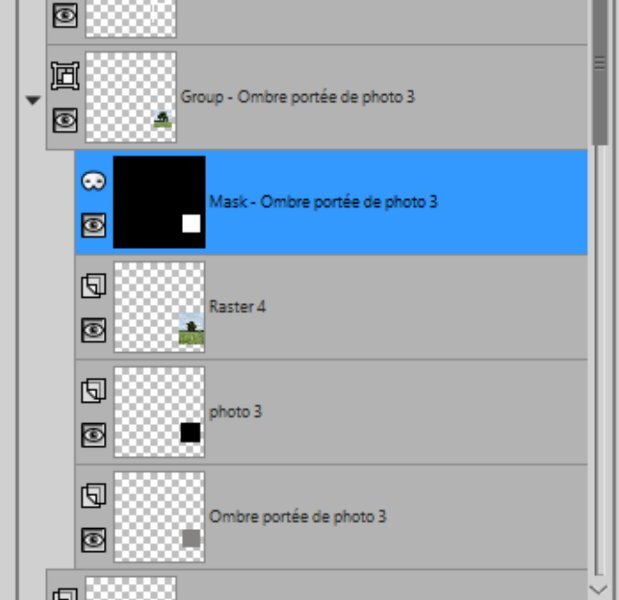
Corrie, I have note taken on paper like you which I find easier for me to digest. Susan, your idea of screen shots of the steps I will take up. I had made a mistake on the last photo for this lesson and still don't know what I did wrong (See snip of my layers) I rectified by deleting the offending layers and replacing by dragging across from the original template and redoing just that last photo. My theme is back to my local tree project and because the main tree image was not wide enough for the mask , it caused a sharp edge where it fell short. I used a black brush stroke inside the white area of the mask using a splodgy brush tip (a-dozi's background-08 003) to blend the edge in. The 2 background layers were blended with Multiply having used Adjust\Colour\Colour Mixer to change a red to blue. The main title font is Mama which Carole gave us the link to download
4 points
-
The car is from CleanPNG. The mask is from Graphics Creation. When I saw that it was Kaleidoscope Day, I set aside a couple of hours to stare mindlessly at the changing shapes and colors.
3 points
-
I am late. But still looking forward to this refresher on masks as I really don't remember a lot from last time. I have been enjoying PaintShop Pro Scripting and because of time spent there, I had forgotten to sign up for this course (until today). I have been finding Scripting very enjoyable though a bit hard a times (like if you use a variable and spell it slightly different in one place (such as using an upper case in one place and lower case in another - Okay that was me recently 🙂 ).. It is nice to know that Carole is available to work alongside us and provide assitance when we need it.3 points
-
I did too, Doska, at my grandson, Will's, "hippie" wedding in California. It was held on the bank of a river and the bride arrived by boat.
3 points
-
That plaid is OUTSTANDING!3 points
-
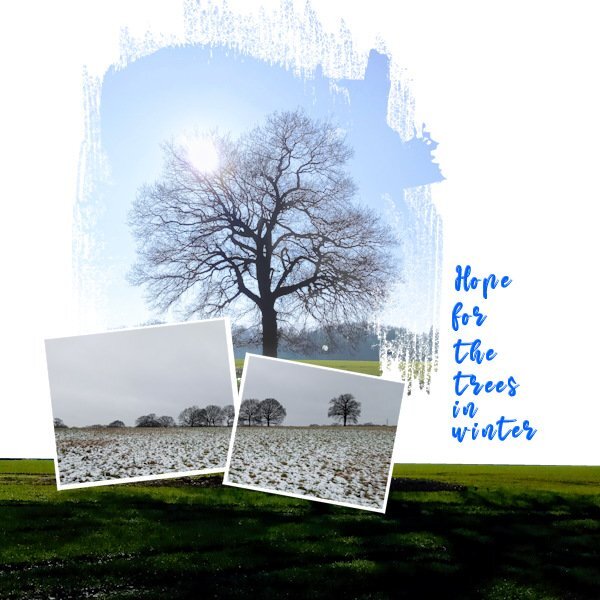
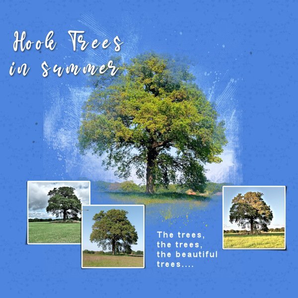
For today's Lesson 2 I am still on my Trees theme. I condensed the the main photo mask shape so it suited the format of my photo better. I used a brush tip 'Fuzz soft' to white out the mask a bit on the sun flare and a bit on the trunk to bring those bits out that were subdued by the grey of the mask. Deciding I liked the grass under the tree on my main photo I duplicated it and made a selection of just the grass. I also like the white of the background for this image so I didn't use the plaid idea although I think on some of the designs I have seen today, the pattern suits. I used the same photo for a panoramic effect for both the small photo masks. I used the Mama font again but am finding I need to kern it quit a bit.
3 points
-
Hi Corrie, yes I see what you mean with how I had it before amending. I relooked at the amended one and the shadow is in the correct place but not showing up on the image so I have changed the Brightness value to make it more visible. Thank you for your help again.
3 points
-
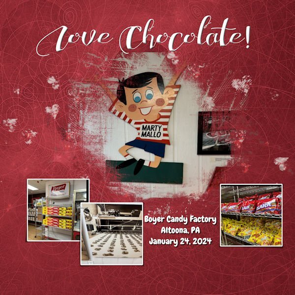
I going to be using the photos that I took in Fredericksburg, VA for this workshop. The photos in the image were taken on route to Fredericksburg, only a little out of the way, because I love Mallo Cups. The graphics are from the kit. Large font is called "ChocolateHeartFree" and the journal font is called "Chewy" which is a free font.
3 points
-
This is what came out of me... Cassell - What I found challenging with this lesson is while I could memorize the steps to making the gray shapes into masks, I don't understand the reason behind all of the steps. It would be good to understand why that particular sequence of steps went from the shape to a mask.
3 points
-
Day 1 of this Mask Workshop. I have really been looking forward to this as I can never seem to get the knack of mastering Masks. Thanks for the opportunity Cassel.
3 points
-
Mask WS Day 1 I used the .pspimage mask from the Extra1 folder. And it tipped it over and moved/resized the other two masks to fit the image. Here is a before and after of using the new Creation Cassel PencilSketch2 script. I had fun with it and if all goes well with my photos I will probably use it for the whole workshop. Background paper is from Creative Fabrica called Vintage Paper Textures - Apothecary. The font is Maraton, from Creative Fabrica as well. I also duplicated the larger mask group and hid it and merged the copy layers so I could add a texture to simulate the texture in the background paper.
3 points
-
You might think so Carole, but in reality he doesn't like being photographed. It's a matter of being quick, otherwise he'll turn his head away 😄2 points
-
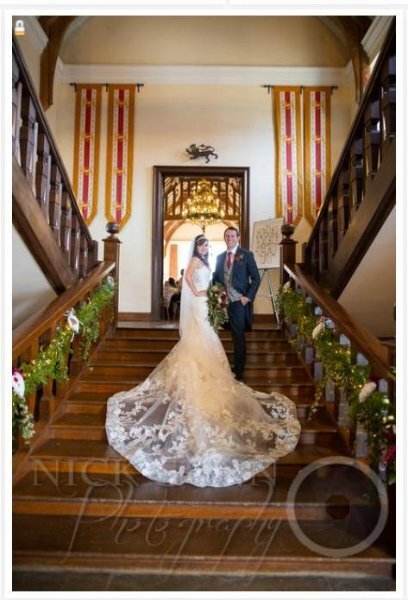
My daughter got married summer of 2022 in a beautiful historic Tudor Palace built for King Henry VIII, (1520). Situated in a old Roman Town, now a City. She honey mooned in Italy, and sent us a photo daily of her eating one of many different Italian Ice Creams. (It was a hot summer!).
2 points
-
Thanks for that explanation. I still wonder about some of the other steps since I don't understand the other ways to make masks.2 points
-
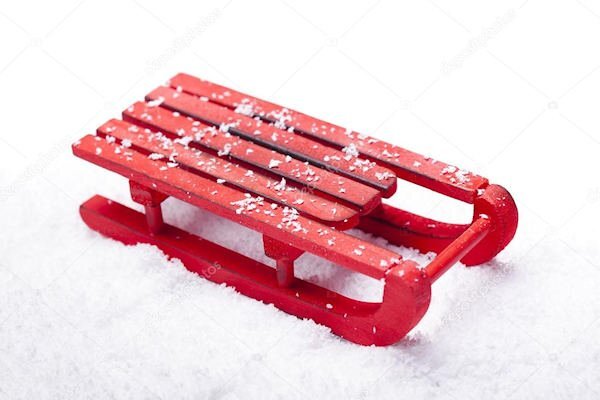
I was born the same year WWII started and manufacturing was all for the war effort, so my grandfather had to construct a wooden sled for me to fly down the nearby steep hill. I found this stock photo at Deposit Photos with a Google search and it looks very similar to my Red Sled. 😊 I kept it for years and used it as winter decor when my daughters were young; propped up outside next to the front door with a pile of fake snowballs in front of it. 🙃
2 points
-
@Cassel I managed to produce day one with many mistakes on my part reverting to PSPx8 .I have just tried the hue saturation lightness as you advised in PSP23 and it works ! I have spent 2 days trying to fix it I didnt think to ask if there was a workaround ! Life is such a learning curve .Thank you so much. Brilliant your Grandson is liking legos . I still have my boxes of them from my boys and they always come out when friends visit with children. They stimulate the imagination so much as you have clealy seen .2 points
-
Gerry, your flower photos are beautiful, I love the rose. Really cool effect with your plaid too. That's a neat way to use it, especially the top green one.2 points
-
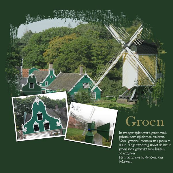
Day 2 "Green" In earlier days green was a colour to show you had money. Green was too expensive for the "common" people. Nowadays green is still a colour people use for their houses, it matches well with the colour of brick. Baskerville old face is the font. Photo's are my own, taken at the Openlucht museum .
2 points
-
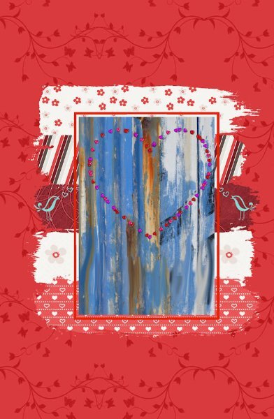
I have now used the extra template and some supplies that Carole gave us to practice the technique. It did help to question with each move what I was actually trying to achieve with each layer. Thank you Harmony for your help there. For this template I found it easier to rename the Stroke layers (1-5) to differentiate them. The main image I created from a picture tube I created of hearts and placed it on my photo of an old painted wall. The wall image fell short of the Mask window so I duplicated the wall image to fit, and used the Smudge brush to blend the join. Then Merged down to one layer.
2 points
-
Masks Workshop - Lesson 1
2 points
-
Took Judy shopping for new pickleball shoes. While she has played PB for years, this is her first pair of pickleball shoes. Our DSW has Sketchers PB shoes in stock which means we can try them on before buying. Judy is very difficult to fit, so being able to try shoes on is a real treat!2 points
-
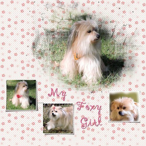
My day one Foxy Girl
2 points
-
Hello @Cassel and many thanks for this WS! 💓 Hello everyone!! Lovely template.2 points
Resized.thumb.jpg.d25811db03a63358cedab1e79f527635.jpg)