Leaderboard
Popular Content
Showing content with the highest reputation on 01/23/2024 in all areas
-
12 points
-
10 points
-
10 points
-
Hi here is my day 4, getting a little behind, I can't sit too long as I have been getting migraines. I am also on a time schedule to get my Granddaughters scrapbook finished which doesn't help, so today I have managed to use the given template for a double purpose. I wasn't sure if it would work because the book is smaller and not quite square, but its all good so happy me.10 points
-
Workshop Template 5 Diamond. I think I am tired out and there is still 2 more project day templates to go. Thinking about the theme (pictures, etc.) is now the hardest part. I texturized and colored the 3 small papers (that was fun) - I used "tiling" under effects>texture effects for the first time and I like it - gives me some ideas for making ribbons. I played with the Change to Target tool on the flower element in the lower right corner. Interesting that this time there was no TITLE layer. I guess the journaling tells all.9 points
-
8 points
-
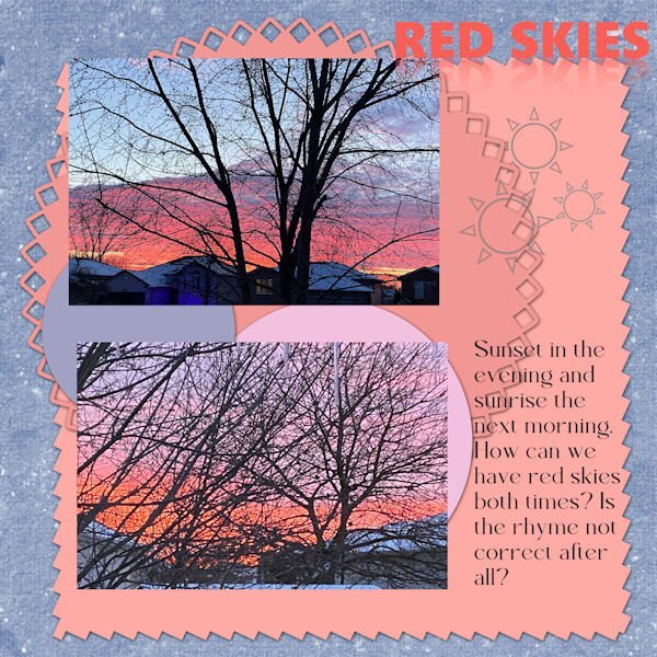
Template 7 (extra). Done. The two pix were taken (top) last night and (bottom) this morning b/c I was impressed with the colours in the sky as the sun set and rose. It always makes me think of "Red sky at night, sailors' delight" and "Red sky at morn, sailors be warned." But it didn't work that way this time. We had a cloudy, damp, and chilly day with some rain. So much for those old sayings I guess. I didn't change much in the template and added not much except for the little suns as elements. I'm not a big flower lover (at least the scrapbook kind, the reals ones are lovely). So I usually change them to something else. Fonts are two different ones and I don't recall their names.8 points
-
7 points
-
I agree. Coming up with a theme sometimes takes a long time. And then I have to actually find pix I can use b/c I don't take many.6 points
-
6 points
-
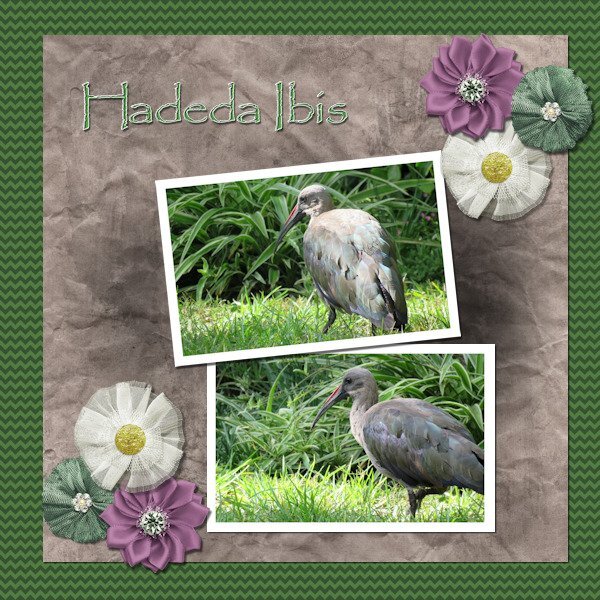
Lesson 6 done! We have a flock of about 10 Hadedas that visit us every day and most times spend the day in our garden. They are large birds (about 76 cm (30 in) long) and very noisy. Their call sounds like their name HA - DE - DA. When they make a noise, don't even try talking because someone standing in front of you won't even be able to hear you. I love these birds.5 points
-
I have had a lot of fun with this Workshop and learned so much. Unfortunately, for the next week, I will be without a Windows computer. I will miss working in PaintShop very much, but my daughter has a full schedule of things to do in Fredericksburg. I am hoping to get some great pictures! I made a quick roadtrip template. Thanks to our vector workshop, I was able to make a little car that sort of looks like our Toyota. The map is from Google. See you in a week.😪5 points
-
Love the layout, Julie! I haven't been here for many days, so I am also trying to keep up with the layouts... Everyone has been so busy and has created great pages!5 points
-
They are beautiful. We have only one variety of this bird in SW Ontario, the belted kingfisher and they're not as colourful as these (white, blue, grey). Would love to see any of them near my yard!5 points
-
5 points
-
You just did a huge project with your travel/trip double pages, no wonder you are tired out. This is great...and this is also not a race.5 points
-
4 points
-
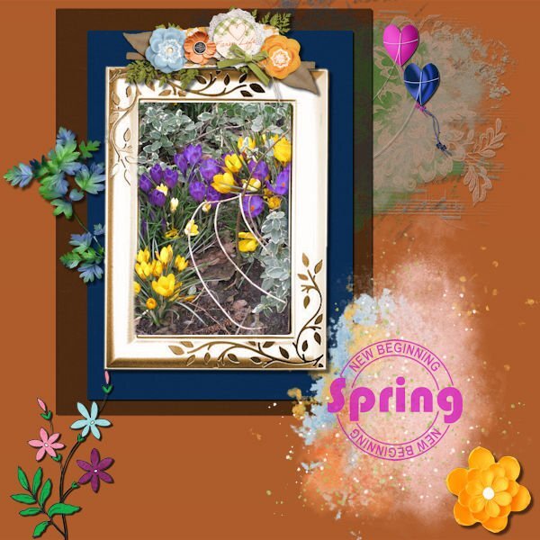
I take it 🙂 I started without a template, wow, to fill it when you don't have an idea how to fill it.............was difficult. I started with the photo and then mats, looked in my stash for spring elements and found a freebie form Carole too. The result is maybe not as nice as earlier projects, but it's ok. Used blend mode, texture effects/blinds. The new word is children 🙂4 points
-
I am sure I have been like that in the past but with this project I had two aims so one prompted the other: regular weekly exercise (training for that sponsored walk) and the photography project. So now, I mustn't give up on the exercise (might sign up for another walk) and need to fulfil the creative project.4 points
-
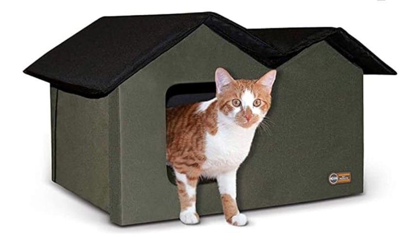
LESSON 7 - A classic scrapbook page, hoping to overcome some really lame photos clipped from a video. A little more involved than I usually do but I think it looks nice. All the elements and papers came from a kit called True Heart Digitals and the fonts are am-index and flora garden. The top cat is a mature female (I think) and the lower one is probably her nearly grown (possibly male) kitten. They seem to act as a bonded pair. She hides under a neighbor's car when I come out on the porch whereas he is bolder and comes running, meowing at me for food. I now have a Cat Cabin on the porch with straw for bedding. I've included a promo photo of it here.4 points
-
Template 6. Changed the layout by moving the title to the bottom, moving the pictures up, adding a journal sheet, and removing some of the elements replacing them with my own elements. I had fun – and learned something new – to put a paper on top of the textured layer and working with the blend mode and the opacity of the paper layer. Great stuff!! The title is Annie Tobin’s font (she was such a wonderful lady) which I glittered and innerbevelled. The heart in the top left corner is from CF and I innerbevelled it. The bow I made with Cassel’s Bow 2 script. The Santa sign is from my stash as is the poinsettia cluster in the bottom left corner. The star tube is from Cassel. The pictures are from scanning 1991 35m prints. They were in bad shape and I used every trick that PSP has (well almost). I had forgotten about fade correction, but Cassel reminded us of that tool and I used it and de-noised it to the max and sharpening it to the max. The difference is amazing. That trip was special and finding it was such a gift. You can't imagine - as we went down the road into the town, it was dark - everything was closed up tight - no lights - off to the left at a distance was an oil drum that seemed to have a fire in it - something that the people on the road in the depression might have used to keep warm or cook food - the scene was really eerie. Dolores really wanted to turn back, but I just felt we had to go further. And then, when we turned that corner it was like Judy Garland opening the door into Oz - from blah to radiant color. I will never forget it.3 points
-
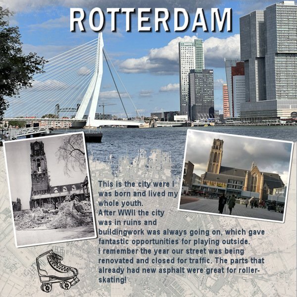
As this challenge will generate a new prompt every month or so and we had the Template Workshop to do, I only now had the time to make something for this new challenge. I liked what Bonnie did and made a page for the city where I was born and lived my whole youth. A little detail that is not mentioned in the layout is the black and white photo which is taken by my dad some time after the bombing of the city center of Rotterdam in WWII. The photo to the right is of the same church and I took that one on more or less the same spot a couple of year ago. My dad passed the love for photography on to me!3 points
-
3 points
-
Corrie and Susan - this was happening to me a lot! I kept finding my .pspimage files in the folders for papers, etc. so I talked to Carole and she pointed me to a little script to use for my Saves that has ended the confusion. It's not you, it appears to be a bug in 2023. At my age I don't need any more hints that I'm losing it! LOL3 points
-
Isn't it great those blendmodes!!! I use them so often and in psp 2023 it has become much easier to see the changes in real time!3 points
-
3 points
-
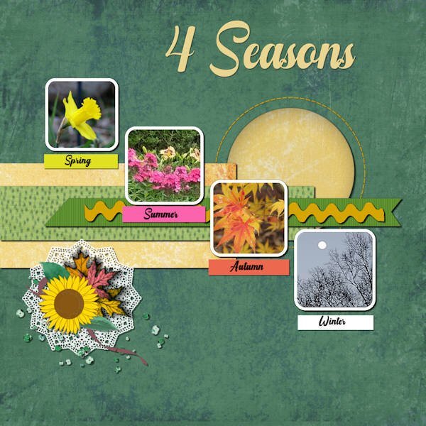
I'm not happy (again) with this layout, but it is what it is! I haven't kept all the different techniques I used on each of the elements, pictures, font, papers; but, I did use different blend modes, and I began to take off when I changed the hue>saturation>lightness on the background paper (which was from a marisa lerin kit) and then played with the blend modes and opacity - which worked with what I was trying to do. I played and played and played around with trying to figure out what to do with the elements in the lower left corner and ended up with a doily since it is round to balance the round paper in the top right corner. Of course, you can see that I also played with the placement of the picture layers and placed the title at the top.3 points
-
3 points
-
3 points
-
I just wanted to say Thanks to Cassel for this great workshop. I have learned so much. I never ceases to amaze me seeing all the wonderfully creative and different takes everyone has posted from the same few templates. Well done everyone. I will be sure to keep checking in for a few days too.2 points
-
2 points
-
It's called "MySave" and I was told to put it in "trusted scripts." I pulled it out and put it on my taskbar with a little icon near the normal blue Save floppy - check with Carole.2 points
-
Susan I have done that so often, saving something in the spot that I had used to get a paper or whatever. When I now can't find my layout where it is suppoost to be I think where was I last and most of the time: hurray found it!2 points
-
Yes, daughter Laurey gave it to me for Christmas. It fits together with Velcro. There's a door in the back, too. The young guy uses it a lot, aside from liking to lounge on top in nicer weather. 😺2 points
-
Bonnie my husband just turned 79 last week and yes he is getting "old" in his behavior and thinking and that frightens me! Of course he has been seriously ill but while it is better now he is stuck in the feeling that he can't do things anymore and won't undertake nothing, only a couple of things he knows well. I know that there is help available but he categorical refuses that! So I sympathize with you not being able to travel with Judy; it is so sad when you see a person you love slipping away from you. I hope this trip will turn out better then you fear and with the help from trusted friends you won't be totally on your own.2 points
-
I never thought to do that before. I always forget to try things even if I think it's silly. There was several blend modes that looked good too. It was hard to pick the one I went with.2 points
-
Day 7 The hardest thing about this for me was picking out all the papers because of all the colors in the photos. So, other than the main background paper, I decided to use all solids and added different textures to them. I like how it turned out. Carole, thank you so much for the awesome workshop. I came away with new tips from every one of the tutorials.2 points
-
2 points
-
I don't sell mine, but since the Scrapbook Kit Workshop in the beginning of last year, I have decided that that is the best way to keep the many elements and papers I have made.2 points
-
2 points
-
2 points
-
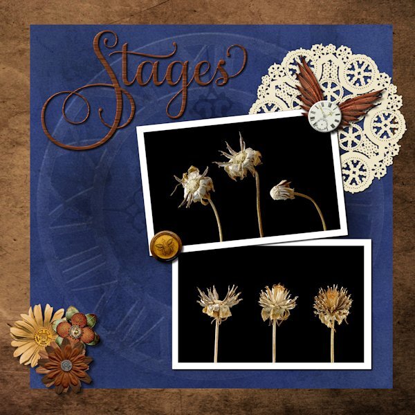
Day 6 What a great video using the blend modes with the textured paper. I used the paper (blue) from the kit as I new I wanted blue anyway. Blend mode used was Multiply. the layer above I had a metal element (was a brass metal clock outer ring element) that I resized to the the blue paper fully then used the blend mode Dodge to make it look like it was part of the paper design (opacity of clock lowered to 38). Ditto for the faint clock hands at 9 and 12, using a blend mode of Softlight and reduce opacity to 57. Title has an inner bevel. Paper doily I used HSL to make it a light ivory instead of stark white. Tiny white clock I added an inner bevel as well. I had a weird message about not being able to save. I'm not super happy with the title fill but was having such issues saving that I just went with it in case catastrophe struck. The deets: Background paper: Riley B Graphics (Creative Fabrica) Blue Paper and white clock face: Janet Scott - elegant autumn mini kit (Digital Scrapbook) Bottom flowers/clock ring/clock hands/wings: (on blue paper): Kerry Dempsy -KMRD Steampunk Elements (Digital Scrapbook) Bee Wax Seal: Billie Irene Steampunk something or other kit (Digital Scrapbook) Font: Samantha Upright (Creative Fabrica) - used glyphs on "S" "t" and "s"2 points
-
2 points
-
This is Template 6 (extra). I am so sick of it by now. I dither around and arrange and re-arrange and then dither some more and try different effects...until I make myself crazy! All images from online (Pixabay, I think). Changed the texture to one in my stash. Two fonts: Dry Hard Sans and Merry Jolly, both with gradient fills.2 points
-
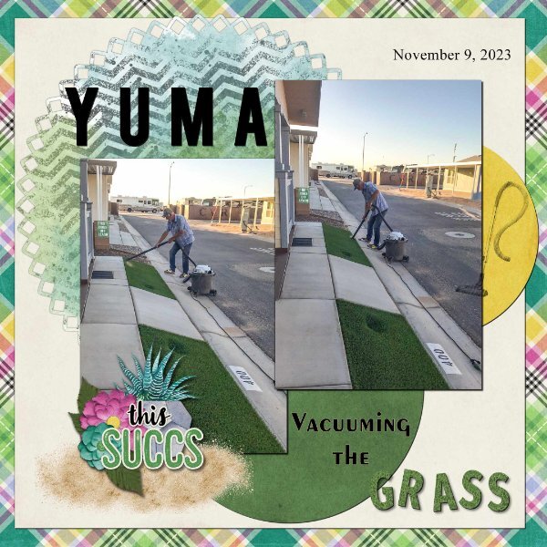
Day 7. Thank you Carole for the templates. I used the diamond membership template. I used a kit from Connie Prince Prickly. Font Fira Sans ExtraBold, Exotc350 Bd BT and Times New Roman. I used Cass GrassTexture script on the word "grass". Speaking of the clip to it script, it is one of my most favourite scrips, I use it all the time when working with templates. I really enjoy seeing all of the great layouts.2 points
-
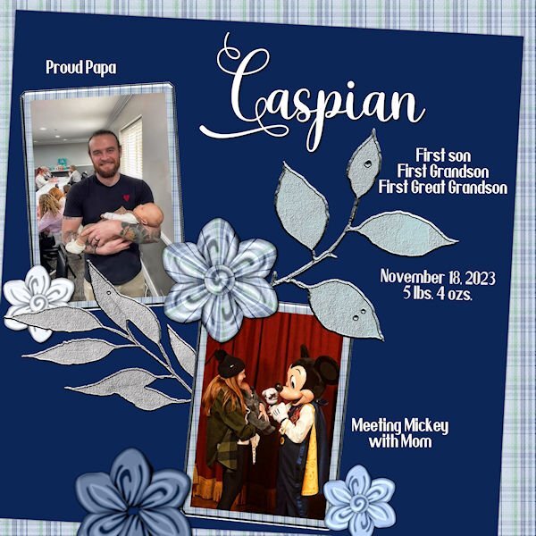
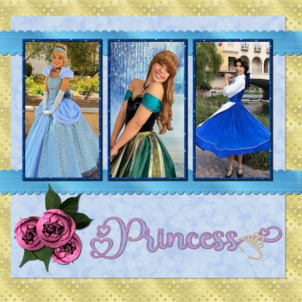
Day 6 - The photos are compliments of my future daughter in law, Lane. She works for a company that does Disney parties for children. The gold dot background is one of my own as is the blue overlay with a lowered opacity. The scalloped ribbons are my own texture, scalloped using cass quick scallop script(what a time saver!). The roses and leaves are from a package that I purchased from deeezy.com. The font is Hilender Rhapsody from Creative Fabrica. I used layer styles for the font, but wanted it to "pop" more and applied Hue and Saturation. The crown is a preset shape that was created from a font. I used VectorTube to apply the diamonds, a directional tube that I made using cassdirectiontube script.2 points
-
2 points
-
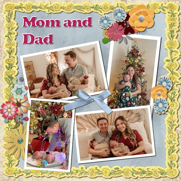
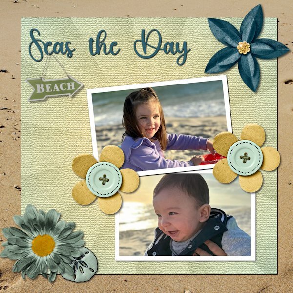
Day 6. Technically, the pictures were taken at Gulf Shores. As a veteran Miamian, I understand the difference between a gulf and the ocean. However, Felix, who is six months old, and Amelia, who is three, are not interested in nuance. Besides, nuanced accuracy would have gotten in the way of the fun title I found. The kit is from Throwing Some Scrap Around by Jodi Watson, which I found on Go Digital Scrapbooking. Unfortunately, the website does not seem to be operational. The font is Hey Beach from Creative Fabrica.2 points
-
Corrie, I am almost "really old"...79. Age is just a number to me. Some say your age is the number of years the world has been enjoying you. I did realize yesterday that others see me as really old. Two neighbor children came over to shovel my sidewalk and a neighbor who owns a tractor came to plow my driveway. While I can still do those things, it was a real blessing to have the help this time. I am really enjoying this workshop. I have day 6 almost complete but all of you will have to wait until I return. I leave tomorrow for sunny, warm (hopefully) Florida for a pickleball clinic. It will be a nice change from our frigid and snow covered ground. I am flying this time so I will not take a computer. I'll have my tablet so I hope to be able to check in but will have no new layouts until I return on Thursday PM. Judy is so confused by this trip, she has been no help and at times a real hinderance. Any change to the "normal" routine throws her for a loop. We will not be taking any other trips for a long time. This trip was planned months ago and I did not realize how quickly Judy would decline. Thankfully, we are traveling with friends who really love Judy and will help where they can. Of course, they should not give up any of the activities they paid for. I am sure it will be a delightful time...and we plan lots of board games too! Everyone stay warm, keep creativing and I'll see you when I get back.2 points
-
2 points



















Resized.thumb.jpg.d25811db03a63358cedab1e79f527635.jpg)
