Leaderboard
Popular Content
Showing content with the highest reputation on 01/16/2024 in all areas
-
15 points
-
I just used this template for the wedding layouts. Here it is for ice cream which was reallly frozen yogurt. The text is wordart...I can't find where it came from...I did add a bevel. Scollop paper is from Digital Scrapbooking and even though, I just used it, I now can't find who created it.15 points
-
Great lesson. Easy to follow though choosing papers was tricky... the more scrap kits you have the harder it is to select down to something specific. I didn't use the dots as they were just too much because of the busy papers I was using. And I lifted the text bar above the photo circle as the bottom of the picture had a ribbed textured fabric in another colour palette so it had to go and hiding it behind the text bar seemed the easiest solution. Font is Cotton Candies and the papers are from kits by CathyK and LilyFee. Looking forward to another template tomorrow. Sharon15 points
-
14 points
-
13 points
-
12 points
-
12 points
-
12 points
-
11 points
-
11 points
-
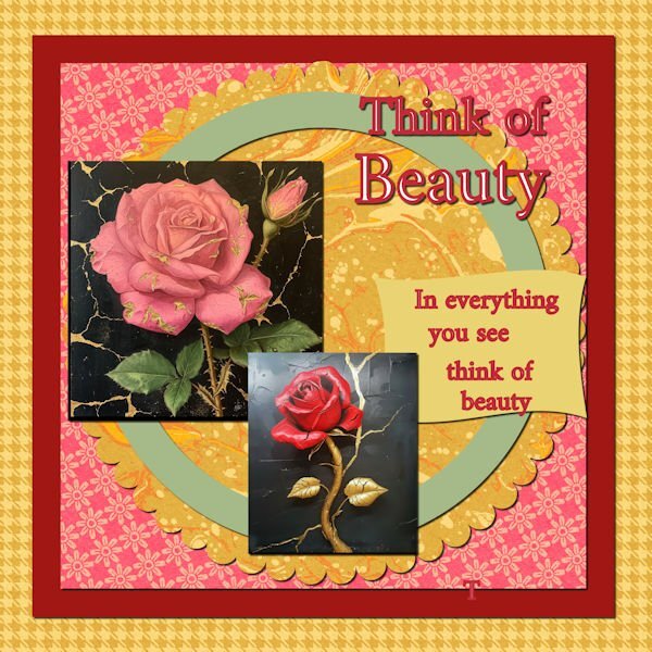
Not sure I like this...but here it is. Wordart by Robin Sampson, Greatest Gifts kit, Digital Scrapbooking. Papers by Saskia Veldhoen, Classy Christmas Kit, Digital Scrapbooking. Green papers are simply a color with texture.11 points
-
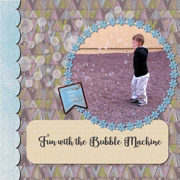
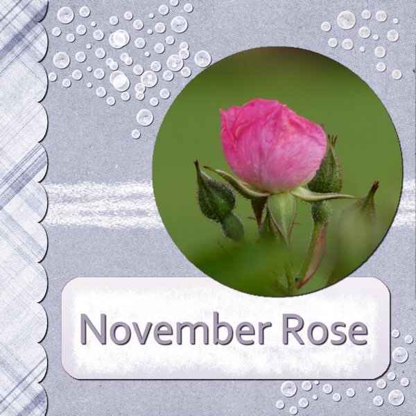
I used the papers from a kit from Pixel Scrapper: Marisal-gl22-jan-mini. Used a full one for the scalloped paper on the left side and as patterns for the background and the label since they would have overpowered the picture otherwise. The element was from that kit. The flower frame was one of my creations which I inner bevelled. The font is Baghira (I’m pretty sure it is from Creative Fabrica since most of my interesting fonts are from there). I duplicated the font and then converted it to a raster layer and inner bevelled it. The scalloped paper I textured with a bark texture which I had created and I also inner bevelled it. I played with adjusting the brightness and contrast on the bubbles as well as inner bevelling them in order to make them more like the bubbles in the bubble machine and also reduced the opacity. I placed a texture on the background paper also. I think that about sums up working with the template. I had forgotten that technique of opening the paper (or photo), copying it and pasting it above the layer you want to size it to, and then matching it to the template layer by using the magic wand on the outside of the template layer (so that it is inverted – or is it “outverted”?) and then clicking on the layer with the photo or paper and deleting. I did do that with the photo and the scalloped paper on the left side. That sums up the layout. The photo was taken in the summer of 2008 of my great grandson in California. His grandparents had bought him a bubble machine that was hand held by my son as he played with his grandson. It produces a “ton” of bubbles!11 points
-
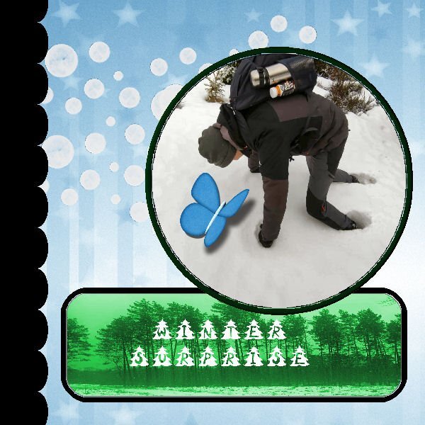
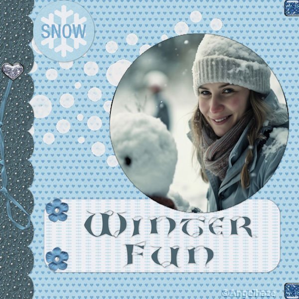
Day one Yesterday we had a tiny, tiny bit of snow with temperatures between -2 C at night and +2 C in the daytime. Here in the Netherlands we don't get snow every year and today was sunny; so I took some photos and used one of those for this day 1 layout. The kit I used is a favorite of mine and is called Winter Morning by DBMagnolia for the Blogtrain January 2022. I didn't use the layer with the circles, hided it and added a new raster layer with snowflakes made with a brush. The font is Fantasy Magist a freebie by Creative Fabrica (one of their everyday freebies)11 points
-
11 points
-
10 points
-
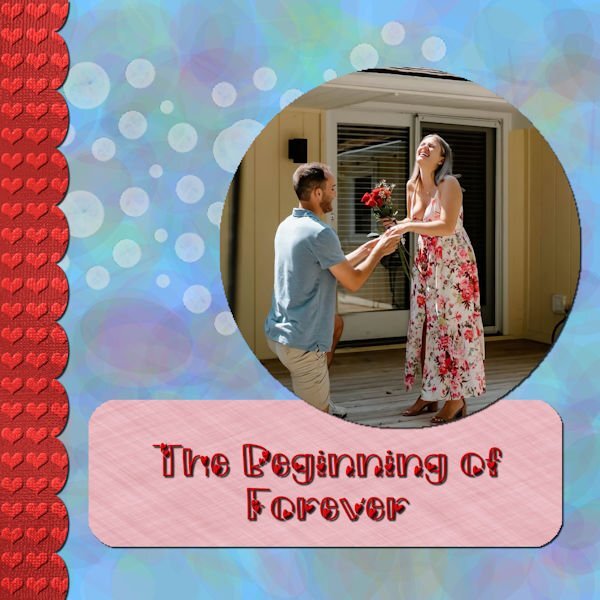
One of my favorite topics is my beautiful niece, Mikayla, and her finance, Joey. She has graciously shared her photos, including her wedding dress which I will not use. I made the heart background using one of my shimmer papers, the ellipse background was made with gmic filter and the rectangle from a FF linen seamless pattern. I lowered the opacity on the dots. The font is Morning Love from Creative Fabrica.10 points
-
10 points
-
10 points
-
Notes on Template 1 exercise I recently showed my wife the flower (actually, it was on my desktop after downloading, and she noticed it) and she liked it, so with Valentine's Day on the horizon, I decided to try to incorporate it into the workshop. 1. Radagund font available at https://www.dafont.com/radagund.font 2. Flower was from Creative Fabrica. 3. I wanted a red background for the flower so just did the selection and filled with red, then used the flower on top of that. As I sized the image down, I ended up with parts of the flowers extending beyond the circle and liked that so left it that way. 4. I wanted the hearts on the paper on the left to be red so I used the color changer tool. 5. I also wanted the lines in the layer over the top of the background layer to be red so I used the color changer tool to do that also. 6. Since the red circle and the flower were both separate layers, I added a drop shadow for each.6 points
-
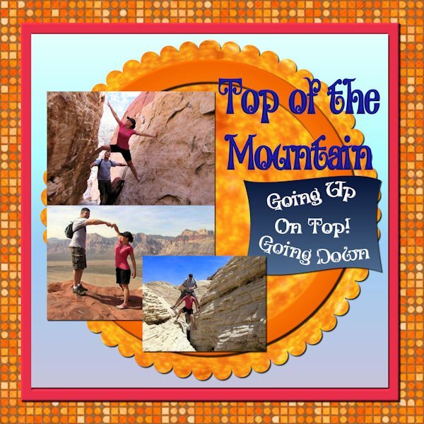
My daughter and son in law loved to hike in the desert around Las Vegas when they lived there. The background is from FF as is the pattern in the scalloped layer. Pictures are from my daughter. The font is Alister Oblique, but I don't know where I got it. The pink square is the color of my daughter's shirt. The other backgrounds are gradients. Beth now is in Fredericksburg, VA, although the Las Vegas house is going to be their retirement home. I will be computerless from Jan 24th to Jan 31st as I will be visiting her in Fredericksburg. Old Town is charming and there is lots to see surrounding Fredericksburg. Needless to say, I will be taking lots of pictures.5 points
-
5 points
-
5 points
-
5 points
-
here is day 2 I used again the QuickTile scripts to make patterns for the papers, fonts are Campanile and Fette Steinschrift, the Lego Blocks are a picturetube by Cassel I made the masks so -- I turned the grey and black photospots to white and used the new masklayer in black, so no need to invert the image.4 points
-
4 points
-
I have had a go at this first one but is taking me longer than it should as I am suffering with an inner ear condition making me a bit/very wobbly headed. Anyway, I will be going at a snails pace and dependant on weather me head feels it is screwed on alright shallbe posting my efforts. Hope everyone is doing ok.4 points
-
I am waiting on eye surgery so small fonts frustrate me at the moment and zooming in and out is so tedious. So, it is large fonts for now. I will have to try wrapping around the text later so I moved the text box to get everything in. Had some issues getting the inner paper to match the colors of the dress but, surprisingly, adding a bevel worked as altering the bevel settings can alter color depth. I was confused about the "layer...new mask layer" instructions & image in the video as I do not have that setting but I found it in the submenu for "new layer" in PSPX8. Can't get used to using those "Cntrl+C" etc commands. I find it easier to use my mouse and the dropdown commands at the top. Just a personal preference. It's a good thing that PSP has so many redundancies. Font is Comic Sans MS and the papers are from kits by CathyK and Brown Owl. I snagged the photos from the internet as no one wants to see a photo of my messy sewing room and I sure don't want to clean it up just for this lesson. However, the larger photo does mimic the inspiration board that I do make up with swatches, trim & ribbon scraps, buttons & thread that I select before starting on a garment. Sharon4 points
-
For Cassel re query about the dog in my layout. No, the dog is not mine. My mother lived with me for the last 20 years of her life and she was extremely afraid of dogs since she was badly mauled by one when she was young. After she died, I thought about getting a dog but arthritis was causing increasing mobility problems and I believe that if you cannot care for a dog properly, including walking it a couple of times a day, you should not own one. So, I am "grandma" to all my friends' and neighbors' dogs. I give great cuddles and have an inexhaustible supply of bacon flavored doggie snacks. Sharon4 points
-
4 points
-
3 points
-
3 points
-
2 points
-
2 points
-
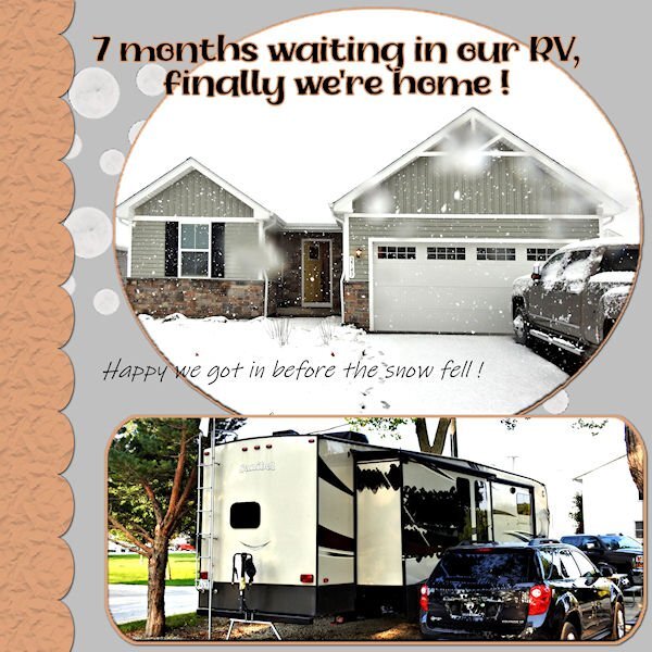
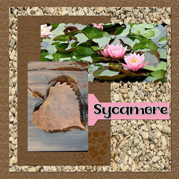
Awesome news, Lynda! Great to see you back. Love the layouts and you new "digs" are beautiful. I especially love your Sycamore layout as I live on Sycamore Avenue (in Canada). I thought living 6 weeks in an RV was bad enough when moved here, but 7 months, wowzers! Mind you, our RV is only 7'x21', two people two cats; a little too cozy!2 points
-
1 point
-
1 point
-
1 point
-
1 point
-
i know it is just me... but I cannot find the lesson anywhere... i have downloaded the template, but i cannot find the instructions on what to do next... sorry... Les1 point
-
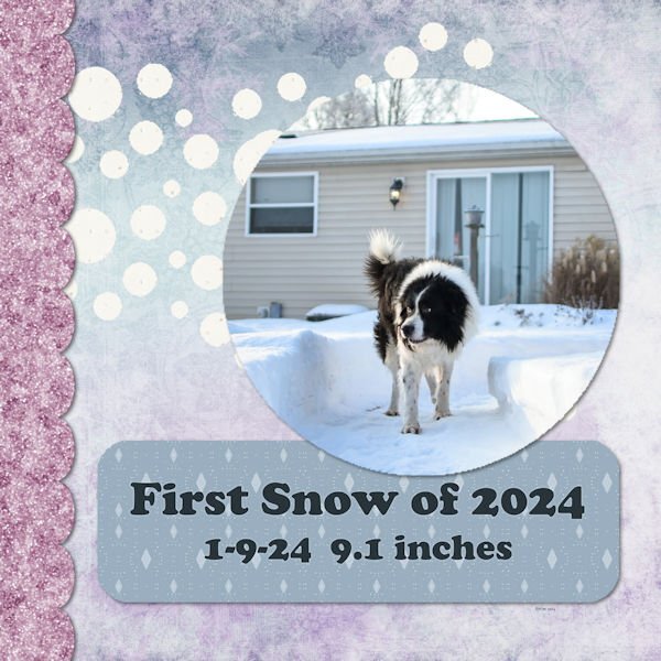
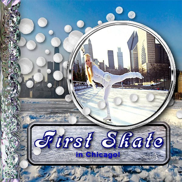
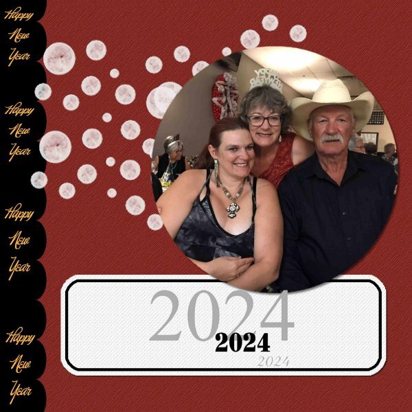
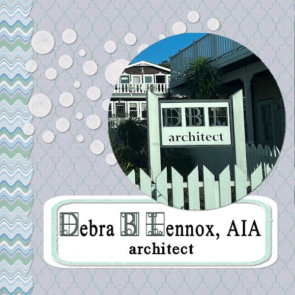
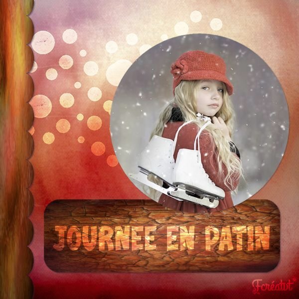
Great to see everyone. Overall, over 100 people have registered. I wonder how many layouts we will see. We are always eager to see your projects, but also to know a bit more about it, so if you want to add some information about the photo, the story, the event, etc., we would love to read. And if you have comments about the tutorial, a tip you learned, or something you discovered, everyone would love to know too, so don't be shy! @Nel Kempersto That paper on the left is very suited with those primates' photo. @France Rivest Bienvenue au Campus! Who is this cute face? @Jen Brown Great header for Facebook. Will you post it on your FB page? @Randy You worked hard and used many techniques. The result is great! @Alice Daniel I hope you can figure out what happened to your project. If you are still stuck, don't hesitate to post about it. We are all here to help. @Ann Seeber That is such an interesting font for an architect's firm! @Louyse Toupin That kit is so well suited for a winter layout! @Donna Sillia That is definitely a great photo to showcase! @sharon thompson I LOVE that quote, and that dog is adorable. Is that yours? @Bonnie Ballentine Is that at one of your regular after-pickleball ice cream get-together? @Emerald Jay That background paper with variegated colors is lovely! @Royanne Hewko It might be just me but it seems like the 2024 overlapping the photo seems a bit out of order. Do you see that? 🙂 @Steven Garthwaite Those snowballs are great!!! I would suggest you be careful with resizing the photo. Jenny will have a headache from being squished a bit 😉 If you have not posted yet, don't worry. I'll be back tomorrow and will review whatever you will post! Keep them coming! You are all inspiring each others.1 point
-
1 point
-
1 point
-
I keep my fingers crossed Ann that you will get good news for Eve on the 23rd1 point
-
Q = Quadratus Lumborum (QL's) This muscles attach on the back side (posterior) of you, bottom 4 ribs to the pelvis. They are work-a-holics and will take over if your core isn't doing work (ie. no being engaged when it should be). Often the culprit of sore low back problems. I banged one side so hard once that one side got twisted in the fascia (called QL syndrome) and caused all kinds of havoc for 3 months until my massage therapist was able to get it untwisted.1 point
-
It's a toughie for sure. It's starts with scapular retraction which most people don't do, they tend to pull with the bicep first thus not engaging the back very well (biceps are a tiny muscle group to be doing all that work). Assisted pulls ups are great too! (with bands or on an assissted pull up machine at the gym).1 point
-
...and if you did aerobics and you did jumping jacks it got some pizazz added to it. hahaha. so many variations, just like plank moves.1 point
-
Lab 11 Mod 10. Requirements: argyle pattern: background paper; triple spiral: doubled it in the lower right corner and single one in upper right corner; slide frame: the 6 photos are displayed in the frames. I used the layout template (modified) from the module. the title font is Lionteen (I'm pretty sure it came from Creative Fabrica). Strange thing again in working with this layout: I tried to duplicate the "Houghton, MI" and put it on each of the frames, but it wouldn't work - I got a blank each time I tried to copy it and move the copy to the next frame, so I had to do a vector for each of the frames on the top and the bottom. Couldn't figure what went wrong.1 point

Resized.thumb.jpg.d25811db03a63358cedab1e79f527635.jpg)


.jpg.3007603d8eae23c96396e8e6587299b9.jpg)












.jpg.208cd26df487ecaab0db48990a4de93c.jpg)
.jpg.997fdcc81ae7a0dc4cd95750ebd45d6e.jpg)
