Leaderboard


Popular Content
Showing content with the highest reputation on 12/04/2023 in all areas
-
Your suggestions are so inspiring. I tried out the transparent frames and added a bit of colour too on one of my Turkish photos. I used the selection tool method.
 5 points
 -
Thinking of you, Chris. I'm hoping your cold goes away quickly.
4 points
-
I mentioned it before, Sue... You are also the master of Word Art... Beautiful!4 points
-
Wait until you are back and see what is happening to the script-a-holics, maybe we all have given up and retired from scripting!4 points
-
I made at last a first start for the dutch month of March. In this case the echo-script did not do what I wanted, but in a few days I give it antoher go. I am a bit ill. A very bad cold. Bad for me because I have to breath through a hole in my neck, after laryngectomie. It's going better already, but it makes me very tired some days.
4 points
-
Too bad I didn't see you! 🙂 But yeah. I try to remind people who are live to just enjoy watching and not worry about taking notes, or worse, trying to work along, since the replay will be available afterward!3 points
-
Now then, don't anyone dare laugh, but seeing as I had completed all my festive cards, calendars and everything else related to the festive season a while back. I decided to start thinking of Christmas 2024. I'm currently working on greetings for the inside of cards, something other than the usual plain journaling. I posted the wordart tree earlier. Since then I have done 3 similar to the one below. Although it's white vectors on a black background, they will be colourized. This is how I start any of my word/subway art. I used from vector shape to cut out the & from the bauble.
3 points
-
I'll take it as a compliment, and it's my pleasure to widen the realm of creative possibilities within PSP. I can see, we are going to have to start another holic group. Only this time for scripts. For scriptaholics. I hold Carole totally responsible for this addiction. As how can anyone resist the temptation of her wonderful time saving scripts. hahahahaha.3 points
-
Easy does it, take care, hope you will be well soon 🙂2 points
-
2 old fishermen with many tales to tell
2 points
-
Easy way means "SCRIPT" right? hahahahaha, I couldn't resist. Adjustment Layers are not hard to make...you got this. I do use them for editing photos ...until I learn my new Raw editor program, which is Waaaaaay down the to-do list. I am really interesting in using them for frames, I would never have thought to do that. Thank you Sue, for forging where no forger has gone before (in my world anyway). Geez, I think I just made you sound like a painting forger, YIKES!2 points
-
I was just trying out the 2023 Holiday postcard freebee and the Echo script. I changed a few things on the postcard. Text, colors, and bevels.
2 points
-
Take care Chris, I hope you feeling stronger everyday.2 points
-
Now I think I know what you are trying to achieve. For this effect may I suggest you use the adjustment layers. I think you will achieve a much better result, not that I'm saying what you have done isn't lovely, it is. Although you have created 3 distinct frames, you still do that using the adjustment layers. In my example, which I did back in 2018, I have done many different ones since, including oval ones, within a rectangle image, which has distinct frames, like yours. Using the selection tool, and the adjustment layer brightness and contrast. Of course you can still lower the opacity whilst the frame is still selected with the selection tool, within the adjustment layer. The adjustment layers are like masks, you can go back at a later time to change it, when saved as a PSP. There are masterclasses on using the adjustment layers. 'Adjust what' is one. I hope this helps you.
2 points
-
This one is a mask saved with the frames in various opacity of white.
2 points
-
I created this starting with a Globe shared on PSPManiacs.
2 points
-
Well, the next thing I did this morning was to take the top of the November Calendar and copy it and change the copy to a square and then use it as a mask and this is what I came up with.
2 points
-
Carole has transparent frames script. I replicated one of them, it's below. The only other thing I can think of is using the adjustment layers.
2 points
-
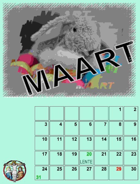
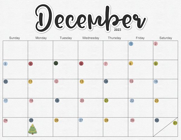
Welcome to December. Here is the December calendar featuring the Amur Leopard this time. Enjoy. I even used a little Out of Bounds on this one. I have posted a full size version on Facebook that will print 11"x8.5" I feature mine on my desktop. The leopard information is from the Beardsley Zoo in Connecticut, where they have successfully bred some new members of this endangered species. Edit: forgot to name the Amur Jaguar font - Sedalia and the journaling is Arial Narrow.
2 points
-
I had noticed that there was a lot of talking about it on this site. I used it for the first time today. Due to all kinds of problems on my laptop, I can no longer use TheFontThing. That's why I was looking for something different. I hadn't taken the time to look into it before. It takes some time getting used to, but then you get something. I haven't mastered everything yet, but I'll get used to it. And it seems to have been on my laptop for ages. Another step further into the world of photo shopping. I'll be doing more homework like this next week. But don't worry about me I'll be back. Probably stronger than before. 🤗1 point
-
Glad to hear that it was such a simple issue (although it can cause a big headache!).1 point
-
Thank you, Ladies!! Carole, you were correct. I had to copy and paste an apostrophe and it was a tiny selection I made. Whenever I would slide one of the layers to my workspace to get the image, it came back as a tiny little thing. I couldn't figure out what the heck that was. It's all fixed now.1 point
-
I did duplicate the vector text and then convert to raster. The drop shadow did work on the text. I don't understand what happened, but this is what I did. I started clicking on all the paper layers and there are four of them plus the background. When I did that with the pick tool, it highlighted in the layer panel, but on my canvas it showed the pick tool always right in the center of the page and I tried to rotate it or move it and I got that symbol of a red circle with a slanted line. The void mark maybe? Anyways, I'm really stumped. The different layers are actually highlighting in the layer panel, but I can't do anything to the layer itself. I closed the image multiple times and opened and closed PSP a few times. I'm going to reconstruct the whole page one piece at a time now. Now I'm thinking maybe there is something up with the template I'm using. I did duplicate the template before I began, so I still have the original. Hmmm...I don't know if I had a little selection. Going to check that now too.1 point
-
Do you happen to have a selection? Sometimes, a tiny selection is present and makes a tool "not work". Try to deselect with Ctrl-D, and then try the shadow again?1 point
-
Hello Carole, unfortunately, I had to cancel the masterclass webinar yesterday. It was too fast for me, I couldn't keep up with the tinkering and it was too late in the evening. I had already spent the whole day making graphic preparations for Advent/Christmas/birthday and was very tired. As a Diamond winner, I will rework the videos in peace, at my own pace (pause video). But nice that I could experience you live Carole. Have a nice week.1 point
-
Must give this technique a try. The technical explanations are very useful, particularly yours Sue on Adjustment Layers. The effect enhances the images really well. Thank you Mary.1 point
-
You emphasise 'easy way'. 🙂 Most things become easy or easier with a little know how and practice. I firmly believe, that once you have created an adjustment layer, there'll be no stopping you. It only takes about 5 steps. If I was you, I would use the adjustment layer the conventional way, contracting by the number of pixels of your frames. Then save as a PSP. To be reused over and over. I have never created an adjustment layer template.1 point
-
This is beautiful. A very good use of the "Just Out Of It" masterclass.1 point
-
Where as you created actual frames around your image, and then lowered the opacity of those frames, the image stayed the same. The brightness and contrast adjustment layer alters the actual image, whilst still retaining the sharpness, colours, and quality, although they might be made brighter or less bright. It doesn't alter the opacity. There are a lot of adjustment layers to play with, depending on the look you want to achieve. While you still have the selection tool active, you can add textures, even an inner bevel. Personally I rarely do that. I'm only making you aware of some of the possibilities.
1 point
-
I think if I hear/see the phrase "Black Friday" this many weeks after the actual one, I will scream!1 point
-
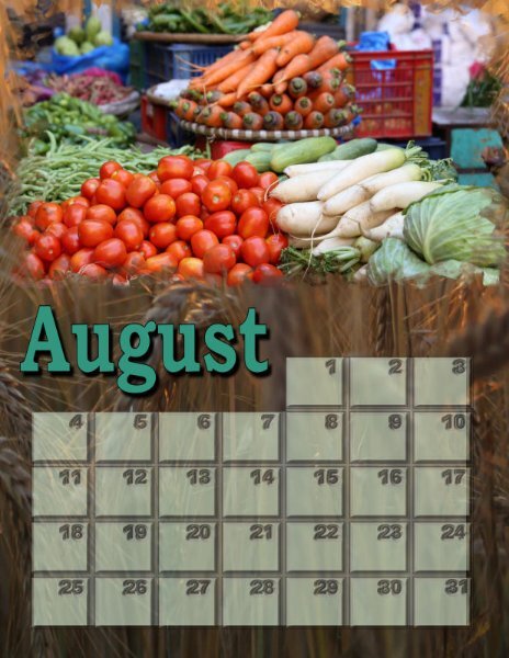
August
1 point
-
The Yule Ball is from the Harry Potter stories. I pieced together a bunch of different elements including a few touches from Particle Shop onto a background pic of the empty ballroom. The font is, appropriately, Harry P.1 point
-
This seems to be a layout that is a hybrid between the November Word Challenge (Cold) and the December (Christmas) Challenge. Just playing with lots of elements and basing it on a layout I saw on Jessica Dunn's Curio Pantry site.
1 point
-
You are absolutely right, I fly out on Wednesday afternoon, arriving at mid day the following day. I will be away for more than a couple of weeks. I fly back on the 31st January. It's going to be a wonderful, special time. I'm told that the girls are now counting down the days of my arrival using their advent calendars. Thank you!1 point
-
These are very cool Mary. Inspiring. I have so many ideas in my head of what I want to do. Now to find the time to do it and the many other things I want to do outside PSP.1 point
-
Very nice! Sue if I'm not mistaken you are almost flying home for Christmas and I wish you a wonderful time with your children and grandchildren! For the grands it will be such a special X-mas with their granny present. Have a safe trip and come back with many new photos of the places you are visiting. See you in a couple of weeks!1 point
-
I also made the 3 transparent frames into a mask and this is the result. I'm just having too much fun. I really need to get back on the Alphabet Soup album as I only have 3 layouts to go before I get it ready to print.
1 point
-
I put this page in November by mistake. I like the gold. I'm going to use this in some of next year's festive cards, as the greeting/verse on the inside page. It ill make for a novel layout. I will also be able change some of the wording, depending who the recipient of the card is going to be.
1 point
-
I'm sorry, but I'm at a loss. The only other thing I can think of is creating and using a frame or frames in a mask, where the opacity of those frames will be sporadic throughout the mask. Or using a vector shape to create a frame, using from vector shape, go to the photo layer promote to a new layer, and change the brightness and contrast of that layer. You now have me baffled!1 point
-
@Sue Thomas Yes, I know about the transparent ribbon frame script, and I can duplicate that (takes time); however, what I saw was not that, it was like using the transparent picture frame, but it is not that either. So the closest to what I remember (or dreamed) was what I pictured above. I used separate layers for each frame; used the selection tool set to rectangle, then selection>modify>selection borders (I believe I set it to 35). What I remembered was the different opacity for each frame, and so I did that on each layer.1 point
-
I saw something similar online, which caught my eye. I decided to create my own. I'll make it more festive with colour, holly etc. Wordart using only fonts.
1 point
-
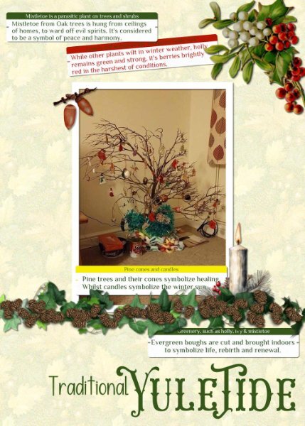
I dug out one of my very old photos from home. It wasn't that long ago that we were discussing the origins of Christmas and it's relation to the Winter Solstice during pagan times, in the campus. I mentioned that my children and I would go out gathering greenery for decorations, and branches for a tree. I have created a Yuletide page. I still make paper chains. I used Carole's label script for the journaling, the pine cones come with PSP. The other elements I have acquired over the years, which I use over and over in other pages, particularly the ivy, which you may recognise.
1 point
-
Wow! All these books are so awesome! (also counting the one by Mary in the travel theme thread). Here is what I've been up to today in preparation for tomorrow's planner class.
1 point
-
I think that technique was just in the Campus update with the link to the blog post tutorial. I wanted to remember and downloaded it. Once I get Christmas put out I can get to fun stuff. I wish I had an instant just-add-water and *POOF* Christmas is all over the house, seed.1 point
-
That little out-of-bound effect is subtle but gives a nice touch!1 point
-
Template 209 of Lady 22.1 point
-
Trip to Skyline Drive in the Shenandoah National Park. The path was very rocky and the leaves covered the rocks. Stepping carefully was a wise thing to do. Template 206 by Lady 22.1 point
-
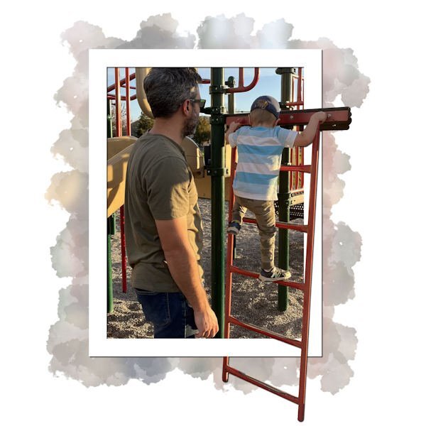
And another And the text: I like to climb in the park. Daddy shows me how to keep my balance, and how to go higher without being scared. Maybe... someday... I will be... a construction worker.
1 point
-
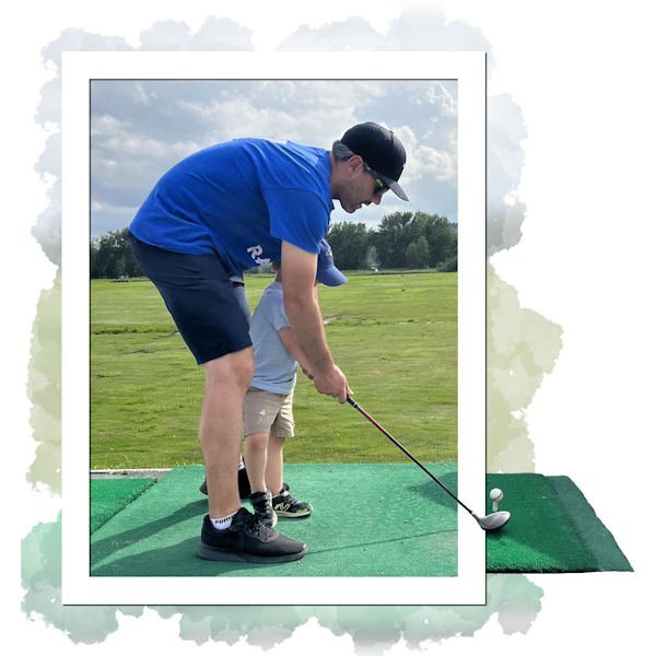
Next page: And the text: I like to play golf. Daddy shows me how to hold the clubs and hit the ball. It is not always easy but it is fun. Maybe... someday... I will be... a golfer.
1 point


600.jpg.7a58405f709833f82c235aa694d8f906.jpg)


a.jpg.3b3457c8bfc9bfc8635f927741c3522d.jpg)


Resized.thumb.jpg.d25811db03a63358cedab1e79f527635.jpg)