Leaderboard


Popular Content
Showing content with the highest reputation on 10/25/2023 in all areas
-
Project 3. Osprey eat fish. The Osprey pictures are from screenshots taken from the Osprey live cam that I follow.
 8 points
 -
Hi I am a little late to the party. Here is my project for New. When I saved it 600x600 the forum told me my file was too big. I don't what I did wrong. I resaved it 500x500.
6 points
-
Hi, now part 4 is also finished. This time I had the problem, that the tool options bar was not docked at the top. It was freely movable and had to be expanded with a small arrow on the right. I looked at the docking options, but there were ticks everywhere, including the tool options. How can I fix this important bar? And yes Carole, I managed to do that with the fill options.6 points
-
I've made a lot myself: such as background from colors out of the pics and a texture. But also the scratches. The ornament is from a font named Azalea ornaments. The photos I gathered from the internet. I had fun making this I hope you have fun watching it. 😆 Carole I had some trouble with the edge, the eraser didn't do the correct remove although I had all the good numbers. It's visible in the right corner down that I had to go over several times. And at the bottom of the big scratch, it's not all removed.
6 points
-
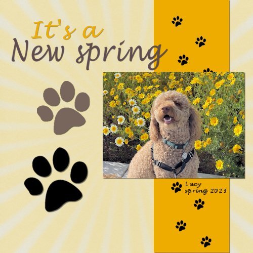
Lots of treats and supervision given whilst taking these photos ! Graphics are Mary Fran's "aintmisbehavin" from the Nitwits site Papers are from Mary Fran's Farley friends from the Nitwits site Thank you for all the help to get me this far !!4 points
-
Lesson 9 Project 4. Thanks for looking!
4 points
-
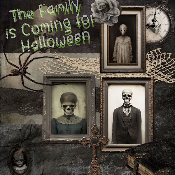
I found this kit on Gingersnaps and couldn't resist using it with a Halloween theme for the Bootcamp. Meet the Creepy Family that's coming for Halloween! Everything on the layout came from that one kit, called ID-Face in the Photograph. The kit has 11 folders filled with embellishments and 3 of papers but none of the extras like alphas or journal cards. The papers are a little odd as they are divided into texture, outdoor and indoor shots. There is very little color in this kit. The font for the title is Before the Rainbow enhanced by the Ripple Distortion Effect.
4 points
-
I found this kit on Gingersnaps and couldn't resist using it with a Halloween theme for the Bootcamp. Meet the Creepy Family that's coming for Halloween! Everything on the layout came from that one kit, called ID-Face in the Photograph. The kit has 11 folders filled with embellishments and 3 of papers but none of the extras like alphas or journal cards. The papers are a little odd as they are divided into texture, outdoor and indoor shots. There is very little color in this kit. The font for the title is Before the Rainbow enhanced by the Ripple Distortion Effect.
3 points
-
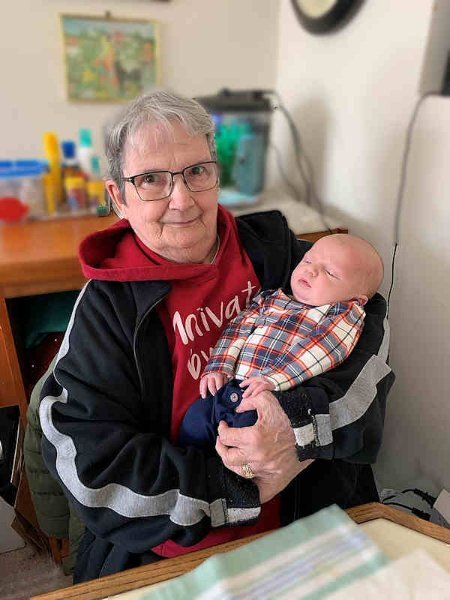
Just poking around in my iPhone, I found this photo of me with great-grandson Logan soon after he was born in February 2021.
3 points
-
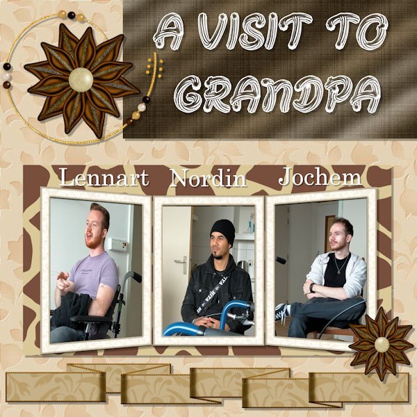
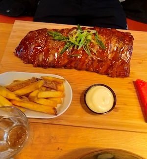
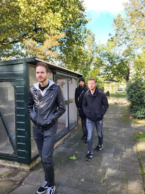
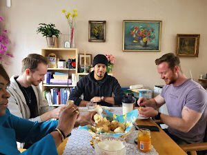
My grandchildren are from different ages but some of them are in their early twenties. Stil scholars. As they live far away we don't see them often. Last Saturday they were here, three boys and their 2 moms. They came from different locations In two cars. As a pastry, I baked a tray full of scones (on demand). The favorite sweet bite of 2 out of the three boys. Of course with apricot jam and clotted cream. Not the original English one that's not available in this small town but a substitute. I always use 1 tin of cream and 1 tin of sour cream, the cream whipped and sweetened a bit with some sugar and vanilla sugar. Then stirring the sour cream through carefully. After a lot of joking and laughter, the whole tray of scones was empty. After finishing the scones the ICTer Lennard had a look in my laptop and changed so here and there something I never had known it was even possible. He added Malewherebite as an extra check-up to find malware. In the early afternoon, we went to Grandpa in the nursing home. He was very glad to see them and the boys took him for a walk in the garden of the home and the ladies pushed his wheelchair Then we wanted to go to the pier/beach but it was raining. So we went into the beach restaurant and had there our dinner. We had a good few over the sea and the tall ships (most cargo ) The ships came in and out of the North Sea Canal very carefully of course. A cruise ship to Scandinavia to it's destination. Many WOWs were heard. Photo 1 the rib of Nordin. He said it was very tasty. Photo 2 The boys during the walk in the garden. Photo 3 Eating the scones. And many many more photo's.
3 points
-
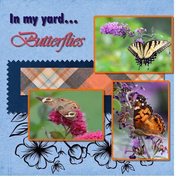
Project 4 I have more flower beds than I can keep up with, but the flowers I plant are for the purpose of attracting and feeding butterflies, bees and hummingbirds--and most of them have to be perennials. : ) The 3 butterflies shown here (top: yellow eastern tiger swallowtail, bottom right: American painted lady, bottom left: common buckeye) are only a part of what we have fluttering around our yard, but I thought more than 3 photos would be too much. I did not include the narrow "ribbon" as I thought there was enough color already. Papers: ps_jessica-dunn_363770-vintage-blooms-solid-paper-04_pu (sky blue) ps_marissa-lerin_367656_a-touch-of-delight-solid-paper-07_pu (dark blue) ps_jessica-dunn_240239_around-the-world-plaid-paper-05_pu (plaid) ps_,arosa-lerin_367836_a-touch-of-delight-sta,[-flower-4 (flower stamps)
3 points
-
It's wonderful to see all the different layouts here is my project 4 Kit Ciel Bleu by Regina Falango this is from January3 points
-
"I take it" The next word is Hedgehog. The photo is from greenlandshop, the font is Arial size 30
3 points
-
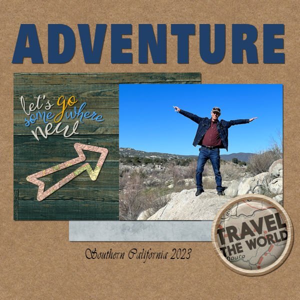
Thanks Ann! That's exactly what I did for this project. I had it set way up to the best quality, and I didn't realize it! It is nice to be back in PSP land. I haven't done any layouts in a while, so I have forgotten a lot. We traveled out west last winter and enjoyed every minute of our time in California, Arizona, and New Mexico!
2 points
-
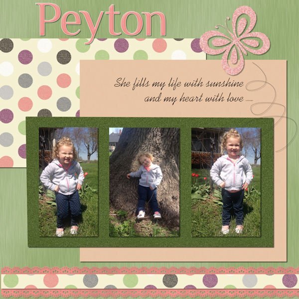
We have 4 grandchildren ranging from the age of 12 to 2. We love them all. This is a page I did of our oldest.
2 points
-
I take it and the next word is Autumn
2 points
-
Here is the link to the Forum and Gallery tutorials. It should help guide you through where to post what and how to do it. https://scrapbookcampus.com/invision/forums/forum/22-forum-and-gallery-tutorials/2 points
-
Thank you Susan.
2 points
-
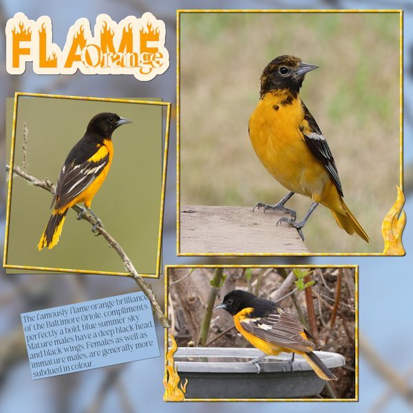
I took the word ORANGE from Corrie. Here is my page. Using the word Orange in the title. I created a ghost text, turning it into a sort of sticker for the title. Added flames to 2 of the frames, extended the branch out and over the frame. Used a photo for the background, which consisted of branches and blue sky, blurred. As I mentioned blue skies in the text. Susan prompted me to mention our blue skies, that go on for ever. I believe I am correct in posting my page, in the original acceptance message of the word Orange. By selecting edit. Which is what I have done.
2 points
-
Now we'll see more of your winter pix of the critters around you. Winter photography is often more beautiful than summertime. It captures the "weather vibe" more clearly.1 point
-
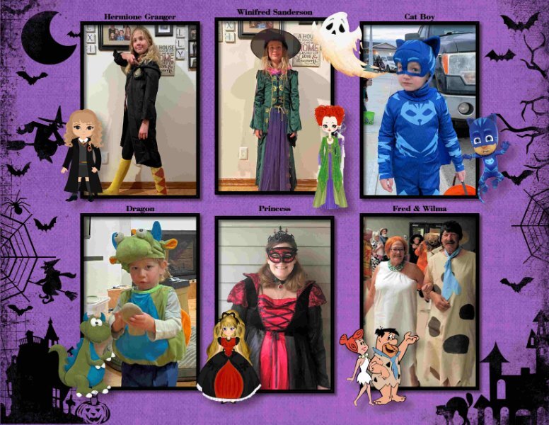
Love Halloween .... Characters are from www.hiclipart.com. It is a great site for free png files.
1 point
-
O, Yes. Your name was not familiar to me but now I know you. These feelings you are having are quite normal. Are these your first footsteps in scrapbooking? You will learn a lot here. The possibilities are legion in PSP. Seeing your work you have a good feeling for colors. That is the halve work already. Good luck further with this trajectory. I hope to see more of you. If you are stuck once there are a lot of helpers here.1 point
-
Sorry for the delay. I should have posted these sooner, but I hope that it is better late than never! @Carolyn Rye It looks like you are getting more comfortable with PSP. You resized the images correctly as they are not distorted. Good work. May I suggest that you reduce the shadow offset a bit more so the elements will have a more realistic thickness (and look like they are nicely laid on the paper)? @Jannette Nieuwboer That is a cool font. Did you know about the alpha made of icing? You can get it HERE. @Doska St.When you applied the white, did you happen to have a texture included that you didn't expect? Or maybe it was a patterned white, instead of a solid white? To make the tag more transparent, you can lower the opacity, as long as your text is on a separate layer, the text will still show well. Did you get the Fill issue resolved in the end? @Emerald Jay Yes, those rulers and guides can be very useful. When you crop an image, it is typically on its own, so that is why you don't keep the handles to resize since the Crop is not meant to resize. What you can do, however, is to make a selection, invert the selection, and delete that new selection. That would "crop" a photo onto your project, and then, using the Pick tool, you would get those handles if you want/need to resize the photo. Your grandpa layout is great while you used that technique of changing the colors of the letters individually. This will open up a whole lot of options in the future! @Barbara Caulton I don't know if it is intentional or not, but the "glitter" tile placed at an angle gives a very interesting effect! You are definitely getting more comfortable. When you replied, you happened to quote Susan. But it is ok. It still displays your project. Continue by simply scrolling to the bottom to post your replies. And no, the gallery does not automatically post in the forum (sometimes, I wish). @Melanie Mitchell You get beautiful shots of those birds, and you are resizing/cropping them well too. A nice way to showcase them! For your project 4, may I suggest that you remove the shadows on the black drawings in the back? It feels like they are nicely drawn, and ink would not have any thickness, so it would not have a shadow. @Ann Seeber That is definitely a more advanced rendition of that project, but I think it is great to see how the same starting tutorial can really take on different directions based on the supplies used. @Bonnie Ballentine Those faces! You definitely have quite a nice circle of friends!! @Gerry Landreth Awwww... what else can I say??? @Anja Pelzer Those blue flowers are wonderful! Blue is a color that is not commonly found in that tone. We often see more purple shades of blue but this bright color is amazing. You will have another project tomorrow, and then, the rest of the week will be to catch up.1 point
-
That's awesome, Ann!1 point
-
Thank you dear ones💗, with the additional grid layer for the edge of the photo, the filling worked, great.🤗I hope that I can now finish the scrap without any further problems. Thank you again for your quick help.👌 @ Anja: Du kannst in Ruhe deine Einkäufe einräumen, danke für den guten Willen🥰1 point
-
This is a common issue. Check that the Fill mode is set to None. I forgot to include that detail in the video because I keep it at None by default, and neglected to specify it.1 point
-
And now to the Garden of the Gods.
1 point
-
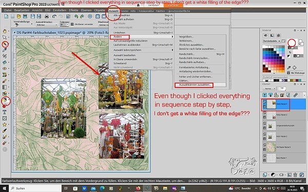
Hello Carol and members, I have a problem with the new PSP Ultimate 2023. I can't fill the photo edges with white even though I clicked everything step by step according to the Video. What mistake am I making (see screenshot) or is it due to changed working conditions in the newer version? I also saved everything and restarted the program and tried filling again, nothing...
1 point
-
I take it. Next word is "garden"
1 point
-
I have been to Rotterdam, only the once, over 40 yrs ago. I suspect it has change a lot since then. From what I can remember it's a beautiful city. I have also flown over the Netherlands countless times, at various times of year, to land at Schiphol airport, to catch the sky hopper for Caerdydd airport. My favourite time of year is when the rows and rows of every colour imaginable of Tulips are in flower, waiting to be harvested. It's certainly a spectacular splash of colour, looking down from above. I think I may be just a little to far north for you to pop in for a cuppa, when you are over next. We shall never say never will we meet in person one day.1 point
-
You create delicate, fine pages, they are simply quite exquisite. You have rather a unique creative style.1 point
-
Did someone mention Northern Lights!!!!!!! September and October is the best time of year to see the Northern lights, although they dance throughout the year. At this time of year they are overhead in my area. Only last night, I was out watching the lights. They weren't green, but white, still a mesmerizing sight to behold. Prior to moving here, I had only ever seen them on the telly. Photo taken 20th September , looking north, out back amongst the trees. It's a good idea to take shots with something in the foreground. Manual, F2.8, aperture mode, shutter speed varies, 1000 plus. It is imperative that you use a sturdy tripod, with weights, to maintain absolute stillness. Taking loads of shots, to get one half tidy one. Sounds like you live in a lovely area Michele, and happy where you are.
1 point
-
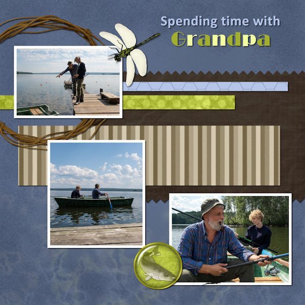
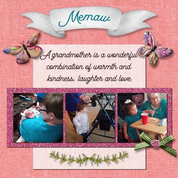
Project 3 I used elements from the Best Mom Ever kit. I swapped out the papers at the last minute and forgot to make of note of the details. These are pictures of my mom and Amelia, who has recently been deposed as the reigning "Baby of the Family." She was always fussy until she was in her great-grandmother's arms. Later, Amelia stayed close to her when they were together, even guiding her walker and eating cake. NOTE: I forgot to credit the quote. It is from that wise sage, Anonymous. Sorry for the oversight.
1 point
-
Font: Lobster. Giraffe stamp by Marisa Lerin, Draw It Templates Kit #7 Giraffe sticker: Jessica Dunn, Inner Wild Mini1 point
-
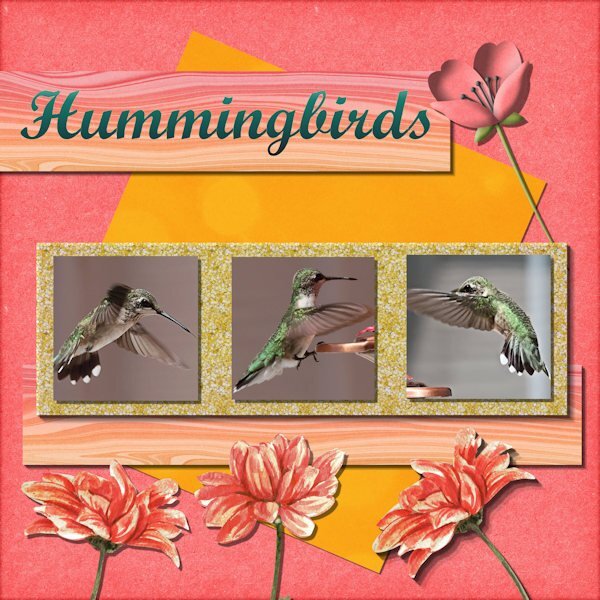
Project 3 We love the ruby throated hummingbird, which is the only one we see here in Georgia. We put up feeders all around the house, and in with some of our flowers. They become adjusted to us, and will hover near us "checking us out." They're very curious birds. They also have incredible memories and will remember what flowers and feeders they've been to in previous years, and return again the following years. Papers came from THD-SweetSummer-Aug23-DSSS-CC Also ps_marisa-lerin-245722-the-good-life-june-2020 THD- BestMomEver-May23 ( flowers) ChineseOrientGlitter Kit (glitter)
1 point
-
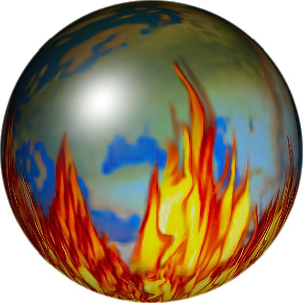
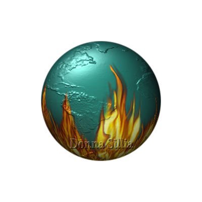
I recently watched a PBS program call "World on Fire" which was about WWII and decided to try to replicate an image that I made several years ago. No matter what I tried, I couldn't remember what I had done, so I made a new one using Balls and Bubbles effect. The earth is from CF Spark. I tried to use it as a Bump map which didn't work and ended up using it for the surface.
1 point
-
I take it and the next word is Roses used a few scripts by Cassel for the buttons, Sequins and confetti, and the glitter. picture tubes by Corel and Cassel1 point
-
Day 7 Project 3 Still confused .. I saved the link to my bookmarks as Ann suggested and remembered this time to click it , but I feel as if I have posted this on Susans page! Do I start a new topic at the at the top of the boot camp page or click like I think I just did ...on reply !! apologies Susan if I have it wrong again. I have used the graduated paper and the glitter from Creative Fabrica, The graphics are Mary Frans "Woofs" I think it was from the Nitwits site. One thing I have learnt ...If it from the whole workshop it has to be how easy layers are after doing the sandwich. If it is one thing from today it has to be how to fill a selection from a pattern using a tile!
1 point
-
Good morning, Everyone 🙂 This is Lesson 7. I did use a glitter I had to flood fill the rectangle selection. It's not so glittery. lol I used to use the guides and snap to guide all the time. And I kept trying to pull a guide down from the top of my canvas, but it never worked. Thanks for telling me about the ruler! I forgot all about that. Now I have them all checked and will use them always. The name up at the top was an alpha set and the guide came in very handy to position the letters. I had trouble with my cropping tool which made the resizing of the photographs difficult. The little tool bar on the bottom of it kept disappearing so at first I could not finish the crop. I found I could double-click inside of it and it cropped the image. But then the handle was gone too and I couldn't move the image. I would have to close PSP and reload it again. I find the 2023 version a little clunky to use, but i'll manage as best I can. I have nothing but time. 🙂 I really enjoyed this lesson, I learned a lot. 🙂
1 point
-
Hello, this time I had some difficulties with the levels. There layers reported as "converted selection" and the Originalraster remained. I deleted them at the end because the layer list was getting longer and longer. There were no changes on the scrap. I also had a problem coloring the tag behind the title. I wanted white, but then the pattern "Glitter" came from the photo frame. After some time I got the white somehow, but it looks like a grid. How can I make a written tag more transparent so that the background shows through a bit? I took the Mother's Day kit from TDH from May 2023-BT and the Swirl is from marutis.ch. Font: Campanile & Vivienne Translation: Botanical garden Art, architecture and botany. In our city botanical garden is located behind an old art museum1 point
-
The scrap kit is K.G. Chocklat. The font's name is Candyday BW and the name's font is Bell M.T. I loved this photo frame so much that I switched over. If you don't agree then I will change to the tutorial. It's not that I can't the "snap to guide.' It's a matter of preference. But I sent this one to my bodyguards. like I call them.
1 point
-
Actually, I took the photo through a window. The contest got a little more heated but they were just practicing.1 point
-
Just finished Day 7. I am still highlighting our Scandinavian trip because it was so special to us. I have always wanted to go to Denmark and Norway because my grandmother was from Denmark and my Grandfather was from Norway. As I was born in Australia, it was definitely on my "bucket list" to visit these countries. This certainly exceeded my expectations. Thanks to Cassel for all your tips on each of the projects I have delivered so far. This is so appreciated as it helps me to learn.1 point
-
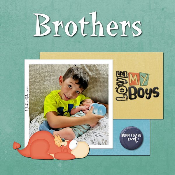
My great-nephew Noah requested a baby sister. It took him about a day to adjust when he was told that it would be a brother instead. He takes the responsibility of being a big brother quite seriously.
1 point
-
I have a little time to scrap so I made another one for this bootcamp I used again a Kit by Lynn Anselc - Autumn Harvest font - Denim and A day in September1 point
-
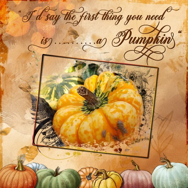
I take it and the NEXT WORD is: ORANGE Halloween isn't for me but pumpkins are. Almost every autumn I make a display on a small table in my patio with pumpkins, dry leaves, chestnut etc. Here I used a fall background from my stash with 3 different overlays and different blendmodes; one with autumn leaves a freebie from Corel, one with more leaves from InkyDeals and a frame. A mask from digitalscrapbook on my photo with a small frame and the font is Michalina. Some pumpkins at the bottom, after all the word is pumpkin!
1 point
-
Having fun with my Daily Look today. Lots of clip art and some of the game characters. The font is Mrs.Monster Academy.1 point
-
Good morning to all. I am newbie from the UK. I have never done anything like this workshop before and have never used a forum so I have no idea how to post in one! I need to post how I have set up my Psp as per yesterdays boot camp instructions . I found this area by chance but it looks like this area is to say hello. Any advice would be most welcome. Thank you.1 point
-
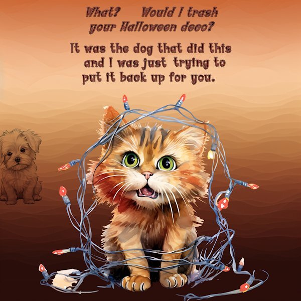
All Components are from Creative Fabrica. The cat one had Christmas lights that I turned orange for them to be Halloween deco.
1 point
-
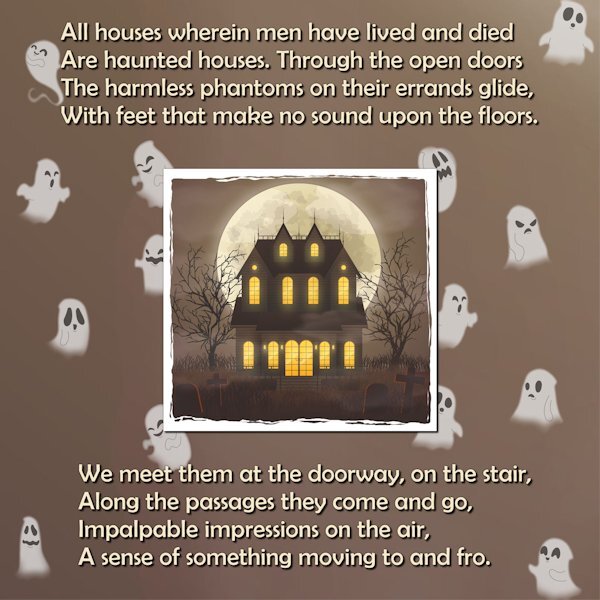
The poem is the the first two verses of ‘Haunted Houses’ by Henry Wadsworth Longfellow (full poem at https://poets.org/poem/haunted-houses) The background is a paper I made. The central image from freepik and the ghost are Caroles ghosts picture tube.
1 point


.jpg.f517b8bd38b42f294d9cb5b36f265557.jpg)

Resized.thumb.jpg.d25811db03a63358cedab1e79f527635.jpg)