Leaderboard
Popular Content
Showing content with the highest reputation on 07/02/2023 in all areas
-
6 points
-
It looks like this has become a trend everywhere. I think it's a good idea. Here, I saw an old telephone booth turned into this little library. This is sponsored by the city. I also saw a "little library" in front of a private house a few years ago. I have the photo of the telephone booth, and will try to take one from the other.5 points
-
4 points
-
3 points
-
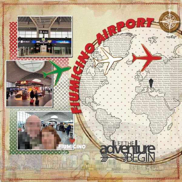
Here is one layout I finally managed to finish. Again, I used a Scrapping with Liz template (SwL_AroundtheWorldTemplate3). Also, from her, the SwL_LettheAdventureBegin cutout. The background is a blend of a photo of the internet (Effects>Art Media Effects>Colored Pencil) on top of a vintage paper. Border stitch is an old freebie from Kristin Aagard (KAagard_July17CCM_BorderStitches_5) From Cassel: Photo mat (Lab13-06 - punched paper) -- Custom Coin Script -- Date Stamp8 Script - Text Overlay (Lab5-09) Font: Futura XBLKIT BT EXTRA BLACK ITALIC. EDIT: Also included the polka dot pattern.2 points
-
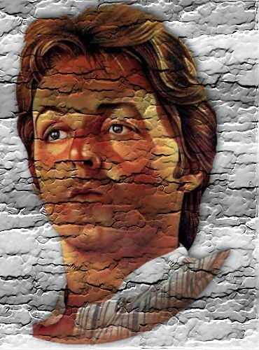
Ik heb de stenen muur gemaakt. Maar met graffiti erop. Ik veranderde de achtergrondkleuren naar zwart en wit met tint en verzadiging. Na het technische proces heb ik er een portret op geplaatst. Heb het in het lagenpalet op vermenigvuldigen gezet zodat de stenen muur er doorheen kwam. En het werkje was af.2 points
-
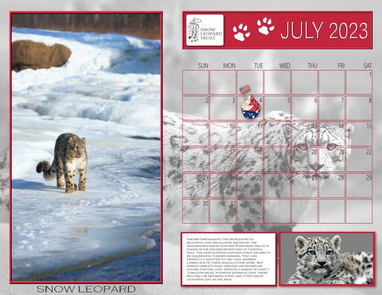
The first thing I like to post is my new Wild Cat calendar for the month. It features the Snow Leopard, the gentle giant of Central Asia. These calendar templates are very large, measuring 4200 x 3245 px. I've been using PSPs print function and get nice 11x8.5" prints on my desktop Epson. I have put a full size jpg in the Files section of our Facebook group: Scrapbooking with PaintShop Pro. The leopard photos are from Unsplash. Here's a copy of the journaling which is rather small in this version: Known throughout the world for its beautiful fur and elusive behavior, the endangered snow leopard (Panthera uncia) is found in the rugged mountains of Central Asia. The gentle snow leopard is not known to be aggressive toward humans. They are perfectly adapted to the cold, barren landscape of their high-altitude home, but human threats have created an uncertain future for the cats. Despite a range of over 1.2 million miles, scientist estimate that there may only be between 4,000 and 7,000 snow leopards left in the wild. EDIT: Unhappy with the background and lower image, I made some changes.2 points
-
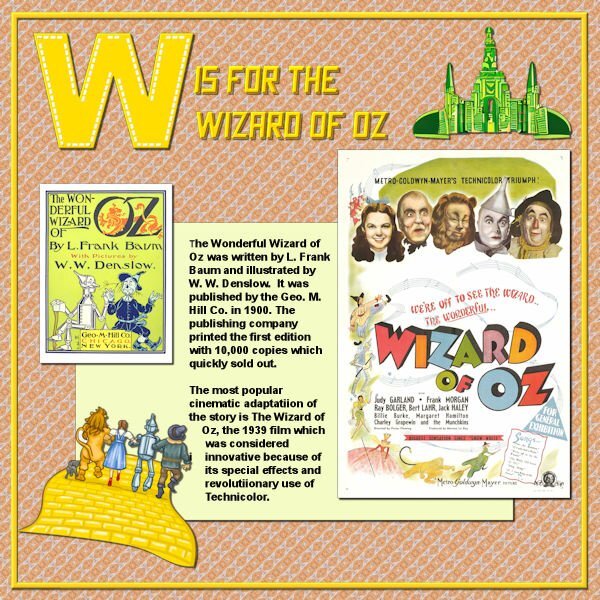
Well, I finished W. Wizard of Oz. The emerald city is extracted from a CF Spark png I asked for, the yellow brick road with the travellers on it is from a clip art, the font is Crash Demons from CF; the poster and the book cover are from Wikipedia and the journaling was extracted from that site; the papers and the W are mine.2 points
-
2 points
-
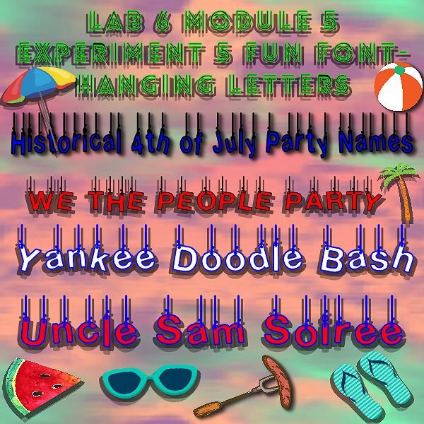
In July, our monthly theme is GRILLING. Whether you are celebrating a holiday (July 1st, 4th of July, or July 14th) with a family gathering around the barbecue, or love camping and outdoor cooking, let's find words that are associated with grilling. It could be a utensil, a brand of barbecue, a specific food or even a recipe name. Everything, based on the alphabet, as usual! Let's go!1 point
-
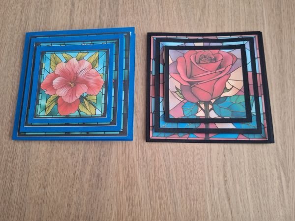
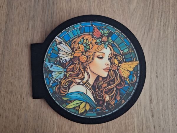
A friend of mine, also a Cricut machine owner, sent me a "how to" YouTube video of Stained glass cards. Today I've been trying to make them myself. The round one I couldn't find a template for, so made it myself ? It is a print and cut layout/template. You print the picture and the machine cuts it in the right size, the rest of the template will be cut too. I'm happy with the result ?1 point
-
1 point
-
1 point
-
1 point
-
1 point
-
1 point
-
Well, guess what? I have one more QP for the Day 8 assignment. I downloaded a few from Digital Scrapbook and this one is from Marisa Lerin called QP-Slovenia03. I decided to combine this with the Random Challenge to tell a personal story. The title font is Corlita Sans; the journaling is in Droid Serif. Behind the text I brushed some dark blue with a brush called cass-Dispersion2. The journaling is a bit small so I'll repeat it here;1 point
-
I used various elements from my stash of freebies. Gotta love blog trains and free sites. The sun image was originally an outline that I filled with the reddish/brownish color. To do this I used the magic wand selection brush in Add mode on all the empty spots, increased the selection by a few pixels, and flood-filled it on a new layer beneath the sun. I also used the Change to Target brush to recolor the two hanging elements. The font is Dream Her, free from DaFont; I applied an inner bevel and some texture to the text to try and make it look like the sun.1 point
-
1 point
-
1 point
-
1 point
-
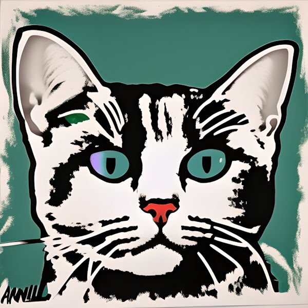
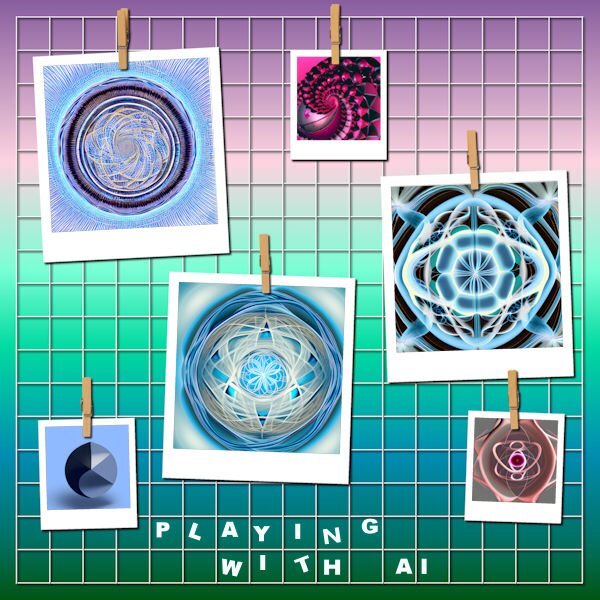
The prompt builder is the bottom of the list. it really helps. I've tried a number of the different Spark's: art, crystalloine which is a png generator, sketch which does black & white pencil sketches, pattern, and of course the prompt buillder. Sometimes it helps to be brief and sometimes the best results are when you get real particular. I'm going to post my Andy Warhol cat which I did this morning - just asked for a cat like Andy Worhol.1 point
-
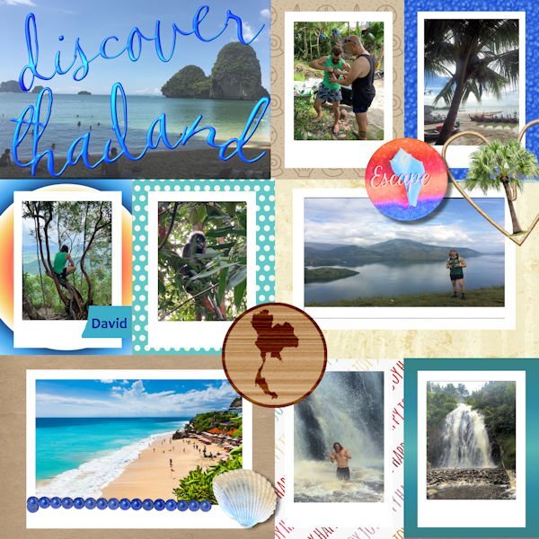
I used a qp that I downloaded a while back from Digital Scrapbook. The original file was a PSD and opened in Paintshop with layers. I could not figure out how to make the picture files into masks probably something to do with the PSD layout. The photos were sent to me by my grandson when he visited Southeast Asia prior to Covid(He made it home just in time.) The font is CallieHmk that I got when I installed the Hallmark card program. The palm tree is a tube, the map of Thailand is from Pixabay and added to the wood based on a Scrap tutorial. The shell is from shell pictures that David sent from Thailand. Escape is from a Digital Scrapbook kit.1 point
-
The subject matter really fits the template. Bet we all have that song on our brain now.1 point
-
I searched in my folders and found this QP, I used a photo from my DD, and added only the date1 point
-
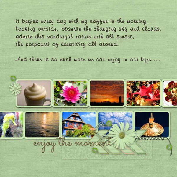
Even if it is "officially" over, I'd like to add QP 7. All photos are mine. A greater choice of totally different pics, not what I do usually but to show a bit the diversity of interests. Of course there is more than this. The font for the text is Freehand591BT. My coffee cup looks really like this ?, I use a milk foamer/frother, but not an electric one.1 point
-
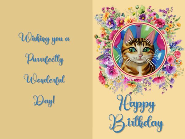
Here is my Non-Scrap project from Day 5 - The Greeting card I used the Creative Spark feature for the cat picture, I love to play with that option. The font is Birthday from Creative Fabrica. I used the method Carole showed us how to keep text aligned in the center by using the selection tool and drawing a rectangle, etc.and adding the text. Carole, you asked which elements I used on Day 8 to add to the template. The large picture with the musical cats is from Creative Fabrica and so is the little birdie on top of the musical notes. The musical notes are from my stash from years ago and I don't remember where I got them..1 point
-
1 point
-
1 point
-
1 point
-
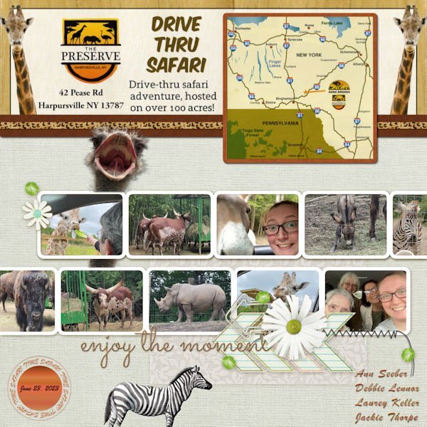
QP-7 - Our drive-thru safari. This layout was good for all the animals that were around and almost inside our car! The font is Brush Script and the ostrich head came from PNGALL. I scanned a flyer from The Preserve for the details and map on top. I will also post this in Facebook and in the comments post the little, very funny video that Jackie did from the front seat to the back and you'll see what I mean about the animals almost "in" the car. ?1 point
-
I think me and their AI dont speak the same language. I have tried and all I get is hideous stuff that isnt anywhere near what I "thought" I described. It's same as when you contact a company and they use a AI help "person". You ask a simple question, how do I find my monthly invoice, and it sends me to look at how to hook up my new streaming box (that I didnt order, cause I already have one).1 point
-
1 point
-
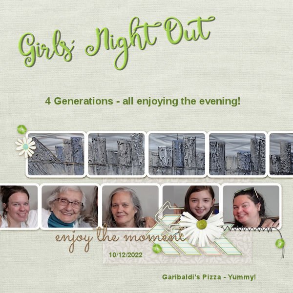
And now here is QP 7. Hard to fit those heads in the spaces. I had to take out part of the flower and clip in order to fit in Emma's head. All were taken from the same photograph. We were in Garibaldi's and the picture behind which covers all of the top layer is one that fascinates me at Garibaldi's - it was behind us in the group picture - it is a metallic take on the Memphis scene taken from across the Mississippi in Arkansas.1 point
-
1 point
-
1 point
-
1 point
-
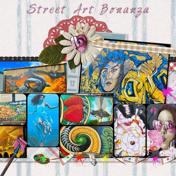
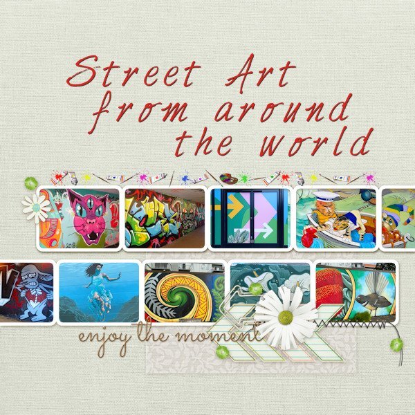
Got there eventually and decided to keep to the same colourful theme of street art. I have replicated some of their artwork and used the 'Art Group' Picture Tube for extra decoration. It has been a fun workshop and has been good for practicing PSP with basic templates as well as good for the creativity. Thank you Carole and thank everyone in the forum for their ideas and comments. Now back to training for my hike!1 point
-
Quick Page Day8 Quick Page from Digital Scrapbook (Marisa Lerin - Tunisia Quick Page 01). Photo is mine, very old...actually comes from a negative that is too old to reprint now. I scanned a smaller print (the one hanging up is 17x22 and would not fit the tiny old scanner I have) version I have and it lost all detail in the shadows. I chose this photo after I was looking for a Quick Page and saw right away, the color was perfect for that photo. This the quickest Quick Page I've done to date. Fonts: Resnick and Reneo (Creative Fabrica). Thank you Carol, for a wonderful workshop. I have enjoyed all the variety of layouts everyone produced. The active forum was fun and I looked forward to checking in to see the new pages and reading the comments.1 point
-
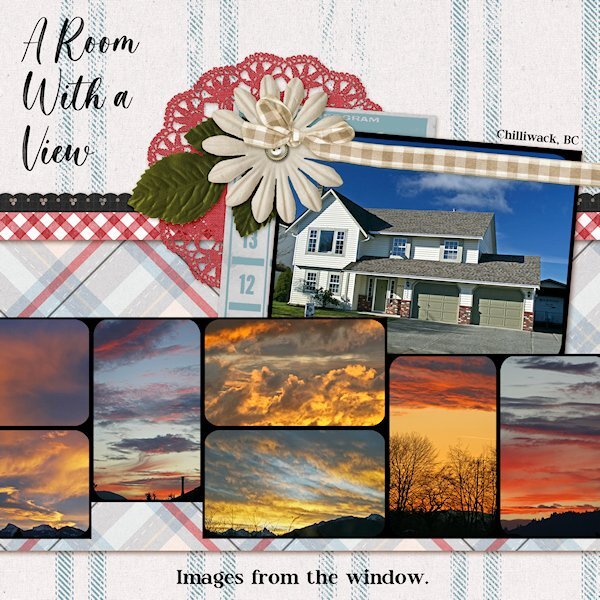
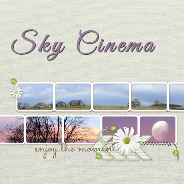
QP Extra Lesson 7 I didnt change anything on the page. Photos of crazy sunsets taken from the windows (front or back) of my house in Chilliwack (British Columbia). Being in the Fraser Valley, surrounded by mountains it was a treat to have days that there was a sunset. Normally we'd have grey sky days. Where I live now, there is less rain and sunsets almost everynight. Fonts: Magista Brush and Maxim from Creative Fabrica.1 point
-
1 point
-
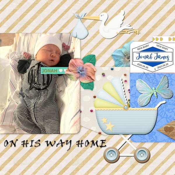
Getting started on catching up. I've been traveling around with family since Thursday so I'm WAY behind! This is QP- 5 - featuring new gg Jonah James on the day he came home from the hospital. The font is Viner Hand for the title. The label on the right was from Carole before she released her new script.1 point
-
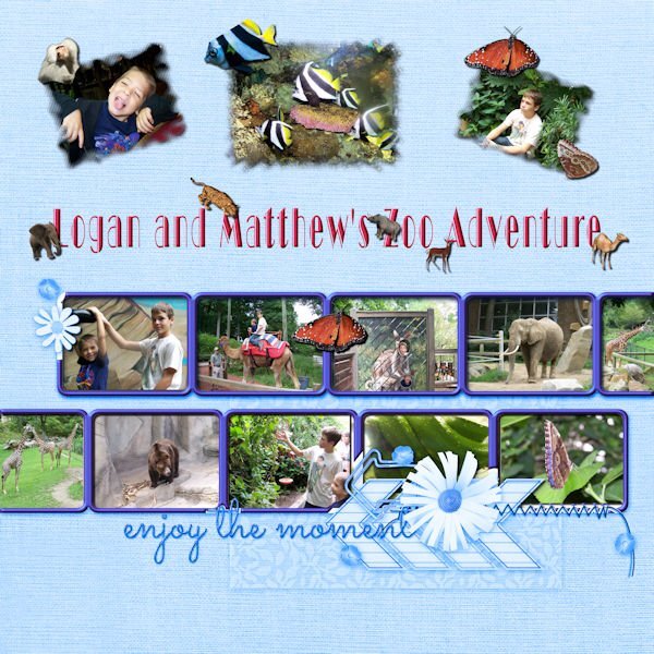
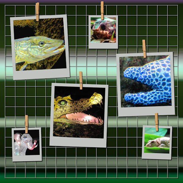
I had to go way back to find 10 pictures. My grandsons in the photos are now 21 and 28, but we had a really great time at the Cleveland Zoo. The font is Broadway display. The additional animals are tubes except for the baboon which was also taken that day. The butterflies are tubes from my own butterfly photos.1 point
-
1 point
-
Using a pic as in a panorama is also very nice! Never thought to do that, but this is fun!?1 point
-
1 point
-
and now the last day, showing you my mom through the early years, font is Rafting Script1 point
-
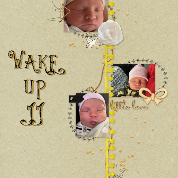
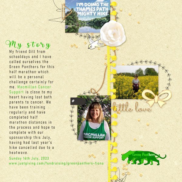
Up to the first template of Lesson6 and have chosen a recent activity to advertise. It's a sponsored charity walk.. I would rather have had a different badge to 'little love' but kept it in situ because it has such good balance on the page. I like what Anja has done with replacing it on her design though. I merged my portrait photo with a scenery shot from one of our walks and have included a little logo that I have designed for our 'Green Panthers' team for the hike. Of course designed using PSP. I adjusted the Brightness of the background. A problem I had was when I resized the image to make the smaller jpg, it wiped out the body text. In the end I 'merged visible' and then resized. It seemed to work.1 point
-
1 point
-
I have just been informed that one of our members, Colin Hooson, passed, last week. He loved our classes and had started a gallery HERE. His health was limiting his work but he always enjoyed it. It is always sad when we lose someone from our community. We are such a tight group. My condolences to his family.0 points






Resized.thumb.jpg.d25811db03a63358cedab1e79f527635.jpg)

