Leaderboard
Popular Content
Showing content with the highest reputation on 04/19/2023 in all areas
-
11 points
-
9 points
-
9 points
-
Day 2: I used the slats horizontally because that fitted my photos better and I made the paper with the little Edelweiss flowers to go with my theme. All the photos are mine except the one with the cars in bad weather, that one came from the internet (no name mentioned). The background paper is made by using an overlay with the blendmode Color. Font is Joaquin Regular, a freebie by Creative Fabrica.8 points
-
8 points
-
8 points
-
7 points
-
6 points
-
Day 2 and also the continuation of the holiday photos The font is Simplefire6 points
-
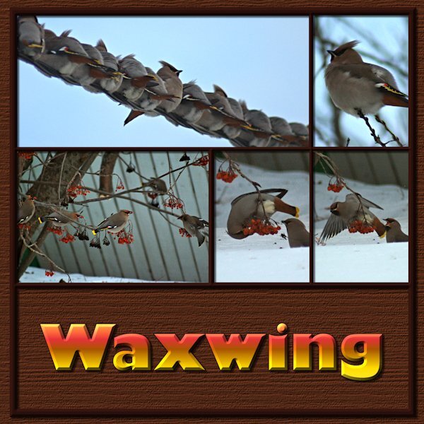
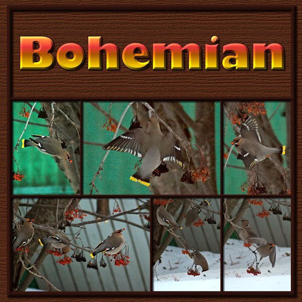
Finally got to Lesson 1. As I am culling photos to make room on the HD I came across these Bohemian Waxwings. They are described as wandering vagabonds by google. Really they are a rowdy bunch of dunkards! They feast on the Mountain Ash tree in our yard and the neighbourhood. These images were very bad; very dark and very soft/grainy. I was about to delete the lot when I thought I'd see what PSP can do. Now I will have the memory preserved even if I delete the bad photos. Font is Gill Sans Ultra Bold, a windows font that is a favorite of mine. I used the magic want to select the mask groups I had made and on the second to bottom layer (I think it's the black layer in the psd file) it the delete key. Ending up with a frame that I moved above all the mask groups and put an inner bevel on it (hard to see because it's a dark frame). Used a wood grain texture (texture effects>texture>wood grain-at about 400 or 600). Bevel on the title as well. Loved this template, it's very versatile. I really enjoyed and was motivated by the layouts from everyone so far. Here's page 16 points
-
Lesson 1 These are photos from a holiday in Malta, the first double page are photos taken in La Valetta.6 points
-
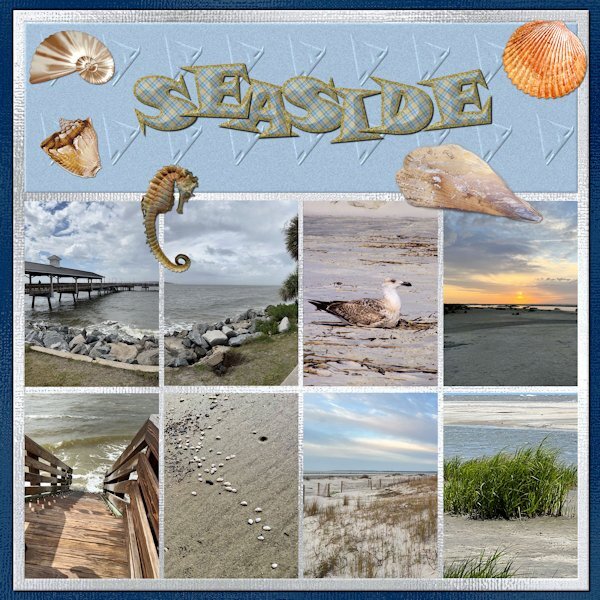
Here is my first double page as I am running behind. They are pictures of that my daughter sent me after her vacation at St. Simons Island. I have her trained to take pictures for my projects. The first page is of the sea and the second is the lighthouse and her climbing and descending the stairs. Two of the shells and the seahorse are downloads from DigitalScrappers. Two are from Filter Forge, and the rest are mine extracted from shells collected by my grandson in Thailand. The font is from my kit with changes to the stroke and fill to a plaid that is also in my kit. The papers are my shimmer papers. I had to edit to change the size of the pages.5 points
-
5 points
-
5 points
-
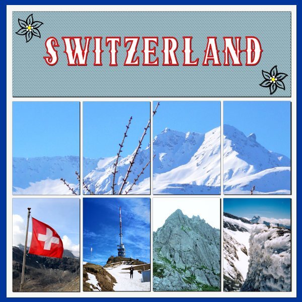
Well I see that I'm not the only one with computer problems. Mine got an update yesterday evening while I had my PSP open, but I was downstairs for a while looking at he Dutch version of the Antiques Road which is a programma I like. When I returned to the pc it was NOT behaving and I had to start my 1st double page a couple of times again before I realized what the problem was. Just close everything and restart and then it was all okay but at that time it was already, or again, after midnight. My theme for this workshop is Switzerland in general. I have been there so many times because my daughter, before moving to the States, has lived there for more then 20 years. I'm just going to show some aspects of Switzerland, think mountains, lakes, flowers etc without giving the names on every photo. I think I'll have to change or adapt the templates because they don't suits my photos. Day 1 features the many mountains of this country.5 points
-
Thank you for showing us pictures of Switzerland. I've been doing my genealogy and I've found out that my great grandmother was born and spent the first 19 years of her life there before moving to the states in 1892.4 points
-
finished my 2nd page and doublepage https://scrapbookcampus.com/invision/uploads/monthly_2023_04/large.KTCL-Souvenir-Templ-doubleP-WS-anja1-500.jpg.c8aee8ed9d0b923fa1bfdcaee924658d.jpg4 points
-
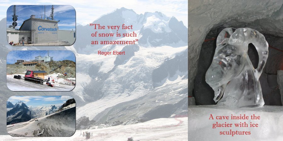
Day 3: I continue with my theme and the photos are from 2004. I'm very sorry to have to tell that the cave inside the glacier with its sculptures is no longer excisting due to the fact that all the glaciers in the Alps are rapidly declining. You can see climate change happening right in front of you. The font is Imprint MT Shadow.2 points
-
2 points
-
2 points
-
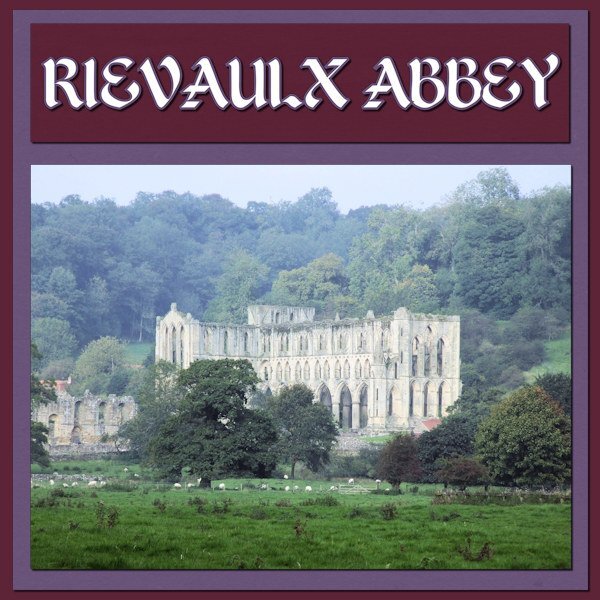
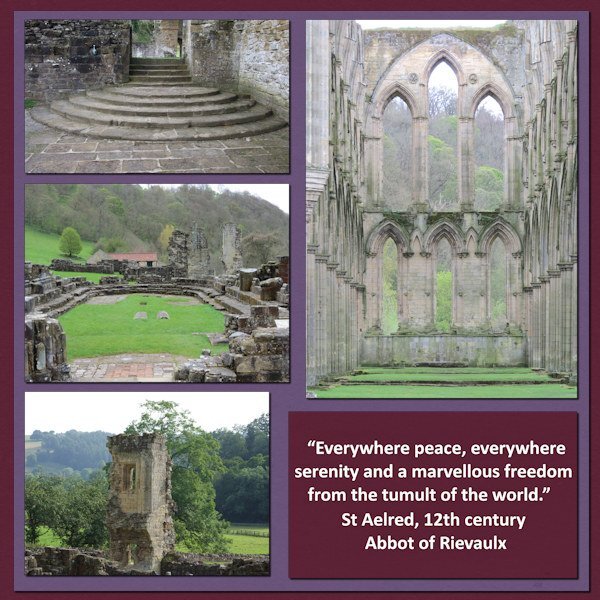
Sharla very nice to see the ruins of the Abbey. A very long time ago I visited there too and it is a magical place. I only have photos on paper in an album, at that point in time we didn't have digital photography at all.2 points
-
2 points
-
2 points
-
2 points
-
I feel your pain. my 2TB SS HD is almost full (on a separate drive with my photo's). Is sure does slow it down. I think we have 32 GB ram. That's my husbands department. I am also in the middle of clean up but I have really bad monitors so i cant really tell if I should delete photo's or not. I have monitors picked out that I want but I dont want to be out of pocket so i will sell off a piece of exercise equipment I think. It's really hard to cull photo's but it's sorely needed. Another SSD will be installed sometime in the future as will more ram. Of course then I need equal amount of space for back up. UGH. Sometimes I watch the green "saving" line and it's so slow and i'm saying, dont stop, dont stop. Never have I cheered for a green line so much in my life. Hubby says: the HD is too full, get rid of stuff. I also followed Ann's recommendations and clear the temp folder after and sometime during a PSP session. New computer stuff is exhausting, I dont want to move up to Win 11. As opposed to new stuff in PSP...that's exciting!2 points
-
2 points
-
2 points
-
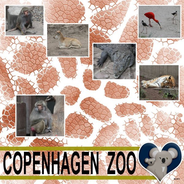
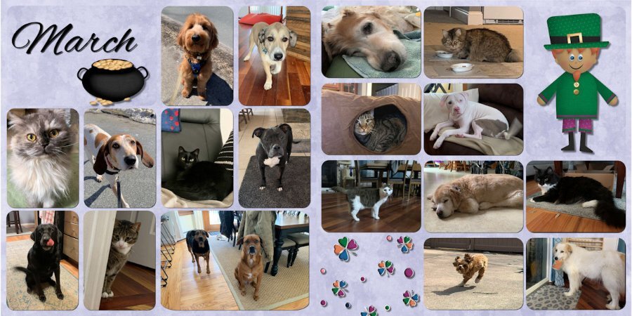
As usual, my project is animals because that's what I have the most pictures of. Part of plan behind this is to create a monthly page (or double page) of the pets I take care of each month and then at the end of the year, put them in a book and gift the book to the pet parents. These are my March pups and kitties.2 points
-
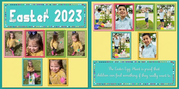
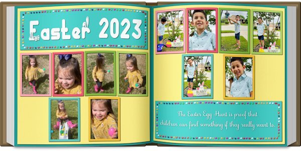
Double-page projects are always challenging. In this case, there were not enough pictures to fill the spaces, and I had trouble finding clip art that I liked. So I resorted to an old theater technique ... spread them out and make it look full. I've done a couple of picture books, and Carole's Open Book script is an excellent tool for previewing the layout. NOTE: The blurb may be hard to read: "The Easter Egg Hunt is proof that children can find something if they really want to."2 points
-
2 points
-
2 points
-
1 point
-
1 point
-
Click on the tiny triangle arrow on the left side of the word Preview on top.1 point
-
I'm posting here because I didn't join the double page workshop. Sorry - after looking at the postings, I'm sorry I didn't. It might have helped the kit i'm working on - the Chattanooga trip my daughter and I took last year. I've been working on it for some time, and after the Build-A-Kit Workshop, I'm finally trying to make it a kit. I had done a few extractions in some of the pictures, since that is what I like to do. But, today I decided on a palette (Yeah, I know, it is a little late in the game!)1 point
-
kasany: Very interesting page. Tell me about the background. Is it a paper or a special treatment?1 point
-
Nice to see the result of the script in this way. This is really nice. Thank you Gerry.1 point
-
yes Carole, I didn't have enough photos that fit to use all the boxes. Leaving out the boxes didn't look good with the whole, I still wanted the boxes to remain, on the other hand I also wanted to show something of the background, and that's how I came up with the idea1 point
-
Thank you Sharla. I chose a photo from the series I made in Malta for the background. and did the following : Effects - Art Media Effects - Pencil the settings adjusted to my liking coincidentally a khaki color was set for color, and I left it that way. Below this layer, a new raster layer, filled with white. On this layer : Effects - Photo Effects - Sepia Toning. Back to the layer with the photo, this layer on Blend Mode : Luminance (Legacy) Opacity : 641 point
-
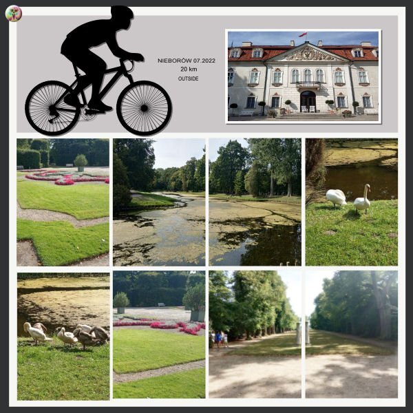
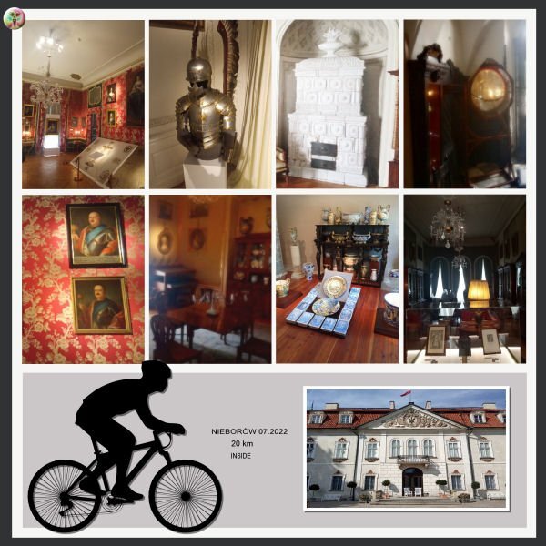
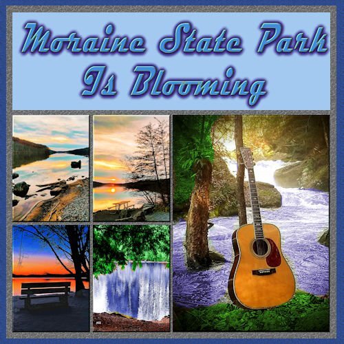
@Hank Sobah That is a very colorful double-page with the Moraine State Park. It is great to envision everything happening in the park. @Nancy McNamara Will we still be able to see some projects from you? I hope so! @Anja Pelzer Using text, and other elements are great ways to fill that space. With two pages, you have more room to showcase more photos and stories. @Gerry Landreth Of course, you can spread the elements to cover more space. You can also enlarge them. Remember that the template was just a starting point. And using the open book is a great idea to display two pages! For the second project, if you used the Frame tool, the proportions should not be affected. I am curious to know how you got such an irregular edge on the frames. I thought it was only working with regular edges/shapes. Very creative! @Lesley Maple I think you will convince me to start pet sitting!!! That is such a fun project and I can see how the pet parents would love that! @Connie Collier That is a great start for your project. You can always add a second page later, when more photos come, or if you want to add a story to the other page. And yes, practice and repetition will be common in this workshop. @kasany I am a bit curious: did you ride that 20 km? And what about those indoor photos? Were they are specific stops along the way or at the end of the ride? @Marie-Claire I see you are using some velum on your page. That is interesting as it lets the viewer see the background image while still making a definition for the text areas. @Corrie Kinkel You can certainly change the format of the templates. They are just starting points! @Sharla Those are beautiful photos!! Well showcased. @Ann SeeberCombining adjacent photo spots for a larger photo is always fun to do as it gives so much more flexibility! For those who have not posted yet, we are curious. Show us your projects, even if they are still a work in progress.1 point
-
Disc is full! Oh, my disc is not full, but I have an old computer (it tells me it cant handle Windows 11) and my 1T SD Cdrive that my son put in for me is 1/2 full+ which slows down my working in PSP. Cleaning up unwanted data is a chore I'm in the middle of. Some pspimage files have a hard time saving and some in opening. Life is interesting - I'm not ready to get a new mega mega PC.1 point
-
Hi all, I started after work with my first page, I choose my photos with old cars we saw on a Classic Days Show 2015. I hope to do the next side tomorrow evening https://scrapbookcampus.com/invision/uploads/monthly_2023_04/large.KTCLTemplate_9photos2-claasic-cars-anja-1a..jpg.4cce92712fb74b91a0562434dc67ff72.jpg1 point
-
1 point
-
I have collected a few clusters over time, but I end up never using them on the few layouts I do. I'm not a scrapbooker so frills and embellishments are not to my taste.I think Sue Thomas's idea of having a layout and then creating the cluster makes good sense. I wanted some spring-y colours in mine to go with the warm weather we're having, which is really unseasonable for this area, as in 'way too hot! The wavy ribbon is from lindsay jane designs and it's a border that I resized and changed the shape of. The flowers and paper strip are from Di Hiller. Only a tiny bit of shadow added since I see that many designers offer their clusters with and without.1 point
-
1 point
-
Sorry to see you work so hard. When I create it, it is already in layers. The idea was only to use the shapes as placeholders, not as exact shapes, which is why I didn't include the layered version. But if that is what participants want, next time, I can share the layered version. It is created using the Cluster Template Maker.1 point
-
The main pic is from CF. The next layer is from PS (DS) by Gina Jones. I picked up one of the colors from the pic for a background and used one of Cassel's edge punches to decorate. To anyone celebrating, have a sweet Passover.1 point
-
1 point
-
1 point
-
1 point


