Leaderboard


Popular Content
Showing content with the highest reputation on 02/16/2023 in all areas
-
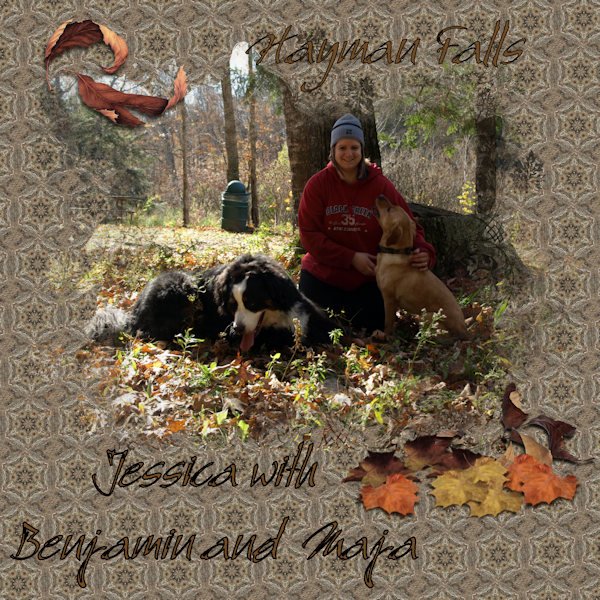
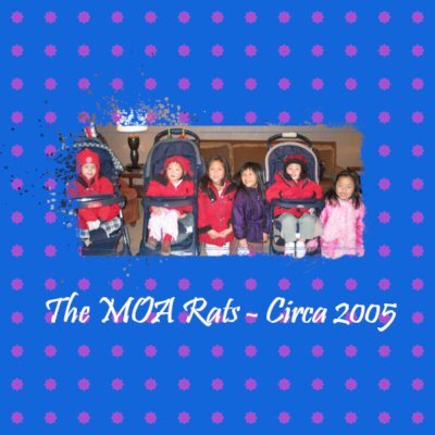
I'm catching up !! Day 3 Mask from "Digital Scrapbook Font : Bambino My Daughter ------Benjamin (BMD)----and my Daughters Dog ----Maja Picture taken 12 Years ago
 9 points
 -
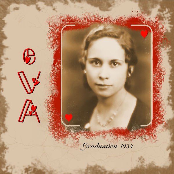
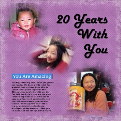
I scanned my mother's hs graduation picture and fixed it up a little. The font is Morning Love. I tried to make a vintage paper using the kaliedoscope to get the plain color, and some cracks with a brush and outlines with a grunge brush.
9 points
-
The nondescript photo of the night sky was taken just after I moved here from Miami, which is plagued by light pollution. Viewing celestial events, such as eclipses or meteor showers, were impossible to see. Even enjoying a starry night was out of the question. There are no streetlights where I live, so I took a moment to enjoy the night sky. I forgot to attribute the quote. It is from that prolific master of words, Unknown. The colors of the kaleidoscope didn't work so I used one as an overlay for texture.
9 points
-
And this is the 2nd extra for Day 2. Carole, I did try using the other patterns at a lower scale, but they lost their beauty and just didn't work as well as the plaid. Yes, I need to check out those other tutorials on the plaids - I remember that we did some different ones in the labs.
8 points
-
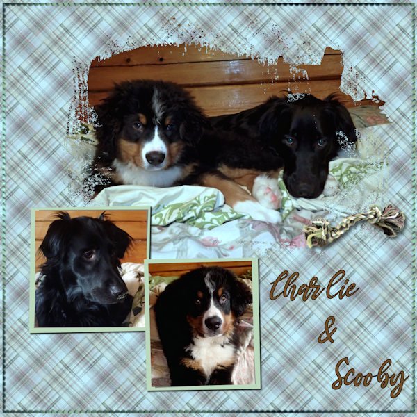
Day 2 My Dogs "Charlie" (BMO) & "Scooby" (LAB) Font used "MAMA"
8 points
-
coming with day 3 to show you not my Sister this time Alpakas. all credits in the gallery8 points
-
I'm loving all these dog pictures from so many folks. I love them all! This is Leo. He was one of my clients but he moved away. Lots of tears that day. ? @CasselYes, on the lesson 2 project, I did use shadows on my smaller photos, but my settings were only 5, 5, 80, and 5. I made the background paper and love the way it turned out. I can't believe how easy this was.
7 points
-
The idea for this page came from a librarian friend who came over for tea today and wanted a small poster for an upcoming reading week display. I couldn't find a good copyrite free picture of the Beast's library so we trolled the internet looking at photos of historic libraries before we settled on the Klementinum library in Prague. Then I had to find a png mask that could be elongated to accomodate the photo. I chose a png mask without a lot of grey edging as the library photo was very detailed and I didn't want to loose much of it. The lottery and money images were from free clipart sites. The font is MV Boli. The background papers is from Freepik. Doing the masking is getting easier but matching orientation & sizing can take time. And I keep forgetting about that pick tool when moving things around.
7 points
-
Excited to start using masks. I love scrapbooking with PSP. This opens a whole new style for me!
7 points
-
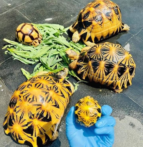
Is it wrong that I want to tweak these Indian Star turtles in Kaleidoscope? ?
7 points
-
I know this is the 3rd day of the Mask workshop, but I'm behind. This is the extra for Day 2. The large photo is by Laurie Solaas, the 2 small photos are by Chris Solaas. The paper and elements are mine. the font is Aryaduta and inner bevelled and shadowed. I chose plaid again for the background. Used the colors from the ocean in the big pic. Using that same rectangle, I did a kaleidiscope pattern and a reflected pattern which I liked, but they were too powerful for the layout. I'll show those also.
6 points
-
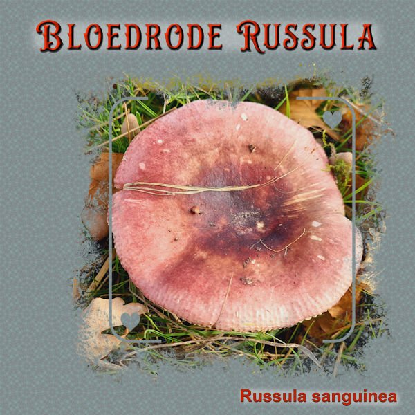
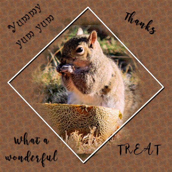
I had already decided that I wanted this photo to use somewhere in this workshop and this is the perfect mask for it. I played too many hours with the kaleidoskop, I forgot how addictive it is as I haven't used it for a while. With all new and exciting things to learn it is easy to forget the older ones. It is a simple layout because when I added some embellishments it didn't work out wel. I think that the photo and the name of the mushroom in bloodred is enough. The name translates in English as Bloodred Russula. To let it stand out I gave it a bevel and the paint behind let it stand out.
6 points
-
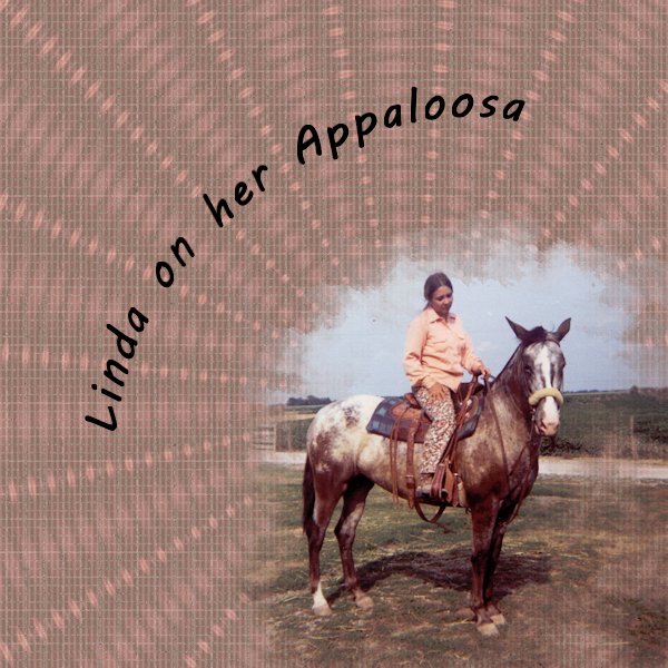
I used a picture of my girlfriend from a long time ago when we both boarded our horse at the same farm. I used the original photo to create a pattern for the background and then used the photo again in kaleidoscope . I put the K. on top of the P one and reduced the opacity a little bit.
5 points
-
This is from Day 3 Kaleidoscope effect I've always used it as a border, but I never considered using it as a background. AWESOME! In the photo, that is Mr. Philly. I recused him last year from a terrible living situation. He is living his best life now ? wondering if my drop shadows look terrible? I have been practicing since the bootcamp lessons. Everyone's photos are beautiful. I love seeing everyone's work. ?
5 points
-
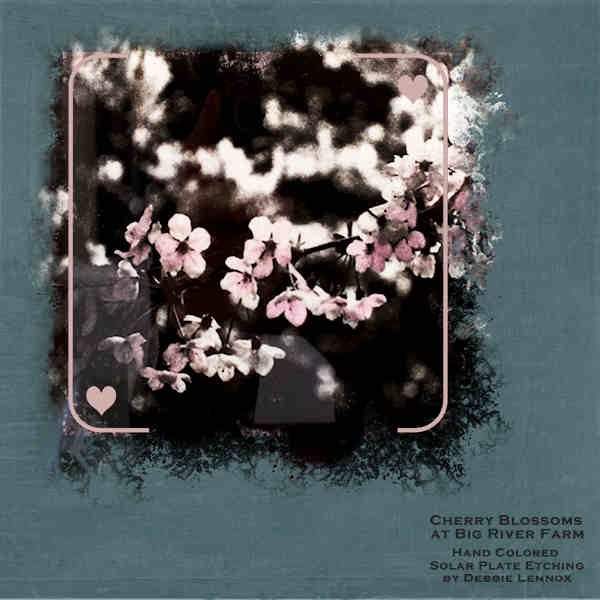
DAY 3 - CHERRY BLOSSOM ART by my daughter, Debbie Lennox. She said it's a "hand colored solar plate etching of the cherry blossoms" at her Big River Farm. Kaleidoscope pattern with an Exclusion layer effect background over paper from "lou lou love stopover" kit. I put an extra mat behind the mask group in order to color the framing and hearts. The font is Copperplate Gothic Bold. (This font strongly resembles Debbie's handwriting because she had to learn proper labeling when she trained as an architect -- she still prefers doing it by hand.)
5 points
-
Here is day 3. I had not made a background like this in a while. I used a freebee from Cassel for the mask etc. (cass-SimpleArtsy-Template01)
5 points
-
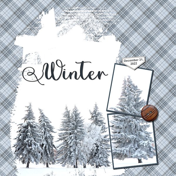
Day 2 Winter theme. Monochromatic with a little button (Janet Scott, Brown Button 2, Digital Scrapbook) to warm it up a bit. I'd forgotten how fun making plaids can be. I changed big mask for quite some time to fit what I wanted. And I had to (on the mask layer) take a brush and blot out (using black) some of the mask that extended beyond the photo edges. I duplicated the image of the bottom square and put it in the upper mask to fit the top of the tree in. Font is Adinda Sayang (Creative Fabrica). Slowly, I'm getting through. Time seems to be elusive right now, and there is no reason for it (except maybe my bad management of it).
5 points
-
I also finally finished day 2 also. The larger dog is my Foxy, the small one is my Sisters dog Zoey, and the person is me (Almost 10 years ago)
5 points
-
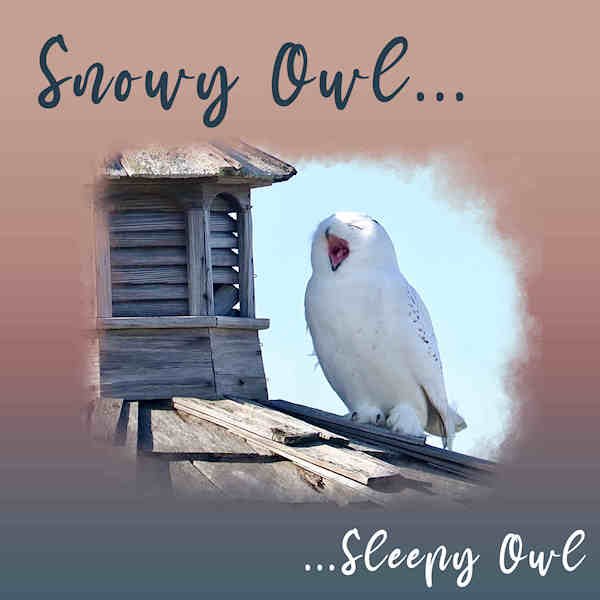
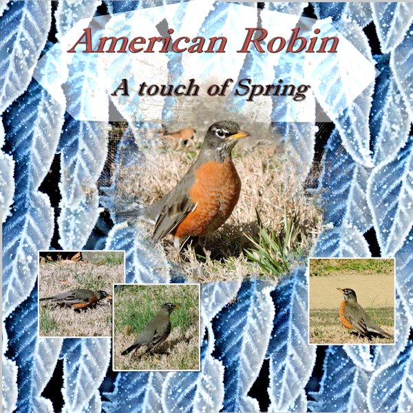
DAY 4 - SNOWY OWL - I used a gradient called Sunset for the background. The font is Mama. I was seeing a strange horizontal blinds texture on the background that I didn't apply. We'll see if it shows up here. -- Yep, I still see it. ??
4 points
-
Creating my own masks. I'm really pleased with the layout and now knowing how to make my own masks. Thanks!
4 points
-
I tried the Kaleidoscope method. The selection I made had red, royal purple, and navy blue. I kept winding up with this bright pink and blue combination. Even if I changed the selection area and started over from scratch. Any clues why this happened? I'm using the 2020 Ultimate version. Thanks!
4 points
-
Day 1 extra I made the background myself with a photo and effects - artistic effects - contours + blend layers The frame(label) with the text, with cass-FancyFrames script.4 points
-
I have to say that using masks is getting ingrained in my brain since I'm doing so many at once. I actually started working through the Mask Workshop in the past workshops in the Diamond area over the weekend. That helped to refresh my memory on doing them. I had not completed last year because of the computer issues so those layouts I did I labeled as 2022. Then started 2023 layouts on Monday. That has really helped me get the steps down. Here is the 2023 extra mask for Day 3. I again blended a texture using burn at 100 (ps_elif-sahin_196131_gold-textures-texture-07-template_pu) with a flood filled layer (color 123-150-67) for the background. This is my 5 year old Havanese, Peyton, enjoying some sunshine on the patio.4 points
-
Like some of the others, I still manage to have trouble doing these masks. Here is day one.
4 points
-
Masks Workshop Day 2 Diamond Extra. This is baby Squirrely White Tail. Her's (or His) dad used to frequent our feeder. Sadly he had a run in with a transformer and did not make it. I'm glad to see he has passed down his white markings. I know, I know, never point the subject out of the frame....but, in my defence, there are TWO ends to this little creature and one of them is surely pointed inward right at you. ? It's all about the base, 'bout the base, no treble (with apologies to the singer of that song). Fonts used: A: Quentara. Tale: Amnestia Normal. Of A: Allicia. Tail: Audiciti. All from Creative Fabrica. Photos: min. I used the plaid at 45 degrees and as large as you can make it (250 I think), with a black layer below and a reduced opacity on the plaid layer. I changed the sizes of the small masks (before they were masks). I remembered learning that if it's in a group I can resize all the group at once so before I made a mask I made a group of the black square and the frame, resized it, ungrouped it and made the mask of the black square. I also bring my photo into the layout and lower the opacity a lot to see the size against the raster layer (before it's a mask) to get the sizing. Once i'm happy with the size of the photo and soon-to-be mask I can then go ahead and make the mask and drag the photo in. It might be a long way but I found before I'd bring in the image and I always wished it was either a bit bigger or small or wider or taller. This takes all that away and I can make the best decision before I make the mask. Love all the layouts, you are all so creative. I'm learning a lot from you.
3 points
-
Day 2 The tag is a freebie of Cassel : Acrylic hobbies tags3 points
-
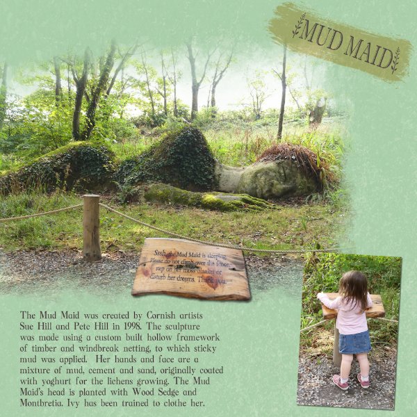
Day 4. I applied 2 overlays to the background paper. Extracted the notice from a photo, perspective, placed it just a tad under the rope. I wanted to make a visual reference, As a reference to the rope is in the notice. It's the same notice which my granddaughter is reading out to me. She had memorized the words, as she had been there many times before. Which reads, in case it's not very legible, after being resized down. Ssssh, the Mud Maid is sleeping, Please do not climb over the fence, step on her moss blanket, or disturb her dreams. Thank you. Ann, I afraid I don't have an answer for the gradient. I haven't experienced that before. With regard to your text, I notice that your joined up writing isn't joined up. Was the kerning set to 0, if it was try a minus number to join the letters. A lovely Male Snowy, I see far more females, than males. Maybe because they are harder to spot, being almost all snow white.
3 points
-
Again blended a flood filled layer with a texture (ps_elif-sahin_79380_dear-old-dad-paper-texture-02_pu). This time using Color at 100. Font is PT Orchid Bold. The mask was done on the lightpost photo. The brick photo was added to a layer below and the mask altered to show it as well.3 points
-
Not too difficult, but not everything has to be. I started with a black png file that I recolored it with red, black, and light grey. Polka dots on the background to make it interesting. I wanted a display font that wasn't fancy so I used Nesdate October Ten, free from DaFont. I added a black rectangular selection behind it as the dots were too distracting.3 points
-
For the Valentine's Day theme, I used AnnieCDigitals Valentine template. The background is a paper from a valentine mini kit by MarisaL of Pixel Scrapper. I used the RemingtonWeather font to try and stay consistent with the wonderful word art Marisa made. And I topped it off one of Carole's lovely bows. (The couple are characters from the game.)3 points
-
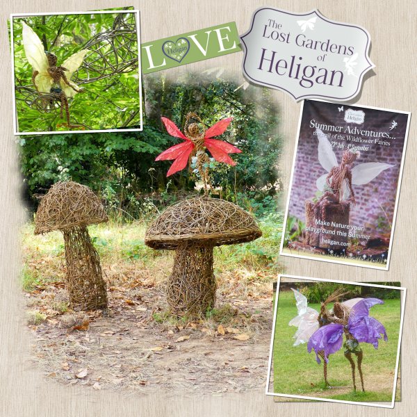
I knew what I was going to do for today's page last night. I had already chosen the photos. I started last night by trying to replicate the label on the poster photo. Using a font bracket, and got as close as I could to replicating the font used. Used a slightly different font, and font dingbats for the Love label. We were frequent visitors to Heligan, which is in Cornwall. The estate owned by the same family for 400 yrs. In the 1970's the house was converted to flats, The gardens were neglected, then in 1990 this sleeping beauty was discovered and re-awakened. Becoming Europe's largest garden restoration. A truly magical place for the young and old.
3 points
-
Another mushroom for day 4. I placed my photo to the left because the mushrooms came out of a tree at its base. When taking that shot I had to be carefull because that tree was on the very edge of a busy road, so I had almost no option but take it this way. It is a funny sight to see these mushrooms coming out of a hole in a still living tree. In the end they will destroy the tree. The background is mad with 3 layers, one a light green blended with a layer with some texture and on top of that an overlay with light leakes set to blendmode soft light. There were a lot of dry leaves around that tree so I put a borders with leaves made with a brush to the rightside, just as an embellishment. Font is Balerina with a bevel.
2 points
-
Along with the extra goodies.2 points
-
There was an item on Dutch television about these gardens not so long ago on a programme about gardening that I like to watch!2 points
-
I had forgotten how we had made that plaid for this mask. I kept trying to remember how we had done it with the rotating mirror. So, duh, I listened to the tutorial. Oh, Yeah!!!! So now I will try to remember how to make this plaid. Again I chose Memphis for the theme. The main pic is one I took from a painting on the wall of one of my favorite fast food places here. The other pics: the Big M bridge lit up was taken by my daughter, Anna. I took the St. Jude pic. The brad I used is one I developed to represent the pyramid in Memphis. The font used is Ambrogio.
2 points
-
Ugh! I already see that I need to fix the shadow on TAIL. And when I fixed the kerning on TALE I didnt get it lined up with TAIL. I feel like I'm chasing my tail!
1 point
-
I'm a bit behind, busy week, unexpected events, (one nice one, extra day babysitting granddaughter tomorrow), will catch up! ?1 point
-
Found them too. Thanks, Corrie!?1 point
-
Wow, Anne - love the picture = but really like that background - how many layers cause it looks like you have an overlay over the kaleidiscope1 point
-
Where are you posting these written instructions? Thanks for this.1 point
-
@CasselI used the text tool with selection on the photo in the layout, copied and paste as a new layer, and resized.1 point
-
So many wonderful projects posted! @Ann SeeberYes, Cupidon is the French name for Cupid ? The striped title is a really nice touch and matches the topic! @Tonimarie, as Susan mentioned, the "fainter" color means that the mask was grey. @Hank Sobahadding more than one element inside a mask group is not typical, but as you show, it gives interesting results. You must have reduced the opacity of the top layer, right? @Julie MagerkaIsn't it amazing how a little detail is sometimes just enough to give a finishing touch? @Sue ThomasI love to look at your projects and always discover little details here and there, like the lifted shadows and the delicate shading. @Rene MarkerI like both backgrounds, but the red one is definitely "richer" and contrasts with the photo, making it stand out. Those patterned papers can yield such different results! Glad that the process is getting more automatic for using Masks. It looks like you are having great fun with those papers! @Anne LampIt looks like you managed to do that mask. In order to see those faint edges more, I would suggest you either reduce the scale of the pattern (if it is a pattern) or apply a solid color with reduced opacity to still show the pattern behind (referring to the first layout). On the second one, it seems more proportionate. By the third project, I think you are getting the hang of it. @Mary SolaasIf you want an additional challenge, check the list of tutorials in the membership; there are 4 different tutorials for different types of plaids! When patterns seem overpowering, one way to tame them is to reduce the scale. Did you try that? @Marie-ClaireThat was such a great choice to apply an effect to the paper. By exploring those commands, we can discover some really neat tricks (wait until Day 6 to see what "accident" I discovered!) @Susan EwartGlad to see that you are comfortable enough to start manipulating those masks layers. This will open a lot of possibilities for you. @Corrie KinkelI am not responsible for addictions to plaids, kaleidoscope, and the upcoming tutorials! ? @Anja Pelzerdid you use a photo for the fill of the title? It looks great. @SuzyI wonder if those turtoises didn't play with your PSP while you were not looking?? @Linda LarsenWelcome to the Campus and this workshop. Your first project is very well done. Yes, learning about masks will be a great addition to your "toolbox" with PSP. @Gerry LandrethLovely photo. What is the font you used? I love those monoline fonts! @Donna SilliaDid you use the mask as a mask or did you "paint" it? That is quite a photo to cherish! @sharon thompsonWith practice, you will see how you can tweak or even create your own masks when you don't have the perfect one on hand. @GabrielaSuch a nice matching background (or course!). You did a great job. @Lesley MapleSo many techniques are very easy (and addictive too). Be careful!! ? @Carol Anne WallIs there any pink at all in the selection you started with? The command will only use the colors included. Could you show what section you used that seem to always give you that pink? @Linda J WalkerIf you want, you can combine all the strips together to make a single layer mask, but you can also just use them to colorize them and show as a "mat" under the photo. As requested, some written instructions are now available as a bonus to our DIAMOND members. I uploaded them for days 1, 2, and 4 (tomorrow). I'll try to finish the others in the next day or two.1 point
-
Corrie, I love fungi, lichen and mosses. Here, we don't get the variety, and quantity, like a home. I have loads of pics of fungi, which I take every time I go home. If the opportunity ever arises to visit Heligan, take it! Their Delhia garden is phenomenal. You'd love it. During my time home we made 3 trips there. Spending the whole day each time. Taking packed lunches for picnics.1 point
-
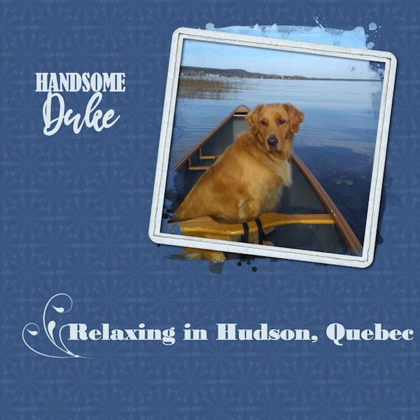
Day 3 - Used a photo of my friend's dog. They have a second home in Hudson, and their pooch loves being in/on the water. Made a kaleidoscope design but didn't take too much time or trouble with it. Added the brush flourish because I thought it looked a little bare.
1 point
-
I just had to resurrect one of my favorite mask layouts from years past.
1 point
-
Do you have fun stories about Valentine's Day? Share with us and let's chitchat!1 point
-
Wow, look at all those new projects!!!! I am so glad!! @Susan EwartNo problem in starting late. As a DIAMOND member, you will keep access permanently anyways! ? @Ann SeeberBe careful not to distort the elements! Your Cupidons seem a little stretched. Maybe you used a square frame and applied it to a rectangular image? On your Day 2, did you add shadows on the small images? That owl really looks tired! @kasanyIs there a privacy reason to hide this lady's face? @Corrie KinkelI love your little signature on the card! Yes, using scripts can be a time saver. It is still a good review to do it manually, once in a blue moon. @TonimarieYou will see that it will get easier with each project. Lovely card! @Anja PelzerWonderful layout about your sister. @Carol Anne WallYes, it is something that everyone should know about, but often, they don't know what they don't know. Beware: it can become addictive! ? I think that the plaid is ok. Maybe you can just reduce the scale if you want it less "powerful". @Sue ThomasAs usual, your photos are so crisp!!! @Leslie Jostes Looking forward to your projects. @MoniqueN.I will work on transcription of the videos. @Marie-ClaireI can always know whose layout it is when you show your four-legged model! @Julie MagerkaDid you have shadows on the small images? Sometimes they "disappear" when you resize. @Gerry LandrethYes, as they age, they seem to want to party with others than their family. @sharon thompsonRenaming the layers might be useful, but typically, if you have the thumbnails it is not as essential. What version of PSP do you use? @Rene MarkerThat texture is great on the page. Fun to see those tutorials "in action"! @Donna SilliaThat plaid is perfectly matching your photo, obviously :). Be a little careful with the shadows on the title: it makes it look like it is floating. @Lesley MapleThat plaid fits perfectly. It can get addictive too! Did you add shadows to the little photos? @Gabriela No problem in "starting late. You will catch up for sure! Keep up the great work. If you have not posted yet, we are waiting for you. If you have any issue, just ask.1 point
-
Day 1 - Diamond Extra. This one is for Ann Seeber. You wanted a photo of me...here is me and my whole family (sibs and parents). ? My parents (Bob and Audrey - represented here by Western Salsify), are lovingly embraced while looking down towards us 4 kids. What? you say, how can that be, surely we kids, with those stunning hair-do's cant be from Western Salsify. You are quite right; we siblings are represented by Clematis Terniflora, which is another way to say, we are all Adopted! In the bigger of the small masks is my oldest brother and my older sister and in the lower smaller mask is my other older brother and lastly me (with the crazy hair). Incidently my older sister and the oldest brother are actually full blood brother and sister, but 2 years apart. Ann, I will try and get a picture up soon, even if it's not a great one, I'm on a mission for you. The important stuff: Font is NS Blackbooks Victorian (Creative Fabrica, I think), and back ground is Brook Gazarek - Crisp Fall Air (Digital Scrapbook) that I darkened and desaturated. Photo's are mine, photographed separately and composited using a blend mode (lighten).
1 point
-
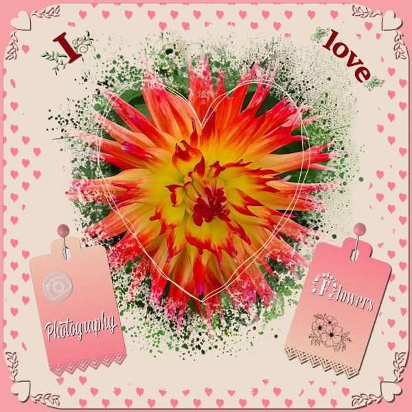
I didn't want to make a Valentine page but the colors lend themselves to a love theme so much! Valentine was and still is not a big thing overhere; it mostly, at least with the elderly people, is looked at as very commercial. Just before Valentiine the flowers are much more expensive and they go down in price after that! It is getting bigger this days with cards and offers of chocolate etc. So I decided to make something with the things I love: flowers and photograpgy which must come as no surprise as you know me by now. I used the Heart Mask that came with this theme and 2 papers from Escale Amoureuze and recolored them to go with the palette. The photo of the Dahlia had much of the colors of the palette in it. Heartpunches from from Caole and the freebie tag from this week; I used the black one and colored it with a gradient made with the palette colors.
1 point