

Gerry Landreth
-
Posts
368 -
Joined
-
Last visited
-
Days Won
2
Content Type
Profiles
Gallery
Forums
Posts posted by Gerry Landreth
-
-
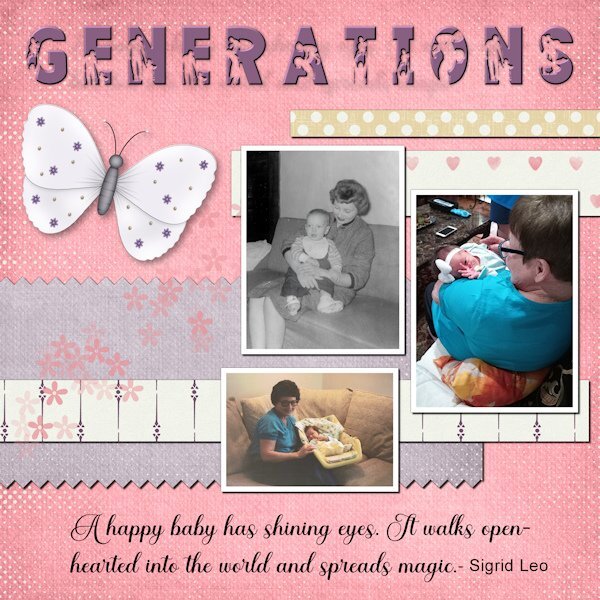
These are pictures of my mom with babies from three generations. She loves babies, and they all have returned the love as they got older.
Now she is with me in home hospice. She can still muster a smile when I mention the name of the great-grandkids.
The title font is FAMILY from Creative Fabrica. I added an inner bevel to help better define the silhouette. The script is Ernestone, also from Creative Fabrica. The papers and elements are from a kit, Inner Beauty, by Annie C. Digitals.
P.S. The black and white picture is me. I wear my hair differently these days.

-
 1
1
-
 5
5
-
-
3 hours ago, Ann Seeber said:
Don't feel bad, Susan. I can't find it either.... ?
It looks like it is posted in the gallery.
-
2 hours ago, Ann Seeber said:
Mooi paars is niet Lelijk - Google says: Beautiful purple is not ugly ?
I think God gets mad if you walk by the color purple in a field somewhere and don't notice it. - Alice Walker (paraphrased)
I can't walk or scroll by the color purple without stopping to admire it.
-
1
-
1
-
-
This was inspired by an article in The Washington Post about the healing benefits of the songs of birds. The article featured sound clips of the birds in the layout - meadowlark, bobolink, and woodpecker.
The glitters were created using Carole's script Glitters-C. The papers and elements are from a kit, Celebrations, by Whispey D'Zines. The fonts are Spring and Ernestone, both from Creative Fabrica.
I forgot to note that in the previous project, I used Carole's Smoothener script to eliminate the jagged pixels appearing in a selection's expansion. It did an amazing job.
-
3
-
5
-
-
17 hours ago, Cassel said:
@cindy harris Great tribute to your mother. I see you might have enlarged the pink heart, which makes them blurred.
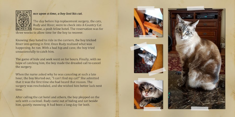
@Gerry Landreth That is a cute story about Lynda and Rudy. I would have assumed that Lynda would have perceived the vibrations of your arrival, but I guess Rudy could have helped!
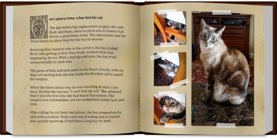
Carole - Lynda slept on a 4" memory foam bed under the window that was large enough to also accommodate Rudy and River. I think Rudy had to crawl over her to get to a spot where he could look out.
-
1
-
-
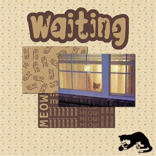
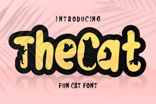
The papers are from Marisa Lerin. The font is The Cat from Creative Fabrica, and the silhouette is from Jessica Dunn at Digital Scrapbook.
The little guy in the window is Rudy. He watches when I leave and pops his head up when he hears me pull into the driveway.
A side story ... In Lynda's younger days, she would get very excited when I came home. Even though she was deaf in her last few years, she would still poke her head up in the window and meet me at the door. I had no idea how she did it.
I finally realized Rudy would wake her to tell her I was home. He was a devoted companion and protector.

-
1
-
10
-
-
17 hours ago, Cassel said:
@Sharla Simple paper is totally fine. That theme will be an interesting one.
@Susan Ewart I'll see if I can move the image for you in the gallery (I have never done it yet)
@Gerry Landreth I didn't know Linda meant beautiful in Spanish. I didn't even know it was Spanish! Beautiful tribute. That cookie looks yummy!
@Randy Using a shadow as a frame is interesting. For best visibility, you should then use it at 100% opacity. I'll check the Frame tool on my 2022. I didn't think you would use it in this project.
@Anne Lamp I would go a little less on the shadows, especially on the title. As a rule of thumb, if you have a font with fine lines, a shadow needs to have less offset, so there won't be a visible "gap" between those fine lines and the shadow (which would make it look like it is hovering over the paper). That photo is stunning. Will we have more cam photos?
OK, tomorrow, you will get the second project to do. If you have not finished the first one, don't worry. You can still catch up!
Carole - the meaning can range from cute to lovely to beautiful. It depends on the country and the delivery. When someone breathlessly says "que linda!" it is definitely "beautiful."
-
1
-
1
-
-
I added a cookie as a reward/incentive. Although you can't tell by looking, it's sugar-free, as is the latte.
-
3
-
 1
1
-
6
-
-
There have been unexpected challenges this week, and I haven't had time to make a sandwich - figuratively and literally. I hope to find a few minutes this afternoon to prepare both.
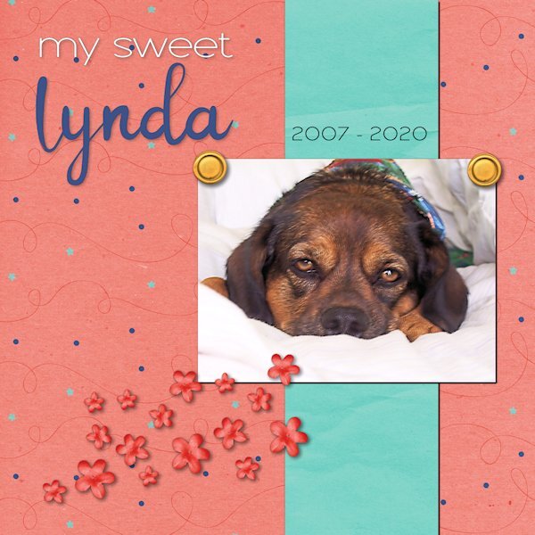
"Linda" means beautiful in Spanish. When she was handed to me, I changed the spelling to a non-traditional one because that's how we do things in our house. She had a beautiful spirit that was always calming. The anniversary of her passing is this weekend.
The kit used for the layout is called "Celebration" by whispy's D'zines from GoDigitalScrapbooking.com.
-
13
-
-
Day 6. Every time I had a follow-up visit with the surgeon, someone would always ask about Rudy. How's Rudy? Or where's Rudy? Followed snickers.
I added an overlay over the grunge to give it an aged paper look.
-
14
-
-
15 hours ago, Lesley Maple said:
Finally done with Lesson 2. I needed to ruminate on the idea and then get the pictures on my dog walks.
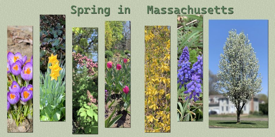
I lived in the historic district of Salem for many years. Spring was spectacular on the North Shore.
-
1
-
-
I'm going to leave this one unfinished for now. There were lots of visitors to see my mom today, which diverted my attention. It also sparked the idea for the theme.
-
2
-
12
-
-
31 minutes ago, Susan Ewart said:
This is a beautiful layout Gerry! Beautiful photography.
I wish I could take credit. I forgot to mention that they are from Unsplash. Most of them are from the same photographer.
-
1
-
-
I used another one of the templates from Yin Designs. The Clip-to-It script is an indispensable tool when working on a layout like this.
My parents were armchair birdwatchers. The feeder was strategically placed where it could be seen through the sliding glass door, and the tattered reference books were nearby in case an interloper flew in for a snack.
When I moved back to Alabama, I carried on the tradition. Several feeders were strategically placed where we could enjoy the birds when the dining table. Mother even dragged out the 20-year-old reference books when needed.
-
2
-
8
-
-
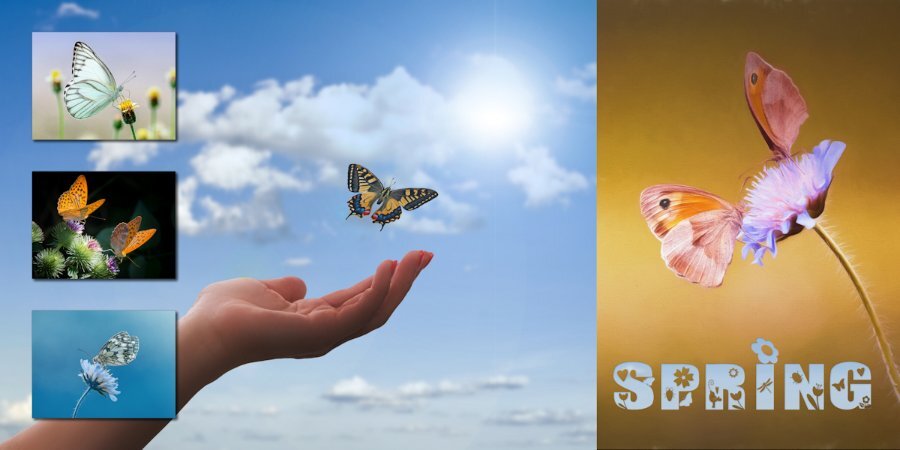
All of the pictures are from Pixabay. The font, aptly named Spring, is from Creative Fabrica
-
2
-
 3
3
-
8
-
-
58 minutes ago, Cassel said:
@Hank Sobah That is a very colorful double-page with the Moraine State Park. It is great to envision everything happening in the park.
@Nancy McNamara Will we still be able to see some projects from you? I hope so!
@Anja Pelzer Using text, and other elements are great ways to fill that space. With two pages, you have more room to showcase more photos and stories.
@Gerry Landreth Of course, you can spread the elements to cover more space. You can also enlarge them. Remember that the template was just a starting point. And using the open book is a great idea to display two pages! For the second project, if you used the Frame tool, the proportions should not be affected. I am curious to know how you got such an irregular edge on the frames. I thought it was only working with regular edges/shapes. Very creative!
@Lesley Maple I think you will convince me to start pet sitting!!! That is such a fun project and I can see how the pet parents would love that!
@Connie Collier That is a great start for your project. You can always add a second page later, when more photos come, or if you want to add a story to the other page. And yes, practice and repetition will be common in this workshop.
@kasany I am a bit curious: did you ride that 20 km? And what about those indoor photos? Were they are specific stops along the way or at the end of the ride?
@Marie-Claire I see you are using some velum on your page. That is interesting as it lets the viewer see the background image while still making a definition for the text areas.
@Corrie Kinkel You can certainly change the format of the templates. They are just starting points!
@Sharla Those are beautiful photos!! Well showcased.
@Ann SeeberCombining adjacent photo spots for a larger photo is always fun to do as it gives so much more flexibility!
For those who have not posted yet, we are curious. Show us your projects, even if they are still a work in progress.
Carole - The black frame for Day 2 was created using IMAGE/PICTURE FRAME. The one I used is square, which is why the sides look a bit thick, and the top/bottom look stretched.
On the layout, I used a brush set called Paint Strokes by Resource Boy (don't remember where I got it.) I used them as masks.
-
1
-
-
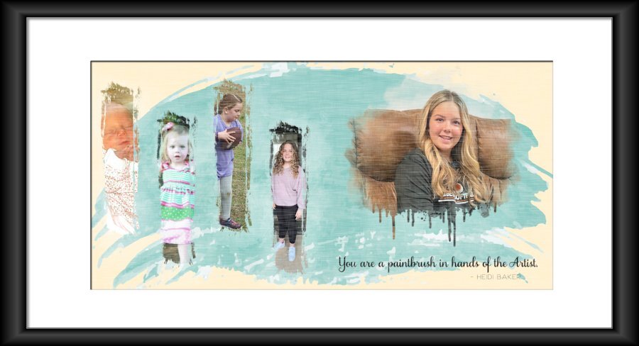
My oldest great-niece, Maggie (named after my mother). She will be 15 in June.
I used the picture frame function in PSP 2022. It seems the proportions may be off a bit, but I'll have to let it go for now. My time has run out for today.
-
5
-
1
-
7
-
-
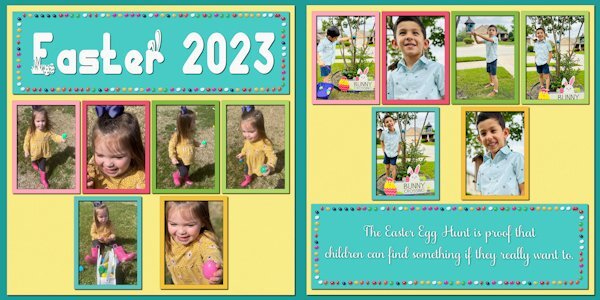
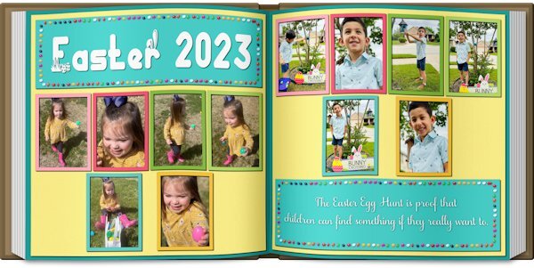
Double-page projects are always challenging. In this case, there were not enough pictures to fill the spaces, and I had trouble finding clip art that I liked. So I resorted to an old theater technique ... spread them out and make it look full.
I've done a couple of picture books, and Carole's Open Book script is an excellent tool for previewing the layout.
NOTE: The blurb may be hard to read: "The Easter Egg Hunt is proof that children can find something if they really want to."
-
4
-
7
-
-
Day 7. I found several fun graphics on Pixabay but kept running into shadow problems. I couldn't use the eggs because the shadow angle was wrong for the layout.
The font is Thanks Bunny. It has lots of fun glyphs.
-
7
-
7
-
-
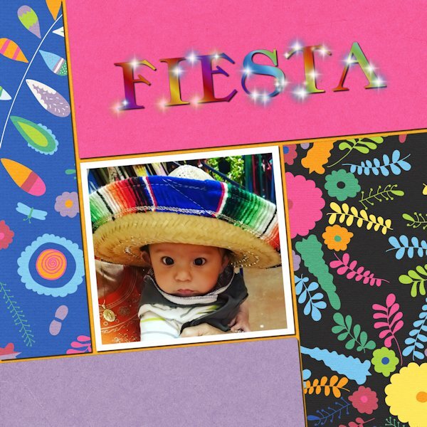
Day 6. I accidentally found that adjusting the settings could give some cool variations. The tube is "flare."
The picture is my youngest great-nephew, four years ago. He lives in Texas, and this was his first trip to Mexico with his abuela.
-
6
-
6
-
-
3 hours ago, Cassel said:
It looks like a buggy patch. Check your version number under Help > About. If your version is 25.1.0.28, you have the buggy patch. The only way to solve that is to uninstall and reinstall PSP and the version number will become 25.1.0.32. This was a documented bug when patch 1 was automatically applied.
I'll try that. Thanks, and ugh! Chasing down bugs used to be fun 20 years ago.
-
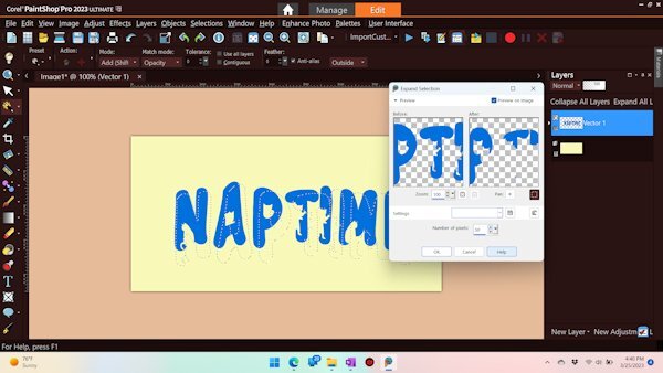
I want to mimic the example. I used Expand Selection, but the selection is offset. What am I doing wrong?
UPDATE: Before I hit SUBMIT, I realized the first question would be about what version I was using, which reminded me to test it in another version. It works in PSP 2022 but does not work in PSP 2023. More often, I have to revert back to PSP 2022.
-
1
-
2
-
-
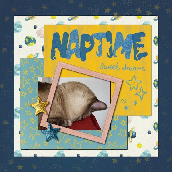
Day 5. Rudy, my Siamese mix, who is blind in one eye. He has odd sleeping habits.
The font is The Cat. The kit, Sweet Dreams by Melo Vrijhof, is from Digital Scrapbook
-
3
-
11
-
-
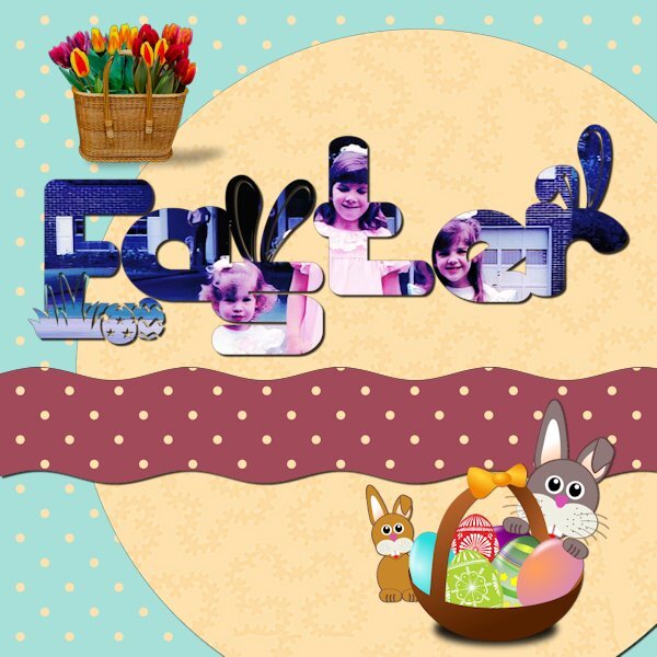
Day 4. Gardening projects of bygone days.
-
2
-
13
-


Scrapbook Bootcamp - May 2023
in Showroom
Posted
Carole - I didn't make the connection with the Scraplift Challenge. It's amazing to see the continuity between generations.
Mother finally adjusted to the cats, and they rewarded her acquiescence with abounding love.
The fonts for this project are Cute Cat and Stay at Home, both from Creative Fabrica.