

Gerry Landreth
-
Posts
368 -
Joined
-
Last visited
-
Days Won
2
Content Type
Profiles
Gallery
Forums
Posts posted by Gerry Landreth
-
-
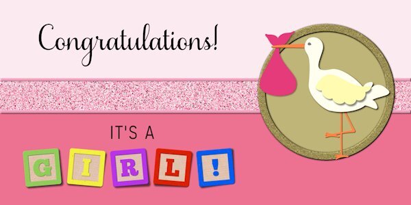
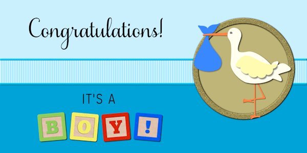
The script is Samantha Upright. The blocks were created using the Baby Alpha Block script by Cassel. The ribbon was also created with a script by Cassel, Glitters-C.
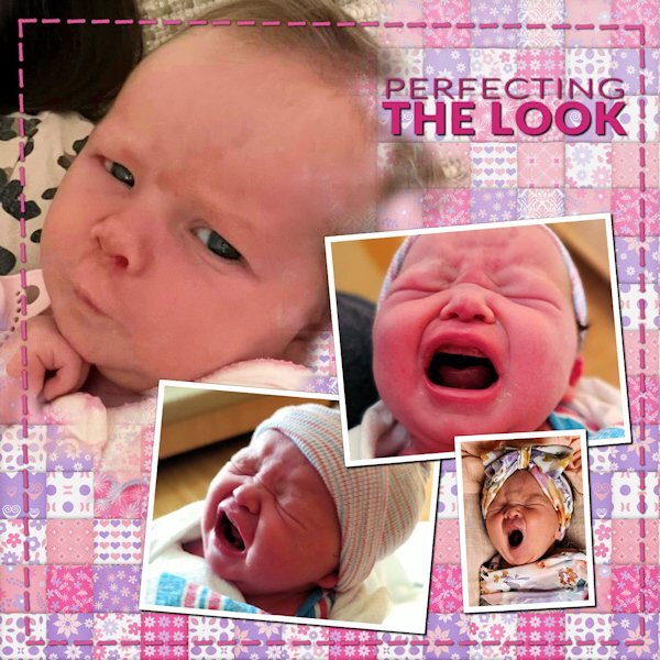
I've added one for a boy. That way, I'm covered. With two great-nieces and one great-nephew added to the brood, I can't leave anyone out.


-
 14
14
-
-
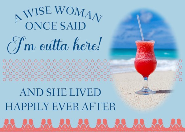
The inside of this card would read, "Happy Retirement!" The text treatment recreates a card I have waiting to be sent to a friend who retires at the end of May.
The picture is a stock picture I've had for years. The sandals across the bottom and the suns in the ribbon are from Cassel's Summer Punches.
-
 3
3
-
 2
2
-
13
-
-
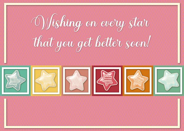
The stars are from a kit by Sheila Reed on Digital Scrapbook.
The font is Ernestone Script from Creative Fabicra. It's a nice calligraphy font with lots of glyphs and swashes.
-
2
-
17
-
-
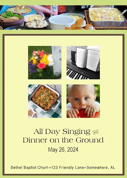
Memorial Day (United States) was formerly called Decoration Day. Families would gather dressed in their Sunday best to decorate the graves of their loved ones.
On the Sunday before Decoration Day, churches would host an "All Day Singing" and a huge picnic. Gospel singers would perform in the sanctuary and congregational singing in between. It was a tradition in the South and is still celebrated in rural areas, particularly in Appalachia.
The inside of the card would have instructions about where to leave your casserole on your way to the worship service. A few volunteers would get everything ready. It would also include some of the groups that would be joining the festivities.
-
5
-
14
-
-
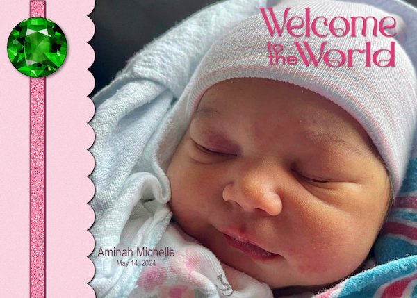
Aminah is the third addition to our family this year, preceded by her cousins Felix and Ansley.
The font is Romland from Creative Fabrica. The ribbon was created using Cassel's Glitters-C script and is adorned with an emerald, the birthstone for May, from cleanPNG.com.
-
5
-
12
-
-
My alarm clock is set! Looking forward to it.
-
1
-
-
5 hours ago, Ann Seeber said:
Sounds like something I could use in PSP because I use the precise cursor which I find hard to see, sometimes.
It's part of a set of tools called Powertoys, a free add-on to Windows. The mouse highlighter is great for finding the cursor, particularly on a busy screen. Just shake the mouse, and a big highlighter shows up, which shrinks down to highlight the cursor.
-
1
-
-
I agree with Corrie. The highlighted pointer is a great help.
I am using something similar to Windows Powertoys called Powertoys Awake. When I shake my mouse, a highlighter appears so I can find it.
-
1
-
-
11 hours ago, Cassel said:
@Bonnie Ballentine The Linoleum pattern is very addictive. It always gives something slightly different so it piques your curiosity! Your style is very simple and always focused on the photo as the star.
@sharon thompson If you use a monochrome noise, the effect will be more subtle. If you want something bolder, use a multicolored noise. That is one way to control that. You mentioned that you converted the abr brushes using a freeware. What version of PSP are you using? You can import them directly in PSP starting with version X5. Check this video. The ability to open a font and have it available in PSP is not something that came with PSP, but it was a Windows feature. That was lost with Windows 8 (I think). I used to LOVE that feature. Since then, I have always used TheFontThing, which still works on my Windows 10.
@Susan EwartI tend to find the point-to-point selection a bit frustrating as I find that it is hard to stop midway, and if you make a mistake in the selection, I find it harder to fix. Your Palette-1 layout is so colorful! That is a very creative way to use masks. About the Palette-2, isn't that interesting how the shadows will give a completely different effect?
@Harmony BirchMaybe your shadow had a horizontal offset but 0 for vertical. At least, that is what it looks like, which is similar to a typical shadow when the element is rotated afterward. That font is nicely used!
@Jen Brown Be careful with the kaleidoscope effect: it is addictive! LOL
@kasanyThe little caterpillar and butterfly come from where? I have seen those shapes before.
@MoniqueN.A simple brush tip can give a great result. You don't need anything fancy. And when you can play with the Brush Variance palette, it opens a whole world of options.
@Anja PelzerYour use of the brush blends it so well with the photo. Great result.
@Sue ThomasI would not know what a spanner is either! I heard a plumber call it an adjustable just yesterday. That was new to me too.
@fiona cook It is great that you chose a font to match the photo. It makes your layout very cohesive.
@Gerry LandrethAre you posting a different image? I still see the shadows on the top left of the title. Using snowflakes instead of polkadots is still using the same technique!
@Ann SeeberYou used the corner punches in the mask? That is a cool idea.
@Marie-ClaireThat last photo of Poncho makes me smile. How can you resist such a face?
@Donna SilliaThat is quite a large kaleidoscope pattern! It is fun how to make that title look like a layered font.
@Corrie KinkelAdjusting the blur of a mask is one command that you can do and it will suit your photo/project.
@Carolyn RyeAs I have mentioned to others, be careful as the kaleidoscope and the linoleum patterns are addictive!
I have been getting several requests for a "Brush Workshop". That was not in my to-do list for this year, but I might add it. I had something else in the pipeline, but I guess I can change that.
Carole - the 2nd image had revised shadows. It seems I made a bad design choice. Below is an image of how I got to that place. The left one is what I started with followed by the routine shadowing. The third is a cutout of the title with the fourth showing the shadowing. This is the one that I used. Had I put that on top of a solid color or a subtle pattern, the eye would have seen it for what it was. However, putting it on top of a bold and colorful pattern confused the eye. Using the original title, the eye would no longer be confused. From a little detail comes an important lesson, which is why I enjoy these workshops.
-
2
-
4
-
-
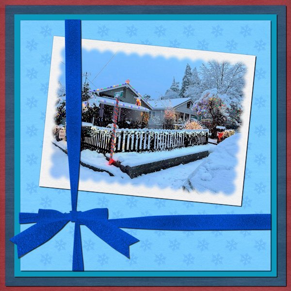
Day 7.
The picture is my cousin's house in Northern California. She loves holiday decorating and snow.
The papers, Winter Day, are by Janet Kemp at Digital Scrapbook. The ribbon was created using Cassel's "Attached Ribbon" script. Instead of polka dots, I used snowflakes.
-
2
-
11
-
-
13 hours ago, Cassel said:
@Susan EwartNot many people have spikes like that at home. My husband found some beside the railroad by our house and managed to invent a game with those. I'll try to find where he posted it on the internet. I love how you manipulated that background paper to create a totally different effect. If you want to do extractions, check this article. That is my favorite technique.
@Carolyn RyeYou are doing great with those masks!
@kasanySince you ended up with a straight edge on the left, you could consider moving the whole mask to the left so the edge of the photo won't look like anything is cut off and it will look intentional.
@RandyThat is an interesting idea to use the same image as a background. Have you considered using it diagonally? You can check this tutorial. The blue plaid is great and definitely not overpowering. You must have selected a great section to get that "subtle" design.
@MoniqueN.Simple layouts are fun to make because they are faster, and yes, it does put the focus on the photo OR the text.
@Emerald JayBeautiful photos and nicely showcased!
@Jen Brown You earn extra points with such cute kitties!!!
@Ann SeeberCombining a colored photo and a black-and-white photo with a mask gives a great effect.
@Anne LampThat subtle layer of the photo in the background makes that page very interesting.
@Gerry LandrethThat script creates a great effect. I think that the shadow on the title is inconsistent with the typical light sources. Can you consider putting them in the opposite direction?
@Marie-ClaireKeep those brush strokes handy. You can use them as masks later too!
@Donna SilliaI am sorry to have made you addicted to layered fonts! LOL
@Corrie KinkelIsn't that good that those rocks are just digitals?
@Harmony BirchDid you rotate your lace after adding the shadows? It looks like it is not consistent as it is going to the right, and not the bottom right. is the Butterfly font a layered font?
@fiona cookThat Blend mode really makes the colors pop!
@Bonnie BallentineYou are always having such interesting adventures!
Carole - I was overthinking the shadows. I used a cut-out for the title and exaggerated the shadow. Below is a revised version with normal shadowing.
-
7
-
-
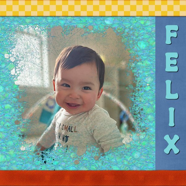
Day 6. Felix is my youngest great-nephew.
The top ribbon is from Marisa Lerin at Digital Scrapbook. The bottom one was created using the Ribbon Factory script from Cassel. The mask was created with the help of the Paint Slash script, also from Cassel. The font is Retro Real Wavy from Creative Fabrica.
-
2
-
10
-
-
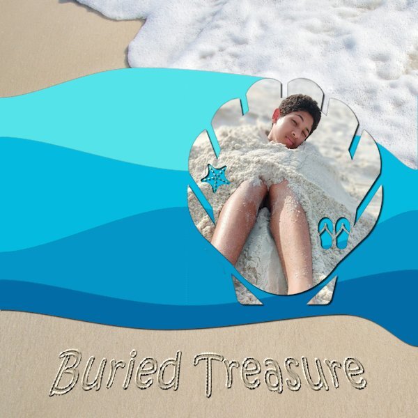
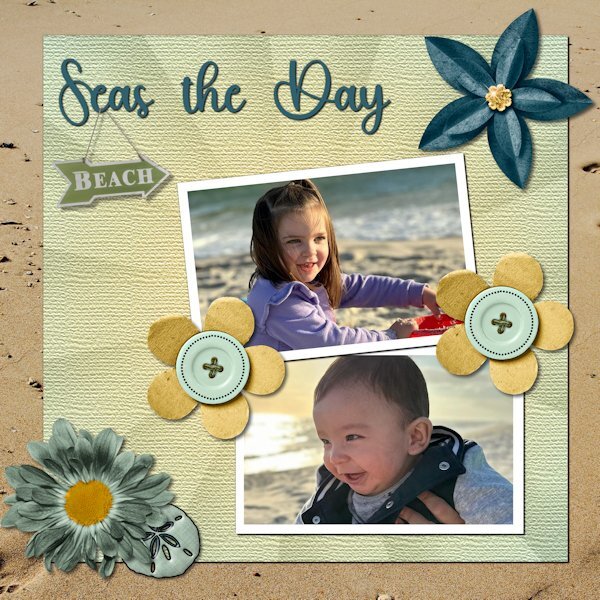
Day 5.
The mask was made using Summer Punches from Cassel. The waves were made using the Waving script, also from Cassel. The beach background is from Pixabay.
I used the Sand Writing tutorial in the Campus to create the title.
The "treasure" is my oldest great-nephew, Brelan who will be 16 in a couple of months.
-
4
-
 1
1
-
7
-
-
This one depicts random thoughts. If it needed a title, it would be My Mother's Day.
Years ago, I started calling my mother on my birthday to thank her for being my mother. I called it My Mother's Day. When I moved back to Alabama to be with her, I would take her to dinner to celebrate (usually at a restaurant that gave a free dessert for my birthday!)
This will be the first birthday without her. I may still go to a restaurant. After all, she wouldn't want me to miss out on a free dessert!
The mask for my mother was made using a watercolor brush from Rikard Rodin. The raggedy edges and the gold from were made using Picture Frame in PSP.
-
1
-
10
-
-
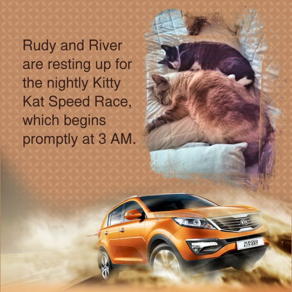
The car is from CleanPNG. The mask is from Graphics Creation.
When I saw that it was Kaleidoscope Day, I set aside a couple of hours to stare mindlessly at the changing shapes and colors.
-
2
-
4
-
5
-
-
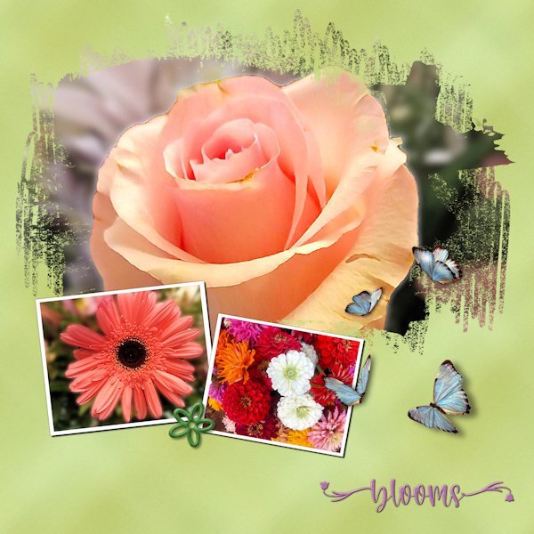
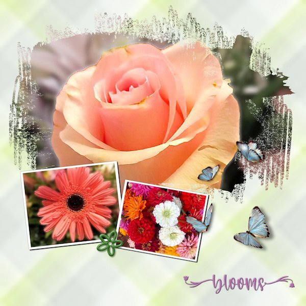
I spent lots of time experimenting with the plaid, including tinkering with the settings for seamless tiling. Since the photos are "busy," I wanted a pattern that wouldn't compete. The green "plaid" looks closer to a grunge effect.
The photos are mine. Although I'm not a good photographer, I keep finding little bits of a picture that look nice enough to showcase.
The font is Welcome Spring from Creative Fabrica. The butterflies came from Pixabay. They already had shadows but in the wrong direction. Flipping them solved the problem.
-
3
-
13
-
-
5 hours ago, Cassel said:
Oh my!!! I will reach out to the author and I added a different link in the meantime.
I had the same problem. The link kept redirecting me back to my Dropbox account. Since I had the template from the previous mask workshop, I was able to use it.
-
1
-
-
Day 1. The script is Shocking Script from Creative Fabrica. The paper is from Pet Papers by Marisa Lerin on Digital Scrapbook.
-
3
-
13
-
-
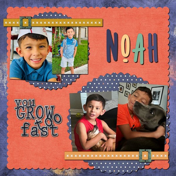
Day 7. Noah has been doing modeling and commercials. In one, he had to portray a child who was happily playing and suddenly dramatically sick. While the director praised his talent, his mother realized she saw the same behavior when she yelled, "Time to go to school!" Is it talent or practice?
The kit is a collaboration called Boy of Mine from Go Digital Scrapbooking. The font is Nonplussed from Creative Market.
-
2
-
1
-
11
-
-
Day 6. Technically, the pictures were taken at Gulf Shores. As a veteran Miamian, I understand the difference between a gulf and the ocean. However, Felix, who is six months old, and Amelia, who is three, are not interested in nuance. Besides, nuanced accuracy would have gotten in the way of the fun title I found.
The kit is from Throwing Some Scrap Around by Jodi Watson, which I found on Go Digital Scrapbooking. Unfortunately, the website does not seem to be operational. The font is Hey Beach from Creative Fabrica.
-
3
-
12
-
-
4 minutes ago, Corrie Kinkel said:
Day 5
Again a layout with purplish colors, I hope that is not becoming a new trend, but the color seems to suit the layout and photos. Although I love seeing colorful layouts, the ones I make are usually more subdued. The papers are by cpjes in the 2022 augustus blogtrain; the doily is by Sheila Reid. The ribbons and flowers are by Marissa Lerin and recolored. The brads come from my stash and the font is Bremlin
Never apologize for purple. "I think god gets mad if you walk by the color purple in a field somewhere and don't notice it." (paraphrased from The Color Purple - Alice Walker.)
-
3
-
2
-
-
Day 5. Felix was born this past summer. The pictures are some of "The Firsts" of his first year - winter (in Illinois), Halloween, and Christmas.
The papers are from Annie Digital. The fonts are Lato Light and Belgium.
-
3
-
16
-
-
Day 4. Ansley, born in September, is the newest addition to my sister's roster of grandkids. We have one more coming in April and added another one by a recent marriage.
The background is from Chantahlia Designs.
-
5
-
4
-
10
-
-
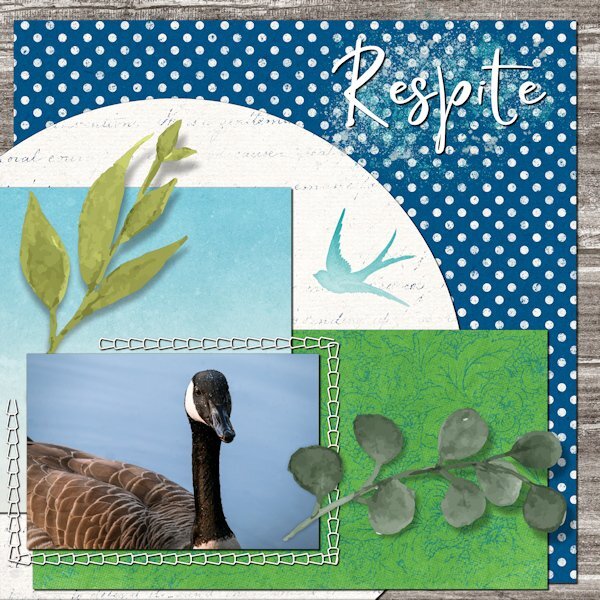
Day 4. The picture is from Pixabay.
A pond in our neighborhood is a favorite rest stop on the migratory route. A neighbor posted a picture of some late-season travelers waddling around on the ice that has formed during this brutal cold snap.
-
5
-
9
-


Greeting Card Workshop - 2024
in Showroom
Posted · Edited by Gerry Landreth
That is a great ribbon. I love your work.