Leaderboard


Popular Content
Showing content with the highest reputation on 06/21/2025 in all areas
-
Here's my Lesson 5 featuring a young European Starling. The fonts are Coral Reef and Corbel.
 15 points
 -
Lesson 1 - Grandparents' Wedding Day.
13 points
-
It wouldn't be me if I wasn't running late. I am doing the workshop this time in affinity. Showcasing a few photos from my first LARP of the year
13 points
-
Here is Lesson 5... Photo is from Pixabay. Thought bubble a PSP shape. used the same brush as Carole used in video and leaf image is an old tiff image from a cd i purchased years ago. everyone is doing wonderful pages and a pleasure to view them.
13 points
-
Been busy planting vegetable gardens and going to rallies, so, not much time for fun. These are a few photos I took at our local "No Kings" rally on June 14th. Pray for us!
13 points
-
And here we go my number 4 I actually used 2 brushes for the mask, one got the soft edges then the other cut out some tiny flowers. The font is Retro Daisy
12 points
-
A little moment of respite (Day 4 with PSP) What can he be thinking?
12 points
-
And day 2
12 points
-
Lesson 4: This is a masked pic I made some time ago. It's the same dog (Baby Duke) who appeared in Lesson 3. My friends take their dog everywhere they can. The background paper and elements come from Katie Pertiet.
12 points
-
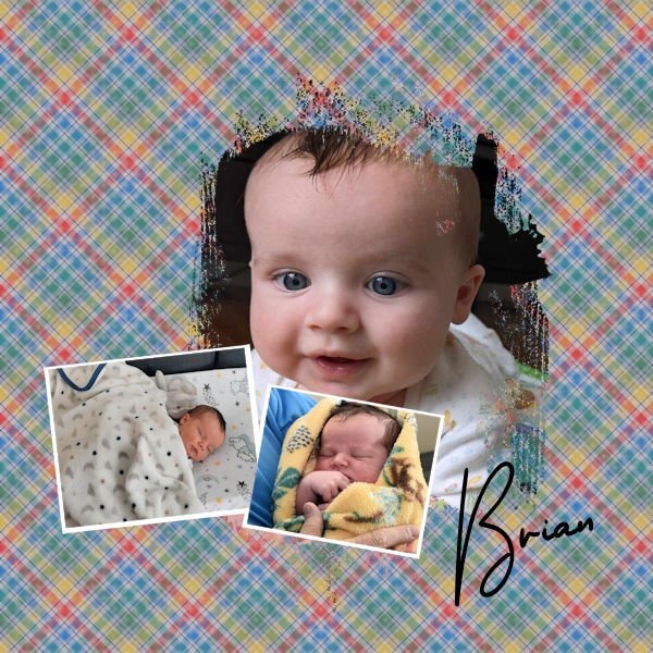
#5 Again, several attempts to make a pretty, and perfect project. I again, will be okay with this completed assignment as is. So glad we are not being graded. 🙂 Today's layout is of my kids with their grandpa and my daughter's baby. My son (the one standing next to Grandpa) has his grandpa's name, and his son also carries on with the name tradition. And the baby is also named after his Grandpa Great.
12 points
-
Day 5. I fiddled with this a lot, still not really happy with it, but maybe it's the shape throwing me off. I will definately be playing with masks for awhile and hopefully I will get better with them. They still confuse me for some reason. As a side note, the male and female catbirds look the same. We seem to have quite a few of them here and they nest in my big rose bush every year.
12 points
-
Lesson 6 I think the Voronoi effect in Affinity is easy to make, if you know the right steps of course. But I must confess I'm not a great fan of it. I always follow the instructions when I'm learning a new technique, because if you understand it you can play with it. So I just did this on the photo that I choose for lesson 6. It is one of the row from Monterey Bay, maybe the colors on the photo were not the best for this effect but I was not happy with what I got. I used only a very small effect and a little blur and I really didn't like it at all. So I tried other settings for that effect and instead of very small I used it to the max and for the blur Box blur at 90%; which you can see in Lesson 6A. For Lesson 6B I tried the Voronoi effect again with small settings and with a gaussian blur of 13,7 and the Blendmode Divide which gave those small dots. I kept the rest of both layouts very simple, only a frame and some text. The squirrels along the coast line were so used to visitors that they were really coming up to us and begging for treats/food and there was food enough for them, so they weren't hungry!
11 points
-
#6 oops, sorry, again troubles with getting the mask to do what it was supposed to do, but my time is up, so this is my project for the day. Grandpa Great was honored for being the oldest member in the American Legion in our city. He proudly rode in the town parade.
11 points
-
Here is my Lesson 6 submission. This one is Mary Ann. She doesn't look too happy. I used todays lesson to create the rounded corner frame to put around Mary Ann. I used the bubble look to create the frame.
11 points
-
Mijn caleidoscoop was erg makkelijk gemaakt. Ik vond de orginele achtergrond verschrikkelijk en heb het nooit gebruikt. Maar nu vind ik het wel leuk geworden. Een fijne trick om eerst iets nieuws te proberen. Dank jewel voor de tip
11 points
-
I just put my grandchildren to bed. I have a little time. (Affinity)
11 points
-
Well I've only just today been able to start this workshop. Affinity really is a dream to use with masks. Here is day 1
11 points
-
Day 6
10 points
-
Day 5: Created in Affinity. Loved making the mask and whilst I was on a roll thought I’d make a plaid and use it.
10 points
-
Lesson 6. By mistake I had selected the 'Cork' texture instead of 'Current' Displacement Map. I made both and then used Screen Blend mode for my photo of Topsham boats.
10 points
-
And here we go with the second one. Not sure how I feel about the background drawing so much attention. The daisy was a tube I made in psp many years ago. As I use any of my tubes or fills I am saving them as Affinity assetts
10 points
-
@Cassel I just checked, and you were so right. Both things I hadn't even noticed. Day 2 the main image was set at 84% opacity, and Day 1 I had totally overlooked enlarging the shadow. Many thanks
10 points
-
And Day 3. I particularly enjoyed making the background paper, so many variables give so many results.
10 points
-
Day 5 using Affinity I used the same brush as Carole as I liked the affect it gave, the font I used is back to Vintage. The photo is of two juvenilles with the red patches on the top of the head and that's mum at the feeder, my son took the photo just the other day, he has had woodpeckers visiting that same tree for the past 11 years. When he sent me the photo he wrote Mrs Woodpecker sighed wearily as she pecked up her order at the McPeanuts Fly-Thru, that second egg had definitely been a mistake... I read Caroles comments and I have redone it I am happier with the result, I also changed the Font to Before the Rainbow as I wasn't happy with the first one Back to Vintage ,thank you Carole ,all comments you make are positive ones
10 points
-
This abstract turned into some kind of cervid in my mind, so I made a deer-shaped brush to go with it for the exercise in Lesson 5. While I did use a mask to cover some of the main image, I didn't feather its edges because I wanted to maintain the strong, side-to-side movement of my "herd." Then I finished it with a layer of animals using the brush with a solid colour.
10 points
-
Here's my Lesson 6 using PSP2023 - I don't do Affinity. I took this photo when we visited the Orange County Arboretum when Debbie was here 2 weeks ago. This little cutie was almost hidden in the lush greenery. I loved the color! I made the linoleum background based on one of the colors in the flower. I added a PSP frame with a transparent border. In fact, I added a second frame over the mask. It was green but I used a blend mode to fade it out. The fonts are am-intex and curlz.
9 points
-
Day 6 using Affinity photo I used a photo of the Hexham Morris Dancers from our Midsummer event festival which was held this Thursday in the market square, the weather was glorious and there was a big turn out. i used an acrylic texture brush for the mask and the font is Baby Garland.
9 points
-
These are a few photos of Chicago, Illinois...All photos are mine as well as the cloud background. The state bird is a Cardinal and the flower a violet. If we ever get rid of a certain wana be dictator, I hope you all visit this city. I am not from Illinois so I don't think I'm being partial. I just can't get enough of this beautiful city.
9 points
-
I am so behind ugh, hoping to get caught up today! I wanted to do both PSP and Affinity lessons but I'll just do the Affinity ones so I can get caught up. Finally able to do the second lesson. OMG I loooooove the plaid pattern tutorial and how easy it is to make a whole pattern page in Affinity!!
9 points
-
Day 6 To practice the tutorial, I applied the Voronoi effect to one of the eagle clipart images and the Linoleum effect to the other.
9 points
-
Day 6. The Affinity tutorial rendered a really nice background paper, not a lot unlike the linolium pattern in PSP. I did both, the plain background is the PSP version. I can not believe that the linolium pattern was the very first background paper I created almost 10yrs ago. Always a joy to scroll through all the creativity, wonderful inspiration. Well done ladies and gentlemen!
9 points
-
Lesson 3 Like the Kaleidoscope. They can result in some interesting images.
9 points
-
And my number 3, because it's a productive morning. The title font is called Heart Heart, though I have no idea where I got it from.
9 points
-
L5. Dome.
9 points
-
Here's a 600x600 piece from the background so you can see the pattern better.
9 points
-
Here is day 4. I struggled getting the brush to work properly. In Carole's video it looked so easy to paint in the mask, but it took me ages to get rid of the outline of the photo. And Carole, I'll check on those things you mentioned, thanks.
9 points
-
Day 4 PSP I have had the house full of friends visiting, and am only able to get back to playing with masks today. I used a photograph of the Cathedral Cliffs up in North Canterbury. I used to go up this way often when I lived further north, in Canterbury; the cliffs are near Hanmer Springs, and the hot pools in that town are fabulous. Again, using Wendy Medium and Arial fonts, I created the background with a topographical map of the area and gave it a warm retro effect using a freebie script from Corel. Day 4 Affinity I have a few brushes downloaded from various places, the Affinity Forum, and more. This one was from the Affinity Forum, by StuartRc. I love this brush and found it fun to work with. To get the opacity right at the edges, I took the spacing right down, then upped it to about 80% for the inside of the brush effect. I used Billie Irene's March 2022 Digital Scrapbook Blog Train paper 01. The font is, again, Gonestone Signature and Arial.
9 points
-
@Linda RexfordAlthough we won't touch on photo editing with masks, once you get comfortable with them, you will see many other applications. I don't see any problem with the shape of the mask in the last layout. It follows the subject. Maybe it is just different than what you had in mind? @Jenny MacKayThat is such a cutie! So photogenic! Great start. Did you add shadows on the small images of the second layout? Sometimes, they seem to "disappear" when you resize the layout. @Susan Ewartif you want to simulate graffiti on the brick, I think that the paint on the title should not have shadows! I love that quote! @Ann SeeberOccasionally, I might comment only on one layout if someone posted more than one. But I don't know why this one was not commented on. And yes, I was referring to the layout "Iba N’diaye ". I use the "Love" reaction once I see/comment on a layout (so I can know where I am). I guess I got distracted. That kaleidoscope pattern is so delicate that I had to look twice to see it. I bet it shows more at full size. @SharlaThat grey background with noise is matching so well with your photo. It really showcases that robin. @Sue ThomasThe rotation setting should be the same in Affinity but you also have to adjust how much of randomness. It is a bit like in PSP where you can choose Random, but you still have to set the % of jitter. What is it that makes you not overly happy with the oriole layout? The only thing I can think of is that you usually add a few more choice elements to your layouts. Could that be it? @AprilDawnThose are great pages! I am glad you didn't give up when you struggled with the downloads. Your work is fabulous and those photos are great. Kuddos to your cousin! That kittie made me smile. @CristinaThere are so many default brushes in Affinity that you have many choices to start. Great story about the chick's names. Those spray brushes can give very interesting edges, even if it is not on masks! @fiona cookYou can always clone some of the space around your subject to make a "larger" image. @Jannette NieuwboerIf you use PSP, the mask might have been slightly grey. That makes it a bit transparent. If it is using Affinity, it could be the opacity level of the mask layer that is less than 100%. What command is not present in your case? With which program? @Robert GarrettIs Thurston a Siamese? We had a Siamese when my daughter was a baby and that cat was very aggressive toward her. We had to rehome him. 😞 You are doing very well with those masks! @Gerry LandrethThose spectres give a real ghostie feel to that mask. Very relevant to the story! @Art KuiperI have seen that kind of picture with a caption "Why women live longer than men". It makes me smile. I bet those guys are still able to get the job done! And yes, once you get the hang of masks, the possibilities are endless. @Donna SilliaOnce you will know all the settings for the brush tool, you will find that both PSP and Affinity are pretty similar. You'll become an expert in both over time. @Connie CollierYour choice of not feathering the edges of the mask was the right one. As much as we might like soft edges, when you have a specific design in mind and you want to see it, your approach was the perfect one. I love that effect. @gwen jewittI would suggest that you soften the shadow on the masked image. Since the splatters are small, a fainter shadow might be matching more. @JacquesIf you merge the photo and the frame/mat, you could add some shadows to give them some volume. I love the colorful plaid. Did you use a segment of one photo? Now we have the proof that the baby is sleeping for you to work on the page! 🙂 @Corrie KinkelYes, you can definitely use different brushes on the same mask. You can use different textures, and different shapes. If you look closely at masks that you can find in some kits, some of them likely use half a dozen different brushes! @ClarineWith so many people with the same name, that should become the title of that layout! @Lynda DiGregorIs it just an illusion or did you squish the large photo horizontally? The people seem a bit tall/thin, unlike the lady with the yellow hat. @Julie MagerkaThat mask is perfect for the photo. It gives that "water" feel all around it. @Jean NaumannYes, Affinity makes using templates/masks much easier. On your first page, did you hide the shadow on the bottom right photo? On the second, if you were using Affinity, was it slightly translucent? If anything, you could brush some white where the people are so we don't see the pattern through. As someone mentioned in this thread, you are giving me a lot of work going through all those wonderful pages. They are all so unique and inspiring. Keep them coming!9 points
-
Lesson 5 I too liked the brush used by Carole, but I added a faint butterfly brush on the outside. Being busy with brushes I used a corner brush as well. I couldn't find a way to get the brush rotate by 90 degrees, I think there must be a way to do that. Of course I have duplicated the brush layer and rotated it by 90 degrees to get what I wanted. Because my flower is round I put the text in a circle and I have to admit I had to check the vector workshop on how to do it. It need more practice to remember all this new things, on the positive side at least I know were to find it.
9 points
-
Day 5 - a little off the course but followed the methods.
8 points
-
Connie, this is beautiful.8 points
-
Little nap of the grandsons, My day 2 (PSP)
8 points
-
I corrected the left side placement on this project in lesson 3. After I submitted I noticed I put the one that was showing the edge of the photo on the left side when I was adjusting the photo.
7 points
-
This is beautiful, Fiona, I particularly love the colours used in the background, and the photo is lovely.7 points
-
les 3 + ruit. de ruit kon ik niet gebruiken daarom heb ik een andere achtergrond gemaakt omdat een ruit uit dezelfde kleuren te druk werd. Bovendien heb ik een ander item van Melo gebruikt en een kwart slag gedraaid. Ik heb een andere methode moeten gebruiken om een ruit te maken want de functie is bij mij niet aanwezig. .
7 points
-
Here is my Lesson 5 using PSP. Meet Thurston. Thurston was a stray Himalia that showed up on our door step many years ago.
7 points
-
Sweet cat:)6 points
-
Thurston was a Himalayan. He was a pretty laid back cat. Thank you for the encouragement. I'm really enjoying the lessons.6 points
-
I am loving these Sydney photographs, and they are so clear and bright. Years ago, I had an apartment in Kirribilli and could view the Opera House from my bedroom window. So I'm enjoying the memories, thank you, Jean.6 points
-
Day 5. It is rare for me to say that I am not overly happy with the result. I realize that I am after all a newbie to Affinity, and in time I will get the hang of this programme. Practise is what I need, but I am afraid not during the summer months.
6 points