Leaderboard


Popular Content
Showing content with the highest reputation on 04/23/2025 in all areas
-
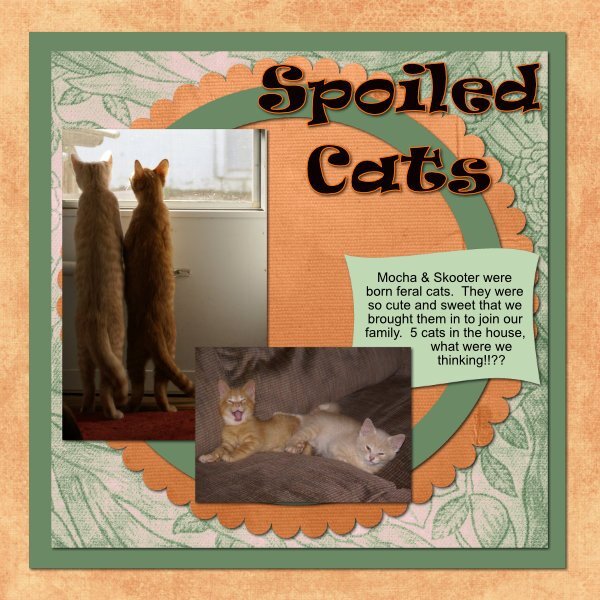
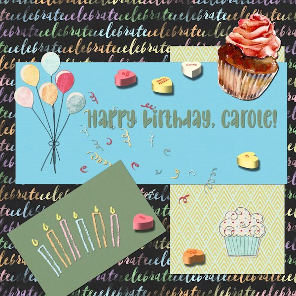
using photos from my girlfriend Melanie, the kit is Meow Party by CaroleWDesigns14 points
-
Day 2: I created the photos with AI (via Freepik). The font is ‘Night in Tokyo’. The papers are from a bundle by Rachel Martin called ‘Ansel’. Project completed in Affinity.
 12 points
 -
The title font on this one was Wet Paint.
11 points
-
Day 2. My papers are from Creative Fabrica and Digital Scrapbooking. The fonts are Ravie and Arial.
11 points
-
Here is my day 2 page. Carole, dropping photos, and papers into their layers is ever so easy, compared to in PSP. (masks) I stopped using the text wrapping tool many years ago in PSP, as editing the text within has its limitations, hence I do it manually. Applying shadows, is also a sinch and time saving. I don't use kits, what I do use, after discovering them in a masterclass are paper layouts. Otherwise I create my own papers, and elements. With practise, I can see myself replacing lots of techniques within PSP with Affinity. Which will allow me more time out in the field with my camera, and other outdoor persuits. Good to see the campus up and running again so quickly. Those gremlins, must have got overly excited at all the wonderful pages submitted. lol Sending you birthday wishes. Thank you for making us aware of Affinity, which I hadn't previously heard of. Along with the easy to follow tutorials. I have said it before , and I shall reiterate. Using the same template, every completed layout is uniquely inspiring.
11 points
-
10 points
-
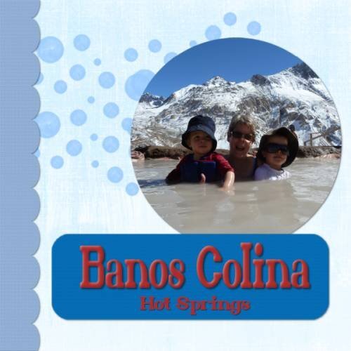
This is a scene from a holiday in 2011 when I visited our grandchildren while they were living in South America. The font used is Arabella.
10 points
-
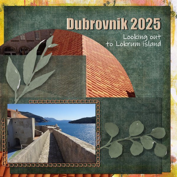
Day 2. I was unable to log in to either site yesterday afternoon when I tried (Campus or Creation Cassel) yet I could other websites. Strange. (Happy Birthday Carole for yesterday anyway). So a bit late presenting my efforts for lesson 2. Continuing same theme as I have lots of photos from Dubrovnik.
9 points
-
Day 2 - Affinity Again, I used papers and elements from the kit "Tastes Like Summer" by Lynn Grieveson. I added a date stamp that was created in PSP using Cassel's DateStamp#8 script. Fonts. Caneletter Script and Canastra.
9 points
-
and Day 2 - I struggled with this one trying to find suitable papers. That is always my problem, I waste far too much time trying to find the right ones. This is my granddaughter Bella, she loves posing for photos.
9 points
-
Here is my Day 1 . I used the Coffee Break kit from Sweet Shoppe Designs and the font is AR Delaney
9 points
-
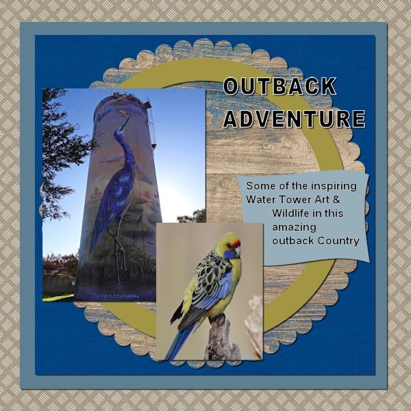
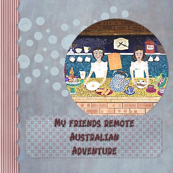
Day 2 using PSP 2023. Our Friends continue their adventures through the Australian Outback. Their love the Water Tower Artwork and also the Wildlife. My friend loves photography, and her photo are a joy to see. We all look forward to their next adventures.
9 points
-
Day 2 Templates
9 points
-
Day 3 Very useful having the shortcuts and I have added a regular command to my toolbar for the standard paper element shadow. I must get used to using all these clever settings. The stitching layer design shape in the template is similar to the rooftops in my theme so I have taken a colour from the rooftop photo that I used as the circular element.
8 points
-
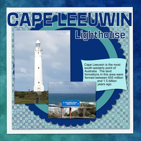
Day 2 - Using the same kit by gemini Out of the Blue - Cape Leeuwin is in Western Australia and it is where the Southern Ocean meets the Indian Ocean - the lighthouse built in 1895 is the tallest on mainland Australia and still operating. It is a popular tourist attraction in the Margaret River region. Interestingly I have 3 font viewers and not one of them allow the fonts to show in affinity.
8 points
-
Here is my Day 3. I used Infinity for the most part. The title was done in PSP.
7 points
-
Today, after talking yet again to someone very close to me, I made this layout. It is simple but it comes from the heart and is made to help that person let go a little bit of the burdens he is carrying right now. Sometimes an image is better than just words. I used a page mask from KP, some papers and elements from NBK designs on Oscraps.
7 points
-
Here's my version of Lesson 2 - trying to showcase the Kosovo Opera House. I dumped a few of the photo blocks and just used the circles. My text font is Elephant, journaling is Copperplate. Papers are from a jess-countryside mini.
7 points
-
Hello Carole, hello eevryone! Thanks for hosting this workshop, Carole. Here is my go at the 1st template, I just duplicated the circle twice and adjsuted the size a bit, but now I am thinking I want to have a second go with the template as is.7 points
-
Lesson 1 Template1b- PSP papers from Creative Fabrica and Digital Scrapbook. Font is Keshiki (CF). The dots have a very low opacity. The rectangle is a blend of a paper and a fill color. the photo is mine and a re-hash from the Magazine workshop (I'm almost done!). No time for new photos right now 😢.
7 points
-
A family story
7 points
-
WIth templalte #36 points
-
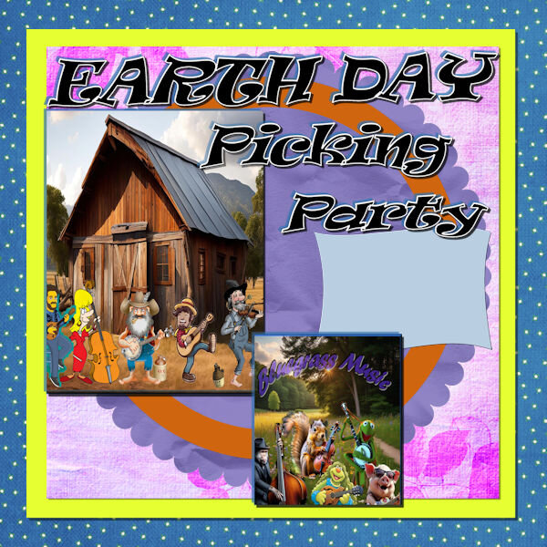
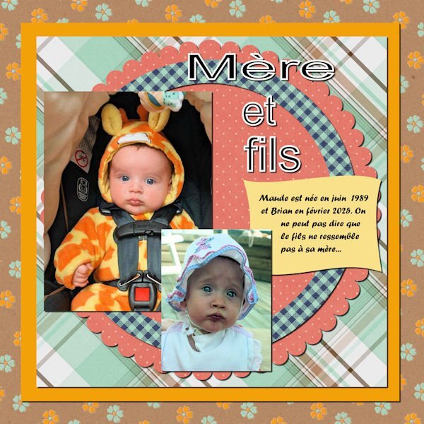
Great to see many more projects posted in this thread. @Linda Rexford Are all the kittens "single-colored" while mom was "striped"? They look so cute!!! @Jeni Simpson That is a very nice set of papers that you used. I love that play on word! @AprilDawn That is such a beautiful photo! And well showcased! @Carolyn Rye It will be interesting that our Australian members might recognize things from that adventure. @Cristina Yes, copying and pasting from one image to another works just the same as in PSP. I guess some commands are pretty universal in most programs (you could even copy and paste into a Word document!) @Sharla Those white dots really match the image like snowballs! @Leslie Pugs I love the title! Have you tried adjusting the Levels on the photo? It could make the colors pop out even more. @Euka Very appropriate to use a wavy pattern for the title. @Ann Seeber That Blind effect matches very well the details in the photo! @DianeM The Float is still available under Window > Arrange > Float. I don't know if there is an actual difference in the result of dragging from Window into the Affinity program. It is not something I am used to do in PSP so I don't do it in Affinity. Maybe someone else could chime in with their experience. So far, if you are able to drag and drop, continue doing that. Maybe you will find some differences, or maybe you will find it works just as well. @Jacques Maude is the same age as my daughter (March 1989)! 🙂 @Susan Ewart The faint dots add just enough texture without being overpowering. That is the beauty of the dots being on separate layers, right? @bina greene Great interpretation and tweaking of the original template!! Is it just the resizing or are some shadows missing in the second template (on the photos)? @Hank Sobah That Earth Day layout made me smile! 🙂 @Anja Pelzer Meow! I love all animals, but I have a sweet spot for cats! @Sue Thomas Yes, some things are very easy with Affinity. Some of those were previously suggested for PSP but never got to the implementation stage! Keep those projects coming! And remember to update your profile so we know what program you are using. It will be easier to give suggestions and ideas knowing what program you are using.6 points
-
That photograph is beautiful, so clear, so shiny. The colours you have used look so good, too. When I lived in Sydney, in the 80s, I got a great view of the Opera House out my window, where I lived, in both Cremorne Point and Kirribilli.6 points
-
Here my go at the 2nd template6 points
-
Here is the new Opera & Ballet Theatre of Kosovo featured on My Modern Met. The designer is BIG - Bjarke Ingels Group. No papers used, just colors and textures. The font is Eras. There are several spectacular photos featured so I will continue with this theme.
6 points
-
Day 2 - I asked my friend, John, if a could use some of his photos from his travels throughout Italy. In response, he shared not only his Tuscany album, but also asked his friend, Robert, to share his album. As a result, I now have about 750 photos of Tuscany in my iCloud folder and used them for this template. The background is one of the photos taken at night and overlaid with a Tuscan grunge from Adobe Express. I created the border using Carole's repeat script of a preset shape with a Adobe Express gold style added. The title font is call concave tuscan and the journal font is black tuscan, both from CF. I added a watercolor leaf pattern to the background layer. Although I missed yesterday, I want to wish Carole a belated "Happy Birthday" and thank her for the gift certificate. I spent the morning downloading my favorites list.
5 points
-
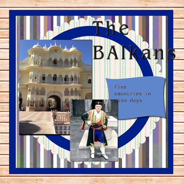
Went on a trip to the Balkans. Lots of driving, but all in all a great time.
5 points
-
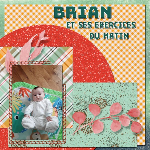
My Day 3: Brian and his morning exercises...
5 points
-
Thank you so much Sharla Wow Sharla, you are really good at describing a scene for the AI. These are beautiful. I really like the sunbeam one.5 points
-
Beautiful layout Susan - love your choice of colors.5 points
-
This is a photo that my sister in-law took a few years ago of Derby a town in the Kimberly region of Western Australia. i have used it before but thought to use it again for this workshop. Not toally happy with how the text ended up but it is my first go and hopefully will improve. Carole thank you for a well explained video i will have to keep practising on the text part. best wishes to everyone, Dawn.
5 points
-
I only use PSP. I downloaded the trial version but I prefer PSP.4 points
-
Working with Affinity for the first time went well, but if I resize my project my photo gets blurred. What am I doing wrong? 🙂 Looked at the video and copied it step by step, but nothing helps 🙂4 points
-
I agree with you about how easy some things are to do in Affinity and like you I hadn’t heard about until it was mentioned by Carole! My 90 days trial version expired the day before I was starting my trip and I just had time to buy it, otherwise all the customized things I did would have gone. I had just the time to have a quick glance and everything was still there🙂 Your photos are great as always!4 points
-
There is nothing amiss with reusing a photo, especially not if it is such a nice one! Seeing all the great projects I’m almost, let well almost sorry that I didn’t take my laptop with me. But I’m having a great time over here.4 points
-
Bonnie I just read the other day that pickleball is now being played in some places in the Netherlands too, although not yet in my part of the country. If it wasn’t you that showed so much about this game I wouldn’t have had a clue about pickleball!4 points
-
4 points
-
I sure hope I can get a photo like that when I take a trip down under. A friend and I are talking about 2027 for the trip!4 points
-
Happy birthday! 🙂 I made this project years ago and didn't know I still had it 🙂 Hope you have a great day! 🙂
4 points
-
Using Affinity Photo 2.2 - the photo is mine and the papers from a Gemini kit called Out of the Blue - the font is Mistic.
4 points
-
There is a botanical garden and animal sanctuary near me where I took this picture of one of the Flamingos.
4 points
-
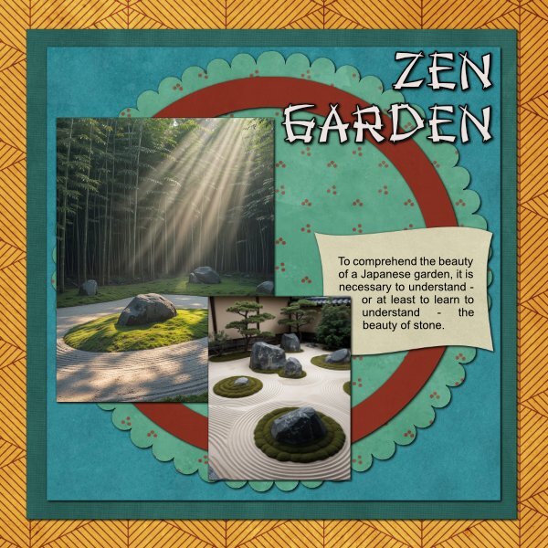
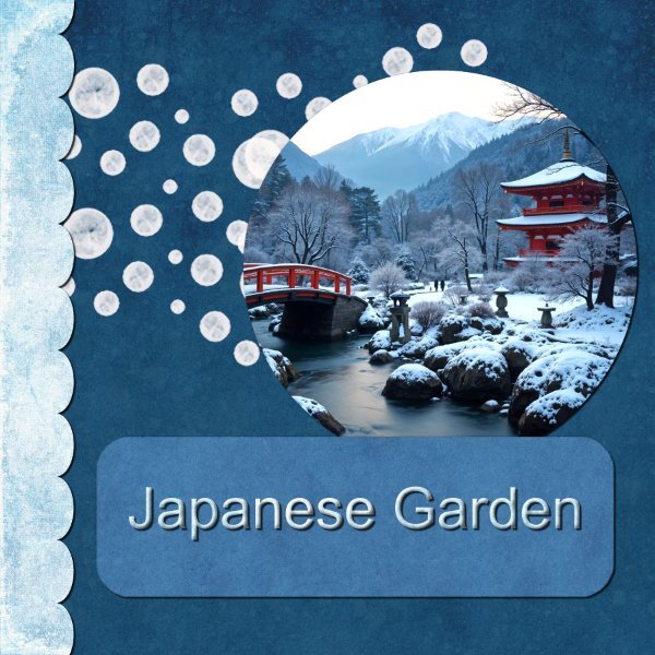
Day 1: 'All things Japanese’ is my theme for this workshop – the images will be downloaded or created by AI. The photo in this image is one I created with AI. The font is Iskoola Pota. The papers are from a kit by Jessica Dunn called Winter Solstice. Project completed in Affinity.
4 points
-
Day 1 – Affinity I used papers and one element from the kit “Tastes_like_Summer” by Lynn Grieveson. I tweaked the color of the Edge Border using HSL Layer Adjustment (Hue-Saturation-Luminosity). I created the page, and only almost at the end did I notice a mistake I had made from the start. So, I decided to start from scratch since the layout was not complicated. At a certain point, I wondered if copying the layers from one document to another would be possible, as it does in PSP. I tried it, and it was even better! I copied the elements and the texts, and they were placed in the same spots I had in the first layout, rather than in the center of the page as they do in PSP. Font: Caneletter Script & Clumsy Blink
4 points
-
Day 1. I used Affinity Photo 2 to do this one. My friend and her husband just completed an amazing trip down to South Australia, through Queensland, New South Wales and Victoria. This is one of the many art pieces that she photographed. This was taken in Cummins in South Australia. Some of the art photos that she has taken are just so beautiful.
4 points
-
Template 1 Diamond Using Serif Affinity 2.6 This photograph shows our village taken from a nearby hill with about as much snow cover as we would ever get. We are heading towards Winter down here. I left the white dots as would be snow. Kit is Jessica Dunn - Snow Place Like Home from Curio Pantry, I used 3 of her papers, the other two were recoloured, to match the papers used. Fonts are Cute Rita and Magical Feather.
4 points
-
On a free font site you have fonts with paws etc. would of been nice on your project too. 🙂 I know I have a font like that, but can't find it at the moment. 🙂3 points
-
Happy Birthday, Carole! 🙂 Sending you the best birthday wishes on this special day! Long life to you and the Campus & Creation Cassel!3 points
-
I do it the same lazy way you do. Drag and drop. For the whole page papers, I do have to align center and align middle to get them in place but I set up those shortcuts on the toolbar so no problem! I do drag and drop in PSP as well. It just works so much better for my scrapping process.3 points
-
my template filled with Affinity , Kit Ilonka Designs - it had to be you - my Mom3 points