Leaderboard
Popular Content
Showing content with the highest reputation on 11/19/2024 in all areas
-
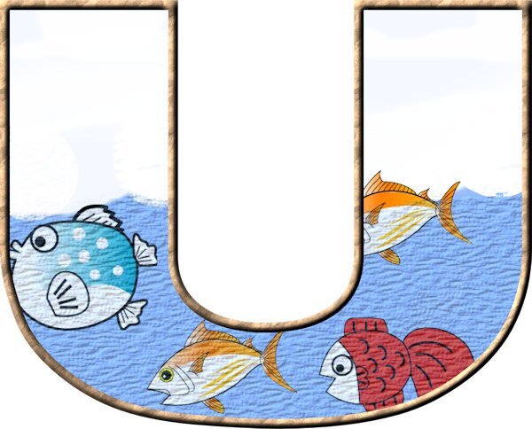
Hello everyone. Here is the first day's project. Hard to spot the "wave" in the title at this resolution but it's there.8 points
-
8 points
-
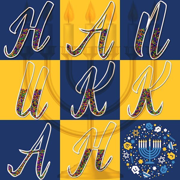
I had been playing with Carole's Word-Grid, so I went ahead and used the Lesson One technique on the letters for Hanukkah. The font is Babilonia and the decor is from the internet. I'm not very handy with Picture Tubes and was wishing I could have a confetti in the blue, gold and white of the holiday. The large menorah is the top layer set to Multiply and at 45% opacity.8 points
-
Day 1. Yes, I have done this workshop before but definitely needed a refresher course. I have always had problems with Text for some reason. The top text I did a Vector and Raster Layer and then used the eraser tool with a watercolor brush to erase the bits from the text. On the bottom Journaling text, I did use a Vector and Raster layer then used Effects, texture then sculpture on the raster layer. I am not really liking the finished project but at least it gave me a chance to play with text.8 points
-
I'm in need of Christmas cards; it is already a bit late but my calendars took more time then anticipated. This is a chance to combine it. I used a card template from the last card workshop. The font is Gill Sans ultra bold but because this is a card I used a less thick outline and filled it with a cass-star tube. The papers and illustrations are from my stash and I have got them from Creative Fabrica a long time ago.8 points
-
Day 1 I played around with this one, when creating the page, I used the same settings for the papers and the photograph, yet they look different, not sure why! I wanted the idea of waves crashing into the shore with rocks flowing in with the water. I used Cafe Rojo for the word BEACH and 1 Archer DNA for the remainder of the text. This lovely photograph of a friend's son and his family at the beach. It was Ruby's first trip to the beach.7 points
-
Lesson 1 Font is Erica One (CF I think) - it is one of the fonts that don't line up so you have to use the 0.1 stroke rule. I used daisy picture tubes and very low opacity fill. Photo is mine. I love this technique. Button is from Elif Sahin (Digital Scrapbook.com), papers are all PSP textures or patterns.7 points
-
7 points
-
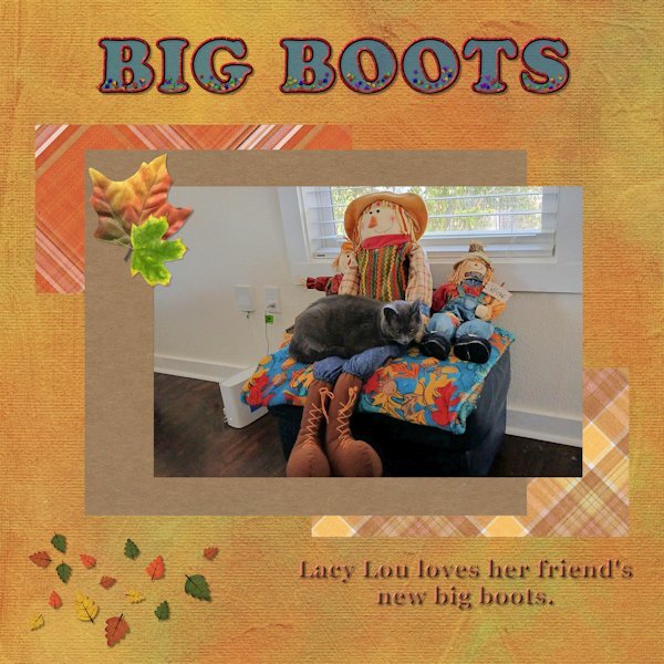
Here is my Day 1. My friend sent me a picture yesterday of her cat Lacy Lou and when I saw it, I asked her if if I could use the picture for this workshop. I noticed that after I added the background paper the blue text seemed a bit darker, even though I had used an opacity of 65. Papers and leave scatters are from Digital Scrapbooking and font is Cooper Std Black. (Thank you Carole). I used the clip-it mode to fill the shapes around the picture, but realized that after that the layers formed a group and 1 could not see the drop shadow that I added. However, I had a lot of fun playing with this layout and I am learning something new every time I join a workshop.6 points
-
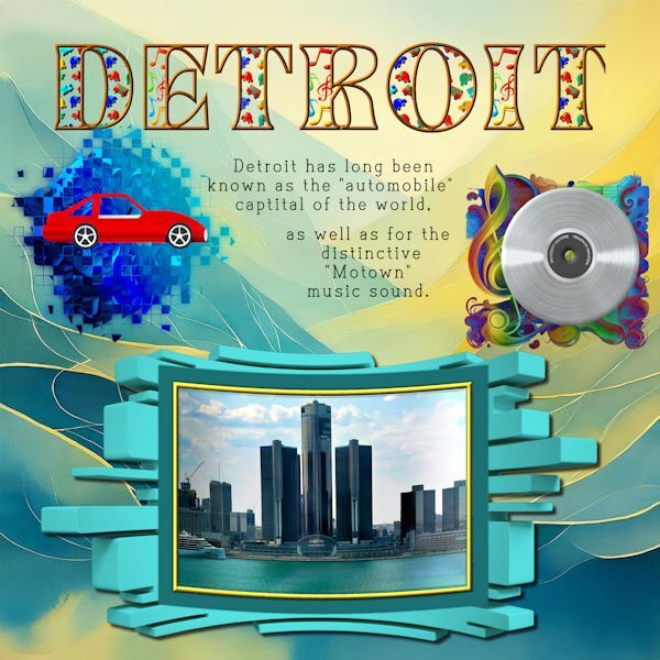
I had started the Detroit page a couple of days ago in order to see the effect of the 3D mask that I made from a Canva graphic and also because all the talk of the bridge to Windsor reminded me of all the times that we have crossed that bridge. The photo is mine taken from our Windsor Casino window. The patterns in the font are from Canva. The car is one that I made after the Vector Workshop and, both of the mask shapes are from Adobe Express. The record was made many years ago in Photoshop. I changed the color and added "Platinum Record Motown." However, the letters on the record are not very visible. The fonts are both from Creative Fabrica - Banner and Type and Write. We will be crossing the Ambassador Bridge on November 27 since we will be spending Thanksgiving at the Casino.6 points
-
Day 1 The first font I used (Swiss721 BlkCnBT Bold) didn't work too well as the fill part was too condensed so I expanded the fill but it then spilled out around the outline on some letters. I then tried in Arial Black ( a safe bet) but had to reduce the kerning a bit. I used X3 Stars for my Picture Tube. It helped laying a Guide Line at the top level where I wanted the stars to appear and then filling downwards. As far as a project goes to apply the effect, I am thinking of a greetings card for my niece in Africa who is about to graduate.6 points
-
5 points
-
5 points
-
5 points
-
5 points
-
5 points
-
I'm so sorry to read this, Jannette. At my age, I'm aware that dementia is one of the big fears of aging. Please be kind to yourself as caregiving is very taxing. My husband suffered mini- strokes that gave him some of the same symptoms. I am convinced that nursing homes are best equipped to care for these patients. That is where my Frank ended his days back in 2018. Even with him having 24-hour professional care it was still very stressful for me. Take care.5 points
-
4 points
-
4 points
-
I'm slow as usual. However, this is a photo of my daughter's dog, Murphy, which she took while they were on a morning walk. The font is - I dont know as I didn't save the text file I just converted it - and I used a pattern where the color was a medium tan for the outline, I used a blue for the transparent inner layer. I used the Lock Transparency tool to put the grass patch picture tube in the bottom of the text and for the birds tube in the "Sky" top of the text. I know, it is hard to see the birds, but they are there. I had to merge the outline layer and the bottom fill layer of the text in order to enlarge the word. the papers and elements are mine. Fun. I don't remember this from the first Text Workshop I did, so this refresher is great. I didn't remember that the sculpture layer not only puts a pattern, but you can change the "light color" color as well as those numbers puts a bevel on the object.4 points
-
4 points
-
Het is niet zo gegaan zoals voorgedaan. Maar ik heb het eruit gekregen. PSP moest eerst flink gereset worden. Eerst flopte het steeds weer, kleuren sprongen terug etc. Ik heb het witte invul gedeelte een voor een ingevuld daarna ingevuld met een patroon. Ook had ik het iets groter willen hebben. Het font heet Eras bold ICT.4 points
-
4 points
-
4 points
-
3 points
-
I'm wondering what kind of drugs I'm on...or should be one. Why the heck I posted here I'll never know, especially since I already posted stuff in the November thread. Thanks for letting me know. I think I'll got bang my head against the wall for a bit.3 points
-
3 points
-
3 points
-
Dank jullie wel voor alle sympathie betuigingen. Ook voor degenen die dit wel hebben gelezen, begrip hebben voor de situatie hier, maar niet zo goed in woorden van troost zijn. Maar ter verdere informatie, mijn man wordt verpleegd in een verpleeghuis. Hij lijdt aan Louis Body dementie. Dat gaat gepaard met veel ups en downs. Ik weet nooit van te voren hoe ik hem aantref. Verdere tekens van LBD zijn naast vergeetachtigheid, hallucinaties en Parkinson verschijnselen en evenwicht stoornissen. Van al deze verschijnselen is het een lichtere versie. Dit is het verschil met andere dementie vormen. Ook ik hoop dat de vertaling goed verloopt. Waar in de wereld je ook verblijft: een Fijne dag.3 points
-
2 points
-
Mary I too forgot the sculpture effect and I hope I will remember a bit longer now because I actually like it!2 points
-
Hallo Fiona en Carole. Ik heb het probleem ook. Het was gisteren een echte worstel wedstrijd. De spatiëring werkte niet naar behoren. Ik moest font na font uitproberen welke wel of niet voldeed. Ik werk in de 2023 maar heb ook nog steeds de 2018 draaiend. Maar daar deed die het ook fout in. Kennelijk staan ze gekoppeld aan elkaar. Maar ik ga het uitzoeken zodra ik er tijd voor heb. Gisteren heb ik daar zeker anderhalf uur tijd door verloren. Het is zo lastig als je device niet werkt naar behoren. Het haalt alle plezier eruit.2 points
-
Welcome everyone, especially our newcomers. @fiona cook Are you using PSP2023? One bug that I had brought up was the fact that some fonts (too many to my liking) will have a different "width" if you have a stroke or not. If that happens and you still want no stroke, you can create one with the same color/pattern as the fill but with a width of 0.1. It will not be visible, but will override that bug. The standard Windows fonts are safe. Others are a hit or miss. @Patty Swinimer Welcome to the Workshop! Although we recommend to resize down to 600 pixels, you should not have to change the resolution. Did you adjust the Compression? @Donna Sillia That is a fun fill that you used. A lot of work to fill the different letters differently. @Cristina Mochetti Glad to see you here. Looking forward to your projects. @Jannette Nieuwboer If you want to post just the text part, crop to its size and you can resize to 1000 pixels (because it won't be very high). It will show better your work. @gwen jewitt That looks like a lovely card! Isn't it nice to be able to reuse projects when working with PSP? @Corrie Kinkel It is a great idea to combine this workshop with the cards you need to do! Looking forward to everyone else's projects @Ann Seeber, @Susan Ewart, @Cristina, @Cindy Sheets, @Jacques, @Julie Magerka, @Mary Solaas, @Dan Greenwood, @Dee Morris, @Jeni Simpson, @Anita Wyatt, @Linda J Walker, @kasany, @Elaine Banks. And the other 100 who have not posted yet, I would encourage you to post. If you encounter any issue with a tutorial, or a tool in your PSP, come and post in here. I read every single post and we are all here to help you succeed.2 points
-
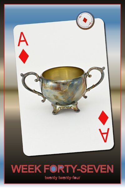
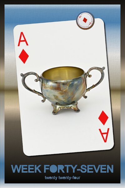
Week 47 I might be early for this, it's really busy week at work with many extra jobs so I'm trying to get a head of the game. This was a surprise one for me. It came together very quickly and was born out of making a mistake and running with it. I chose a gradient and forgot to check if 'use all layers' box was unchecked. When I flood filled it only filled the middle portion (inside of the frame). I thought it would be cool to invert the gradient and flood fill a new layer. I stretched the top of the new layer to get the lines to line up. I didn't know what color to make the font and the outline and parts of the vector were cutout from the mistaken flood filled layer. I hid the Vector layer and this is the result. I added the blinds texture to the outside (you can see it in the cut out vector parts too) and a texture to the inside of the frame. My boo-boo, here is the week in the proper spot2 points
-
It takes a bit of time to unzip and organize into folders, but it's so much fun to explore!2 points
-
My budget is almost non-existent now. I have to resist and desist!2 points
-
2 points
-
I am pretty sure I have done this workshop before, but I always need refreshed. Hope I will have time to keep up with this workshop, since I really never got started on the last one I signed up for a couple of months ago.2 points
-
2 points
-
Z = Zoroastrian Funeral I won't go into detail about the traditions of it, but we needed something for "Z." Let's skip it next round. lol1 point
-
1 point
-
1 point
-
1 point
-
1 point
-
1 point
-
1 point
-
1 point
-
We skipped X... X =The letter X...The letter “X” and the letter “P” are sometimes engraved together, or overlapping, on a gravestone. These are the first two letters of Jesus Christ’s name from the Greek alphabet, Chi (X) and Rho (p). This is called the Chi-Rho Cross.1 point
-
1 point
-
1 point
















Resized.thumb.jpg.d25811db03a63358cedab1e79f527635.jpg)