Leaderboard
Popular Content
Showing content with the highest reputation on 09/25/2024 in all areas
-
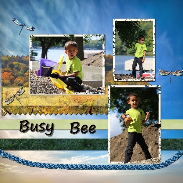
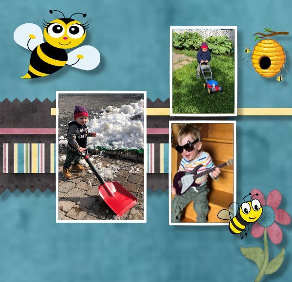
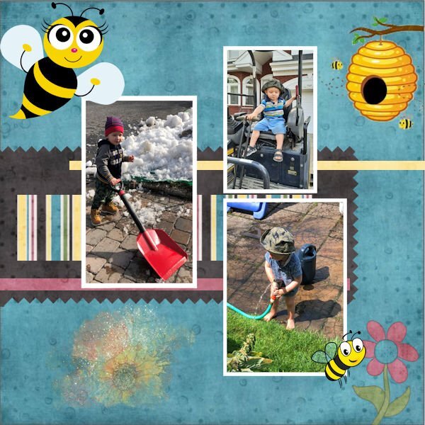
This was my fourth attempt to finish this assignment. When I went to the file folder to find and add the next element, it would shut the program down. After the 3rd time, I ended up restarting the computer. Finally, it went pretty quickly/smoothly and I finished. If you can check out the frames on each of the photos, you can see that it is not a solid frame. Using the flood tool, I had to click each spot to get the white to attach, and as you can see, the white still did not fill in on all the spots. Not sure why this happened, but it was consistent thru all 3 prior attempts as well. But in the end, I liked the camo effect so didn't mind that it didn't work as it should have. My grandson will love that I did this assignment for him.8 points
-
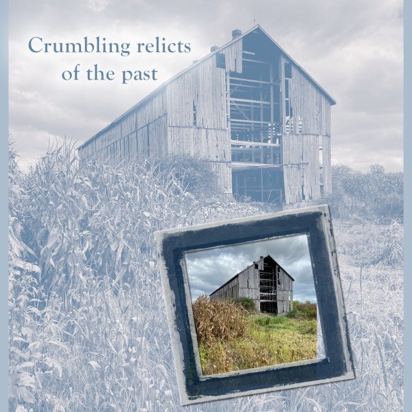
I made a "road trip" this week (unexpectedly) and ended up in a county (Ontario) to the east which is predominantly agricultural. I passed an old barn which was set in the middle of corn fields with only a rutted track to get to it. On the way back, I had to stop and try the track (which was, fortunately, dry) and get some pix. I have always loved old barns. They are a throwback to an earlier age of settlement (here in Canada) that speaks to the richness of community despite the distances. Men and women gathered to help new neighbours in a "barn raiser" that took not much more than one day of labour by everyone involved. Most of them are now gone, but occasionally a real remnant can be found. The background image is treated as Sepia Effect with an Overlay blend against the blue background. The frame on the colour image is from ET Designs.7 points
-
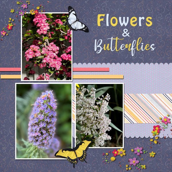
Project #4 I continue to use my photos from California and to me it is amazing to see the wide variety of flowers there when I take a stroll through the neighborhood where my family lives. All the papers are from Rachel M Hailey; the butterflies are from the Meadow bundle by Jessica Dunn and the scatters from Marissa Lerin. The fonts are Impact and My Butterfly. No pinky shears for me, I like scallops more. I mirrored the layout from the lesson because my photos are more tilted to the right and this way is more pleasing to the eye, at least to mine. As always the most time goes to selecting the photos which is a pleasure!7 points
-
6 points
-
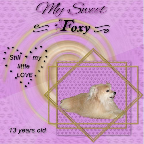
I have been wanting to use this photo I took of my Foxy and thought this was a good place to play with it. She is a rescue and they said she was a Yorkie-Pom mix. I call her the harry beast most of the time because she has the Pomeranian undercoat and sheds all the time. I am just glad she isn't the size of a Great Dane. Oh well, I still love her to death.6 points
-
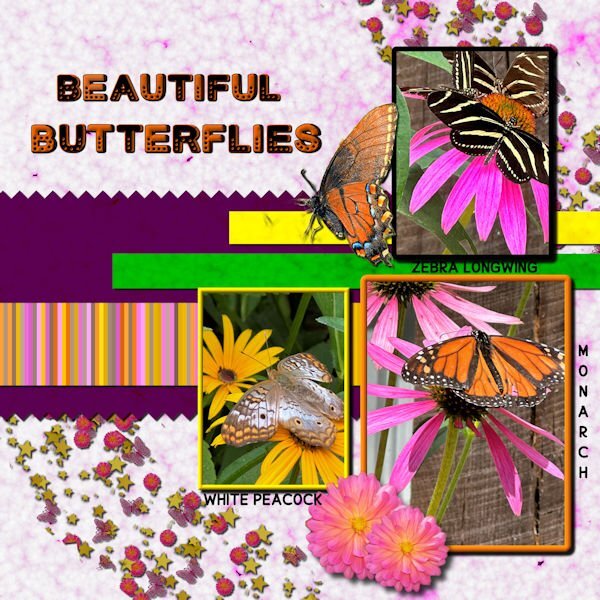
Day 6 I've used bees in the past, so this time I switched to butterflies. All of the butterfly photos were taken by me at a beautiful butterfly house. The single monarch is an extraction from a photo sent to me by my grandson. I made the background papers using FF and changing the colors for the papers. The stripes were made with cass stripe 2. I made the scatters using cass script scattered elements. The stars, flowers and butterflies were from my kits. The font is Cute Dots from CF.6 points
-
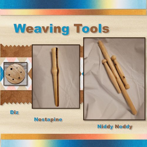
Here is my Project 4. I used some pictures of Weaving tools that I turned this summer. I am not a weaver, but I belong to an organization that has Woodturners, Weavers/Spinners and Gourd Artists so we cross paths quite a bit. Most of the papers I used came from DigitalScrapbook.com (formerly Pixel Scrapper).6 points
-
Project 4. Background started out as an internet image for Flamingo Wallpaper you can purchase for your home (in what room would you put that LOL???) which I completely transformed to make a pattern for my paper. Butterflies were from ps_elif-sahin, watermelon heart from Janet Kemp, Barcode from Marisa Larin, the striped ribbon was modified from one got from Flolinette-PBS, the other I can't remember but it was modified and originally from digitalscrapbook.com. The dragonfly, I found on the internet.6 points
-
5 points
-
5 points
-
5 points
-
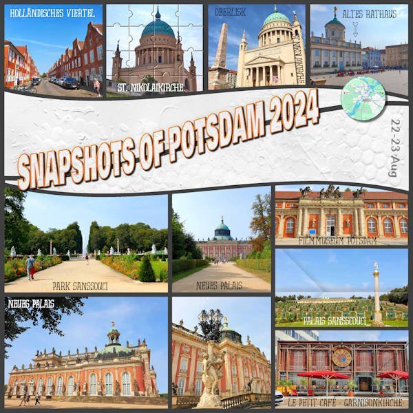
This layout is from the trip we did in August, the first stop. This city has many places to visit, but we only stayed there for two nights, so there are plenty of things to see if we ever go back. Credits: Template by Scrapping with Liz SwL_SimplePhotosandWavesTemplate1 Paper – Lilypad – Mommyish - JustJaimee-jj-CU-GessoTextures-1 Cassel’s Tutorials: Folded Photo Puzzle Flair Button Fonts: Evertone one / Bowlby One SC / Dessert Menu Sans4 points
-
Day 7 - Project 3 The papers and flower are from a mini kit by Marjan De With that I obtained in the Nov 2018 Blog Train. I made the scatter using Cassel's Punch Confetti script. For the glitter, I took a maroon glitter paper from Marisa Lerin, added a layer on top with the foreground/background gradient using the maroon and green from the papers, and changed the blend mode to Hue. The title font is Romantic Crafty and the text font is Segoe Print.4 points
-
Happy Birthday month to you, @Bonnie Ballentine. You have wonderful friends who celebrate you. What more can you ask for?4 points
-
4 points
-
The more celebrations and the longer they go on, the better!4 points
-
Thank you, Corrie. I celebrate all month and sometimes longer. You are not late. You're helping to extend the celebration!4 points
-
4 points
-
You made a great variation of the inked edges! Nice that you described how you did it.4 points
-
3 points
-
3 points
-
I had not heard of Katie Pertiet before. Her stuff is gorgeous! thanks for the mention Julie and Cristina3 points
-
Thank you, Mary. It is a pleasure and honor to join you.3 points
-
3 points
-
Thank you, Susan. I should have more time by the end of October. I had 4 birthday celebrations. It was great!3 points
-
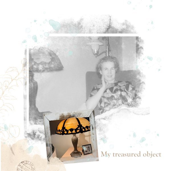
This lamp was bought by my mother during the early 50s at an auction sale. I always loved it and after she died I was able to bring it to my home where it has been for many years. I keep the photo of her with the lamp beside it. Several years ago I got to attend Antiques Roadshow in Detroit. I wanted to take the lamp to learn about it, but it was too heavy, too fragile, and too valuable to me, and it stayed home.3 points
-
I really liked the inked edges and found them and tried one. I don't know what embellishments you tried, but I used the magic wand on one set to inside-tolerance 70-not contgious -no feather--and was able to flood fill that selected area with a gradient and it worked OK. It did take a bit of playing around to get it to select just the colored part with no white on the inside. Here is one corner of it.3 points
-
Thank you and the description of the script says that it makes the broken effect on text or shapes! Well that instantly gave me the idea to use it on that paperclip after I had figured out how to use the clip.3 points
-
I also managed to get Day2 lesson done and my all time favorite sandwich is a BLT with lots of bacon and tomato on wheat toast. And no meal is complete around our house without dessert. ☺️3 points
-
Hello everyone,🖐️ now the hot, humid summer is over in Germany and I can sit back at the PC and relax. It was really a stressful time for us health-wise. But now things should get going again. I'm currently working on two private birthday cards and am practicing an online AI generator. Here is my latest scrap of it. I'm slowly running out of private photos that I can show publicly. @ Carol I'm really unhappy with the PSP 2023, would it be possible to exchange the program for an earlier version at Corel? I really want to be able to use the filters I've collected. Or is Corel planning to do an update? You're connected to the company and maybe you know more about it?2 points
-
Thanks Ann, and I always appreciate when someone catches my grammar/spelling bloops. However, the word "relict" does mean something left over, or a remnant. In old obituaries, the woman who died was often referred to as "relict of so-and-so" meaning the widow. But that raises another question. What I think now is that "from the past" might be redundant since "relict"connotes the past. Funny how semantics come into layouts, eh? But, as you say, it's easy to change in digital form.2 points
-
Thank youi, Ann! I love it here in the 80s...Excellent Eighties!2 points
-
Wow! Thank you, Michele! Yes, I am blessed with wonderful friendships!2 points
-
Happy Birthday, Bonnie, and welcome to the Excellent Eighties Club! I, too, celebrate the whole month of February, as birthdays were always super special in my family.2 points
-
That's really beautiful Julie. I too, love old barns.2 points
-
I also enjoy old barns. There's a TV show:Barnwood Builders follows Mark Bowe, whose West Virginia company purchases old barns and log cabins in order to reuse the hand-hewn logs in modern housebuilding. You might enjoy it. I think it is on HGTV or a channel like that. https://www.imdb.com/title/tt3286608/episodes/?year=20172 points
-
Thank you, Cristina. Thank you for the quote. I see its use in another layout!2 points
-
When I found KP I was smitten with her designs. She recently celebrated her 60th birthday with 60% off in her store. That was fun!2 points
-
I can't resist Bonnie....and your Layout "priceless"! The series is such fun to see.2 points
-
2 points
-
@Bonnie Ballentine I, too, want to wish you a wonderful birthday year. The 80's are good - welcome to the club. You still keep fit with the Pickleballl group so it should be smooth sailing.❤️2 points
-
I too want to wish you, probably to late, happy birthday! But as the saying is: Better late than never.2 points
-
I am much obliged. Please do scraplift it. I'd love to see how you'd use the technique.2 points
-
I already told you on FB that I may be "scraplifting" this idea; I love it so much.2 points
-
i like what you did with the flatware (metallic effect) and the addition of the napkin. I'm going to have to break out the tutorial(s) on creating metallic elements and practice on that until I can remember the steps without having to use notes or re-watch the videos.2 points
-
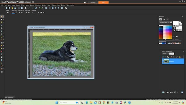
Hi everyone! I am so late getting started with this bootcamp, but I will try my best to keep up. Just finished Day 1 lesson. I have PSP Pro 2023 Ultimate and I prefer a dark gray background to work with and I always have the materials and layers palate available and just move them out of my way as needed. I have tried to teach myself how to use it & have a basic knowledge of some of it but I know I have a lot to learn. Looking forward to all the lessons. I have included a screenshot of how mine is set up with a photo of my very spoiled dog, Dozer.2 points
-
For my 80th birthday my friend, Michelle, came up and the 3 of us went to Skyland Drive. It was a fun day with good food, ice cream and the best of time spent with friends. Template from Lab 14-09. Word art from Creative Fabrica.2 points
-
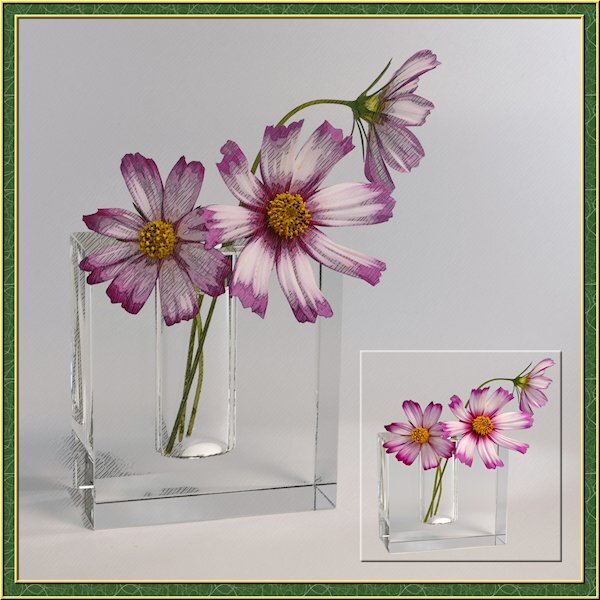
I've been busy lately with another project so this is a sparse layout from me. I needed a little PSP time so my brain could reset for the other project that I'm running into more challenges than expected. the little photo is framed with a cutout. I actually extracted the flowers and vase then made the selection around them and added the cutout. the good part was I didnt need to be perfect with the extraction as it blended in with the background. I got lucky on that. I also used the pencil sketch 2 script. I played with the opacity of the layers and used a mask to make the centre yellow part show through a little more. I turned on the photo layer that the sketch leaves intact to allow the the color to come through. maybe a little too much though.2 points
-
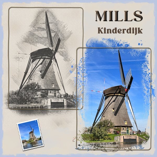
As soon as I read this back and front challenge I thought of the sketch made with cass-PencilSketch script of a windmill. Because the sketch is on a beige paper I made a background paper of the same colors to let the sketch blend in with the background. On the actual photo of that mill I used Jessica Dunn's mask for the June 2024 photomask challenge on digitalscrapbook.com. The postage-stamp is made with my own script and was already in my stash. Because the layout needed something extra I used an inked edge from Rachel M Hailey, she has a couple of them in different colors. It is a simple layout but when I tried some embellishments it didn't work.2 points
-
I just followed the memorial flight of the paratroopers today on the telly. Luckily the weather was great so the landings could take place as planned. There have been years that it had to be cancelled due to bad weather conditions, but not today.1 point


Resized.thumb.jpg.d25811db03a63358cedab1e79f527635.jpg)

