Leaderboard
Resized.thumb.jpg.d25811db03a63358cedab1e79f527635.jpg)


Popular Content
Showing content with the highest reputation on 05/28/2024 in all areas
-
Hi , here are my next 3 cards. card4 - gnomes from Creative Fabrica, font Magnolia Sky. card5 - kit tiny and mighty by Jen Yurko, font is Retro Love card6 - font is Starline, photo is mine card 4 card 5 card 610 points
-
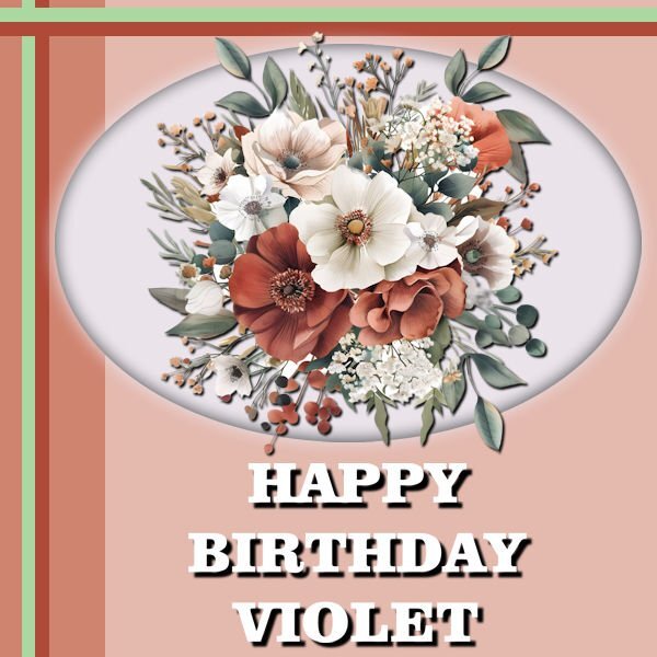
DAY 6 - A HAPPY BIRTHDAY CARD Just in time ... A friend's Mom is celebrating her birthday and I wanted to create something a bit special. The Flowers are from Creative Fabrica. The font used is called Clarendon Blk BT, I don't remember where I found it.
 9 points
 -
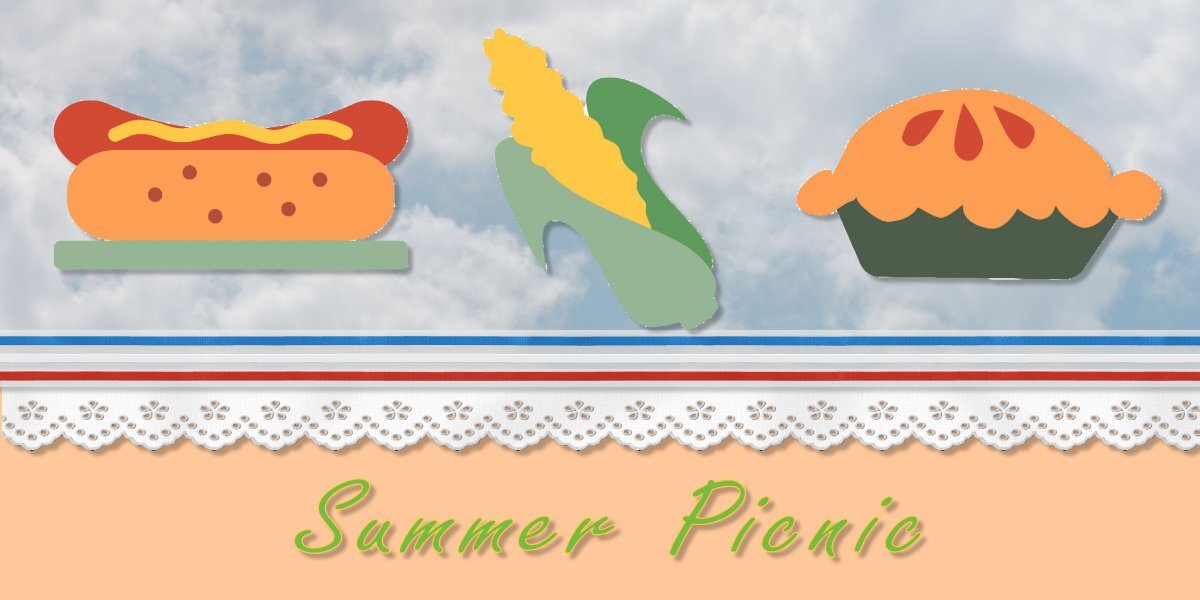
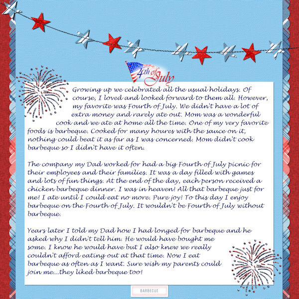
Here is my day 7 made with the Diamond template. I food items are from C F "Barbecue-Cookout-SVG-Clip-Art-69956312" The red white blue ribbon is cass-Bow16-Sample-Blue-White-Red-Ribbonfrom Cassel. The eyelet is from cass-Eyelet2-sample The font is Freestyle Script. The blue sky with cloud top paper if form a photo I took a couple of years ago. I had fun with this one, but can't say I had fun trying to do the envelope, but I finally got it done, hopefully right. I suspect I will never use either one though, but I at least wrote down the instructions on how to make one.
8 points
-
7 points
-
Here's my Day 4. The cute kitty is from CF and the font is Scoot Charrita which we got free from CF via Cassel's Big 10 Event a few years ago. I used Cass corner punch B-999-17 and erased the outer edge because I thought it resembled cat paws this way.7 points
-
Hello, here is my CardWorkshop-Card6 done with 2 photos from L'internaute and the ribbon designed by me.
7 points
-
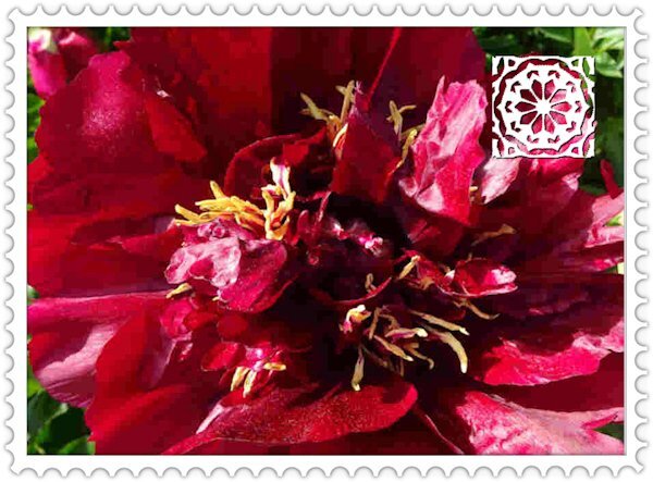
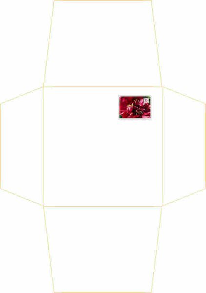
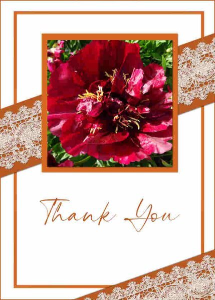
My previous Peony Stamp was a bit low res.
6 points
-
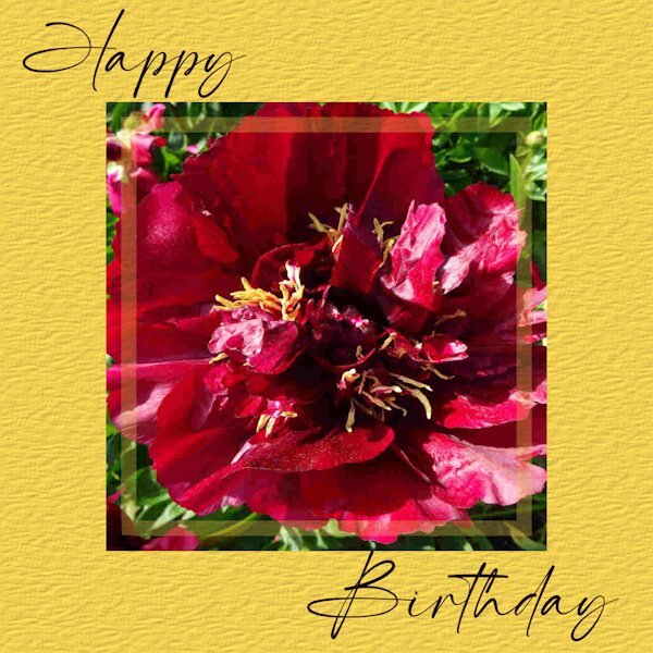
My print outs have come out at the right dimension so I thought I would do another version of a card with the matching envelope using the popular Scrapbook square format. This one is 11cm card but the max I can do with an envelope is 14.5cm square. This card will just have one fold. The peony photo is mine and the background has a 'Paper' effect (Effects/Texture/Paper. I have made a pretend postage stamp for the envelope. No royalty on this one but instead a Brush Tip 'FancyFlower' with a small inner bevel. The Selection border around had the perforations made with the Eraser tool, size:30, Steps 118. (note to self!)
6 points
-
Here is my CardWorkshop-Card7. The flowers come from the: Pandora Florals Kit from Creative Fabrica .
5 points
-
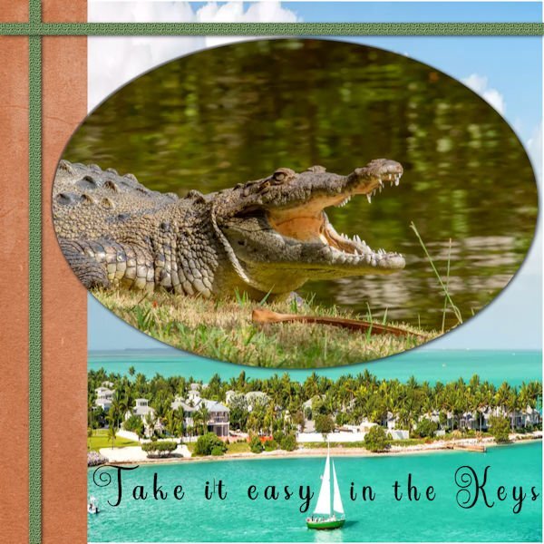
@Jeni Simpson Papyrus is definitely a traditional font to be used. @kasany Yes, a less ornate font is easier to read. @Michele Just a little trick if you want to add a link: link the text instead of adding the link separately, especially if it is a FB link as they are so long. @Julie Magerka Lovely cards for lovely people! @fiona cook Those dimensions SHOULD work. You just have to make sure that the printer you are using (if you are using at home) uses 300ppi. You might want to test it. @Doska St. Let me send you an email to check a few things to help with the freeze, ok? @MoniqueN. This shadow effect is great and it does give the impression of a thicker paper. @Donna Sillia When you want to create just an arc, the easiest way is to make three points: beginning, middle, and end, and change the nodes to Symmetric. Don't even try to make it freehand. It is a nightmare! 😉 @Louyse Toupin As I was scrolling to your card and saw the croc, I was wondering what kind of greeting card you were making, until I read it! @Anja Pelzer Those black gnomes stand out on the red/pink card. Great choice. @Randy Maybe that font is standard? I know I have it too and use it regularly. @Anne Lamp Who knows when you might use one of those in the future? If you don't use those, you might create new ones! Now, it is the last "daily post for me. If you encounter any issue, don't hesitate to post and I will respond (I get a notification for every single post in the forum!) Also, remember to fill out the survey about this workshop! I find it interesting that some registrants have filled out the survey but never posted any of their projects. But that is ok. Maybe some are uncomfortable posting their projects. Keep them coming if you are not finished.5 points
-
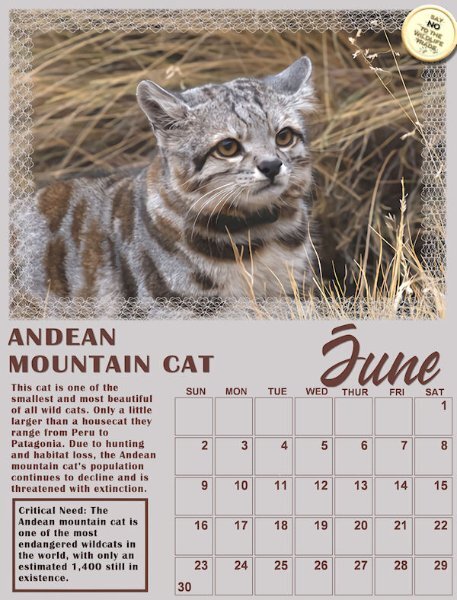
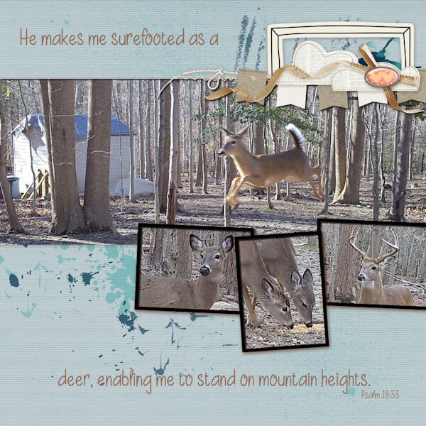
Well, I've been working on my wild cat calendar for June so I thought I'd show it off as it has been created in May. I'll post it full size on Facebook so it can be printed @ 8.5 x 11 inches. I used a cass template from last year's calendar workshop. Introducing the critically endangered beautiful little Andean Mountain Cat from South America. The fonts are Wakanda for the June title and Britannia Bold for the rest. I love his little white moustache!
4 points
-
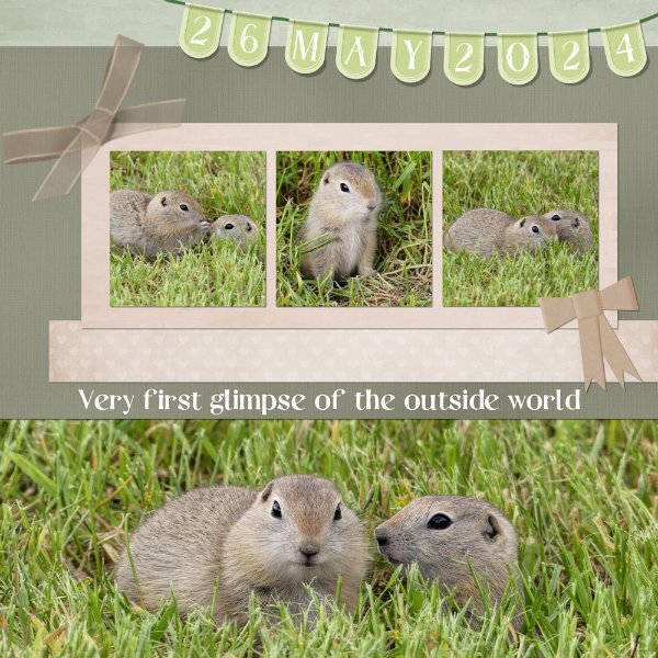
After reading the latest blog post about using a split page, I downloaded one of the templates, and came up with this. Organza ribbon, (used Carole's bow script), paper bow. Banner from the masterclass. I was fortunate enough yesterday to witness these two 5-6 week old ground squirrels emerge from their undergound nursery for the very first time. They were so tiny, one would fit comfortably in the palm of my hand. Unfortunately, that wasn't likey to happen.
4 points
-
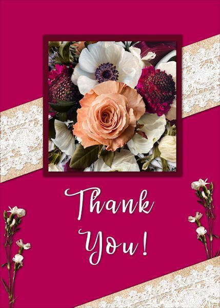
A get well soon card. Flowers are formCreative Fabrica, font I don't remember. The paper and the stripes are meant to be printed, the rest is thick paper 🙂
4 points
-
I created the card with my peony photo as a 5"x7" 1500x2100 and decided to set the envelope up to suit UK A4 standard size so I can use it for future. A4 210x297mm = 8.3"x11.7"". In pixels (8.3x300dpi) 2490 x3510. I hope I have understood this. The envelope (not shown) was a little clunky where I had applied the Pic tool Perspective scale on the flaps so I might redo that. I also liked the idea of printing a design on the envelope or maybe a pretend stamp. The font on card is The Billion. Loved the lace. So pretty.
4 points
-
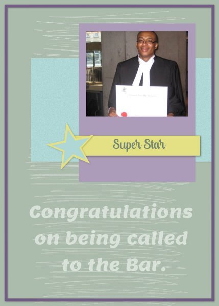
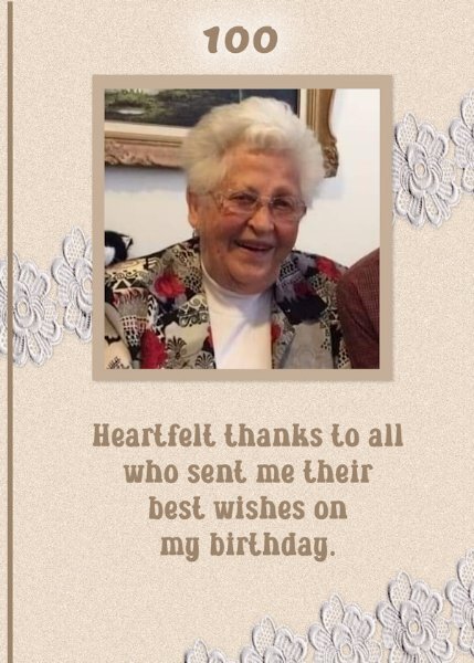
Lessons 6 (extra template) & 7 The grad pic is actually a former college student of mine who went on to law school and invited me to his call to the bar. The 100th birthday pic is a former teacher of mine who celebrated that milestone a couple of years ago and is still with us. She did get many greetings and cards for that occasion.
4 points
-
I like how you have the flowers "spilling over" the oval.3 points
-
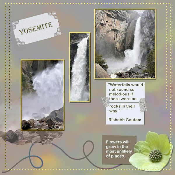
A bit late but I had so many other things to do first, like the card workshop and the photo album about my trip. Both are finished now, my album is at the print service and they estimate it will be ready on Saturday. I like the DIY challenges so I did this about the visit to Yosemite National Park. The waterfalls were spectacular because in Spring they carry a lot of water from the melting snow. The background is a full size photo of one of the falls with a heavy blur and the blendmode color, the paper underneath was a muted green. On the rectangle with the word Yosemite I used a holiday punch from Carole because when I was there we had snow as well as rain and sunshine. The 2 smaller rectangles are papers glued together with some washi tape by Marissa Lerin which I have in my stash. I gave the dots a color and a slight bevel.
2 points
-
Oh, they are adorable.2 points
-
I think you are twins...I have a hard time telling you apart...🤣 You both have a hat on and you both wear glasses, totally twins!2 points
-
Carole it already is such an old logo! It is approximately 20 years but I like it and all my family and friends always look for it on the back of my cards. I only change it for X-mas.2 points
-
Actually, I did use Text on a path, but my path was wonky. I remade it using a path that more closely followed the line on the banner.
2 points
-
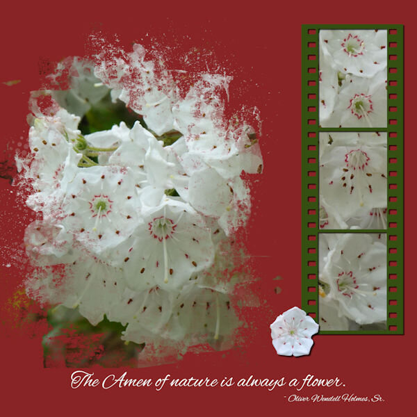
Once again, the Mountain Laurel is having a bountiful year. Template 221 by Lady 22.2 points
-
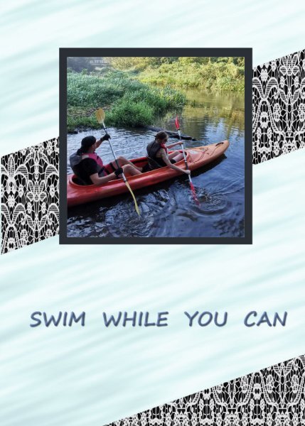
L7. Card7. Shot --kayaking,
2 points
-
Chantalia Designs has a gorgeous vintage collection today. Her site is always free. https://l.facebook.com/l.php?u=https%3A%2F%2Fchantahliadesign.com%2F%3Fs%3DVintage%20Magnolias%26post_type%3Dproduct%26fbclid%3DIwZXh0bgNhZW0CMTAAAR1hK0OUNStC2ntLzs2SGEIM34-386gqoG19G0lJgIS5VSUJ-Q2PnJ8Uqzg_aem_AZ3Exa0uT_lwYA94uH59NW0GgYKh4heAZuvZjxDarYG6b9ppfwnHjrXKfiEHKuB0U6366_eh_1WAvCXrAUQNWCQt&h=AT3uUORnnhicTQ8jwBmSay1lAJPTWNXAjCHc0nUn7jTzG4CAU2WUcmJjNISQDoWVyJcu0-cD5IYqaO0MgXzk52vMudX-xFXc8muSZ1sq-_NP_jERNScliCReGkBsW2D8PCBQ&__tn__=-UK-R&c[0]=AT04vSuDxnR1FxSFR6TdV42WfdbpCe88yy_mAPmJsYgH9WfXK3bGVzxZaVTd46Zt897k4wJC-3Jq2rDXrUsBNItwCmHpQp4axOSo40HnWfC4RUzSvz0PZWSX28yE6L7xBWOBqqJnwxLx7ztYi6oY1ppCH31zz6k-ywtlKYs_YnWthBj_5jCmML9yzF_oKs6O2 points
-
Corrected L.6, Card6.
2 points
-
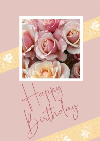
Card 7, at last. I wanted this card to be softer and more feminine than others I have completed. I chose a photograph I took many years ago of a rose bush, although just the roses, I wanted a bouquet-ish look. The ribbon comes from Melo Vrijhof of Digital Scrapbook. This was colourised to match the lemon coloured rose at the bottom of the photograph, using Adjust > Hue and Saturation > Hue Map, something I had never noticed before, thank you, Carole. The font I used is one of my favourites, Romantically Free for personal by maisfontes. I angled it to fit in line with the ribbon without having to reduce to too small a size, and, I think, it works on the angle. Jeni
2 points
-
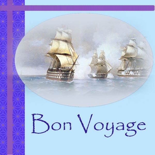
Card 6 at last. I found this beautiful tube of ships at sea and thought of all my ancestors who travelled to New Zealand from various ports around the world, so thought to wish them all Bon Voyage on their 2-3 month journeys. I used a font I have always loved, Papyrus. It has been around forever, and I love the beauty of this font. I added a light drop shadow to the ellipse of the image because it was a soft tube. Jeni
2 points
-
From the album: Bonnie B
1 point -
@CasselIt was a watercolor picture and came out like this, I also loved it the way it turned out 🙂1 point
-
1 point
-
And here is my take on number 7
1 point
-
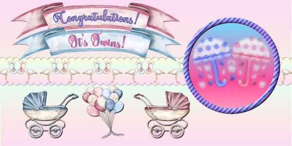
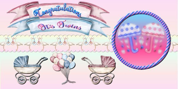
Day 5 - I'm running behind this week. All the images are from Creative Fabrica except for the umbrellas which I made a long time ago and which I made into watercolors using casswatercolor script. Font is called Better Spring Font from CF. The circle design was made from Day 2 stripes lesson. The umbrellas were actually made for a very good friend who had just had twin grandaughter and grandson.
1 point
-
If this card would be in a shop, I would buy it 🙂1 point
-
Sweet girls! 🙂1 point
-
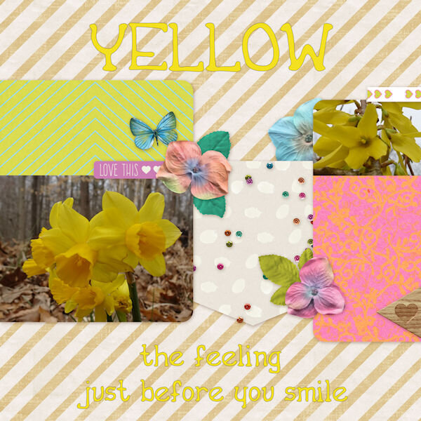
Day 3 Font is Victorian parlor The animals are from Creative fabrica
1 point
-
Lesson 7 Another favorite quote.1 point
-
I found the font. I Will be playing with different letters, along with other simillar fonts that I have. As if I don't have enough lace fonts, as I have all of Carole's. Nice to have something a little different. I agree the lace edging works really well with image.1 point
-
Following Mary Solaas's steps, I went back to the Labs tutorials. If I had kept the sequence where I left off, I would have used Lab11-Module11, but to fit my needs, I followed the techniques from Lab13-Module 2 (Corner Cut Shape & Double Arrow pattern). This is the first layout I created with an 8.5x11 size or, in this case, 11x8.5. I am still not sure which direction I'll take... I mentioned before that Lyn Grieveson, a designer from The Lilypad, started using 8x10 size (portrait orientation)... Carole has a post with good information about Different Sizes for Scrapbook Projects. Anyway, here is my layout and credits: Background paper - KAagard_Great Outdoors Pattern2 from the "Great Outdoors" kit by KAagard. Mask - Palvinka_HelloSpring_photomasks_2 from the "Hello Spring" kit by Palvinka... I like the Photomasks she designs... I used a Mask on top of the photo, which lowered the opacity a lot. Elements from the "Nature Walk" kit by DiHiller. Carole: Straight Pin & Pinned Paper techniques /// Datestamp#8 Script /// Decorative Stitches (cass-stitch-turkey) Font: High Notes
1 point
-
Thanks Sue. Another group I used to belong to a long time ago now had a tut on how to make a lace strip using this lovely font and that oval was just begging me to put something frilly on it. A single layer was a bit skimpy so I duplicated and mirrored it to fluff it up a bit.1 point
-
I hope I'm doing this right...this is my go at the first lesson.
1 point
-
Sue a lovely page and you were quick in making it! As usual you have set the bar pretty high. I like how you used the curly line and I'm glad with your remark about the the dashed lines. Stitching was what came into my mind as well, so I will happily discard that idea!1 point
-
From the album: Bonnie B
1 point -
From the album: Bonnie B
1 point -
1 point
-
1 point
-
From the album: Bonnie B
1 point -
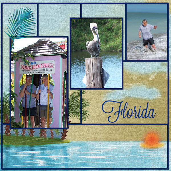
From the album: Cassel
1 point -
From the album: Rene's Album
Mask Workshop Day 1 February 2023 Papers and Elements from TLP Collab: Welcome1 point -

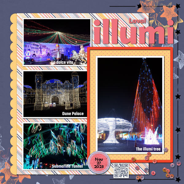
From the album: Cassel
Would be fun to do all those things!1 point