Leaderboard
Popular Content
Showing content with the highest reputation on 03/16/2024 in all areas
-
9 points
-
8 points
-
8 points
-
This picture brings back memories of days playing in the mud. I did the background in CorelDraw.8 points
-
And a second project 2 for day 5 @Cassel. Myriad on my NEW haiku. Graphics myself, Marisa Lerin, Sharon Dewi Stolp,8 points
-
Project #2 I had a bit of a problem to get the right color for the background but in the end I settled for this dark color as a contrast for the others. The photos I have for this church are not great, they were done 16 years ago with a simple camera. So instead of my own I found a nice one on the internet to use. The clock and the flowers come both from digitalscrapbook.com and the background papers are by Marissa Lerin. Fonts are Berlin and Lucinda calligraphy.8 points
-
7 points
-
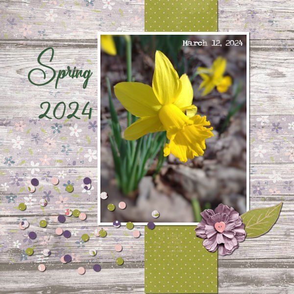
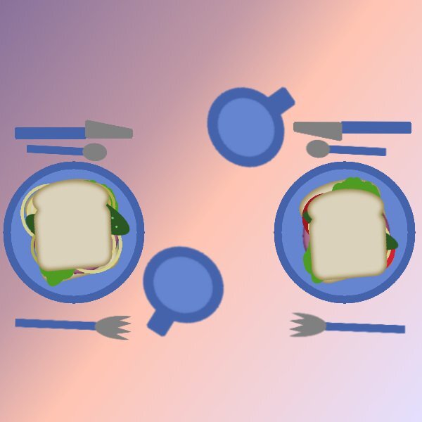
Never again will I sign up for a workshop scheduled for the week after DST! I have slept all week! My sandwich and project 1: My daffodils began blooming last week. A friend suggested I feed them which I did today. I have one bunch that volunteered in my yard. Last week I noticed some blooming in the woods so yesterday I marked them so I could dig them when the green died back and plant them in the yard for next Spring. Today I went to feed them also and found another 10 or more bunches than I had not marked. It's raining now but when the rain is gone, I have more marking to do...and I will have a bunch of digging to do later! I created both papers for my daff page. Wordart, scatter and stickers are by Melo Vrijhof at Digital Scrapbooking.7 points
-
6 points
-
@Cassel: Just to make sure, here is a second Project 0ne. Would not want to miss the entry... 💕Supplies myself and Jen Maddock, fonts are Qiara on title and Myriad Pro on my NEW haiku.6 points
-
Here is page three of my '7 stocks' micro project- Four more to go. TFL! These pages I'm sharing here are the right pages of a spread , the left ones will either have typography, photos or a mix of both and maybe a list of dishes that those stocks are to be used in. Fonts are again Pacifico on title and Lato on body. Supplies myself.6 points
-
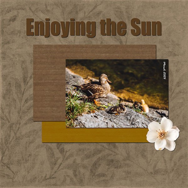
Day 5, Project 2. While I was walking in the woods looking for daffodils I met this lovely lady. She was in a group of 6 or 7. Although she is on alert, she did not appear to be too concerned.5 points
-
5 points
-
It's the computer mischief fairies at work. Simply stunning layout and such an incredible photo, so incredible it deserved to be shown twice! I think you are a nature magnet....I think the porcupine is thinking the same thing...."I am incredibly privileged to be photographed by Sue Thomas, I've been waiting weeks for this day". All kidding aside. You put in a lot of work and you get the rewards for it. Best payday ever, eh? PS. I was so proud of how less word-y I was on the original post...and here I am blabbering away ruining my good intentions of less talk.5 points
-
4 points
-
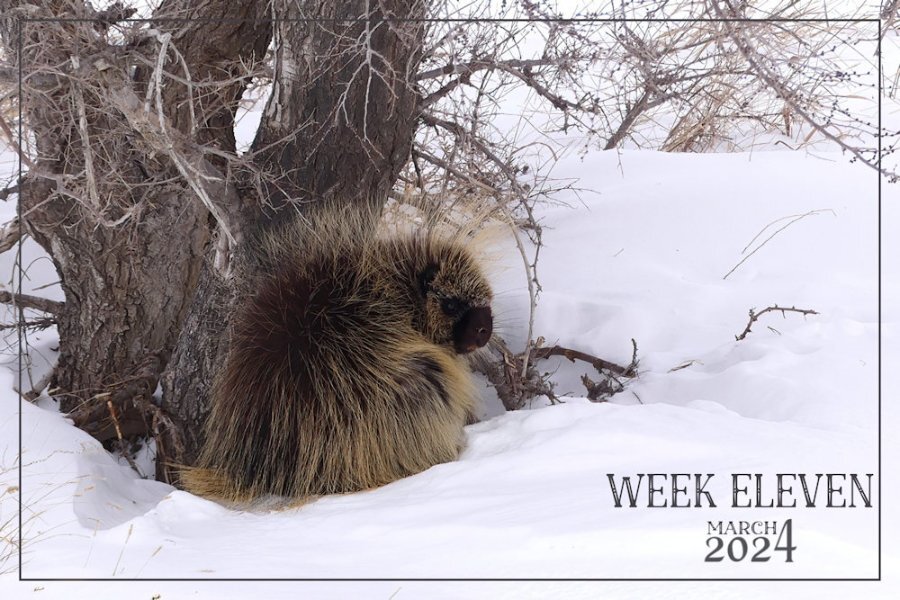
Here is my week eleven. Doing this challenge really does make you realize how quickly the weeks simply fly by. Saturday is the start of a new week for me. I was quite privileged, and awe inspiring to be allowed to get fairly close to this big procupine. (Danielson Park, trail hiking) I didn't feel threateneed by it, as it didn't display any signs of being threatened itself. AS they will retraet up a tree rather than attack. As it was feeding on bark and twigs. They have a more varied diet during the summer months. They have such tiny eyes for its size.4 points
-
3 points
-
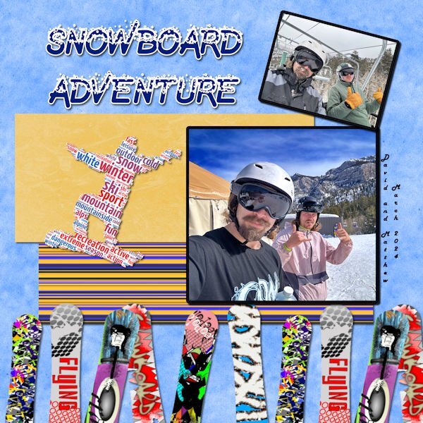
Day 5 - It's Spring Break, and my grandson's are indulging in one of their favorite sports--Snowboarding. David just sent me the photos. I made the background using casssnowtexture script with a modification to the color. The striped paper is from cassstripes2 script. The snowboards and the snowboard word art is from Canva. The font is Undercover Snow from Creative Fabrica.3 points
-
2 points
-
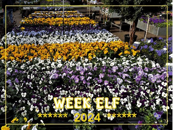
WEEK-11: This week we had a couple of very fine spring days and we were visiting a nursery in a nearby village where we go quite often. They have a nice place to sit with something to drink/eat as well and outside they have at the moment so many plants in stock that I couldn't help myself and made a couple of photos from the big display of pansies. Of course we took some home with us and they are now on the garden table where we can see them from the livingroom.2 points
-
I am really appreciative of your words, whether you are babbling, or short and to the point. I never know what I'm going to find. I always have my wits about me. Constanly looking, listening, treading lightly. The rewards can be immence.2 points
-
2 points
-
2 points
-
So this is my Project 2. I tried to recall what you taught us in the mask ws @Cassel. Supplies myself. I used eyecandy for the shadows, as always. Fonts are Sugared Lemons on my NEW poem and Rustic Pantry on title, Quicksand on gardening text. I put a gradient overlay on the left page to make a book-ish look.2 points
-
Hey y'all, I'm here too....I'm just slow. I have done Bootcamp a couple of times. It is always a good 'refresh' for me. I will be using 2019. I like a medium gray workspace, and dark gray background. I don't know what photos I will be using. I had some major surgery Feb 22. When I signed up for Bootcamp, I knew it would be during 'recovery time' for me, but I didn't realize how slow recovery would really be, and how limited I would be physically. I am seeing signs of spring out my window, so I may look for photos of spring to use.2 points
-
2 points
-
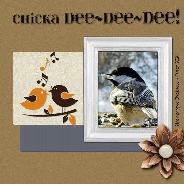
The next Bootcamp layout features one of my favorite little birds. They visit when I'm out filling their feeders and impatiently scold me. Their voice is high-pitched and metallic sounding. They fly back and forth from trees across the street for one seed at a time, making them very busy, indeed. The title font is "itsadzokes01." The side font is "Before the Rainbow." The photo is by Joan Diamond. The cartoon birds are from Dreamstime. The wood flower is from the kit - cpjess-wildwood thicket.2 points
-
2 points
-
Carole's border and page punches, along with her fancy fonts, really don't need any introduction. For the date I created a wooden token. As for the hedgehog I went with a semi watercolour effect. Frame and mask my own. Whilst home with the little girls, I would take them up Badgers lane, once at the top the view is spectacular. They would take their magnifying glasses, I spy insect book, and magnifying insect jars. Needless to say I got those for them. We would turn over stones, to see what was underneath. On one occassion we saw this Hedgehog. Of course I had my camera with me.2 points
-
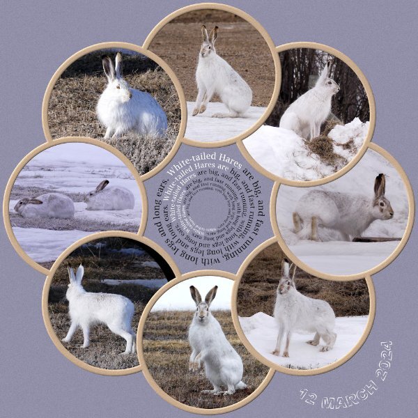
As you can see I've had a superb day outside, being entertained by 6 hares. At home we have a saying Mad March Hares. They aren't mad at all, instead it's the courting behaviour of mating hares. They spent the day, running up, down, over and around the snowbanks in the yard and out in the stubble, chasing one another. Mating suitors.2 points
-
1 point
-
Great work, @bina greene I agree with what you say on the culinary pages, and keep most of those ingredients in my pantry. I love pomegranate molasses and add that to stews and casseroles. Pizza is never the same without anchovies and I tend to add olives and capers as well. I love the background on your souvenirs page. and your layouts all work well.1 point
-
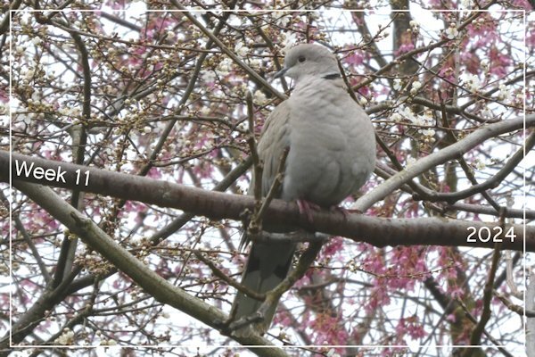
Luckily we are getting some sunny days now, everybody over here is fed up with all that rain and gloomy weather! Not only in the garden centers but outside the flowers are coming now! So hopefully I can show some in the coming weeks. This afternoon I went for a stroll and I haven't got far, because I have taken a couple of shot of the prunus trees that are springing into life! I know about the character elf, also in the elf from the shelf book!1 point
-
1 point
-
Once you resized to 600 pixels, the size of the jog might depend on a variety of factors. In recent PSP versions, the compression can be set when you Save as... but in older versions, you would need the optimizer to adjust it. Maybe you had previously used the Optimizer and set the compression lower for some reasons, and the next time you used the Save as... it just remembered that setting. Check next time if you have a correct filesize, if it remembers your recent setting.1 point
-
1 point
-
My best friend (since I was 12) is moving to Nairn, Scotland inJune. She is looking forward to seeing/learning about all the flora and fauna of her new area. How lucky to see these in the wild.1 point
-
As I've mentioned (ad nauseam, I'm sure) the game I do these pics for has been repeating themes from a long time ago so I've just been tweaking the originals. Today I took the time to create a new one. The upside-down leprechaun stuck in his pot of gold is a freebie from DitzBlitz. I used several papers for the BG at different opacities including a couple from Janet Kemp's the-lucky-one bundle (PS/DS). The posers are my avatar from the game and the font is Celtic Knots, free from Fontspace.1 point
-
Cassel: Good question! I threw the dice and let the program show me a selection therefore I have no idea what I used! 😉1 point
-
Thank you for the kind words. The intention was to keep the flow of circles, including the date.1 point
-
Besides stunning photos I like the idea of having the text in e circle to match the photo circles!1 point
-
Creating and using masks has opened a door for you. Taking your creativity to a whole new level.1 point
-
1 point
-
1 point
-
Here is a second page for the culinary project. Each stock has their own page... instead of putting two or more on one layout. Fonts Lato and Pacifico1 point
-
One of my pickleball players gave me daffodils on Friday. Last year she gave me several bunches but this year she gave me a huge bunch all at one time. Template is from Lab 14-03. I created the plaid background using the daff that is in the center. My small bunch of daffs are blooming but they are not very pretty. Rosemary says I need to feed them...they volunteered...I never thought to feed them. I have found several bunches volunteering in the woods. I hope to dig them after the green dies, store them in a cool dry place and plant them next September. They need feeding also. Maybe next Spring I will have a nice display...fingers crossed!1 point
-
Fabulous pages @Ann Seber. TFS!!! 💕 I have a sort of culinary book going at the moment, Graphics myself, fonts Pacifico and Lato. see here https://imgur.com/a/xL7mbzw The second one is from a daily project with papers I made for a designer challenge at DS, the 3rd one is from an album on the Paris arrondissements (here the 4th), and the last one is from my recent trip to Barcelona..1 point





Resized.thumb.jpg.d25811db03a63358cedab1e79f527635.jpg)








.jpg.48e47647f2803f6afd893725cdae7a2a.jpg)
