Leaderboard


Popular Content
Showing content with the highest reputation on 02/16/2024 in all areas
-
Day 4...an old photo...blast from the past. There is a "Tank Farm" nearby. Old military equipment is restored there by volunteers. Once a year, they bring out everything to display to the public. They even fire the big guns a couple of times. Somehow, I lost my photos of the tanks, etc. A friend took this one of the motorcycle and sidecar.13 points
-
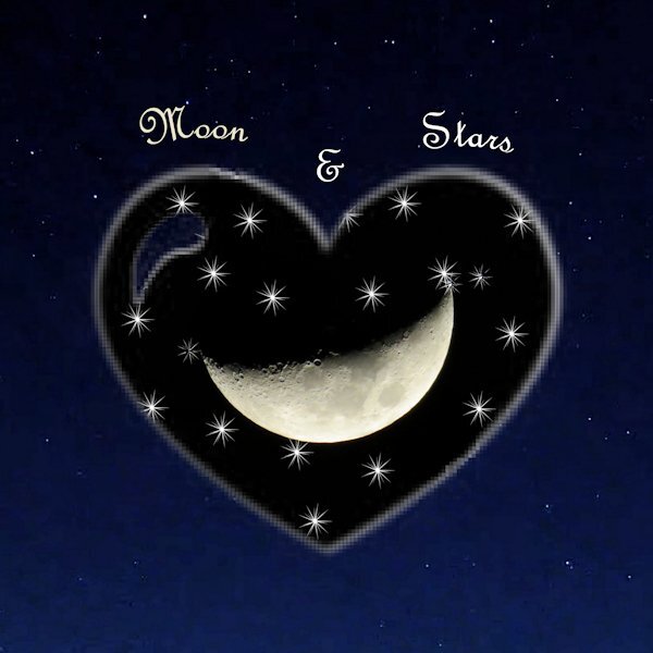
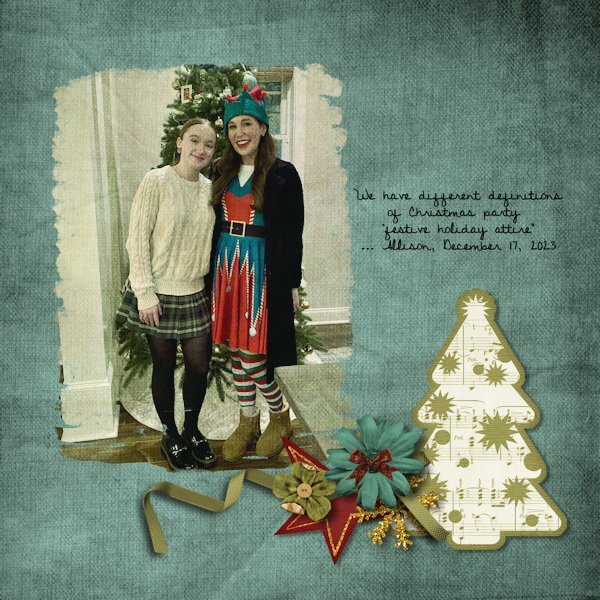
My day 5. I did something different. I used a heart brush set to white on the mask and also star shaped brush. I then used the same heart brush set to white on a new layer and put it behind the mask group to make it show up better because it was on the dark background. The moon pick is mine. The background paper was created from a screenshot taken on an Explore.com live cam. It is so much fun to play play play.
 10 points
 -
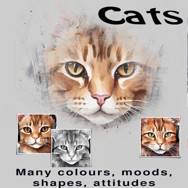
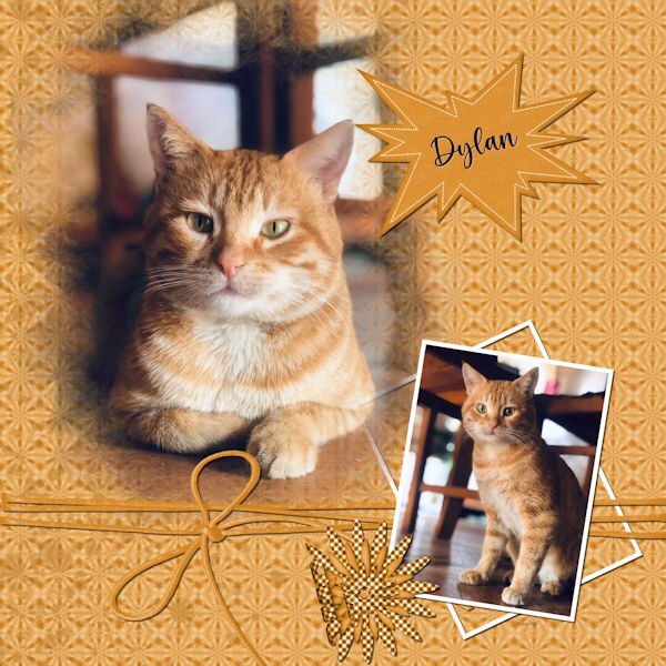
Day 1 - Yes, I am just getting started. The pictures are from Creative Fabrica. I saved the full size image also as pspimage as I should be able to change the pictures and add things as I want. For the short term, there is a family member who loves cats and I am thinking of changing the cat pictures to actual pictures. Thank you to all who are sharing their creations.
10 points
-
10 points
-
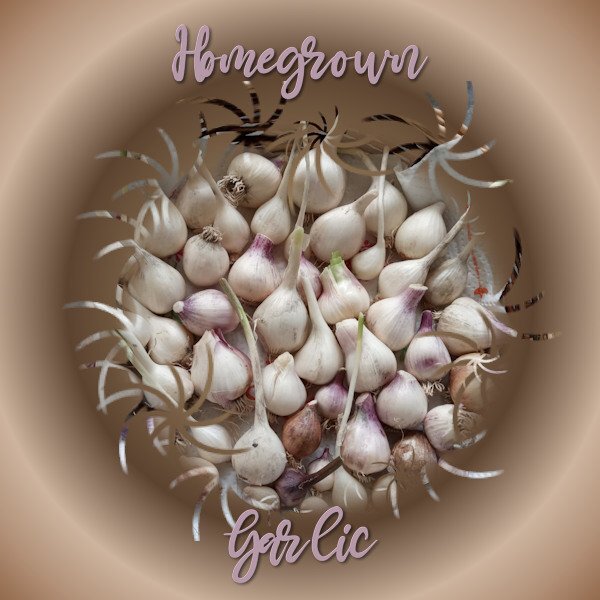
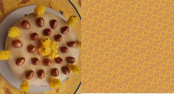
Lesson 5. I made a kaleidoscope pattern originally to use with my garlic photo but it didn't suit it. I was so fascinated though with the way the colours and shape from my original photo of an Easter cake worked in the pattern, I saved it for viewing. For my garlic photo: Brush tip ' Twirly Star. Text: Mama with white inner bevel and black shadow. Off to make my dinner now. Looking at garlic has made me hungry.
9 points
-
Good evening, phew, I don't understand why working in the layers is so complicated in PSP? In PI and PS you can work with each individual level separately. I don't understand what "floating" means and why you should constantly move a layer somewhere in between. That's when you get on your nerves. I was able to easily insert and edit the small photos in PI as a PSD file. I hope that the end result should look like this. Titel: Girls & Horses8 points
-
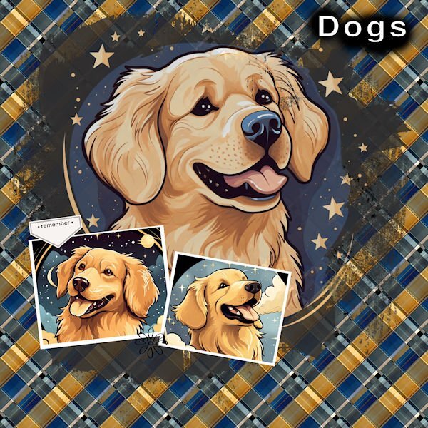
Day 2 I really like what the background has done. It looks really nice. Thank you, Carole, for the turorial.. The Dog images are from Creative Fabrica.
8 points
-
now here is my day 4 , font is Arnold Story8 points
-
my day 3 fonts are Arnold Story and Handwriting8 points
-
DAY 3 Template: Lady22 (lady22.eklablog.com) - Butterfly: Janet Kemp (Digitalscrapbook) - Cluster: Jessica Dunn (Digitalscrapbook) - Wordart: Freebie (Creativefabrica) The kaleidoscope patterns were always overpowering, so I solved it this way.7 points
-
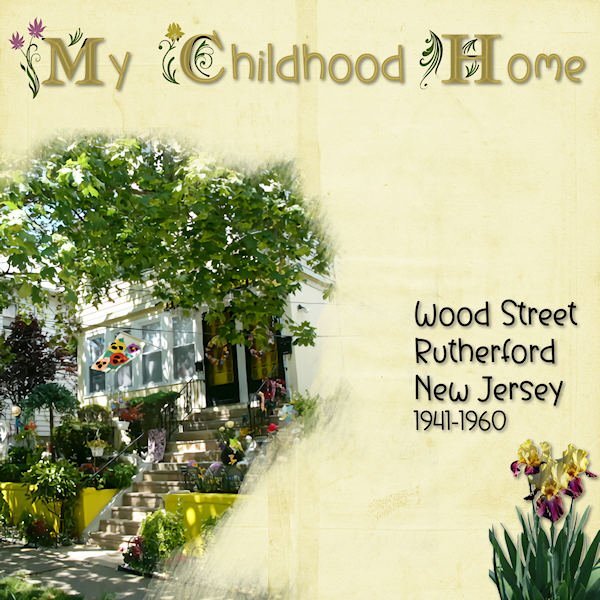
LESSON FOUR - MY CHILDHOOD HOME - I didn't get to do this in January so I used it for this mask lesson. The title fonts are am_intex for the decorated ones and Before the Rainbow for the san-serifs, treated with an inner bevel and shadowing. I found the bearded iris with Google Images and removed the background. The background paper is from Circle of Life mega kit.
7 points
-
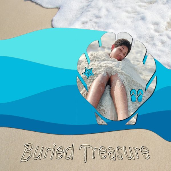
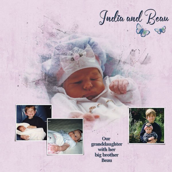
Day 5. The mask was made using Summer Punches from Cassel. The waves were made using the Waving script, also from Cassel. The beach background is from Pixabay. I used the Sand Writing tutorial in the Campus to create the title. The "treasure" is my oldest great-nephew, Brelan who will be 16 in a couple of months.
7 points
-
Day 4. A very simple layout that has the mask in the right hand corner because that suited my photo best. The font is Better Brush and I used a greyish background with an inked edge. The only extra embellishment is a paint splash that is in my stash and recolored.
7 points
-
Day 4 - Am a bit behind but hope to finish 2 assignments today to catch up. I used a watercolor brush from Sweetpoison over at Deviant Art (they have such intriguing names there). It took a couple of tries to get it right and I did cheat by placing the photo to one edge. Then I got the bright idea of using another photo as a background paper. The background that was being masked out was a bit dark so it doesn't really blend that well with the background photo but at least I got the concept right, I think.
5 points
-
Lovely tribute to your Mother. She was a lovely lady. What you said about calling her on Mothere's day made me think about my Mother. My Oldest Sister would call her on her (my sister's) birthday and wish Mom a happy Mothers day. The first time Mom was confused and said it wasn't Mothers Day, and my Sis said well it was the first day you were a Mother. Sis did that for years.5 points
-
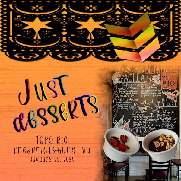
I am continuing with the amazing food the my daughter and I had in Fredericksburg at an Italian-Mexican fusion restaurant. One dessert is a goat cheese panna cotta and the other was a chocolate pot with hazelnuts. The background is actually a wood background that I made, but when I used the textile fill, this is how it came out. The pictures and the arrows are my own. The black border is from Creative Fabrica. The font is called "Los Pinata" from Creative Fabrica. I converted the text to curves as character shapes, duplicated them and now I can't remember the next steps, but I know that I did not use stroke. I guess I will have to keep experimenting and save my steps.
5 points
-
This one depicts random thoughts. If it needed a title, it would be My Mother's Day. Years ago, I started calling my mother on my birthday to thank her for being my mother. I called it My Mother's Day. When I moved back to Alabama to be with her, I would take her to dinner to celebrate (usually at a restaurant that gave a free dessert for my birthday!) This will be the first birthday without her. I may still go to a restaurant. After all, she wouldn't want me to miss out on a free dessert! The mask for my mother was made using a watercolor brush from Rikard Rodin. The raggedy edges and the gold from were made using Picture Frame in PSP.
5 points
-
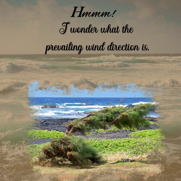
my Day 4 The photo was from the Black Sands Beach area on Hawaii Big Island. The background paper was adjusted from "Ocean-Water-Background-Digital-Paper-27720793 10 " I have no idea where that was downloaded from years ago.
5 points
-
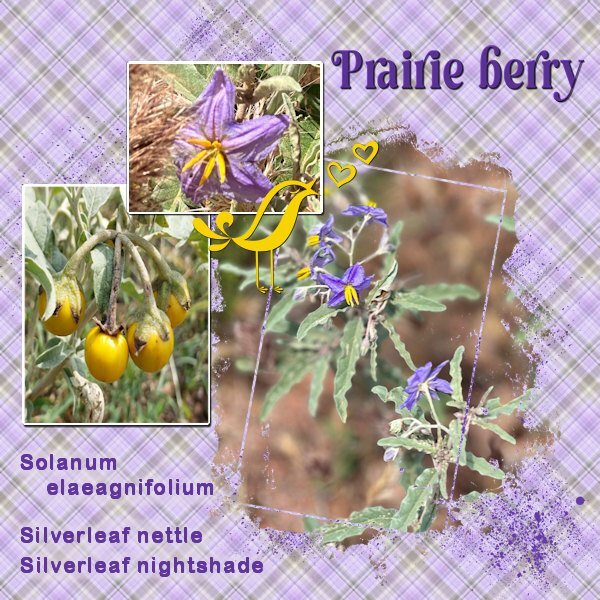
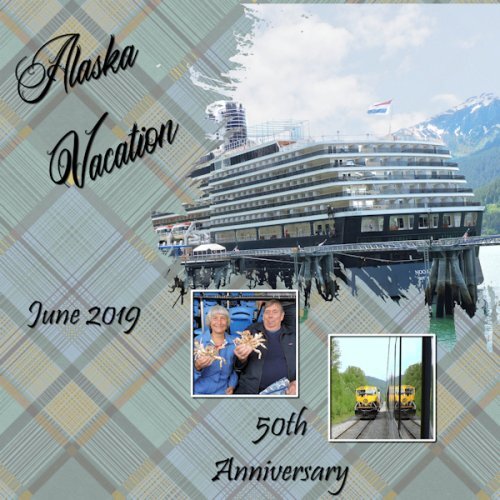
.... looking at this too often.. it seems. Plaid is by Jessica Dunn as is most of the rest, except a strip by Marisa Lerin and the frame mask by Rachel Martin. Fonts: Omnia, Pinky Funky5 points
-
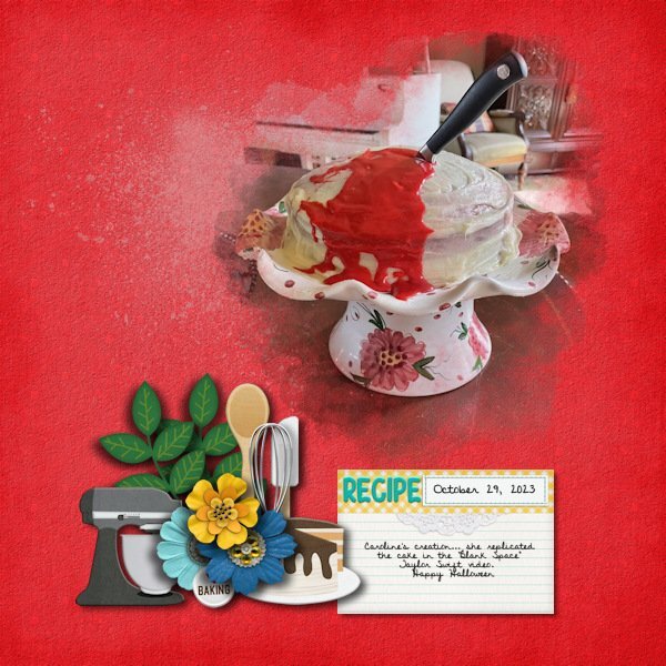
Day 4. I used a brush from the Brusheezy download, #21. It was a lot of trial and error since a part of the photo was very close to the edge and I kept getting the hard edge. I did a lot of fiddling with the size and jitter settings but finally got it. Kit used is called And Bake by Clever Monkey Graphics and is available at Sweet Shoppe. I again used the Discover Beauty font. A note about the cake. My cousin's granddaughter (age 12) has been cooking and baking for about 4 years. She has figured out how to bake using gluten free ingredients since her mother has 2 auto-immune diseases and can't have gluten. Essentially the whole family is eating gluten free in support of Mom. At the age of 10, she knew that she wanted to open a bakery specializing in gluten-free items. And, sweet Caroline is a big fan of Taylor Swift thus this cake!
5 points
-
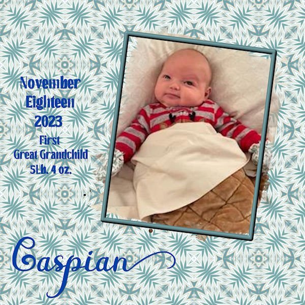
Lesson 3 My first Great Grandchild. Unfortunately the only photos I have are sent through messenger. The quality pretty much stinks. I just copied Carole's setup. The background was made according to lesson 3.
4 points
-
You make me hungry!!!!4 points
-
Day 2 again, Thanks Carole for pointing out my mistake with not replacing that placeholder with something else. I used a bird from the Escale Amoureuze kit but recolored it to yellow.
4 points
-
Love the moon pic and the stars leading to it.3 points
-
I added shadow to the text which I think makes it stand out better. After converting the text to character shapes and duplicating, I colored the bottom letters and then moved the top letters which kept black slightly using the pick tool to expose part of the bottom layer.
3 points
-
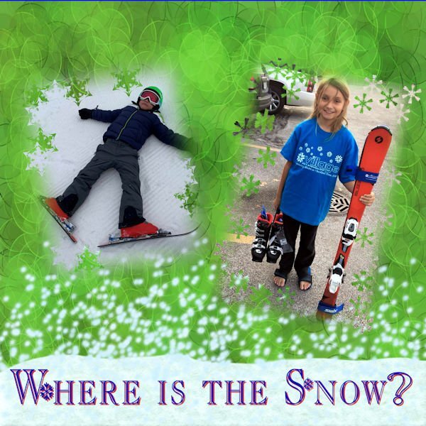
My youngest grandsons ski and the oldest snowboard. I used the younger ones since snowboarders haven't sent me any good pictures yet even though there is snow in the mountains near Las Vegas. The photos and background are my own. The snow was made with a cassel script and the flakes were made with a brush. The font is Christmas Flakes which is a free download. This mask was not my favorite since the pictures were too close to the edges.
2 points
-
That plaid turned out great, and I agree it really sets off this page.2 points
-
@sharon thompson The difference with the compression is that you are likely using the File > Optimizer > JPG. In older versions of PSP, that was the only place to adjust the compression but since a few versions, it is available (like Julian illustrated) just in the Save as... dialog window when you choose jpg format. @Harmony BirchThat is a fun way to combine different tools to create that background paper. And that font is so fun! @Emerald JayAnother kitty picture. That background is great to showcase him. @fiona cookThat is a very creative way to showcase that tree! It is fun to hear that you had two mask groups. @Rene Marker Yes, when you have a sharp edge on a photo, it can be tricky. Depending on your preferences, you can consider placing an edge on the edge of the page, so that makes one less to worry about. But it won't always work out. Just an option to keep in mind *IF* it can work. @bina greeneIs that "due today" actually written on the wall? @Julian AdamsThanks for your help about the compression. I had forgotten to point that out. @Anne LampThat is a great idea to layer a colored version on a faded copy of the photo. The effect is very interesting. @Gerry LandrethThat is such a cute tradition. I am sorry for your loss, but she surely would love to see you enjoy that dessert (free or not!) @Donna Sillia Before reading your description, I thought you had used a sort of layered font! @Anja PelzerThose colors are so vibrant! It really makes that bird even more colorful! The layered papers really allow you to use a pattern that would otherwise be overpowering. @Corrie KinkelThat extra paint splash is just one element but really suits that layout to emphasize the flowers. @Bonnie BallentineYour adventures never cease to amaze me. There must never be a boring day for you!2 points
-
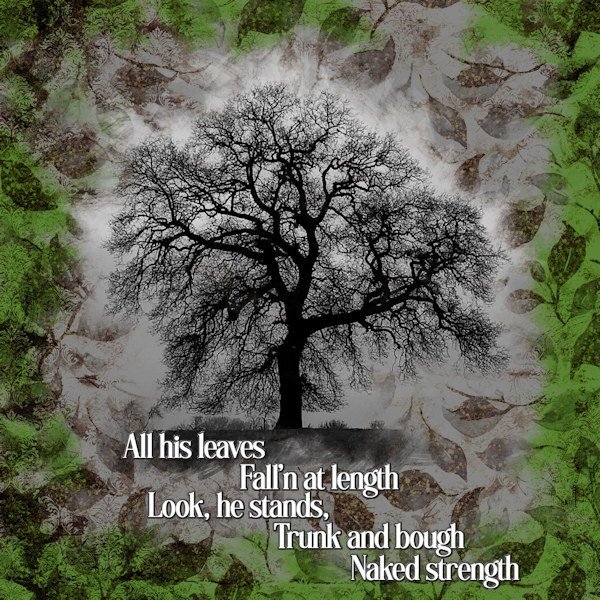
Lesson 4. I had a little trouble locating the image to brush the mask with white because the mask completely blanks it but by trial and error seemed to work out. I made two masks groups including an additional background one for the green bits. The main photo is a colour one of mine that I made monochrome. For the text I used Effects/3D Effects/Chisel (with solid white colour). The words are extracted from the poem 'The Oak' by Alfred Lord Tennyson. Artistic licence requested for the shape of the leaves, not being oak!
2 points
-
This was a good refresher for me. Font used is Perfectly Imperfect.
2 points
-
Here's my lesson 4, 2 photos, 2 masks, made the background with a selection from the girls dress, applied balls and bubbles and seamless tile and used as a fill, then put a beige layer on top with an opacity of 50 to tone it down a little. The font is Eyeballs. Then just a couple of scatters and a ribbon to finish it off. .
2 points
-
I said that I didn't care for the Kaleidoscope effect but that doesn't mean that I didn't try it out. Interesting results but too busy for my papers. The 600X600 pixel jpgs were large for some reason & would not load so I resized the to 400X400.
2 points
-
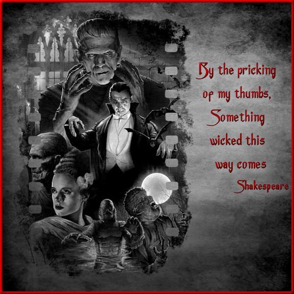
Day 3 - Still can't figure out how I locked that color palette for my project but decided to work around it. If anyone can help sort that for me, I will redo the project but with a colored background paper as originally planned. I flattened the image & exported to a jpg and then reopened it, treating it like any other jpeg & then finished the lettering & border. That restricted my background to b&w instead of the red bloody splattered grunge paper that I wanted but, it seems to work. I did have to change the quote though as my original choice went better with the bloody paper. The film style mask is a snag from Pinterest, the monster collage is from a horror movie archive, the paper texture is from Freepick, and the font is Anger Styles from Dafont. I am not a fan of the kaleidoscope effect but that is just a personal preference. I am too busy making more plaid patterns from yesterday's lesson.
2 points
-
PERFECT way to solve the Kaleidoscope! It makes it look more like an art piece. What a great idea.1 point
-
I am glad it worked!1 point
-
That's great, Harmony! The font is outstanding! 👀1 point
-
In addition to the the post Carole advised you to check out you can just click on the word "Quote" at the bottom of every persons post and it allows you to respond. the persons post and photo pops up and you can type in what you want to say and then below that on the bottom right is "submit reply". Just click that and it should come up. Sometimes it takes a few seconds and even sometimes posts go missing in cyberspace. Usually we add a post to Carole saying we posted something but it didnt show up. She can sometimes find it.1 point
-
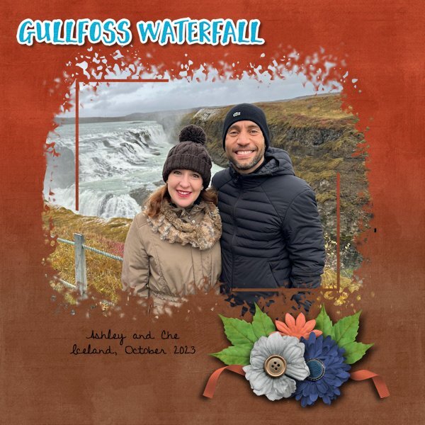
Day 3 are 2 more layouts for my cousin. Layout #1 used the mask by Melo although I added to it so that I could get more of the photo. The kit is a really old kit by a designer that retired over 10 years ago. The kit was called Christmas Time and the designer was A Work in Progress. Again, the font is Discover Beauty. Layout #2 used the extra mask from the 2022 Mask Workshop. The kit is called Around The World: Iceland and is available at Sweet Shoppe Designs. It is a collab kit from 2 designers. I again used Discover Beauty for the font.
1 point
-
Day 3 of the Mask Workshop. This day tested what I have learnt about Masks. I feel so much more confident now. My problem now is how to respond to others on this site. I don't know where to go to respond to anyone. Cassel is there some literature that I can get regarding this? I feel a bit silly that I do not know.
1 point
-
Workshop Day 2 This is the place we stayed at for 7 months while waiting for our home to be built.
1 point
-
Hi all , I`m in too I will go with photos from our Tierpark --Zoo here in Aachen I made over the years here is Day 1 and Day 2 the fonts are Ariston and Handwritten1 point
-
Day 2 I gave up trying to make the plaid paper and adapted one I already had. I was looking for the "custom selection" command in the wrong place. GRRR! I will try again to make the plaid for something else.
1 point
-
I spent lots of time experimenting with the plaid, including tinkering with the settings for seamless tiling. Since the photos are "busy," I wanted a pattern that wouldn't compete. The green "plaid" looks closer to a grunge effect. The photos are mine. Although I'm not a good photographer, I keep finding little bits of a picture that look nice enough to showcase. The font is Welcome Spring from Creative Fabrica. The butterflies came from Pixabay. They already had shadows but in the wrong direction. Flipping them solved the problem.
1 point
-
I started a bit later today and noticed a new link for a template which I used, although I have the old one and the Diamond one too. I have both used, but a new template is always welcome! For this template I could use a couple of photos that are narrow and long without having much resizing. I made different plaids until I had one that I liked and that went well with the colors of the photos but I reduced the opacity otherwise it would overpower the photos. Fonts are Perfectly Vintages and Arial rounded. The smaller photos had no borders or a mat underneath, so I made very thin borders to make them stand out a bit more.
1 point
-
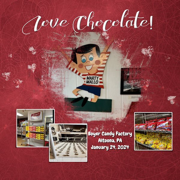
I going to be using the photos that I took in Fredericksburg, VA for this workshop. The photos in the image were taken on route to Fredericksburg, only a little out of the way, because I love Mallo Cups. The graphics are from the kit. Large font is called "ChocolateHeartFree" and the journal font is called "Chewy" which is a free font.
1 point
-
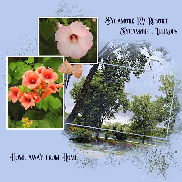
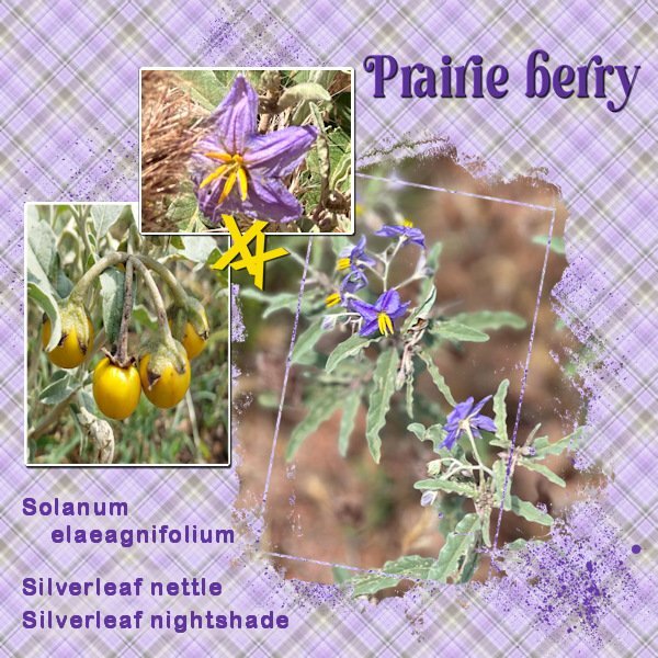
Day 2 "Green" In earlier days green was a colour to show you had money. Green was too expensive for the "common" people. Nowadays green is still a colour people use for their houses, it matches well with the colour of brick. Baskerville old face is the font. Photo's are my own, taken at the Openlucht museum .
1 point
-
Day 1 of this Mask Workshop. I have really been looking forward to this as I can never seem to get the knack of mastering Masks. Thanks for the opportunity Cassel.
1 point
-
Mask WS Day 1 I used the .pspimage mask from the Extra1 folder. And it tipped it over and moved/resized the other two masks to fit the image. Here is a before and after of using the new Creation Cassel PencilSketch2 script. I had fun with it and if all goes well with my photos I will probably use it for the whole workshop. Background paper is from Creative Fabrica called Vintage Paper Textures - Apothecary. The font is Maraton, from Creative Fabrica as well. I also duplicated the larger mask group and hid it and merged the copy layers so I could add a texture to simulate the texture in the background paper.
1 point
-
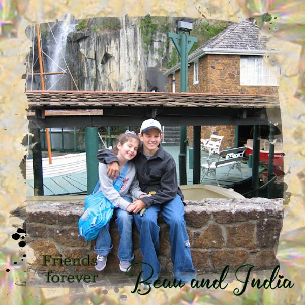
Here's my day 1, I used a paper from the kit you linked too and colorised it and the font is Poemiore for the title and good old Arial for the journalling. I did the making the picture subject clearer a little differently as it was not the middle of the picture I wanted to make clear but rather their faces which were closer to the edge so I used a large paintbrush and set the hardness to about 30 and the size to approx 1500 and painted in white directly onto the mask. I tend to like the appearance of an outer frame so promoted a selection of about 50pixels round the border to a new layer and used an inner bevel on it. Promoted to a new layer in case I want to change the edge at any time. Great lesson I often forget how to make those templates into masks.
1 point
-
I found the cutest photo of a kitten online at https://picjumbo.com/latest-free-stock-photos/ I made a card front using the kitten. Thank you for the lesson Carole.
1 point
Resized.thumb.jpg.d25811db03a63358cedab1e79f527635.jpg)