Leaderboard
Popular Content
Showing content with the highest reputation on 02/13/2024 in all areas
-
12 points
-
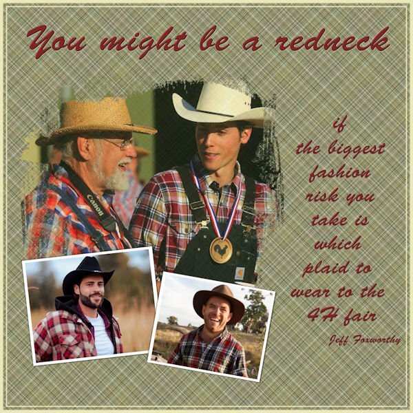
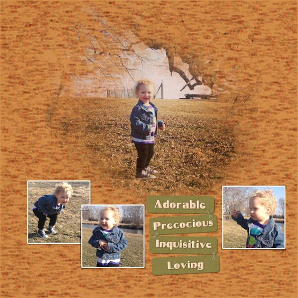
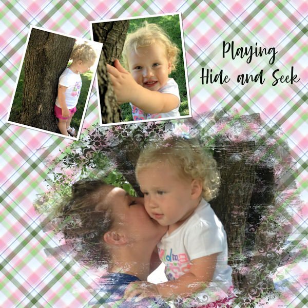
Day 2 starting off great. I actually had that template that is no longer available (large stashes confuse but are can be helpful if you know exactly what you want). I think I have mastered the whole raster to mask group conversion enough to start altering the mask since I wasn't too keen on some of the streaky bits once the photo was added. Went back and forth several times and, between a paint brush and an eraser tool and the pick tool, managed to get rid of the offending streaks. Because of the theme that I was using, I couldn't make my plaid from the photos so I used a another photo of a greenish grain field.... lots of small edges and muted colors in it. That way it wouldn't clash with the plaids in the main photos (all snagged from free photo sites). Added a few very thin borders. Font is Brush Script. I tried using that trick of brushing behind the text to make the words more distinctive but, because my background plaid is so small & tight, the brushing was too obvious. When adding a shadow really didn't work either, I changed the color of the drop shadow to a mid green color from the plaid and it brought out the text a bit. The nice thing about these structured lessons is that, if you make enough mistakes & have to redo things, you get more confident & adventurous (though you still need post it note reminders on your monitors for the command sequences).11 points
-
11 points
-
11 points
-
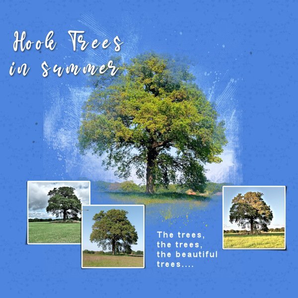
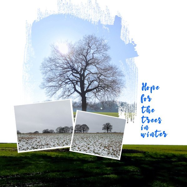
For today's Lesson 2 I am still on my Trees theme. I condensed the the main photo mask shape so it suited the format of my photo better. I used a brush tip 'Fuzz soft' to white out the mask a bit on the sun flare and a bit on the trunk to bring those bits out that were subdued by the grey of the mask. Deciding I liked the grass under the tree on my main photo I duplicated it and made a selection of just the grass. I also like the white of the background for this image so I didn't use the plaid idea although I think on some of the designs I have seen today, the pattern suits. I used the same photo for a panoramic effect for both the small photo masks. I used the Mama font again but am finding I need to kern it quit a bit.10 points
-
This is what came out of me... Cassell - What I found challenging with this lesson is while I could memorize the steps to making the gray shapes into masks, I don't understand the reason behind all of the steps. It would be good to understand why that particular sequence of steps went from the shape to a mask.10 points
-
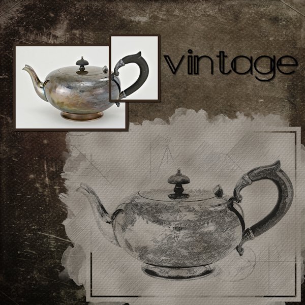
Mask WS Day 1 I used the .pspimage mask from the Extra1 folder. And it tipped it over and moved/resized the other two masks to fit the image. Here is a before and after of using the new Creation Cassel PencilSketch2 script. I had fun with it and if all goes well with my photos I will probably use it for the whole workshop. Background paper is from Creative Fabrica called Vintage Paper Textures - Apothecary. The font is Maraton, from Creative Fabrica as well. I also duplicated the larger mask group and hid it and merged the copy layers so I could add a texture to simulate the texture in the background paper.10 points
-
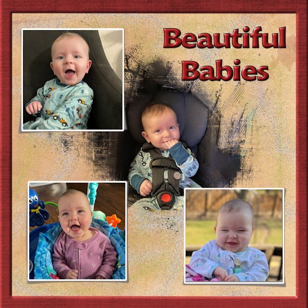
Here's my day 1, I used a paper from the kit you linked too and colorised it and the font is Poemiore for the title and good old Arial for the journalling. I did the making the picture subject clearer a little differently as it was not the middle of the picture I wanted to make clear but rather their faces which were closer to the edge so I used a large paintbrush and set the hardness to about 30 and the size to approx 1500 and painted in white directly onto the mask. I tend to like the appearance of an outer frame so promoted a selection of about 50pixels round the border to a new layer and used an inner bevel on it. Promoted to a new layer in case I want to change the edge at any time. Great lesson I often forget how to make those templates into masks.10 points
-
Never used a Mask before and no idea what I m doing ! but I have managed to put something together no doubt with many mistakes !The video was excellent, it was my brain and my version of psp letting me down! My idea was to showcase the first 7 weeks in a puppys life one week a day. After taking two days to do day one I am not sure how that will turn out! Never mind life is a learning curve ..Just realised I have not put a date they were born on . opps ! The papers and graphics were from MARY FRANS... FARLEYFRIENDS9 points
-
I going to be using the photos that I took in Fredericksburg, VA for this workshop. The photos in the image were taken on route to Fredericksburg, only a little out of the way, because I love Mallo Cups. The graphics are from the kit. Large font is called "ChocolateHeartFree" and the journal font is called "Chewy" which is a free font.9 points
-
9 points
-
This will be the 3rd time I'm doing this workshop and it will be a rehearsal of the masking techniques for me. Especially because I normally tend to use the Raster to Mask script and now I will do them manually. I have a lot of flowers from my last year's trip to the States that I haven't used in other projects like the Calendar or Travel Workshop. Last year I used the templates for the Diamond members, so this time I will probably use the given templates. For the background: 2 papers from Escale Amoureuze with a blend mode and an inked edge overlay by Rachel M Hailey. The font is Montana Rough.9 points
-
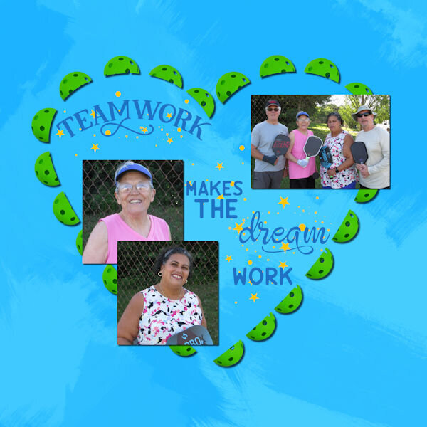
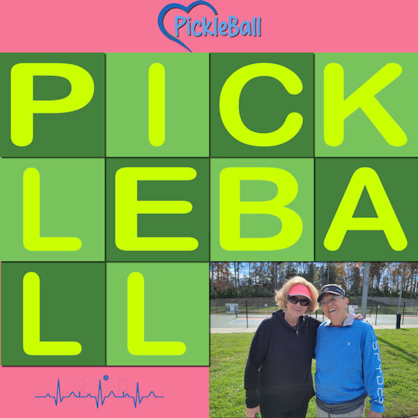
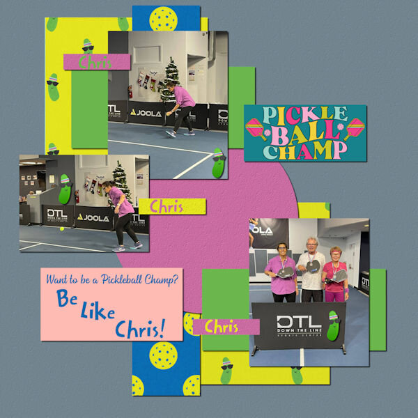
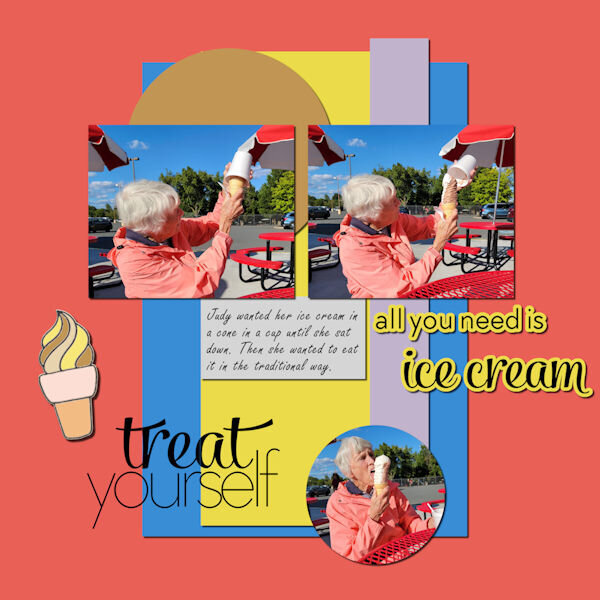
Took Judy shopping for new pickleball shoes. While she has played PB for years, this is her first pair of pickleball shoes. Our DSW has Sketchers PB shoes in stock which means we can try them on before buying. Judy is very difficult to fit, so being able to try shoes on is a real treat!8 points
-
8 points
-
8 points
-
The mask bits are getting easier. However, choosing papers & fonts to go with the layout is more difficult for me. I somehow always end up in scrap kits by Brown Owl & Cathyk for papers and then adjust the colours. Script fonts are a **** at times as they never turn out quite like you want even when using Fontrunner for previews. I kept getting error messages when trying to attach my image. It was 600 pixels but exceeded the max kb size by quite a bit. It took me several minutes to realize that I had saved it as a png rather than a jpg... rookie mistake.8 points
-
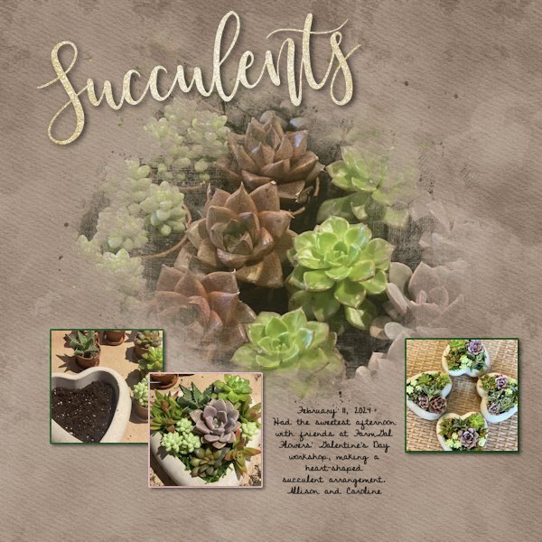
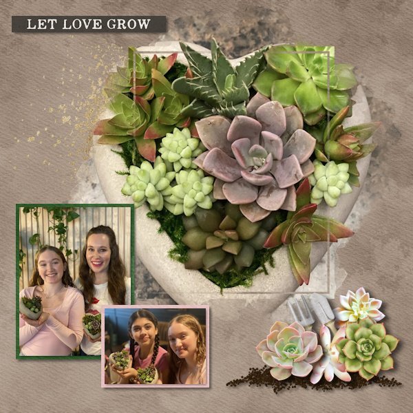
My cousin's daughter posted photos just yesterday that were perfect for the day 1 templates! I used a kit called "Plant Life" by Studio Flergs from Sweet Shoppe Designs. A kit I've had for awhile because I loved it but had no photos... until yesterday! I copied Allison's description from Facebook for the journaling.8 points
-
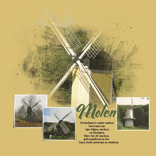
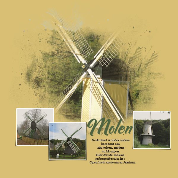
My first lay out for the mask workshop is about mills (duh) The text says: The Netherlands are famous for tulips, mills and cloggs. These photo's are taken at the "Openlucht museum" in Arnhem (Netherlands) I forgot to write down what font this is for the title, the the text is (I think) Baskerville old face.8 points
-
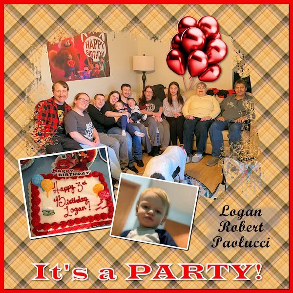
My Lesson Two - It's a Party! This occurred Saturday, Feb. 10, though his birthday was on the 6th. I used the same old template as last time. Discovered some strange layers. 😁 It happens when I'm struggling with masks, especially if they're in French! 😆 I created the plaid, and the balloons are a template from Marisa Lerin. I do struggle to align photos in a mask that is on an angle. I tried the Free Rotate tool but didn't see much change with it. Is there a trick to it?7 points
-
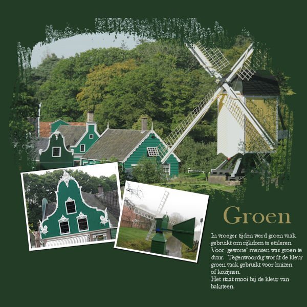
Day 2 "Green" In earlier days green was a colour to show you had money. Green was too expensive for the "common" people. Nowadays green is still a colour people use for their houses, it matches well with the colour of brick. Baskerville old face is the font. Photo's are my own, taken at the Openlucht museum .7 points
-
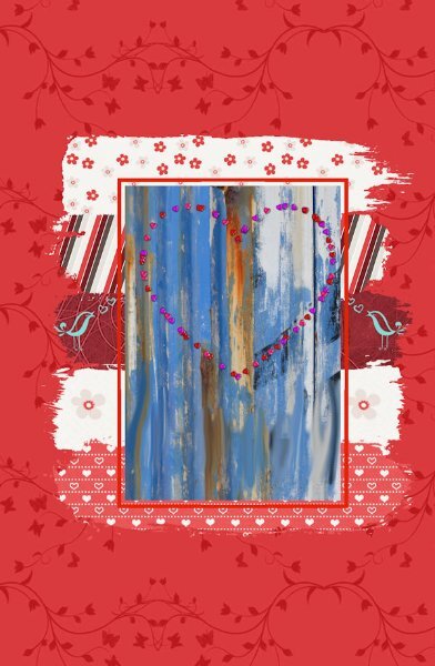
I have now used the extra template and some supplies that Carole gave us to practice the technique. It did help to question with each move what I was actually trying to achieve with each layer. Thank you Harmony for your help there. For this template I found it easier to rename the Stroke layers (1-5) to differentiate them. The main image I created from a picture tube I created of hearts and placed it on my photo of an old painted wall. The wall image fell short of the Mask window so I duplicated the wall image to fit, and used the Smudge brush to blend the join. Then Merged down to one layer.7 points
-
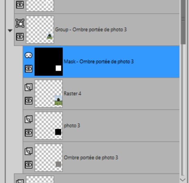
Corrie, I have note taken on paper like you which I find easier for me to digest. Susan, your idea of screen shots of the steps I will take up. I had made a mistake on the last photo for this lesson and still don't know what I did wrong (See snip of my layers) I rectified by deleting the offending layers and replacing by dragging across from the original template and redoing just that last photo. My theme is back to my local tree project and because the main tree image was not wide enough for the mask , it caused a sharp edge where it fell short. I used a black brush stroke inside the white area of the mask using a splodgy brush tip (a-dozi's background-08 003) to blend the edge in. The 2 background layers were blended with Multiply having used Adjust\Colour\Colour Mixer to change a red to blue. The main title font is Mama which Carole gave us the link to download7 points
-
7 points
-
I started a bit later today and noticed a new link for a template which I used, although I have the old one and the Diamond one too. I have both used, but a new template is always welcome! For this template I could use a couple of photos that are narrow and long without having much resizing. I made different plaids until I had one that I liked and that went well with the colors of the photos but I reduced the opacity otherwise it would overpower the photos. Fonts are Perfectly Vintages and Arial rounded. The smaller photos had no borders or a mat underneath, so I made very thin borders to make them stand out a bit more.6 points
-
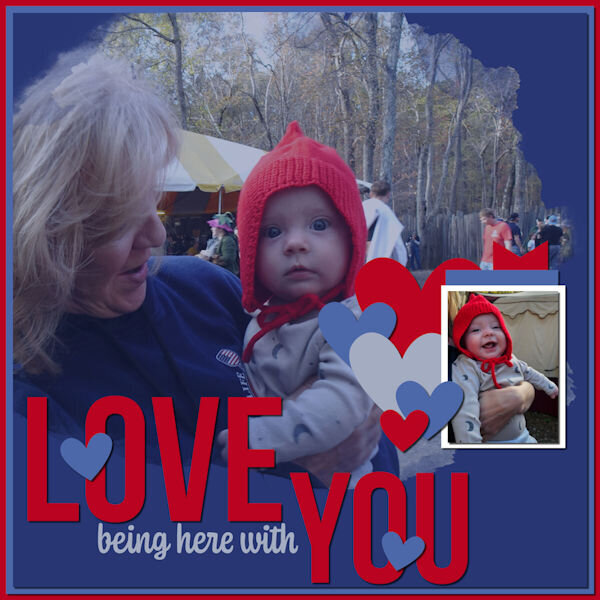
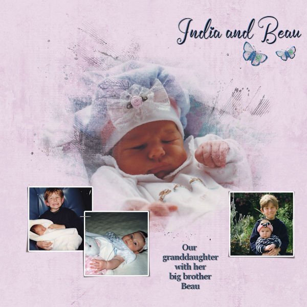
If it helps any you need to use the black shape to make a selection so you need to use a show all mask so that the shape shows on it. you float the selection so that you have it to place on the mask layer. You need to be on the original shape layer and make your mask from that if you do it on the selection it will promote it to a layer and you will get a totally white mask layer with no black shape to flatten down onto it. You pull the selection into the mask group on top of the mask and defloat the selection so that it becomes a black shape on the white mask layer. At this point the center is blocked and the outside shows through the opposite of what you want. On show all masks white creates a hole for what is underneath to show through and black lets nothing through. So you invert the mask layer and now your photo can show through in the middle of the mask.. I hope that helped. Cassell can probarbly explain it better Forgot to say you did a great job showcasing those smiling babies6 points
-
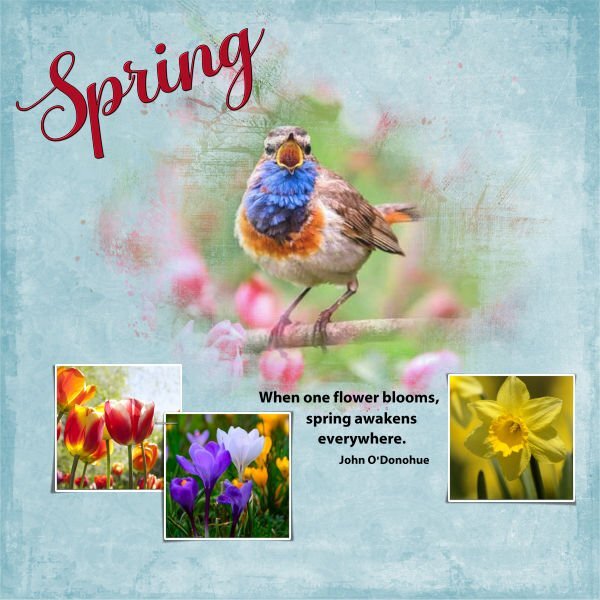
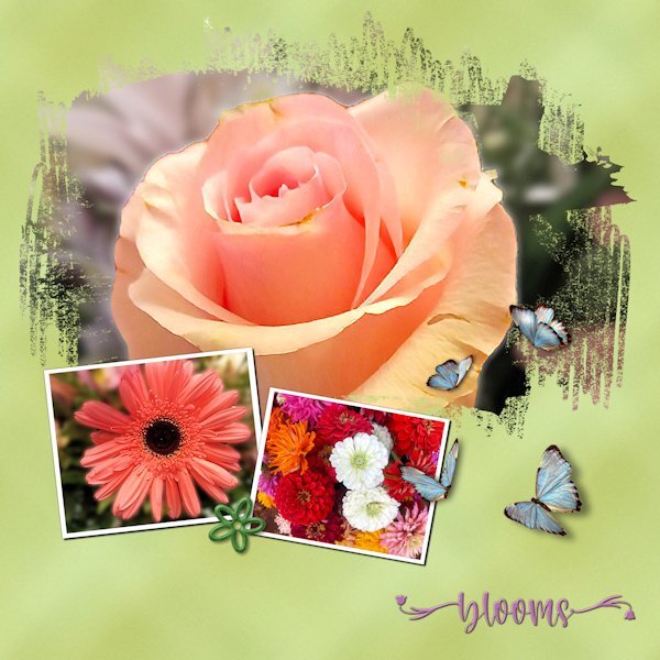
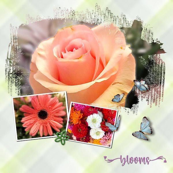
I spent lots of time experimenting with the plaid, including tinkering with the settings for seamless tiling. Since the photos are "busy," I wanted a pattern that wouldn't compete. The green "plaid" looks closer to a grunge effect. The photos are mine. Although I'm not a good photographer, I keep finding little bits of a picture that look nice enough to showcase. The font is Welcome Spring from Creative Fabrica. The butterflies came from Pixabay. They already had shadows but in the wrong direction. Flipping them solved the problem.5 points
-
5 points
-
4 points
-
Agree about raster to mask script. A good companion to it is the Merge Group Rename script. I drag my photos into the layer palette which keeps the image number of it. By using the Merge Group Rename, it keeps the image number which is useful if I have multiple photos of the same subject. I was doing the steps for my first layout for the regular photo spots and it wasn't looking right (was following the written directions but didn't scroll down far enough). So I used the script and realized that I had missed a step of changing the grey to black.4 points
-
DAY 1 I made the background myself, a neutral color, with monochrome noise above it. With the brush tool I placed two stains. Edges : overlay by Marisa Lerin on Digitalscrapbook. I made the beads with the script cass-Alpha Beads, with AR Destine font The written font is Sun Island Regular3 points
-
3 points
-
All of my layouts for this workshop are being done for a book I'm doing for my cousin's family. So because of that I am using kits that I have in my stash so the book will look cohesive when done. I had the template from last year's workshop so didn't even try to download it. Layout #1 for Day 2, kit is a retired kit from Bella Gypsy (Christmas Cheer). Template from 2023 workshop. Layout #2 for Day 2, I used 2 kits, both retired from Bella Gypsy (Soul Sisters, Woof). Template is from 2023 workshop, extra for diamond members. Font is Discover Beauty for both layouts.2 points
-
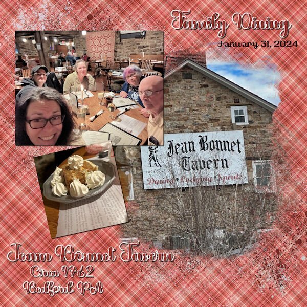
Day 2 - Continuing with my birthday trip theme, my daughter took some selfies at one of our favorites stops on the way home from Virginia. Jean Bonnet Tavern is filled with ambience and a lot of wonderful food. The font is called "Valentine" from Creative Fabrica, and the plaid background is from one of my Build a Kit plaids. I thought it matched the old quilt hanging on the wall. The dessert is Oatmeal Pie. My husband begged our wonderful server for the extra whipped cream.2 points
-
2 points
-
Oh my!!! I will reach out to the author and I added a different link in the meantime.2 points
-
I am a compulsive note taker. Sometimes, I take too many different notes on one piece of paper that I cant make sense of them, later when I come back to them.2 points
-
@Cassel: Yup. that's right. I usually don't boast the locations (unless the photo gives them away anyways) since I want to keep them under wraps (the best places are too crowded anyways ). But if you want to visit, you are welcome to crash, we're usually there over Xmas and New Year's. Therasia's like the quiet cousin next door to flashy Santorini. It's all about chill vibes and keeping it real. You won't find the tourist hustle here, just laid-back Greek island life. Picture-perfect villages with white houses and colorful flowers everywhere, plus those quaint stone streets to wander. The beaches are like hidden treasures, perfect for a dip or snorkel session. And the views? Unreal! You've got rugged cliffs meeting crystal-clear waters all around. Therasia's just got that simple, down-to-earth charm that makes you feel right at home, away from the crowds and hustle.💓2 points
-
Count me in too. I love a party....there's always masks at a party isn't there?2 points
-
1 point
-
1 point
-
1 point
-
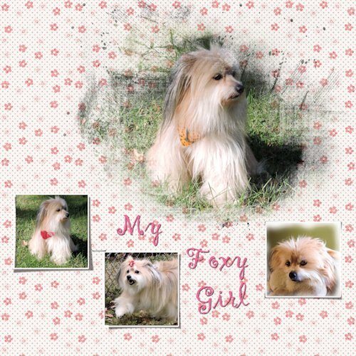
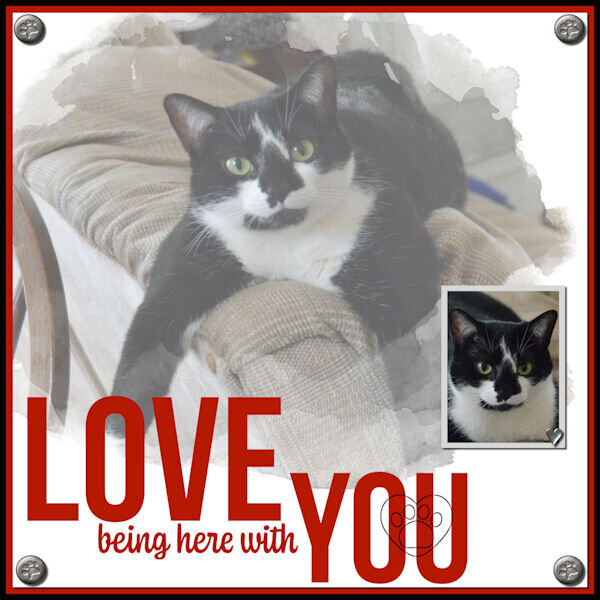
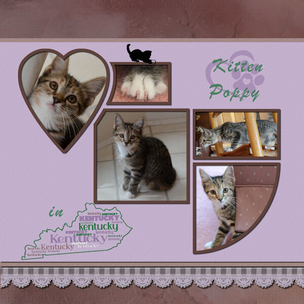
Welcome to all the posters. At this point, we have 147 registrants! Woohoo!!! That means we should see a lot of wonderful projects in this thread. Welcome to all the newcomers to this workshop, namely @Barbara Caulton, @Diana Moore, @Mariana Trapnell, @Deana Davis, @Jen Brown, and others. If you ever get stuck, don't hesitate to ask in this forum. There is always someone ready to help (sometimes, faster than I can). Welcome to our return participants. Even with the same tutorials and templates, you can always try something slightly different. @MoniqueN. Nice photos of windmills. Can you check if you might have hidden the shadow on the bottom right photo? It seems to be missing. @Rene Marker Two layouts for the price of one! For the first layout, can you check if the shadow layer for the middle photo on the bottom might have been moved? It should be above the left photo, but it looks like it is under. @Jen Brown Cute kitty! I love the patterns you used in the background. It looks like you used washi tape! @sharon thompson Choosing photos and supplies is often the most time-consuming task. The more you have, the worse it is! LOL The mistake you made when saving in PNG, I bet you learned from it and likely won't repeat it too soon! @Deana Davis Did you end up getting the first lesson? If not, here is a little secret: you can access the lesson page through the Workshops in the DIAMOND members' section! @Gerry Landreth That font you used is a great one. Simple yet elegant! @Corrie Kinkel Those flowers really pop on the dark background! @bina greene Are those your photos? If so, where are they taken? I would love to travel with you there! Maybe you could add a location on the layout? I might just be nosey! @Anne Lamp Oh, you will get a lot of fans in this group with that Foxy girl!! @Bonnie Ballentine I am so glad you managed to get all those "ordinary" photos of day-to-day activities. This is a great snapshot of a fun activity. @Harmony Birch It is great to hear that you are already comfortable enough to tweak a mask to suit your need! @Emerald Jay Oh, another cutie!! Will we have more pictures of that little star in future lessons? If any registrants are reading this thread and have not received their confirmation emails, (1) check your spam folder or (2) reach out to me. Keep up your work, and show us your lessons. Those projects are made to be quick, so I hope you will catch up. Don't be shy!!!1 point
-
1 point
-
Hi, I've been working on the Masterclass video cutout today because I love cutout design so much. I'm still having a bit of a problem with the buttons. And I actually got the beginning right first time. So that it doesn't look so boring, I framed it a bit.1 point
-
Masks have always eluded me, too, but would be so useful. Based on the comments above, I will have my note-taking app at the ready. 🙂 Can’t wait to learn!1 point
-
So excited to learn more. I have tons of Masks, but it's been a while, so I need a good refresher1 point
-
1 point
-
I am in too but was thinking I would be the only one who has completed the course before to be repeating the exercise. I am so relieved. Like Monique says 'repeating is a good thing' For me it's a subject that is a little difficult to feel at home with as I find it difficult thinking in reverse as it were. When I have been successful the result is so satisfying and I also think that the MasterClass is one of my favourites. Thank you for putting it on again Carole.1 point
-
Of course I'm in too, I love using masks and a rehearsal of those techniques is always a good idea! I have registered but didn't got the usual confirmation mail! Are the gremlins still at work?1 point
-
1 point









Resized.thumb.jpg.d25811db03a63358cedab1e79f527635.jpg)

