Leaderboard
Popular Content
Showing content with the highest reputation on 01/25/2024 in all areas
-
Template 6 Diamond. Because one of the pictures was horizontal, I had to change the layout somewhat. I colored and textured the 3 ribbons; that Winter Vibes font that was talked about and several of us downloaded it, the sticker and the mitten banner are mine as is the background paper. The Hot Chocolate card in the center is from Pixel Scrapper – Jessica Dunn (one of my favorite developers). The 2 hot chocolate buttons holding the mitten banner are from Pixel Scrapper – Brooke Gazarek. The 3 generations are from different families of mine.7 points
-
Hi Susan and all , I would like to say Thank you very much for the many hearts and likes among my few graphic works. I appreciate them and I'm really happy about them. @Susan Ewart yes, that was the wedding of one of our godchildren >10 years ago. I had a large, extensive photo book made for her and for us using my framed and scraped photos. I love to "weave" embellis (often a lot of erasing work, but it doesn't take much effort for me if the result is consistent)5 points
-
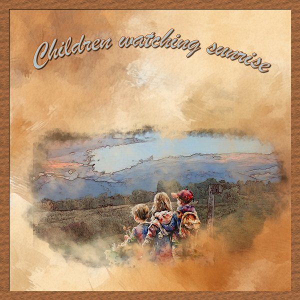
That wonderful illustration is by Elsie Julia Miller. I don't love the finished product (ran out of creativity last night lol). But I wanted to share how to get a great background paper by using Cassel's Painted Background script. It takes colors from the original pic and, using one of five painting methods that you pick from, creates the paper for you. I think I used the Sponge option. The fonts I used are Varsity Team (from 1001 Fonts) and Brilliant Signature (from a CF bundle).5 points
-
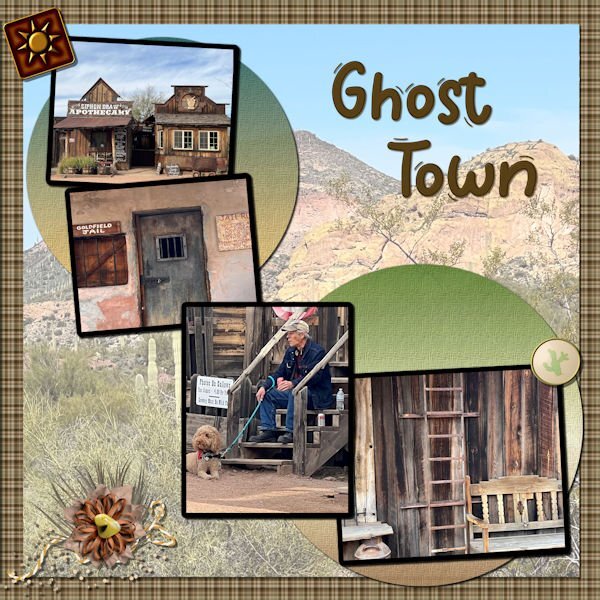
Template 7. The background paper, the 2 round papers, and the elements are all from my desert kit we did last year. The font is Wigglye from CF. The paper on top of the background paper is a picture from the same group as the 4 pictures that are dominant; however the opacity has been reduced, the underlying paper is white, and the blend mode is Multiply. The font was innerbevelled and shadowed.3 points
-
I was short on time and creativity last night when I decided to use the Painted Background script and it saved the day. It uses the colors from the photo of your choice and gives you brush options to choose from. I've used it before and I love it. So the next time you need a unique paper, try this script.3 points
-
I come from a long experience of quitting. Once I got into my 50's I decided enough of that! Thanks for the vote of confidence...I could have used you when I was younger.3 points
-
I love how you wound the ribbon through the Font. What a stunning layout and that photo is outstanding!2 points
-
I started cooking out of necessity at a fairly young age. I am now pretty old and have a gazillion kitchen gadgets, but maybe my favorite and most used these days is my instant-read thermometer! After years of leaving food to cook 'just a little longer to be safe', I can now know when it's done to perfection! It would be my first kitchen accessory recommendation for any new cook!2 points
-
So far so good. I am dedicating Wednesday mornings to work on this book. Depending on how late I sleep in, or what else might be on my schedule, I still manage to get a few hours each week. My process is to go through all the content that is gathered from various blog posts, tutorials, and classes, and make them all in the same style. Blog posts and classes have different formats (with intro, links, etc.) so I am making those a bit more streamlined, removing some extras, shortening sentences, etc. Today, I was working on chapter 5, which had a lot of screenshots for tools and dialog windows for various PSP versions. I plan to limit the screenshots to 2023 (or whatever will be the current version when it is published if there are significant changes). I reason that although there are some differences, if someone uses PSPX8, and the screenshot is from PSP2023, it should still be easy enough to follow. I can therefore remove a lot of "unnecessary" screenshots to save space! For those who have purchased the Tips and Tricks book, that was in a 6x9 format. I feel that would be a bit small for a scrapbooking book that would include lots of images so I plan on a full-size 8.5x11 format. I don't know if it is new (on Amazon) or if I had not noticed it before, but I think it would give a better result for the reader. And I will be able to have it IN COLORS! (that was not available at a reasonable price when the Tips and Tricks book was published).2 points
-
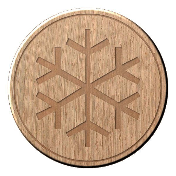
Lab 13 - 03 I used the template : link in the notebook. Made the Wooden token and Decorated metal charm tutorial. The digit beads were made with the cass-Alpha-beads script. The other elements come from pixel-scrapper-blog-trains/feb-2017-blog-train-final-list: themagnoliapatch.blogspot.com WinterFun-addon. Own photos, January 2009, Belgium, Waterloo. A walk with my first Scottish Collie Enzo. I'm not entirely happy with the metal charms I made, I think it doesn't look that metallic.1 point
-
1 point
-
1 point
-
1 point
-
1 point
-
S = Swimming for seniors, which I'm doing for many, many years now. It is a mixture of aquafit and aquajogging and a coffee afterwards with a lot of chitchat is our reward1 point
-
1 point
-
This sounds wonderful. I like that size, there is nothing like the feel of a physical book in your hand. I cant wait for it to be published.1 point
-
1 point
-
1 point
-
1 point
-
Interestingly, just this weekend, we tried a new recipe for chicken breasts. It was soooooo easy (5 minutes prep). It is to cook those breasts in the slow cooker. NO LIQUID added, yet, it generated almost a cup of its own juice and the meat was so tender.1 point
-
1 point
-
Good morning, here I'll show you my further progress in my PSP training in the new German forum. Unfortunately, I'm not allowed to publish my own training tasks elsewhere (at the moment sign tags) despite many credits on the picture (the artists who gave permission to the forum can only be shown edited in the forum), but my own frames around my own photos, which can I show where I want. With frames you can easily get into a routine with PSP. Unfortunately there is no filter. With filters I always have to save in .psd and then insert the filters into PI. I can't even insert the "Filter unlimited" into PSP because many filters are integrated.1 point
-
I had to Google rolling pin rings, but now that I've seen how they work, it makes perfect sense to me. If you want to cook chicken breasts but are concerned that they will dry out, try this. Bread (I like to use Panko crumbs) and par fry them to get the desired color on the breading. Put them in a baking dish, add chicken broth, and bake at 400F for about 30 to 45 mins. When they're all done, the broth will have been absorbed and the chicken will be nice and moist. Since I don't usually like white meat because it's too dry for my taste, I was glad when my sister taught me this method.1 point
-
1 point
-
1 point
-
It did me too and he hasn't seen this photo of mine because he died 40 years ago. However he knew that I liked photography and I have showed him lots of my photos. He would have loved all the new digital ways of editing.1 point
-
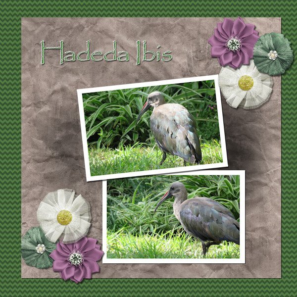
Lesson 6 done! We have a flock of about 10 Hadedas that visit us every day and most times spend the day in our garden. They are large birds (about 76 cm (30 in) long) and very noisy. Their call sounds like their name HA - DE - DA. When they make a noise, don't even try talking because someone standing in front of you won't even be able to hear you. I love these birds.1 point
-
Template 6. Changed the layout by moving the title to the bottom, moving the pictures up, adding a journal sheet, and removing some of the elements replacing them with my own elements. I had fun – and learned something new – to put a paper on top of the textured layer and working with the blend mode and the opacity of the paper layer. Great stuff!! The title is Annie Tobin’s font (she was such a wonderful lady) which I glittered and innerbevelled. The heart in the top left corner is from CF and I innerbevelled it. The bow I made with Cassel’s Bow 2 script. The Santa sign is from my stash as is the poinsettia cluster in the bottom left corner. The star tube is from Cassel. The pictures are from scanning 1991 35m prints. They were in bad shape and I used every trick that PSP has (well almost). I had forgotten about fade correction, but Cassel reminded us of that tool and I used it and de-noised it to the max and sharpening it to the max. The difference is amazing. That trip was special and finding it was such a gift. You can't imagine - as we went down the road into the town, it was dark - everything was closed up tight - no lights - off to the left at a distance was an oil drum that seemed to have a fire in it - something that the people on the road in the depression might have used to keep warm or cook food - the scene was really eerie. Dolores really wanted to turn back, but I just felt we had to go further. And then, when we turned that corner it was like Judy Garland opening the door into Oz - from blah to radiant color. I will never forget it.1 point
-
1 point
-
1 point
-
Love the layout, Julie! I haven't been here for many days, so I am also trying to keep up with the layouts... Everyone has been so busy and has created great pages!1 point
-
They are beautiful. We have only one variety of this bird in SW Ontario, the belted kingfisher and they're not as colourful as these (white, blue, grey). Would love to see any of them near my yard!1 point
-
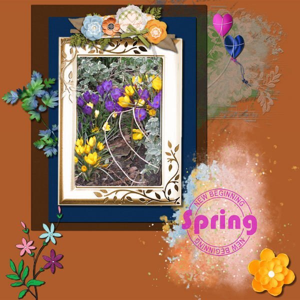
I take it 🙂 I started without a template, wow, to fill it when you don't have an idea how to fill it.............was difficult. I started with the photo and then mats, looked in my stash for spring elements and found a freebie form Carole too. The result is maybe not as nice as earlier projects, but it's ok. Used blend mode, texture effects/blinds. The new word is children 🙂1 point
-
I agree. Coming up with a theme sometimes takes a long time. And then I have to actually find pix I can use b/c I don't take many.1 point
-
1 point
-
This is Template 6 (extra). I am so sick of it by now. I dither around and arrange and re-arrange and then dither some more and try different effects...until I make myself crazy! All images from online (Pixabay, I think). Changed the texture to one in my stash. Two fonts: Dry Hard Sans and Merry Jolly, both with gradient fills.1 point
-
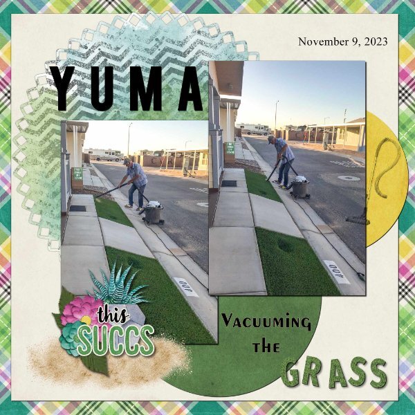
Day 7. Thank you Carole for the templates. I used the diamond membership template. I used a kit from Connie Prince Prickly. Font Fira Sans ExtraBold, Exotc350 Bd BT and Times New Roman. I used Cass GrassTexture script on the word "grass". Speaking of the clip to it script, it is one of my most favourite scrips, I use it all the time when working with templates. I really enjoy seeing all of the great layouts.1 point
-
1 point
-
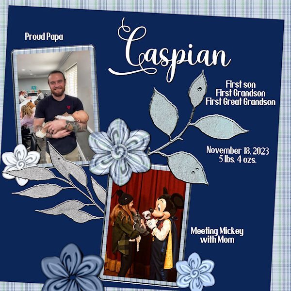
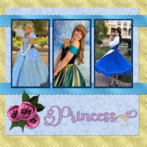
Day 6 - The photos are compliments of my future daughter in law, Lane. She works for a company that does Disney parties for children. The gold dot background is one of my own as is the blue overlay with a lowered opacity. The scalloped ribbons are my own texture, scalloped using cass quick scallop script(what a time saver!). The roses and leaves are from a package that I purchased from deeezy.com. The font is Hilender Rhapsody from Creative Fabrica. I used layer styles for the font, but wanted it to "pop" more and applied Hue and Saturation. The crown is a preset shape that was created from a font. I used VectorTube to apply the diamonds, a directional tube that I made using cassdirectiontube script.1 point
-
1 point
-
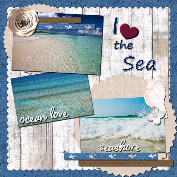
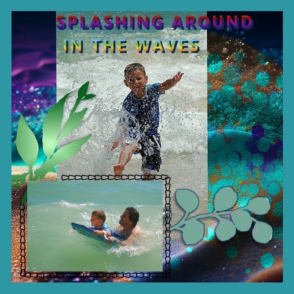
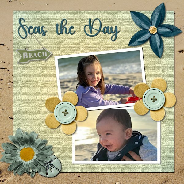
Day 6. Technically, the pictures were taken at Gulf Shores. As a veteran Miamian, I understand the difference between a gulf and the ocean. However, Felix, who is six months old, and Amelia, who is three, are not interested in nuance. Besides, nuanced accuracy would have gotten in the way of the fun title I found. The kit is from Throwing Some Scrap Around by Jodi Watson, which I found on Go Digital Scrapbooking. Unfortunately, the website does not seem to be operational. The font is Hey Beach from Creative Fabrica.1 point


