Leaderboard


Popular Content
Showing content with the highest reputation on 01/20/2024 in all areas
-
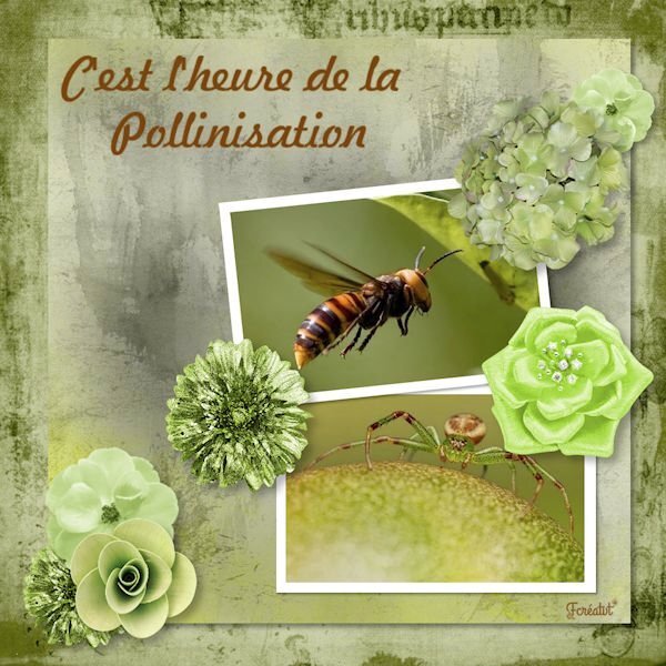
Day 5 Again a layout with purplish colors, I hope that is not becoming a new trend, but the color seems to suit the layout and photos. Although I love seeing colorful layouts, the ones I make are usually more subdued. The papers are by cpjes in the 2022 augustus blogtrain; the doily is by Sheila Reid. The ribbons and flowers are by Marissa Lerin and recolored. The brads come from my stash and the font is Bremlin
 14 points
 -
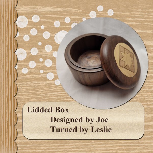
A little late in getting through these lessons and posting. My pictures will likely all come from the things I've turned since I may want to use some of these layouts in my advertising. Thanks for the great info. This one shows a Walnut lidded box with an inset in the top. I wish I could take credit for the inset, but I purchased the material from a retired woodturner and we didn't have time for me to learn how he put the shape together. The turning work is all mine though.
13 points
-
Day 4
13 points
-
Lesson5 with: cass-Template5 Made with : Summer's Blush Bundle by Jessica Dunn Summer Scenes
13 points
-
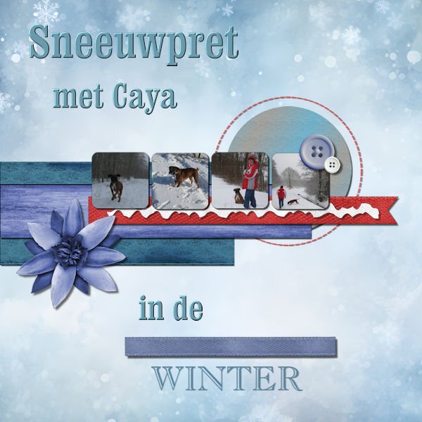
Lesson 5 Our last boxer, she loved the enormous amount of snow we had that year. 🙂 Caya died very young, just 5,3 years. I just realised it's already 10 years ago she died............. Background comes from Craetive fabrica, also the ricrac and ribbons en buttons 🙂
12 points
-
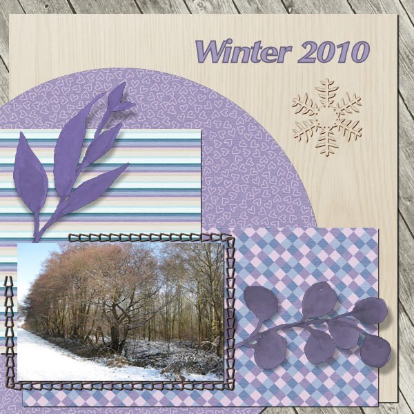
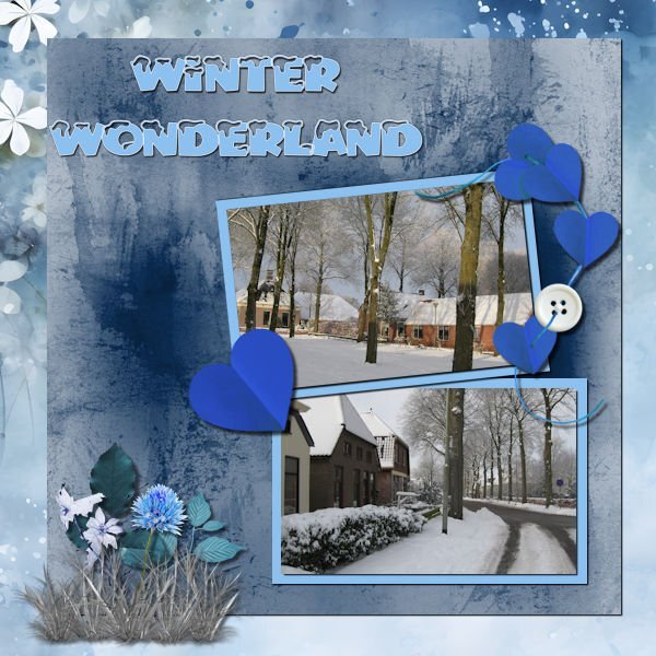
Lesson 4 Love the difference in(?) the light in winter🙂
12 points
-
Lesson 3 I have to remember to write down the kits and fonts for you guys.......:)
12 points
-
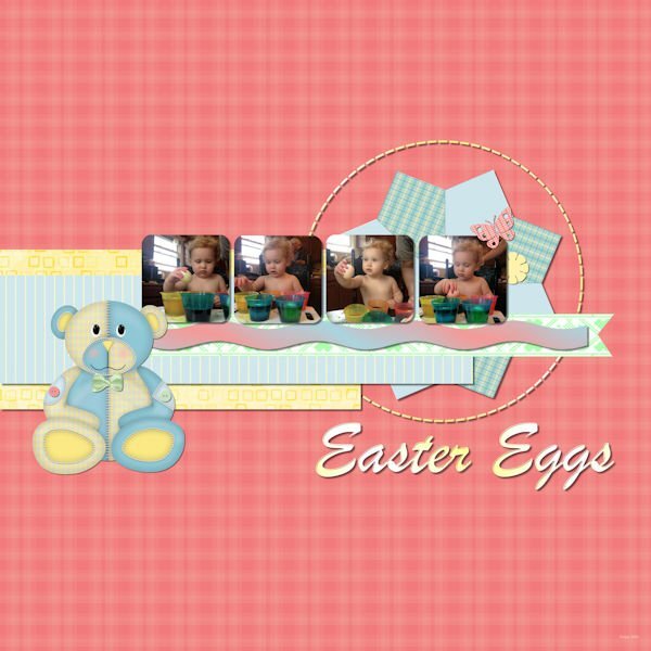
Day 5 The kit I used is called Baby's World that I made. Font is Brush Script MT. I added 2 buttons and the bow tie on the teddy bear.
12 points
-
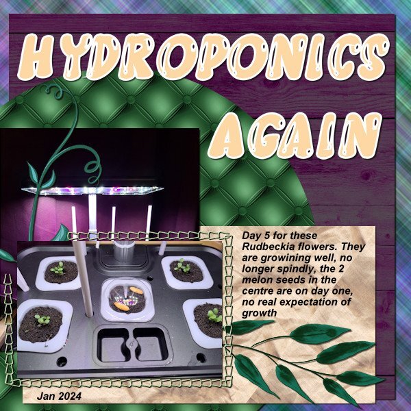
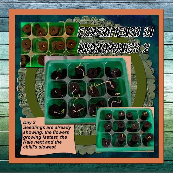
So here is my day 3, can't wait to get the day 4 email. One of the paper boxes I put a photo of the light for this set of hydroponics it seemed to fit well instead of using a paper.
12 points
-
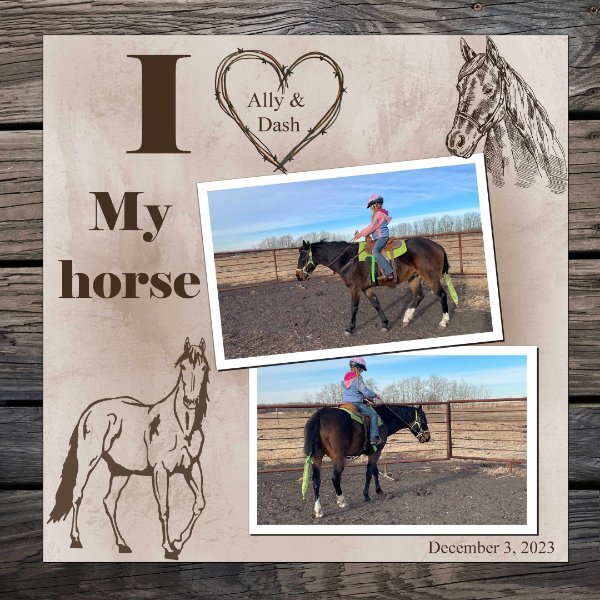
Day 6. I am on time ...... Another great handout. I really like the reverse shadow, I have saved the PDF for future reference. I did not use the flowers as I wanted it more horsey!!!!
11 points
-
Day 4 Diamond template. The pictures are from Creative Fabrica – Freebie from a day or two ago of watercolor winter scenes. The 3 smaller pictures are from 3 different scenes in the group. I textured and used brightness and contrast on the white layer background; the font is Winter Vibes (sorry, I couldn’t get the one which I downloaded that had snow on it to come up in my font list, so I just went with this one as I like it too. I innerbevelled the font twice and then gave it a slight shadow – I picked the color from one of the pictures. The 3 small pictures I chiseled so that they would stand out since the background large picture is very busy.
11 points
-
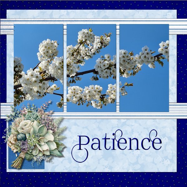
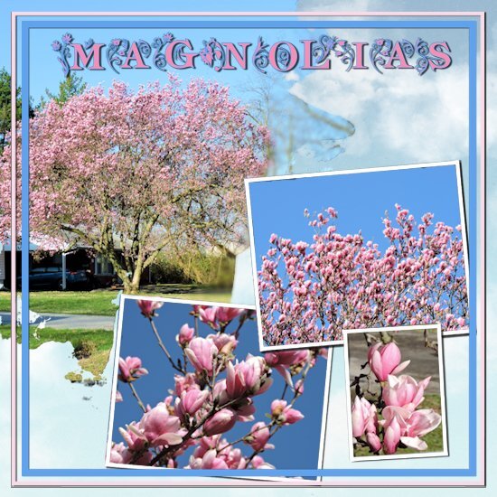
Day 4 Magnolia tree from two years ago. Last year a hard frost came a just the wrong time after the tree had bloomed out. Bummer. The text is am-intex or at least that is what it is called on my PC, the background is "cpjess-springskies-paper-blueskies folder" at least that is how I have it labeled.
11 points
-
Lesson 2: I couldn't find a scrapkit to my liking in my stash, used winter papers, not all to happy with the result, but it's ok 🙂
11 points
-
As always, I'm late with my projects 🙂 Last time I participated I used a spring them, now I will do a winter theme 🙂 Number one:
11 points
-
Day 5 result. I had promised another new dragon themed tag for a guy who has a "Dungeons & Dragons" group (he has a truck, I don't, but I need one to haul soil etc for my garden so I make tags for his group emails all year). I did try and work with the template but, after inserting all those menacing dragon eyes into the photo slots, I quickly abandoned that idea and deleted them. There was a circle and some rectangles left and, in the spirit of moving placeholders and using the pick tool for scaling, I went completely off script. The paper was a rescaled and recolored wallpaper, the dragons & flames were already in my stash but, because I usually work in tagger scale, I was constantly rescaling things. The pale dragon at top right was a jpeg so I had to tube it (I hate tubing) and there was no clear color definition. After adding it to the paper, I realized that I should have misted it as blurring the edges didn't work well. It was going to be blended into the background so it doesn't look too bad unless you zoom in on some of the edges. It took several attempts with drop shadows to make the flames leap out a bit. Font is Brush Script Std.
11 points
-
Day 4 Font: Nelson (Creative Fabrica - Laura Worthington) Paper: Riley B Graphics (Creative Fabrica) The word "Echo" is the shadow only (of something once that was and now isn't) and I used it in the literary sense from a google search below. I shadowed the frame but not sure I like it or not. What does echo symbolize in literature? In literature and art, an echo can symbolize memory, the past, or the idea of something being repeated or reflected back. In many cultures, the echo has been used as a symbol of communication, reflection, and the interconnectedness of different elements.Feb 26, 2021
11 points
-
Day 4 (running a day behind). YEAH!!!!!!!! Finally got text to wrap around. Thanks to Cassel for that extra link to another video. I had my curser in the wrong place..... such a simple thing to learn the hard way. Got to use it in this lesson though. Paper is from a kit by ETD, font is Victoria Cat (free from DaFont) and the photos were snagged from the internet. Having all those layers makes it easy to change things but I have to label everything before I start scrambling them. And a bonus, now I know what to do with all those large grunge and watercolor brushes that I have - when in doubt, use them like masks.
11 points
-
Day 6
10 points
-
Day 5, all caught up ..... yahoooo Kit TirAmisu design Autumn Mood. Love my grandchildren
10 points
-
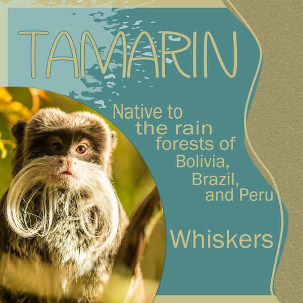
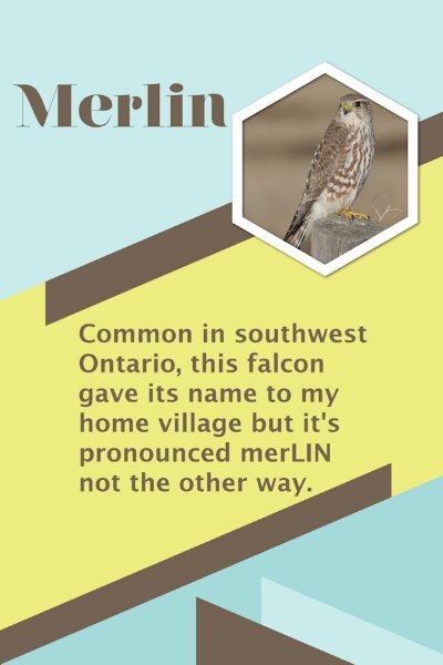
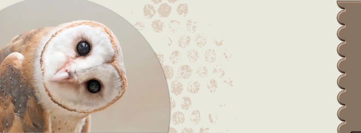
First chance I've had to catch up for this workshop. Did first three. The first (with owl) is a FB header; the second (monkey) is a Diamond extra template; and the third (falcon) is a poster format. I had to improvise on the wrapped text b/c I have trouble with that feature.
10 points
-
Ok so here's day 2, changed things up a little bit so I could display 3 of the 5 varieties of seed planted.
10 points
-
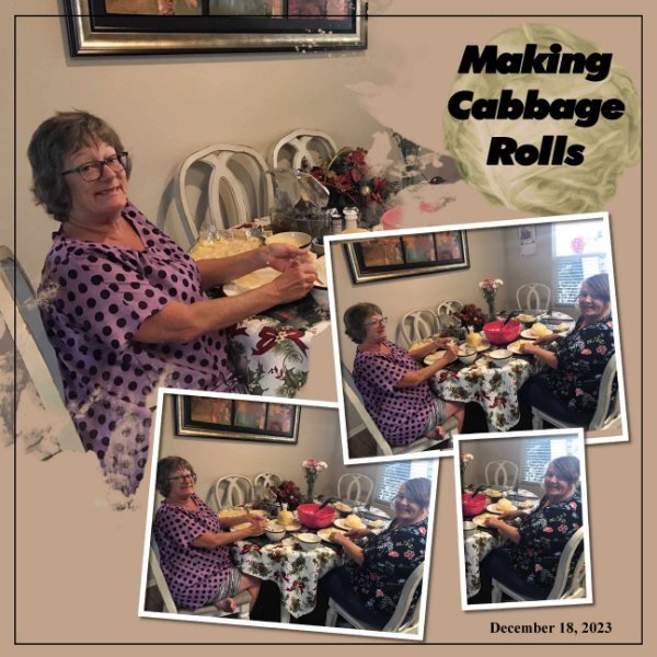
Lesson 5 - My daughter, Deb's, birthday is 3 days after Christmas. I just got these photos of their party in California. The dinner is crab and wild-picked mushroom risotto. The newspaper is what they used as a table cover as crab is messy! The title font is Monotype Corsiva. The flower is from cpjess-wildwood thicket kit. The hearts are labeled "SG_Exuberance_Emb_DCA_Hearts." The ric rac is labeled "AHA_somewhereintime_emb_ricrac."
10 points
-
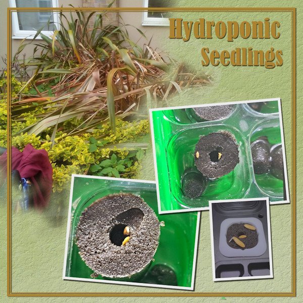
So here goes my day 4, the harder seedlings are just starting to sprout, and much to my surprise so are the melon seeds that I threw in just for fun. The bigger picture is the neglected mess of a garden that we cleared ready for our vegetable garden. If I remember next time I will include a picture of how it stands now waiting for the seedlings to be sturdy enough to plant out.
9 points
-
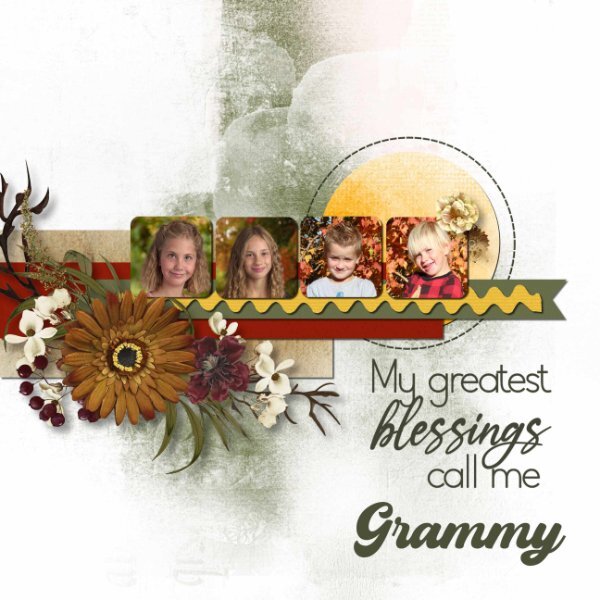
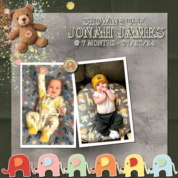
Lesson 6 - Jonah James is now 7 months. I hear he's ready to crawl! It seems I'll never run out of great-grands to celebrate! The font is Algerian, the blend mode for the textured background was Multiply, the kit is from Marisa Lerin called Oh, Baby, Baby. Just a minor correction. It seems I have the wrong baby on the left. That is actually Raja. I've changed the layout. Mea culpa!
9 points
-
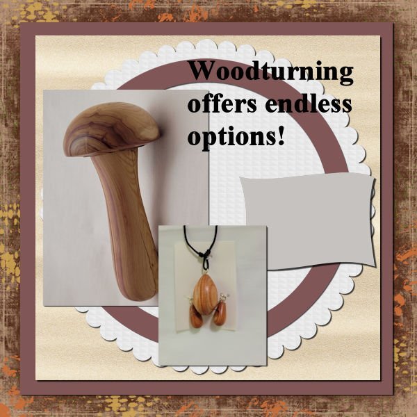
A few more of my turnings. The darning mushroom is made from a piece of a lilac bush. You should be able to just see the purple lines in it. The sawdust smells a lot like the flowers. The pendant and earrings are made from some small pieces of tulip wood. The papers I used all came from Marisa Lerin's DigitalScrapbook.com.
9 points
-
My template 4 result, completed quite quickly thanks to gettting to understand how the script work. Have had them for ages but never used them as I got into such a muddle before. Can actually I love them and glad I have them in my stash.
9 points
-
Day 5. Felix was born this past summer. The pictures are some of "The Firsts" of his first year - winter (in Illinois), Halloween, and Christmas. The papers are from Annie Digital. The fonts are Lato Light and Belgium.
9 points
-
Day six: The photos are mine, taken a couple of years ago. The papers and teacup are from the Afternoon Daffodil kit by Jessica Dunn - I changed the background paper by adding a pattern of daffodils to it from a png graphic from Freepik. The glitter bits are from somewhere else – I can’t remember where. The font is Righteous.
8 points
-
Template Lesson 5 result. Took longer to get elements together than anything else. Loved using the scripts.
8 points
-
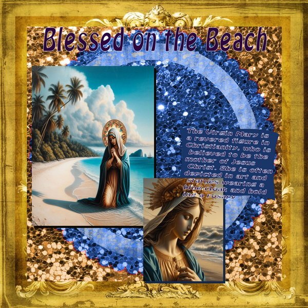
Again...more AI Virgin Marys with a short paragraph about her using chat GPT This did not come out the way I wanted this page to look but I posted it anyway.
8 points
-
Lesson 6 Font is Wintervibes (thanks to who mentioned it earlier) Photo's are my own and all the elements are from a very old kit I had 🙂
8 points
-
Lesson5: cass-Template5 Diamond and Autumn Breeze-Kit Part1 & Autumn Breeze-Kit Part2 Charley the cat
8 points
-
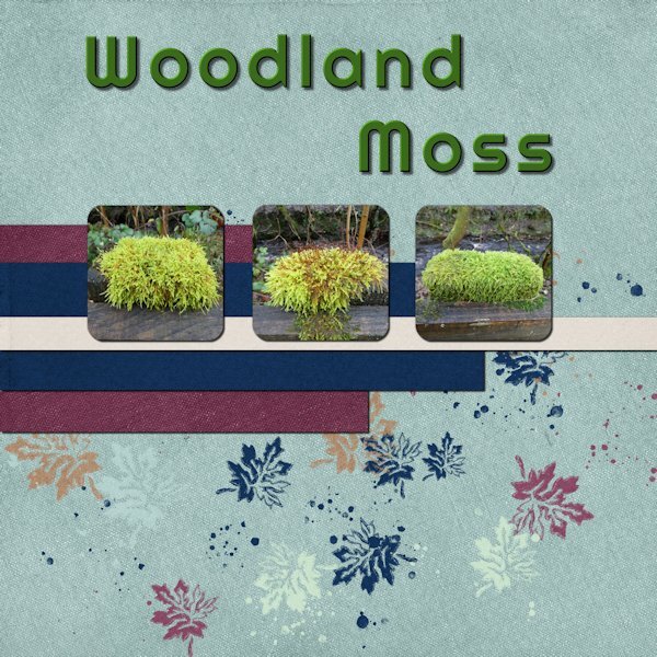
Day 5: I found the boxes in the template a little too small so I made them bigger and reduced the number to 3. The photos were all taken on a walk in local woods earlier this month (January). The font is Righteous. The Papers are from Jessica Dunn’s Wildwood Thicket kit.
8 points
-
Thanks for this gorgeous template @Cassel. There is soo much in it. I moved things slightly around and turned it since I wanted to feature my poem as well. Font is Beach House. The huge layered flower in the top right is by Marisa Lerin.8 points
-
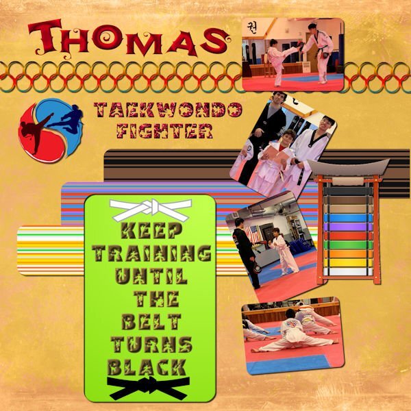
Day 5 - I used the Diamond template but rearranged and resized the photos. Photos are from my daughter in law; the belts, symbol and belt tower is from Canva. The striped papers were made with cass stripe 2 script. The fonts are AgreloycAsparagus, an oft font and Btz Taekwondo from Creative Fabrica. It is a good thing that I have nexusfont since I don't have to install all my downloaded fonts, a folder that is added to everyday from the wonderful fonts that everyone posts here. The background is from Riley B graphics at Creative Fabrica, thanks to Susan's mention.
7 points
-
Day 5 My cat, Rocky, who crossed the Rainbow Bridge many years ago. Rocky was a rescue and already named when I got her. She was named by children. I also had a male cat, Misty...also a rescue and named by children. Carole, the white circle inside the stitching...I achieved the brown pawprints using a blend mode...white paper, black pawprints, background paper. I had to hide the original white circle but am unable to add a shadow without changing the colors...the blend mode works with the layer directly underneath.7 points
-
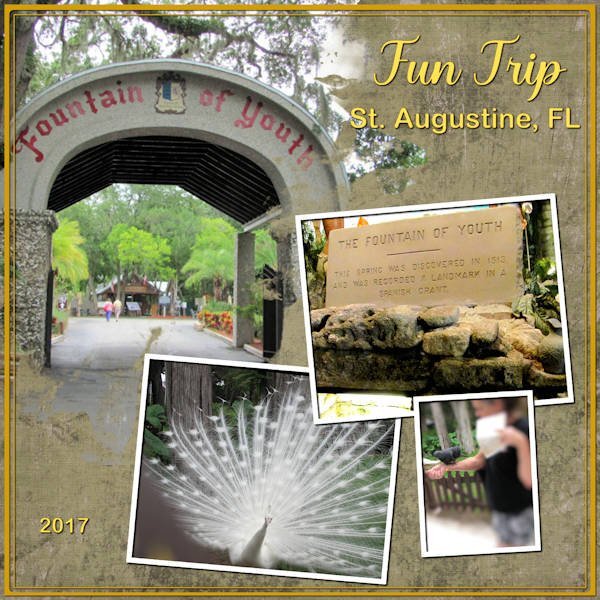
Day 4 Template. St. Augustine, FL in June, 2017. I did increase the opacity of the lower right photo layer as directed (I originally forgot that little trick but the picture came out dull, so I then remembered and did as directed). The picture I used Adjust>Depth of Field in order to focus on the bird Anna was feeding on her arm. I used Adjust>Brightness and Contrast on both the main picture and the picture of the fountain of youth. The background paper is a double layer each a paper from PS-marisa-lerin-change. I treated each of the layers (including the white layer included on the template) with different blend modes: the white layer is normal, the green layer is luminance, the cream color layer is color and an opacity of 38. The title font is Violenty Script (CF) and the St. Augustine, FL and the 2017 are Arial Rounded MT Bold. All the fonts were duplicated and changed to raster layers, then I inner bevelled each of them. The layout frame I colored, then selected it and modified, expanded it and then colored the expansion too. Then I innerbevelled it.
7 points
-
My day 3
7 points
-
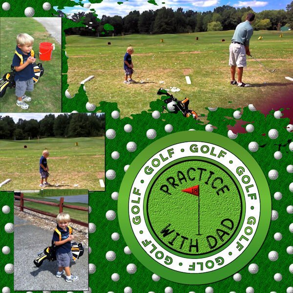
Day 4 - I created the background using balls and bubbles to make the golf ball, then cass seamless pattern script to make the pattern and grass texture from Paintshop. The circle is from a Marisa Lerin sport kit. The flag is from a font called Sports and Hobbies which froze my Paintshop so I had to use Photoshop and save it as a png. The font is Gomuno Bubble which is an oft font. I had to reduce the painted area in order to get the photo of dad and son to fit properly. After I merged the mask, I used the eraser to remove bits of black that remained. The photos are my own and may be a little fuzzy since I captured them from a video.
6 points
-
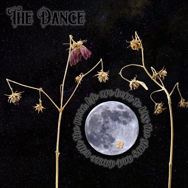
Day 5 First, apologies for really messing with the template. I did keep the round circle that the stitching was around and turned it into a mask and fit the moon (yup, I did some unspeakable things to the moon to make it not as real). Also, the little flower on the (*Ahem*) private "underparts" of the moon (you know, it looks like a cat walking away from you with it's tail up). They are right in the spots they started at too. I couldn't seem to make the template work with the small pictures like I have in the past so I had to improvise. I used "text on a path" for the quote around the moon, and wanted to add the author but it would have looked weird with a big gap of small lettering. For both the title and the quote I used a layer style of outer glow. That is an odd thing. I had it at the lowest possible setting and 50% opacity and it's really still too big. I did have to lower the opacity of the layer as well so it wasn't too overwhelming. I wonder if there is a better way, and not have to use the layer style as there is not much fine control with it. Once I had that I turned the font color black. The stars was a starry background paper I got somewhere, that I put above the photo layers and used "screen" blend mode. I thought these subjects looked like they were dancing when I shot them, they are the Forgotten Moonflower Fairy Queens. Font: Title is Morgan Tattoo and the quote font is Morning both by Creative Fabrica Quote: by Avijeet Das Little Flower: Digi-Dewi -Relax, flower-brown (Digital Scrapbook.com)
5 points
-
Day 6 Today I'm sticking with my flowers but this photo is from last spring and I choose it because I'm fed up with the cold and the remnants of the snow that makes the footpaths slippery! The timing of this workshop is great as we, my hubby and I are getting a little bit afraid of taking a fall on those slippery paths/roads and that is maybe a sensible thing regarding our ages. Why don't I like being sensible.............. I wanted to use this photo and therefore I used the extra diamond template because I could combine the mask layers in one layer (something we learned in the Magazine Workshop). The papers come from a kit called Denim and I got the dark background by using 2 papers and a blendmode. I really like using the blendmodes and in PSP 2023 that has become so easy. Instead of using the flowers that are in the kit I have chosen I bouquet from my stash. The font is Prida01 and that one has nice glyphs and I gave the text a bevel.
5 points
-
Choosing a kit is sometimes more time consuming than the actual project I think 🙂5 points
-
Love it!👍4 points
-
I love the crisp clean look Gerry4 points
-
I knew this was yours before I saw the name. You love your seedheads and do such a beautiful job of presenting them.4 points
-
Never apologize for purple. "I think god gets mad if you walk by the color purple in a field somewhere and don't notice it." (paraphrased from The Color Purple - Alice Walker.)4 points
-
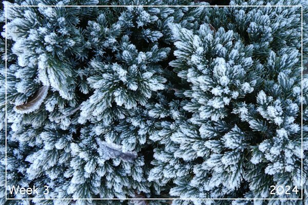
Week 3 Temperatures below -4C most of the week. At times a severe frost and my photo this week reflects that – frost on a small conifer bush in the garden.
4 points
-
Thank you. Make sure to tell me if I do overstep. I did live 20+ years in Surrey, BC; nothing you say to me will phase or offend me.3 points
-
The colours and that textured background paper make this really special. It's rich and luscious.3 points
-
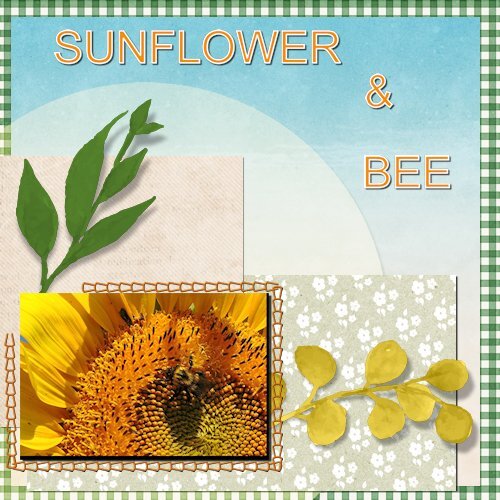
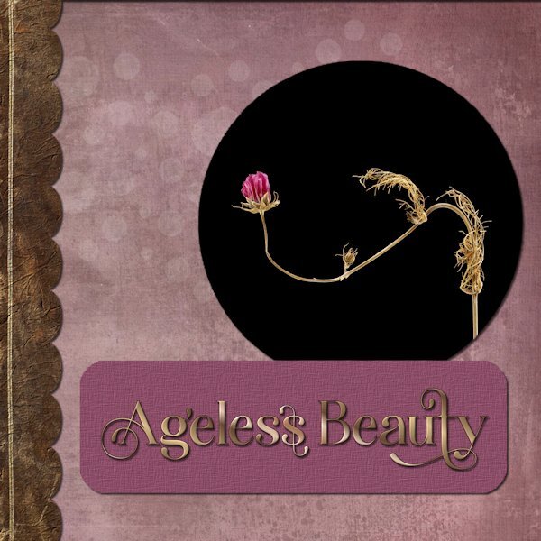
I finally got on the board. here is day 1 I still see the beauty in flowers long after they are done. I originally left them in the garden for the birds to use in the winter but found their lines and shape were interesting and beautiful. Papers: Riley B Graphics (Creative Fabrica) (I highly recommend her, if you love grunge backgrounds and some overlays that include a video! - In PS) I added texture to the dark brown scallop piece. Font: Hostania (Creative Fabrica) Inner bevel was added Magenta paper for Title: chosen from photo then texture added
3 points


.jpg.ea0de3bb5afd63d9d8be16f6b989c0f3.jpg)

.jpg.a470b800ab1ac9400350beff4e68bbc1.jpg)


Resized.thumb.jpg.d25811db03a63358cedab1e79f527635.jpg)