Leaderboard


Popular Content
Showing content with the highest reputation on 11/17/2023 in all areas
-
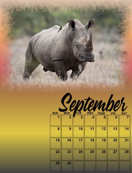
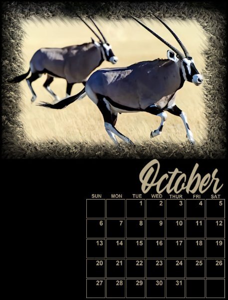
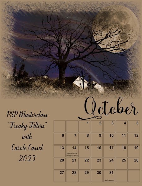
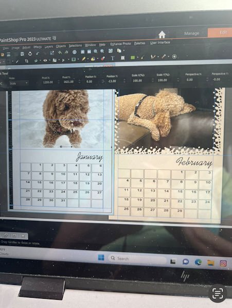
Here are September/Rhino and October/Oryx. After seeing the video, I find changing the calendar grid and font colors much easier! (Lock Transparency!)
 7 points
 -
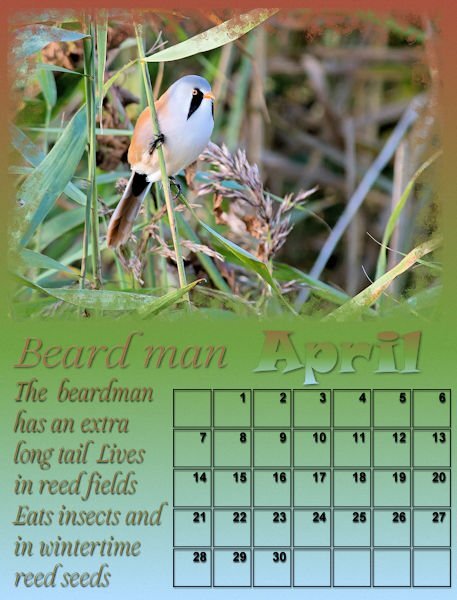
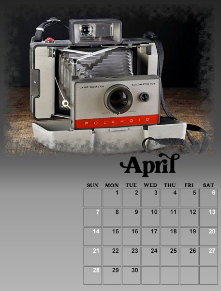
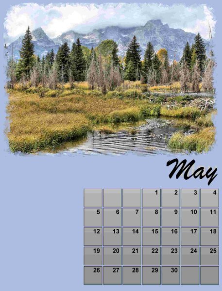
Here is April.
6 points
-
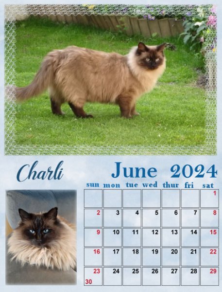
Calendar March 2024 Charli May and June
6 points
-
I love all the wonderful calendars here around here are my march and april used again the calender script with font Bittermilk for March and font Earwig Factory for April, I used the Innerbevel and a little shadow march background with a gradient and texture april background - a pattern from the flower and a gradient6 points
-
4 April's turn
5 points
-
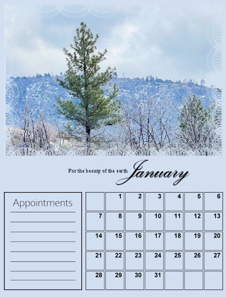
I decided to be ambitious and try to complete two calendars: one featuring our Labradoodle Lucy and one focused on Nature. When I was a little girl, my mom signed me up for the children's choir at our church. The very first and only Hymn I learned from the experience was "For the Beauty of the Earth." Still today, it is my favorite church Hymn. The lyrics resonate deep with me because I love the beauty of nature. There is beauty all around us. We live full-time in our motorhome, and I am fortunate to be retired, in good health, and can spend time traveling the United States. Someday, I hope to travel around Canada as well! I love taking pictures, and all of the photos I post are my own. Here are the first three pages of my Nature Calendar set.
5 points
-
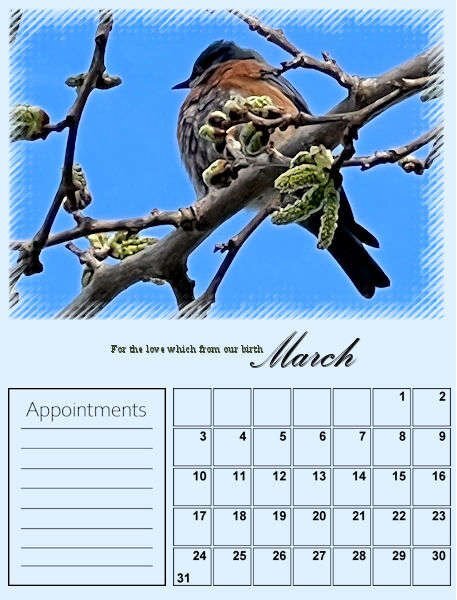
I'm behind I noticed. but here's March.
5 points
-
Fonts used are Yoshieka, Greater Amberjack and Arial.
4 points
-
September so far, needs a little picture at the bottom left. Font (🤣) is Charlemagne
4 points
-
Cor Blimey! I'm aghast at the number of fonts some of you have. I genuinely feel we need to set up a Fontaholic support group, where we can help you to refrain from clicking that font download button. I see now that Michele isn't an isolated case. I see this is a real problem for some and it needs to be addressed immediately. I'm with Rene on this one. If I see a font which really catches my eye, I firstly double check to see if I have something which is almost identical, if I have, I leave it well alone. I have my favourites, which I use repeatedly in my pages. I think my disposition may have something to do with it, as I don't like, clutter, whether it's in the kitchen, in the office, or on my laptop. I think I may have over dramatized a bit, but I couldn't resist. 🙂4 points
-
And I think 385 fonts are too many!!!4 points
-
And Finally July!
4 points
-
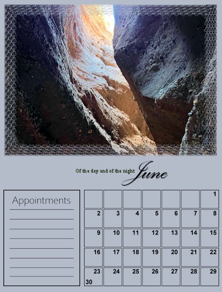
Here are May and June.
4 points
-
I currently have 12,492! Do I qualify for FA? (full disclosure - 5213 came from Google fonts that was on the font program I use)4 points
-
We need to start a meeting of Fontaholics Anonymous.4 points
-
July and August with some of the dates in another color. At first I wanted to make all the weekend days for all the pages in the same color, so it would be coherent. That didn't work because the backgrounds of my pages have different colors and besides white and black there wasn't one color suitable for all. Therefore I took a color from each page for the weekend dates for that page. If a month has special days like X-mas I'll give them a different color and probably a short text. Family birthdays will be added later on. Now I'll go back to my other pages for adjustments. I post every day the pages of that day and lesson. When we are at the end of the workshop the last pages will be completed and I'll have to go back to update the earlier ones.
4 points
-
Lesson 3 - May & June I really like these templates (I mean all the ones so far).
3 points
-
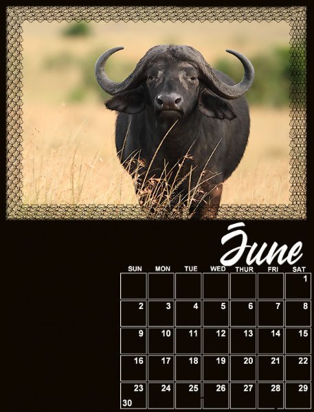
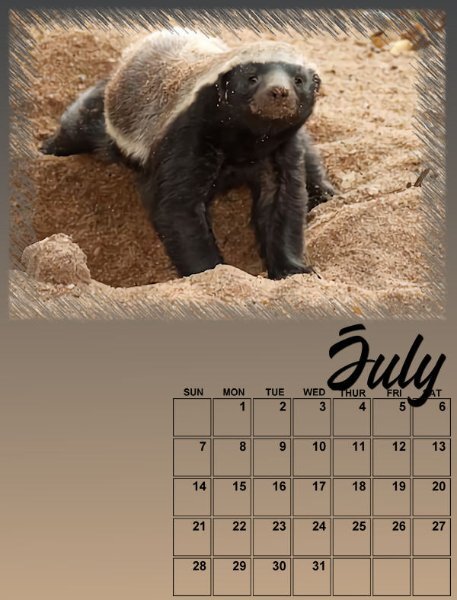
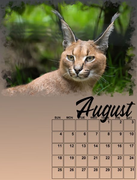
Here are May, June, July and August. Not complete but started with backgrounds, photos and the Wakanda font for the month to keep it consistent. I have added a strip file I used for the 2022 Calendar workshop so I would be able to have the days of the week. I'm glad I kept it! In date order, the photos are the African Lion, the Cape Buffalo, the Honey Badger and the Caracal. I will be adding details as we go along.
3 points
-
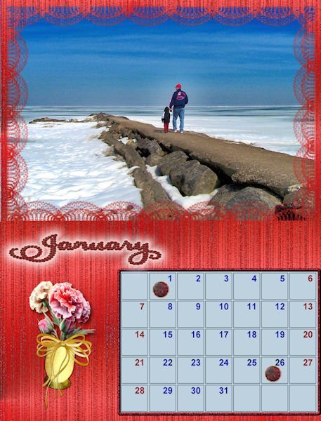
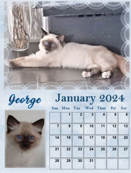
I completed January. The script is Samantha Upright from Creative Fabrica. I spent quite a bit of time deciding on the font. I used the directional tube script to make a garnet and then ran Vector Tube. I used Layer Styles to add an outer glow to January.
3 points
-
After the "font" discussion back to my calendars and these months are almost done now. I didn't like the black date numbers and have changed them to a middle/dark grey color for all the months; the outlines of the boxes are very thin and I kept those in black to keep them visible. In the lesson from today was the option to color the boxes mentioned and I gave it a try but didn't like it. All my pages have a gradient and then some part of the boxes has a slightly different color than another part, which didn't look great even with the opacity lowered or a blendmode. But I wanted something to fill those boxes and it should not be very obvious too. After some trying different options I took the same photo as in the page and in the scripts I have inside PSP I choose the find all edges. I know how to do this manually, but the script is much quicker. After that I put the resulting image in the date boxes and played with the blendmodes and opacity until I liked what I got. More work now to do this for all the other months!
2 points
-
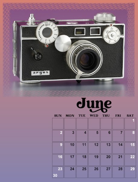
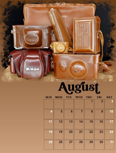
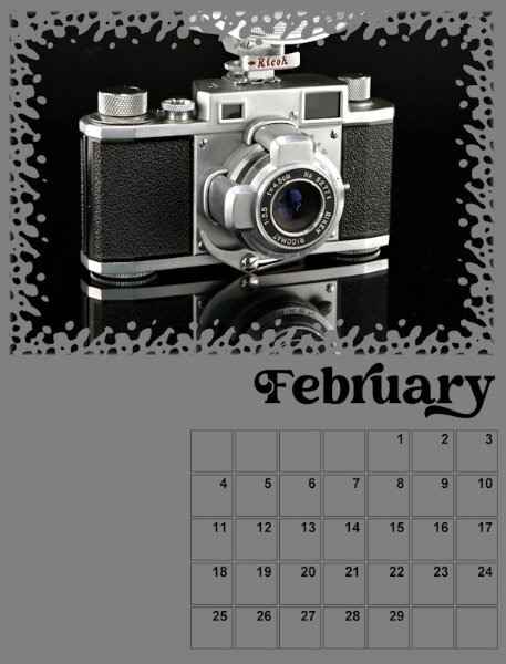
Lesson 4 - July & August Not exactly a vintage camera in these shots but accessories to the cameras are important too. Okay, maybe not cases. Who uses them? I remember starting out and always used the case (on the SLR) and it would flop around and get in the way when I was taking pictures. They don't even give you those types of cases anymore, heck Canon doesnt even give you lens hoods unless you buy the "L" series lenses - after you mortgage your house to buy them that is!. The big case in the back is a polaroid 800 Land camera I forgot had. I might photograph it and switch it out with the other Land camera in month 4. I'm on a roll and having fun. Just got a text to head to work 2 hours earlier so my fun is over. Never enough time for PSP. Carole, as my teacher can you write me a note saying "Susan can't work today, she has important assignments to finish. Oh, and a question: In PSP 2022 if I open the calendar template and activate the Month vector it showed the size in points (32 points), and when I changed it to pixels is showed the correct pixel of 133. But, when I use PSP 2023 (which is what I'm using for the workshop) and activate the month vector is shows its in pixels and yet still says 32. Clearly it's not that size. Is it supposed to know and show the size in pixels once you double click on object ("T") layer inside the vector layer?
2 points
-
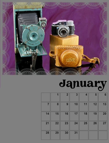
Lesson 2 - March & April I am not keeping the backgrounds, they are stand-ins until I decide on a background I like. Since it's Vintage cameras I'll look for vintage or grunge type backgrounds. Hope it comes to me. I centered the months on the date boxes and add days-of-the-week along to the top. NOTE: yes, I see I posted the wrong March month before I centered the months. Oops. I'm leaving the boxes and will decide at the end if I changed them. I might add text beside for information about the cameras in the photo. And I might move the photos around to different months. I did change the size of the first letter in the Month like Carole showed in one of the videos (I've gone back and got the early months caught up) So many good ideas from everyone. I will be trying them out along the way. I especially liked moving the Month and adding days-of-the-week. Thank you all who did that.
2 points
-
If I'm not mistaken, this might be categorized as "hoarding." I sail right past fonts on offer; too many limits my ability to choose. I just looked at my Nexus Font and it told me I had a total of 659 fonts. That's more than enough!2 points
-
Although I made light of being a fontaholic, with a little banter, you took it as it was intended. I can also see it as an issue for some. We'll help as much as we can. Let us know the next time you get the urge to download a font, we'll try to find a way to restrain you from doing so. 😀2 points
-
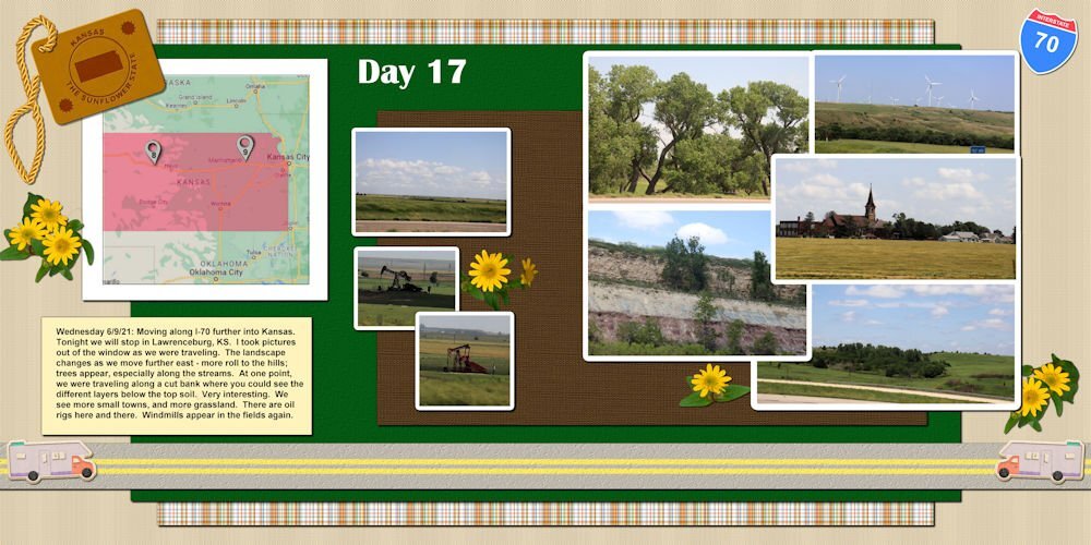
Getting close to the end of the year. Think I will be able to finish this project before the end of the year. This is the day before our visit in the town of Lawrenceburg, KS.
2 points
-
Heeeelp me....I need a 12 step program. Too much choice means not being able to choose at all, I know it's an issue. In some areas of my life I am analy over over organized and some, I'm a bloody mess. Your post gave me a good laugh at myself.2 points
-
B*I*N*G*O, that was the crucial tip🤩. Now the layer icons are back. Thank you, Jannette🥰. Now I just have to go back to the settings that Carole described in the video at the beginning of the boot camp, then I have the additional icons again and can continue with the tutorials.👍2 points
-
Installed 1115, according to Nexusfont, so I'm just a beginner compared to you 🙂 😄I have a lot more, but not everything installed.2 points
-
I will be the looser of the club. 😁, I like fonts too (who does not do) but they must have something special for me.2 points
-
You are not the only one that is addicted!😆2 points
-
Hi, Leslie here from Peterborough ON Canada. I'm not ignoring this group, but it has become a very busy week. I hope to be able to review and work on all of the calendar options on Sunday.2 points
-
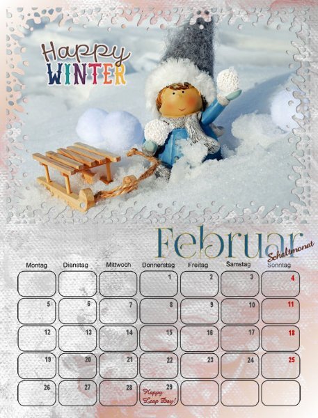
Here are the updated versions of the January and February calendars. After seeing Sue Thomas's rounded date box, I changed the one I created years ago... I am very much interested in the script Carole mentioned above. Credits: Bella Gypsy Happy Winter / bellagypsy_happywinter_wordart1
2 points
-
Hi, I'm using X9 version and I am missing a step somewhere. When I change my font for the month and resize it, it is leaving a copy of the old font underneath and in the original color of the background. Can anyone lead me to what I need to check or back up and fix?
2 points
-
That works only if you already listed your home phone to the account as a recovery method. If she had she would have probably already been offered that option. I used to be very paranoid about giving out my phone number for fear of getting spammed. These days 2 factor authentications are everywhere and if you don't have a phone number associated with your account you can't get back in if you ever get locked out. (sorry for going off topic... What can I say? I'm a Geek!) Here's my final versions
2 points
-
Calendar 2024 My boys July and August
1 point
-
Lovely bright idea, I was impressed with the appointment box, great idea1 point
-
Glad that worked. I don't typically suggest this as the first step to reset since it means you reset EVERYTHING, which means you have to re-customize also everything. I like to start with "less drastic" measures.1 point
-
Ann, very beautiful calendar. I love the Cape Buffalo layout and that you used white font/dates, the black is perfect and I never thought to go black. I'm so far behind. Busy week at work (Black Friday flyers, ugh) so I hope I catch up this weekend.1 point
-
Shirley, this is a beautiful calendar.1 point
-
Only after I'd finished the March calendar did I realize that Easter is in March this year... So, later, I will change it to an appropriate photo. This photo will be in April then. I still used the same overlay with blend mode. Credits: (Although this is a calendar, I cannot help using some techniques I've learned here on the Campus! 😄) MarisaLerin: (marisaL-PSFeb14 Be Mine / marisaL-scatter1) ShabbyPrincess: ShabbyPrincessDesign_Promise Collection / SP_Promise_Butterfly
1 point
-
This is my idea for one of my calendars. But, I need to ask for help, once again! Because I moved the month over, and I extended and moved the Calendar dates a little bit, is there anyway to set move permanent guides for all of my templates so I don't have to set the manually for each of them. Because I work on a laptop, (we live in our RV and haven't purchased a good desktop computer yet, my rulers are really hard to see. Which makes setting the guides up uniformly (twelve times) really hard! I appreciate any feedback. thanks bunches!!
1 point
-
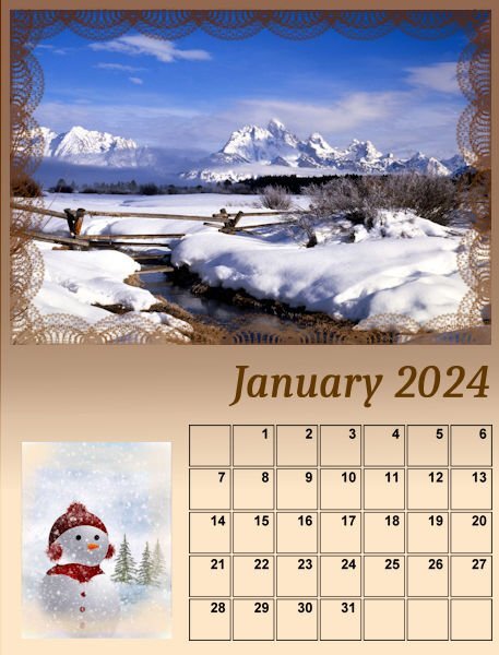
Calendar 2024 January
1 point
-
Month of January.
1 point
-
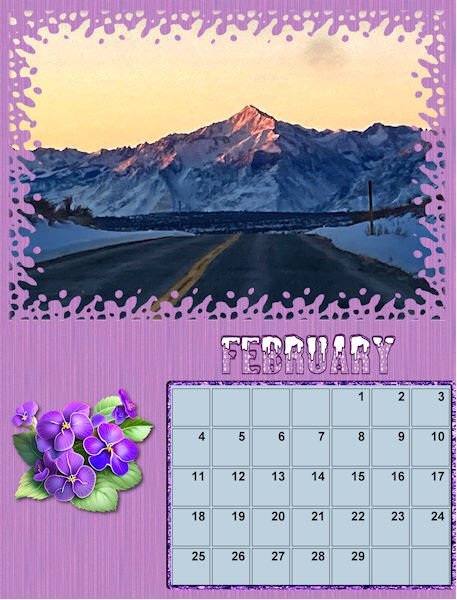
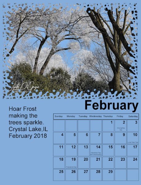
Here is my February page, font is Sweet Love the Statue is in our Zoo in Aachen1 point
-
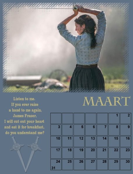
My birthmonth has to have my favourite character from Outlander, Claire, and a quote from her. The other templates/ months still need work of course, but I knew this has to be the one for March.😎
1 point
-
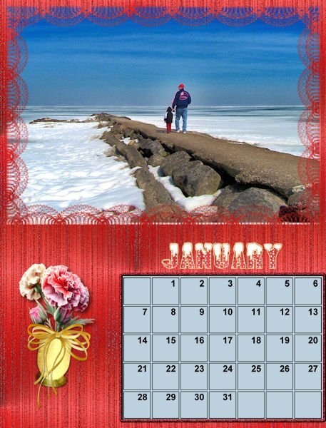
My January and February--I am using a color and birthday flower for each month. Although I have a lot of flower pictures, I don't have pictures of violets or carnations, so I used CF Spark. I may just continue using it for each flower for consistancy. The font is Alamonte Snow. Photos are my own.
1 point
-
Here is the start of my Calendar - Jan/Feb I mostly have portraits orientation on the cameras I did photograph for the Magazine workshop. So, I will be in the studio shooting again to get some in landscape format. I'm sticking with the Creative Vintage font I used in the Magazine workshop. I will add the background as the lessons continue. I like that we build on each one and then go back to the previous months to add the new techniques. Good practice for me.
1 point
-
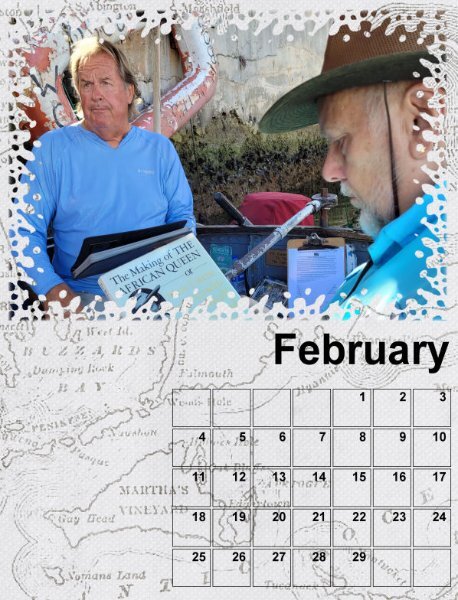
For this page, I chose a picture of me on the actual African Queen, from the movie. That boat has been all around the world, so the background is a map.
1 point
-
Hi everyone .I am in also .My photo didn't go on the "photo here" layer. It made a new layer so already gone wrong and only on Day 1 !! It is still behind the overlay so I think it will still work. It is defiantly going to be user error again !.Seem to get a lot of this these days ! Have fun all ..
1 point
-
I added some text and I made a box with the days in it. I saved the box as a png for future use. As the Nature Conservancy has already sent the 2024 calendar. I used it to label the days. I'm using photos from over the years that I've taken. Each will be used in the month taken. Not sure about the backgrounds yet. I would like to put some shadows of some kind to the frames. Don't know if that's possible. Have to wait and see.
1 point