Leaderboard
Popular Content
Showing content with the highest reputation on 11/16/2023 in all areas
-
11 points
-
10 points
-
9 points
-
9 points
-
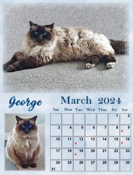
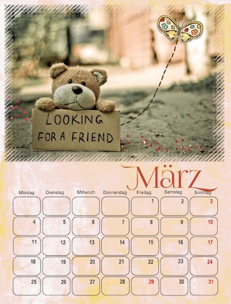
Only after I'd finished the March calendar did I realize that Easter is in March this year... So, later, I will change it to an appropriate photo. This photo will be in April then. I still used the same overlay with blend mode. Credits: (Although this is a calendar, I cannot help using some techniques I've learned here on the Campus! 😄) MarisaLerin: (marisaL-PSFeb14 Be Mine / marisaL-scatter1) ShabbyPrincess: ShabbyPrincessDesign_Promise Collection / SP_Promise_Butterfly8 points
-
That works only if you already listed your home phone to the account as a recovery method. If she had she would have probably already been offered that option. I used to be very paranoid about giving out my phone number for fear of getting spammed. These days 2 factor authentications are everywhere and if you don't have a phone number associated with your account you can't get back in if you ever get locked out. (sorry for going off topic... What can I say? I'm a Geek!) Here's my final versions7 points
-
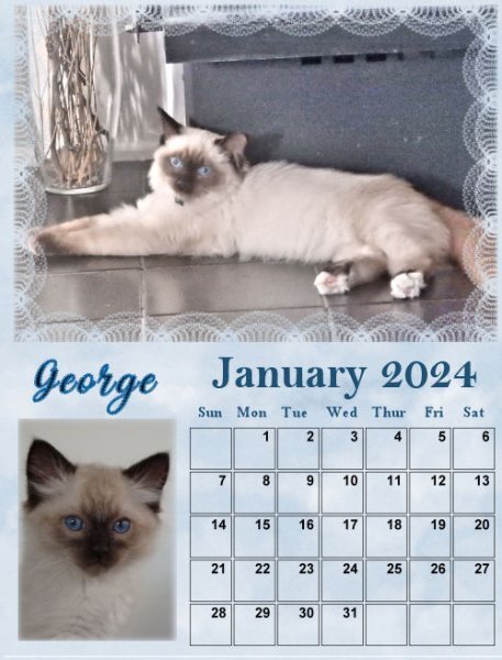
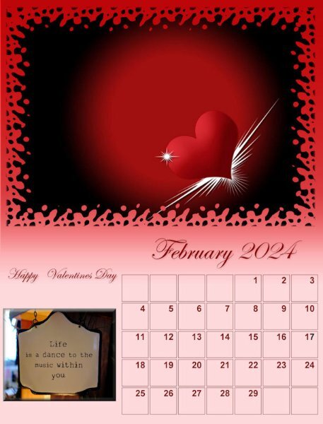
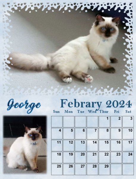
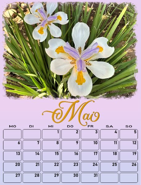
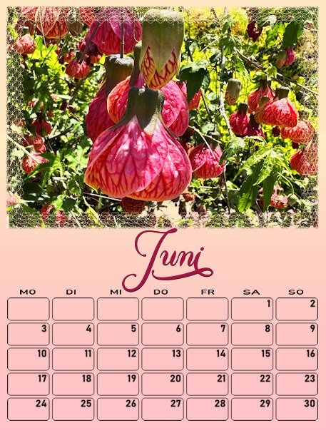
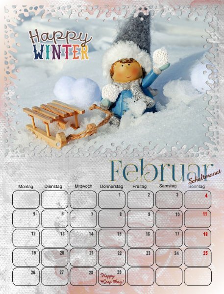
I have altered the date boxes for the weeks to start on Monday. I have Carole's Custom Calendar script for 2 years now and it works great and is a timesaver too. The script gives the opportunity to choose a different format for the boxes and you can design them too. But I wanted a simple shape, nothing fancy so I can write things inside them. Therefore I have them on the full width of the page. I have spend some time to find a font that I like and that has the glyphs I want. For the time being I have put the month's name in the middle of the page, maybe I'll change it later. I will use the same font for all the months but change the color to match the pages. Font is Almond script. Now I'll have to see what the dates for all the holidays in 2024 are. Some of course are always the same, but not all. And I have to search the ones for Switzerland too, because some of theirs are not celebrated here and visa versa.7 points
-
6 points
-
6 points
-
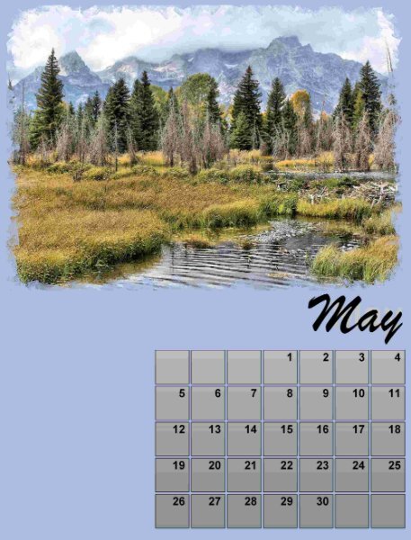
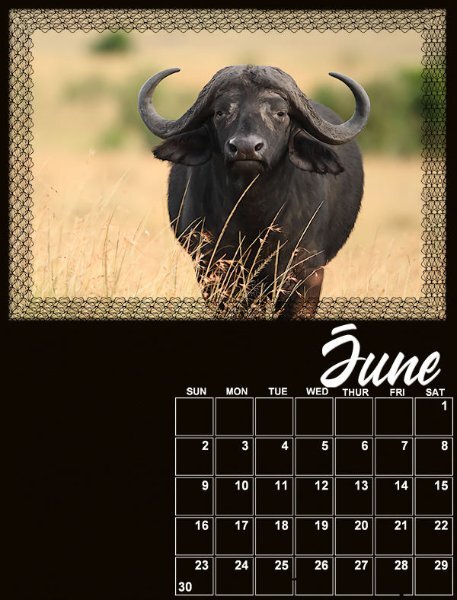
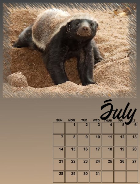
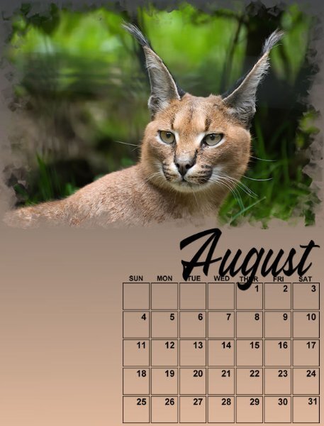
Here are May, June, July and August. Not complete but started with backgrounds, photos and the Wakanda font for the month to keep it consistent. I have added a strip file I used for the 2022 Calendar workshop so I would be able to have the days of the week. I'm glad I kept it! In date order, the photos are the African Lion, the Cape Buffalo, the Honey Badger and the Caracal. I will be adding details as we go along.4 points
-
Thank you so much Cristina! It appears, I have my stamp written all over my work, making it unmistakably mine. 🙂 I have also created other different shaped boxes. Including cut box effect. A certain person will know, I won't mention any names, but you know who you are. I love the theme you have used for your calendar, quite ingenious. Like Michele's theme, it goes to show that you don't have to use photos.4 points
-
3 points
-
I remember those as well! 🙂 ... They are gorgeous. Your calendars are unique, as are your work excellence, an eye for details, photos, etc. It's always a joy to see them.3 points
-
3 points
-
Nice idea to put the month in the middle. I think I maybe the size a tiny bit smaller would even be prettier 🙂 Nice font!3 points
-
3 points
-
Meerkat Manor! Has anyone watched this British television programme. Produced by the Oxford scientific films, which first aired back in 2005. It ran for 3 or 4 yrs. I didn't miss an episode, one of the best natural dramas ever made. Its a drama series, following a family of Meerkats in the Kalahari desert. The kardashian family isn't a patch on the Whiskers family.3 points
-
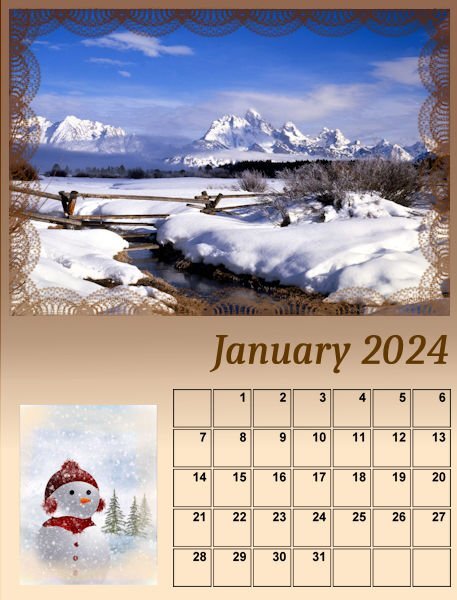
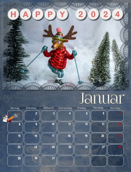
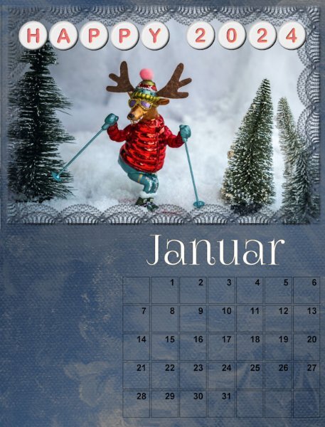
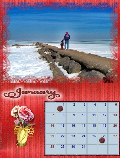
So far, I have only updated the month of January. Just to be different this year, I added Cassel's Alpha Beads. The basic is a freebie, and I changed the font/color following the Alpha Beads tutorial. Credits: Overlay: ps_melo-vrijhof_162544_textures-painted-paper2-paint-paper-09_cu Font: FoglihtenNo07 https://scrapbookcampus.com/the-lab/lab-10-module-06/ Edited: I mentioned it before, but I'll mention it again. All photos are/will be from Pixabay, Unsplash, or Pexels. I downloaded them years ago and use them whenever necessary.3 points
-
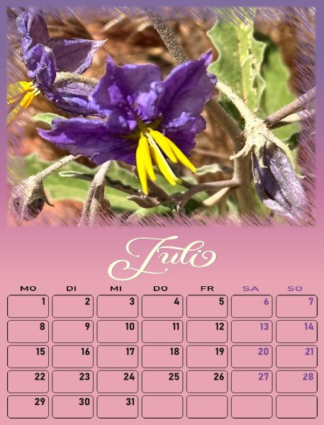
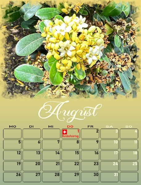
July and August with some of the dates in another color. At first I wanted to make all the weekend days for all the pages in the same color, so it would be coherent. That didn't work because the backgrounds of my pages have different colors and besides white and black there wasn't one color suitable for all. Therefore I took a color from each page for the weekend dates for that page. If a month has special days like X-mas I'll give them a different color and probably a short text. Family birthdays will be added later on. Now I'll go back to my other pages for adjustments. I post every day the pages of that day and lesson. When we are at the end of the workshop the last pages will be completed and I'll have to go back to update the earlier ones.2 points
-
2 points
-
I don't get that either. Film makers film the harshness of nature and do nothing. I couldn't stand by and just watch. I watched a show about a pride of lions and one the the babies got separated and they filmed in and kept saying if it doesn't reunite with the mother it will die (which I think it did in the end) and it was getting weaker and weaker. It was heartbreaking. I'm not naïve about the harshness of nature, but we humans created a lot of natures struggles so we should be trying to save, fix or help anything that needs it and quit saying that it's cycle of nature. I can believe that statement in a time long before mankind, but not now.2 points
-
I have to get this script! ... I created a simple date box years ago, but if I want to do something different, this script will be handy.2 points
-
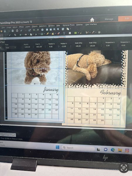
This is my idea for one of my calendars. But, I need to ask for help, once again! Because I moved the month over, and I extended and moved the Calendar dates a little bit, is there anyway to set move permanent guides for all of my templates so I don't have to set the manually for each of them. Because I work on a laptop, (we live in our RV and haven't purchased a good desktop computer yet, my rulers are really hard to see. Which makes setting the guides up uniformly (twelve times) really hard! I appreciate any feedback. thanks bunches!!2 points
-
Thank you for feeding my font addiction! It's gorgeous, especially with the extra glyphs.2 points
-
@Julian Adams Looking better and better! @Carolyn Rye That is a good start. With upcoming lessons, you will likely revise those pages! @Jannette Nieuwboer I am sure he will be proud to display that calendar! @Cristina Oh, it is fun to see those beads in use! @Chris Schults Looking forward to your projects. Some participants might be waiting until the end to show the COMPLETED pages so it is ok for you not to post anything yet 🙂 @Anne Lamp Oh no! I hope you find a solution. I have no idea how I can help. @Corrie Kinkel I think I might feature that particular script in the Campus blog next week. So others can choose to customize their date boxes even more if they want. @Shirley There are lots of cat lovers in this group. That calendar will be a star!! @Ernest Moore Are you actually EDITING the text or are you typing on top of it? If you are typing over it, it is not much of an issue as you can delete the other layer. Can you do that?2 points
-
Oh Anne, that is awful. I just went through some computer woes that took my husband two full days and much research (just to talk to a human) to get it resolved. Once he talked to a real, actual human it was fixed in less than a minute! I wish you luck and a speedy recovery of your e-mail account and all other computer woes. Sometimes, computers are just plain evil!2 points
-
As suggested by Sue Thomas I have added shadows to the images on this project. I also learned that adding drop shadows as a new layer really helps. When I first tried to add a drop shadow, it wasn't to my liking. But another try just added a second shadow ti the first not a replacement. Then I saw the little box to add the drop shadow as a new layer. Now I can experiment until I get the effect I want. I also changed the images to the proper size as outlined in the instructions. My first go had some images the wrong size (too large). With the resizing the project looked wonky so I had to adjust the images to make it more balanced. Thanks for the learning opportunity.2 points
-
2 points
-
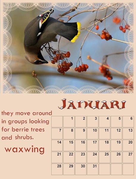
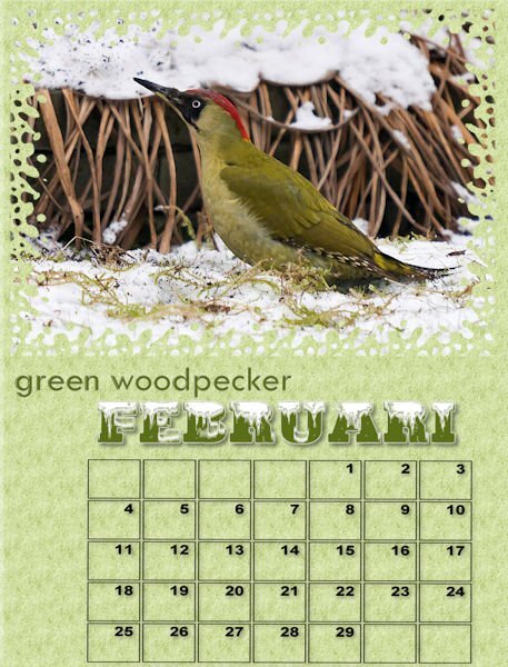
I'v improved the januari and added the februari On the photo of the green woodpecker is a copyright, it is from Ad van Duren nature photografer. I do not have to pay for it as it is for private use. I may use more of his photo's he promised me. I will make a logo to him in exchange. And he wil have a copy of the calendar!!! Now I have to make an extra effort.2 points
-
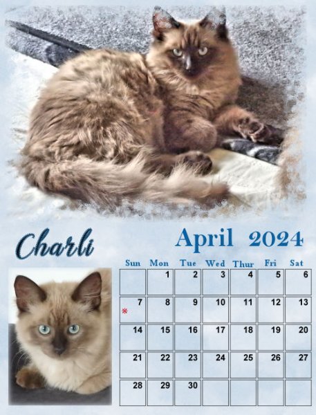
I love all the wonderful calendars here around here are my march and april used again the calender script with font Bittermilk for March and font Earwig Factory for April, I used the Innerbevel and a little shadow march background with a gradient and texture april background - a pattern from the flower and a gradient1 point
-
1 point
-
1 point
-
Hi, Leslie here from Peterborough ON Canada. I'm not ignoring this group, but it has become a very busy week. I hope to be able to review and work on all of the calendar options on Sunday.1 point
-
I used a script in PSP to make the calendar with the numbers and month, in the script I can choose the fonts1 point
-
I almost always use a shadow on a separate layer. If you don't need any tweaking, it is fine but if you ever want to adjust something or remove it, it is the perfect option!1 point
-
1 point
-
1 point
-
1 point
-
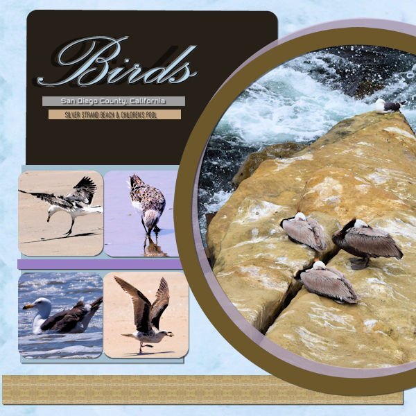
This is the cleaned-up version of my design. I fixed the kerning on my font by setting my kern value to -25. Then I swapped two of the square pictures and adjusted my circle layers so they did not over-power any of my squares. Finally, I fixed all of my shadows. My background paper used the pattern effect on my picture of the three birds. I used the same effect to create the brown band across the bottom of the design. The thinner bands and the large rectangle were created using the colors in the circle picture. Thank you to everyone who offered me advice and suggestions.1 point
-
1 point
-
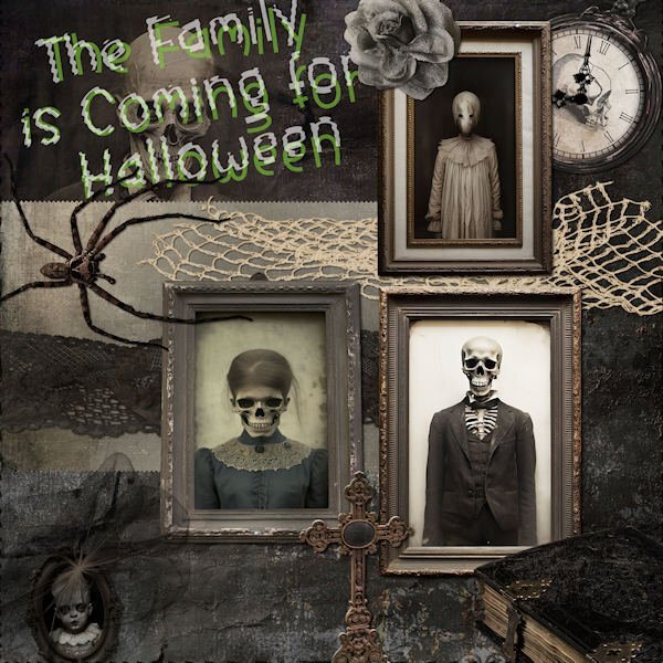
I found this kit on Gingersnaps and couldn't resist using it with a Halloween theme for the Bootcamp. Meet the Creepy Family that's coming for Halloween! Everything on the layout came from that one kit, called ID-Face in the Photograph. The kit has 11 folders filled with embellishments and 3 of papers but none of the extras like alphas or journal cards. The papers are a little odd as they are divided into texture, outdoor and indoor shots. There is very little color in this kit. The font for the title is Before the Rainbow enhanced by the Ripple Distortion Effect.1 point
-
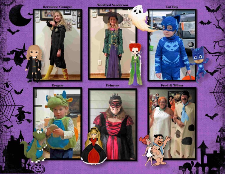
Having fun with my Daily Look today. Lots of clip art and some of the game characters. The font is Mrs.Monster Academy.1 point
-
1 point
-
1 point
-
1 point
-
1 point
-
1 point
-
1 point
-
1 point
-
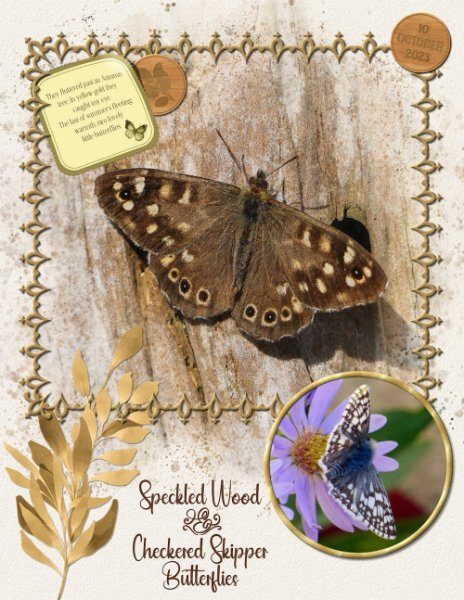
I still have 2 native Aster plants with some flowers on. The little skipper turned up on the 10th October. I was pleasantly surprised to see, and be able to photograph it. Last night I worked on finishing off creating rectangle, and square frames using Carole's frame punches. Now I have all the punches framed, ready for use. I used one them in this page, also used the wood token 2 tutorial to date the page.1 point
















Resized.thumb.jpg.d25811db03a63358cedab1e79f527635.jpg)
600.jpg.53817e031d579ac61960346fb753d4dd.jpg)
