Leaderboard
Popular Content
Showing content with the highest reputation on 11/14/2023 in all areas
-
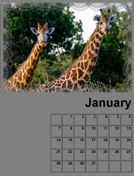
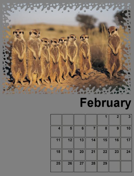
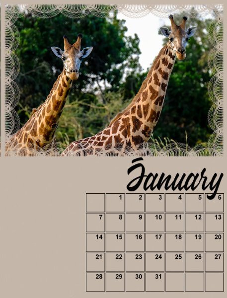
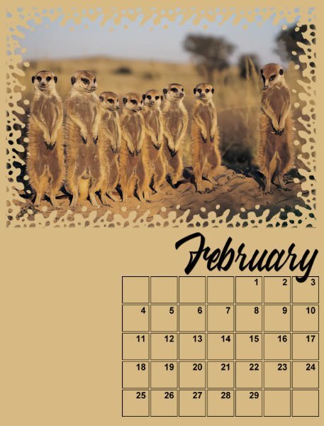
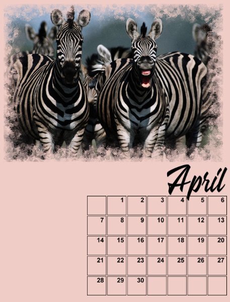
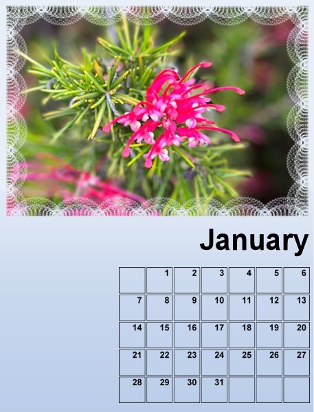
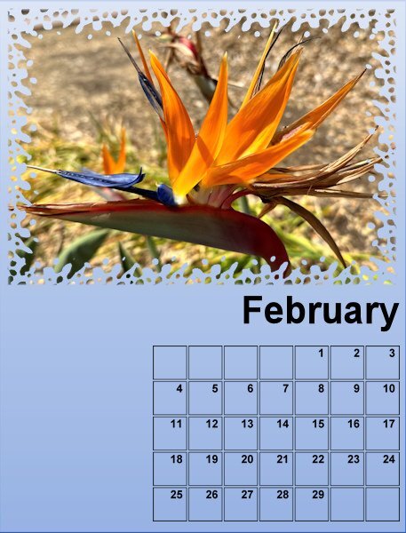
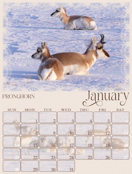
Here are my preliminary Jan and Feb pages. Waiting for the next lesson to proceed further. The topic is Wildlife of Botswana, where, in previous years, I had documented a fantasy vacation to Africa for a Travel Workshop, based on my admiration for the book series, The No. 1 Ladies Detective Agency by Alexander McCall Smith.7 points
-
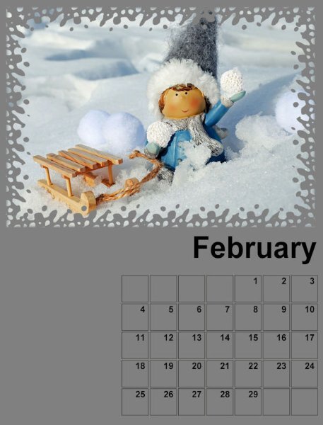
Here are my first two months. I thought I would go whimsical this year. Then again, I may change my mind. LOL7 points
-
7 points
-
7 points
-
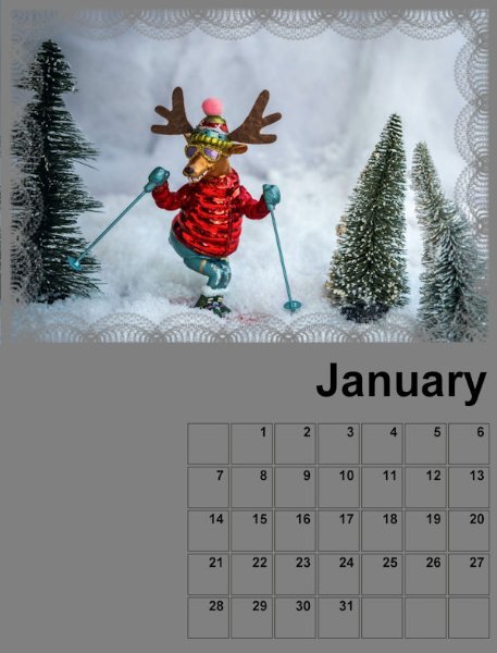
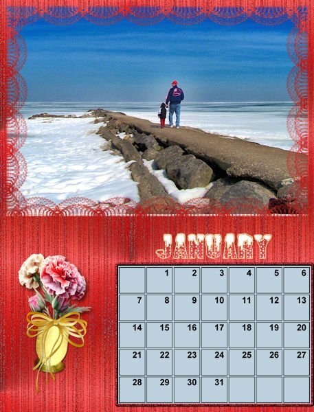
Here is my January page , I used the calendar script in PSP to make the dates and filled the background with a pattern font is White Winter6 points
-
5 points
-
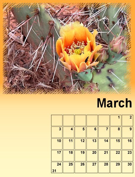
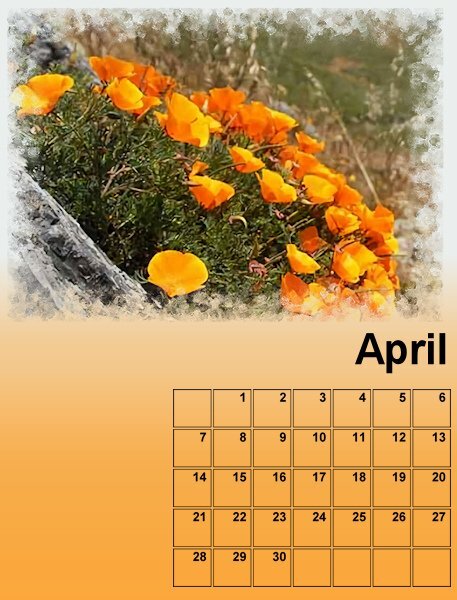
And this are the pages March and April, by the way when I change the font I will change language too. One copy of this calendar will be in German and one in Dutch, because I have to make X-mas presents for different countries and languages! But it will be easy, only the months and the days of the week. All my pages will go by the same principle but the colors will change depending on the colors of the flowers in the photos.5 points
-
5 points
-
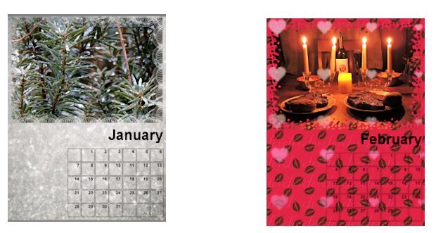
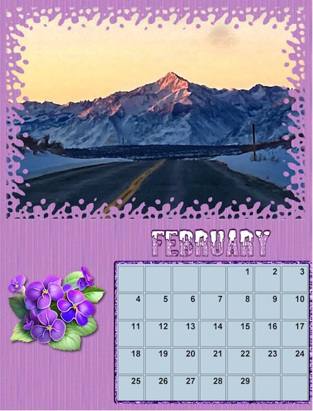
Here is the preview of January and February. I used the technique showed in the lesson with a twist. Instead of using 2 solod colors and the gradient faded background I used one solid color as a base and then chose a matching gradient on an extra raster layer and took it down and played with the blendmodes until I got something that I liked. Fot this 2 pages I used the same color and gradient only with a different blendmode. I will change the font much later in this project so I can do them all in one go. I will probably change the date boxes too because over here the week starts with a Monday.5 points
-
5 points
-
5 points
-
4 points
-
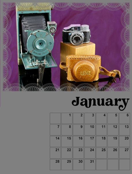
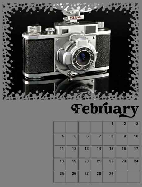
Here is the start of my Calendar - Jan/Feb I mostly have portraits orientation on the cameras I did photograph for the Magazine workshop. So, I will be in the studio shooting again to get some in landscape format. I'm sticking with the Creative Vintage font I used in the Magazine workshop. I will add the background as the lessons continue. I like that we build on each one and then go back to the previous months to add the new techniques. Good practice for me.4 points
-
4 points
-
4 points
-
3 points
-
My daughter was really scared for snakes. Once she was in a course and for her examen the teacher had the summon test.He had a real Boa Constrictor on board. She was so scared that she would leaf the building only by knowing it. But the teacher convinced her that nothing would happen. He removed her from the group for the final test. Finally as she stood with the boa around her neck, all she saw was a very beautiful animal. I'll have a look and see if I can still find the photos.3 points
-
Well done, but I think I would prefer that one to stay inside the computer.3 points
-
Here is my February page, font is Sweet Love the Statue is in our Zoo in Aachen2 points
-
Barbara, honest, it is ok. That worked like it should. The "overlay" is the mask. Nothing went wrong and you have no "user error" at all.2 points
-
2 points
-
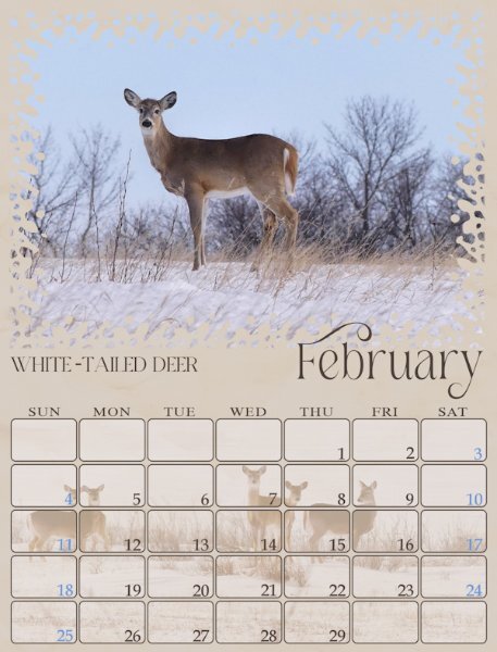
I added some text and I made a box with the days in it. I saved the box as a png for future use. As the Nature Conservancy has already sent the 2024 calendar. I used it to label the days. I'm using photos from over the years that I've taken. Each will be used in the month taken. Not sure about the backgrounds yet. I would like to put some shadows of some kind to the frames. Don't know if that's possible. Have to wait and see.2 points
-
Glad to see this workshop pop up again! I created a calendar for my granddaughter, Anna Lee, 2 years ago with the theme of the TV show, Downton Abbey, as we were both passionate fans. She and her husband even traveled from California to England and visited the real "castle." I don't know what my theme will be for this year yet but maybe another favorite TV show as they yield a lot of media photos to work with. Here's an example of my previous work.2 points
-
I think the frame works well. Draws the eye well and low enough opacity not to be intrusive. Love it.1 point
-
I started this page 3 nights ago, all that was left to do was to add a post it note, date stamp, and an alpha bead. All element tutorials can be found in the creative scrap. I think I have the titles of those tuts correct) My very first sighting and photo of this secretive bird will be a memory I shall cherish. I used the same technique that I used on the Great horned Owl. Created a mask, by using hide all, this time I added a frame. If the frame doesn't look right to you let me know1 point
-
1 point
-
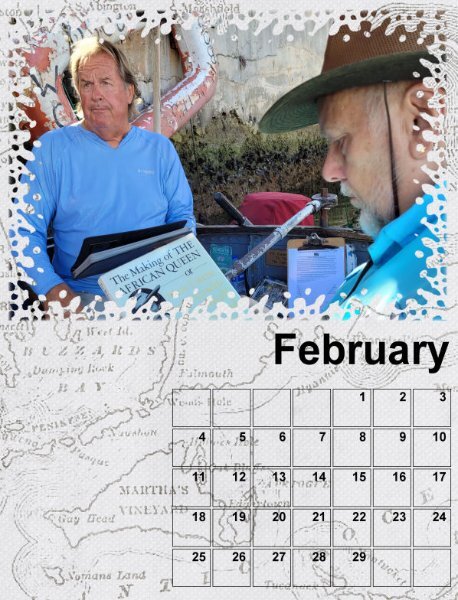
Ever such creative work submitted by talented ladies and gentlemen. Some will know that 3 weeks tomorrow I will be flying home, which had meant that throughout the summer I had been busy plodding away with calendars, cards and advent calendars. This year I made 3 different calendars, insects, landscapes and mammals. It just so happened that I used the very first set of templates for this calendar. So I thought I'd post Jan and Feb, as I am not actually participating this year. I created my own rounded date boxes.1 point
-
Question 1 - yes, it is the latest version with most problems solved (although there is one "added" bug with the moving of a selection). Question 2 - I don't think it will work well if INSTALLED on an external drive. I have heard some people trying that with less than-happy results.1 point
-
You might be thinking of quick-pages. Templates are often black and white and they give you suggestions for the placement of photos, papers, elements, etc. but you still have full control over what you put. If you have Photoshop supplies, PaintShop Pro can use .psd files (although not all the features will carry over, like the Layer Styles) .abr brushes - you just have to import them into PSP .grd gradients - you have to import them .csh - preset shapes. You can convert them with a script. Here is an article about it. Of course, all the .psp files like .pspbrush, .psptube, .pspgradient, .pspshape, etc. are native for PSP. Typically, you don't need to import/export any of them. You just put them in the correct folder. And all the usual non-program-specific files like .jpg and .png are available as is.1 point
-
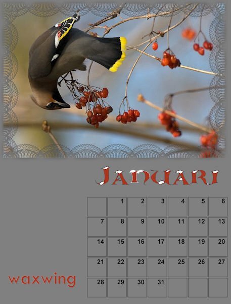
The bird is reaching out to the berries I suppose. The branches bend completely due to the weight of the bird.1 point
-
1 point
-
No, it's below the masked layer. I have it as a background. I lowered the opacity so the text was more visible. Maybe I have to raise the opacity and change the color of the text.1 point
-
Michele, Is the bottom picture on top of the January template? It has a "line" which you can see clearly. In the February layout it seems to blend more with the template 🙂1 point
-
1 point
-
Always nice to see a project through some else her (Michele) eyes, now I see what you mean and leave as it is 🙂 Thanks!1 point
-
1 point
-
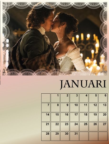
I think it looks great. The candles on the right balance the picture beautifully.1 point
-
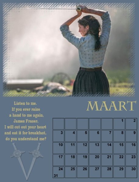
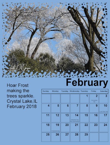
Welcome to the participants who already posted: @Ann Seeber @Corrie Kinkel @Bonnie Ballentine @Jannette Nieuwboer @Anja Pelzer @Susan Ewart @Cristina @Jeanine Caston @Les Cook @Brian Smith @Stanis Faye @Lynda DiGregor @Julian Adams @MoniqueN. @Dan Greenwood @Barbara Caulton @mark sternat Now, for the daily feedback and answers. @Lynda DiGregor That is an interesting idea to add the days of the week. Why didn't I think of it!? To create a shadow, you COULD do it, but it might be a bit challenging since your photo is through a mask. I'll add an extra lesson for that at the end. Thanks for the idea. @MoniqueN. I don't think your photo is so offside. You can enlarge it a little and I think it would work. @Barbara Caulton as Ann mentioned, it is normal that when you paste the photo, it will be a new layer. The PHOTO HERE layer is just a placeholder telling you where to activate the layer so you did it correctly. @Anja Pelzer Good start. I guess you are already familiar with these templates. Each day will have a lesson about something else on those templates, like the dates, the month, and the background. @mark sternat We'll get to help you. I already sent you an email about it. You'll get there. If you have not posted anything yet, don't worry. Even if you did the lesson, your pages are not completed yet. If you want to wait until the end to show your work, it is fine. You can still come and post comments, and share your struggles, or your ideas. You can comment on others' projects, etc. Make yourself visible. We want to "see" you 🙂1 point
-
1 point
-
1 point
-
I'm going to give this one a try! I've used SP for many years but never learned layers and masks and all the other more advanced tricks. Will we learn how to make the elements already include our downloads? I've never made a mask or a table of squares before.1 point
-
1 point
-
Template by Triple J Designs from the April, 2023 ALFLT Blog Train.1 point
-
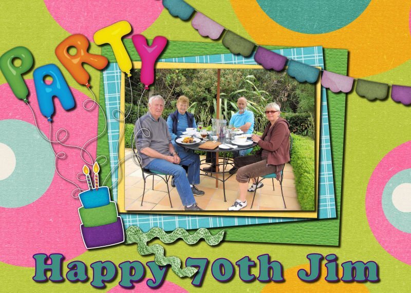
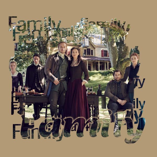
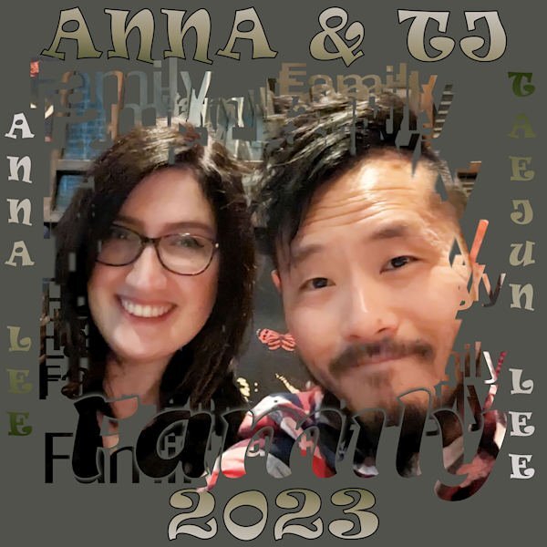
Decided to play with Cassel's Echo Text Mask-Family Sampler. I played with various group photos, but this seemed to work the best. This is a great portrait of my granddaughter and her husband from earlier this year. It turned out like a Word Art comp. The font for the title and side info is Ravie. Now I'll acquire the script so I can customize it.1 point
-
1 point
-
1 point
-
1 point
-
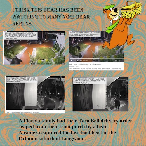
I just saw this video of a bear stealing this Taco Bell delivery and I just had to share this little page here. The pics were screenshots from the video. I have no idea if it was O K to do this, but what the heck, it cant be any worse than the way things are shared all over facebook etc. I made no attempt to add shadows or anything, I just had to do this for the Fast Food theme. Apparently we humans are not the only ones that enjoy a little fast food home delivery.1 point











.jpg.6261982a5cafc25358e1895746365d19.jpg)

Resized.thumb.jpg.d25811db03a63358cedab1e79f527635.jpg)
.jpg600.jpg.49bb213ea0cb3252be79cb51a495439d.jpg)
