Leaderboard
Popular Content
Showing content with the highest reputation on 09/26/2023 in all areas
-
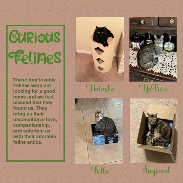
Here is my Day 6. This was a hard one for me, it is not perfect yet, but I am trying. Had a difficult time with text not showing until Carole reminded me to convert the text layer to raster. Even than PSP was acting funny and would not convert. I tried it with another sample and it worked OK. After stepping back a bit to get my energy back, it finally worked. However, I detected just a tiny border around the text, not the larger left side rectangle, just around the story text. After trying to get ride of that, I decided to leave it alone before messing up my whole project more. My photos were not quite the right size so I made them fit and deleted the grey area. My project showcases : Natasha, YaPurr, Bella and Siegfried. Because I had extra spaces below the photos I decided to add their names. Font used there : Amberto Bold. Font for Title as before Cat Paw. Added brown background with texture: Crumbled.8 points
-
8 points
-
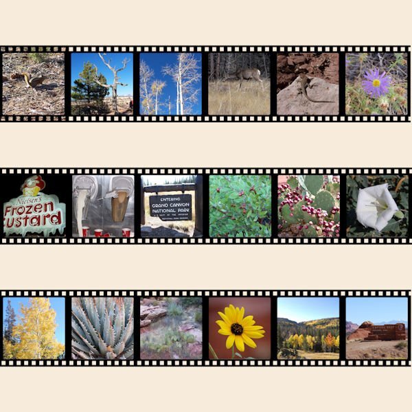
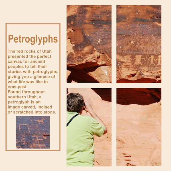
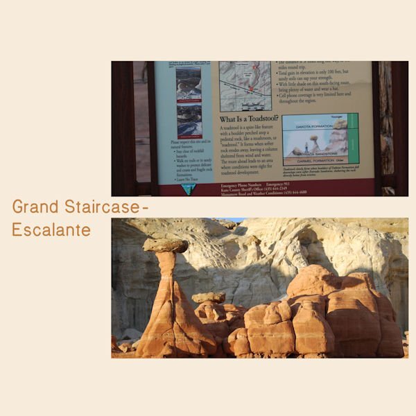
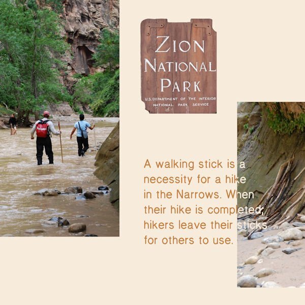
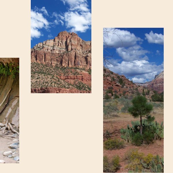
I had a difficult time getting started as I kept changing topics. This turned out very different than I planned. For many years my basketball team and I would compete in the Huntsman Senior Games. There are the Utah State Games and they are huge...over 10,000 athletes from the USA and 26 countries. Some years we went to the games, played and returned home. My favorite years were when we stayed and visited National and State Parks in Utah. I planned on highlighting basketball but put all my attention on the beauty of Utah. Day one8 points
-
7 points
-
7 points
-
7 points
-
7 points
-
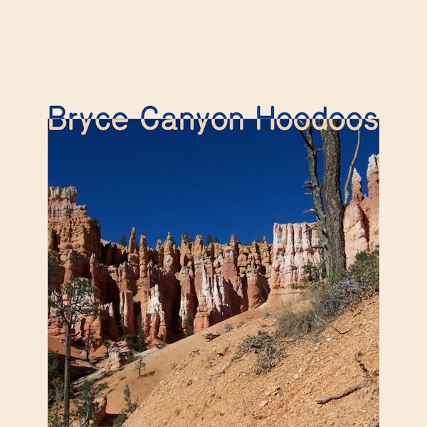
Day 2 Bryce Canyon National Park is my favorite. The small graphic on the lower right says, "The Queen Victoria formation is one example of many pinnacles, spires and walls named for famous personalities or man made features. It is even now changing in appearance and will slowly disappear as erosion continues."7 points
-
6 points
-
5 points
-
Day 5. I decided to add a pop of color to this page. Is it too much? It's really difficult to get out of the "scrapbook" head.4 points
-
4 points
-
I think it's just right. Love the color! And what you did with the gradient is really neat. I would not have thought of that, it sure put the focus on the girls.3 points
-
Bonnie I love your idea to feature the beauties of the National Parks of Utah, the photos are stunning and pay tribute to the region! I would love to see it for myself, maybe when I visit my family in the States again in the future.3 points
-
2 points
-
Corrie, it is a beautiful area and very different from the east coast where I live. I never had more than a day or 2 to explore but over the years I saw a good bit. The Huntsman Games are in St. George, Utah...the southwest corner of Utah. St. George was our base. Once we saw Zion, Bryce (twice) and Grand Canyon all in one day. We were treated to a full moon rising over Bryce...amazing. All my photos of that event are very grainy.2 points
-
Bonnie, your photos are fabulous. In this case, I think I would put the photo of the rocks on the top and the signage on the bottom. Just my opinion.2 points
-
2 points
-
Sometimes, just sometimes, we have to be reminded of the tools that are available to us.2 points
-
2 points
-
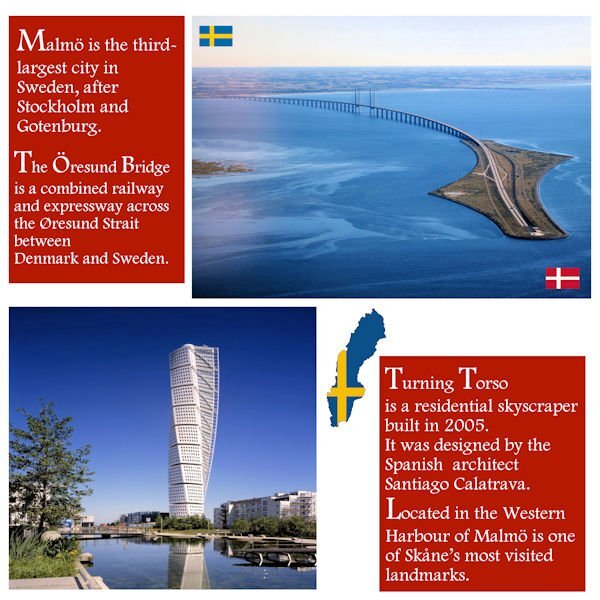
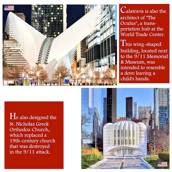
Last week, I stumbled upon a video suggested by YouTube, and it was about the reconstruction of Ground Zero... I was surprised to hear the architect, Santiago Calatrava, was responsible for the designs of two buildings... It's interesting because before looking up the Öresund Bridge, I'd never heard his name before. In the USA, he is also the architect of the Margaret Hunt Hill Bridge in Dallas, Texas, and the Milwaukee Art Museum, Wisconsin. So, I decided to include this information and create another layout page for Day 2. Now, it will be a Double Page. It's not exactly complying with the Day2 template, but being the "editor-in-chief" of this magazine, I think it's OK this time. ?2 points
-
2 points
-
1 point
-
@Anita Wyatt When I want to make a major change in a project, I rename it before I "mess" it up. For the original version, I would name it Day 6 01 01. The next version would be Day 6 01 02. That way if I hate 01 02, I could always go back to 01 01. Sometimes I end up with more than just two versions.1 point
-
I'm trying to visualize her dancing in those shoes with Fred Astaire -- backwards! You can do it, Babs!1 point
-
Here's my Day 4. Hayden has a bunch of Barbie illustrations, especially now with the Barbie movie out. But I decided to go with his old-school collection. (I know it's supposed to be a two-page layout, but I was afraid if I combined it into one image, it wouldn't be very visible once I sized them down.) Hayden has a bunch of Barbie illustrations, especially now with the Barbie movie out. But I decided to go with his old-school collection.1 point
-
1 point
-
1 point
-
1 point
-
1 point
-
1 point
-
1 point
-
I've been working on this on and off for days whenever I found time. I'm done so I can maybe get started on the Magazine Workshop.1 point
-
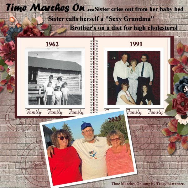
I picked the song Time Marches On by Tracy Lawrence. I like the words and truth of the song that time does march on. I used CASS Airbrush script on the background paper then used the Brick Texture. I created the clocks using Notebook-Lab-10-01 clock face. I used font Times New Roman and Forte. For the elements I used Jumpstart Designs My Weathered Heart.1 point
-
1 point
-
1 point
-
here is mine for the challenge, Using picture tubes by cassel and corel1 point
-
1 point
-
1 point
-
1 point
-
1 point
-
1 point
-
so many wonderful places and photos from all the travels I love to see them all here is my last day , playing with the cutout- tutorial1 point
-
1 point

Resized.thumb.jpg.d25811db03a63358cedab1e79f527635.jpg)
