Leaderboard


Popular Content
Showing content with the highest reputation on 09/20/2023 in all areas
-
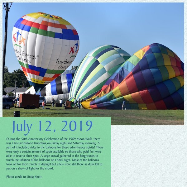
Ok here is my day 2 of the magazine workshop. I was all set to post this in the AM and I received a call from my Shirley friend, she was in a panic, she said " Aren't you going to Shirley Club" Well tools down and I was off, we had a 3/4 hour drive, but we got there in time, and here I am.
 13 points
 -
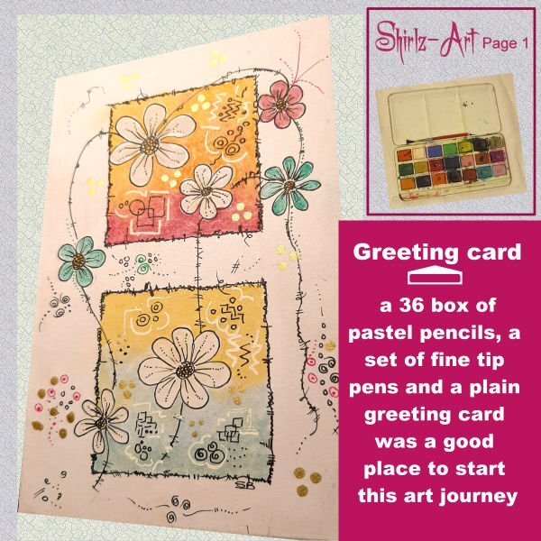
Day 2
11 points
-
day 2 showing our Cathedrale by day and night for the background I used again a seamless tile from the cathedrale, fonts are Kastel Voire and Cherry Swash10 points
-
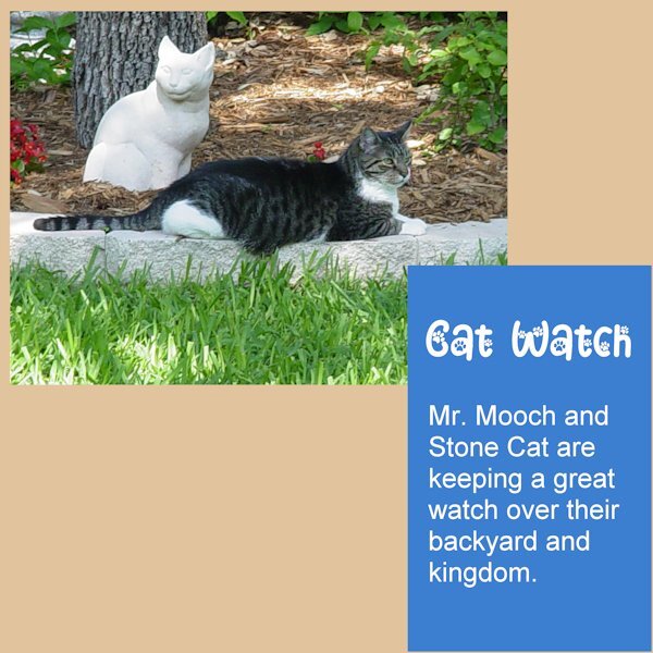
Magazine Lesson- 2: I used a photo of our Mr. Mooch as he is keeping close watch over his kingdom. Stone Cat is keeping him silent company. The title font is Cat Paw as in my Day-1 project, the rest of the text is Arial. Thank you Carole for pointing out what to do, if the photo does not cover the whole area. I also added a matching background.
10 points
-
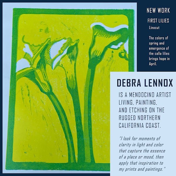
My page 2 is now ready. It features Debbie's New Work, and I chose this piece mainly because it fit the portrait format. The pale blue is part of the piece. The font is still Agency.
9 points
-
Day 2 page.
9 points
-
8 points
-
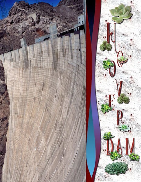
Day 1: After going through my picture file and starting one then another, I finally decided to use my Hoover Dam pictures, although mere pictures cannot do justice to the size of this amazing work of engineering. The font is Star full inline from deeezy,com. The separator waves are from the casswaves script. The background is from one of my texture photos-granite. The succulents are tubes.
7 points
-
My Day two magazine page.
7 points
-
Day 36 points
-
Day 3
6 points
-
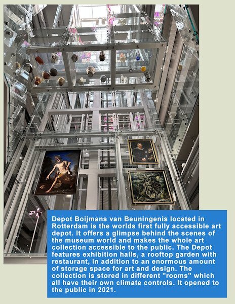
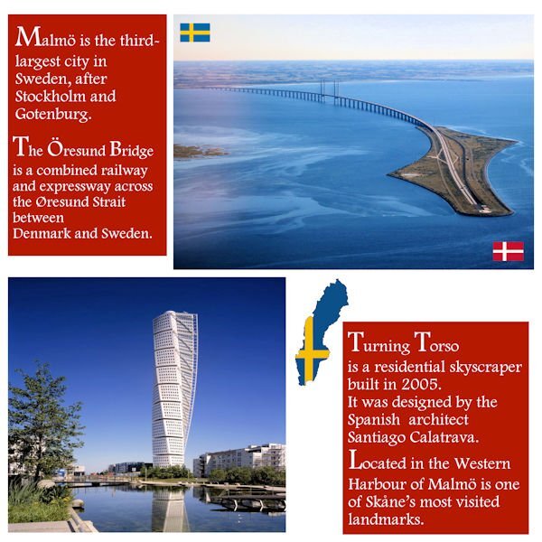
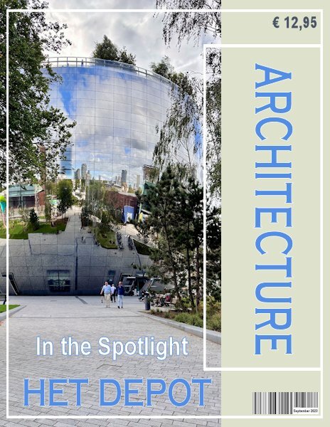
Day 3 and we are still in Het Depot at a floor with different areas for restauration, conserving and packaging for transport of the divers art works. At some point there was a cabinet filled with all kinds of pigments and paint tubes. It was a pity that I couldn't take a shot of it due to all the reflections in the glass doors. The whole building, if you can call it that, is full of glass inside and out. The elevators have glass walls, the stairs have glass panels and there are even glass floors, which will be in another photo. I kept the same font Copperplate Gothic but with colors from the photo. I added an artist impression of the building with some statistics.
6 points
-
Day 3. One of my photos from early Saturday morning. Again used the background from the previous layouts and the same font, BakerSignet BT. I did put a black stroke around the font today since it was blue on the blue of the photo. I think it made it stand out a little bit.
6 points
-
The other night I introduced ya'll to a snow guy named Harold. Today he brought his girlfriend Harriet for a visit.
6 points
-
Day 2 and I changed the template for my photo and put the blue mat to the bottom. I kept the blue color because in my cover the text had that color too. I have a bit of text and I used Arial so all that text is easier to read. I will probably keep the light green color as a background for all my pages, it goes well with most of the photos I plan to use.
6 points
-
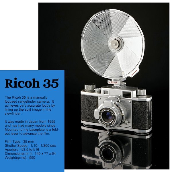
Day 2 I turned the template upside down again. This was the photo I most liked in what I shot. I had wanted to do a straight on shoot with the full reflection but the camera would be quite small in the end. In the reflection you will the film advance lever that folds out to advance the film. I am not going to change the blue layer or the background (and the text color) until the end to see where I want to go with that. I just realized I forgot to add it has a 'Bulb' setting as well - oops. Marie-Claire, WOW, what a great angle of Poncho and beautiful composition. He looks so regal.
6 points
-
Day 16 points
-
Here is my page 3 DEBRA LENNOX ART - PACIFIC OCEAN. Featured is her etching called Salmon on the Fin. As you can see, the fish is diagrammed for consumption. This is one of my favorites of her work but unfortunately, she sold it and there are no prints left either. ?The title font is still Agency. The background is another of her watercolors, "Finding Magic," that was an impressionistic treatment of the Pacific, and I used a Hard Light layer effect.
5 points
-
Day 25 points
-
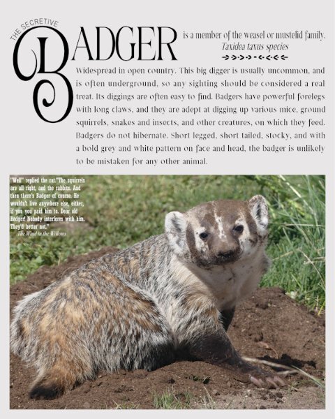
The front cover of my magazine read that there was going to be an article on the secret life of the badger. Here it is. Badgers are frequent visitors, they keep my rodent population under control. This lovely female was digging to get under the work shop, where several ground squirrels resided. I added a quote from rat, from The wind in the Willows
5 points
-
Marie-Claire, Poncho is so handsome! He sure deserves to be on the cover page! ?5 points
-
My piece is finally complete, thanks for the help.
5 points
-
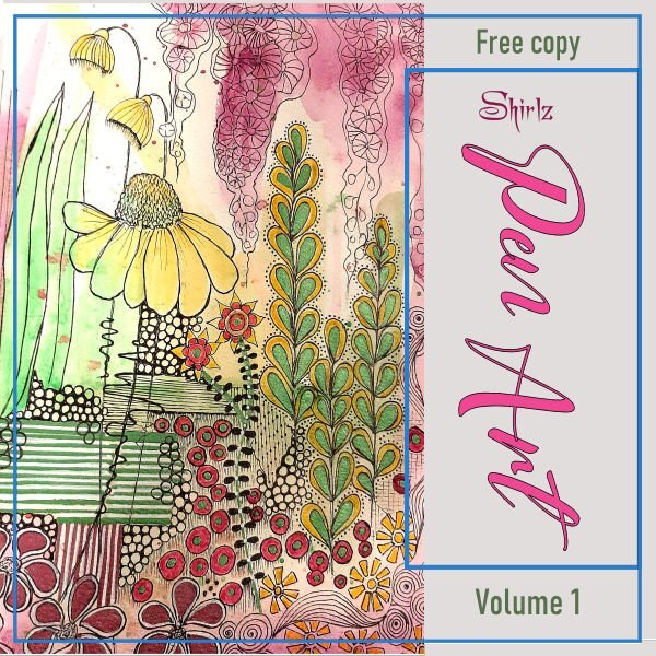
wow, I love all the covers here, I made my page in A4 format my background is made with a seamless tile from the wall, font is Kastel Voire5 points
-
I rotated the template since my photos work better with a landscape setting. Like Carole's photo, mine showed the gray area so I hid that layer to show more of the background. I again flood filled the background with the same color as the day 1 layout but this time I added a texture (added the texture to day 1 as well). Since I wanted blue text, I changed the text box to a green color in one of the balloons. The title blue is the same as day 1 but I used a darker blue from the balloon for the actual story text.
5 points
-
A giant dog!4 points
-
Corrie, this must be a very interesting place to visit.4 points
-
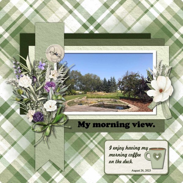
I enjoy having my morning coffee out on the deck, I have such a beautiful view of our yard. Such a peaceful way to start my day. Coffee cup from the vector course from Cassel, plaid paper cass-stripes-2 script, elements Ilonkas Designs The Story Of Seasons, button cass-Custom Kit Buttons. Font Freehand521 BT, Cooper Black and Times New Roman
4 points
-
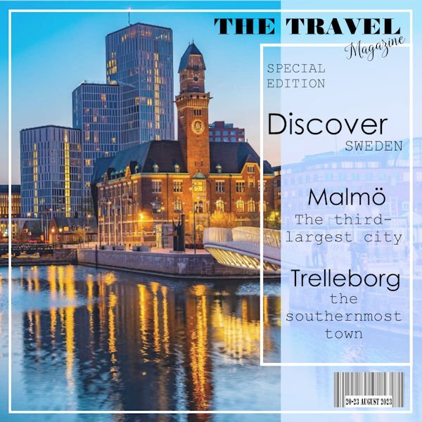
Here is my Day 1. I am using stock photos and my own. I also added a Bar Code with the date.
4 points
-
Day 2 ...I'm not keen on having the white areas show up in my picture book magazine.... So I filled them in ( a bit tricky)... I'm thinking that towards the end we can fine tune the work we have already done.
4 points
-
Magazine Workshop - Day 1
4 points
-
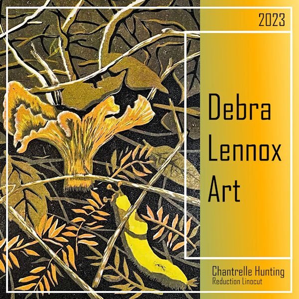
I finally hit on a topic that got me enganged so I did the cover. Debra Lennox is my daughter. The font is Agency and the background gradient is one from my files titled Tulips. *shrug* That bright yellow guy on the right under the mushroom is called a banana slug. ?
4 points
-
Everyone here is doing such a great job! The good thing about this workshop is that a magazine can be about anything; there are no boundaries. And we are lucky enough to learn about all the different subjects posted.3 points
-
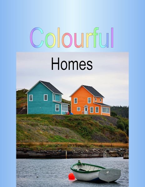
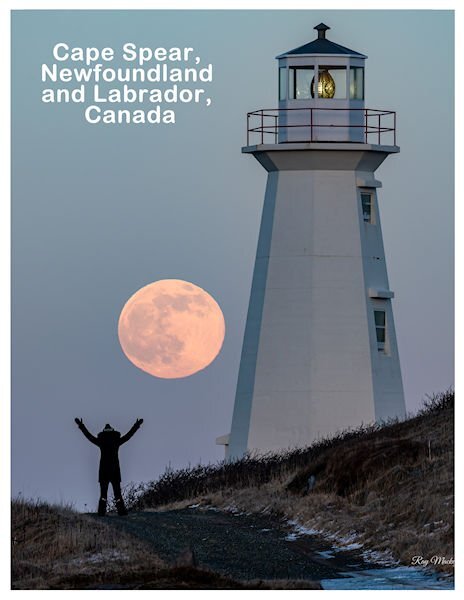
@Louyse Toupin Oh, we are going to Mexico!!!! @Susan Ewart You will see that you will likely want to keep tweaking the pages as the lessons come through. @Corrie Kinkel Tweaking is something that you might do over and over again! Keep it up. @Shirley The borders are likely to change to a different color as you create your next pages. @Ann Seeber That gradient is really powerful in that page. @Anne Burgess That will be a fun magazine! Remember that you can change things later if you want. @Brian SmithDid you visit Newfoundland and Labrador? @Cristina That is a fun use of the text for that front page! @Rene Marker That will be such a colorful magazine! @Anja Pelzer That is an interesting texture you added! For the frames, you might want to tweak them later, maybe separate the two from each other, etc. You will see. @Marie-ClaireDid you edit that photo or did you take it that way? The perspective is spectacular! @Anne Lamp Will we have all colorful flowers like that? It will be a delight! @Donna Sillia Spectacular photo! Looking forward to more photos and stories. @Sue Thomas Once done, I am sure your magazine would be worth printing! @Gerry Landreth It is nice to visit the town! @Anita Wyatt That is a cool photo with the "silent cat"! As for the tutorials, you can do the minimum as the days go and then want to go back to the previous ones. It is expected! Don't worry yet about "finalizing" your pages. As you go through different lessons, new tricks will be shown and you might want to apply them to previous pages.3 points
-
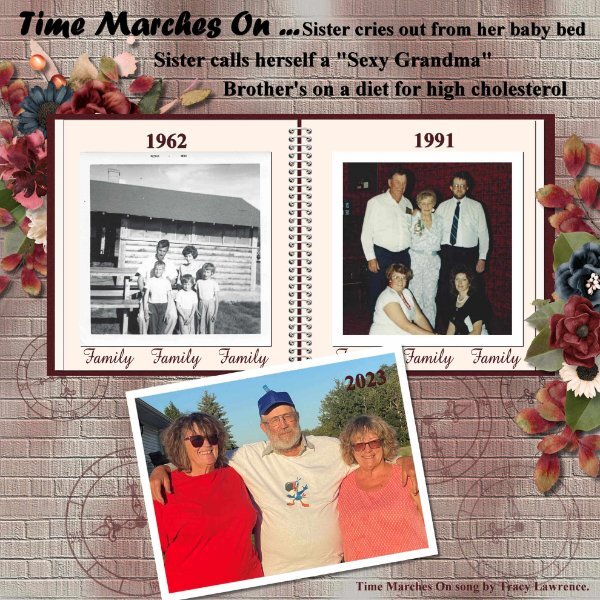
I picked the song Time Marches On by Tracy Lawrence. I like the words and truth of the song that time does march on. I used CASS Airbrush script on the background paper then used the Brick Texture. I created the clocks using Notebook-Lab-10-01 clock face. I used font Times New Roman and Forte. For the elements I used Jumpstart Designs My Weathered Heart.
3 points
-
Thanks Monique. What a beautiful caps only font. I thought I would try it out but thought it might be overpowering in the vertical , but would be nice for the first letter. (example)
3 points
-
And Day 2. The next days will be done later as I am juggling other workshops and a course.
3 points
-
Magazine work is new to me and I wasn't sure how far to go, but I see others have completed their pages so I have added the background and some more text. I have tried to colour the borders, but the whole background page fills in with colour, so I guess there is a trick to that.
3 points
-
Yesterday I wasn't all too happy with what I did and this morning I had a bit of spare time (half an hour or so). I changed the font for a more readable one (Copperplate) and changed the color too and put the barcode and price on the page, after all it is suppoost to be a magazine. Now my cover is ready!
3 points
-
Magazine Workshop - Day 2
2 points
-
I just signed up this magazine workshop. I am not sure but will surely try.2 points
-
I see that you have found my Facebook post.2 points
-
He sure does, Susan! ?2 points
-
Yes Susan, I just smeared some very wet water colours on the paper, and for the penned element colours I used mainly watercolour pencils2 points
-
It is a reflection, the whole of the building is covered in glass tiles which give this surrealistic effect. You can finish the page if you want, but when I remember well it is mentioned to the end of the week.2 points
-
I've been working on Lab 12 Mod 9 so I decided to use the included template for today's daily look. The "people" are characters from the game and the font is PLAYFULL CARTOON. (It's from a Mega Collection Font Bundle from Creative Fabrica. There are 86 fonts in the bundle and it's still available for $3.00.) The brick wall texture, included with PSP, came in handy.2 points
-
Hello, here is my magazine cover
2 points
-
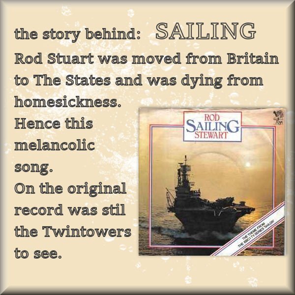
Ros Stuart: SAILING
2 points
-
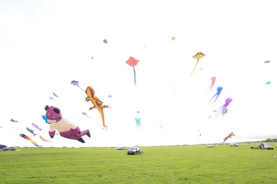
I have visited the Kite Festival today and have photographed some of the large kites. The stunt kites were not flying as the wind speed was to high for them to put on a controlled display. I am hoping for a calmer day tomorrow. This is a view of the kites flying when I arrived, requires some editing.
2 points
-
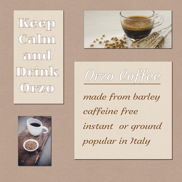
I don't drink 'real' coffee but I have a lovely substitute - barley coffee which is called Orzo. The photos are from the web. The papers are from Jessica Dunn's Old Farmhouse Kit.
2 points
-
This is one I did back in 2017. I used a photo for the background (Delphinium). Usual word art, the coffee and biscuits I found on line, masked it into the page. I'm not a big fan of coffee, when I do have a cup, it's a few grains of instant coffee. I do enjoy a cup of tea though. Herbal or regular.
2 points


.jpg.31b61357103ecb48ef4b510c5b833430.jpg)


.jpg.ac08bc06dfedd9faa256bea28fb50306.jpg)