Leaderboard


Popular Content
Showing content with the highest reputation on 09/19/2023 in all areas
-
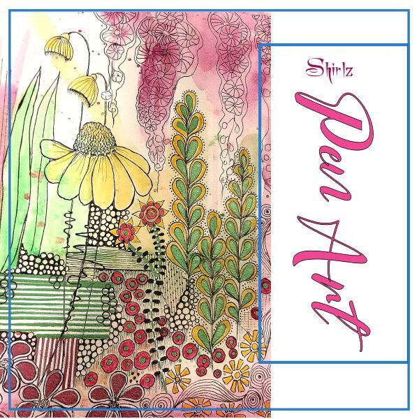
Recently, during our winter months in new Zealand, I had a go at an assortment of pen art. I thought why not feature my work in a magazine, so here goes. This is my first magazine workshop.
 12 points
 -
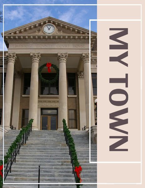
My cover features the historic Limestone County Courthouse in Athens, Alabama. It was built in 1919 in a Neoclassical style with Palladian influences. I have no idea what that means. They had me "historic." Located in the heart of town, it is the anchor for Athens Square, a lively entertainment district hosting seasonal activities that attract hundreds of residents from Athens and surrounding areas.
12 points
-
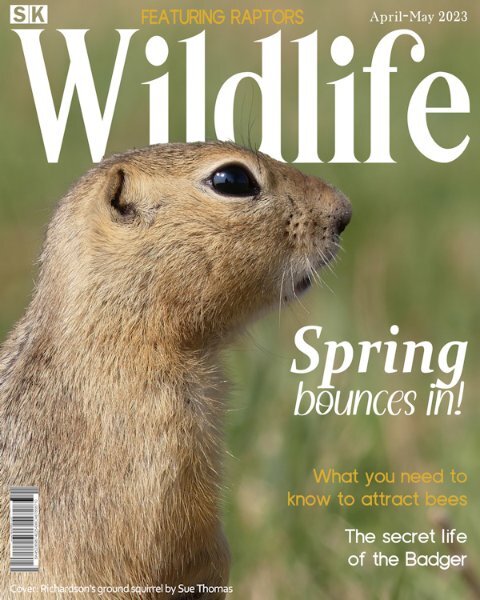
I see there are already lots of wonderful pages submitted. To many to comment on each one individually. After being outside all day, I had time to think what theme I was going to go with. Autumn is in the air, with the trees changing their colours, it seems like only the other day that I was welcoming Spring. Hence, I have decided to go with a Spring magazine. I'm afraid I have created my usual magazine cover. If nothing else it may inspire and show what can be created using a single unedited photo and some text. The bar code is one of many I have created. I will be featuring Raptors, bees, the badger and more in the coming pages. SK is an abbreviation for Saskatchewan.
11 points
-
Hello, here is my magazine cover
10 points
-
Day 2 ...I'm not keen on having the white areas show up in my picture book magazine.... So I filled them in ( a bit tricky)... I'm thinking that towards the end we can fine tune the work we have already done.
9 points
-
Magazine Workshop - Day 1
9 points
-
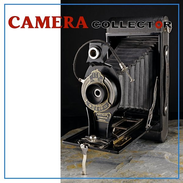
Day 1 I rotated the template so the camera would look inward. I couldnt bring myself to put the title sideways. After all, my masterpiece will be in bookstores near you soon, and in the rack, after the first row you just see the top title of the magazine. ?. I used a retro font for the word "camera" and in red, a power color in photography. Since it's my first time through this workshop I will wait to see where we go with this cover. There is magazine covers I see in the forum I wish i could buy in the store! Great work everyone.
9 points
-
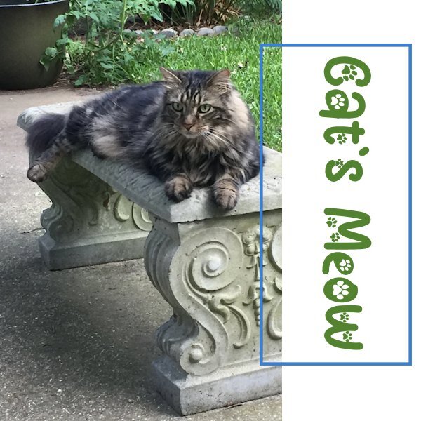
Here is my Magazine Lesson-1. The title is: Cat's Meow. The photo shows our Cat Leo. I am doing this magazine cover also as a tribute to him as he is one of the Cat Angels at the Rainbow Bridge, and he will be forever in our hearts. The font is Cat Paw from Creative Fabrica. The next pages will showcase our other feline companions, and I will add Marcus somewhere also to keep them company.
9 points
-
I should have gone with an 8 1/2 x 11 instead of the 12 x 12, but I didn't think (and still do not think) I wil be printing it, so wh not go with the traditional square? I'm not even sure I like this! (The Title) We have one of those Robert Love "Love" statues, so the O is off kilter. I think I may have it too close; will be interesting to see it here online.
9 points
-
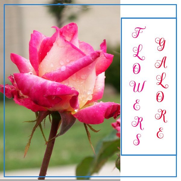
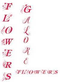
Day 1 cover page. I have a bazillion flower pictures so I thought flowers would be a good theme for my magazine. The font is Hesthia Austine but in all caps. I resized the mask to show more of the flower.
9 points
-
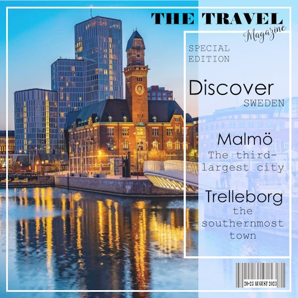
Here is my Day 1. I am using stock photos and my own. I also added a Bar Code with the date.
8 points
-
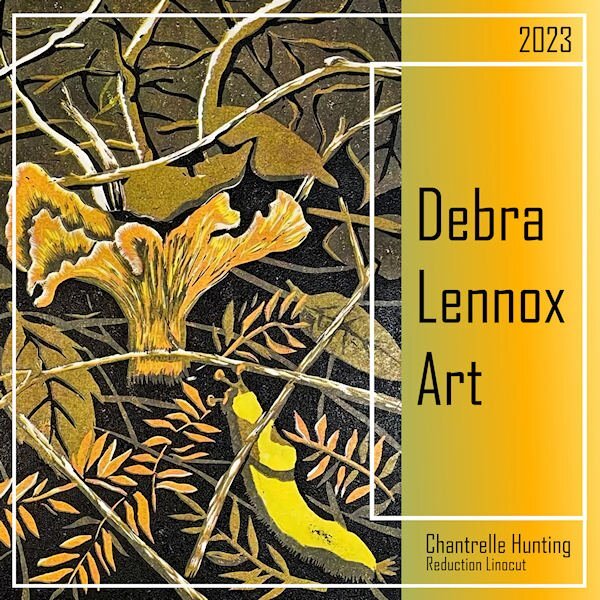
I finally hit on a topic that got me enganged so I did the cover. Debra Lennox is my daughter. The font is Agency and the background gradient is one from my files titled Tulips. *shrug* That bright yellow guy on the right under the mushroom is called a banana slug. ?
8 points
-
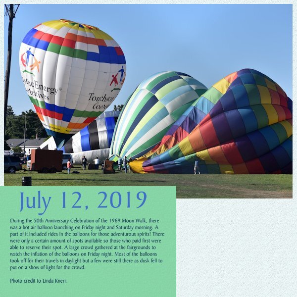
I'm using this workshop to do some layouts of the Hot Air Balloons that were an event during the 50th Moon Landing Anniversary weekend in my town in 2019. I'm still doing 12x12 since I will be adding elements and other items after the workshop. The layouts will be included in an album I have about the town. But for now, here is the "cover". I changed the color of the background to match a kit I will be using for the elements.
8 points
-
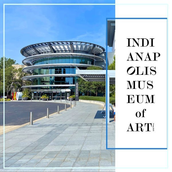
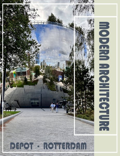
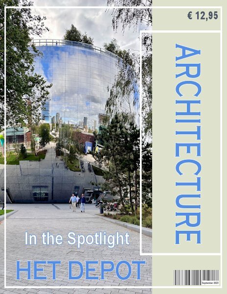
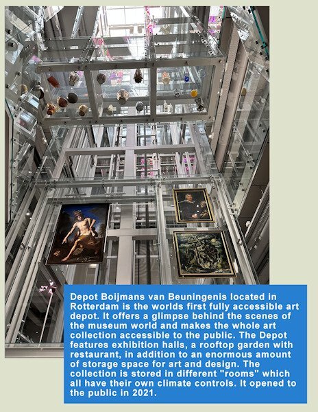
Here is the start of my cover page, but there will be more on it. I have done this workshop (called a challenge 2 years ago) , so I have the templates already resized to rectangular. A magazine to me is rectangular, I looked in the shops where they sell magazines and they are all rectangular; a brochure can be any size though. Last week I visited the "Depot" of a very well known museum called Boijmans van Beuningen in Rotterdam. Because their storage department became way to small for everything a museum has in storage (or depot), a new depot was being build. A took a lot of photos which I can use, therefore my magazine is called Modern Architecture. In the following pages you will see this Depot is very futuristic. On my first page I have gone a little bit further then the tutorial, but I'll try not to go to far ahead. The font I chose is Bauhaus.
8 points
-
wow, I love all the covers here, I made my page in A4 format my background is made with a seamless tile from the wall, font is Kastel Voire7 points
-
I rotated the template since my photos work better with a landscape setting. Like Carole's photo, mine showed the gray area so I hid that layer to show more of the background. I again flood filled the background with the same color as the day 1 layout but this time I added a texture (added the texture to day 1 as well). Since I wanted blue text, I changed the text box to a green color in one of the balloons. The title blue is the same as day 1 but I used a darker blue from the balloon for the actual story text.
7 points
-
And Day 2. The next days will be done later as I am juggling other workshops and a course.
7 points
-
Yesterday I wasn't all too happy with what I did and this morning I had a bit of spare time (half an hour or so). I changed the font for a more readable one (Copperplate) and changed the color too and put the barcode and price on the page, after all it is suppoost to be a magazine. Now my cover is ready!
6 points
-
Hello People ... I decided to go with the 8.5 X 11 inch format ...(Is that the same as A4....?) I also decided to make my image take up the full page... I'm hoping this will be ok down the road.
6 points
-
Day 2 and I changed the template for my photo and put the blue mat to the bottom. I kept the blue color because in my cover the text had that color too. I have a bit of text and I used Arial so all that text is easier to read. I will probably keep the light green color as a background for all my pages, it goes well with most of the photos I plan to use.
5 points
-
Day 15 points
-
Magazine work is new to me and I wasn't sure how far to go, but I see others have completed their pages so I have added the background and some more text. I have tried to colour the borders, but the whole background page fills in with colour, so I guess there is a trick to that.
5 points
-
I was lucky to have the old templates in my stash so I could start inspite of the wrong link in the mail ? I'm working on 3 magazines and will see which one will be the one I will finish ? One Outlander, one about my granddaughter which I can't show and one of our holiday which ended 3 days ago.
5 points
-
My piece is finally complete, thanks for the help.
4 points
-
I've been working on Lab 12 Mod 9 so I decided to use the included template for today's daily look. The "people" are characters from the game and the font is PLAYFULL CARTOON. (It's from a Mega Collection Font Bundle from Creative Fabrica. There are 86 fonts in the bundle and it's still available for $3.00.) The brick wall texture, included with PSP, came in handy.4 points
-
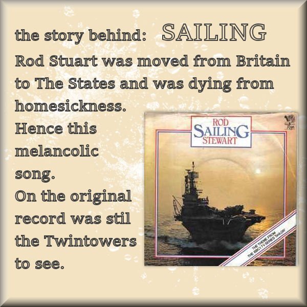
Ros Stuart: SAILING
4 points
-
Day 2 page.
3 points
-
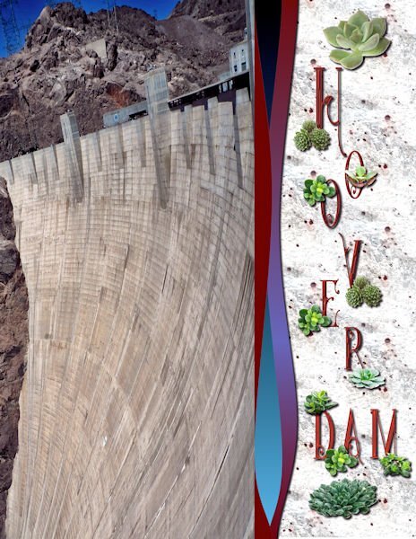
Day 1: After going through my picture file and starting one then another, I finally decided to use my Hoover Dam pictures, although mere pictures cannot do justice to the size of this amazing work of engineering. The font is Star full inline from deeezy,com. The separator waves are from the casswaves script. The background is from one of my texture photos-granite. The succulents are tubes.
3 points
-
My Day two magazine page.
3 points
-
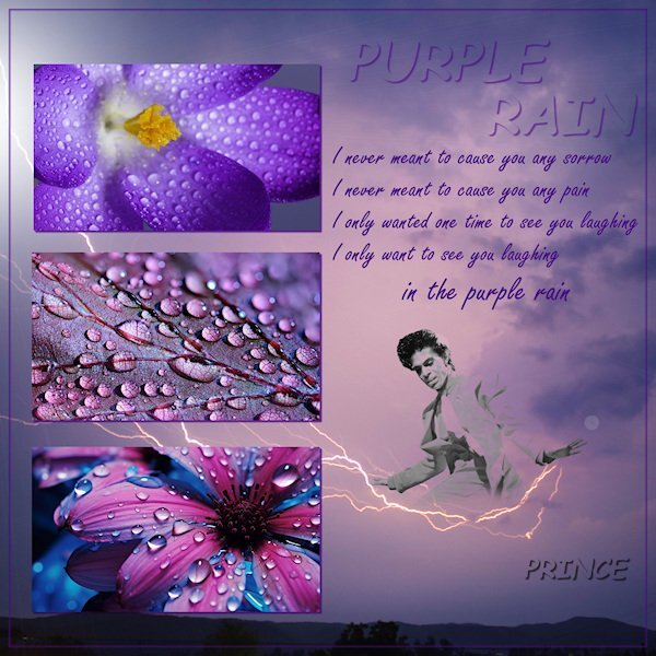
Pictures from Pexels.com, and png from pngwing.com Song, Purple Rain from Prince
3 points
-
here is mine for the challenge, Using picture tubes by cassel and corel3 points
-
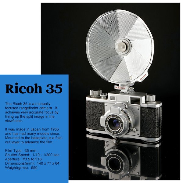
Day 2 I turned the template upside down again. This was the photo I most liked in what I shot. I had wanted to do a straight on shoot with the full reflection but the camera would be quite small in the end. In the reflection you will the film advance lever that folds out to advance the film. I am not going to change the blue layer or the background (and the text color) until the end to see where I want to go with that. I just realized I forgot to add it has a 'Bulb' setting as well - oops. Marie-Claire, WOW, what a great angle of Poncho and beautiful composition. He looks so regal.
2 points
-
Thanks Monique. What a beautiful caps only font. I thought I would try it out but thought it might be overpowering in the vertical , but would be nice for the first letter. (example)
2 points
-
Libera, you are not alone! ? I'm juggling this workshop, the scripting, and now the Magazine!2 points
-
Beautiful art. that's an exceptionally detailed linocut, especially the mushroom. I dont know what a reduction linocut is but the result is stunning.2 points
-
I use 3 different Canon cameras and all are set to take the same size photos. I use the 4:3 image size then have a choice of 5 different combinations of size (number of pixels) and compression (image quality). All 3 are set for the largest pixel size (which is about 5184x3888) and the highest image quality. These settings do take up more space on the memory cards but with the larger cards I still get a lot of photos. So I'm able to use any photo on a 12x12 layout with no problem. Sizing down for a layout is not an issue either! I run into the problem you are having when I receive photos from other people that use a lower number of pixels in their settings so that they get more photos on the memory card.2 points
-
It was a pleasure! You resized the pattern perfectly, it isn't any longer a distraction, instead it enhances the overall layout, without taking the eye away from the photos.2 points
-
Hi @Sue Thomas, I did take your advice as I agree it was a bit distracting. It led me on a whole new adventure about seamless tiling LOL! Decided to make a tag as I had been inspired by those made in the Travel class and here is the revised result. Thank you sharing your thoughts from experiened eyes!?.
2 points
-
I'm going to suggest some options for you to consider. Try them and see what you think. Rotate the whole page 90 degrees, it should accommodate the photo, possibly doing away with some of the pavement. The text can then be written on one or two lines. The other option is to Rotate the text as demonstrated in the tutorial. As it is in my opinion the text doesn't look right.2 points
-
What an beautiful photo you used! ?2 points
-
Wow, beautiful photo!2 points
-
I didn't like them even when I was young. In those days I liked the French chansons more. Now I appreciate them more than then.
2 points
-
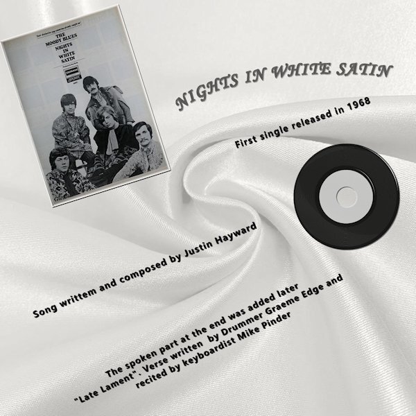
Nights in white satin has always been my Husband & My "Song" The single was released in 1968 and we were married in 1969 so the [Chorus] was true then and is still true today. "Cause I love you Yes, I love you Oh, how I love you" The info was Wikipeda.
2 points
-
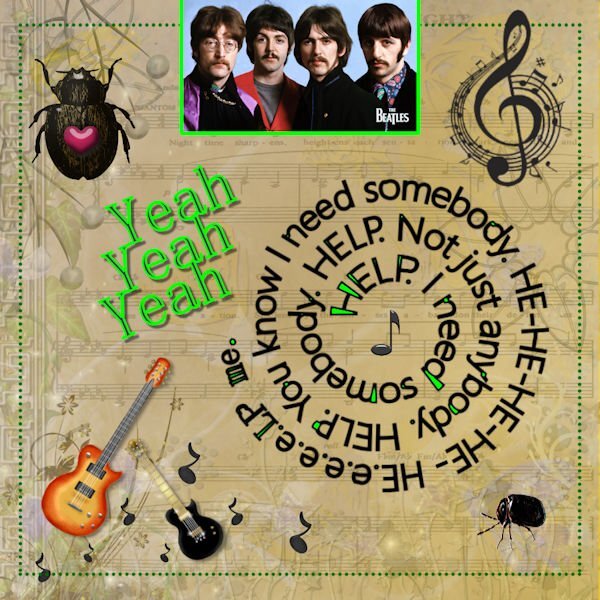
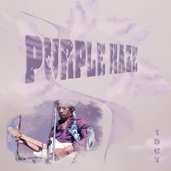
The first song that came to mind. The one, the only Jimi Hendrix. Nothing special done, just bits and bobs to try and capture the psychedelic vibe.
2 points
-
I know, I know, this "game" is almost over but I won't give it up completely. A little bit frustrated because I ddin't manage to stay on it. At least Day 1, 2 and 3. Just a small correction, I added the wrong postmark a few minutes ago.
2 points
-
Poppy does not like snow...ever! Template # 198 by Bourico Casper, AKA, Lady 22. Fonts: Meows, Palace Script MT, Christmas Snow Bold Swash 007 by A Janner, Snowdays at Digital Scrapbook Hearts on a string by Marisa Lerin, brush #03, Winter Plaid Kit at Digital Scrapbook Snowflake by Gina Jones, Winter Elements, Snowflake 02 at Digital Scrapbook
1 point
-
Yes, I'm in? But you have to wait a while. At the moment I'm busy in the garden and have no PSP time. Yesterday accidentally I was busy making something about an old song. Some parts are fixed but not everything. For sure It's coming up.1 point
-
I've made something in Particle-shop today. A castle in a bottle. The background is made of 2X the castle, one upside down and merged. Then activated Particle-Shop and the image was in. I blended the whole layer of the background to what you see by using several disciplines. In the end, I gave it some sparkles. And added the castle to it. Than accepted. back in PSP, I placed the background behind the bottle and the castle. Selected the bottle, reversed, and Dell. The bottle was finished. In the end, I gave it some sharpness. And so was my empty bottle filled.
1 point
-
made this layout for my Berlin Travel Album and for this challenge, because I found this photos . I am drinking coffee in the train1 point
-
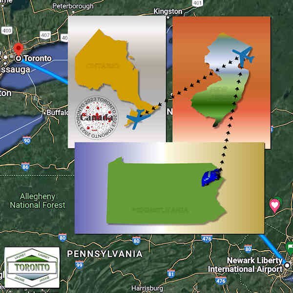
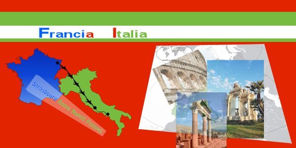
Here is my Day One map/trip project featuring a jaunt my daughter and granddaughter took from Pennsylvania, USA, to Toronto, CA, last week. Their route goes from Matamoras, PA, to Newark Airport in NJ by car, and from there the flight to Toronto. I started out with the template but ended up paring it down a lot. I like playing with maps!
1 point


.jpg.31b61357103ecb48ef4b510c5b833430.jpg)


Resized.thumb.jpg.d25811db03a63358cedab1e79f527635.jpg)

.jpg.858aad9480fa037359d9669991e64e11.jpg)