Leaderboard


Resized.thumb.jpg.d25811db03a63358cedab1e79f527635.jpg)
Popular Content
Showing content with the highest reputation on 09/17/2023 in all areas
-
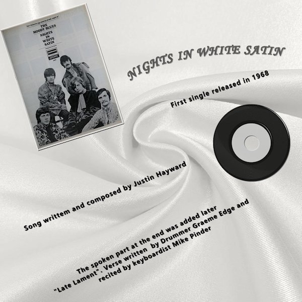
Nights in white satin has always been my Husband & My "Song" The single was released in 1968 and we were married in 1969 so the [Chorus] was true then and is still true today. "Cause I love you Yes, I love you Oh, how I love you" The info was Wikipeda.
 5 points
 -
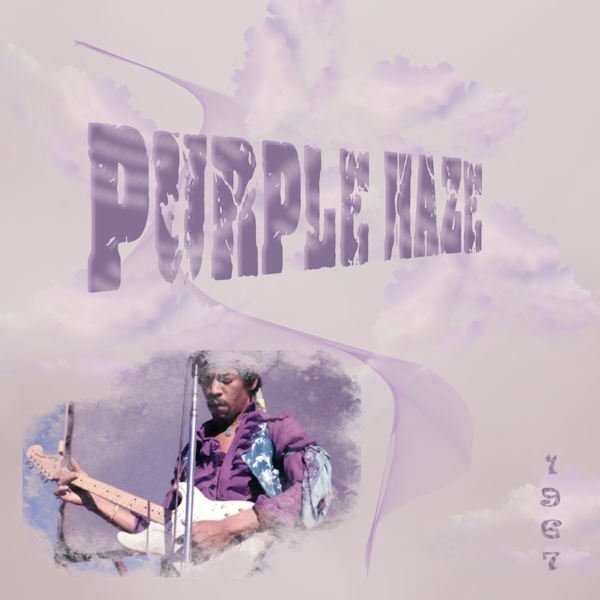
The first song that came to mind. The one, the only Jimi Hendrix. Nothing special done, just bits and bobs to try and capture the psychedelic vibe.
5 points
-
here is my work with the fence for the fence I made a big shadow on its own layer, mirrored vertical and use the shear tool for perspective, added gaussian blur and reduced opacity4 points
-
Poppy does not like snow...ever! Template # 198 by Bourico Casper, AKA, Lady 22. Fonts: Meows, Palace Script MT, Christmas Snow Bold Swash 007 by A Janner, Snowdays at Digital Scrapbook Hearts on a string by Marisa Lerin, brush #03, Winter Plaid Kit at Digital Scrapbook Snowflake by Gina Jones, Winter Elements, Snowflake 02 at Digital Scrapbook
4 points
-
Poor Kitty Cat. It only wants to get home for it's dinner.
3 points
-
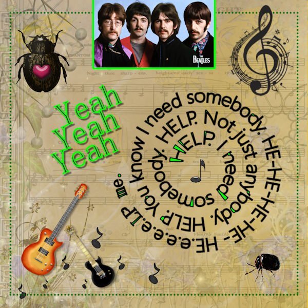
I didn't like them even when I was young. In those days I liked the French chansons more. Now I appreciate them more than then.
3 points
-
Carole's Framed Mask 3 freebie Font: KG When Oceans Rise
3 points
-
Here's my "freebie" challenge layout.
3 points
-
Mine will be about Cats. ?2 points
-
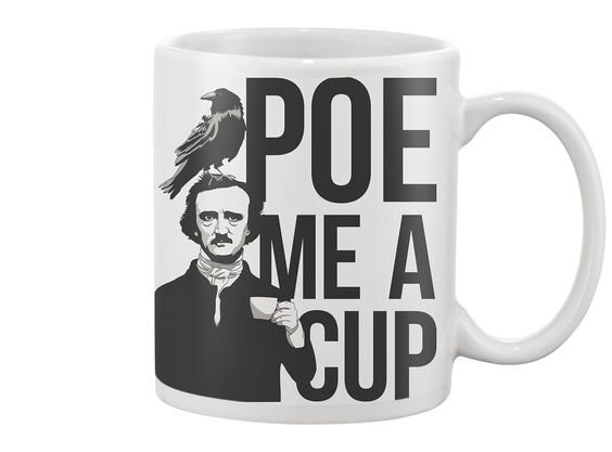
P = Poe me a cup...
2 points
-
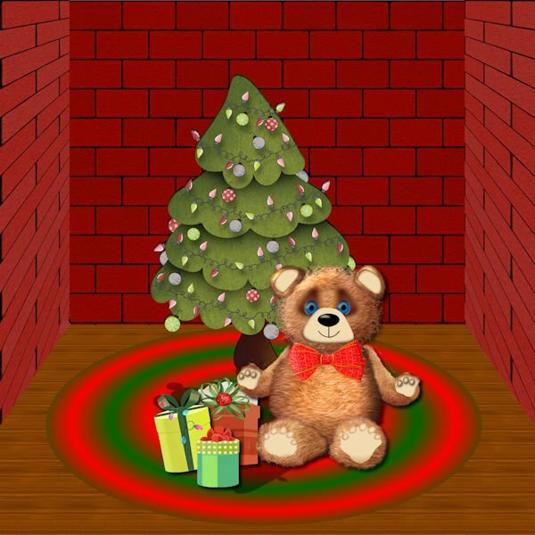
I am definitely not an artist, but I wanted to try to make a Teddy Bear. Starting with vector shapes to which I applied plush using the cass plush script, I used a lot of what I have learned about shading. The paws are tubes which I modified. I used a vector to trace the ear of a teddy that I downloaded using AI and the script to merge and cut out the inner shape. The background is from the Masterclass on Pop ups that I never completely finished. The tree is from Digital Scrapbook, and I'm not sure where I got the presents. All the other shapes--head, body, legs and arms were made from vectors.
2 points
-
I hear ya. Mine too. I was hoping to shoot some cameras but not sure if I'll have time. I might go ahead, they wont be the best photos though. But being a Diamond member perhaps it show up in the workshop section and I can always redo it down the road.2 points
-
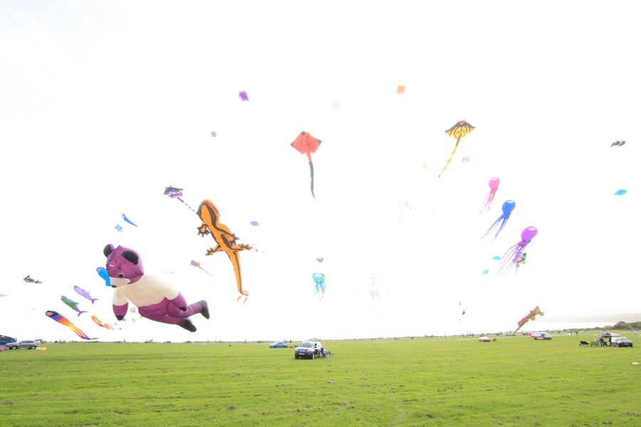
I have visited the Kite Festival today and have photographed some of the large kites. The stunt kites were not flying as the wind speed was to high for them to put on a controlled display. I am hoping for a calmer day tomorrow. This is a view of the kites flying when I arrived, requires some editing.
2 points
-
The English language is perplexing. Now, that's a word (perplexing), I really dont know what it means, but I used it anyway *GASP*. People are always telling me, when I use a "big" word...."you better go look that up". I think I should stick to one syllable words...except syllable is more than one. YIKES!2 points
-
Once a week, there is a radio show that has been on for many years. It is called Vinyl Tap. It is 2 hours of songs that are picked around a particular theme. Sometimes, it has to do with a word, sometimes, a topic, sometimes it is another particularity (like "unlikely duets"). With the fall months coming, use a title or lyrics of a song that has a COLOR in the title. "Lady in red", "Yellow submarine", "Pink Cadillac", "Brown eyed girl", etc. Are you up to the challenge?1 point
-
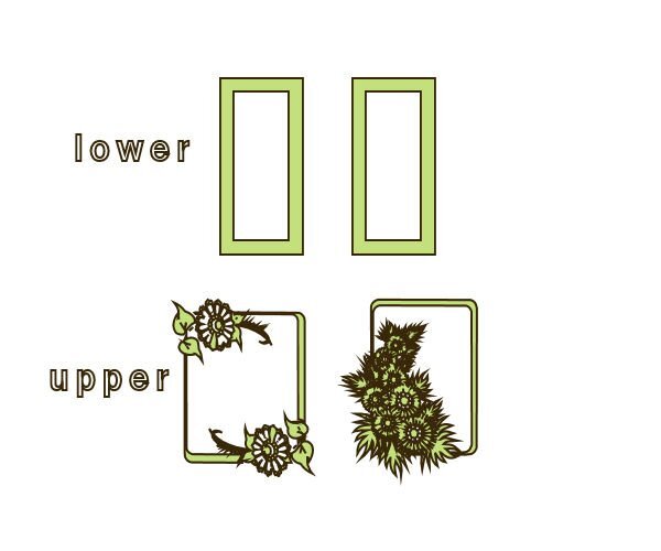
Did you know this? Me not til today.? Maybe some of you do not know ider. I have a dingbat font that's called FRAMES. I never used it before cause there were always those strange window icons that popped up when I pressed the lowercase. But when I press the uppercase my frame pops up. Always learn something new when I'm doing "homework". In both situations, I typed hi.
1 point
-
T= Turkish coffee.
1 point
-
S = Salted Coffee (not something I ever tried)1 point
-
What a great musician...1 point
-
....and in french = beurk (and again nothing better than "freshly-ground coffee") ?1 point
-
You nailed it. I'd call that pretty artistic. Good job Donna.1 point
-
Mine will be about whatever topic has the most photos. ?1 point
-
I'm in, but what will my magazine be about???
1 point
-
I love to include many options for scripts so that you can run them over and over again and get different results.1 point
-
Blimey, that's a word I haven't used in a long while. I would often say to myself or to someone I'm perplexed by what you just did or said, whilst shaking my head. Baffled, confused by not understanding why they did what they did or said. Usually pertaining to disciples within equestrian. My children had me more perplexed on copious occasions with the antics they used get up to.1 point
-
I live in Beverwijk, about 20km northwest of/Amsterdam. The Netherlands. But not born here, I'm born in Utrecht a city in the centre of the country.1 point
-
Only to satisfy my own curiosity, I looked up the meaning of the word spare in my very old Collins English dictionary, which I have had since I was a child. Adjective: not used/needed, not being used or not needed at the present time. A duplicate kept as a replacement. word origin Old English: to refrain from injuring. Spare the rod save the child. I use the word quite often, when someone asks me if I have for example eggs, I will often reply with, I can spare you some eggs. Not everything on Google is accurate.1 point
-
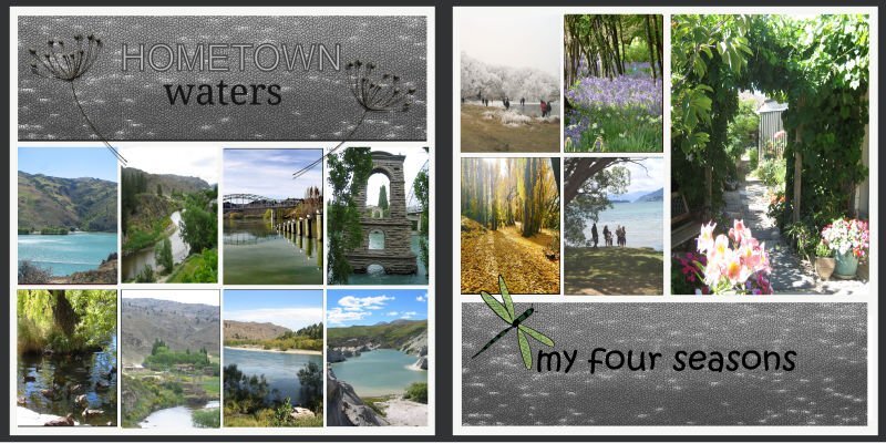
South Island New Zealand
1 point
-
Susan and Rene, I have to agree with you both. It appears I started quite the conversation. Changing gears slightly, but on the same subject, which is a relevant point, which I think has just been proven, when it comes to creating a good magazine cover or page, the text should be easy to read and understand. I believe it's a good idea to use simple short sentences. The same goes for the layout, it has to have balance, variety and emphasis to be an appealing and a functional design, that will make sense to anyone. Of course it doesn't only apply to magazines, but to any creative page. Should there be any typos, just read over them. Simple and minimalistic ( I wonder how many meanings these two words have!! lol) should be my middles names This is my opinion!1 point
-
I find it better to open many dingbats, such as frames and vector clipart in Character map, or some other similar program. That way you can select what you are looking for, instead of selecting all the keys on the keyboard until you find the one you want. Upper case is quite often the norm for dingbats etc.1 point
-
My "elegant" bedroom is definitely not 'simple and spare' these days... I'd have to clean off the bed if someone were to stay overnight. But is a "spare" because it is the extra bedroom!1 point
-
Besides scrapbooking and scripting I get once in a while an English lesson or explanation too. WOW ?1 point
-
E = Every adventure starts with Coffee
1 point
-
D = Devil Mountain Co. Black Label Brewed Coffee is believed to have the most caffeine per ounce at 129.6 mg.1 point
-
C = Coffee, Cakes, and Cookies. ?1 point
-
B = Books, a natural accompaniment to coffee! (and a cat! ?)
1 point
-
Z = zzzzz ~ snoring due to being served decaf instead of high test!1 point
-
Y = Yawn, indicating a need for coffee... ?
1 point
-
Just signed up for this course. Locally there is a kite festival this weekend,( weather permiting )and I hope to be able to take some photos. So that will give me an article for my magazine.1 point
-
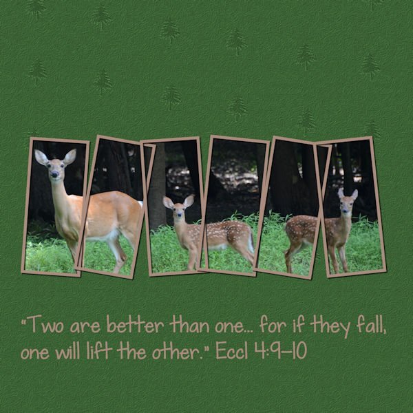
I had a photo obscured by haze, so I used the PSP tool to remove the haze, added a PSP frame, the cass-fence freebie, a couple of picture tube trees and ended up with this, "White-Tail Doe with Triplets." (Guess what? Markus showed up!)
1 point
-
Yes, when it comes to dingbats, or fancy fonts, the designers might not always create something for all the keys. Sometimes, it will miss digits, or punctuation marks, etc. Even when I create fonts, I don't always have something for every possible keystroke. Good observation!1 point
-
Here is my contribution to this challenge. The photo is from a Biergarten we like to go to when the weather is nice and warm... not so much this year. I added Markus to the layout in a different way it is meant to be used, as I don't have a "real" Markus to take to places. ? I used a technique from the 2018 Popup Masterclass.
1 point