Leaderboard
Popular Content
Showing content with the highest reputation on 09/04/2023 in all areas
-
I found this beautiful stained glass image in Creative Fabrica (can you believe it's meant to be a mouse pad?). I used it to make the background paper by applying 100 Gaussian blur on the original, adding the Mosaic Antique effect, and then another little blur. The text was made using the text cutter option for the font (Andalusia). Then Inner Bevel on both the text and the main pic.9 points
-
9 points
-
I made the paper using what I learned in the Meli-Melo creative scrap tutorial and added a texture and some extra blur. Doing/re-doing these tutorials is really helping me. The font is Ambrogio and I used the Outer Bevel 3-D effect.6 points
-
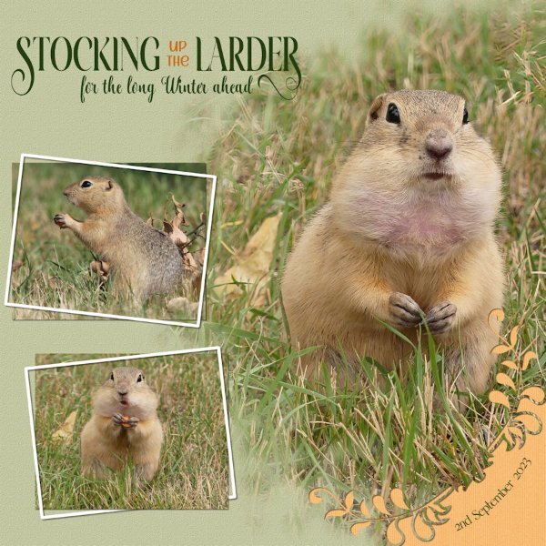
The beauty of observing and shooting these entertaining creatures, is that I can create a story behind the shots. Umpteen times they will pack their cheeks and disappear down their holes to their burrows to fill their larders. In the bottom photo you will see him packing a piece of carrot in to the cheek. Stretching the skin, to reveal the pink skin, something I hadn't noticed before.6 points
-
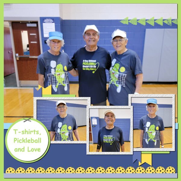
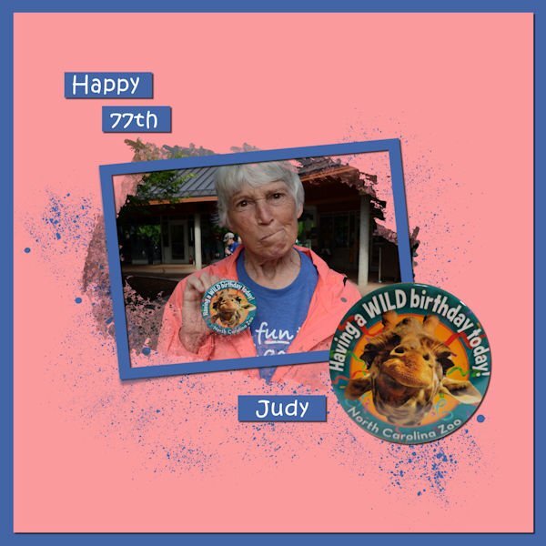
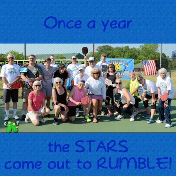
Template by MissFish, Showoff #2. There's a long story about this layout. Several years ago, Saffan's sister passed away. He came to pickleball the day he learned of her passing and, of course, was very sad. He asked me to be his sister and I am still his sister to this day. I introduced him to pickleball and gave him the shirt he is wearing. He gave me the shirt I am wearing as a birthday gift and also gave Judy her shirt. Judy is struggling with dementia and I have become her caregiver. In his typical kindness, Saffan included Judy in the gift giving. She was thrilled. So, you see...it really is about T-shirts, pickleball and love!5 points
-
5 points
-
5 points
-
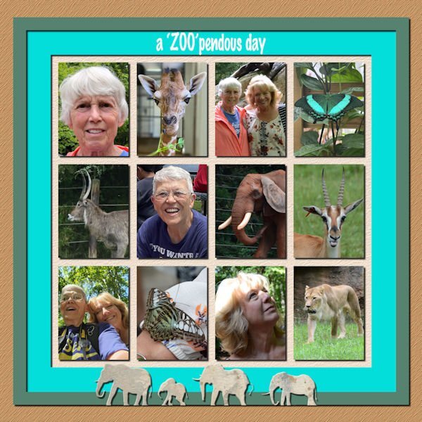
Another zoo layout. I create the template with Carole's multi-photo frame script. The Zoopendous day was taken from a photo frame by Gina Day, A Day At The Zoo, September, 2017 Digital Scrapbooking blog train. The elephants at the bottom are from the same kit. I erased the grass that was a part of the border and I deleted one elephant.4 points
-
4 points
-
I began this layout some time ago. I often let them sit and go back to them with renewed energy. I played with this on a long time. I placed the text above the background paper, which I made. Then I used the burn blend mode. I think the text looks like it is a part of the background...not just sitting on top. The original color of the text affected how each blend mode appeared. I changed the colors many times.4 points
-
This is one I did back in 2017. I used a photo for the background (Delphinium). Usual word art, the coffee and biscuits I found on line, masked it into the page. I'm not a big fan of coffee, when I do have a cup, it's a few grains of instant coffee. I do enjoy a cup of tea though. Herbal or regular.4 points
-
4 points
-
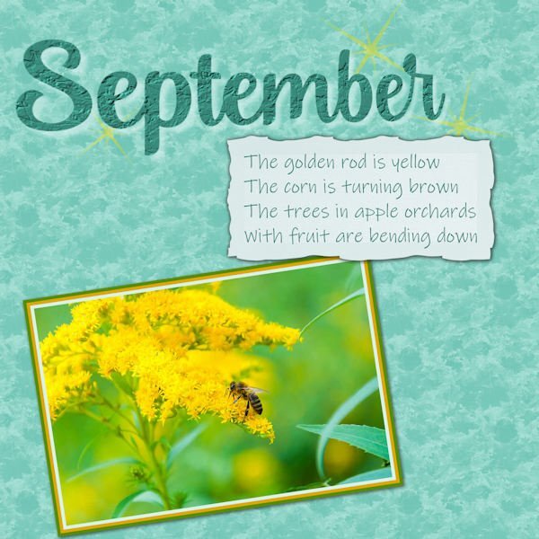
I wanted to get in here early on this month's projects. This is a simple one, an ode to one of my favourite months. The quote comes from a poem called "September" by Helen Hunt Jackson (1830-1885). She was friends with Emily Dickinson and Harriet Beecher Stowe. If you wish to read the whole poem, just google her. It's quite lovely. As a child (and teen), we had to learn "memory work", usually poems or passages from Shakespeare (in high school). Those things are deeply embedded and don't fade away. Every year, as I pass the corn fields or the orchards near me, the poem leaps into my mind. Even when I was a "big city girl" for many years, I would recite it. The background has a texture of wet autumn leaves applied, and I used it again for the font on the title. The image is from online with added borders. The label is from DS, colour adjusted.4 points
-
3 points
-
3 points
-
made this layout for my Berlin Travel Album and for this challenge, because I found this photos . I am drinking coffee in the train3 points
-
3 points
-
3 points
-
so many wonderful places and photos from all the travels I love to see them all here is my last day , playing with the cutout- tutorial3 points
-
I'm so busy catching up with the scripting course that I recycle a layout that I did about coffee. It is from november 2020 and I was in my first year here in the Campus. I was building my stock and wasn't a diamond member yet, so the papers came from Pixelscrapper (digitalscrapbook.com as it is called nowadays) and the bow is a freebie by Carole. The photos are mine, as always.3 points
-
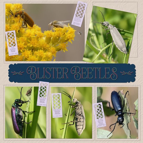
I bought the new Punches in the store earlier. I simply had to have them and try them out. What photos shall I showcase tonight I thought. Anyway, this is what I came up with, using one of the new brushes, as a label. I also used one of Carole's corner punches on the strip. Instead of putting a frame a round the photos I embossed the background paper around them for a change. Of all the Blisters the Epicauta sp. is my favourite, and I call them velvety greys, not only do they look velvety, they feel ever so velvety to the touch, as does the tan blister. The velevety grey's legs also reminds me of the parts of a Meccano set. Julie, we had the same idea, I too used a photo of one of the Blister Beetles on a Goldenrod plant. It's one of the Blisters favourite flowers. And one of the last flowers to bloom here.3 points
-
3 points
-
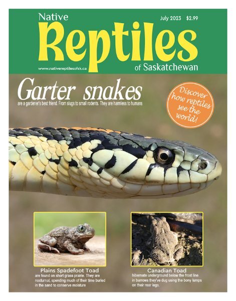
Creating a magazine cover is another way I like to showcase my photos, and I enjoy creating them. They are quick and easy to create, as they don't require shadows, textures. Whilst getting all the information that a scrapbook page will contain. Title, date, location and so on. They are flat pages. Although the toads are amphibians, I still added them to the cover. The snakes are reptiles of the suborder Serpentes. The Plains Spadefoot toad are small, this one was an inch and a quarter, as I measured it. The other one wasn't much bigger at 2 inches. I love everything about snakes. This on I picked up to take a portrait shot, looking around for a non busy background.3 points
-
My father died 46 years ago now when my children were young and I miss him more then ever now I'm getting older. It is a "weird" feeling that I'm much older then he ever was.2 points
-
2 points
-
Carole and I were talking about her corner and frame punches, and we agreed, that they are unique. You won't find them anywhere else, not even in photoshop. I use them a lot, not only on strips or labels, but I will quite often punch out a quarter of a page or more, which will give a lovely effect. I can't remember who it was, but someone commented how large the punch was, and never thought to use them in that way. Michele, your pages are always fun, the colours and effects you use are as Jannette said a feast for the eyes, and brighten up anyone day, with your choice of colours.2 points
-
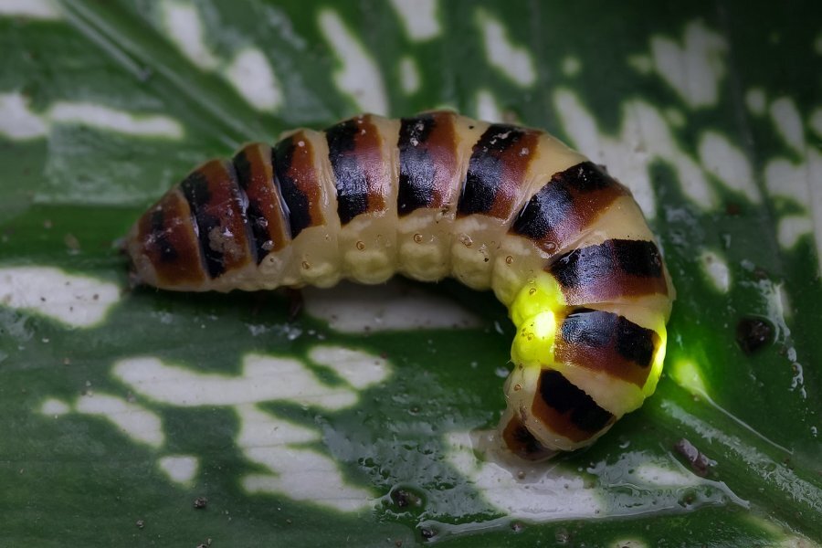
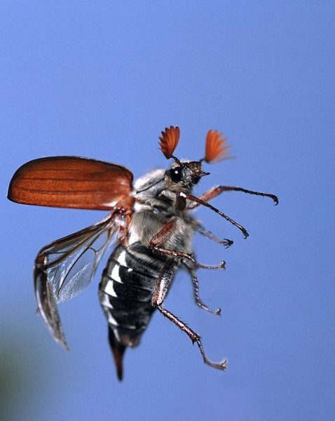
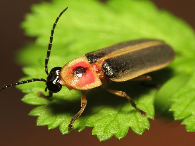
They are beetles, commonly called Fireflies, glow worms, lightning bugs. They belong to the Lampyridae family, the order of ( Coleoptera) beetles. In the class of insecta ( Insects). They produce light in special organs in their abdomens. A combination of several chemicals, which they can control, how and when to flash. It's pretty fascinating really.2 points
-
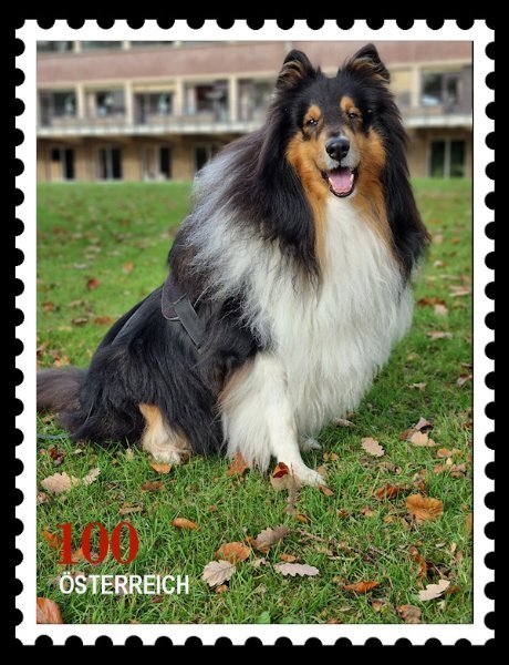
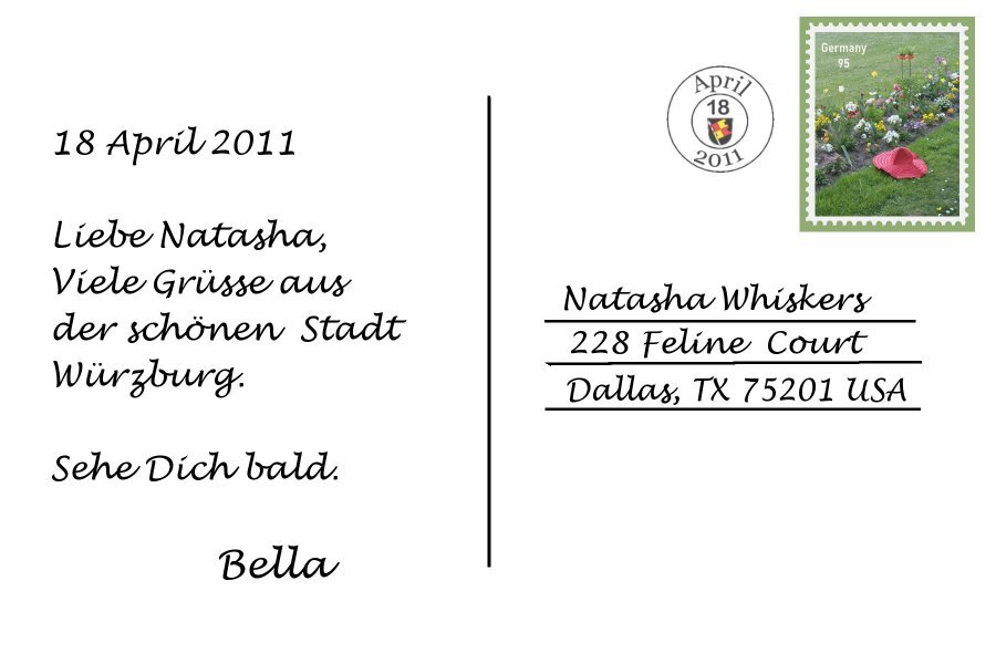
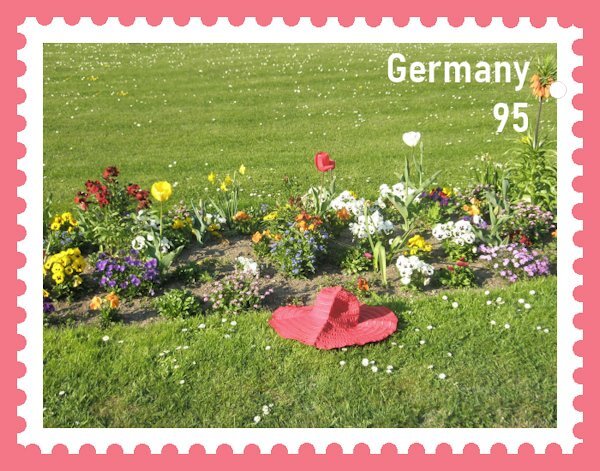
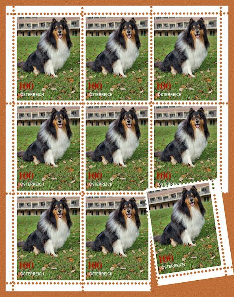
I'd send more snail mail if stamps were like this! I love stamps, they are little works of art I can afford. This is beautiful. This technique is so real looking and most everyone across the globe knows what a stamp is.2 points
-
2 points
-
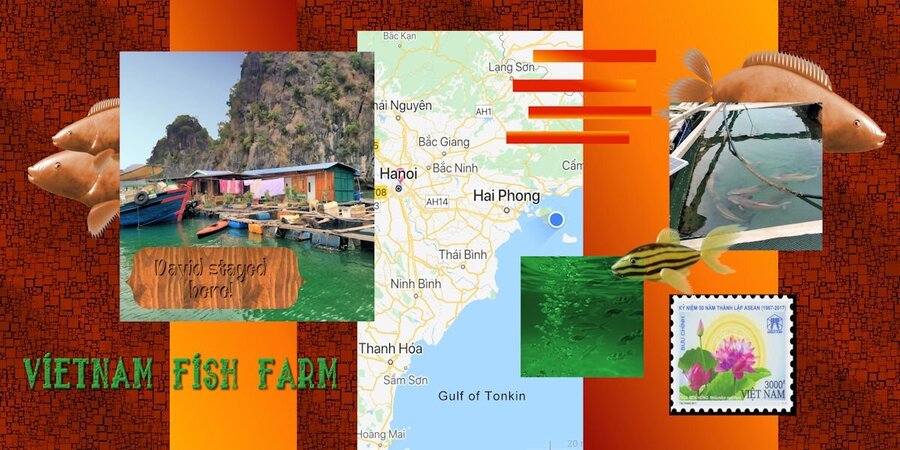
Finally finished! I decided to use my grandson's pictures from his stay at a river fish farm in Vietnam. I didn't have a lot of pictures, but I made some fish using Filter Forge filter "Aquaria." The water picture is AI from Adobe Express. The map is from a photo that David sent me when he sent the fish farm picture. The font is a grunge font called "sailor 1 grunge." I couldn't divide it in half because I placed the map in the middle. Papers are mine; two columns are a gradient.2 points
-
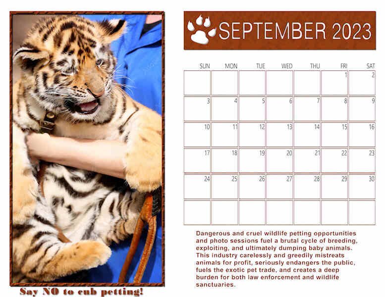
Here's my Wild Cat Calendar for September. Template from Cassel. Photo from FreePix. Information from The Wildcat Sanctuary, Sandstone, Minnesota. I used the pattern Wood Tile 01 to fill the photo frame, the top strip and the calendar grid. I have this posted on Facebook in its full size, so it is printable. (I have it on my refrigerator door @11x8.5")2 points
-
2 points
-
2 points
-
And these are the next 2 pages. You will probably recognize Cass's pinwheel. the balance of the elements and papers are mine. The pics of Jim and Joe are blurry - although I used a flash with my point-and-shoot camera, it was pitch black that night lit only with a small fire off to the side and not too close to them. Had a job lightening them up enough so you could vaguely see them. Oh, well. It was a great night. Somehow it always is after a good thunderstorm - the air is so clear.2 points
-
I've done some research on the fireflies, here is my result. It's from Wikipedia. there are more than 200 firefly species. I did not have time to do anything with the photos. It's more informative. The text is from the first photo. I've got them from the internet: Close-up view of a bioluminescent beetle Elateroidea (Lampyridae Ototretinae Stenocladius or Rhagophthalmidae), on a leaf. This specimen measures about 20 mm (0.79 n). The species produces and emits light, via a chemical reaction during which chemical energy is converted into light energy. The principal chemical reaction in bioluminescence involves some light-emitting molecule and an enzyme, generally called the luciferin and the luciferase, respectively. Oxidation of organic compounds induces photon emission. The intensity of this light can be perceived by the human eye in a radius of 2 m (6.6 ft). This is a long-exposure photograph (1.3 s) made with a tripod and a macro lens, in the middle of the night (2 am). In conditions of ambient darkness, the adjustment of the manual focus is difficult, and the camera settings (ISO and depth of field) should be done according to the mobility of the living organism, which may lead to motion blurs. At any time, the insect can also decrease the intensity or even completely stop emitting its light (example here). A soft and diffuse auxiliary lamp has been brought to reveal the details of the animal. Bioluminescent beetle species are in regression in the world because of the phenomenon of light pollution, insecticides, and climate change. This specimen comes from the island of Don Det, Si Phan Don Laos, a wild area far from any major city. This image won the 1st prize in the Wiki Science Competition category Wildlife and Nature from France.2 points
-
Bonnie what a nice gesture with the shirts and you must be very fond of Judy to become her caregiver. I hope you can cope when her dementia is getting worse. From experience, which I wish I never had, I can tell you that it is a long and hard responsibility to take on. My mam had this awful condition and it has taken more then 12 years before she died. So from helping out in the beginning it became a heavy burden in the end and there were days that I really hoped she would die in her sleep. In the first place for her, because she was so unhappy in the last stages of her live and that was so painful to witness. She died 16 years ago now and I still can have a nightmare about it; it has replaced to some extend the happy memories of her. So take good care of Judy and of yourself too.1 point
-
V = Very hot. A tongue in cheek comment about how now McDonald's and other have to put this on there cups after getting sued by someone that spilled hot coffee on themselves. (who would want a cup of hot coffee luke warm?)1 point
-
You show us all the different and often unexpected ways to use them in your layouts. And everyone comments on them, so your style is as unique as the punches themselves. A good combination wouldnt you say?1 point
-
As I said on the FB page, I really love your use of the punch in the bottom right corner. Besides being pretty, it really does balance out the composition as a whole.1 point
-
Thanks Suzzy. I try to create balanced pages. The heading at the top left, needed something down in the bottom right, to balance it out. I feel a balanced design is naturally pleasing to the eye.1 point
-
Thanks Sue. It was simply a texture from the Effects menu>Textures. I usually forget there are more choices there than in the Materials Palette.1 point
-
My mum died just before her 70th Birthday. 23 yrs ago. I don't know about you, but as I have got older the more I miss her. Out of the blue I would ask her a question pertaining to something I was doing at the time. Or something that I'm doing would remind me of a memory of her.1 point
-
Doesn't matter how many years go by, does it? They are missed and in our hearts forever.1 point
-
1 point
-
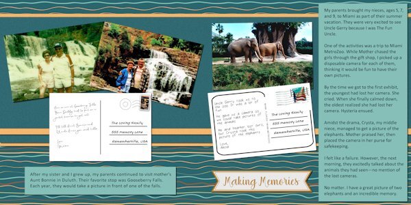
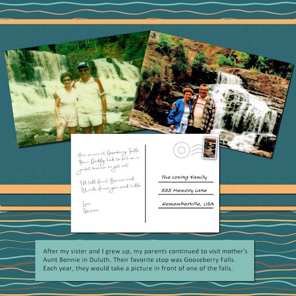
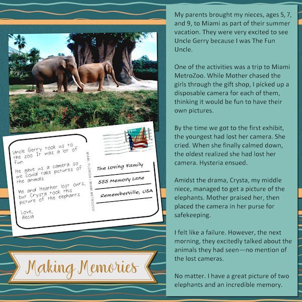
Day 6. No more Carmen Sandiego adventures - for now. Stumbling on these photos triggered some fun memories. My dad would plot elaborate routes from Alabama to Minnesota, but Gooseberry Falls was always on the list. The elephant picture reminded me of the many times when I felt inadequate in my quest to be The Favorite Uncle but fell short. They always had a good time, which was what it was all about.1 point
-
Most of the elements are from a template by AnnieC included in the March 2021 ALFLT Blog Train. There was a lot of improvising to fit it into FB's new pic size. I had the opportunity to add a paper fold I made in the Creative Scrap tutorials; it helped balance the l/o. The font is About Loving from CF. Hope my cousins liked the card.1 point
-
Thanks...pretty exciting. We've been in the same house in Crystal Lake for 34 years. Time to get rid of stairs and be closer to our son.1 point
-
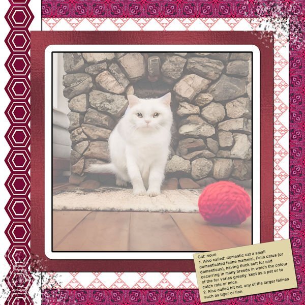
Lab 11d Mod 5: hexagon shape, smudge brush, dictionary copy: All done - (smudge brush was used in the bottom left corner and top right corner. The picture is one generated by me in CFSpark (asked for a cat on a rug by a fireplace) - used the white overlay reduced to 10% and then overlayed one of Susan Ewert's cracked paint overlays with reduced opacity just to give the frosted glass some depth ; the papers are my own. Made several ribbons or paper strips of different hexagons I'll post them also.1 point
-
1 point
-
1 point

Resized.thumb.jpg.d25811db03a63358cedab1e79f527635.jpg)





.jpg.ac08bc06dfedd9faa256bea28fb50306.jpg)
